What is Off-Canvas Menu WordPress
Off-canvas menus in WordPress have become a popular solution for those looking to add modern navigation options to their websites without cluttering the interface. Picture a hidden panel sliding in from the side of your screen, only becoming visible when you need it. That’s the essence of an off-canvas menu. It stays out of sight, helping to maintain a clean look for your site, but it’s always there at the ready for your visitors to access.
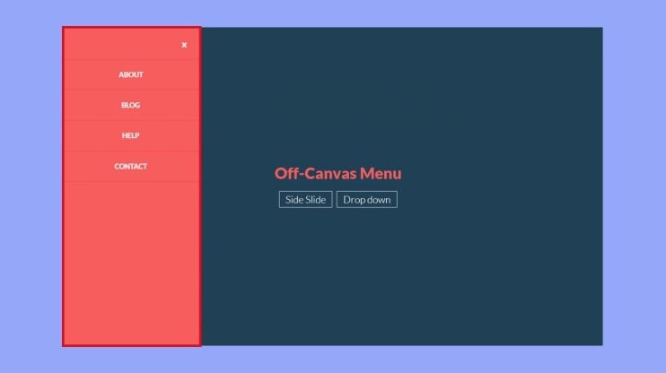
Understanding what is off-canvas menu in WordPress and how it works is straightforward. When you interact with a specific trigger, usually a button or link on your site, the off-canvas menu glides in from the edge of the page, providing additional navigation options. This technique allows your website to accommodate more content or functionality without overwhelming your visitors. With WordPress, integrating an off-canvas menu can be as simple as using the right plugin or theme feature, thus enhancing your site’s design and user experience.
Understanding off-canvas menus in WordPress
Off-canvas menus in WordPress are a sleek way to manage your site’s navigation while ensuring a user-friendly experience. They cleverly utilize screen real estate, offering quick access to content without cluttering the view.
Core concepts and definition
An Off-canvas menu refers to a hidden navigation panel that slides into view from the edge of a screen. Think of it as a secret panel that’s there when you need it, but out of sight when you don’t. This menu usually appears when you click a button or icon, like the popular hamburger icon. The main content shifts or remains in place, making room for your menu to show its magic.
Benefits of using off-canvas menus
The use of off-canvas menus can significantly improve user experience. Since they are tucked away, these menus don’t take up precious screen space until needed. They’re a fantastic way to keep your WordPress site looking clean while still offering extensive navigation options. Here are a few pluses:
- Focused content: Your main content stays front and center without being overshadowed by navigation.
- User engagement: Intuitive design encourages users to explore more of your site via quick links or secondary menus.
- Space-saving: Provides a solution for including additional menu items without cluttering the design, perfect for featured products or special promotions.
Common use cases
Off-canvas menus aren’t just for mobile views—though that’s where they shine. You can use them for secondary menus, housing quick links, or even showcasing a featured product. These menus are also excellent for creating a more immersive experience by neatly compiling options. They can facilitate navigation on blogs, e-commerce sites, portfolios, and more. If you’ve ever used a site where the menu seems to magically appear, giving you all you need without taking up space, that’s the off-canvas menu working for you.
How to implement an off-canvas menu
Implementing an off-canvas menu in your WordPress site involves a few steps such as selecting a suitable plugin or coding one yourself. You’ll also be configuring the menu settings to make sure it aligns well with your site’s design and usability.
Choosing the right plugin
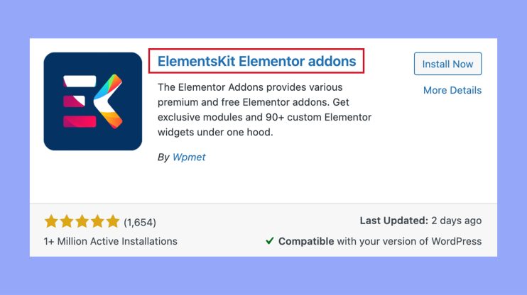
When you’re looking to add an off-canvas menu to your WordPress site, exploring the range of plugins available can be the easiest approach. For a seamless experience, Elementor and Elementor Pro offer powerful features, including drag-and-drop capabilities that make adding a sidebar menu straightforward. Look for a plugin that offers extensive customization options and robust support if you need help down the line.
Adding an off-canvas menu to your WordPress site using ElementsKit is quick and easy. Here’s a simple, step-by-step guide:
- Go to Plugins > Add new. Search for ElementsKit. Click Install now and activate the plugin.

- Navigate to ElementsKit. Go to the Widgets section. Enable the Header Offcanvas widget and save changes.
- Go to Posts > Add new and title your post. Click Edit with Elementor. In the Elementor dashboard, search for the Header Offcanvas widget. Drag and drop the widget onto the page. Click the hamburger icon to add menu items. Customize your menu by editing content and adding items like a vertical menu.
- Adjust settings such as overlay color, menu type, icons, and style (color, background, hover effects, etc.). Once customization is complete, click Update.
- Finalize and publish. Review your off-canvas menu. Customize additional settings like width, background type, position, and padding. Click Publish to make your off-canvas menu live.
Your off-canvas menu is now set up and ready to use. You can continue to customize it from the widget area for more variations.
Custom implementation using CSS and JavaScript
Manual implementation using CSS and JavaScript is your go-to method if you prefer a more hands-on approach or need a bespoke solution. Start by creating a new CSS class in your stylesheet to control the off-canvas menu’s appearance. Then, use JavaScript or jQuery to dynamically show and hide the menu based on user interactions. Remember to consult official documentation for the APIs you plan to use for precise integration.
Designing an appealing off-canvas menu
In crafting an off-canvas menu, attention to detail in design elements and thoughtful consideration of user experience are pivotal for both aesthetics and functionality.
Visual elements and styling
Your off-canvas menu should be visually coherent with your site’s design. The icon, often a “hamburger” icon, acts as a visual cue for the menu and should be easily recognizable. Text readability is crucial; so, choose a size and font that are legible on all devices. For layout, maintain a consistent structure that complements the overall alignment of your page. The use of color and background color not only adds to the aesthetics but also guides the user’s attention. Images can be incorporated but should not overwhelm the menu’s simplicity.
Responsiveness and accessibility
Your menu’s width and height must adapt to various screen sizes, ensuring that items are neither too cramped nor too spaced out. Padding around menu items guarantees adequate touch targets for mobile users. Prioritize accessibility by using a text-to-background contrast that accommodates users with visual impairments. Menus should be navigable by keyboard as well, reflecting a commitment to inclusivity.
Enhancing user interactivity
Interactive elements should provide instant feedback, like changing colors when hovered over. A smooth transition when the menu opens and closes can greatly enhance the experience. Consider adding a custom header within your off-canvas menu for added personal touch or functionality. Remember, each interaction with your menu is part of your user’s journey through your site, so make it intuitive and satisfying.
Advanced customizations and troubleshooting
When enhancing your off-canvas menu, you might encounter the need for deeper customizations and occasional hiccups. Tapping into code hooks and addressing common bugs will ensure that your menu works seamlessly across various devices.
Working with hooks and filters
To add your own flair to the off-canvas menu, you can use custom hooks. Hooks in WordPress allow you to ‘hook into’ the rest of the code at specific points, letting you modify or add to the existing functionality. For instance, here’s a simple code snippet in PHP to demonstrate how a custom action hook can be used:
function your_custom_function() {

  echo 'Your custom content here';

}

add_action('your_custom_hook', 'your_custom_function');
Applying CSS can further tailor the look of your menu. For example, adding the following CSS can change the menu’s background color:
.your-off-canvas-class {

  background-color: #000; /* Change to your desired color */

}
Debugging common issues
Encountering a bug can be frustrating, but there’s usually a straightforward fix. If you’re seeing errors or unexpected behavior, check your JavaScript console for clues. Commonly, a conflict might arise from multiple scripts running on the page. Here’s a quick JavaScript solution to check for errors:
console.log('Testing for errors');
If your menu isn’t displaying correctly, review your CSS and ensure you’re not loading any legacy CSS solutions that conflict with your current theme.
Ensuring compatibility and responsiveness
For developers, ensuring that your off-canvas menu is both compatible with all browsers and responsive to different device sizes is crucial. Regularly test your menu on different screens, and make use of media queries in CSS to tweak styles for different resolutions. Here’s an example of how you might adjust the width of the off-canvas menu for small devices:
@media (max-width: 768px) {

  .your-off-canvas-class {

    width: 75%; /* Adjust based on your design */

  }

}
Remember, maintaining compatibility across browsers and devices is essential for providing a consistent user experience. Keep this in mind while adding custom PHP, JavaScript, or when opting for a JavaScript solution versus a pure CSS one.
In conclusion, off-canvas menus are a modern way to improve your WordPress site’s navigation. They stay hidden until needed, keeping your site clean and uncluttered. You can easily add them using plugins or custom code, making navigation more user-friendly. Off-canvas menus enhance the user experience by providing quick access to more content without cluttering the screen. Use them to keep your site professional and easy to navigate, ensuring a smooth and engaging experience for your visitors.
Subscribe to AI insights
- The latest trending AI news
- How AI boosts efficiency at 10Web
- In-depth reviews of AI tools
- Entrepreneurial wisdom and insights
- Valuable business growth tips
Share article
-
 Copy
Copy
-
-
-


 Back
Back