What is a Sticky Header in WordPress
A sticky header in WordPress is an essential feature for enhancing user navigation and overall user experience on a website. Often known as a fixed header, it’s the portion of the site that remains visible and ‘sticks’ to the top of the page as you scroll down. This means that no matter how far down a visitor scrolls, the header will always be accessible, providing constant access to the navigation menu, essential links, and possibly even a search bar. This sticky functionality is widely used in website design as it helps users find their way around your site more efficiently.
Adding a sticky header to your WordPress site can be surprisingly straightforward. Whether your theme comes with a built-in option for a sticky header or you decide to employ a plugin, the customization options are plentiful. You can adjust the look and functionality to match your site’s design and address your visitors’ needs, ensuring that your sticky header is not just a fixed element, but a benefit to your site’s navigation and aesthetic appeal.
Understanding sticky headers in WordPress
Sticky headers have become a fundamental element in modern web design, enhancing user navigation and accessibility while browsing your WordPress site.
What is a sticky header
A sticky header, also known as a fixed header, is a navigation menu that remains fixed to the top of the screen as you scroll down a webpage. Unlike regular headers that disappear when a user scrolls down, sticky headers stay visible at all times, providing constant access to the navigation menu. It’s a feature commonly leveraged by designers and developers to improve the user experience on a website.
Benefits of using sticky headers
Implementing a sticky header on your WordPress site can enhance your user experience by providing effortless navigation and reducing the need to scroll back to the top. This is especially important in ecommerce, where quick access to the navigation can improve a site’s conversion rate. Sticky headers can also be used for brand recognition, featuring your logo prominently, and including CTA buttons to guide users towards important actions.
Sticky header design principles
When designing a sticky header, there are several best practices to consider to avoid compromising the webpage’s usability:
- Background color: Choose a color that ensures the text and elements are clearly visible against the page content.
- Transparency: A subtle transparency effect can integrate the header well with the site’s content without being too intrusive.
- Design: Minimalist designs often work best, so the header doesn’t distract from the content.
- Size: Make sure the header isn’t too large to avoid consuming valuable screen space.
- Responsiveness: Ensure your sticky header looks good and functions well across different devices.
By adhering to these principles, you’ll create a sticky header that not only looks good but also contributes positively to the navigation and overall user experience on your WordPress site.
Implementing sticky headers with WordPress tools
When you decide to enhance your WordPress site with a sticky header, a variety of tools can streamline the process, from selecting plugins or themes to customizing through CSS.
Choosing the right plugin or theme
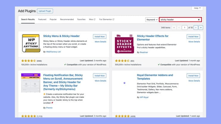
Your WordPress dashboard is the gateway to adding functionality to your site. For a sticky header, start by looking at WordPress plugins like Elementor or themes that come with this feature built-in, such as the Blocksy Theme. Remember to check that the plugin or theme is compatible with your version of WordPress and has good reviews for performance and support.
- Plugins: Search for “sticky header” plugins from the Plugins > Add new section. Look for options with high ratings and frequent updates.

- Themes: Some themes, including Blocksy, offer this functionality in their header settings. You can browse these within Appearance > Themes.
Customizing sticky headers through CSS
After choosing a plugin or theme, you might want to customize the look and feel of your sticky header. This is where CSS comes into play. By determining the class or id of your header element, you can apply custom styles for position, size, color, and more.
- Editor: Access custom CSS options through Appearance > Editor or by using a plugin that allows CSS customization.
- Code: Use CSS properties like position: fixed; and z-index to ensure your header remains at the top and visible above other content.
Modifying header settings in WordPress
Fine-tuning your sticky header is often necessary to get it just how you want it. Within your header builder section in themes that support this feature, you’ll find settings to adjust the behavior of your sticky header.
- WordPress site: Navigate to Appearance > Customize to access Header settings.
- Block editor: With Gutenberg, look for a List View selection method to group the header in a block to enhance with sticky properties.
Remember to check the changes in different browsers and on mobile devices to ensure your sticky header looks great and functions well across all platforms.
Enhancing user interaction with sticky headers
Sticky headers provide a seamless way for your visitors to navigate your site without losing their place. They serve as a constant companion at the top of the user’s screen, offering easy access to various functionalities.
Integrating menus and navigation elements
When you include a sticky menu in your WordPress site, you’re allowing visitors to effortlessly move through your content without scrolling back to the top. Imagine your navigation menu, complete with navigation links like ‘About Us’ and ‘Services’, always available no matter how far down the page your user scrolls. Let’s not forget the shopping cart icon for your ecommerce shop, which reminds users they have items waiting for checkout, increasing the likelihood of completing a purchase.
Example of navigation elements in a sticky header:
- Home
- Products
- New Arrivals
- Best Sellers
- About
- Contact
Incorporating special features
Sticky headers also offer a key opportunity for increased engagement. By placing a call-to-action button within reach, such as ‘Subscribe Now’ or ‘Book a Consultation’, you encourage visitors to interact more with your site. Social media icons and a search bar can also be fixed within the header, so users can follow your brand or find specific content with ease. Imaginative use of hover animation on these elements can further enhance engagement, creating an interactive experience as users navigate.
Example of special features in a sticky header:
- Call-to-action: “Join Newsletter”
- Search bar: Always available for quick searches
- Social media icons: Instantly connect with social platforms
Optimizing sticky headers for mobile devices
Since a significant amount of web traffic comes from mobile users, ensuring your sticky header is mobile-friendly is crucial. A responsive design that adapts to different screen sizes and touchscreen navigation ensures usability is not compromised on smaller devices. Your sticky header should be just as intuitive on a smartphone as it is on a desktop, perhaps simplifying elements to suit the mobile devices‘ compact screens.
Example of mobile optimization in a sticky header:
- Simplified menu button (hamburger icon)
- Visible shopping cart icon
- Minimized logo size
By thoughtfully integrating these elements into your sticky header, you both enhance the aesthetics of your site and greatly improve user experience, making your WordPress site more intuitive and user-friendly.
Subscribe to AI insights
- The latest trending AI news
- How AI boosts efficiency at 10Web
- In-depth reviews of AI tools
- Entrepreneurial wisdom and insights
- Valuable business growth tips
Share article
-
 Copy
Copy
-
-
-


 Back
Back