What Is Transparent Header in WordPress
A transparent header in WordPress is a design feature that allows the background of your webpage to show through the header area, giving your site a modern and sleek look. At the same time, it can enhance the visual appeal of your website, improve the overall user experience by making your navigation menu more visually engaging.
Using a transparent header is simple with WordPress themes like Astra and Blocksy. The transparent header feature can help draw visitors’ attention to your content and make your website stand out.
Adding a transparent header can also optimize your site for better usability. With a sticky transparent header, your visitors can access the navigation menu even when they scroll down the page. This ensures that your users always have easy access to the main parts of your site, keeping them engaged and improving their browsing experience.
Understanding transparent headers in WordPress
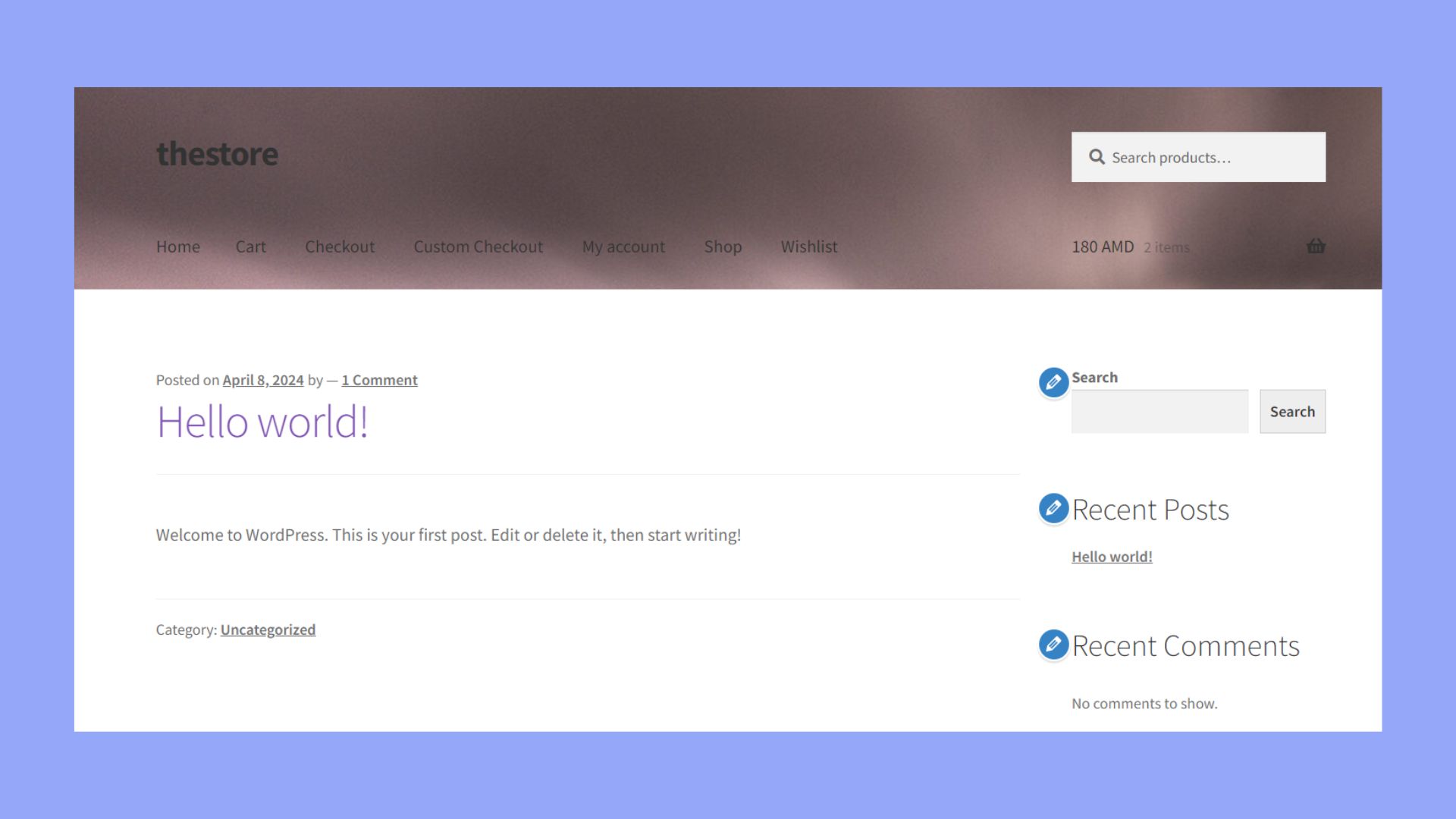
A transparent header is a header that does not have a solid background. Instead, it allows the background image or color of the webpage to show through. This type of header is often created using CSS and theme options. It overlays the webpage content, creating a more integrated and smooth look for your site.
Transparent headers are part of modern website design. They can make your site feel less cluttered and more visually appealing. This is especially useful for sites with strong visual content, such as photography portfolios or design blogs.
Benefits of using transparent headers
Having a transparent header has a number of advantages. Here are some of the main ones:
Enhanced visual appeal: Transparent headers contribute significantly to the aesthetics of a website. By merging the header with the background, the overall design becomes more cohesive and less segmented. This integration helps the site appear more open and spacious, avoiding the typical blocky feel of traditional headers. The seamless transition between the header and the content below creates a more fluid visual experience.
Greater engagement: Transparent headers can greatly enhance the user experience by allowing visitors to view more of the page content immediately upon arrival. This feature is especially beneficial for websites that utilize large, compelling images or sliders at the top of their pages. This initial visibility encourages deeper engagement as users are drawn in by the prominent, unobstructed visuals.
Flexible styling options: The versatility of transparent headers makes them a favorable choice for various website themes and styles. Whether the site’s design is minimalistic, bold, or colorful, a transparent header can be adapted to match. This adaptability allows designers to maintain design continuity across different pages and styles without compromising on the visual unity of the site.
Common uses on websites
Transparent headers are frequently used on homepages and landing pages. These pages often feature large images or sliders at the top, and a transparent header helps to showcase these visuals more effectively.
Ecommerce sites also benefit from transparent headers, especially on product pages, where showcasing products in the best light is crucial.
Blogs and portfolios can use transparent headers to create a cleaner look. By minimizing the visual weight of the header, the content becomes the main focus.
Transparent headers are also popular in single-page designs, where sections are smoothly scrolled. The header stays at the top but remains less obtrusive, providing a sleek look.
Setting up a transparent header
After learning what is transparent header in WordPress comes setting it up. Setting up a transparent header in WordPress involves choosing the right theme, using the WordPress Customizer, or applying manual CSS changes. Solutions may vary slightly between themes, so understanding your specific tools will be key.
Choosing the right theme
Selecting a theme that supports transparent headers is crucial. Themes like Blocksy, Kadence, and Astra are popular choices. These themes come with built-in options to easily manage and customize your header settings without the need for extensive coding knowledge. Look for themes with a customizer or page builder support to simplify the process and offer more flexibility in design then go ahead to install it.
Customizing through WordPress Customizer
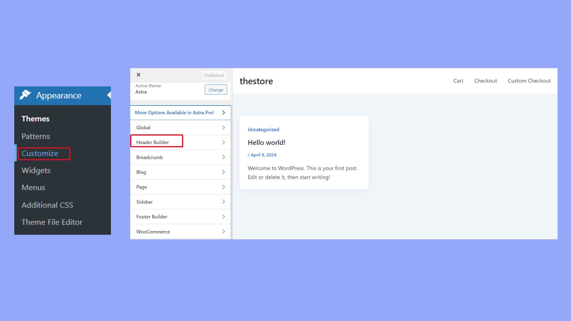
To set up a transparent header on your WordPress site, you can utilize the built-in WordPress Customizer. Start by accessing your WordPress dashboard and selecting Appearance > Customize. This will take you to the WordPress Customizer, where you can modify various aspects of your site’s appearance directly.
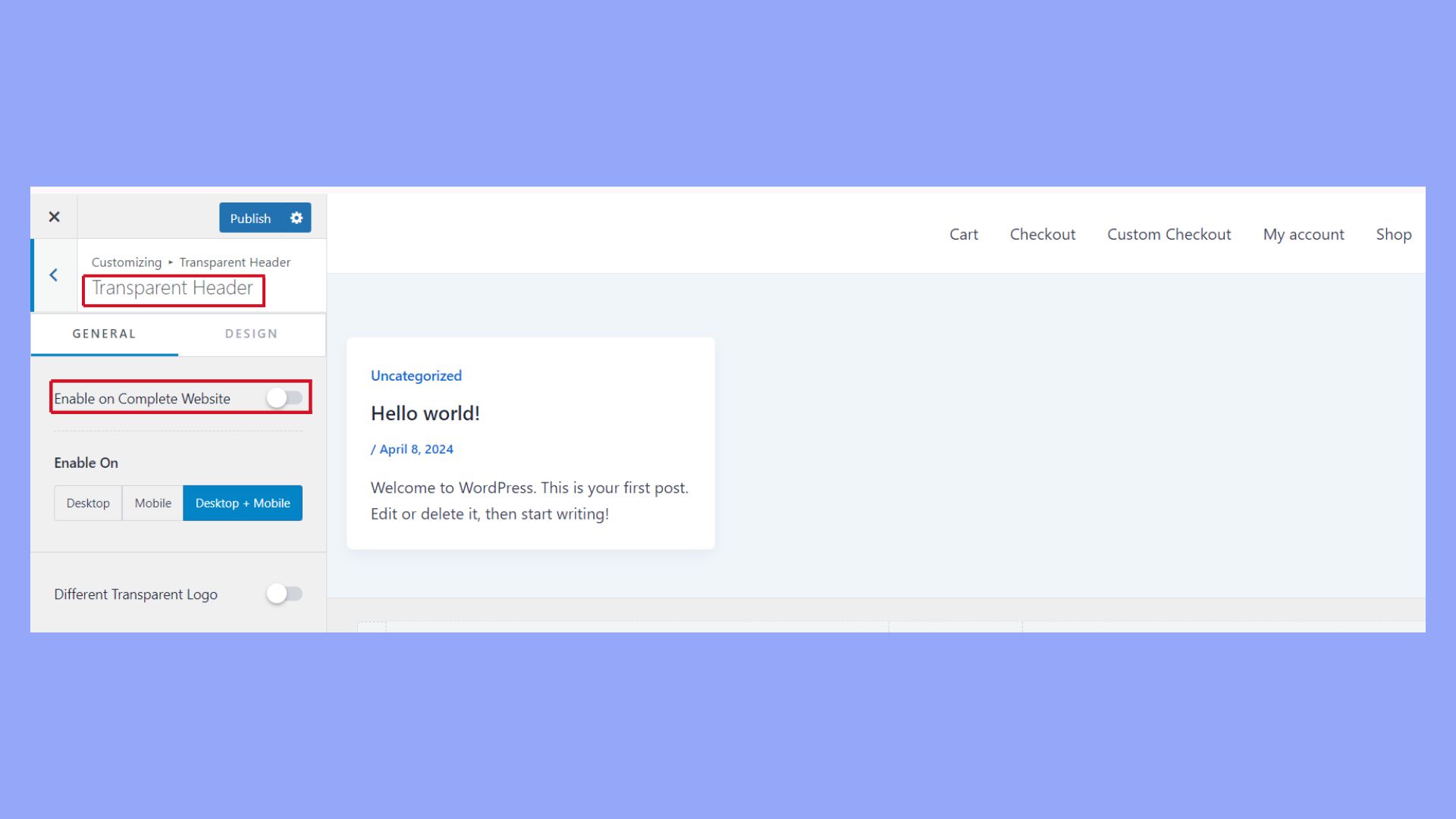
Once inside the Customizer, navigate to the Header section. Here, you’ll find various options related to the customization of your site’s header. Look specifically for the settings that enable a transparent header. You will also have the opportunity to adjust related settings, such as the background color and text color, to suit your preferences.
These options are particularly useful as they allow you to see changes in real-time, providing immediate visual feedback. This feature ensures that your header not only becomes transparent but also blends seamlessly with the overall design of your site, enhancing both aesthetics and user experience.
The Astra Header Builder is particularly user-friendly and includes additional settings to fine-tune your header’s appearance, ensuring it aligns with your overall site design. This process is great for those who want more flexibility without touching any code.
Manual customization with CSS
If your theme does not support transparent headers by default, you can still achieve it with custom CSS.
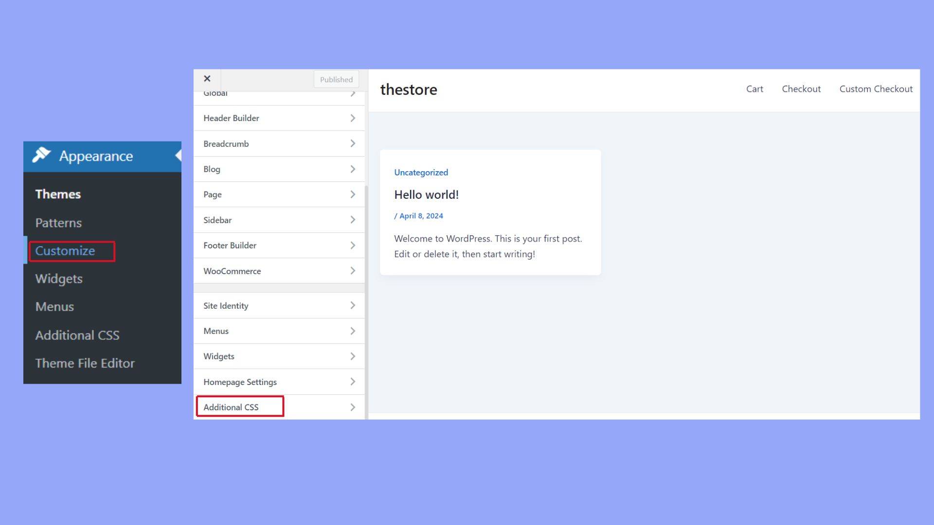
Open your WordPress Customizer or go to the Additional CSS section and add the following CSS code:
 header {

    background-color: transparent;

}
Save and publish your changes. This method gives you complete control over the header styling but requires some familiarity with CSS.
Designing with transparent headers
When designing a transparent header in WordPress, you’ll need to carefully select your background asset, adjust the opacity and contrast for readability, and style it for both desktop and mobile devices.
Select your background asset
Choosing the right background is crucial. You have various options like images, videos, or even solid colors. If you use an image, make sure it complements the overall design of your site. It should not be too cluttered.
An alternative option is using videos that loop seamlessly. These can add a dynamic feel to your site but double-check that they don’t distract from the content. Ensure that the background you choose doesn’t clash with text readability.
Adjust opacity and contrast for readability
Balancing opacity and contrast ensures your content remains readable. When using a transparent header, set the opacity to a level where the background is visible but doesn’t overpower the text. Start with an opacity of around 70% and adjust from there.
Contrast is also vital. Light text over a dark background works well, and vice versa. Additionally, if your background image has multiple colors, adding a subtle shadow to the text can help improve readability.
Style for desktop and mobile devices
Responsive design is essential. Transparent headers might look great on a desktop but could be unreadable on a smaller screen. Test how the header looks on different devices. For mobile devices, you might want to use a simpler background to avoid clutter. Adjust padding and margin settings so that the header elements don’t overlap or become too small. Using CSS media queries can help you fine-tune these settings effectively.
The consistency in styling across devices makes your site look more professional. Always preview changes on multiple devices before finalizing your design.
Advanced customization and troubleshooting
Customizing transparent headers in WordPress can help make your website look sleek and modern. To make sure everything works well, you might need some tips on using page builders, handling special pages like archives, and fixing common issues.
Integrating with page builders like Elementor
When using transparent headers with Elementor, start by creating a custom header. Open the Elementor editor and design your header as usual. Go to the Advanced settings in Elementor and set the background to transparent. This way, your header will blend smoothly with any background on your pages.
Remember to check the visibility settings to make sure your header displays correctly on all devices. If you face a white background issue, it might be because of conflicting CSS. Adding custom CSS in Elementor can solve this problem. Make sure to also look at the Elementor Pro features for more advanced controls, although the free version provides basic transparent header functions.
Handling transparent headers on archive pages
Archive pages, like 404 and search result pages, can sometimes have issues with transparent headers. You might notice that your primary header doesn’t look right on these special pages. To fix this, you need to adjust the settings specifically for these pages.
Go to your WordPress Customizer > Header. Look for options related to archive pages and ensure the transparent header settings are applied here as well. If your theme allows, you can create a different header style for archive pages to maintain a consistent look. Testing in different browsers is also a good practice to avoid any design problems.
Troubleshooting common issues
Common problems with transparent headers often include misalignment, background color issues, and headers not appearing on specific pages. Start by checking your theme’s documentation for transparent headers.
If you encounter a misalignment or the header not appearing, double-check your page templates. Go to Appearance > Customize > Header, and make sure all necessary templates have the transparent header enabled.
For background color issues, adjust the CSS. You can add custom CSS in the Customizer or your theme’s additional CSS area to fix problems like unexpected background colors or transparency not working. If you’re using a page builder, ensure that its settings don’t conflict with your theme’s settings.
Through these steps, you can improve your transparent header’s performance and ensure a smoother user experience.
In conclusion, using a transparent header in your WordPress site can significantly elevate its visual dynamics and user engagement. By carefully selecting the theme and customizing settings through the WordPress Customizer, you can achieve a sleek, modern look that seamlessly integrates the header with your site’s overall design, making it an indispensable tool for any visually driven website.


