Image Photo Gallery Final Tiles Grid
By Freemius
Image Gallery + Photo Gallery + Portfolio Gallery + Tiled Gallery in 1 plugin. Includes lightbox and hover effects. It supports Pinterest (masonry) ph …
+2
Overview
Compatibility
Installation instructions
Customer support & learning resources
Changelog
Main benefits
Responsive image grids
Supports lightbox effects
Pinterest-style galleries
Smooth animations
Hardware acceleration
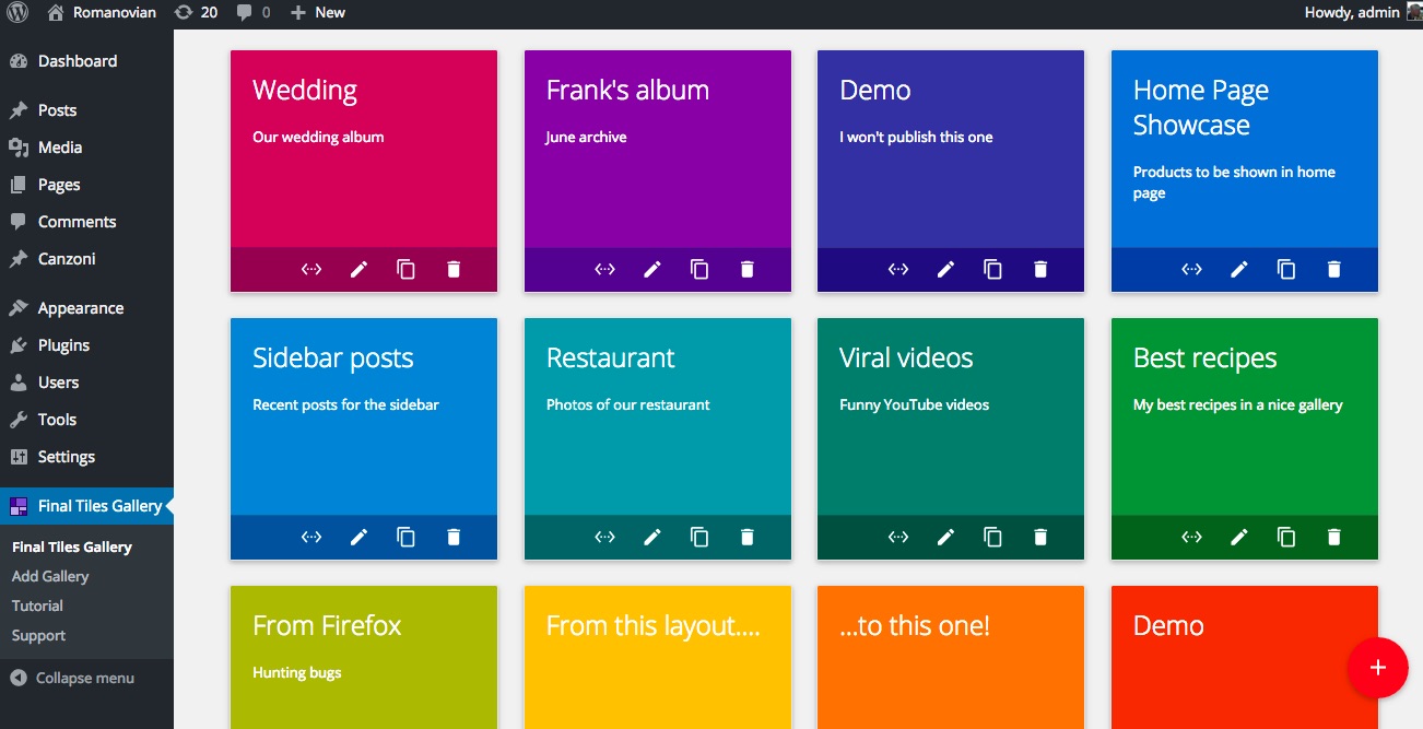
About this plugin
Author: Freemius
Categories: Media Management
Version: 3.6.0
Last updated: 18-07-2024
WordPress version: 5.2
Tested up to: 6.6
PHP version required: 5.6
Languages: Čeština, Русский
Tags:
Learning resources: View resources
Overview
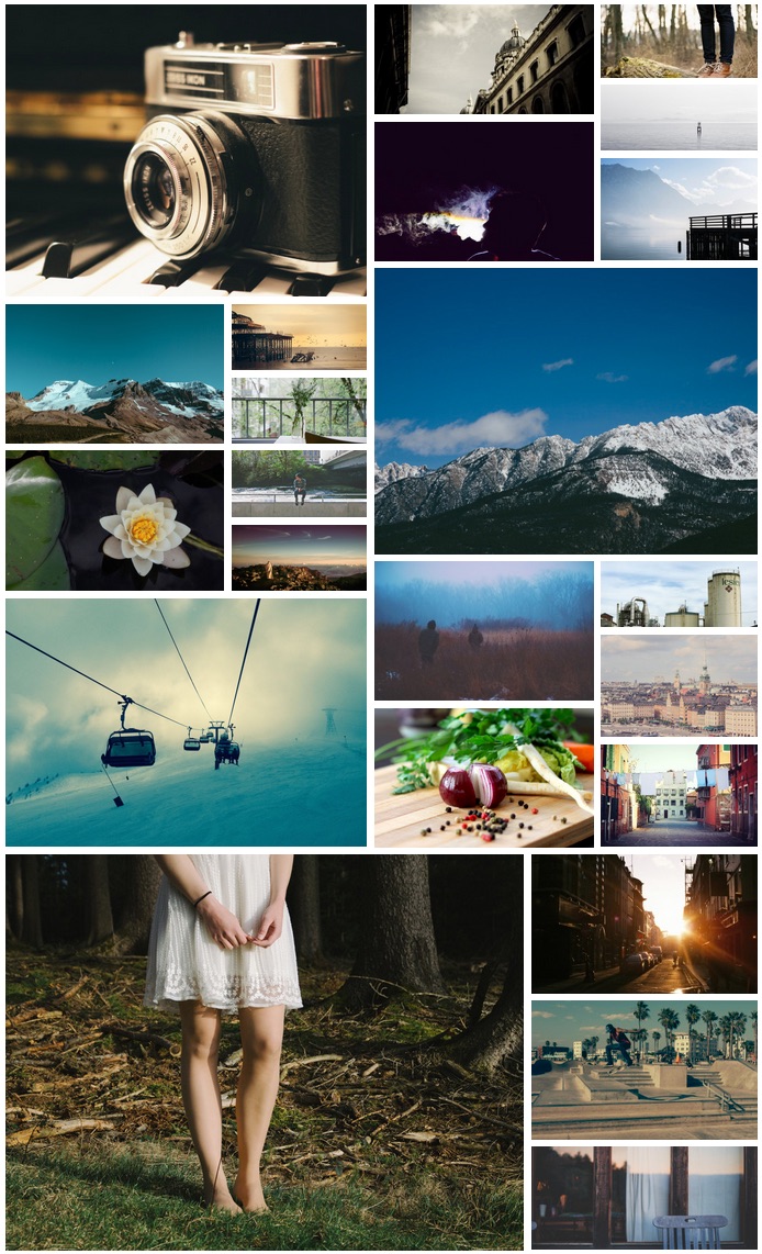
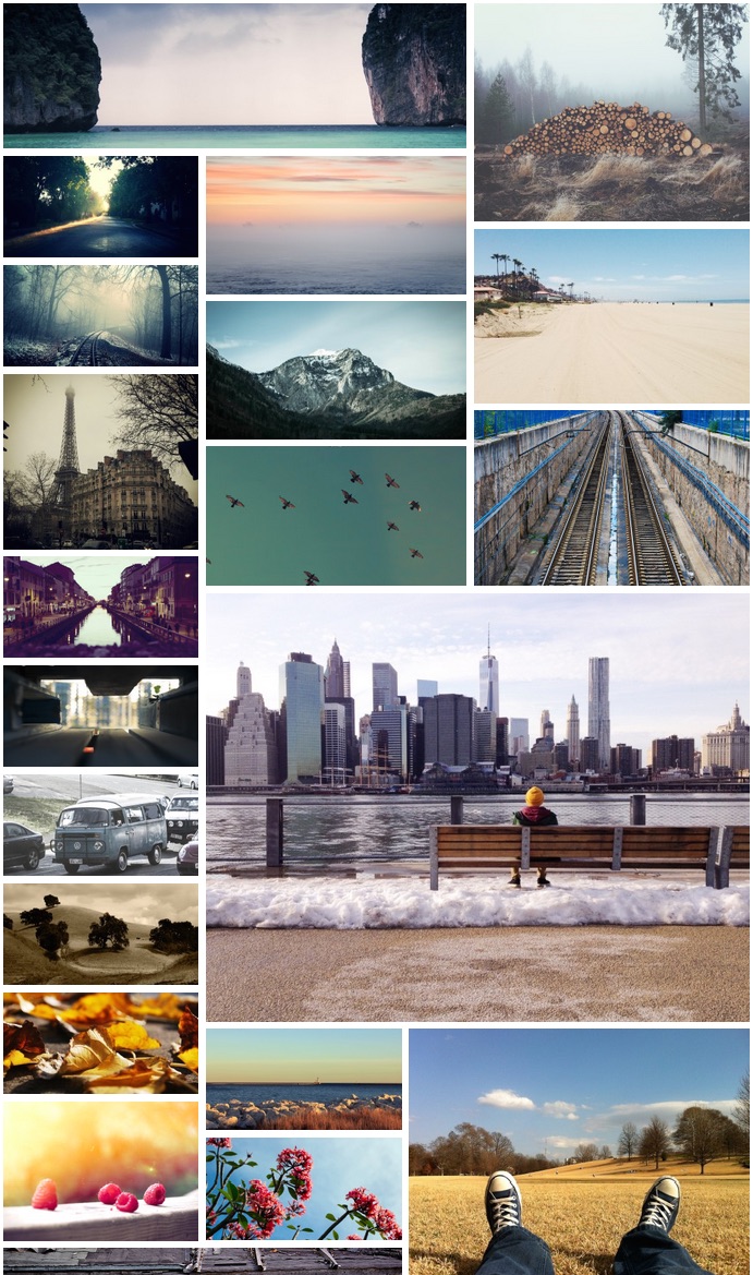
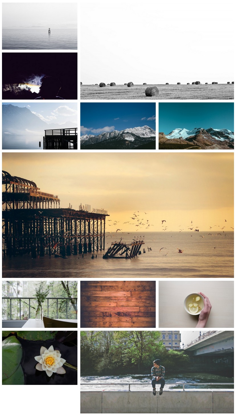
The WordPress plugin described is a versatile and dynamic image gallery solution that integrates multiple gallery formats including photo, portfolio, and tiled galleries, all within a single plugin. It features an innovative algorithm that preserves the original size of images without cropping, creating visually appealing and varied image grids, reminiscent of Pinterest (masonry) and tiled grid designs. The plugin is fully responsive, with smooth animations that adapt seamlessly to any screen size, including mobile devices thanks to CSS3 hardware acceleration. It is ideal for creating wedding albums, designer portfolios, photography showcases, and product displays. Key features include customizable margins, responsive design, random or manual image sorting, a single lightbox with EverlightBox support, social sharing, video galleries, and more. Upgrading to the PRO version unlocks advanced features such as filters/categories, additional lightbox options, mobile-specific lightboxes, various hover effects, WooCommerce support, and custom post galleries, providing users with extensive customization options to enhance their gallery presentations.
Unique Image Grid Algorithm
- Uses a brand new algorithm for more interesting image grids
- Doesn't crop images and keeps the original size if possible
- Allows images to be used like tiles with different sizes
Fully Responsive Design
- Adapts to the browser with smooth animations
- Responsive on mobile devices using hardware acceleration and CSS3 properties
Versatile Layout Options
- Offers two layouts: Tiles and Columns (masonry)
- Adjustable margin between images and image rendered size based on screen size
Enhanced Features in PRO Version
- Includes filters/categories and multiple lightbox options
- Supports WooCommerce and recent/custom posts galleries
- Provides caption and image hover effects, as well as image loaded effects
Rating and reviews

usmaltd
08 Jul, 2024
The tiles format beautifully!

batiok
29 Apr, 2024
Пока ещё делаю сайт, но плагин опробован и на другом сайте, отличный плагин, советую.

Galina_
21 Mar, 2024
Отличный плагин!

67nj
22 Feb, 2024
Great (and quick) solution for the usual last minute client request!Super helpful!

1sun
29 Aug, 2023
Great plugin, easy to handle!