What is Bootstrap WordPress
Bootstrap and WordPress are powerful tools for web development. Integrating Bootstrap with WordPress allows you to create visually stunning and responsive websites quickly and efficiently.
Bootstrap is a front-end framework that simplifies design by providing pre-built components, while WordPress is a robust content management system (CMS). Combining the two helps you achieve professional results even if you’re not a coding expert.

If you prefer hands-on customization, creating a Bootstrap WordPress theme can give you the flexibility to create unique designs.
You might start by creating custom page templates or even using plugins that facilitate Bootstrap-WordPress integration.
These plugins can make your life easier by offering ready-made solutions to incorporate Bootstrap’s capabilities into your WordPress site.
Whether you’re a beginner or a seasoned developer, leveraging both Bootstrap and WordPress can enhance your web development process.
Bootstrap’s responsive design features ensure your site looks great on any device, while WordPress’s extensive theme and plugin ecosystem provides endless customization options.
You’ll love how these two powerful tools work together to bring your web design ideas to life.
Getting started with Bootstrap and WordPress
Getting started with integrating Bootstrap into WordPress involves understanding how these tools work together and preparing your development environment. It offers powerful benefits for website customization and responsiveness while requiring some initial setup.
Understanding Bootstrap in WordPress
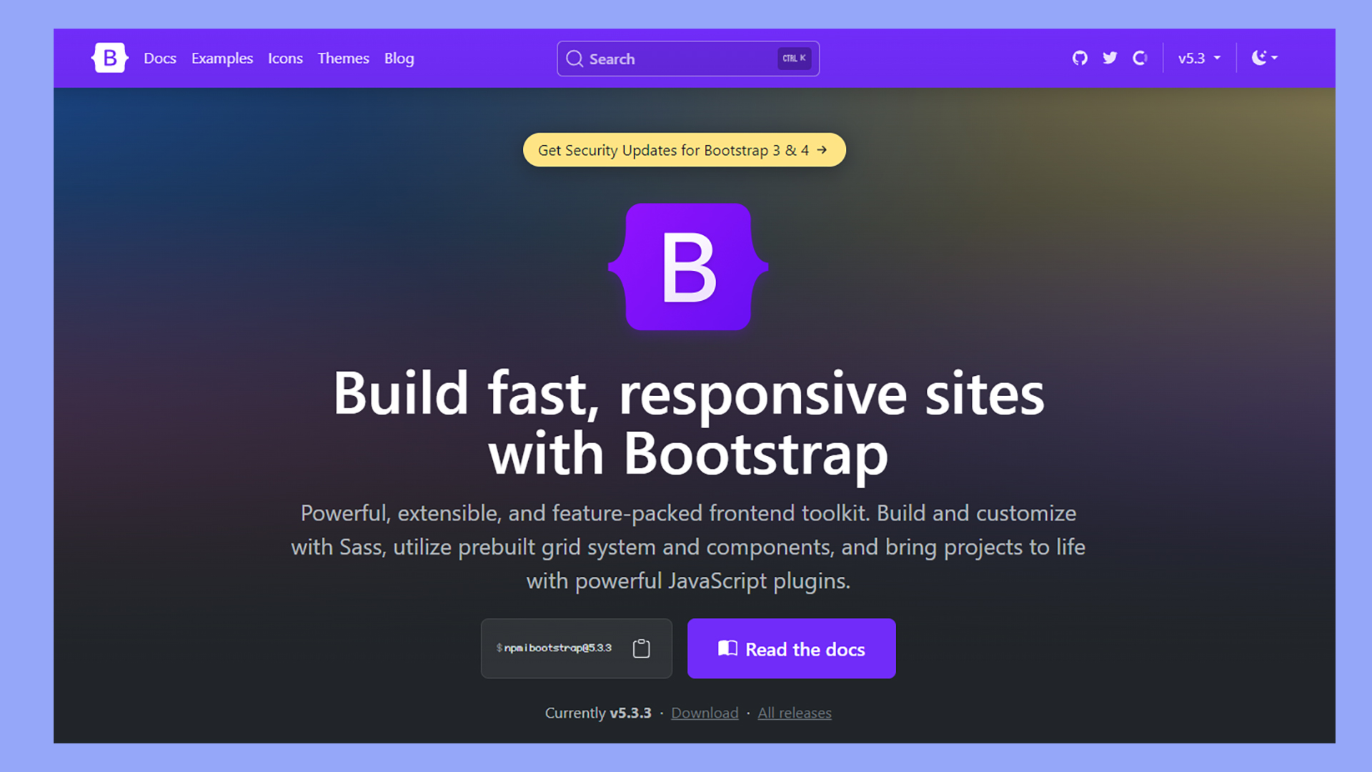
Bootstrap is an open-source framework designed for creating responsive, mobile-first websites. It includes HTML, CSS, and JavaScript components that help you build fast and consistent layouts.
When you integrate Bootstrap with WordPress, you enhance the theme’s capabilities, making it easier to design complex layouts without extensive coding.
To start, you can manually include Bootstrap in WordPress by adding a reference link to your header.php file. Alternatively, you can use a Bootstrap WordPress theme or install a plugin.
For example, the Twenty Seventeen theme can be modified to work with Bootstrap for a seamless integration process.
Benefits of using Bootstrap with WordPress
Integrating Bootstrap with WordPress simplifies the process of creating responsive and visually appealing websites.
One of the primary benefits is that Bootstrap’s grid system allows you to create complex layouts with ease. This system is particularly useful for developers who want a consistent, clean design across various devices.
Another advantage is the array of pre-designed components like navbars, modals, and buttons, which save you time and effort. Using these components can make your site more interactive and professional-looking.
Additionally, Bootstrap’s documentation is extensive, providing you with a wealth of resources to troubleshoot and learn new techniques.
Prerequisites for Bootstrap WordPress integration
Before you begin integrating Bootstrap with WordPress, you need to have a few things in place.
First, make sure you have a WordPress installation up and running. You’ll need access to your theme files, specifically functions.php and style.css, where you will include Bootstrap’s CSS and JavaScript files.
You should also familiarize yourself with basic HTML, CSS, and PHP. These languages are essential for customizing your WordPress theme and ensuring that Bootstrap integrates correctly.
Having a code editor and some knowledge of how WordPress themes work will also make the process smoother. Lastly, always back up your site before making significant changes.
Creating a Bootstrap WordPress Theme
In this section, you’ll learn how to create a Bootstrap WordPress theme by setting up basic theme files, incorporating Bootstrap into your theme, and customizing Bootstrap components.
Setting up basic theme files
Begin by downloading and unzipping the latest version of Bootstrap. Make sure you have a reliable WordPress hosting provider and WordPress installed on your domain.
Open the WordPress directory and navigate to wp-content/themes. Create a new folder for your theme, for example, bootstheme. Inside this folder, create the essential files: index.php, style.css, header.php, and footer.php.
In style.css, add the theme information:
/*
Theme Name: BootSTheme
Theme URI: http://example.com/bootstheme
Author: Your Name
Author URI: http://example.com
Description: A responsive WordPress theme using Bootstrap
Version: 1.0
License: GNU General Public License v2 or later
License URI: LICENSE
Text Domain: bootstheme
*/
Incorporating Bootstrap into your theme
Integrate Bootstrap by adding the necessary Bootstrap files. First, enqueue the Bootstrap CSS and JS files in your functions.php file.
function bootstheme_enqueue_styles() {
    wp_enqueue_style('bootstrap-css', 'https://stackpath.bootstrapcdn.com/bootstrap/4.5.2/css/bootstrap.min.css');
    wp_enqueue_style('theme-style', get_stylesheet_uri());
}

function bootstheme_enqueue_scripts() {
    wp_enqueue_script('bootstrap-js', 'https://stackpath.bootstrapcdn.com/bootstrap/4.5.2/js/bootstrap.min.js', array('jquery'), null, true);
}

add_action('wp_enqueue_scripts', 'bootstheme_enqueue_styles');
add_action('wp_enqueue_scripts', 'bootstheme_enqueue_scripts');
In header.php, link the Bootstrap stylesheet, and add navigation bars. Use Bootstrap classes to ensure your layout is mobile-friendly.
<!DOCTYPE html>
<html <?php language_attributes(); ?>>
<head>
    <meta charset="<?php bloginfo('charset'); ?>">
    <meta name="viewport" content="width=device-width, initial-scale=1">
    <link rel="stylesheet" href="<?php echo esc_url( get_stylesheet_uri() ); ?>">
    <?php wp_head(); ?>
</head>
<body <?php body_class(); ?>>
    <nav class="navbar navbar-expand-lg navbar-light bg-light">
      <a class="navbar-brand" href="#">Navbar</a>
      <div class="collapse navbar-collapse">
        <?php
        wp_nav_menu(array(
            'theme_location' => 'header-menu',
            'container' => false,
            'menu_class' => 'navbar-nav mr-auto'
        ));
        ?>
      </div>
    </nav>
Customizing Bootstrap components
Customize Bootstrap components to fit your theme’s design and functionality. You might want to modify buttons, forms, or navigation bars using custom CSS.
Add custom styles to style.css:
.navbar {
    background-color: #333;
    color: white;
}
.navbar a {
    color: white;
}
You can also use the WordPress Customizer for additional customization.

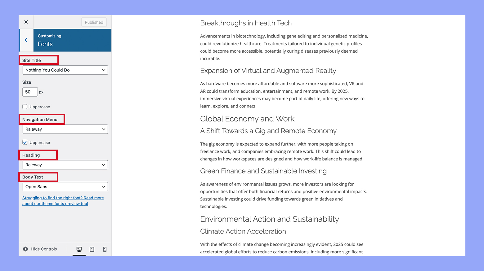
Create a customizer.php file and add options for changing colors, fonts, and layout settings.
function bootstheme_customizer($wp_customize) {
    $wp_customize->add_section('bootstheme_colors', array(
        'title' => __('Colors', 'bootstheme'),
        'description' => 'Modify theme colors',
    ));

    $wp_customize->add_setting('navbar_color', array(
        'default' => '#333',
        'transport' => 'refresh',
    ));

    $wp_customize->add_control(new WP_Customize_Color_Control($wp_customize, 'navbar_color_control', array(
        'label' => __('Navbar Color', 'bootstheme'),
        'section' => 'bootstheme_colors',
        'settings' => 'navbar_color',
    )));
}

add_action('customize_register', 'bootstheme_customizer');
Enhancing functionality with plugins and extensions
If you want to make your WordPress site more powerful, using Bootstrap-compatible plugins and extensions is a great option. These tools can help you optimize performance and add advanced features easily.
Bootstrap-compatible plugins
There are many plugins designed to work seamlessly with Bootstrap in WordPress. These plugins allow you to add widgets, customize layouts, and improve the design of your website without needing to know a lot of code.
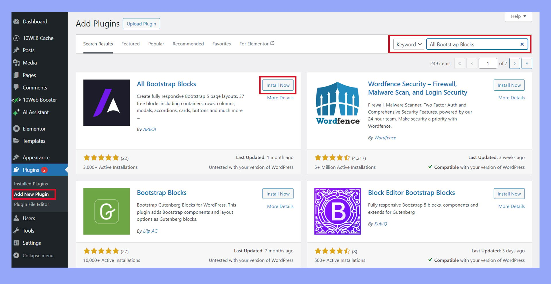
For instance, you might use a Bootstrap block plugin to incorporate pre-designed blocks into your site. All Bootstrap blocks often come with responsive design, making your site look good on any device.

Additionally, using plugins like Bootstrap’s JavaScript plugins can replace older libraries like jQuery, resulting in a quicker and more modern site.
Optimizing performance with CDN
A Content Delivery Network (CDN) can help your Bootstrapped WordPress site load faster by caching and delivering static content like CSS and JavaScript files from servers close to your users. This is particularly useful for sites using Bootstrap, as the framework relies on numerous files.
Many hosting providers offer built-in CDN services, especially beneficial for high-traffic sites like an ecommerce site using WooCommerce.
By optimizing your site’s performance with a CDN, you can reduce load times, improve SEO, and provide a better user experience.
Extensions for advanced features
There are many extensions available that can add advanced features to your Bootstrap-powered WordPress site. Extensions can offer a range of functionalities, from enhanced form builders to custom theme components.
For example, consider using extensions to add ecommerce functionalities if you run an online store.
Integrating WooCommerce with Bootstrap WordPress can make your shop look sleek and professional. Other extensions might include SEO tools or social media integrations, which can help widen your site’s reach and functionality.
Many of these extensions are supported by a strong web development community, which means you can find plenty of documentation and tutorials to help you get the most out of them.
Best practices for Bootstrap WordPress sites
Using Bootstrap with WordPress can make your site more responsive and user-friendly. It’s important to focus on browser compatibility, mobile-first design, and SEO and accessibility to provide the best user experience.
Ensuring browser compatibility
To provide a consistent browsing experience, test your Bootstrap WordPress site on multiple browsers like Chrome, Firefox, Safari, and Edge. Cross-browser compatibility is crucial for reaching a broad audience.
Make sure all Bootstrap components behave as expected across different browsers. Use tools like BrowserStack or Sauce Labs for testing. Avoid using browser-specific features unless absolutely necessary.
Sometimes, small CSS tweaks might be required to fix minor inconsistencies between browsers. Always validate your code with tools like W3C validator to catch any markup errors.
Mobile-first approach in web design
Creating a mobile-first design means designing for smaller screens first and then adding features for larger screens.
Bootstrap’s grid system makes it easy to create responsive websites.
Start by setting your viewport meta tag. Then, use Bootstrap classes like .col-xs, .col-sm, .col-md, and .col-lg to define how your layout should adapt to different screen sizes.
Optimize images and assets to ensure faster loading times on mobile.
After that, test your site on actual mobile devices to make sure all elements are touch-friendly and easy to navigate.
SEO and accessibility
Good SEO practices improve your site’s visibility in search engines.
Ensure your site has a clear structure. Also, make sure to use proper headings and semantic HTML.
Use SEO-friendly elements like meta tags and alt text for images.
Bootstrap’s responsive design also helps improve user experience. This is a factor in Google’s ranking algorithm.
Accessibility ensures that all users, including those with disabilities, can use your site.
Use ARIA roles and labels to make your site more accessible.
Test your site with screen readers and tools like Lighthouse to identify barriers.
Ensuring your site is both SEO-friendly and accessible will help you reach a wider audience. It will also improve user satisfaction.
In conclusion, understanding Bootstrap and WordPress can significantly enhance your web development capabilities. By integrating Bootstrap in WordPress, you can create responsive, visually appealing, and professional websites efficiently. Whether you use pre-built themes or customize your own, leveraging these powerful tools together can streamline your workflow and elevate your site’s design and functionality.


