This article will teach you how to check if your WordPress site is mobile-friendly, strategies that can be employed to optimize your WordPress site for mobile users, and how to speed up your website specifically for mobile users without trading the quality of your website’s user experience.
54.4% of all internet traffic on the planet was generated by mobile devices in 2021. DataReportal reported that 55.4% of internet users made online purchases using their mobile devices in the same year. To top it off, 73.1% of web designers discovered that mobile optimization or responsive design is the main reason why visitors switch to another website.
These figures demonstrate how important it is for any business to have a mobile-friendly website. Another study indicates that WordPress powers 48% of websites on the internet, a number that is increasing daily. Evidently, WordPress websites need to be as mobile-friendly as possible for both desktop and mobile users. But, how do you make sure your WordPress website is optimized for mobile devices while maintaining the quality of experience you want for your users?
This article will teach you how to check if your WordPress site is mobile-friendly, strategies that can be employed to optimize your WordPress site for mobile users, and how to speed up your website specifically for mobile users without trading the quality of your website’s user experience.
How to Check if your WordPress Site is Mobile-friendly
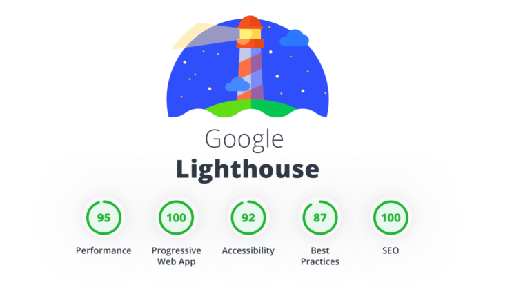
A mobile-friendly website provides a quality user experience for users on all screen sizes with no loss in performance. Several tools on the internet can be used to perform a mobile-friendliness test for a website. The recommended ones are Google Lighthouse and PageSpeed insights, both built by Google. However, there are other reliable ones such as the Google Mobile-Friendly Test that do not provide as many technical details to act on but are particularly useful for improving the UI and UX of mobile visitors.
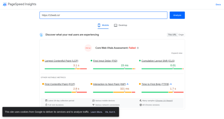
The essential technical details as regards mobile friendliness and performance, in general, are categorized as Core Web Vitals (CWV). The Core Web Vitals include:
- Largest Contentful Paint(LCP): How long it takes for the largest element in the viewport to load.
- First Input Delay(FID): How long it takes for a browser to respond to an interaction
- Cumulative Layout Shift(CLS): how much difference is made to page structure when a new element loads i.e Do elements shift viewport positioning?
These Core Web Vitals are measured and reported by Google Lighthouse and PageSpeed insight to provide actionable data for improving overall site speed.
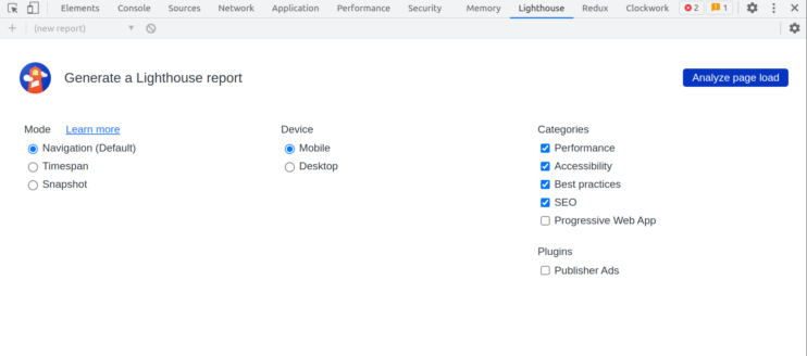
Lighthouse is an open-source tool created by Google for auditing websites and reporting key performance metrics with insights on how to improve site performance. In addition to providing metrics on the Core Web Vitals, Lighthouse also checks for accessibility and basic SEO needed to improve site ranking in search engines. However, Lighthouse provides more details about performance issues. For example, Lighthouse would suggest using an optimized version of a rendered image causing a slow site speed.
Also owned by Google, is a browser-based tool for site auditing and performance insight reporting. It provides insight into the Core Web Vitals and page-level performance metrics.
The major difference between Lighthouse and PageSpeed insights include:
- Mode of Operation: Lighthouse works in the command line and on browsers, and PageSpeed is strictly browser-based.
- Scope: Lighthouse scans the entire website for performance issues while PageSpeed scans a single page for insight.
- Level of detail: Lighthouse provides suggestions on how to improve on performance issues while PageSpeed highlights the issue found.
This tool provided by Google as part of its Webmaster tools analyzes a website URL and gives feedback on its mobile-friendliness. If the website page is mobile-friendly, it shows a green check with a success message and provides an option to view the tested page and a screenshot of the page on a mobile screen. If it is not, it shows you a list of suggestions on where to improve to pass the mobile-friendliness test.
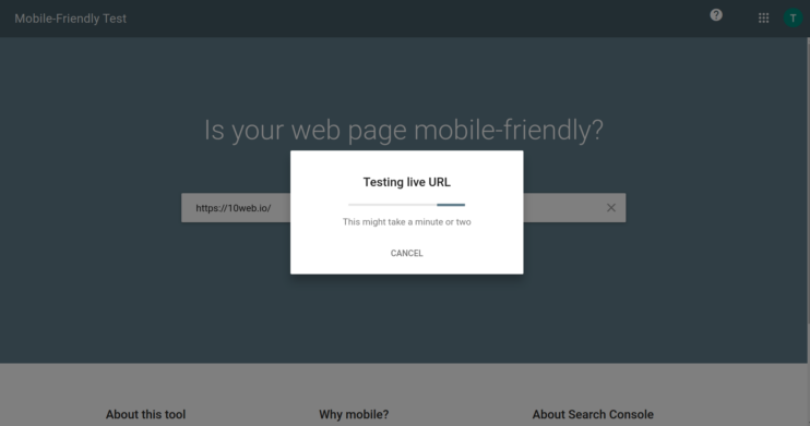
Source: Google Mobile-Friendly Test
It is important to note that this tool doesn’t crawl all the URLs on the specified site, instead, it only crawls the page rendered on the specified URL.
These tools help to see that optimization is more than making sites fast on mobile devices. For example, the suggestions given by Google Mobile-Friendly Test and performance issues highlighted by Lighthouse and PageSpeed. In the same light, it is important to pay attention to the visual details and the experience of mobile users as much as the speed of your website. Tools like Google Lighthouse and PageSpeed Insights provide lower-level details that impact the overall performance of a website for diagnosis.
Strategies to Optimize WordPress Sites for Mobile Users
Mobile optimization on WordPress is an experimental process for most site owners and developers. It doesn’t always have to be so. The tips discussed below are at the base of every optimization technique employed by every WordPress website on the internet.
Use a responsive WordPress theme
You’ve probably heard this a hundred times already, but yes, it is that important.
Imagine if amazon.com had a bad design for mobile users, they definitely wouldn’t be as influential as they currently are. That being said, what is responsiveness for websites?
The responsiveness of a website is the quality of its design across all screen sizes, e.g. whether elements are visible and not overlapping, texts are readable, content fits the screen, etc. The statistics highlighted at the beginning of this article strongly point out its importance in websites. A responsive theme enables easy customization for different screen sizes with little to no loss in visual and performance quality.
Another thing to look out for when choosing a responsive theme is the contributions of the developers. When was the last time the theme was updated? Is it still well maintained? What versions of WordPress and PHP is it still compatible with? This information ensures that you’re running the same WordPress and PHP versions on your server/hosting provider as required by the theme.
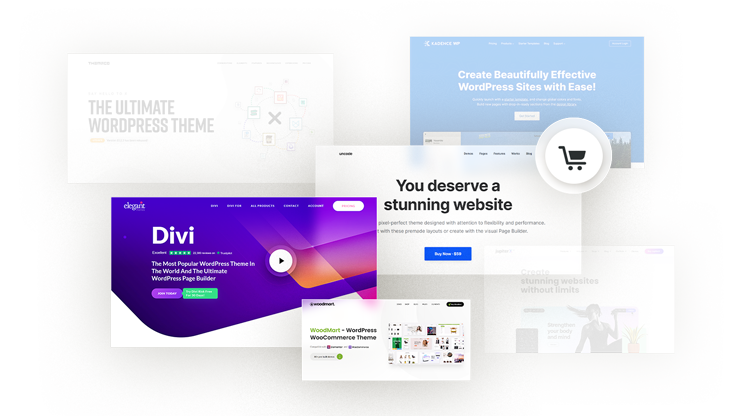
Examples of responsive WordPress themes include:
- Astra
- Divi
- Genesis Pro
- 10Web Builder Theme(not available on wp.org, use the link)
- Elementor Hello
Consider mobile-first development
The mobile-first approach in development and design is a method of building for mobile users first after which the design for desktop users can be adapted to the mobile template. This approach ensures ease in product delivery while ensuring quality on all screen sizes.
To adapt this approach to your WordPress development, start designing from smaller screen sizes before progressing to larger screen sizes. This also involves taking note of images and how they render on different screen sizes.
Here’s the question, what’s the difference between the mobile-first approach and the responsive design approach? Simply put, the mobile-first approach aims at accomplishing a responsive design for your site starting from the smallest screen size to the largest while the responsive design ensures that your website looks good on all devices.
Optimize images and videos
Multimedia/graphic content plays a very important role in site speed. Because of this, optimizing images and videos are usually done to improve performance on both mobile and desktop.
Images can be optimized for mobile devices by choosing the right file format and compressing when necessary. WebP is the modern standard for web images, JPEG is recommended for graphics with high color composition, PNG for simple images, and GIF for animated images only. Given that JPEG weighs more in terms of size, it is usually advisable to use PNG unless absolutely necessary.
However, WebP is smaller in size compared to JPEG and PNG ensuring faster site load without significant loss in image quality.
Practically, compressing images reduces image sizes. This is done by uploading to tools like TinyPNG and JPEG mini before uploading to WordPress. 10Web Booster provides an all-around website optimization capability, including automatic image optimization and conversion to WebP. With 10Web Booster, all you need is to upload the image, optimization is done automatically.
For videos, choosing the right file format and compressing with tools like Converterpoint before uploading to WordPress helps with performance. The recommended format for all devices is .mp4, however, .ogg and .webm are still widely supported as playable video formats on browsers. Other best practices include cutting out the audio and keeping videos (if necessary) as short as possible for mobile users. More practical video optimization best practices are discussed here.
Make use of full frontend optimization
This process could take a long list of reviews on your site, but 10web has made it easier. The tips are detailed in this comprehensive article on front-end optimization. They include best practices for frontend optimization including compressing and optimizing multimedia files, lazy loading, caching, and lots more. This part of optimization is very important because it has a direct link to site speed.
Choose a fast and reliable hosting provider
This is as important as your site itself. If your hosting provider isn’t delivering your website content fast enough, you are in the same pit as a site owner or developer with a non-responsive site.
There are different types of web hosting. With shared hosting(usually cheaper), you’d share the same server resources with another user on the same server. This also means if your pairing user performs some tricks that break the server, your website goes down.
This is not the case with automated hosting like 10Web. 10Web hosting provides a high-performance infrastructure that guarantees a 99.9% uptime for your website, a 90+ PageSpeed score, and real-time backups. Moving a site to 10Web hosting is a 1-Click experience through automated migration to create a copy of your website on 10Web in minutes. You can get started for free here.
You most probably don’t need AMP
Yes, you probably don’t need it. Understandably, many site owners have moved to AMP to increase site load speed. But is that really necessary?
AMP is great if your website is primarily read-only, that is, most of what your website visitors do isn’t interactive. With less interactivity required from your users, you’d enjoy the SEO benefits AMP provides. However, If your site uses the interaction of a website visitor for the best experience – ditch AMP, and apply the page optimization best practices discussed.
How to Speed up your Website for Mobile
Caching
Caching is basically storing data for faster access times. On the web, It is done to improve the user experience of website visitors by ensuring that all page resources are not requested from the server every time a user requests them.
As opposed to caching on physical computers, the web has four main caching techniques that do not exclude each other:
- Browser cache: This is the most popular one. It is used to save files requested from a server by a user in the browser to ensure that on subsequent requests (provided that it is the same page), the page loads faster because the resources are being fetched from the browser instead of the server.
- CDN cache: In general, Content Distribution Networks (CDNs) provide a caching mechanism for serving resources (webpages and files) in place of the actual server. The resources requested to load a page are retrieved from a server (usually the one closest to the visitor) on the CDN to increase page load time.
- Page and File cache: A page cache and file cache are used in computers, but the WordPress development ecosystem has adopted this mechanism for reducing the load on a hosting server. It stores page HTML and generated scripts and styles as static files and serves them on request.
- Server cache: or cache server responds to resource requests from a client in place of the server primarily to reduce the load on the server. Unlike a server on a CDN, a cache server is a single server sitting in front of the original server.
Eliminate Render Blocking Resources
Render-blocking resources are usually CSS and JS files that prevent fast load times for a webpage. This section will discuss three ways to eliminate render-blocking resources.
- Minify HTML/CSS/JS
During development, a developer uses spaces, indentations, comments, and new lines – classified as non-executables – to ensure code readability. However, these extra whitespaces require more resources from a server because it has to process the code including the non-executables before sending them to the browser which doesn’t “need” the non-executables used for code readability to display a web page. This time taken by the server can be gained by minifying the HTML, CSS, and JS files.
Minifying code files strip away all the code elements that provide no functional benefit to the webpage display. Without the extra lines, indentations, and whitespaces; the lines of code to be processed, the size of the file, and the request-response time for file retrieval diminishes. This time-saving processing also reduces the execution time of the files by the browser.
- Make Critical CSS Inline
Critical CSS are styles needed to render the visible top elements(above the fold) of a page. To ensure that critical styles are inline, load critical CSS first before other stylesheets. This makes sure that the page is interactive shortly after the HTML is rendered. In addition to that, other stylesheets will still be loaded asynchronously as the page loads, but the visible top parts of the page are not delayed by this process.
- Use JS delay
Some JavaScript files also contribute negatively to the site speed if they’re not optimized properly. Examples are third-party JavaScript files for analytics, social widgets, trackers, ads, popups, etc. If the execution of these files is not deferred, they would block the parsing of the page HTML until they’re executed, reducing site load time.
Conventionally, It is easy to conclude that the best practice is for JavaScript files to be loaded at the end of the HTML code. But important JavaScript files like analytics and social widgets that add out-of-the-box functionalities and dynamism are loaded at the top of the page in the <head> tag.
What’s the way out? Delay the non-critical JS files. This would ensure that third-party JS files are not loaded, nor executed until the parsing of the webpage HTML is complete. With this approach, your site loads faster while still enjoying the benefits of out-of-the-box functionalities.
Critical JS files, on the other hand, cannot be delayed. These scripts directly affect the initial rendering of the visible parts of the page (above the fold).
- Remove unused CSS and JS
Whether during traditional web development with code or from an installed theme on WordPress, unused CSS and JS files reduce page load time as much as any other render-blocking resource. This is because these unused files are also processed and executed during the page-load consuming valuable time.
One of the ways to remove unused CSS and JS files is to find them. But that’s pretty stressful. Traditional web development has a tool called PurgeCSS that can be used to remove unused CSS from any project. On the other hand, WordPress provides plugins to do these cleanups with a few clicks on the dashboard. This process can be carried out manually or through 10Web in an automated way with 10Web Booster.
In addition to removing unused scripts and styles, they can be loaded per page ensuring that unused files are not loaded on a page; and also per device, ensuring that desktop styles are not loaded on mobile.
- GZIP compression
GZIP compression is great for file compression. It compresses HTML, CSS, and JS files making file transfer easier and faster to a user’s browser increasing the speed of a website and consequently the user experience. It can be enabled via the server or with plugins (10web Booster does this). However, for sites hosted on 10Web, there is a better alternative to GZIP – Brotli compression.
Lazy Loading
Conceptually, lazy loading delays the loading of a webpage element until they are needed. For example, if a webpage is loaded and you notice that on scrolling the images on the page are just being downloaded, that’s lazy loading in action. This technique has proven useful for front-end optimization and impacted the performance of websites.
10Web handles this by utilizing browser-native lazy-loading techniques for lazy-loading multimedia content including iframes to provide a lightweight solution and improve the overall Core Web Vitals of a website.
Image Optimization
As discussed earlier, optimizing images can be done by choosing the right image format for your use case and compressing it (if necessary) before uploading it to WordPress. This technique combined with lazy loading can provide incremental progress in site speed if multimedia content is causing slow site speed on your website.
Optimize font delivery
Fonts are important subsets of user experience on your website. However, they can also be render-blocking sometimes. One of the proven ways to optimize font delivery is to load them asynchronously as you would do with third-party JavaScript files. Although this would result in some sort of font change flicker, because of the font swap (the device font is used and then replaced) it doesn’t hurt site speed or user experience and it helps with the cumulative layout shift (CLS) score and other performance issues.
Use a CDN
A Content Delivery Network(CDN) is a network of servers located in different parts of the globe serving the same content to every client. The closest server on a CDN is what serves the requested content at any given time reducing the time taken to the actual server. Popular CDNs include:
- Cloudflare
- StackPath
- Google Cloud Platform
- Fastly
- KeyCDN
WordPress also provides integration to CDNs through plugins.
Chiefly, using a CDN to optimize your website would largely depend on the speed benefits it provides. If your website conversion rate is excellent, then you might want to stay without a CDN until your metrics say otherwise.
10Web Booster Pro offers complete website optimization, including speed, performance, and security through its partnership with Cloudflare. 10Web Booster Pro with an integrated Cloudflare enterprise CDN deliveries optimization solutions including full page caching, image optimization, minification and compression, elasticity and scalability, SSL certification, security checks, and website protection, all within the Cloudflare “reserved-for-enterprise” network.
Cloudflare is leading the industry with its powerful CDN solution. Cloudflare has one of the most advanced global networks with edge servers in over 275 cities in 100 countries. Its “reserved-for-enterprises” network, employed by 10Web Booster Pro, serves webpages under 100ms to nearly 95% of the world’s population.
Through the enterprise tired CDN, your website will receive unparalleled speed and lightning-fast loading time, reduced latency, and will provide visitors smooth and seamless website experience
Want to speed up your website instantly?
Get 90+ PageSpeed Score automatically with 10Web Booster ⚡
On any hosting!
Final Thoughts
You’ve learned how to optimize your website for mobile users and the useful techniques that can be used to ensure that mobile optimization on WordPress is properly executed. It is important to note that optimization is not an overnight miracle, it takes a little bit of testing to know what suits your use case best. Truth is, you don’t want to render a low-quality image for a graphics design website in the name of optimization.
Optimize your Website Automatically with 10Web Booster
- Vital features for speed optimization include lazy loading and multimedia content optimization.
- Automated optimizations with advanced techniques such as inlining critical CSS and JS delay, 90+ page speed score for mobile, and passing Core Web Vitals.
- Ultimately, excellent customer support guides you through any difficulties you encounter, and 24/7 live chat is free for 10Web customers.
10Web Booster will help you handle your website optimization with clicks. Get it for free!
Want to speed up your website instantly?
Speed up your website automatically
Get 90+ PageSpeed Score automatically with 10Web Booster. On any hosting!


Speed up your website instantly
Speed up your website instantly
-
 Automatically get 90+ PageSpeed score
 -
Experience full website caching
-
Pass Core Web Vitals with ease
 Automatically get 90+ PageSpeed score