53% of users abandon a page that takes more than 3 seconds to load. That’s one principle applied poorly. There are at least a dozen more shaping your site’s performance right now, whether you’re aware of them or not.
This article covers two layers of web design principles: the foundational ones that have survived every platform shift since print, and the modern ones that reflect how design has evolved in the age of AI, adaptive interfaces, and performance-driven search. For each, you’ll find the definition, the reasoning, and how 10Web’s builder and editor are built to satisfy them.
What are web design principles & web design best practices
These two terms are often used interchangeably, but they describe different levels of the same discipline.
Web design principles are the foundational guidelines that govern visual and functional decisions. They include concepts like visual hierarchy, contrast, consistency, and structure. Principles are the underlying logic behind why certain designs feel clear and others feel chaotic.
Web design best practices are the practical application of those principles in a real website context. They’re specific, actionable, and testable: apply a design system, use fluid layouts, pass Core Web Vitals, write semantic HTML. Best practices translate abstract principles into decisions you can actually implement.
Principles tell you what to aim for. Best practices tell you how to get there.
Foundational web design principles
These five principles have held across every major platform shift, from print to AI-native interfaces. They’re grounded in human cognition and behavior, not technology, which is why they remain relevant regardless of what tools or trends emerge.
Clarity
Users should immediately understand what a page is, what matters on it, and what to do next. Good design reduces confusion before it adds personality. This affects hierarchy, navigation, typography, layout, and calls to action. The best interfaces feel obvious, not impressive.
A visually complex hero section with no clear headline delays orientation. Every design decision should pass a simple test: does this help the user understand something faster, or does it require them to work harder?
Visual hierarchy
Every design communicates priority, thus, controlling where attention goes. Users naturally scan for size, contrast, spacing, position, and movement. The designer’s job is to guide that attention intentionally.
Without hierarchy, everything competes. Cognitive load rises. Users disengage before they’ve found what they came for. Research from the Nielsen Norman Group confirms that users scan rather than read. They look for structural signals to decide where to invest attention. A strong heading hierarchy, clear section contrast, short paragraph blocks, and deliberate use of whitespace are the tools that make scanning productive.
Consistency for trust
Consistency reduces mental effort. Predictable interactions, repeated patterns, stable spacing, coherent typography, and unified behavior across pages mean users don’t need to relearn the interface every time they navigate. Consistency is one of the strongest invisible trust signals in design.
When patterns break, users notice, even when they can’t articulate why. A button that behaves differently on page 3 than it did on page 1 creates friction. A heading style that shifts between sections creates visual uncertainty. These are not aesthetic problems. They’re usability problems that erode confidence in the product.
Friction kills engagement
Every extra step reduces completion rates. Good design minimizes unnecessary choices, input effort, waiting, confusion, and interruptions. This applies to forms, onboarding flows, ecommerce checkouts, navigation, and content consumption equally.
The simplest path almost always wins. Research on decision fatigue shows that more choices slow decisions and increase abandonment. Removing options, reducing steps, and making the default state the correct one for most users are all high-value design moves that have nothing to do with visual style.
Structure over styling
A well-structured, visually plain site often performs better than a beautiful, chaotic one. Strong structure means logical information architecture, semantic organization, readable content flow, modular sections, and clear relationships between elements.
Styling trends change constantly. Structure is the foundation underneath all of them. A site can be restyled without being rebuilt if the underlying structure is sound. A site with poor structure requires a rebuild regardless of how good it looks.
Modern web design best practices
These reflect how design practice has evolved alongside changing technology, user behavior, and the growing influence of AI on both how sites are built and how they are found.
Design systems over page-by-page design
Modern sites are built as reusable systems, not isolated pages. That means consistent spacing scales, typography tokens, reusable components, shared color logic, and standardized interaction patterns. The goal is to enforce a design system at the point of creation for faster iteration, easier AI-assisted editing, cleaner responsive behavior, and scalable maintenance.
Page-by-page design is how inconsistency accumulates. Each new page becomes a decision point when there is no design system in place.
Adaptive-first design
Mobile-first was the right principle for its moment, but the current landscape is more complex. Sites now need to work smoothly across phones, tablets, ultrawide monitors, foldables, and embedded webviews. Layouts need to adapt intelligently across the full range, not just shrink from desktop to mobile.
Modern best practices include CSS Grid and Flexbox for fluid layout behavior, container queries that let components respond to their own size rather than the viewport, fluid typography that scales proportionally, and adaptive navigation patterns.
Core Web Vitals are design constraints
Performance is no longer a technical afterthought. It is a design input. Google’s Core Web Vitals directly affect search visibility and are tied to decisions made at the design stage.
The three metrics that matter:
- LCP (Largest Contentful Paint): How long it takes for the main content block to load. Target: under 2.5 seconds.
- CLS (Cumulative Layout Shift): How much the page visually shifts during loading. Target: under 0.1.
- INP (Interaction to Next Paint): How quickly the page responds after a user interaction. Target: under 200ms.
Best practices include minimizing layout shifts (no images without defined dimensions), lazy-loading media, optimizing font loading, limiting JavaScript hydration, and reducing third-party scripts.
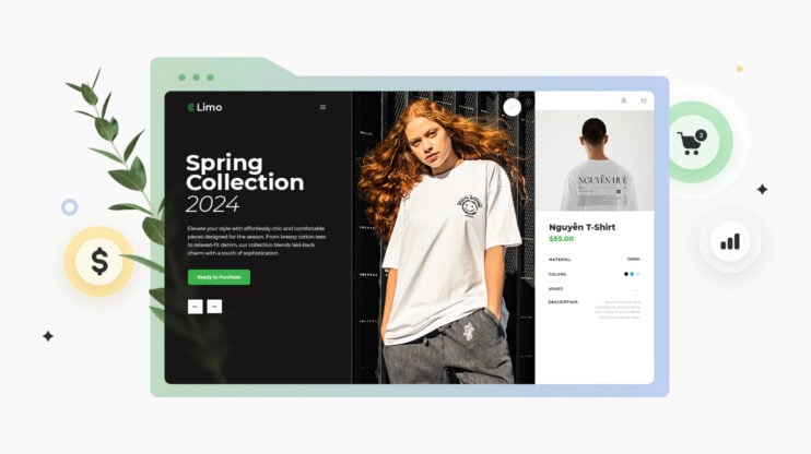
Visual hierarchy that’s instantly scannable
Users scan before they read. Research from the Nielsen Norman Group shows that most users read in an F-shaped pattern: strong attention at the top, horizontal scans lower on the page, then vertical scanning down the left side. Modern sites are designed with this behavior in mind.
Best practices emphasize strong section contrast, clear heading hierarchy, short paragraph blocks, modular layouts, and asymmetric whitespace — all aimed at reducing cognitive load without sacrificing information density.
Accessibility is foundational
Accessibility is no longer treated as a compliance add-on. It is a quality standard. The Web Content Accessibility Guidelines (WCAG) 2.1 heavily influence modern design systems because accessible sites are more usable for everyone.
Core practices include semantic HTML, full keyboard navigation, accessible contrast ratios (4.5:1 for body text, 3:1 for large text), proper heading order, readable font sizing (16px minimum for body copy), and motion reduction support for users with vestibular disorders.
AI-readable structure
Sites are increasingly designed not just for human readers, but for AI crawlers, answer engines, and retrieval systems. How a page is structured affects whether it appears in AI-generated answers, gets cited by LLMs, or surfaces in zero-click search results.
Best practices include clean semantic HTML with explicit sectioning, entity clarity, FAQ structuring, schema markup, and answer-first content blocks. A well-structured, accessible site is also a well-indexed, AI-readable one.
Trust design over visual novelty
Modern users evaluate trust quickly. A site that loads fast, holds its layout, maintains consistent branding, and presents information without friction signals competence before a word is read. The trend has shifted away from flashy landing pages and visual overload toward product clarity and proof-driven UX.
Strong trust signals include fast load speed, stable layouts with no shift, consistent branding, real screenshots, clear pricing, and transparent navigation.
AI-assisted editing changes how sites are built
Modern site builders increasingly optimize for prompt-based editing, reusable components, global style controls, and deterministic updates. This shifts design priorities toward cleaner component logic, predictable layouts, and modular architecture.
Layouts need to be modular enough that individual sections can be edited, replaced, or regenerated by an AI without breaking the rest of the page. A monolithic layout where sections are deeply interdependent cannot be maintained by a prompt-based system.
Simplicity is the current premium signal
The direction of high-performing web design is cleaner interfaces, less clutter, fewer competing actions, sharper messaging, and faster interactions. The modern premium feel is restraint, clarity, responsiveness, and confidence — not visual excess.
Cluttered pages have higher bounce rates, complex navigation reduces task completion, and heavy visual treatments slow load times. Simplicity performs because it removes the conditions that cause disengagement.
Web design best practices checklist
Design system and visual consistency
- Global theme or design system applied and inherited site-wide
- Color palette defined with primary, secondary, and accent roles
- Maximum of two font families applied through a global type system
Performance and Core Web Vitals
- Images converted to WebP with lazy loading enabled
- No images without defined dimensions (prevents CLS)
- 90+ PageSpeed score confirmed on both mobile and desktop
Adaptive layout and UX
- Layout tested across mobile, tablet, and desktop breakpoints
- Tap targets minimum 44×44 pixels on mobile
- CTAs are specific, high-contrast, and repeated at scroll points
Accessibility and structure
- Heading order is sequential (H1 once, H2 for sections, H3 for subsections)
- All meaningful images have descriptive alt text
- Color contrast meets WCAG 4.5:1 for body text
Brand and trust signals
- SVG or high-resolution logo tested on light and dark backgrounds
- Favicon set and visible in browser tab
- Page layout remains stable during load (no shift)
Common web design mistakes to avoid
- Building page by page without a system
- Designing only for desktop
- Treating performance as a launch task
- Ignoring Core Web Vitals until rankings drop
- Vague or absent CTAs
- Prioritizing visual novelty over trust signals
- Designing without AI readability in mind
How 10Web applies modern web design best practices
| Design principle | How 10Web applies it |
| Design systems vs page-by-page design | Global Themes: color tokens, font families, spacing, and shadows applied site-wide |
| Adaptive-first layout | AI enforces responsive output on publish; desktop/mobile preview in Visual Editor |
| Core Web Vitals | 10Web Booster: image optimization, caching, CDN, automated 90+ PageSpeed |
| Scannable hierarchy | AI generates structured, modular layouts with clear section and heading hierarchy |
| Accessibility | Dark/Light mode switcher at site and section level; SVG logos adapt automatically |
| AI-readable structure | Clean semantic HTML output; structured sectioning from AI generation |
| Trust design | Consistent branding via themes; fast load via Booster; auto logo and favicon from day one |
| AI-assisted editing | AI Co-Pilot for prompt-based editing; deterministic global updates via theme system |
| Simplicity | Predefined clean themes; modular, focused editor modes; restraint in AI generation defaults |
| Figma-to-live accuracy | Figma Agent at approximately 85–90% fidelity |
How 10Web applies these principles during and after website generation
10Web’s builder and editor are structured to apply most of these principles by default, removing the gap between knowing the principles and building them.
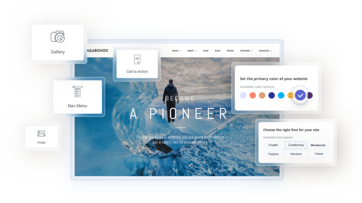
Design systems through Global Themes
When a site is generated with 10Web, it receives either a fully custom AI-generated theme or one chosen from 10 predefined system themes. Each theme defines the color palette, font families, border radius, and shadow intensity as a unified set, the foundational tokens every component inherits from.
Changes made to the Global Theme propagate across every page and every component using named values like Primary, Secondary, or Background. Elements manually assigned a specific value become independent from the theme, giving designers system-level control with per-element override capability when needed.
Adaptive layouts from generation
Mobile responsiveness is enforced automatically when a site is published. The Visual Editor includes a desktop and mobile preview switcher for reviewing layouts at both breakpoints before going live. The underlying generation produces fluid, responsive layouts rather than fixed-width designs.
Core Web Vitals through 10Web Booster
10Web Booster handles the performance metrics that directly affect search ranking and user experience. It converts images to WebP, implements lazy loading, minifies CSS and JavaScript, generates critical CSS, and enables full page caching.
Booster integrates with Cloudflare’s Enterprise CDN across 275+ global locations, reducing latency and cutting bandwidth costs by up to 60%. The result is an automated 90+ PageSpeed score and passing Core Web Vitals without manual optimization work.
Accessibility and dark/light mode controls
10Web supports dark and light mode at two independent levels. The site-wide toggle switches the entire site between modes instantly. The per-section switcher gives independent mode control at the component level, so a page can have a dark hero, a light content block, and a dark footer without custom CSS.
SVG logos adapt automatically to dark and light mode, and favicons are auto-generated and adapt to browser display settings.
AI-assisted editing and structured updates
10Web’s unified smart editor supports prompt-based editing via the AI Co-Pilot, alongside direct visual editing and custom code in one interface. Because the Visual Editor is built on a Global Theme system, updates made at the theme level are deterministic: changing the primary color updates every component using that named value, everywhere on the site, with a single action.
Trust design through consistency and speed
A site generated with 10Web launches with consistent typography, a defined color system, a professional logo, a favicon, and a 90+ performance score before a single manual edit has been made. Global Themes, 10Web Booster, and auto-generated brand assets together cover the core trust signals users evaluate at first impression.
Figma Agent and Clone/Redesign Agents
For sites that start from an existing design or live URL, 10Web provides three specialized agents: the Figma Agent (approximately 85–90% fidelity from Figma files), the Clone Agent (approximately 70% accuracy from a source URL), and the Redesign Agent (rebuilds with a fresh design approach). Global Themes are not applied to agent-generated pages, as these agents rely on inline styles to maximize visual similarity to the source.
FAQ
Which web design principles matter most for a small business site? Do I need a design system for a small website? What is a global theme and how does it enforce consistency? What causes layout shift (CLS) and how do I fix it? My PageSpeed score is low. Where do I start? What's the difference between mobile-first and adaptive-first design? What makes a website look trustworthy to first-time visitors?
Clarity, consistency, and structure tend to have the highest impact. Clarity means visitors immediately understand what you offer and what to do next. Consistency builds trust through predictable patterns. Structure ensures your content is readable and findable by both users and search engines. Performance matters too, slow sites lose visitors before they’ve read a word.
Yes, even simple sites benefit from one. A defined color palette, two font families, and consistent spacing already constitute a basic design system. Without it, inconsistency accumulates fast and makes a site feel unprofessional even when individual pages look fine.
A global theme is a design system applied at the site level. Every component draws from the named values within the design system. When you update the primary color in the theme, it changes everywhere at once. Consistency becomes automatic rather than something you have to maintain page by page.
Layout shift happens when elements move after the initial load, usually because images or embeds don’t have defined dimensions, so the browser hasn’t reserved space for them. When the image loads, it pushes content down. To fix it, always define width and height on images and media elements, and avoid injecting content above existing elements after load. A CLS score above 0.1 affects your Google ranking.
The highest-impact changes are image optimization (convert to WebP, add lazy loading, define dimensions), eliminating render-blocking JavaScript, enabling full-page caching, and using a CDN. These four typically account for the majority of improvements. Automated tools like 10Web Booster handle all of these without manual configuration, which is considerably faster than implementing them individually.
Mobile-first means designing for the smallest screen and scaling up. Adaptive-first means designing for the full range of screens (phones, tablets, ultrawide monitors, foldables, embedded webviews) with layouts that respond intelligently to each context.
Trust is signaled before anyone reads a word. Fast load time, a stable layout that doesn’t shift during loading, consistent branding (logo, colors, typography), and clear navigation or pricing are the strongest indicators.