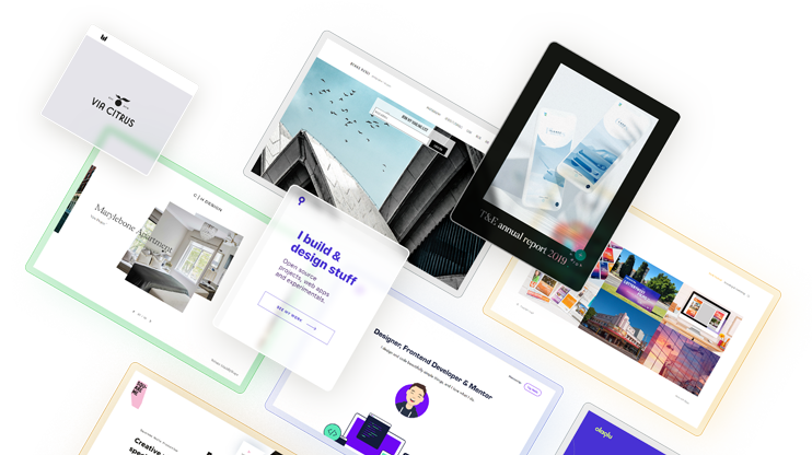
You’ve got a project to launch, but not much time, budget, or energy to build a multiple page website. Maybe it’s a portfolio, a product, an event, or something entirely your own. You need a simple, professional, and fast-to-create solution. In other words, a one page website.
One page websites work best for focused projects with a single goal: showing a portfolio, launching a product, promoting an event, or establishing a professional presence. With everything in one place, a single page website guides visitors through your message without distractions. According to HubSpot, these pages have the highest conversion rate (23%).
I’ve collected these 17 creative and effective one page website examples across different industries, showing exactly when to use these layouts (and when to avoid them), and understand why single page designs convert better. Get a step-by-step guide to build your own in under an hour.
Key takeaways: one page website essentials
- Best for: Product launches, portfolios, events, landing pages, and service shows
- Average build time: 1-4 hours with modern builders vs 2-3 weeks for multi-page sites
- Conversion advantage: Single-focused call-to-actions perform 15-25% better
- Mobile optimization: 78% faster loading on mobile devices
- Cost savings: 60-80% less expensive than custom multi-page development
Who should use one page websites: Freelancers, small businesses, event organizers, product launchers, and anyone needing a quick online presence without complexity. Let’s look at it in more detail.
What is a one page website and when does it make sense?
A one page website is a single, scrollable page that contains all essential business information – from your brand story and services to contact details and call-to-action buttons. Unlike traditional multi page websites, everything lives on one continuous page that visitors go through by scrolling.
One page websites make sense when you need focused conversion with minimal complexity. They work best for businesses with a single primary goal: driving sign-ups, presenting a portfolio, promoting an event, or selling a specific product.
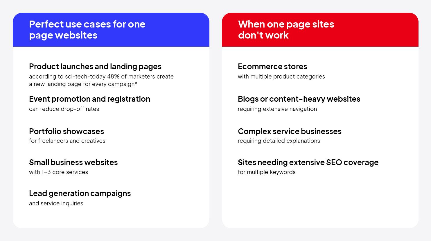
*According to sci-tech-today, approximately 48% of the marketers have been creating a new landing page for each campaign launch.
Answer these 4 questions to determine if a one page website design fits your project:
- Do you have a single primary goal for visitors? (Buy, sign up, contact, download)
- Can you explain your offer in under 10 sections? (Hero, about, features, testimonials, contact, etc.)
- Do you need to launch within 1-2 weeks? (One page sites build faster)
- Is mobile traffic your priority? (One page sites have better mobile performance)
If you answered “yes” to three or more questions, a one page website is an optimal choice for you.
17 top one page website examples
These one page websites show conversion-focused design patterns you can steal and adapt for any project. From product launches to professional portfolios, each example shows how different industries use single page layouts to drive specific actions.
Key patterns: Clear value propositions, strategic content flow, mobile-first design, and industry-specific approaches to user engagement.
1. Cook Collective
Flexible, fully-equipped shared kitchen rentals. 
Cook Collective’s single-scroll site opens with the promise “Rent a Kitchen by the Hour,” then goes through three tidy sections – About, Pricing, Book a Tour – so visitors instantly grasp what’s offered, why it matters, and how to act. Real kitchen photos, a warm palette, and a sticky “Book a Tour” button keep the experience personable yet laser-focused on conversions.
Takeaways:
- Lead with a benefit-driven headline
- Follow a clear What-Why-How flow
- Keep your primary call-to-action visible at all times
2. ACID
An annual event focused on innovation in chemistry.

ACID is a well-structured one page website built to promote a chemistry-focused event in Amsterdam. Usually, a one pager is enough for promoting an event. A bright hero banner announces the date and venue, then the page glides through program highlights, keynote profiles, and a concise schedule before landing on a friction-free registration form. Each section sits on its own color block, so users always know where they are, while sticky “Register now” buttons keep sign-ups one click away.
Takeaways:
- Clear content sections
- Bold headings and timeline-first content
- Simple registration flow
To achieve such clean page results, build your one page website with the 10Web AI Website Builder. Get a fully AI-generated site, without touching any code or design.
3. Ribalta
An Italian pizzeria in Portugal serving pizzas with authentic ingredients.

Ribalta captures a full dining experience on a single page website. Each section sits on generous white space, letting wood-fired pizza shots pop while keeping directions and booking just a click away. The warm, inviting visuals help build trust and appetite at the same time. Small businesses, especially in food and hospitality, can easily adopt this format.
Takeaways:
- A simple layout with big images
- Use a short intro, a visual menu, and a clear way to contact or book
4. Feniix
An international holding group supporting energy-focused companies across Latin America.
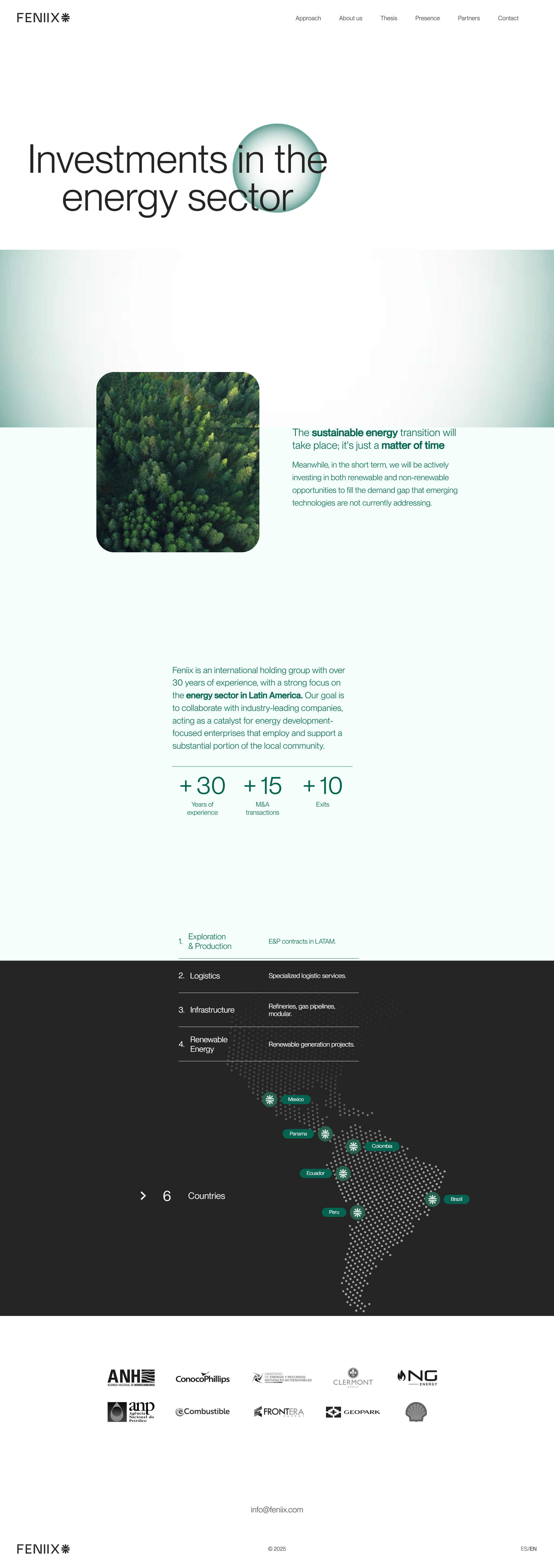
Feniix takes a complex, multi-layered business model and presents complex information in a digestible format. Every section has a clear purpose, making it easy for investors or partners to grasp what Feniix does and why it matters. The design is minimal but professional, with each section flowing logically. If you’re in a technical, corporate, or B2B space, this layout is a great model.
Takeaways:
- Focus on clarity: short copy and metrics
- Sectioned content, a neutral color palette
- Simplify navigation
5. Monte Café
A cozy café with a community-focused atmosphere.

Monte Café’s website highlights the café’s vibe, menu, and booking details without making visitors click around. The photos are neatly organized and give the feel of having lunch or breakfast, or a midday coffee at the café. This site is a strong example for any local business owner who wants to create an inviting online presence.
Takeaways:
- A short introduction
- Quality images
- Well-written sections that provide essential information
6. HoneyBee
Locally produced, natural honey focusing on quality, sustainability, and small-scale beekeeping.

HoneyBee communicates authenticity and quality as a one page website example. The site introduces the product, highlights its benefits, shares a bit of the story behind it, and encourages visitors to connect. They even make purchasing possible on a single page. The earthy design and natural color palette reflect the values of sustainability and small-scale production, making the entire experience feel trustworthy.
Takeaways:
- Thoughtful sections
- Clear product benefits
- A gentle tone go a long way
7. Cre8tive Revolution
A global business club that equips creators, innovators, and entrepreneurs with AI-powered leadership programs and community support.

Cre8tive Revolution makes a strong first impression by centering the site around personal presence and clarity. Right away, you know who’s behind the brand, what they do, and how they can help. The conversational tone and vibrant design give it a confident and approachable feel, while the layout moves naturally from services to testimonials and calls to action. For solo entrepreneurs, consultants, or service providers, this site is a smart blueprint.
Takeaways:
- A focused bio
- A clear offer
- A few standout visuals
8. Brainsave
An AI-based tool helping users capture, organize, and instantly retrieve information from their personal digital memory.

Brainsave tackles a complex concept with crisp flow: a punchy hero pledge (“Never lose a thought again”) leads into feature cards that pair minimalist icons with plain-language benefits, then rolls straight into real-world use cases before a contrasting sign-up banner seals the deal. By limiting copy, repeating the “Get Early Access” button, and anchoring visuals in a calming teal palette, the page keeps skeptics focused on value instead of tech jargon.
This website is easy to replicate for startups or SaaS tools trying to introduce or explain something new.
Takeaways:
- Starting with a strong, plain-language pitch
- Introducing benefits
- Guiding users toward action
9. Timeline
A science-backed longevity supplement for cellular health, energy, strength, and endurance.

Timeline blends science and storytelling, building trust and driving conversions. It clearly explains what the product is and why it matters, backed by clinical research, expert endorsements, and real customer stories. The website flows through benefits, science, reviews, and purchase options, creating a persuasive experience that is both credible and human.
If you’re selling a wellness or science-based product, Timeline shows how to use content strategically.
Takeaways:
- Clever use of content
- Showing benefits
- Reinforcing with proof, and supporting with social proof
10. Alma Food
A nutrition app to track food, get personalized advice, and eat smarter without traditional calorie counting.

Alma gives a playful yet professional experience that clearly explains the app’s value: voice-based nutrition tracking, personalized feedback, and the Alma Score system. The site uses real app chat previews to show what it’s like to use the product, which builds familiarity and trust. This one page website is a good example to study if you’re launching a wellness or lifestyle app.
Takeaways:
- Real product visuals
- Clear feature highlights
- Soft branding elements can help connect emotionally
11. Eggshell
Personalized branding, website design, and illustration services with a focus on creative, one-on-one collaboration.

Eggshell balances personality and professionalism. This portfolio site presents key services: branding, web design, and illustration, through a flowing scroll, with clean visuals and concise content that beautifully display the previous works. The website emphasizes direct communication and a customized solution. For freelancers or small studios, this layout is a solid model.
Takeaways:
- Highlight your core services
- Feature visual examples of your work
- Make it easy to get in touch
12. We Ain’t Plastic
The personal portfolio site for UI designer Roland Lösslein, showing his digital design skills through a minimal presentation.

We Ain’t Plastic shows how to present personal expertise engagingly. The layout moves from an introduction to key skills, project highlights, work process, and contact details without ever feeling too much information. It uses simple typography, smooth transitions, and a unique visual identity (like the gem illustration) to distinguish itself. For freelancers or creatives, it’s a strong reminder that you don’t need multiple pages to tell a full story.
Takeaways:
- Use minimal design packed with personality
- Reveal-on-scroll sections
- One clear contact link
You can easily replicate this site with 10Web AI Website Builder and customize based on your project.
13. Curatr
A Paris-based studio that connects brands with the right creative partners based on their goals, budget, and style at no cost.
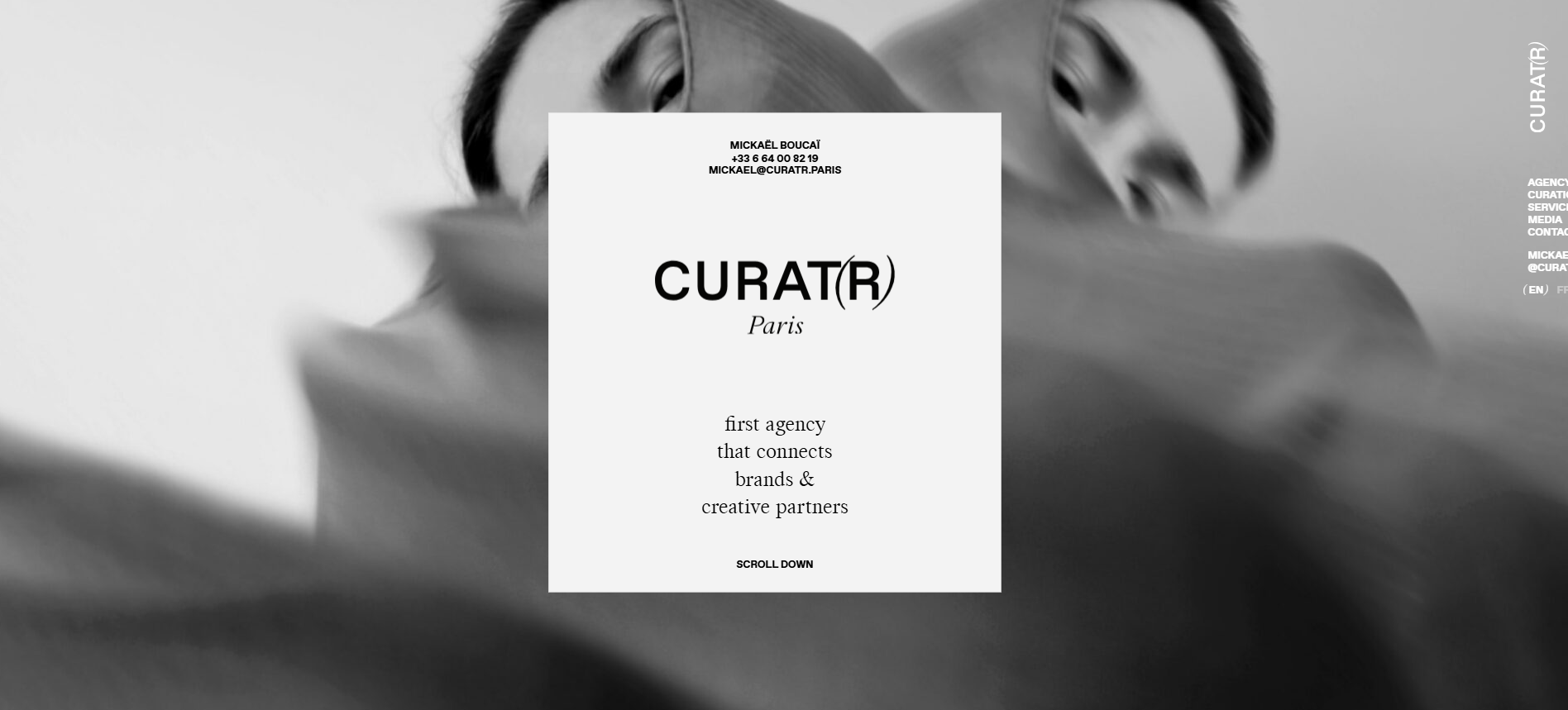
Curatr has a beautiful way of presenting information. As you scroll, new pages seem to open, but everything is organized on a single page. The style itself communicates luxury and is brand-centered. The content and high-end visuals are appealing to the eye. All that this site communicates is professionalism. As a one page website example, Curatr Paris is exemplary for businesses in fashion, big luxury companies launching a specific product, and designers who want to show their creativity.
Takeaways:
- A stylish, luxury-focused design
- One page can deliver high-end branding and a great client experience
14. Health Cap
Venture capital firm investing in breakthrough life sciences and healthcare innovations.

Health Cap has a specialized website with a professional look that conveys the essence of what they do. The site introduces the firm, outlines its investment focus on life sciences, and highlights key portfolio companies in a linear scroll. For investors, founders, or partners, it offers a quick yet informative overview of who HealthCap is and what they bring to the table.
If you’re in a high-trust industry like finance or healthcare, this format shows how to communicate authority without overloading users.
Takeaways:
- A sharp introduction
- Focused content sections
- A simple design but strong impression
15. Pillow Talk
A private audio journal that helps users reflect and unwind through voice notes and smart insights.

Pillow Talk’s one page website communicates emotions through functionality. By speaking to the persona on the emotional level, the first line on the page offers a solution: the private audio journal for the self.
It opens with a personal story that grounds the brand in authenticity, then guides visitors through the benefits of audio journaling, privacy-first features, and real user testimonials. The page design is soft and minimal, yet packed with value that’s communicated through a conventional tone. This format is ideal to recreate for founders or creators launching digital wellness tools.
Takeaways:
- A simple, linear structure with strong emotional storytelling
- Benefit-driven content
- Actual user voices builds credibility
16. The Reserve At Ochoco
A modern apartment community in Prineville, Oregon, offering thoughtfully designed floor plans and lifestyle-focused amenities.
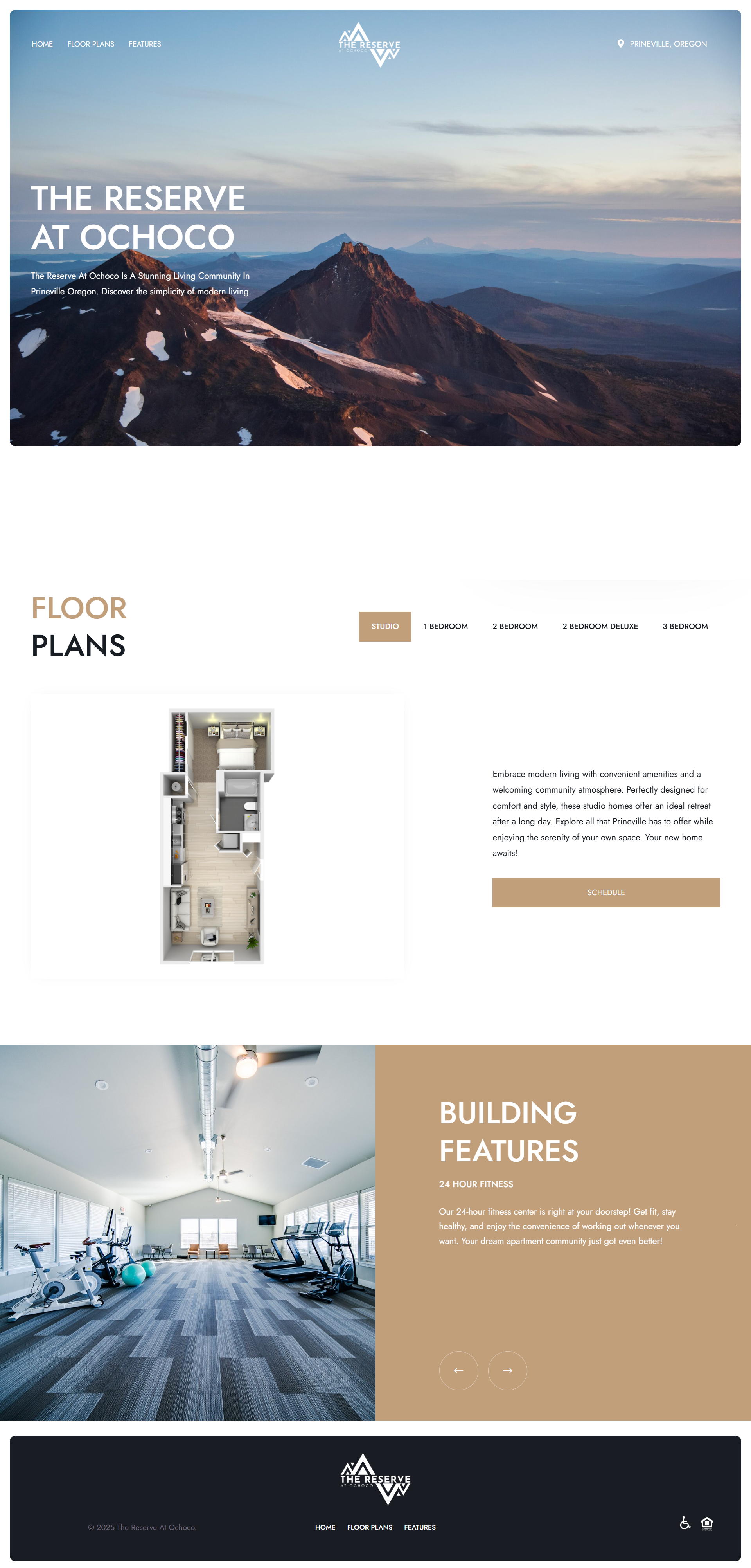
The Reserve At Ochoco delivers what prospective renters need: clear visuals, intuitive navigation, and key details all on one page. The homepage draws attention with a scenic hero image and a clean, high-contrast waiting list form, making it easy to express interest right away. As you scroll, floor plans, descriptions, and building features unfold in a linear experience.
For real estate or rental properties, this layout is a strong example of function meeting design. High-quality visuals, a focus on key details (like floor plans and amenities), and a built-in form for lead capture can be done with most modern site builders.
Takeaways:
- Open with a striking hero plus inquiry form
- Clarity, simplicity, and smart flow sell the experience
Create your one page website, simple and fast
Now that you’ve seen what one page websites can do, you probably know it’s the right fit for your project. But there’s still one big question: “How do I build one without spending weeks figuring it out? To get a fast and simple solution, use 10Web AI Website Builder. Be it for a freelance project, your own small business, or a product launch, 10Web can create a website for your needs in a few minutes. And all that, based on a simple prompt about your business/project.
Let’s create a one page website for you together.
Arcade
- Go to 10Web.io > describe your business or project in a few words > click Generate Your Website.
- Review and edit (if needed) the website name, description, and structure.
- Delete the unnecessary pages.
- Click Next > choose the website colors, fonts, and styles.
- Click Generate to apply.
Even better, once your site is generated, you’re not on your own. The editor-based AI Co-Pilot is your on-chat assistant. It helps you edit and manage content effortlessly using simple prompts. Adding new sections, rewriting copy, or updating offers? It’s as easy as typing what you need.
Launch your one page website today
One page websites work best when you want to keep visitors focused on one page and have enough content for that. The one page format can be used for a new product, an upcoming event, or a personal portfolio. The 17 examples you just saw prove that a tight story flow, plus one clear call-to-action, can boost sign-ups and sales without burning weeks (or your wallet).
You don’t need to figure it all out from scratch. With the 10Web AI Website Builder, you can build your own one page website in minutes without coding, design knowledge, or stress. You provide your business description, and AI takes care of the layout, structure, and styling. You can customize as much (or as little) as you want.
So if you’ve been waiting for the perfect moment to go live, this might be it. Clear. Focused. Fast. Your one page website starts with 10Web!
FAQ
What is a one page website?
Are one page websites popular?
What industries use one page websites?
How long should a one page website be?
What makes a good single page site?
How to create a one page website?

Build your website in 1 minute
Create your dream website with 10Web AI Website Builder
and take your business online!


