Most portfolio websites lose people in the first 10 seconds, not because the work is weak, but because the layout feels generic, the story is hard to follow, and the next step is unclear.
This guide rounds up 10 portfolio website examples that do the opposite. Each one is clear, intentional, and built to deliver results, such as landing a job, attracting freelance clients, or starting more effective conversations with the right people. I will point out the exact layout choices that make each portfolio work for us, then show how you can build a similar structure in under an hour with no code.
If you have been saving inspiration tabs for weeks, this is the part where you turn those screenshots into a portfolio website that actually gets you hired.
Portfolio website checklist (what to include to get hired faster)
You do not need a complicated portfolio website to impress people. The sites that work best keep the path simple: show your value fast, show your best work, then make it easy to contact you. Use this checklist to build a portfolio website that converts.
| Element | Why it matters | What to do |
| Strong first impression | Communicate your value in seconds. | Write a clear headline, use one strong hero visual, and keep branding consistent (fonts, colors, tone). |
| Simple navigation | Help people find what they need without friction. | Stick to a clean menu (Home, Work, About, Contact) and remove anything that doesn’t support the goal. |
| Organized work samples | Show your range without overwhelming visitors. | Feature 4–6 best projects, add 2–3 line blurbs, and use clean, optimized visuals. |
| Clear project story | Turn “nice visuals” into “I want to hire you.” | For each project: problem → your role → approach → outcome. |
| About section | Build trust and personality quickly. | Say what you do, who you help, and what you are known for. Add a friendly photo. |
| Proof and credibility | Reduce hesitation and build confidence. | Add testimonials, client logos, measurable results, or press mentions if you have any. |
| Clear contact options | Make hiring you feel effortless. | Use one primary CTA (“Hire me” / “Book a call”), add a contact form or email, and link to socials. |
| Mobile-ready + fast-loading | Make the site feel professional everywhere. | Compress images, use clear headings, and test on mobile to avoid layout breaks and slow loads. |
How to build your portfolio website (using 10Web)
Once you know what your portfolio needs, the next step is turning it into a real website without overthinking the build. With 10Web go from prompt to production website, which means you can generate a full portfolio (pages, structure, and styling) and then refine everything with visual editing and the WordPress ecosystem behind it.
You have two quick paths, depending on how you like to work:
Option 1: Start with 10Web’s AI Website Builder
Use the AI flow when you want a complete first draft quickly.
- Open the 10Web AI Website Builder and describe your work (role, niche, style, and what you want the site to achieve).
- Let AI generate the initial structure (typically a homepage + work/projects + about + contact).
- Refine your projects, tighten the headline, and add your proof (testimonials, logos, metrics).
- Use the visual editor to adjust sections, layout, and copy without touching code; this matters because real portfolio sites usually need many small iterations before they feel “you.”
Option 2: Start with a portfolio template
Templates work well if you already know the vibe you want and prefer to fill in the blanks.
- Go to 10Web’s portfolio website template
- Replace the placeholder projects and about copy using the checklist above
- Add or remove sections based on your goal (get hired vs attract clients)
- Publish, then refine; your first version is not the final version, and a template makes iteration easier
Most tools help you generate a prototype. The difference with 10Web’s positioning is the focus on building a production website with the things portfolios actually need long-term: visual editing for quick tweaks, content workflows via WordPress, extensibility through plugins, and performance/SEO foundations.
If you already have an old portfolio you dislike, rebuilding gets easier when your first draft is generated quickly, and you spend your time polishing the story, not wrestling with layout.
10 portfolio website examples that work
To make this guide genuinely useful, I looked at real freelance portfolios shared on LinkedIn, in designer forums, and across popular threads. I paid attention to what gets people hired, booked, or contacted, then focused on the portfolio website examples that make the next step obvious: clear positioning, curated work, and a layout that helps visitors move from browsing to reaching out.
1. Steven Wolf Designs

For: Freelancers or small studios who want to look polished and professional.
Steven Wolf Designs nails clarity, trust, and visual consistency. The branding feels confident, the typography adds personality, and the structure makes a small team feel like a full studio.
What to borrow:
- A strong headline that instantly explains what you do
- A clear services list that avoids vague wording
- A grid layout with plenty of breathing room for easy scanning
2. Pedro N The World

For: Photographers, content creators, and visual storytellers.
Pedro’s site pulls you in with visuals, then keeps you there with storytelling. It makes the creator feel human and memorable, which is exactly what clients want before they reach out.
What to borrow:
- Short personal notes that build connection without oversharing
- Editorial-style galleries that still feel organized
- A contact path that is clear and friction-free
3. Sayo Miyajima
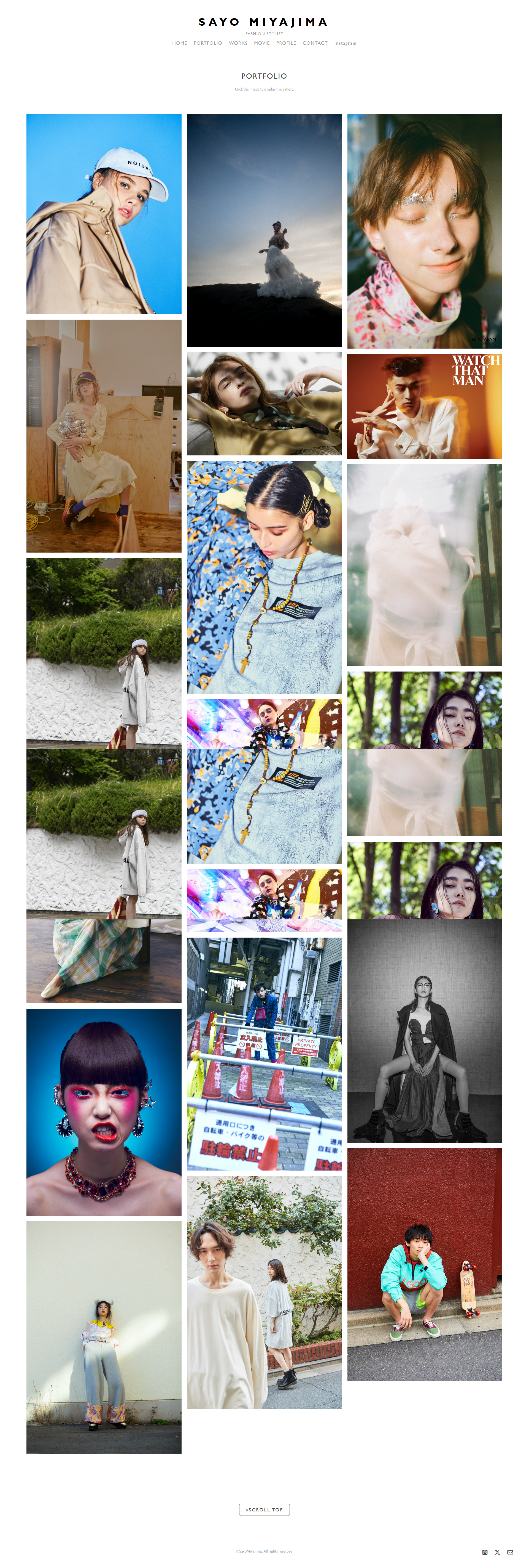
For: Stylists, fashion creatives, and freelancers in visual industries.
Sayo’s site has a premium, magazine-like feel, but it is built for action. Work is visible immediately, navigation stays simple, and the About page gives real booking-level clarity instead of a fluffy background.
What to borrow:
- Strong visual hierarchy with obvious project entry points
- A visible, friendly contact section that feels inviting
- Branding that looks high-end without feeling overdesigned
4. Lois van Baarle (Loish)
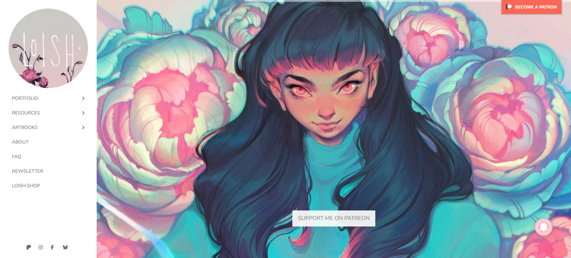
For: Illustrators and visual artists who want their portfolio to feel like a living sketchbook.
Loish is one of those portfolio website examples that shows the work and the thinking behind it. It feels calm and personal, and the process moments make the projects more compelling than a simple gallery ever could.
What to borrow:
- Project pages that include sketches and in-progress visuals
- A minimal layout that matches the tone of the work
- Clear categories that help different visitors find what they want
5. Sean Halpin
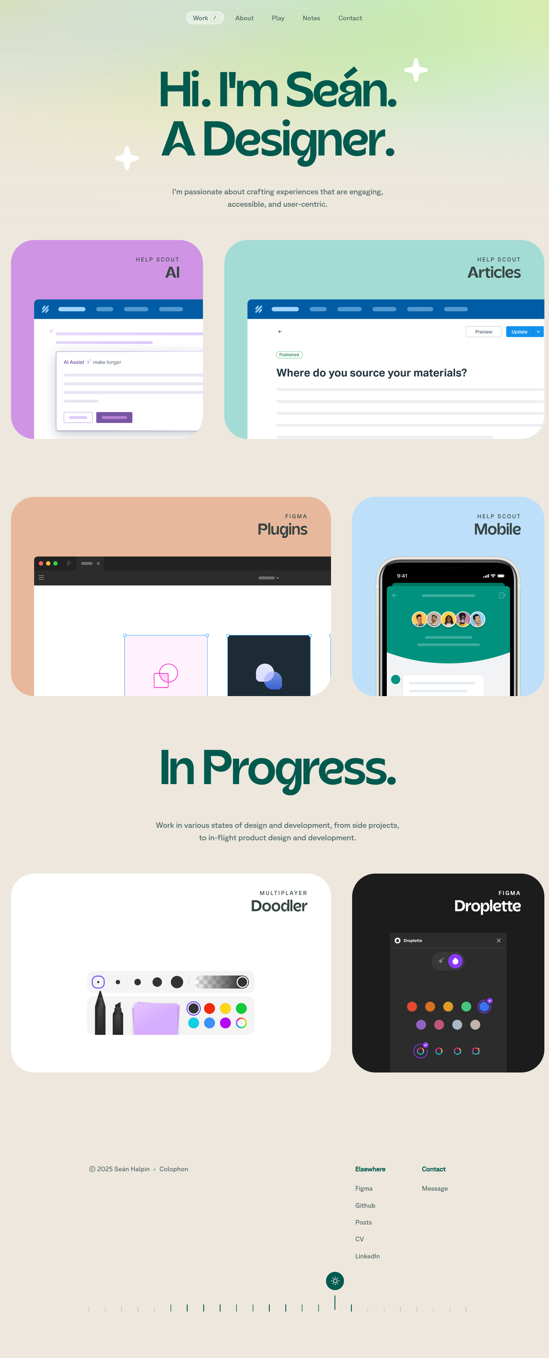
For: UX/UI designers who want their site to reflect how they think.
Sean’s portfolio looks simple, but it feels deliberate. The copy is conversational, the structure is content-first, and the layout reads like a well-organized product flow rather than a random collection of screens.
What to borrow:
- Copy that sounds human while staying professional
- A case-study structure that mirrors real project thinking
- Consistent branding that makes the site feel mature and intentional
6. Alice Lee

For: Multi-skilled creatives who want to show process across different mediums.
Alice’s work spans formats, but the site still feels easy to follow. Projects are grouped in a way that makes her range feel coherent, and the short stories beside the visuals help you understand how ideas evolve.
What to borrow:
- Clear grouping by medium or project type
- Short storytelling snippets that explain creative decisions
- A grid navigation that keeps a big portfolio approachable
7. Mihailo Vucenic
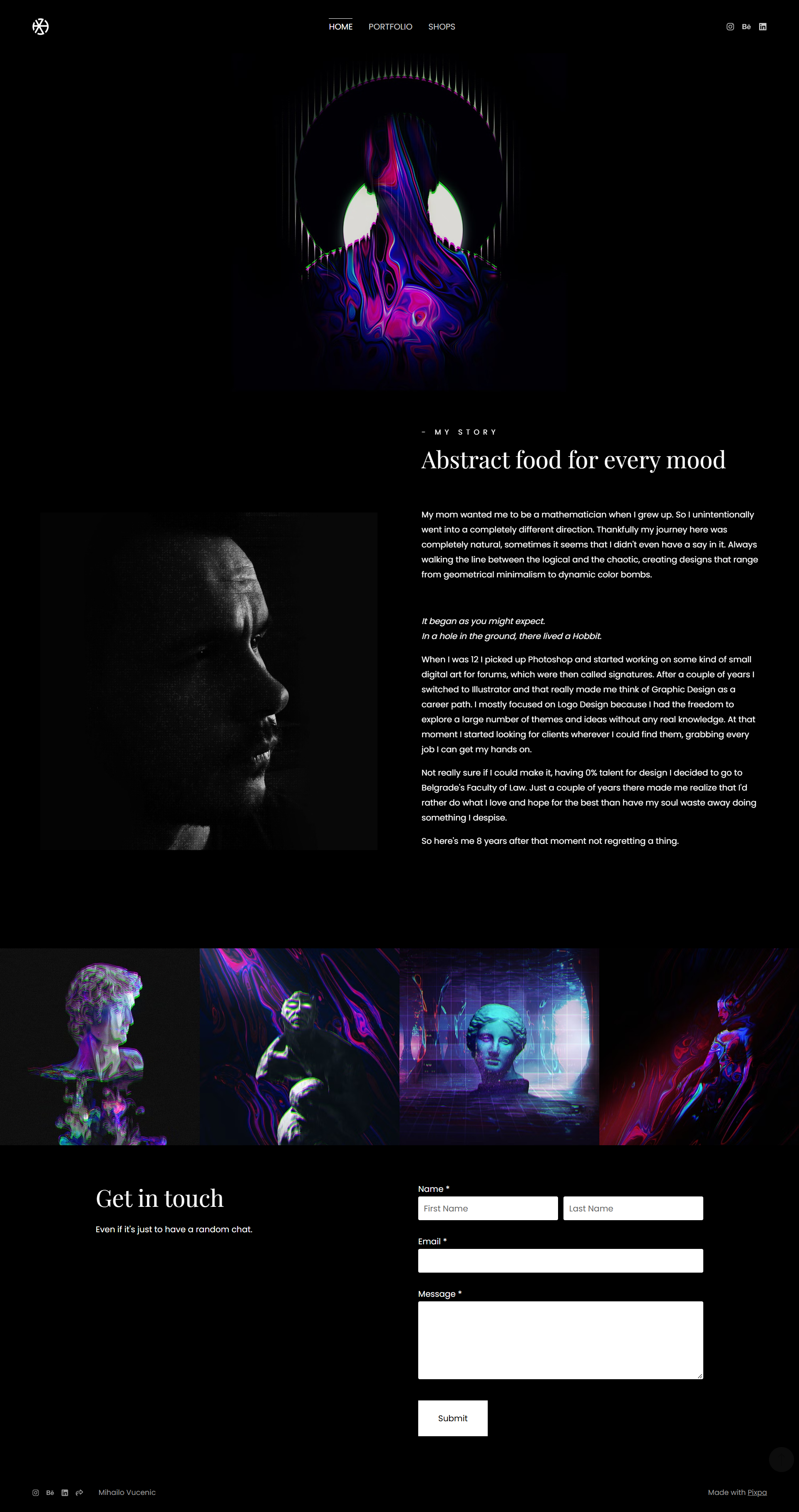
For: Designers who want clarity, control, and restraint.
Mihailo’s portfolio website proves minimalism can feel bold when every detail is intentional. The dark layout and sharp grid give structure, while the work stays front and center without distractions.
What to borrow:
- A black-and-white theme that makes your work pop
- A grid that creates rhythm without feeling rigid
- Distraction-free navigation that keeps attention on the projects
8. Velvet Spectrum

For: Creators who want an immersive, playful portfolio that still stays usable.
Velvet Spectrum goes bold with color, texture, and motion, yet it does not collapse into chaos. The layout stays grounded, so the personality shines without making visitors work to understand the site.
What to borrow:
- Motion that supports browsing instead of interrupting it
- Consistent spacing that keeps things readable
- A strong visual system that makes “loud” design feel intentional
9. Adham Dannaway
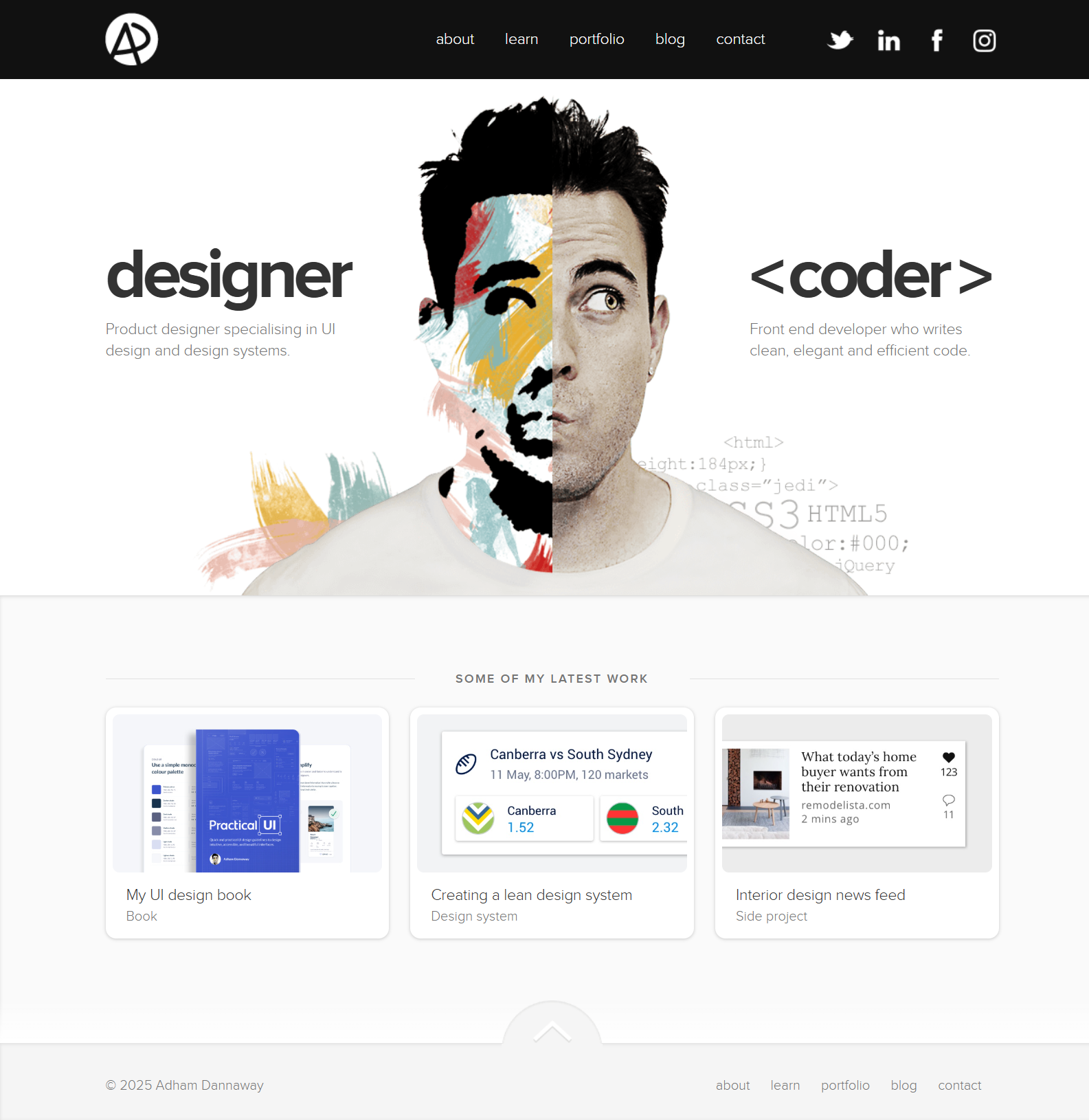
For: Creators with two clear skill sets, like design + development.
Adham’s split-screen layout is the pitch. In seconds, you understand what Adham does and how his work is structured, which is why this portfolio gets referenced so often.
What to borrow:
- A layout that instantly communicates positioning
- Smooth transitions that keep the experience cohesive
- A structure that makes “range” feel easy to grasp
10. Demas Rusli
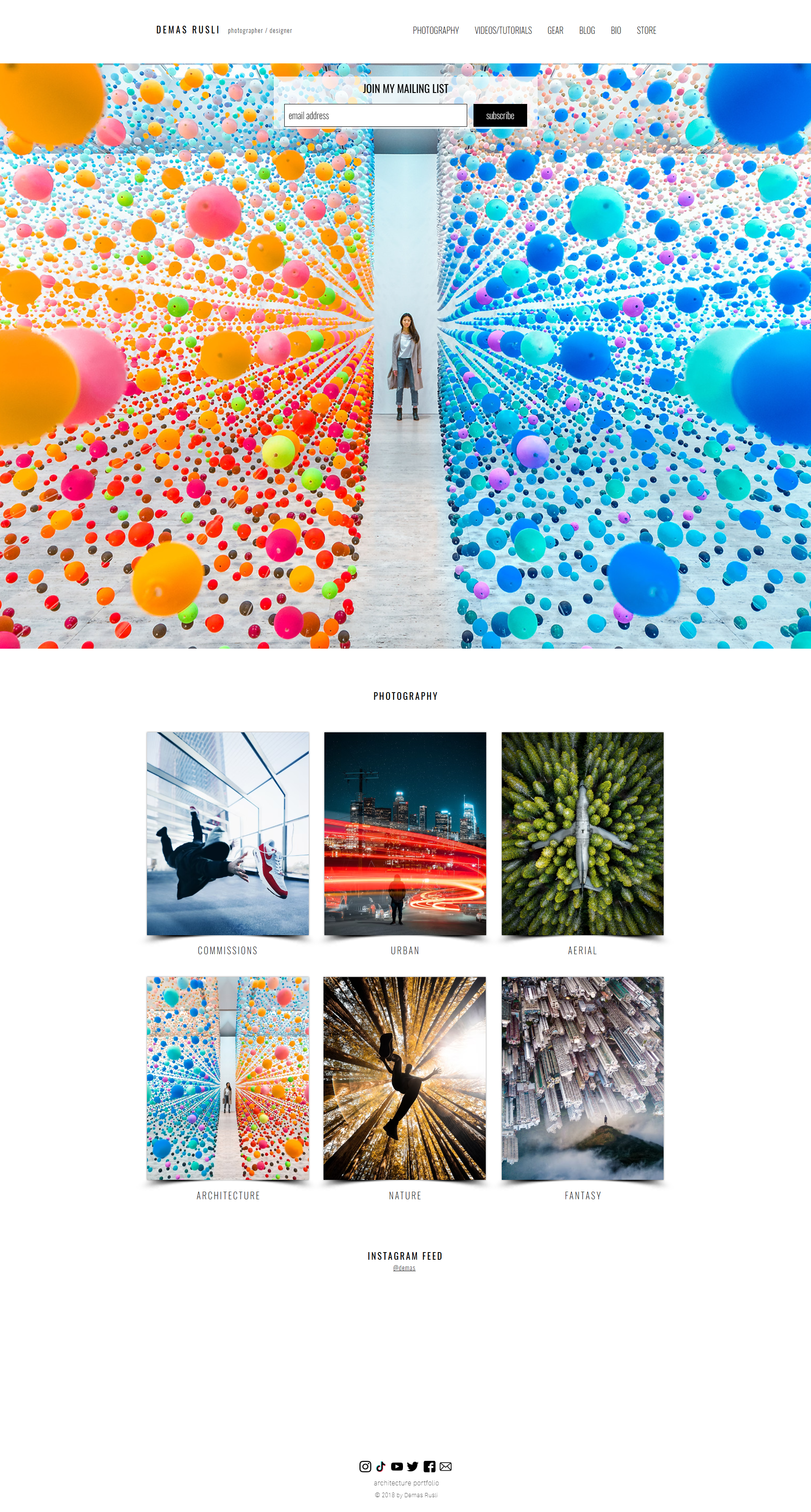
For: Photographers and creators who want a clean, full-width portfolio layout.
Demas’s site is visual-first, but it stays organized. Full-width imagery, subtle interactions, and filtering make a large body of work feel premium, browsable, and surprisingly calm.
What to borrow:
- Full-width visuals that showcase range immediately
- Category filters that help visitors explore faster
- A responsive layout that holds up well on mobile
Do you like this full-width portfolio style? Use the 10Web Portfolio Website Builder to generate a similar portfolio website in minutes, then swap in your projects and publish.
Create your dream website with 10Web AI Website Builder 
Build your website in 1 minute
and take your business online!
Conclusion
After reviewing these portfolio website examples, the pattern is simple: the ones that get people hired are built around decisions, not decoration. They make your value obvious, show a focused set of projects, and guide visitors to one clear next step.
Start with the checklist, pick a layout that matches your goal, and publish a first version even if it feels imperfect. Your portfolio gets stronger through small updates, not one big “perfect” launch.
If you want to move faster, the 10Web Website Builder lets you generate a portfolio site in minutes, then refine the layout, copy, and projects until it feels like you, without dealing with code or rebuilding from scratch.
FAQ
How can I create a portfolio?
What does a good portfolio look like?
What should a portfolio website include?
How many projects should I put in my portfolio?
How do I make my portfolio website?


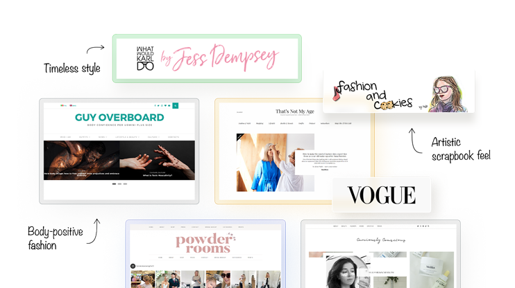
Fashion is more than just clothes; it ‘s a form of self-expression and creativity.
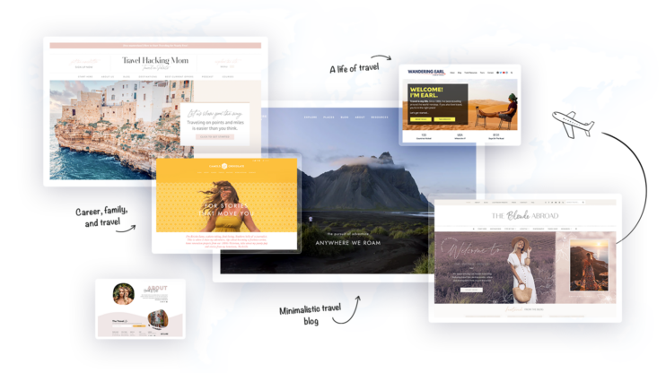
this article consist of many kinds of small blogs like
Budget travel guides and backpacking tips.
Travel, tech, and family adventures.
Adventure travel and digital nomad life.
Diverse global travel and culture.
and many more important things wer covered in this article which is helpful for travellers.