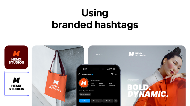

You know that tiny little image that shows up in a browser tab when you open a website? That’s your favicon.It’s such a small thing that most people don’t even think about it, but that little 16×16 icon is usually the first piece of your brand anyone sees in a tab, a bookmark, or even on someone’s home screen. It has to be clear enough that people instantly know it’s you.
I get how easy it is to overthink it, so I asked our graphic design lead, Tatev Soghomonyan, to help out. She’s worked on favicons for everything from startups to big-name brands and has a really practical take on what works (and what doesn’t).
In this guide, you’ll see how to design a favicon that’s recognizable, and find the best tips, clear advice, and some simple tactics to help you create a simple, bold icon, no matter where it shows up.
1. Ensure the right technical setup
The technical setup might feel like a small thing, but it really isn’t. If your favicon doesn’t load properly or ends up looking blurry, the design won’t matter, people simply won’t see it clearly. Here’s our design team lead’s advice on how to make sure that doesn’t happen:
Expert advice
The most important thing to know when making a favicon is the format of the file. Whether it’s 16×16px or larger, it has to be PNG or, better yet, ICO format. It should have a transparent background, and you should not have unnecessary empty spaces.
So, from technical standpoint, these are the three key things to pay attention to:
- The file format: PNG works well on most modern browsers, and it’s easy to export. However, ICO is even better if you want full compatibility across older systems, especially Windows. It also lets you include multiple icon sizes in one file, which means your favicon can adjust more gracefully to different screen types.
- Transparent background: Without it, your icon might show up as an awkward white box, especially in dark mode, which most people use these days.
- Spacing: Too much empty space, and your icon looks tiny. Too little, and it might get cropped. You should aim to balance it.
2. Follow the simplicity rule
It’s totally normal to want your favicon to look “designed.” You might be tempted to use the full logo, add gradients, show off your brand colors, or include tiny details that look great in larger formats. However, at 16×16 pixels, complexity backfires.
Gradients often blur into mush, especially on different screens or in dark mode. Bright or subtle fades might look great in a header, but at favicon size, they can flatten into one dull blob. The same goes for too many colors. What feels vibrant on a full page can look chaotic or fuzzy when shrunk down.
Then there’s the detail trap. The more you pack in, icons, shadows, fine lines, the more your favicon turns into visual noise. At that size, the best thing you can do is create a simple, bold icon that stays readable and distinct at a glance.
Expert tip
While working on a favicon, you have to always remember simplicity. Designers often forget this and try to use complicated versions of the logo, like gradients, too many colors, or too much detail.
In the case of our 10Web favicon, the design team started by stripping the logo down to its simplest form: one shape, one color, no frills. That’s the place you can start from. Here are a few more things worth cutting:
- Gradients, which often render poorly or get lost entirely
- Too many colors, which blur together or lose contrast
- Tiny details, like outlines or icons, that vanish on small screens
Think of favicon design like a tiny test of clarity. If someone can recognize your brand at 256 pixels, you’ve done it right.
3. Make the right choice: Typography vs. icons
Expert tip
It’s better not to use text in the favicon. Use the icon of the full logo (if the logo has an icon). If the logo is pure text, it’s better to use the first letter of the wordmark.
Small text simply doesn’t work at 16×16 pixels. Even clean typography turns into a blurry mess, especially on high-res screens or when someone has multiple tabs open. One of the key lessons in how to design a favicon is knowing when to ditch the text and focus on shape.
- Logo has an icon: Use only the icon
- Text-only logo: Extract the first letter with thoughtful styling
- Hybrid approach: Single letter in a circle or stylized monogram, but only if it stays legible
Look at Medium, Notion, or Facebook, they all use simple, bold forms that work instantly, even when tiny.
How to test your favicon size and design?
A simple test beats all guesswork.
Expert tip
What I do is scale 10Web’s logo down to the smallest favicon size (16×16) and look at it at 100% zoom in Illustrator. If I can still recognize the logo, then everything is fine. I also check how the logo looks in light and dark backgrounds.
So, to test, scale your design to 16×16 pixels, view at 100% zoom, and ask: “Can I still recognize this?” If yes, you’re good. If not, simplify more.
Essential testing checklist:
- Recognition at actual size (16×16 at 100% zoom)
- Light and dark background compatibility
- Cross-browser appearance
- Real-world tab testing with multiple sites open
How to create a simple, bold icon: Complete do’s and don’ts
| Do | Don’t |
| Use a simple, bold shape that stays clear at small sizes | Don’t use complex shapes or effects that blur when scaled down |
| Use a transparent background | Avoid solid backgrounds unless they’re tested and brand-relevant |
| Save as PNG or ICO for full browser support | Don’t use JPEG or SVG, they often break or display poorly |
| Zoom out to test clarity at 16×16 | Don’t assume your full logo will scale, simplify it |
| Limit to 1–2 high-contrast colors | Don’t use too many colors, they blur at small sizes |
| Use an icon or first letter if your logo is too detailed | Don’t rely on text, it’s unreadable at favicon size |
| Test on real browsers and tab styles (incl. dark mode) | Don’t skip real-device testing, previews can be misleading |
Create a simple favicon design with AI
You could absolutely follow all the steps above: test your spacing, simplify your design, check contrast, export the right file format. You could also skip the manual work, because there’s a much faster way: let AI handle it for you.
With the free 10Web Branding Kit, all you have to do is describe your brand in a few words. That’s it. In seconds, the kit generates:
- A clean, bold logo (with a simple favicon-ready icon)
- A favicon you can use on your website, in browser tabs, or even social profiles
- A brand-aligned slogan, mission, and vision
- Downloadable assets in the right formats, no resizing or editing needed
The icons it creates are already optimized for small sizes, so you don’t have to worry about testing and editing again. You just preview the favicon design, download it as a PNG or ICO, and you’re good to go. Although you already know how to design a favicon, you can do it faster, then all you need to do is adjust it to what you really want.
Final thoughts and next steps
A favicon is not a mini-version of your logo, but a quick visual cue for your brand, showing up in tabs, bookmarks, and mobile screens. If you’re starting to design your favicon from scratch, keep it small and focused. Create a simple, bold icon in one color, and check that it still holds up at 16×16 pixels.
If you want to speed things up, try the 10Web Branding Kit. It’s free, fast, and gives you a ready-to-use favicon, along with a full set of brand assets, to help you launch with confidence.
FAQ
How do I create my own favicon? If that sounds like too much back-and-forth, the free 10Web Branding Kit can create one for you with the manual struggle, with just a simple brand description. Is favicon 16×16 or 32×32? How to make a perfect favicon? How do I format a favicon?