
School websites have a tough job: they need to serve current families and also make a great first impression on new ones. When the structure is messy, people miss deadlines, updates get ignored, and the site becomes a source of frustration rather than a resource.
This roundup shares school websites that handle the essentials well—navigation, mobile usability, clear admissions paths, and content that feels current. Each example comes with a takeaway you can apply right away.
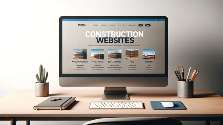
Create your dream website with 10Web AI Website Builder 
Build your website in 1 minute
and take your business online!
What makes a great school website?
A great school website feels easy. Not because it is “simple,” but because it is organized around real people who visit it every day. These are parents planning their week, students seeking resources, staff sharing updates, and prospective families deciding whether this school is the right fit. Your goal should be to help all those visitors find what they need in a few clicks.
1. Structure it for the 3 main audiences
Most school websites get messy when everything is treated as “general information.” A cleaner approach is to build the navigation around intent:
- Parents: calendar, announcements, policies, lunch, transportation, portals, forms
- Prospective families: admissions, tuition, tours, school story, academics, contact
- Students: resources, schedules, clubs, counseling, learning tools
- Staff: internal links, staff resources, directories, updates
To support this structure, make sure the essentials are easy to find: an Admissions/Enrollment page that clearly explains the steps, deadlines, and requirements (plus tuition if it applies), a Contact page with the school’s phone and email, office hours, and the right department contacts, and an About the School page that covers your mission, leadership, campus, values, and quick facts.
2. Make mobile navigation the default, not an afterthought
A large portion of visitors will land on your site from a phone. If the menu is hard to use, everything feels harder than it should.
Aim for:
- A menu that stays short and predictable (no “mega-menu maze”)
- Quick links for top tasks (calendar, lunch, admissions, portal, contact)
- A clear primary action on key pages (Book a tour, Apply, Contact admissions)
The pages that benefit most from mobile-first design are the ones families rely on when they are in a hurry: the homepage (with quick links and the latest announcements), the calendar or events page, the news or announcements section, and the admissions page—especially the parts that cover deadlines and next steps.
3. Cover the accessibility basics so everyone can use the site
Accessibility is not just a compliance checkbox. It is also good usability. If text is hard to read or menus cannot be used with a keyboard, families get stuck.
Basic standards that make a big difference:
- High contrast text and readable font sizes
- Alt text on important images
- Keyboard-friendly navigation (menus, buttons, forms)
- Clear headings that help users scan fast
4. Build trust with the content families look for
School sites are judged quickly. If key information is missing or outdated, visitors assume the same about the school.
Trust signals that should be easy to find:
- Safety information and procedures
- Accreditation or affiliation details (when applicable)
- Staff directory and leadership contacts
- Clear policies (attendance, bullying, uniforms, etc.)
- Updated announcements (even a small update helps)
For trust, a school website should make the basics easy to verify. That usually means a clear staff directory, a centralized policies or handbook hub, accessible safety and health information, a page for school leadership or administration, and, if it fits your school’s setup, a support or donate page for families and community members who want to contribute.
If you want, I can tailor the “must-have pages” list slightly depending on the angle you want the article to lean into most: K–12 school websites, private/charter admissions-first sites, or universities and colleges.
How to create your school website
A school website is not a one-time project. It needs to stay useful through schedule changes, new announcements, enrollment seasons, and those “we need this posted today” moments. A tool like 10Web helps because you can launch quickly, then keep refining the site without rebuilding it every time something changes.
You have two good ways to start, depending on how you prefer to work.
Option 1: Use 10Web’s AI Website Builder
This path is best when you want a school website you can generate quickly, but still fully control afterward. 10Web AI Website Builder builds a complete WordPress site with hosting, performance optimization, and visual editing already included, so you’re starting with something publishable, not a rough mockup.
Start the education AI builder flow and describe your school (type, grade levels, location, tone, and what visitors need most—admissions, calendars, announcements, or contact). In minutes, you’ll get a working website structure that you can edit visually using an Elementor-based builder, which makes updates simple even for non-technical staff.
What makes this especially useful for schools is that the site is built on a long-term foundation: WordPress for flexibility, Google Cloud hosting for reliability, and automated speed optimization that helps pages load fast on mobile.
A simple build flow that works well:
- Generate the first draft and confirm you have the core pages: Home, About, Admissions, Calendar, News, Contact
- Replace the placeholder content with the essentials families actually look for (deadlines, office hours, key contacts, portal links)
- Use the visual editor to adjust sections, menus, and homepage quick links without touching code
- Benefit from built-in performance features like PageSpeed optimization and secure managed hosting from day one
- Publish early, then keep improving with quick updates throughout the school year
Option 2: Start with a 10Web education template
Templates are great when you already know the style you want and prefer to fill in structured sections rather than generate everything.
Choose an education template, then treat it like a framework. Keep the navigation clean, swap in your real content, and build trust by making key information easy to find. This approach is especially helpful if you already have photos, branding, and content ready.
What to prioritize as you customize:
- Build around the must-have pages: Admissions, Calendar/Events, News/Announcements, Staff Directory, Policies/Handbook, Contact
- Add clear calls to action on key pages (Apply, Book a tour, Contact admissions)
- Make trust content easy to find: leadership/administration, safety/health info, and policies
- Publish early, then refine—templates make updates painless when the school year shifts
Most school websites get better through iteration. If you can launch a clean structure first and improve it week by week, families feel the difference immediately—even before you polish every page.
10 best school websites
Let’s take a look at the best school websites by our choice. These websites meet the requirements you should also follow when building yours.
1. Porto Business School
Portuguese business education hub.
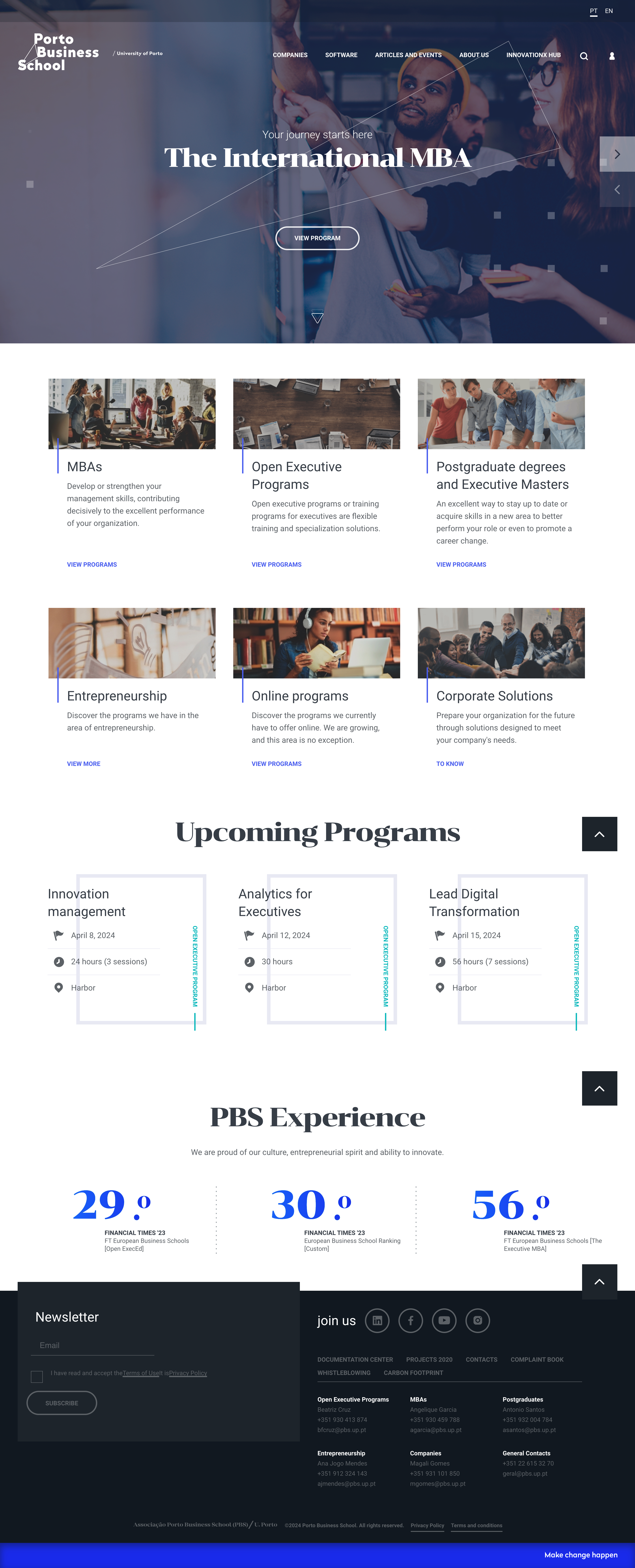
What we like most about this website:
- Program pages feel structured and easy to compare, with strong visuals and clear outcomes.
- The navigation stays professional and uncluttered, even with lots of academic content.
- Rankings and achievements are placed naturally, building trust without feeling promotional.
Porto Business School’s website is a great example of how to present higher education programs without overwhelming visitors. Everything is organized around decision-making—exploring MBAs, executive education, events, and school credibility. The layout makes it easy to understand what the school offers within a few scrolls, which is exactly what prospective students need.
2. Ross School
Innovative global education community.
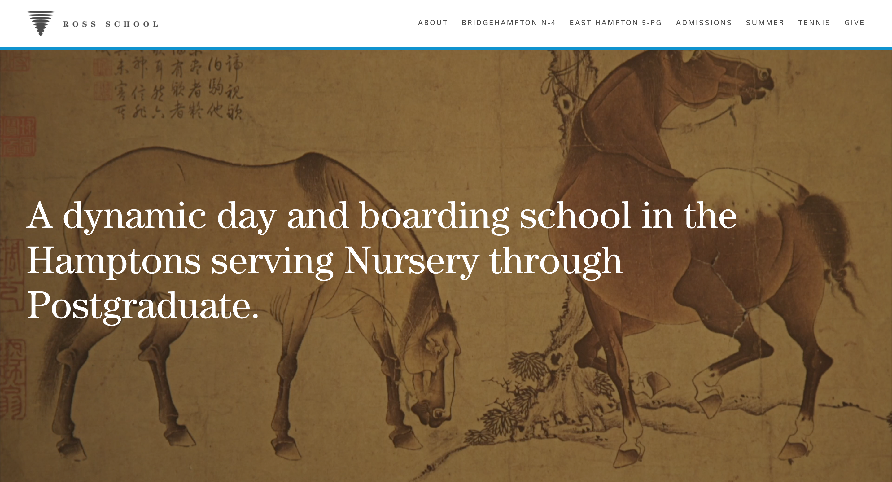
What we like most about this website:
- The homepage immediately communicates the school’s philosophy through design and storytelling.
- Student life feels real, supported by testimonials, campus moments, and academics together.
- The site balances visuals with structure, making it immersive yet easy to navigate.
Ross School’s website does a strong job of showing what it feels like to attend—not just what the school teaches. It guides families through academics, boarding life, and community values with a clean layout that never feels crowded. For a day-and-boarding school with multiple campuses, the experience remains surprisingly intuitive.
3. Bronx Charter School for Children
Elementary education in The Bronx.
What we like most about this website:
- The mission and purpose are clear right away, creating an inviting first impression.
- Navigation is simple and parent-friendly, with no digging required to find essentials.
- Events, support options, and key updates are easy to spot from the homepage.
Bronx Charter School for Children shows how a smaller school site can feel organized and welcoming without flashy design. The structure focuses on what families actually look for—school values, upcoming events, and ways to stay involved. It’s a strong example of clarity over complexity.
4. Washington Market School
Progressive preschool in NYC.
What we like most about this website:
- Warm imagery and video tours help parents picture the learning environment instantly.
- The site feels calm and child-centered, matching the school’s philosophy.
- Testimonials add a personal, community-driven layer of trust.
Washington Market School’s website is a great reminder that preschool websites are emotional as much as informational. The design communicates care and approachability while still making programs and admissions information easy to access. It feels like an extension of the school’s culture.
5. Greensboro Day School
Comprehensive Pre-K–12 education.
What we like most about this website:
- Strong branding and visuals give the school a polished, modern presence.
- The virtual campus tour helps prospective families explore without scheduling a visit first.
- The layout supports both current families and admissions-focused visitors equally well.
Greensboro Day School’s site works because it feels structured around the parent journey. You can quickly find admissions details, school divisions, and campus life without bouncing between pages. It’s a good example of how to make a large Pre-K–12 school feel approachable online.
6. The New School
Progressive university in NYC.
What we like most about this website:
- The design feels bold and creative, reflecting the school’s identity immediately.
- Programs and research are grouped clearly, which matters on a large university site.
- Visuals support discovery, but navigation still stays functional.
The New School’s website shows how a university can express personality without sacrificing usability. With so many departments and academic paths, the site keeps structure at the center while still feeling modern and artistic. It’s a strong example of brand-driven design paired with clear information flow.
7. Columbia Business School
Prestigious Ivy League business education.
What we like most about this website:
- Academic programs are presented with clarity, making it easy to explore options quickly.
- Photography and NYC positioning reinforce the school’s professional environment.
- The layout builds credibility through content depth, not clutter.
Columbia Business School’s website is designed for high-intent visitors who want answers fast—MBA structure, faculty research, student experience, and admissions expectations. It handles a large volume of content without feeling overwhelming, which is one of the hardest things for school sites to do well.
8. The Town School
NYC independent school community.
What we like most about this website:
- The site feels vibrant and human, with imagery that reflects daily school life.
- Important values like equity, inclusion, and community are integrated naturally.
- Navigation stays simple, making it easy for families to explore the full experience.
The Town School’s website works because it speaks directly to prospective families. It clearly communicates what makes the school distinct—its learning model, culture, and student journey—without burying the basics. It’s a great example of warmth paired with structure.
9. King’s School
Seattle private Christian education.
What we like most about this website:
- Outcomes and credibility are supported with real numbers and graduate success.
- Testimonials and student experience content build trust quickly.
- Admissions and academic paths are easy to locate across grade levels.
King’s School does a strong job of combining tradition with modern usability. Families can quickly understand the school’s values, academic approach, and community focus, while also seeing clear evidence of student outcomes. It’s a solid example of trust-first design for a Pre-K–12 school.
10. Haas Hall Academy
Charter school for college preparation.
What we like most about this website:
- Academic success is communicated immediately through clear, credible statistics.
- Alumni stories make the achievements feel personal, not abstract.
- The layout keeps college preparation at the center of the experience.
Haas Hall Academy’s website is built around one clear message: outcomes. The site highlights graduation and college acceptance rates without feeling overwhelming, and it supports those numbers with testimonials and rankings. For a charter school with a focused mission, the structure stays sharp and effective.
Conclusion
These school website examples all make life easier for the people who rely on them. The strongest sites are not just visually appealing. They are organized around real needs—parents looking for updates, students searching for resources, staff sharing information, and prospective families deciding whether this is the right place for their child.
If there is one takeaway from this list, it is that a great school website comes down to structure, trust, and clarity. When admissions steps are easy to find, calendars are one click away, and important policies are clearly presented, the website becomes a good resource.
If you are ready to build or refresh your own site, 10Web can help you get there faster. You can generate a full school website with the AI Website Builder, or start from an education template and customize it with your school’s content. Either way, the goal is the same: launch a clean, professional foundation first, then improve it over time as your community grows and changes.
FAQ
What should a school website include?
What makes a school website effective for parents?
What pages do prospective families look for most?
How can schools make their websites easier to use on mobile?
Can a school website be built with AI?