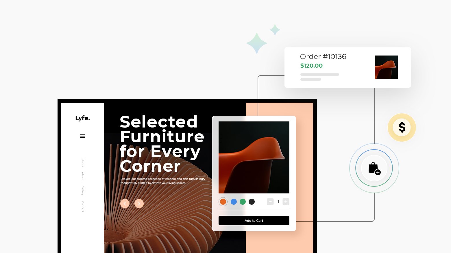
Staying ahead with cutting-edge design is important for online retailers aiming to attract and retain a loyal customer base as ecommerce expands. New design trends emphasize combining functionality with creativity, prioritizing intuitive navigation, immersive visuals, and hyper-personalization to meet modern shoppers’ expectations. These trends offer online retailers exciting avenues to increase user engagement, streamline the shopping journey, and build a distinctive brand presence.
This article will explore 22 ecommerce design trends shaping online retail in 2025, uncovering key opportunities for brands to differentiate themselves in a competitive market and strengthen customer loyalty.
FAQ
What are the current trends in website design?
What is the trend of ecommerce?
What is the future of web design in 2025?
What kind of design is good for an ecommerce website?

Create your online store in minutes!
Looking to sell online? Develop and launch your store with 10Web AI Ecommerce Website Builder.
Understanding ecommerce design trends
Ecommerce design trends shape how online stores look and work. These trends change fast as shoppers want new and better ways to buy things online. Keeping up with trends helps your store stand out and sell more.
Some top trends for 2025 include:
- Animated product reveals
- Immersive brand experiences
- Neo-brutalism style
- Whimsigothic visuals
- Personalized shopping
Animations make sites more fun to use. They can show products in cool ways or guide you through the site. Immersive experiences pull you into the brand’s world.
Neo-brutalism uses raw, stark designs. Whimsigothic mixes witchy and gothic looks. Both styles catch the eye and feel fresh.
Personalized shopping uses your data to show items you might like. This makes finding things easier and more fun.
Other trends to watch:
- Big, bold fonts
- Bright, saturated colors
- Curved shapes and frames
- Interactive elements
- Storytelling on product pages
These trends help make online shopping more engaging. They turn boring stores into exciting places to explore and buy.
Importance of keeping up with ecommerce design trends
Keeping up with ecommerce design trends is important for online retailers aiming to maintain a competitive edge. As technology and consumer preferences evolve, a modern design approach reassures customers that a brand is innovative, trustworthy, and user-focused. Failing to keep up can make a website feel outdated, potentially diminishing user confidence and loyalty.
Adopting current design trends improves functionality and usability, and keeps the shopping experience fresh, encouraging customers to return. Consistently refreshing design can also:
- Boost brand credibility by showing users that the business adapts to modern standards.
- Increase engagement through intuitive navigation and an enjoyable shopping journey.
- Drive higher conversion rates by fostering a positive and seamless user experience.

Create your online store in minutes!
Looking to sell online? Develop and launch your store with 10Web AI Ecommerce Website Builder.
22 ecommerce design trends
Ecommerce design is always changing. New trends pop up each year to help online stores look better and work better. Here are 22 trends that are shaping how online shops look and feel in 2025 and beyond.
1. Minimalist aesthetics
Minimalistic and clean design focuses on reducing visual clutter to enhance user experience and highlight key elements. This trend emphasizes clean lines, solid colors, and high-quality images, creating a premium look that feels both modern and luxurious. Brands can create an uncluttered aesthetic that lets products stand out, offering an intuitive and visually pleasing shopping experience by using neutral or pastel colors, ample white space, and simple shapes. This approach is especially effective for brands aiming for a luxurious and sophisticated feel while keeping the interface straightforward and easy to navigate.
Some key features of minimalist ecommerce design:
- Large product images
- Limited color palettes
- Simple, sans-serif fonts
- Plenty of white space
- Icon-based navigation
- Streamlined product pages
2. Dark mode UX
Dark mode is becoming a popular design choice for ecommerce websites. It helps reduce eye strain for users who spend a lot of time looking at screens. You’ll find dark mode toggles at the top of many retail sites and apps. Some even match the dark mode settings on your device.
Dark mode can make your site look modern and sleek. It lets you highlight important elements by making the background darker. This can draw attention to products, buttons, or other key features you want customers to notice.
When using dark mode, make sure your text is easy to read. Choose light colors that stand out against the dark background. You might need to adjust your product images to look good in both light and dark modes.
Some benefits of dark mode for your e-commerce site include:
- Less eye strain for users
- Modern, stylish look
- Easier to highlight important elements
- Potential battery savings on mobile devices
3. Micro-interactions
Micro-interactions are small animations that give feedback to users on websites. They make your site feel more alive and responsive. When you hover over a button and it changes color, that’s a micro-interaction.
These tiny details can make a big difference in how people use your online store. They guide users through tasks and make the shopping experience smoother. For example, a shopping cart icon might wiggle when you add an item.
Micro-interactions can also show that something is loading or confirm an action was successful. This helps keep shoppers informed and reduces confusion. A progress bar filling up as an order process is another good example.
Using micro-interactions can set your store apart from others. They add a fun, interactive element that keeps customers engaged. Just be careful not to overdo it – too many animations can be distracting.
- Hover effects on product images
- Animated “Add to Cart” buttons
- Loading indicators
- Confirmation messages
- Progress bars for multi-step processes

Create your online store in minutes!
Looking to sell online? Develop and launch your store with 10Web AI Ecommerce Website Builder.
4. 3D product visuals
3D product visuals are changing how you shop online. These realistic images let you see items from all angles, just like in a store. You can rotate, zoom in, and even customize products on your screen.
Many brands now use 3D visuals to showcase their items. This helps you get a better idea of what you’re buying. You can check out details like texture and size more easily.
3D product images often come with special features. You might be able to change colors or add parts to see how it looks. Some even let you place furniture in a virtual room to check if it fits.
These visuals can make shopping more fun and help you feel more sure about your choices. They show products clearly and can cut down on returns.
- Interactive 360-degree views
- Customization options
- Virtual try-on for clothes and accessories
- Augmented reality for placing items in your space
- High-quality textures and lighting
5. Mobile-first design
Mobile-first design puts smartphones at the center of the online shopping experience. This approach makes sure websites work well on small screens first. Designers create layouts that fit phone screens and then add features for bigger devices.
Mobile-first design uses simple menus and big buttons that are easy to tap. Images are sized to load quickly on phones. Text is clear and readable without zooming. Forms are short and simple to fill out on small screens.
This design style helps more people shop on their phones. It can lead to more sales since many shoppers use mobile devices. Sites that work well on phones also rank higher in search results.
- Easy-to-use navigation
- Fast-loading pages
- Large, tappable buttons
- Simplified checkout process
- Responsive product images
6. Personalized experiences
Online stores are getting better at giving you a custom shopping experience. They use data about what you’ve looked at and bought before to show you items you might like. This makes it easier to find things you want.
Some sites let you make a profile with your sizes and style preferences. Then they can suggest clothes that fit you well. Others remember what you’ve put in your cart and show similar products.
You might see personalized product recommendations on the home page or in emails. These are based on your past activity. Some stores even change their layout or content for each shopper.
- Custom product suggestions
- Tailored email offers
- Personalized home pages
- Size and style profiles
- Saved shopping carts
- Targeted ads based on browsing history

Create your online store in minutes!
Looking to sell online? Develop and launch your store with 10Web AI Ecommerce Website Builder.
7. Sustainable design
Eco-friendly design is gaining traction in ecommerce. You’ll see more sites using green color schemes and nature-inspired imagery. Product pages highlight sustainable materials and ethical practices. Brands showcase their eco-credentials through certifications and impact reports.
You’ll notice minimalist layouts that reduce digital clutter and energy use. Sites optimize images and code to lower their carbon footprint. Some offer carbon-neutral shipping options at checkout.
Reusable packaging gets featured prominently. You’ll find more products made from recycled materials. Sites educate customers on proper recycling and upcycling.
- Green color palettes
- Nature-inspired graphics
- Sustainability certifications displayed
- Carbon footprint calculators
- Eco-friendly shipping choices
- Recycled and recyclable product options
8. AI-powered chatbots
AI chatbots are changing how online stores talk to customers. These smart helpers can answer questions, give product info, and help with orders at any time. They make shopping easier and faster for you.
Many top stores now use AI chatbots. They can understand what you’re asking and give helpful answers right away. This means you don’t have to wait for a human to help you.
Chatbots can also suggest products based on what you like. They remember your past choices and show you things you might want to buy. This makes shopping more fun and personal for you.
Some cool features of AI chatbots include:
- Quick answers to common questions
- Help to find the right products
- Order tracking and updates
- Personalized product suggestions
- Available 24/7
9. Voice commerce
Voice commerce is changing how people shop online. You can now use voice assistants like Alexa or Siri to buy products. This makes shopping easier and faster.
Voice shopping is growing fast. By 2023, voice-based purchases could reach $20 billion worldwide. That’s four times more than in 2021.
Many shoppers use voice to research products. About half of voice users look up items this way. It helps them find new things to buy.
Voice commerce opens up new ways for brands to connect with customers. It can suggest products that fit what people are looking for. This helps turn curious shoppers into buyers.
To make voice shopping work well, online stores need clear product descriptions. They should focus on key features and benefits. Using simple language helps voice assistants understand and share product info correctly.
- Easy reordering of past purchases
- Voice-activated shopping lists
- Personalized product recommendations
- Quick price comparisons
- Hands-free checkout process

Create your online store in minutes!
Looking to sell online? Develop and launch your store with 10Web AI Ecommerce Website Builder.
10. Augmented reality shopping
Augmented reality technologies are transforming ecommerce by allowing interactive and immersive product experiences. Through 360-degree views, 3D imaging technology, and virtual try-ons, shoppers can engage with products more realistically, improving confidence in their purchases.
Features like virtual tours and immersive showrooms offer a personalized shopping experience, allowing customers to visualize products in their own spaces or explore them in detail. By integrating interactive visual design techniques and custom graphical touch, these technologies drive higher customer engagement rates, creating a unique and compelling online shopping journey.
- Virtual try-ons for clothes and accessories
- 3D product views from all angles
- AR-powered store navigation
- Interactive product demos
- Customization tools for personalized items
11. Inclusive design
Inclusive design is a big trend in ecommerce. It means making your online store easy for everyone to use. This includes people with disabilities, older folks, and those who speak different languages.
You can start by adding alt text to images. This helps people who use screen readers. You can also make sure your site works well with keyboard navigation. This helps those who can’t use a mouse.
Color contrast is important too. It makes text easier to read for people with vision issues. You might want to add captions to videos. This helps deaf users and those who prefer to watch without sound.
Don’t forget about language options. Offering your site in multiple languages can boost your customer base. You can also use simple, clear language to help all users understand your products.
- Large, easy-to-click buttons
- Adjustable text size
- Voice search option
- Clear product filters
- Easy return policies
12. Bold typography
Bold typography grabs attention and makes a statement on ecommerce sites. You can use it for headings, product names, and key information to guide shoppers. Large, heavy fonts create a visual hierarchy and highlight important details. This helps customers quickly find what they’re looking for.
When using bold text, pick fonts that are easy to read. Sans-serif typefaces often work well for this purpose. Pair bold fonts with lighter ones for contrast. This creates visual interest and improves readability.
Remember to use bold typography sparingly. Too much can overwhelm visitors and make your site hard to navigate. Stick to using it for the most important elements on each page.
Some ways to incorporate bold typography:
- Oversized product names
- Eye-catching sale banners
- Prominent call-to-action buttons
- Large section headings
- Emphasized key product features
13. Illustrated graphics
Illustrated graphics are making a big splash in ecommerce design. You’ll see more websites using custom drawings and animations to catch your eye. These fun visuals help brands stand out and show off their personality. They can explain products in a clear, simple way too.
Many online stores now use illustrated characters or mascots. These friendly faces guide you through the shopping experience. You might spot them pointing out deals or explaining how to use products.
Product pages are getting creative with illustrations as well. Instead of just photos, you’ll find cute drawings showing off key features. This makes it easier to understand what you’re buying at a glance.
Checkout pages are livening up with illustrated graphics too. Cute icons and progress bars make the buying process feel less boring. You might see animated characters celebrating when you complete your purchase.
- Colorful product diagrams
- Illustrated size charts
- Animated how-to guides
- Playful error messages
- Illustrated shipping tracking

Create your online store in minutes!
Looking to sell online? Develop and launch your store with 10Web AI Ecommerce Website Builder.
14. Minimal navigation
Minimal navigation makes online shopping easier. It cuts down clutter and helps you find what you need fast. Many stores now use simple menus with just a few main choices. This keeps things clean and lets products shine.
You’ll often see slim top bars with only key links like Shop and About. Some sites hide the full menu behind a hamburger icon. When you click it, a neat list pops up.
Drop-down menus are getting simpler too. Instead of long lists, they show the main groups first. You can then dig deeper if needed.
Search bars are big and clear, often right at the top. This lets you jump straight to what you want.
Some other minimal navigation features:
- Sticky headers that stay as you scroll
- Side menus that slide in and out
- Breadcrumbs to show your path
- Back-to-top buttons for easy returns
15. Storytelling layouts
Storytelling layouts help you connect with customers on a deeper level. These designs use visuals and text to create a narrative around your products. You might see full-width images with overlaid text that tell a brand’s story. Or product descriptions that incorporate personal anecdotes or origin tales.
These layouts often feature scrolling effects that reveal new elements as you move down the page. This keeps shoppers engaged and curious to see what comes next. You’ll find more white space in these designs, giving each element room to breathe and make an impact.
Photos play a big role in storytelling layouts. They’re often large, high-quality, and show products in use or in lifestyle settings. This helps customers picture themselves using the items.
Some key features of storytelling layouts include:
- Timeline-style product histories
- Customer testimonials woven throughout the page
- Behind-the-scenes content about product creation
- Interactive elements that let users uncover more of the story
16. Interactive product demos
Interactive product demos are becoming a key trend in ecommerce design. These demos let you explore products in detail before buying. You can see how items work and interact with them virtually. This helps you make better choices and feel more confident about your purchase.
Many online stores now use 3D models and augmented reality. You can rotate products, zoom in on features, and even place items in your own space. This gives you a clearer idea of size, color, and fit.
Some sites offer guided tours of their products. You can click through different features and learn how to use them. This is great for tech gadgets or complex items.
Video demos are also popular. You can watch short clips showing products in action. This helps you see how things work in real life.
Interactive demos can increase sales by:
- Reducing returns
- Increasing customer satisfaction
- Helping you find the right product faster
- Making shopping more fun and engaging
17. Animated loading pages
Animated loading pages are becoming popular in ecommerce design. These pages keep shoppers engaged while content loads. You’ll see fun animations like spinning icons, progress bars, or brand mascots in motion. They turn waiting time into a brief moment of delight.
Some sites use animated loading pages to tell a quick brand story. Others showcase product teasers. The key is to keep it short and interesting. Too long, and shoppers might leave.
These pages also give you a chance to set expectations. You can hint at what’s coming or highlight a special offer. It’s a smart way to use those few seconds of loading time.
Remember, the animation should match your brand style. Keep it simple and smooth. The goal is to entertain, not distract.
- Moving logos or icons
- Animated product previews
- Loading bars with fun themes
- Brief brand storytelling animations
- Countdown timers for special events

Create your online store in minutes!
Looking to sell online? Develop and launch your store with 10Web AI Ecommerce Website Builder.
18. Unconventional and multidirectional layouts
Unconventional and multidirectional layouts bring a fresh, dynamic approach to ecommerce design, creating unique and memorable browsing experiences. These layouts use asymmetrical elements, layering, and split-screen functionalities to guide users through a multidimensional journey that feels both engaging and modern.
Features like diagonal scrolling and side-by-side product comparisons improve interactivity, allowing users to explore products in new ways and focus on their shopping journey. With dynamic white space and multidirectional flow, these layouts appeal especially to younger demographics seeking an innovative and visually exciting online experience.
Some benefits of grid-based layouts for ecommerce:
- Better visual organization
- Easier product comparisons
- Faster page loading
- Simpler responsive design
- Consistent look across the site
19. Infinite scrolling
Infinite scrolling is a popular design trend for ecommerce sites. As you scroll down a page, more products load automatically. This creates a smooth browsing experience without clicking through multiple pages. It works well on mobile devices where tapping small page numbers can be tricky.
Many shoppers like infinite scrolling because it’s easy to keep looking at products. You don’t have to stop and click to see more. This can lead to more time spent on a site and potentially more sales.
But infinite scrolling isn’t right for every online store. It can make it hard to find specific items or return to products you’ve seen before. Some shoppers prefer traditional page numbers for easier navigation.
- Continuous product loading
- Mobile-friendly design
- Increased browsing time
- Seamless shopping experience
- Potential for higher engagement
20. Neuromorphic design
Neubrutalism and Vaporwave aesthetics bring bold, unconventional styles to ecommerce, helping brands create memorable and distinct identities. Neubrutalism features thick shadows, raw textures, and unexpected layouts for an edgy, unpolished feel, while Vaporwave draws on neon pastels, futuristic imagery, and psychedelic typography inspired by cyberpunk culture. Together, these aesthetics allow brands to break from traditional designs, crafting experiences that resonate with younger, tech-savvy audiences looking for fresh, unique visuals.
In ecommerce, neuromorphic design can make shopping more engaging. Product cards might have a slight lift, inviting you to click. Navigation menus could appear as raised buttons, making them easy to spot and use.
Colors in neuromorphic design are usually muted and calming. This can help reduce eye strain during long browsing sessions. You’ll often see light grays, soft blues, and pale pinks used to create a soothing shopping environment.
Other features of neuromorphic design in ecommerce include:
- Rounded corners on elements
- Minimal color palettes
- Soft, diffused shadows
- Interactive elements that respond to clicks
- Subtle hover effects on buttons
21. Circular layouts
Circular layouts are gaining popularity in ecommerce design. You’ll see more websites using rounded shapes and curved elements to create a softer, more organic look. This trend moves away from rigid grid structures to a more fluid layout.
Circular designs can guide your eyes around the page in a natural way. They can highlight key products or sections. You might find circular product images or round buttons that stand out. These shapes can make your site feel more approachable and friendly.
Some brands use circular layouts to create a unique browsing experience. You could see product carousels that rotate in a circle. Or maybe a circular menu that spins to reveal different categories.
- Rotating product displays
- Curved section dividers
- Circular navigation menus
- Round hover effects
- Bubble-shaped content areas

Create your online store in minutes!
Looking to sell online? Develop and launch your store with 10Web AI Ecommerce Website Builder.
22. Brutalism aesthetics
Brutalism in web design is making a comeback. This raw, minimalist style puts function before looks. You’ll see stark layouts with basic shapes and bold colors. Text is often big and easy to read. Images are simple or absent.
Brutalist sites don’t try to be pretty. They aim to be honest and direct. You might see exposed HTML elements or unpolished designs. It’s like seeing the bare bones of a website.
This trend fits well with some ecommerce brands. It can make your store stand out from sleek, polished competitors. Brutalism can give your site an edgy, rebellious feel.
But be careful. This style isn’t for everyone. It might turn off some shoppers who expect a more refined look. Test it with your audience before going all-in.
- Large, bold typography
- Monochrome color schemes
- Visible grid systems
- Lack of decorative elements
- Use of system fonts
Conclusion
Incorporating some of these 22 ecommerce design trends can position online retailers at the forefront of online shopping in 2025, offering customers a seamless, engaging, and memorable experience.
Embracing innovations in design and user experience, allows brands to attract a broader audience and build stronger, long-term relationships with customers. As these trends continue to evolve, staying adaptable and responsive to customer needs will be key for businesses aiming to thrive in an increasingly dynamic online market.


