
Your downloadable brand kit metadata should include clear file names, usage notes, file format details, dimensions, color codes, version history, licensing info, related guidelines, search tags, and a contact person for every asset in your kit. Now, let’s slow down for a second.
If you’ve ever sent someone a logo and later seen it come back stretched, pixelated, or in completely the wrong color, you know the pain of poor brand kit organization. It chips away at the trust and professionalism your brand works so hard to build.
I’ve been digging into how different teams handle this, even went through Reddit threads where people openly shared what works and what doesn’t. The pattern was clear: if your files have the right metadata, people use them correctly. If not, you’re stuck answering the same “Which one should I use?” questions forever.
Let’s walk through exactly what to include so your brand kit becomes a one-stop, foolproof resource.
Why is metadata critical in a brand kit?
Metadata is simply the extra information that explains what a file is and how to use it. Think of it like the label on a spice jar: you might recognize the look, but the label tells you exactly what’s inside and how it’s meant to be used. When your brand kit has good metadata:
- People find the right file faster.
- Partners and chapters stay consistent without you micromanaging.
- You don’t have to resend the same logo 15 times a year.
One nonprofit manager I read about on Reddit used to send PNGs and hex codes by email whenever a partner asked for them. Now, everything’s in one clean labeled kit with notes, so those requests have dropped to almost zero.
Essential downloadable brand kit metadata checklist
Here’s what our 10Web design team recommends adding to every asset in your brand kit.
1. File name and version control
Clear names make it obvious which file is which. Instead of logo.png, go for something like Logo_Primary_RGB_v3. That little bit of detail tells people the exact version, color mode, and purpose.
I talked to our design team at 10Web, and here’s how they handle it:
- Inside the office: Everyone shares the latest version directly, with clear file names like 10Web-logo-(black).png. No one has to guess which file to use.
- Outside the office: We always attach the brand guidelines. That way, partners know exactly which colors, sizes, and placements are correct (and which are not). The guidelines include “do’s and don’ts,” spacing rules, and visual examples to prevent misuse. So, let’s see these additional guidelines.
2. Description / usage notes
This is where you give quick guidance. Keep it short but specific, like: “Use on light backgrounds only. For dark backgrounds, see the reverse version.” It’s amazing how many brand slip-ups happen because people think they know when to use something but don’t check. A one-sentence note here can save you from ugly design mistakes.
3. File format & suitable uses
Not everyone knows the difference between PNG, SVG, and EPS, and they shouldn’t have to Google it. Spell it out right in the metadata:
- PNG is best for web and social media.
- SVG/EPS is scalable for large print or signage.
- PDF is shareable final layouts.
This prevents someone from printing a blurry PNG on a 10-foot banner.
4. Dimensions / resolution
Include the size in pixels for digital and DPI for print. For example: “1200×628 px (web) at 72 DPI” or “Print-ready at 300 DPI.” If the dimensions are there, people know instantly if it will work for their project, no trial and error.
5. Color information
List your HEX, RGB, CMYK, and Pantone values. If there are multiple brand colors in the asset, list them all. That way, whether someone’s designing a social ad or printing merchandise, they’ll use the exact shades, not “something close enough.”
6. Version history / date updated
Add the last update date and a quick note on changes: “Updated August 2025 – adjusted spacing for better readability.” This helps people trust that what they’re using is current, not the 2019 version from their Downloads folder.
7. Licensing & rights
If there are restrictions, make them impossible to miss. For example, “photography licensed for internal use only, not for paid advertising.” It’s better to be clear here than deal with legal headaches later.
8. Related brand guidelines
Link to the exact section in your guidelines that covers this asset. That way, if someone needs more detail from your downloadable brand kit metadata, they can get it without hunting through 40 pages.
9. Tags & keywords
If your files live in a cloud folder or DAM system, tags like “social header” or “email signature” make them much easier to find.
10. Owner / contact person
Sometimes, people need an exception or special file. Make it clear who to reach out to so they’re not guessing or emailing five people at once.
Examples of metadata in action
Let’s say you have your primary logo in your kit. Here’s what the metadata might look like:
| Field | Example |
| File name | Logo_Primary_RGB_v3 |
| Description | Use on light backgrounds only. Reverse version for dark backgrounds. |
| Format | PNG, SVG |
| Dimensions | 1200×628 px (web), scalable SVG (print) |
| Colors | HEX #000000, RGB (0,0,0) |
| Updated | Jan 2025, adjusted spacing |
| Licensing | Internal and partner use only |
| Guidelines link | Brand Guidelines – Logos [linked] |
| Tags | logo, primary, digital, print |
| Contact | Jane Smith – jane@company.com |
You can apply the same format to fonts, photography, templates: anything in your brand kit.
How to add metadata to your brand kit?
Getting your files organized is easier than you think. Just right-click any file and hit “Properties” on Windows or “Get Info” on Mac. You can then add a proper title, some tags, and a quick description that actually makes sense.
Most design programs like Illustrator or even basic Microsoft Office let you bake this information right into the file. That means no matter who gets their hands on it or where it ends up, all your helpful notes come along for the ride.
For files stored in the cloud (Google Drive, Dropbox, or a Digital Asset Management (DAM) tool), use the built-in description and tagging fields. This makes searching and sorting your assets a whole lot easier for everyone.
Let’s say, you’re part of a smaller team without a DAM system, online brand kits are a quick and easy way to keep your logos, colors, fonts, and notes in one place, without setting up anything complicated.
What if you don’t have a brand kit yet?
Here’s something I noticed while talking to people about metadata: some don’t even have a proper brand kit to add metadata to. If that’s you, don’t worry, you don’t need weeks of design work to make one.
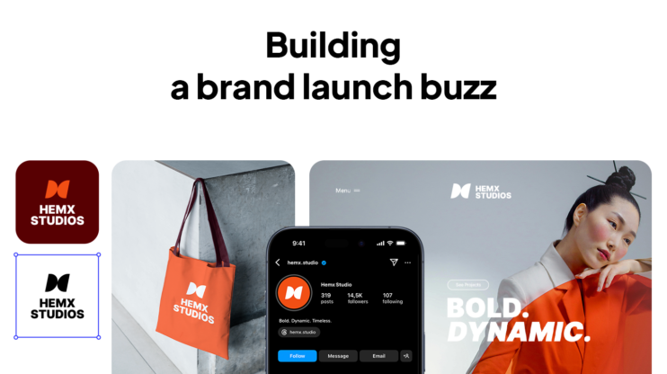
Tools like 10Web Branding Kit can create one for you in seconds. You just type a short description of your brand, and the AI instantly generates:
- Your logo
- Your slogan
- A color palette
- A favicon
- A full website structure
- Social media kits and more
It’s completely free, and the downloadable option for your assets is coming soon. Once you have that kit, you can add the metadata we’ve talked about here to make it truly ready for anyone to use.
Describe your brand and get complete brand assets.
Go from idea to brand in minutes.
Wrap-up
If there’s one thing to remember about downloadable brand kit metadata, it’s this: a brand kit with the right metadata is a brand kit people can actually use, confidently and consistently. If you don’t have a kit yet, you can spin one up in seconds with 10Web’s free Branding Kit, then add these details to make it truly bulletproof.
FAQs
What’s the difference between metadata and brand guidelines?
Do I need all these fields if I’m a small nonprofit?
Can I use free tools to manage metadata?