
Most people decide where to eat before they even leave the house, and the first thing they do is check out places online. They look at the website, and if it’s clunky, confusing, or hiding the menu in a download link… they’re already looking elsewhere.
Your website is your first impression, your brand, and your silent host. That’s why I pulled together 11 restaurant websites that do it right. What I want you to get out of this article is how you can use certain aspects of each restaurant website example in the best possible way for building your own site. Each example will have takeaways, so I suggest looking at these carefully to see which you resonate with.
What should a restaurant website include?
If you want your restaurant website to actually bring in more bookings and orders, the basics need to be instantly clear. Top search results usually highlight sites that make it easy for diners to find what they need in seconds.
Most great restaurant websites include a few key things:
- A menu people can actually read. Your menu shouldn’t be hidden behind three clicks or stuck in a slow PDF. Visitors want to scan it quickly, especially on mobile.
- Reservations or ordering that takes zero effort. Booking a table should feel effortless. The best sites use obvious “Reserve” or “Order Now” buttons right at the top.
- Location, hours, and contact info upfront. People searching “restaurant near me” are usually ready to visit. Make sure your address, hours, phone number, and map are impossible to miss.
- A mobile experience that doesn’t feel like an afterthought. Most diners are browsing on their phones. If your site loads slowly or feels clunky to scroll through, they’re gone.
- Photos that make people hungry (and build trust). Strong food and interior photos do a lot of the selling for you. Bad photography does the opposite, fast.
- Simple navigation that doesn’t make people work. Nobody wants to hunt for the menu or the booking link. A clean, obvious structure converts better than anything fancy.
- A vibe that matches the actual restaurant. Your website should feel like your space. Trendy, cozy, upscale, casual — whatever your brand is, your design should support it.
Quick takeaway:
A good restaurant website should answer everything in under 10 seconds: What’s the food? Where are you? And how do I book or order?
What if building the right website like this wasn’t so hard?
So, there’s a lot more to a good restaurant website than just a nice photo, plus, the whole thing needs to feel like your restaurant.
Of course, there are plenty of tools out there you could try to build the right website for you. You could even hire a developer or designer. Most will probably hit your wallet hard and still leave you without full control.
With 10Web, it’s a different story. It’s an AI-powered restaurant website generator that understands what restaurants need and builds the full site for you. You just need to:
- Tell the AI about your restaurant: Just a few quick things: your name, what kind of place you run, what vibe you want, and what pages you need.
- Let the AI build your site for you: You’ll get a full draft in seconds. Homepage, menu page, booking buttons, images, and text, all designed to fit your concept.
- Make it yours and go live: You can customize any part of the website: colors, fonts, photos, layout, and content, then publish your site.
What makes 10Web’s AI Website Builder different?
You’re not just getting a template. You’re getting a full restaurant website, built and managed by AI, with tools that make growing your business easier from day one. Here’s what you get out of the box:
- AI-powered creation & editing: Tell the AI what you do, and it builds your site. Want to change something? Just type it in a chat with AI, and it’ll handle everything.
- Performance that converts: Fast load times and mobile-optimized layouts make a great first impression (and boost your search ranking).
- Hands-off tech management: Hosting, backups, security, and updates are all included, so you can stay focused on the kitchen and reservations.
- Built-in business tools: Add bookings, payments, ecommerce, or email marketing in a few clicks, no extra plugins or platforms.
- Save time and money: No designer, no developer, no hidden fees. Launch faster and spend less keeping it running.
You bring the vibe, 10Web takes care of the rest.
Create your dream website with 10Web AI Website Builder 
Build your website in 1 minute
and take your business online!
11 best restaurant website examples
Every site below nails one job: menu clarity, friction-free booking, brand vibe, or mobile speed. I’ll highlight what works, what you can borrow, and what to skip, plus mini warnings so you don’t repeat their mistakes.
2 restaurant websites that nail menu clarity and usability
Your menu is one of the main reasons why people come to your site in the first place. Don’t make them work to find it. These restaurant website examples make that ridiculously easy, and each does it a little differently.
1. Pastaria
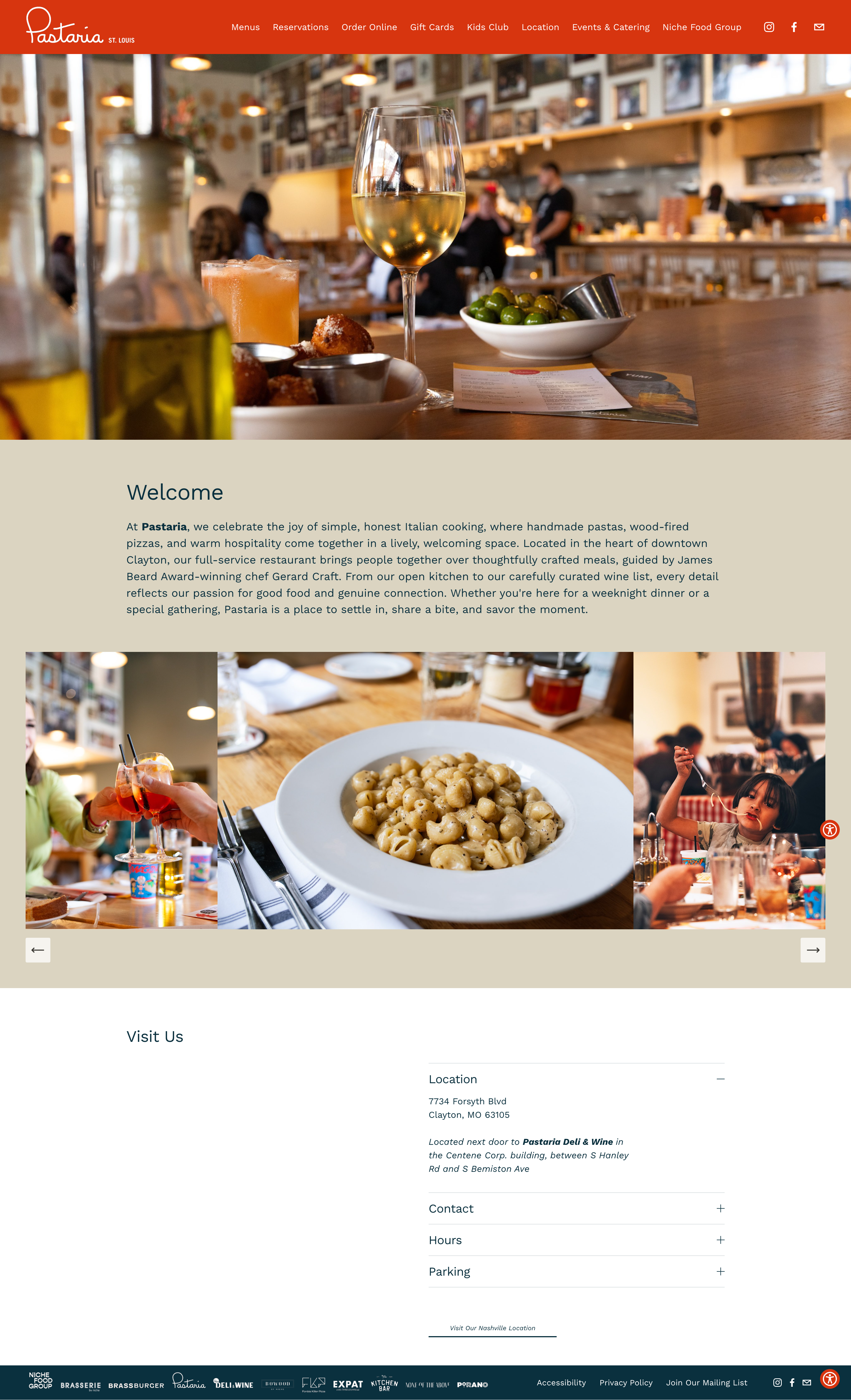
The menu is the very first thing in Pastaria’s navigation bar, with dropdowns that let you jump straight to lunch, dinner, dessert, or drinks. That saves visitors from aimless scrolling and gives them exactly what they came for.
Main takeaways:
- Lesson: Make your menu impossible to miss, and break it down clearly.
- Steal-this-idea: Use labeled dropdowns for quick access to specific meal types.
- Watch-out: Whimsical fonts work here, but test readability on mobile.
2. Adachi
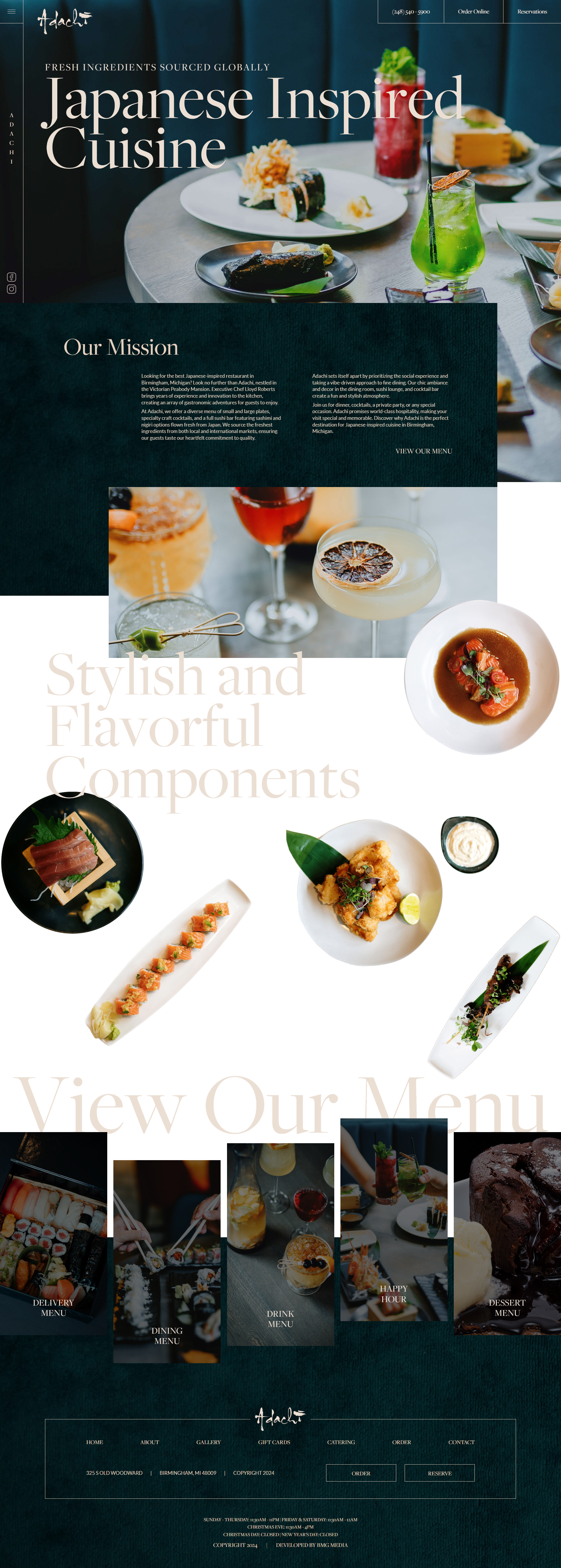
Adachi puts its menu near the bottom of the homepage but makes it easy to use: clearly labeled buttons for dining, drinks, dinner, dessert, and happy hour that link to fast-loading PDFs. I don’t usually recommend PDFs since it’s tricky to ensure accessibility, but if you go that route, this is the cleanest way to do it: with large letter size and minimal photos.
Main takeaways:
- Lesson: If you’re sticking with PDFs, make them short, fast, and clearly labeled.
- Steal-this-idea: Group menu types into clickable buttons so users can scan quickly.
- Watch-out: Mobile-first users often abandon sites that force them to download files.
3 booking flows that actually make people complete the reservation
Diners hate jumping through hoops just to make a reservation or place an order. These sites keep it simple: fast access, clear options, no logins, no guessing.
3. Yang’s Kitchen
One thing I love about Yang’s Kitchen is that the top navigation gives you quick access to: Reserve, Order Pickup, and Order Delivery. You’re not mixing dine-in with takeout: you click, and you’re in. That kind of clarity removes friction. Customers instantly know what to do, which makes them way more likely to follow through.
This might sound small, but it solves a big problem: when sites dump too many options in your lap or hide them behind menus, people hesitate, get annoyed, and leave. Yang’s Kitchen avoids all that. They show you the door and hold it open.
- Lesson: Every action should have its own clear entry point.
- Steal-this-idea: Give dine-in, pickup, and delivery in the navigation bar.
- Watch-out: Don’t overthink it. Simplicity converts better than cleverness.
4. Sweet Cheeks Q
Sweet Cheeks Q takes a slightly different approach: when you hit Reserve from the reservation page, it doesn’t open a new one. You get a quick pop-up form right there on the site. That means less waiting, fewer clicks, and no risk of users bailing mid-process. Everything’s right in front of you: number of guests, date, contact info, done.
Main takeaways:
- Lesson: Fewer steps = fewer lost customers.
- Steal-this-idea: Use a pop-up form that keeps users in the flow.
- Watch-out: Repetition helps. Remind people to book more than once.
Quick note on menus: In the menu section earlier, I mentioned how important legibility and accessibility are. Sweet Cheeks Q mostly gets it right, until you hit the color contrast. White text on a pink background might look bold, but it’s hard to read for some visitors, especially on mobile. Just a reminder: if customers can’t read your menu in two seconds, they’ll stop trying. Style should never come at the cost of usability.
5. Frantzen
Frantzén is a luxury dining spot, and it shows. The homepage doesn’t give you a bunch of choices, it sets a mood. There’s no main navigation. No links scattered everywhere. Just one button: Reservation. It’s right in the header, and when you click it, a sleek little pop-up appears where you choose your date, time, and party size. That’s it.
What works here is intent. They’re not trying to do five things; they’re doing one thing well. For a fine dining restaurant, that kind of confidence actually builds trust. You feel like you’re being invited, not sold to.
Main takeaways:
- Lesson: When the experience sells itself, don’t distract from it.
- Steal-this-idea: Use a single clear CTA if reservations are your top goal.
- Watch-out: This works for high-end brands—but casual spots may need more up front.
3 sites that instantly communicate their restaurant’s vibe
Besides showing the menu and reservation, these restaurant websites make you feel what it’s like to walk through the door. All three use different methods to do so: color, photography, personality-packed copy, and more. Let’s see how each builds a vibe that matches the dining experience.
6. MIDA
MIDA nails brand identity with just a few thoughtful choices. The soft pink palette is unexpected for an Italian spot, but it works: it feels warm, modern, and neighborly. Right below the hero image, a short positioning line explains exactly what MIDA stands for: great food, shared meals, and community. The visuals, fonts, and message are all in sync, and it makes the site feel like an extension of the dining room.
Main takeaways:
- Lesson: A few well-aligned design choices tell your whole story.
- Steal-this-idea: Use color and copy to reinforce your vibe right away.
- Watch-out: Don’t just “go pretty,” make sure your aesthetic matches your values.
7. Bon Bouquet Cafe
Bon Bouquet is bright, animated, and full of movement, and it totally works. The café’s brunch spot is known for its tropical, maximalist aesthetic, and the website leans all the way in with fun colors, hover effects, and parallax scroll animations. Normally, this much motion might overwhelm a user, but here, it mirrors the energy of the café itself. It’s chaotic in a way that feels intentional.
Main takeaways:
- Lesson: If your space is lively, don’t be afraid to let your site be, too.
- Steal-this-idea: Use interactive elements to reflect your in-person atmosphere.
- Watch-out: Too much movement can backfire. Test usability on real devices
8. Anton’s
Anton’s goes all-in on photography, and that’s the right call. The homepage is mostly images: moody, editorial-style shots of food, wine, and interior details that ooze nostalgic charm. There’s not much text, and you don’t need it. The photos are the story. Each one gives you a glimpse of what it feels like to eat there, and the grid layout keeps things feeling polished without being too slick.
Main takeaways:
- Lesson: Great photography sells mood, not just meals.
- Steal-this-idea: Use large, well-lit images to create an emotional pull.
- Watch-out: Low-quality photos kill trust fast. Invest in a pro if needed.
Create your dream website with 10Web AI Website Builder
Build your website in 1 minute
and take your business online!
3 mobile-friendly restaurant websites that feel smooth and fast
Lots of hungry diners check restaurant websites on their phones. If your site doesn’t load fast, show key info immediately, and feel good to scroll through, they’re out. These three sites do mobile right, each in a different way.
9. Federalist Pig
Federalist Pig is built for scrolling. Instead of cramming everything into one block, they break up content into short, punchy sections (Happy Hour, Chef’s Special, Lunch Combos”) that are perfect for thumbing through on a phone. Each block has its own CTA, and the “Order Now” button pops up multiple times so you never have to search for it.
Main takeaways:
- Lesson: Great mobile design means clear chunks, short scrolls, and easy exits.
- Steal-this-idea: Repeat key CTAs throughout your homepage to keep them visible.
- Watch-out: Don’t rely on one giant hero section to say it all. Mobile users will scroll, just give them reasons to keep going.
10. The Original
The OG site immediately tells you where it is, right up top. It’s a win for mobile users searching “near me.” The menu loads cleanly, sections are swipe-friendly, and their event listings feel built for skimming. There’s no heavy loading or buried info, but simple location, food, and what’s on now.
Main takeaways:
- Lesson: Put location, hours, and events above the fold for mobile users.
- Steal-this-idea: Lead with geo context to convert “near me” searchers faster.
- Watch-out: Don’t bury local info under generic brand statements.
11. Smith & Wollensky
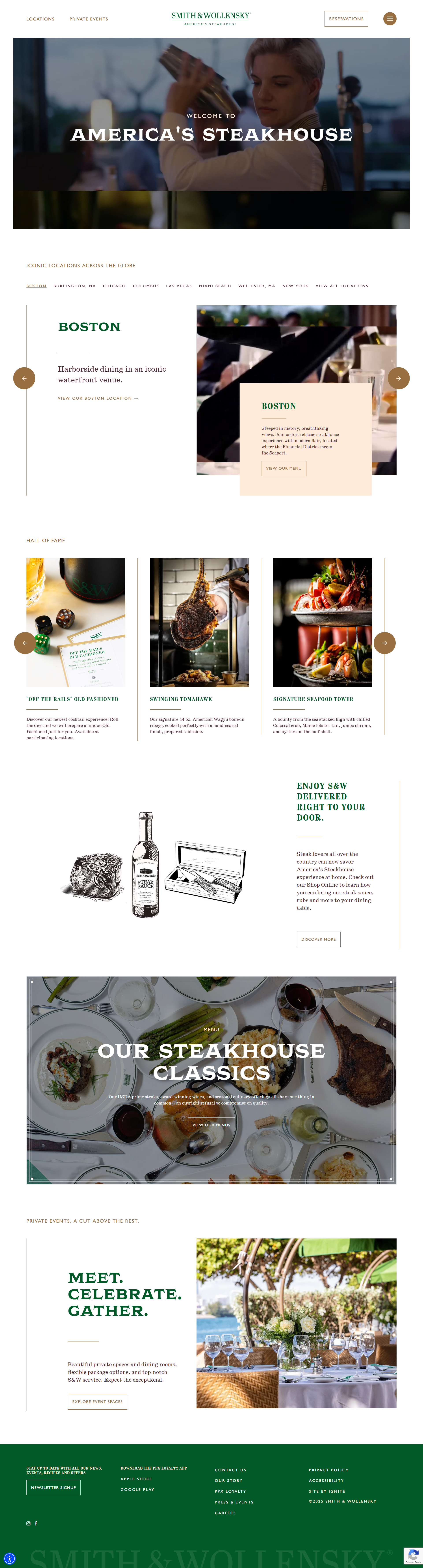
Smith & Wollensky is a great example of mobile-first visual hierarchy. The video and large food photos load instantly and take center stage, creating instant desire. The “Find a location” dropdown is right up top, and their Shop Online feature actually works smoothly on mobile.
Main takeaways:
- Lesson: Mobile users decide with their eyes. Make visuals do the selling.
- Steal-this-idea: Combine full-bleed food shots with a fast location picker.
- Watch-out: Avoid desktop-styled layouts that require zoom or swiping sideways.
Why most restaurant websites fail (and what to fix first)
According to an MGH survey of U.S. restaurant patrons, website usability issues can cause diners to lose their appetites. 68% have been discouraged from visiting a restaurant because of its website, and 62% decided not to order delivery for the same reason. So no, slapping your menu online and calling it a day doesn’t cut it.
Here’s what drives potential customers away, according to the same survey:
- 30% leave when menus are hard to find or read
- 33% bounce due to clunky or confusing navigation
- 30% lose interest when the site looks outdated or poorly maintained
That’s extra important on mobile, because so many diners check out a restaurant online before deciding where to go. So if your site isn’t mobile-friendly, you’re losing people before they even get a taste.
Your restaurant website needs to handle all of the above, and then some, if you want to stand out in a sea of local competitors. That’s why I’ve grouped these examples into specific categories, each one focused on a different takeaway you can apply to your own site. Watch for the types of content and functionality your diners want, and use the examples to put together the perfect restaurant website templates.
Is your website as good as your food?
If your site doesn’t instantly show your vibe, serve your food visually, and make booking or ordering effortless, it’s probably doing more harm than good. The 11 restaurant website examples above show that great restaurant websites focus on clarity, speed, and making visitors hungry for a visit.
Not sure where to start? Build your website with AI to create a stunning, mobile-optimized site in minutes, with no tech skills. Just tell the AI a few things about your restaurant, and it builds the whole thing for you. Hungry diners are only a click away. Make that first impression count!
Create your dream website with 10Web AI Website Builder Love the designs? Make them yours in a few clicks with 10Web AI Website Builder.
Build your website in 1 minute
and take your business online!Build your website in 1 minute
Create your website now for Free

