
If you’re reading this, you don’t need another roundup that praises clean design and clear CTAs. You need real law firm website examples that do the hard stuff: earn trust, calm clients’ nerves, and move people to act.
Most law firm websites I’ve reviewed aren’t just forgettable. They actively repel clients. They confuse, overwhelm, or worse – make you seem out of touch. A gavel icon won’t fix that. You need a better web design and content strategy.
The 11 sites in this list went through a screening process to save your time and show how smart design, bold positioning, and human language can make the difference between a visitor bouncing or booking a consultation.
11 law firm websites that influence client decisions
These examples are here to prove a point: your website design directly impacts whether someone trusts you enough to reach out. For each site in this list, I’ll highlight two things:
- What it does exceptionally well (and why it works).
- How it helps the firm connect with the real concerns of their clients, from fear and confusion to urgency and doubt.
For each one, you’ll also get three practical takeaways you can apply to your own site, so you’re not just admiring good design, you’re learning how to make it work for you.
1. Stanchieri Family Law
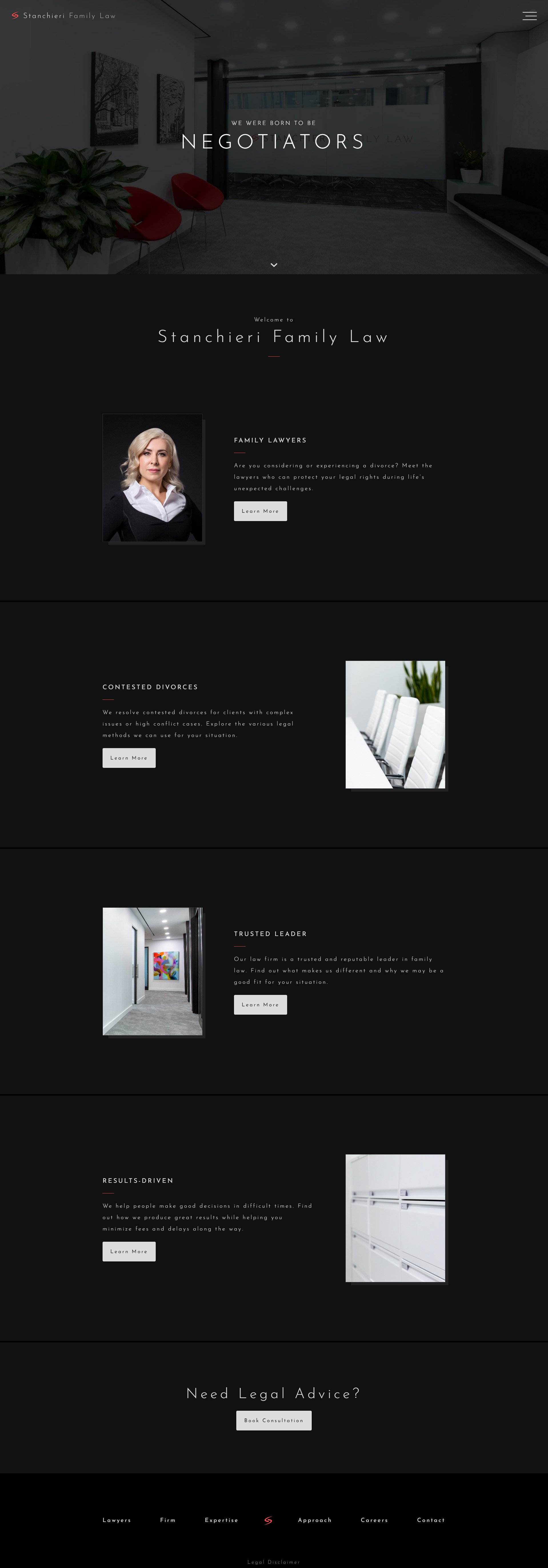
This site is an excellent example of how focused design can earn trust fast. They don’t try to appeal to everyone and make it immediately clear that they specialize in contested divorce cases. That’s important because someone searching for a divorce lawyer isn’t looking for a generalist; they’re looking for confidence and clarity in a stressful situation. The homepage delivers exactly that through niche-specific messaging, clean layout, and a logical structure that guides visitors straight to the information they need.
What to borrow from this website:
- Use your homepage to make your specialty unmistakable (don’t bury it under generic taglines).
- Break up your content into clear, digestible sections (e.g., who we are, what we do, how to start).
- Place consistent, action-focused CTAs (“Book a Consultation,” “Meet the Team”) in visible areas to reduce hesitation and guide visitors forward.
2. YLAW Group
YLaw’s homepage is like the opening scene of a series like Suits than a traditional law firm website. Cinematic visuals and sharp branding pull clients in and make it memorable compared to hundreds of other websites they’ve opened that day. Combining the visual with the confident tone, YLAW turned the idea of “professionalism” into something warm and human, without losing edge. For family law, that balance matters.
What to borrow from this website:
- Use bold visuals and color to make a strong first impression that signals tone and confidence.
- Avoid stiff, generic language (write like a human who understands emotional moments).
- Design each section to flow like a story (not a brochure), guiding visitors from intro to action.
3. Employment Law Center of Maryland
This site understands exactly who it’s speaking to: people who’ve just been fired, mistreated, or left in the dark by their employer. That first punch of copy, We Sue Bad Bosses, is for sure catchy, but it also speaks directly to that frustration. The homepage then backs it up with clickable boxes for every key practice area (wrongful termination, wage theft, discrimination), each leading to pages that explain the full legal context in plain English. It’s designed to feel like a path forward, not another obstacle.
What to borrow from this website:
- Use clear, clickable sections to help people instantly spot the issue they came with.
- Write headlines that reflect how your clients actually talk about their problems.
- Structure content to guide people from “I think I need help” to “I know what to do next.”
4. Jaszczuk P.C. Attorneys
Jaszczuk P.C. Attorneys breaks every expectation, in the best way. The bold color scheme, oversized fonts, and casual tone don’t dilute credibility, they enhance it. When you’re suing major corporations or defending high-stakes litigation, your site needs to say “we’re confident, not conventional.”
What to borrow from this website:
- Use bold, high-contrast visuals to stand out and signal confidence.
- Skip the boilerplate, write like a team that knows what makes you different.
- Let real personality shine through photos, bios, and easter eggs (without undermining credibility).
5. Trey Porter Law
This site treats every call-to-action like it matters, because it does. They have a sticky “Free Consultation” button to the bright, high-contrast prompts after each key section, and even more. All these elements are placed to make getting help feel easy. On mobile, it’s even sharper with no buried forms, pinching and zooming. You can take actions right where your thumb lands.
What to borrow from this website:
- Make your CTAs unmissable: high contrast, mobile-first, and always visible.
- Use language that reduces hesitation (“Free Consultation” beats “Submit”).
- Place buttons after every major content block—not just at the top or footer.
6. Tremain Artaza PLLC
This one feels like a long-awaited exhale, and I think that’s intentional. Instead of forgettable courtroom gavels or skyscraper stock photos, you get a peaceful landscape and a clear promise to make the client’s life easier. This might be a risky strategy of web design if the visuals are not paired with good copywriting, but when done right, it removes anxiety rather than adding it.
What to borrow from this website:
- Use soothing imagery and tone to lower tension in high-stress legal areas.
- Be transparent about pricing and process, uncertainty is what scares clients most.
- Keep navigation simple: no popups, no clutter, just clear paths forward.
7. Bick Law LLP
Here’s proof that your website is your authority, if it’s focused. Bick Law specializes in environmental law, and they highlight it. Industry awards, client testimonials, and a blog that covers real-time updates from a legal lens: it all signals they know their niche cold. That kind of clarity builds trust with clients and ranks better on Google.
Bonus: The bold visuals and clean layout are also excellent, but the real win is how confidently they own their space.
What to borrow from this website:
- Build your site around one niche and go deep, don’t dilute your expertise.
- Keep your blog updated with smart takes on current events in your field.
- Use awards, media mentions, and testimonials to prove you’re the go-to.
8. Fragomen
Fragomen could’ve built a site that just flexes their 70-year legacy and 6,000-person global team, but they didn’t. Instead, they lead with something far more persuasive: value. Their Knowledge Center, alerts, and explainers turn confusing immigration rules into bite-sized help. It’s trust-building at scale.
What to borrow from this website:
- Turn your insights into resources (checklists, explainers, tools) that help before you’re hired.
- Split your paths early (e.g., “For Companies” vs. “For Individuals”) to increase relevance.
- Don’t just talk about innovation, show how it makes your client’s life easier.
9. Reese Marketos
Reese Marketos isn’t trying to win you over with walls of text. It wins by showing strength: the header has only their name, a clear positioning, and a dropdown navigation to guide you, while the homepage opens with a mountain-climbing video with a couple of likes that signal ther serious approach of the law firm. Everything here feels precise, confident, and in control,. just like you’d want your trial team to be.
What to borrow from this website:
- Lead with a single bold visual that captures your firm’s energy or ethos.
- Replace long bios with case outcomes and sharp, high-trust proof points.
- Use interactive elements to show personality without compromising authority.
10. Taylor Janice Workplace Law
This site does something too many law firm websites skip: it builds two entirely different journeys: one for employees, one for employers. It’s not just smart; it’s respectful of your time. The header menu is split the same way, so you’re never stuck digging through info that doesn’t apply to you.
They also do a great job of showing they know the local laws. Each office (Calgary, Edmonton, Vancouver, Red Deer) has its own section with location-specific info, and there’s even a map so you can see exactly where they operate. That kind of detail builds trust, especially in employment law, where rules change from province to province.
What to borrow from this website:
- Create separate navigation paths for distinct audiences, don’t make users sort through irrelevant content.
- Localize your pages to show expertise in regional law, bonus points if you add office maps.
Important to note: Yes, there are a few stock photos used on the page, but they’re used in the background. The real trust comes from the actual lawyer photos throughout the site. So if you’re going to use stock at all, keep it subtle, and balance it out with real people. Otherwise, you risk looking generic.
11. TSMP Law Corporation
TSMP’s site shows wide service range: corporate deals, litigation, capital markets. All of those are neatly laid out, telling clients they can handle complex, multi-practice needs. Rankings in 14 areas and 8 award-winning lawyers are featured visually, not boastfully, making trust easy to build.
Bonus points for their “In the News” section, where partners share media appearances and legal takes, positioning TSMP as leaders, not just practitioners.
What to borrow from this website:
- Group a wide service offering into clear, scannable sections.
- Show off rankings and awards with confidence, but keep it clean.
- Use press mentions and published opinions to build thought leadership.
How to create your own law firm website
You’re a lawyer. You solve complex problems and navigate high-stakes situations daily. What don’t you have time for? Wrestling with clunky website builders or waiting weeks for a developer to make simple edits.
Yet, your website is often the first impression someone gets of your firm. If it’s outdated, hard to navigate, or doesn’t reflect your expertise, it’s costing you real clients. That’s where AI can finally make life easier.
With 10Web’s AI Law Firm Website Builder, you can build a professional, trust-building law firm website in minutes without any technical skills or hiring a team. Just tell the AI a few things about your practice, and it creates a complete site that’s clean, mobile-friendly, and built to convert.
Here’s how it works:
- Describe your firm: Add your services, style preferences, and goals.
- Let the AI build it: Get a ready-to-go website in minutes—pages, design, and structure done.
- Tweak it your way: Adjust branding, add bios, upload case wins, and publish.
Once you’re live and need to update something, just type what you want: “Add a new practice area,” “Update my contact info,” or “Change the homepage headline.” The AI handles it instantly.
Already have a site? You can migrate it for free and edit it with AI going forward.
Create your dream website with 10Web AI Website Builder 
Build your website in 1 minute
and take your business online!
Why 10Web is ideal for law firm websites
- It helps you build trust fast: Add real case results, testimonials, awards, anything that shows people why they should choose you. The AI makes it easy to put the right proof in the right places.
- You don’t deal with tech stuff: No more worrying about hosting, backups, or weird plugins breaking your site. It’s all handled, so you can just focus on your practice.
- Making updates is ridiculously easy: Want to add a new win to your homepage or change your services page? Just type what you want changed—done. No web guy required.
- It’s designed for people who are stressed and in a hurry: Clear menus, fast load times, and straightforward pages help potential clients find what they need, and take the next step without friction.
- You’ll show up in search and look good doing it: Built-in SEO and lead tools (like contact forms and call buttons) help more people find you and actually reach out.
- You get a pro-level site without the agency price tag: No big dev bill, no waiting weeks. You get a polished site that works hard from day one, and you stay in control.
Create your dream website with 10Web AI Website Builder
Build your website in 1 minute
and take your business online!
Build your own law firm website!
Successful law firm websites blend professional design with strategic functionality. The best sites present legal services elegantly while guiding potential clients smoothly toward consultation with their persuasive content, making what can be a daunting legal process feel more approachable and comfortable.
Ready to create your own impressive law firm website without the technical headaches? Skip the learning curve, use 10Web’s AI Website Builder and create your legal practice site with just a few clicks!
Turn these law firm website examples into your own success story. Create your professional, client-ready law firm website with 10Web in just minutes!
FAQ
About law firm websites
Do clients really care what my website looks like? What makes a website actually convert visitors into clients? Why not just hire a designer?
About AI Website Builder
I already have a site. Is AI just for people starting from scratch? What if I hate everything AI generates? Will I look like every other lawyer using this? Is this secure and legit enough for a law firm?
Create your dream website with 10Web AI Website Builder
Build your website in 1 minute
and take your business online!