
A wedding website is a central digital hub used to manage guest communication, automate invitation replies, and provide essential event logistics. To help you build a site that balances aesthetic appeal with functionality, we have analyzed 11 high-performing wedding website examples.
Whether you are looking for minimalist one-page designs, destination-specific travel hubs, or story-driven layouts, these real-world examples demonstrate the industry’s “best practices” for 2026. A successful wedding website must serve as a functional personal assistant, answering the five core questions: Who is marrying, What is the schedule, Where is the venue (with maps), What to wear/bring (dress code/registry), and Why the celebration matters.
In this guide, we break down why these specific examples work, what “don’ts” to avoid to prevent guest confusion, and how to use AI-powered builders like 10Web to generate a custom site in minutes.
What makes a wedding website work
Think of your wedding website like your personal assistant. It doesn’t just sit there looking pretty; it keeps your guests informed, organized, and out of your texts. If you want a site that does its job, there are 5 things you should do.
5 essential elements of a high-performing wedding website
A functional wedding website acts as a digital concierge, streamlining guest communication and logistics. To provide maximum utility, every site should follow the “5 W’s” framework of wedding guest experience:
| Element | Description | Why It’s Essential |
| Who | Couple’s story & personality | Establishes the tone and builds emotional connection with guests. |
| What | Full event schedule & timeline | Eliminates confusion regarding ceremony start times and reception details. |
| Where | Venue locations & travel maps | Provides “one-tap” directions and parking logistics to reduce late arrivals. |
| What to Bring | Dress code & Gift Registry | Clarifies attire expectations (e.g., “no heels for garden”) and simplifies gifting. |
| Why | The “Vibe” or personal mission | Humanizes the event, making it feel like a celebration rather than a formal chore. |
We’ll go into more detail on how to achieve these results on your own website later. Just keep in mind that you don’t need to do any of this manually with AI tools like 10Web Wedding Website Builder. Your dream wedding website is definitely possible.
How to build your wedding website
Now that you know what makes a wedding website functional and have seen examples of stunning designs, you might be wondering how to create one yourself without hiring a developer or spending weeks stressing over code.
The most efficient way to build a professional site in 2026 is by using an AI-powered builder like 10Web AI Website Builder. It bridges the gap between a generic template and a custom-coded site, allowing you to launch a platform that looks like you spent thousands of dollars on it—in just minutes.
Here is how you can build your site with 10Web in 3 simple steps:
- Describe your vision: Simply sign up and describe your event in a few words (e.g., “A modern wedding website for a destination wedding in Italy”). You don’t need to manually pick a template; the AI analyzes your needs instantly.
- Let AI do the heavy lifting: Within seconds, the AI generates a fully structured website, including professional layouts, initial copy (text), and relevant images. It builds the foundation for you so you aren’t staring at a blank screen.
- Customize and launch: Use the intuitive drag-and-drop editor or chat with the AI Co-Pilot to tweak details. Change the color palette to match your flowers, rewrite the “Our Story” section, or move the RSVP button to the top. Once you are happy, hit publish.
Benefits of building your wedding website with 10Web
Using 10Web isn’t just about saving time; it’s about ensuring your site actually works for your guests. Here are the specific benefits you get:
- Zero coding required: You do not need technical skills. The platform handles all the backend code, security, and setup automatically.
- Mobile-first design: As seen in the examples above, guests will likely view your site on their phones while traveling. 10Web automatically ensures your site is 100% responsive and mobile-friendly.
- AI content generation: Stuck on how to write your bio or venue directions? The built-in AI writer can draft text for you, which you can then edit to add your personal touch.
- Total design freedom: Unlike rigid templates where you can’t move elements, 10Web is based on Elementor, giving you complete drag-and-drop control to place maps, registries, and photos exactly where you want them.
- Blazing fast speeds: 10Web sites are optimized for a 90+ PageSpeed score, meaning your guests won’t be left waiting for your schedule or maps to load.
Prefer to browse designs first? You can use the 10Web Wedding Template to launch your site instantly, then easily make any changes you wish.
11 best wedding website examples to get inspired by
These real wedding website examples show how different styles and formats can still check all the right boxes. I’ve added a quick category tag (like Destination, One-Pager, or Story-Driven) so you can find what fits your vibe or planning needs faster. Use them to spark ideas for what your site could look and feel like.
1. Veley & Ross
Tags: Minimalist, RSVP-Focused
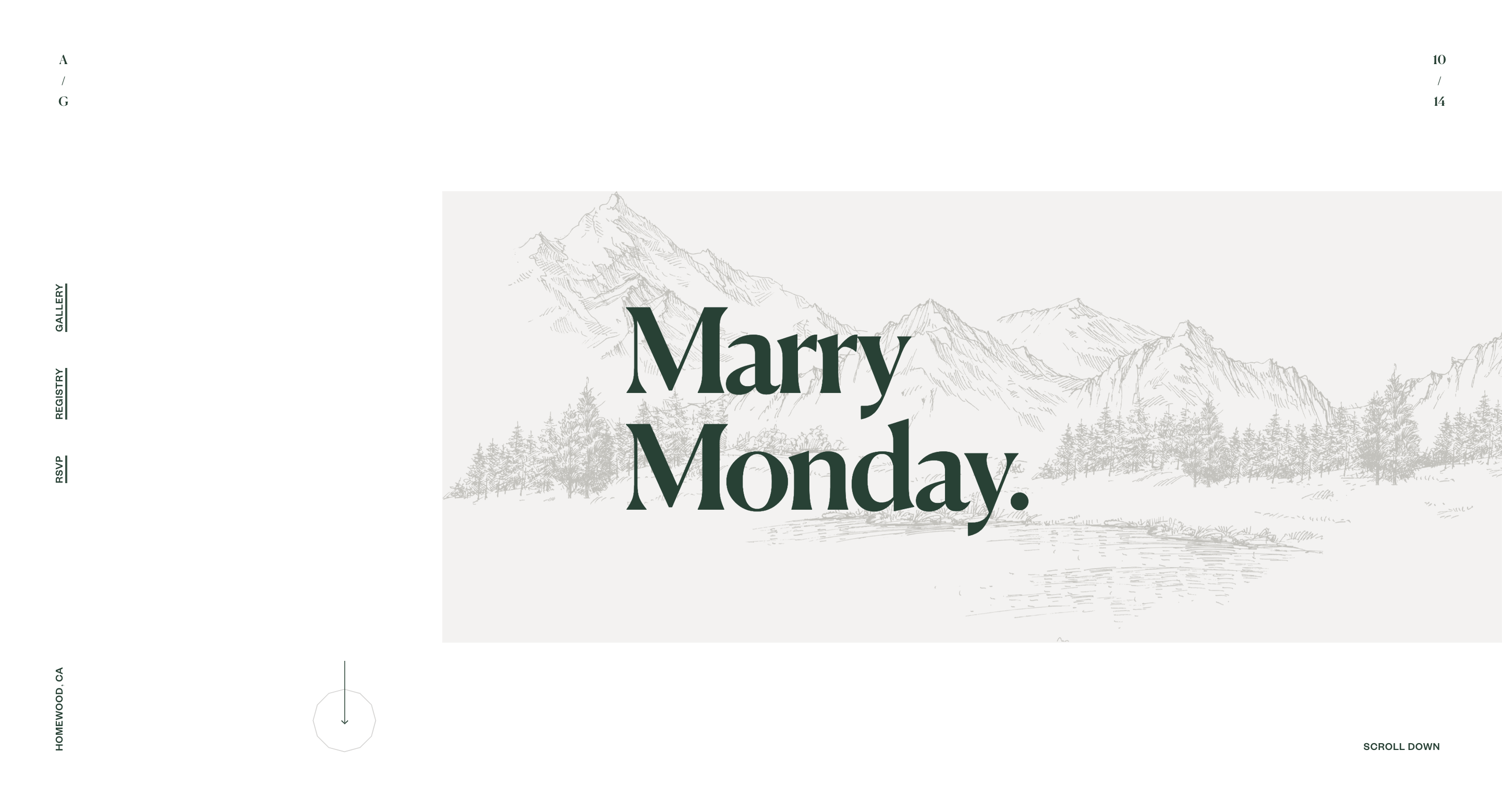
Veley & Ross is a great, simple wedding website example that does exactly what it needs to, without showing off. The design is minimal but not cold. It opens with a soft mountain illustration that sets the tone, then leads guests straight to RSVP, registry, and gallery in the side navigation, so the guests don’t need to scroll.
Why it works:
- Essentials (RSVP, registry, gallery) are all in the side nav
- Minimal design that still feels personal thanks to illustration + photos
- Font is legible on both desktop and mobile (no script overload)
Idea to borrow: Use a custom banner or illustration to set the tone without adding pages. It’s low effort, high impact.
Avoid this: Don’t bury RSVP in a dropdown or at the bottom. This site keeps it visible, which saves you 20 text messages the week of.
2. James & Laura
Tags: RSVP-Focused, Utility-First
James & Laura’s website is the kind of RSVP wedding website example that prioritizes clarity over decoration, and that’s a good thing. The first thing you see is the wedding date, time, venue, and a button that opens directions. Even their gift preferences are handled with a quick message and a touch of personality. The tone is relaxed, the layout is simple, and the whole site respects the guest’s time.
Why it works:
- Critical info appears immediately, RSVP and logistics are front and center
- Gift section is short, direct, and feels like it’s written by humans
- Layout uses plain language, not wedding-industry lingo
Idea to borrow: Treat the homepage like a billboard: just the essentials, clearly presented. Date, time, location, RSVP – done.
Avoid this: Don’t overthink your gift section. A one-line explanation + link is better than forcing guests to click through 3 tabs.
3. The Pittmans
Tags: Personality-Heavy, RSVP-Focused
Although Courtney & Brendan’s site feels like a vibrant, welcoming photo gallery, it still works great as one of the more thoughtful wedding website examples. The homepage is essentially a photo wall, but just above that, everything important (RSVP, Registry, Event Info) is neatly laid out in a navigation. It’s a strong example of how to lead with emotion and still respect your guests’ time by making information accessible.
Why it works:
- Hero section builds emotional tone without wasting space
- RSVP is easy to find
- Layout stays readable even with high-contrast photography
Idea to borrow: Let your favorite photos set the tone, but keep the important links fixed and visible.
Avoid this: Don’t hide the RSVP under the Gallery or About page. Visual-first doesn’t mean function-last.
4. Sabrina Joy & Matthew
Tags: Classic Layout, Story-Driven
If you’re looking for a wedding website intro example that keeps it classic but not boring, this is it. The design of this site is what most couples think of when they picture a wedding site, but executed with restraint and thoughtfulness. The intro is short, the navigation is clean, and there’s a sweet proposal video that adds just enough personality. Everything from RSVP to the “Our Story” section is where you’d expect it.
Why it works:
- Great layout for guests who aren’t tech-savvy
- Intro copy is personal without being overshared
- Visual hierarchy keeps your eyes moving to the right spots
Idea to borrow: Keep your story short on the homepage, and link out if you want to share more.
Avoid this: Don’t feel like you have to be quirky. A clean, well-structured site is sometimes the best move.
5. Stephen Marys Kathryn
Tags: Story-Driven, Travel-Friendly
Kathryn & Stephen’s wedding website can be described with one word: warm. The photos definitely help create this feeling, but it’s balanced with clear info blocks that guide guests through the big questions: where to stay, how to get there, and what to expect.
Rather than stuffing all the FAQs into one scroll-heavy section, it’s broken up logically: Travel, Accommodation, FAQs. The tone stays relaxed throughout, and the photos feel like real life, not a styled shoot.
Why it works:
- Short intro builds connection without slowing things down
- Travel and lodging info are easy to find, not buried in a “Details” page
- FAQs are practical and split into bite-sized chunks
Idea to borrow: Break up long-winded pages. Use separate sections for travel, logistics, and guest questions.
Avoid this: Don’t assume your guests will email you if they’re confused. This site prevents that from happening in the first place.
6. Rush and Danit
Tags: Destination, Personality-Heavy
Rush & Danit built a complete experience. Instead of a wall of text, the agenda is laid out as a clean infographic, and guests are invited to submit song requests for the party. It feels interactive, thoughtful, and made with real people in mind. If you’re planning a multi-day or destination wedding, this is a wedding website schedule example worth stealing. It’s fun without being chaotic, informative without being dull.
Why it works:
- Visual agenda is easier to digest than a bullet list
- Optional song request adds guest engagement
- Clean layout balances info and personality
Idea to borrow: Turn your schedule into a visual: timeline, graphic, icons. Guests remember that.
Avoid this: Don’t let your site be a read-only bulletin. Make it feel like an invitation, not a noticeboard.
Found inspiration? Your website is just a few clicks away. Start 
Build your website in 1 minute
with 10Web AI Website Builder to effortlessly bring your vision to life.
7. Judie & Z
Tags: Story-Driven, Bio-Focused, Funny
If your vibe is playful and low-pressure, Judie & Z’s site is a great match. It reads more like a scrapbook than a formal site, walking guests through their story with light narration and casual, colorful design. But the real highlight is their wedding party bios. Each person gets a short intro, some funny, some heartfelt, and the tone makes guests feel like they already know the crew.
Why it works:
- Scroll-based story keeps users engaged
- Bridal party bios are short, specific, and actually fun to read
- Layout feels like a celebration, not a brochure
Idea to borrow: Introduce your people. Your guests will connect more when they recognize names at the wedding.
Avoid this: Skip generic bios. “This is Jess, my maid of honor” isn’t a bio—it’s a label.
8. Sweetinz
Tags: One-Pager, Story-Driven
Mike & Kate’s wedding website gives off a soft modern fairytale feel. Especially their vertical timeline is a great way to tell their story in a structured but personal way. Even though it’s a one-pager, the sticky navigation menu keeps everything easy to find, so guests never feel lost. The layout flows nicely: starting with wedding details, moving into their story, and ending with RSVP. The scrolling experience is smooth and intuitive.
Why it works:
- Visual timeline keeps storytelling short and scannable
- One-page layout avoids menu overwhelm
- Great balance between function and vibe
Idea to borrow: Use a vertical timeline if you want to tell your story without a dedicated “Our Story” page.
Avoid this: Don’t forget a sticky nav, it’s the only thing keeping one-pagers from turning into scavenger hunts.
9. Ben & Casey
Tags: Personality-First, Funny, Bio-Heavy
Ben & Casey’s site is unfiltered, self-aware, and hilarious, in the best way. The headline roasts them, the photo captions are full of inside jokes, and somehow it still gives you all the info you need.
If you hate generic wedding copy but still want a site that works, this is one of the most entertaining personal wedding website examples you’ll come across. It’s proof that you can have fun and make sure guests RSVP on time.
Why it works:
- Every section has personality, but it’s still useful
- Bio tone feels like the couple actually wrote it (not ChatGPT)
- Fun to read = guests stay longer = fewer questions later
Idea to borrow: Inject humor in the headlines or photo captions, it’s low-risk and makes people want to keep scrolling.
Avoid this: Don’t let jokes get in the way of clarity. This site keeps the layout clean underneath the personality.
10. Alex and Bailey
Tags: Bio-Heavy, Community-Focused
Some wedding websites are about the couple, this one’s about the crew. Alex and Bailey’s site puts the emphasis on group photos and full wedding party bios, making it feel like a real community celebration. They also include helpful FAQs, guides, and wedding details, all presented in a clean, cohesive design that keeps the focus on the couple. It’s a thoughtful mix of personality and practicality.
Why it works:
- Wedding party bios help guests connect before the event
- Candid photos give the site real energy
- Travel and FAQ sections are clearly labeled and easy to skim
Idea to borrow: Let your people shine: bios make introductions easier and make the event feel more intimate.
Avoid this: Don’t let personality overtake function. This site balances both.
11. Chris & Jessica
Tags: One-Pager, Personality-Heavy
This site is visually playful without losing clarity. The illustrated banner is one of the most charming introductions among wedding website examples. It’s a one-pager, so at first glance it might feel like there’s a lot going on, and there is. But that’s the point: the couple clearly wanted to avoid last-minute questions, so they packed the page with all the info guests might need.
Block sections keep things organized, and the sticky header helps visitors jump to travel tips, contact info, and more. It’s a great choice for couples who want both personality and practicality. Just make sure to break up text to avoid overwhelming your guests.
Why it works:
- One-page layout feels dense but not chaotic
- Sticky nav helps users jump straight to what they need
- Illustration and copy style feel genuinely custom
Idea to borrow: Group all your info into sections, but break them up visually with design or icons so it doesn’t feel like a scroll marathon.
Avoid this: Don’t overload one-pagers with text walls.
Conclusion
Your wedding website is more than just a digital invite; it’s the central hub that keeps your guests informed and your planning stress-free. As the 11 examples above demonstrate, there is no single “perfect” design. Whether you were inspired by the minimalist utility of James & Laura or the story-driven warmth of Judie & Z, the best site is one that reflects your personality while answering the “5 Ws” clearly.
You don’t need to be a web designer to achieve this balance between beauty and function. By leveraging AI-powered tools like the 10Web AI Website Builder, you can bypass the frustration of coding and rigid templates. Simply describe your vision, let the AI handle the structure and mobile optimization, and focus your energy on what matters most: celebrating with your favorite people.
Ready to cross this task off your list? Generate your custom wedding website with 10Web in minutes and give your guests the experience they deserve.
FAQ
What are the essential elements of a wedding website?
How do I create a wedding website without coding?
Can I customize an AI-generated wedding website?
How much does a professional wedding website cost?
Will my wedding website work on mobile phones?
Create your dream website with 10Web AI Website Builder Love the designs? Make them yours in a few clicks with 10Web AI Website Builder.
Build your website in 1 minute
and take your business online!Build your website in 1 minute
Create your website now for Free


![]()