Online shopping has become a big part of our lives. Stores want to make it easy for you to buy things on their websites. They focus on making their checkout pages work well.
A good checkout page helps you finish your purchase quickly and easily. It should be clear and simple to use. Stores try different designs to make sure you have a good experience when you buy from them online. They want you to feel safe and happy with your purchase.
The article covers best practices and design elements for creating high-converting ecommerce checkout pages, including user-friendly layouts, security features, guest checkout, and mobile optimization. It also reviews examples from major platforms like Amazon and Shopify to illustrate effective checkout designs that reduce cart abandonment and improve conversions.
FAQ
How to design a good checkout page?
What is the checkout page in ecommerce?
Which checkout flow design is most effective?
How to make a checkout page?

Create your online store in minutes!
Looking to sell online? Develop and launch your store with 10Web AI Ecommerce Website Builder.
Key elements of an effective checkout design
A well-designed checkout page can make or break your online sales. It needs to be easy to use, build trust, and give shoppers options. Let’s look at the most important parts of a good checkout design.
User-friendly interface
A user-friendly checkout interface makes buying easy. Keep the design simple and clean. Use big, clear buttons for important actions like Add to Cart and Complete Purchase. Make forms short and only ask for needed info.
Show a progress bar so shoppers know where they are in the process. Group related fields together, like shipping address details. Use clear labels and helpful hints for each field.
Auto-fill info when you can to save time. Offer a way to save payment details for future purchases. Make error messages clear and show them right away.
Use a single-page or accordion design to cut down on page loads. This can speed things up and lower the chance of shoppers leaving.
Security and trust indicators
Shoppers need to feel safe when they buy online. Show security badges and logos from known payment providers. Use HTTPS and display the padlock icon in the browser bar.
Add a brief message about your security measures near sensitive fields. Show accepted payment methods with familiar logos. Include links to your privacy policy and terms of service.
Use clear language to explain how you protect customer data. Add customer reviews or ratings to build trust. Show contact info and live chat options for quick help.
Avoid pop-ups or new windows during checkout. These can make shoppers nervous. Keep the design consistent with your main site to maintain a sense of familiarity.
Guest checkout options
Not everyone wants to create an account to buy. Offer a guest checkout option to make it easy for first-time buyers. Place this option clearly on the first checkout page.
Explain the benefits of creating an account, like order tracking and faster checkout next time. But don’t push too hard. Let shoppers choose what’s best for them.
If someone picks a guest checkout, give them a chance to make an account after they buy. This can be a single-click process using the info they just entered.
For returning customers, offer social login options to speed things up. But always have a standard login too for those who prefer it.
Optimizing the checkout process
A well-designed checkout process can boost sales and keep customers happy. It’s all about making things quick and easy for shoppers.
Streamlined navigation
A smooth checkout flow guides buyers through each step. Use a progress bar to show how far along they are. Keep forms short and only ask for needed info. Group related fields together. Auto-fill details when possible to save time.
Add clear labels and helpful hints. Use inline validation to catch errors right away. Make buttons big and easy to tap. Place a clear call-to-action like Continue to payment at the bottom of each page.
Put optional stuff like promo codes in a dropdown to reduce clutter. Give shoppers a way to save their info for next time. This speeds up future purchases.
Mobile responsiveness
More people shop on phones now. Your ecommerce checkout page design must work well on small screens. Use a single-column layout that’s easy to scroll. Make text and buttons big enough to read and tap.
Offer mobile-friendly payment options like Apple Pay or Google Pay. These let users check out fast without typing card info. Use numeric keypads for number fields.
Hide extra info in collapsible sections. This keeps pages short and focused. Test your checkout on many devices to catch any issues. A smooth mobile experience can boost sales a lot.

Create your online store in minutes!
Looking to sell online? Develop and launch your store with 10Web AI Ecommerce Website Builder.
25 ecommerce checkout page design examples
This section showcases 25 examples of ecommerce checkout pages from major brands, highlighting best practices in design and functionality.
Amazon checkout
Amazon‘s checkout page is a model of simplicity and efficiency in ecommerce checkout page design. When you reach the checkout, you see a clean layout with clear steps. The page shows your shipping address, payment method, and order summary. You can easily change these details with a click.

Amazon offers multiple payment options. You can use credit cards, debit cards, or Amazon gift cards. The page also lets you use digital wallets like Amazon Pay. This variety makes paying quick and easy for you.
The checkout page has a progress bar at the top. It shows you where you are in the buying process. This helps you know what to expect next. Amazon also uses color to guide you. The main buttons are orange, which stands out on the page.
- Guest checkout option
- Order summary with item images
- One-click ordering for repeat customers
- Mobile-friendly design
- Clear security badges
- Option to add gift wrapping
Shopify quick checkout
Shopify‘s quick checkout makes buying easier for your customers. It lets them complete purchases on one page without going through many steps. This helps reduce cart abandonment and boosts sales.
You can customize the quick checkout to match your brand. Add your logo and change colors to create a smooth shopping experience. This builds trust with buyers.
The quick checkout supports many payment methods. You can offer credit cards, PayPal, Apple Pay, and more. This gives customers options and makes paying simple.
Guest checkout is another useful feature. It lets shoppers buy without creating an account. This speeds up the process for first-time buyers.
- Mobile-friendly design
- Autofill for shipping and billing info
- Progress bar to show checkout steps
- Upsell and cross-sell options
- Chat support during checkout
Big Cartel checkout
Big Cartel has built a checkout system that aims to boost sales. Their checkout page is simple and easy to use. It focuses on the key steps needed to complete a purchase.
The page has a clean design with few distractions. This helps shoppers stay focused on buying. Big Cartel lets store owners customize colors and fonts to match their brand.
You can set up payments through Stripe or PayPal on Big Cartel. This gives customers trusted options to pay. The checkout also works for both new and returning customers.
Big Cartel’s checkout has these features:
- Guest checkout option
- Login for returning customers
- Clear display of costs
- Mobile-friendly design
- Customizable look
Nike’s innovative cart design
Nike‘s checkout page shows why they’re a leader in online sales. The design is clean and simple. You see clear product images and details throughout. The total order amount is always visible. This helps you keep track of costs.
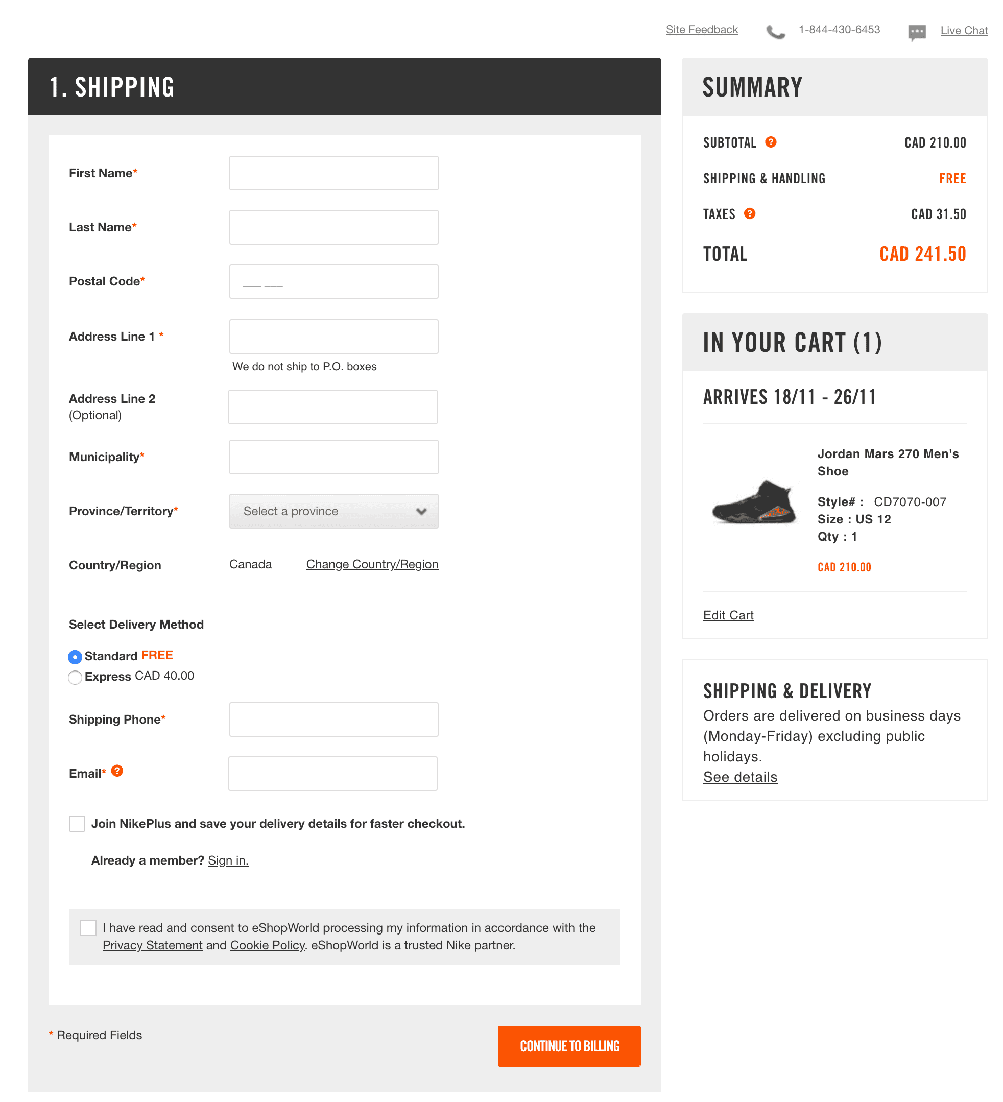
Nike offers multiple payment options. You can pay with credit cards, PayPal, or Nike gift cards. This gives you flexibility in how you complete your purchase.
Security is a top concern. Nike displays trust seals to show your data is safe. They also provide links to customer service and live chat. This support is there if you need help.
The checkout process is smooth and quick. You can easily edit your cart or save items for later. Nike makes it simple to complete your purchase without hassle.
Key features of Nike’s cart design:
- Clear product images
- Multiple payment options
- Visible order total
- Security seals
- Easy access to customer support
- Quick editing of cart items
IKEA’s smooth payment process
IKEA’s app checkout process aims to make buying furniture easy. You’ll find streamlined forms for shipping and payment details. The app breaks down the steps to avoid overwhelming you.
IKEA keeps the design clean and simple. You can clearly see what you’re buying and how much it costs. The app offers multiple payment options to suit your needs.
As you go through checkout, IKEA shows your order summary. This helps you double-check everything before you pay. The app also gives you a chance to add any forgotten items.
- Express checkout option • Guest checkout available • Clear order totals • Multiple shipping methods • Easy-to-use form fields
Wayfair’s simplified user experience
Wayfair‘s ecommerce checkout page design focuses on making things easy for you. The page has a clean layout that’s not cluttered.
When you’re ready to buy, you’ll see clear steps to follow. This helps you know where you are in the process.
Wayfair uses big, bold buttons that stand out. You can’t miss the Add to Cart and Checkout buttons.
The page shows you important info about your order. You can see the total cost, shipping details, and delivery date at a glance.
If you have questions, help is just a click away. Wayfair puts customer service links right on the checkout page.
Other features in Wayfair’s checkout design:
- Guest checkout option
- Saved payment methods
- Order summary
- Product recommendations
- Mobile-friendly layout
Etsy’s clear transaction steps
Etsy‘s checkout page shows you exactly where you are in the buying process. You see a simple bar at the top with numbered steps. This helps you know what to expect next. The page is clean and easy to read.
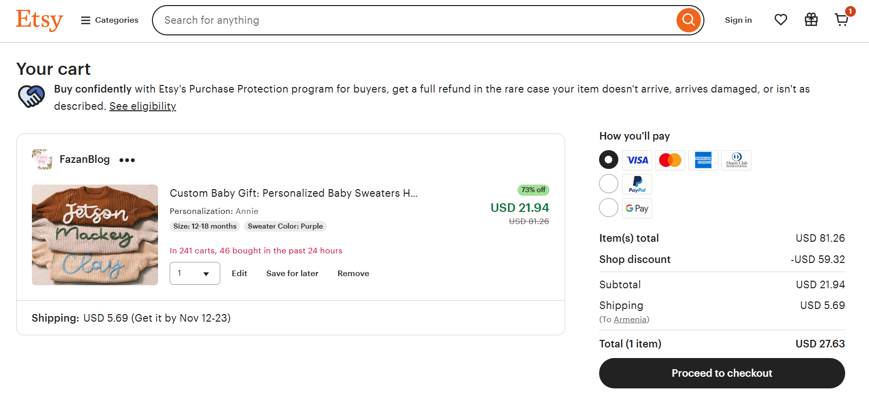
Etsy keeps things simple by asking for only the info they need. They show you the item price, shipping cost, and total up front. This helps you avoid surprises at the end.
You can pay with many options on Etsy. They accept credit cards, PayPal, and even Etsy gift cards. This makes it easy for you to choose how you want to pay.
- Guest checkout option
- Order summary always visible
- Clear return policy link
- Mobile-friendly design
- Save for later feature

Create your online store in minutes!
Looking to sell online? Develop and launch your store with 10Web AI Ecommerce Website Builder.
Target’s consistent aesthetic
Target‘s checkout page keeps things simple and on-brand. The red and white color scheme matches their logo and stores. You’ll see a clean layout with clear steps. Each part of the checkout is easy to spot and fill out.
The page has big, bold buttons that stand out. You can’t miss where to click next. Target shows order details and shipping options in a clear way. They use icons to help you understand each choice.
Target’s checkout also offers helpful extras. You can save your info for next time or use guest checkout. They show accepted payment methods with small logos.
- Free shipping offer clearly displayed
- Option to pick up in-store
- REDcard discount reminder
- Gift options available
- Estimated delivery date shown
- Mobile-friendly design
Adobe’s intuitive payment flow
Adobe‘s checkout page shows how to make buying simple. The page has a clean look with lots of white space. This makes it easy to see what you need to do next.
You’ll notice big, blue buttons that stand out. These guide you through each step. Adobe splits the process into small chunks. This keeps you from feeling overwhelmed.
The page shows a summary of what you’re buying. It’s always visible on the side. This helps you feel sure about your purchase.
Adobe offers different ways to pay. You can use a credit card or PayPal. This gives you more choices and makes buying easier.
Some other features of Adobe’s checkout design:
- Progress bar at the top
- Clear error messages
- Option to save payment info for next time
- Mobile-friendly layout
This ecommerce checkout page design puts the customer first. It aims to make buying quick and stress-free.
Tesco’s real-time stock updates
Tesco‘s checkout page gives you up-to-date info on item availability. You see if products are in stock before you buy. This helps you avoid disappointment and wasted time.
The page shows stock levels for each item in your cart. You can quickly spot any out-of-stock items. This lets you adjust your order right away if needed.
Tesco updates stock info often during checkout. You get the latest data as you move through the process. This cuts down on errors and keeps your order accurate.
The real-time updates also help Tesco manage inventory better. They can restock popular items faster. This means fewer stockouts for shoppers like you.
Other features of Tesco’s checkout design:
- Clear stock status icons
- Easy removal of unavailable items
- Suggested replacements for out-of-stock products
- Stock alerts for low-inventory items
ASOS’s quick address autofill
ASOS makes entering your address a breeze with their smart autofill feature. As you type in your address, suggestions pop up to help you complete it faster. This saves you time and reduces errors when checking out.

The autofill works for both shipping and billing addresses. You can easily select the right address from the dropdown list that appears. This feature is especially handy on mobile devices where typing can be tricky.
Asos also remembers your previous addresses. Next time you shop, you can quickly pick a saved address instead of typing it all again. This speeds up the checkout process even more.
- Clear input fields
- Dropdown suggestions
- Mobile-friendly design
- Address saving option
- Quick selection of saved addresses
Walmart’s secure checkout features
Walmart‘s checkout page gives you many options while keeping things simple. You can choose to have your items delivered or pick them up at a store near you. The page is easy to use and understand. You can see your cart contents and total cost right away.
When you check out, you’ll see clear sections for your info, shipping address, and how you want to pay. The page uses lots of white space to help you focus on what’s important. This makes it less confusing to finish your purchase.
Walmart takes steps to keep your information safe. They use encryption to protect your data when you buy something. This helps you feel more secure when shopping online.
Other features you’ll find on Walmart’s checkout page:
- Guest checkout option
- Multiple payment methods
- Order summary
- Promo code entry
- Estimated delivery date
- Clear return policy
Zara’s minimalist page layout
Zara‘s ecommerce checkout page design keeps things simple. You’ll find a clean, uncluttered layout that’s easy to navigate. The page uses a white background with black text for high contrast. This makes it easy to read and fill out forms.
Zara breaks the checkout into clear steps. You can see your progress at the top of the page. This helps you know what to expect next. The page asks for only essential info, cutting down on form fatigue.
Large, bold buttons guide you through each step. These buttons stand out against the minimal design. You’ll always know where to click next. Zara also uses subtle animations to confirm your actions.
The page shows a summary of your order on the side. You can review your items and total cost at any time. This transparency builds trust and reduces cart abandonment.
- Mobile-friendly design
- Secure payment icons
- Guest checkout option
- Clear shipping options
- Promo code field
Best Buy’s quick payment options
Best Buy offers several ways to pay quickly at checkout. You can use Apple Pay, Google Pay, or PayPal for fast one-click payments. These options save you time by not having to enter card details. Best Buy also accepts credit cards, debit cards, and Best Buy gift cards.
For larger purchases, you can apply for Best Buy’s store credit card right at checkout. This lets you get special financing offers. You can also use Affirm to split your payment into monthly installments.
Best Buy’s checkout page is clean and simple. The payment options are clearly laid out with large buttons. You can easily switch between different payment methods. The page shows order totals and any discounts applied.
- Express checkout with digital wallets
- Store credit card application
- Buy now, pay later with Affirm
- Multiple credit/debit card support
- Gift card redemption
Macy’s responsive mobile experience
Macy’s mobile product page shows a user-friendly design. The layout is clean and easy to navigate on small screens. You can quickly see product images, prices, and key details.
The page has large, clear buttons for adding items to your cart. You can easily select sizes and colors with touch-friendly menus. Product descriptions are short but helpful.
Macy’s uses high-quality photos to showcase items from different angles. You’ll find customer reviews to help you decide. The page also suggests related products you might like.
Other features of Macy’s mobile product page include:
- Sticky Add to bag button
- Wishlist option
- Size guide
- Free shipping info
- Easy returns policy
- Zoom function for images
AliExpress’s multiple payment gateways
AliExpress makes checkout easy with lots of payment options. You can pay how you like best. Credit cards, debit cards, and e-wallets are all welcome. This means more sales for them and more choices for you.
The checkout page shows payment icons clearly. You see Visa, Mastercard, and PayPal logos right away. This helps you feel safe about paying. Local payment methods are there too. You can use your favorite way to pay, no matter where you live.
AliExpress keeps your info safe with strong security. The page looks clean and simple. You don’t get confused or worried. Everything is laid out neatly, step by step.
- Clear payment icons
- Local and global options
- Simple, step-by-step layout
- Strong security measures
- Mobile-friendly design
Sephora’s easy coupon application
Sephora makes it simple to use coupons during checkout. You’ll find a clear promo code box right on the payment page. Just enter your code and click apply to see your discount. The box is easy to spot and use.
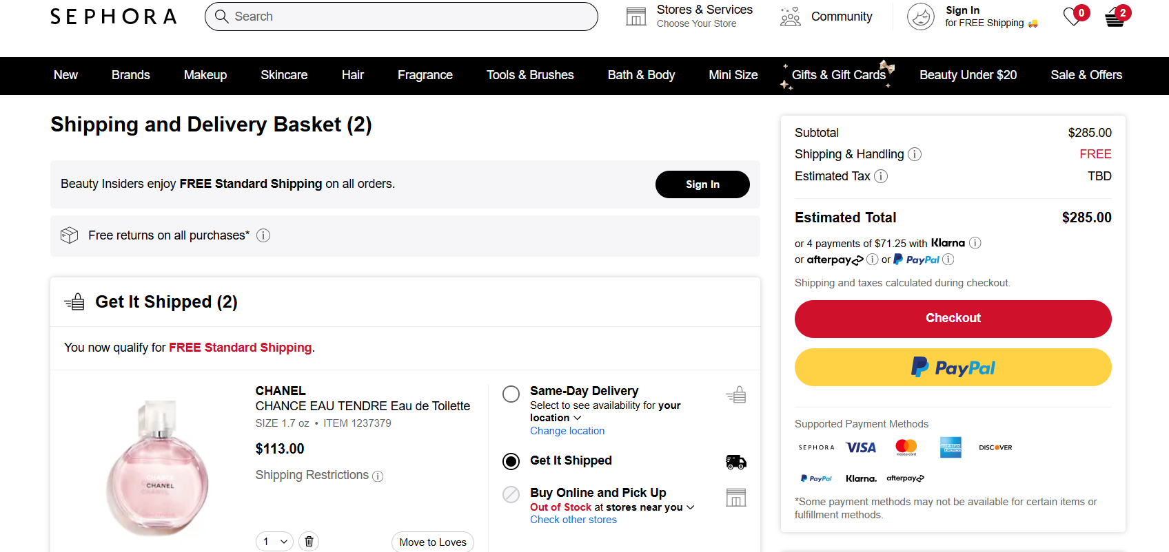
Sephora shows your savings clearly after you apply a code. You can see the discount amount and new total right away. This helps you know your coupon worked as expected.
If you have multiple coupons, Sephora lets you add them all. You can stack compatible codes to maximize your savings. The system tells you if a code isn’t valid or can’t be combined.
Some key features of Sephora’s coupon system:
- Prominent promo code box
- Instant discount calculation
- Ability to stack multiple codes
- Clear error messages for invalid codes
- Easy removal of applied coupons
Staples’s transparent shipping costs
Staples shows you shipping fees clearly on their checkout page. This helps you know the total cost before buying. You see the shipping options and prices right away. No surprises when you’re ready to pay.
The page is simple and easy to read. You can choose how fast you want your items delivered. Each option has a clear price next to it. This lets you pick what works best for you.
Staples uses a clean design for their ecommerce checkout page. The shipping section stands out with its own box. You can’t miss it when you’re filling out your details.
- Free shipping option for orders over $45
- Multiple delivery speed choices
- Estimated delivery dates shown
- Option to pick up in-store for free
Nordstrom’s dynamic purchase suggestions
Nordstrom uses smart product recommendations on their checkout page. As you add items to your cart, the page shows you related products you might like. These suggestions are based on what you’re buying and your past purchases.
You’ll see a Complete your look section with items that go well with what’s in your cart. This could be shoes to match a dress or accessories for an outfit. The suggestions are shown as small product images with brief descriptions and prices.
Nordstrom keeps these suggestions subtle. They don’t distract from the main checkout process. You can easily ignore them if you want to finish your purchase quickly. But if something catches your eye, you can add it to your cart with one click.
This feature helps you find items you might have missed. It can also increase the average order value for Nordstrom. The key is that these suggestions feel helpful, not pushy.
- Easy-to-use interface
- Personalized recommendations
- Quick add-to-cart option
- Mobile-friendly design

Create your online store in minutes!
Looking to sell online? Develop and launch your store with 10Web AI Ecommerce Website Builder.
Overstock’s easy guest checkout
Overstock makes buying easy with its guest checkout option. You don’t need an account to shop. Just click the Continue as Guest button to start. The page is clean and simple. It shows you what you’re buying and how much it costs.
You enter your shipping info first. The form is short and asks only for what’s needed. Next, you pick how you want your items sent. Overstock gives you clear shipping choices with prices.
Payment comes last. You can use a credit card or PayPal. The page is secure, so your info stays safe. Overstock also shows you any discounts or coupons that apply.
- Large, clear buttons guide you
- Progress bar shows where you are in checkout
- Order summary always visible
- Option to create account after purchase
- Mobile-friendly design for easy use on phones
Lidl’s personalized recommendations
Lidl‘s ecommerce checkout page design uses smart product suggestions to boost sales. When you shop on Lidl’s site, you’ll see items that match your interests. These picks are based on what you’ve bought before and what you’re looking at now.
The checkout page shows a You might also like section. Here, you’ll find products that go well with what’s in your cart. This helps you find things you may have missed.
Lidl keeps the checkout process simple. You can see your order total and shipping info at a glance. The page also has clear buttons to edit your cart or go back to shopping.
To build trust, Lidl shows customer reviews for suggested items. This helps you make choices based on what other shoppers think.
Other features of Lidl’s checkout design:
- Easy-to-use payment options
- Order summary with item images
- Save for later option
- Mobile-friendly layout
- Quick add-to-cart buttons for suggested products
Costco’s member-exclusive benefits
Costco offers special perks to its members. You get access to low prices on a wide range of products. The company’s bulk-buying model helps you save money on everyday items.
As a member, you can shop at any Costco store worldwide. You also get free technical support on electronics you buy from them. Costco’s website makes it easy to browse and order items online.
Members enjoy extra savings through Costco’s coupon books. These feature limited-time deals on popular products. You can also take advantage of Costco’s travel services, which offer discounted vacation packages.
Costco’s gas stations often have lower prices than nearby competitors. This can lead to big savings for members who drive regularly.
Other member benefits include:
- Free health screenings
- Discounted insurance services
- Access to Costco’s pharmacy
- Affordable optical and hearing aid services
Booking.com’s effortless reservations
Booking.com makes it easy for you to reserve accommodations. The site’s checkout process is quick and user-friendly. You can see all the important details about your stay on one page.
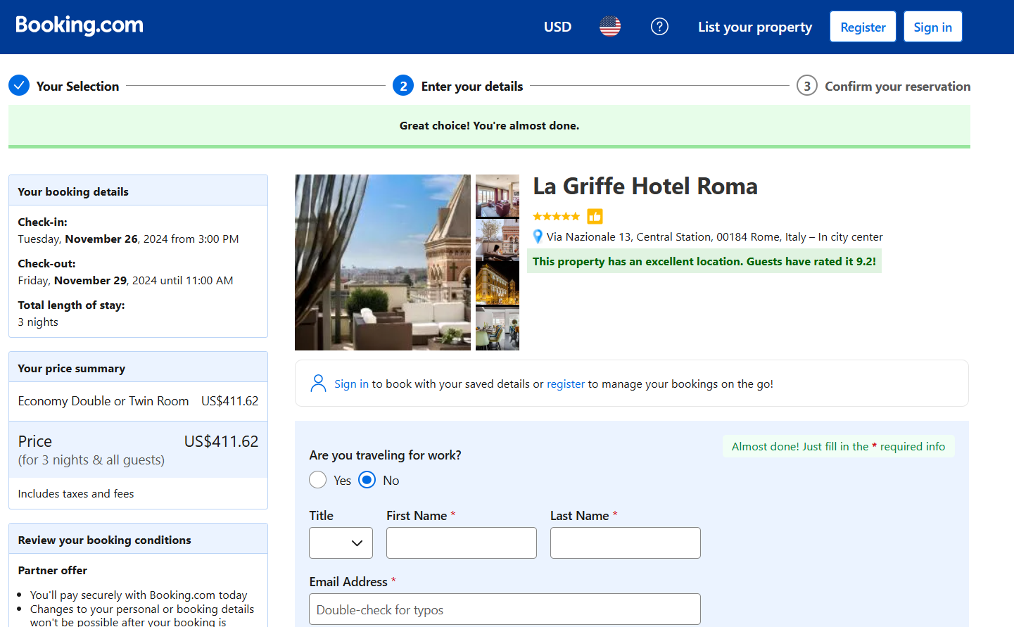
When you’re ready to book, you’ll see a clear breakdown of costs. This includes the room rate, taxes, and any extra fees. The site also shows you the total price for your entire stay.
Booking.com uses social proof to build trust. You can see reviews from other travelers right on the checkout page. This helps you feel more confident about your choice.
The site offers multiple payment options to suit your needs. You can pay now or later, depending on the property’s policies. This flexibility makes it easier for you to plan your trip.
Some other features of Booking.com’s checkout design:
- Clear cancellation policies
- Option to add travel insurance
- Price match guarantee
- Secure payment processing
- Mobile-friendly design
Airbnb’s flexible payment plans
Airbnb offers payment options that make booking easier for you. You can split your payment into two parts. This lets you pay some now and the rest later. It’s helpful if you’re planning a trip but don’t want to pay all at once.
When you book, you’ll see if the split payment choice is available. If it is, you can pick it at checkout. You’ll pay part of the total right away. The rest is due closer to your trip date.
This system helps you manage your money better. It gives you time to save up for the full cost of your stay. It’s a smart way to book without straining your budget.
- Clear payment breakdown
- Choice of payment methods
- Easy-to-understand terms
- Reminders for second payment
- Secure ecommerce checkout page design

Create your online store in minutes!
Looking to sell online? Develop and launch your store with 10Web AI Ecommerce Website Builder.
Conclusion
A well-designed ecommerce checkout page is key to reducing cart abandonment and boosting conversions. By focusing on simplicity, transparency, and trust-building features like guest checkout and clear security signals, businesses can create a seamless experience that encourages customers to complete their purchases.
Examples from top brands show how each design choice—from intuitive layouts to mobile optimization—can improve customer satisfaction. Ultimately, a streamlined checkout process not only drives sales but also builds loyalty in today’s competitive ecommerce landscape.


