Are you looking to create a graphic design website that not only showcases your work but also captures the attention of potential clients? A standout online presence is central for graphic designers aiming to highlight their unique style and connect with a wider audience.
We’ll look at 17 curated graphic design website examples that excel in creativity, presentation, and user experience. Then we’ll explore the main challenges of building a visually compelling website and provide inspiration to help you craft a portfolio that truly stands out. Get ready to discover the best in graphic design websites and learn how to make your own site an engaging showcase of your talents.

Build your website in 1 minute
Create your dream website with 10Web AI Website Builder
and take your business online!
Key Takeaways
- Inspiration from industry leaders: Explore our picks of the 17 standout graphic design websites. Check out their creative layouts, engaging features, and portfolio presentation.
- Tips on creating the best graphic design portfolio: Tips on what to include in your design portfolio website, how to structure your portfolio, and which platforms to use for best results.
- Avoid common mistakes: The common mistakes designers make when creating and managing their graphic design website. In this section we also offer solutions to fix these mistakes.
- Organize effectively: Structure your portfolio with clear categories, concise descriptions, and consistent branding for easy navigation and impact.
- Leverage personal branding: Craft a cohesive brand identity with unique visuals and a clear design philosophy to stand out in the competitive market.
- Simplify website creation: How to use tools like 10Web AI Website Builder to streamline the process of creating a professional, fast, and functional graphic design site.
- Stay relevant: Continuously improve your portfolio by incorporating new projects, following design trends, and seeking constructive feedback.
17 best graphic design portfolio website examples
A graphic design website is a living, breathing reflection of your unique style, design expertise, and professional problem-solving skills. It’s about telling your story through design and demonstrating your mastery of the tools and techniques of your craft.
To make your website truly shine, clarity is key. A well-organized portfolio helps visitors navigate through your projects with ease. Categorizing your work into clearly titled sections ensures that your audience quickly finds what they’re looking for. Pair this with intuitive navigation, and your site becomes not just a showcase but an experience.
One of the most interesting aspects of a graphic design website is the process behind the work. Sharing the journey of a project—from the initial idea to the final polished piece—adds depth and relatability. Walk your audience through your thought process, iterations, and creative problem-solving. This makes your work more engaging and builds trust and credibility with potential clients.
When choosing which website to include in our article, these are the key elements we looked for:
- Clear and unique layouts: Intuitive and visually appealing arrangements that showcase the work effectively.
- Branding consistency: Unified use of colors, fonts, and spacing to create a cohesive look and feel.
- High-quality images: Sharp, professional visuals that accurately represent the projects.
- Engaging process stories: Relatable narratives, engaging content that describe the journey of your designs from concept to completion.
- About and contact information: A personal touch with easy ways for clients to connect with you.
- User friendliness: Intuitive navigation and an uncluttered UI/UX.
1. Joao Verissimo
Graphic web design in motion.
What we liked most about this site:
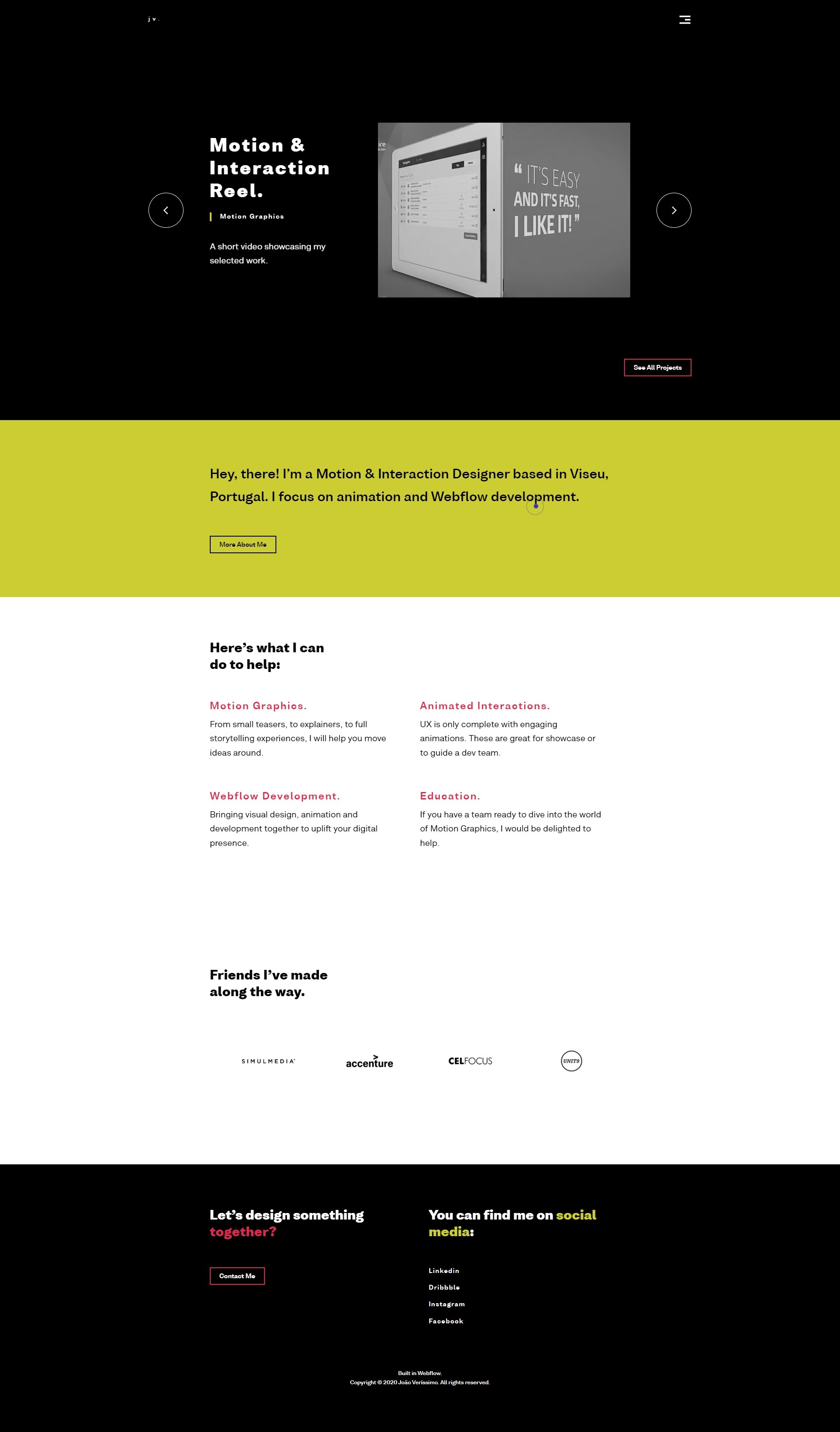
- Slider with animated showpiece project and promotional videos.
- Minimalist navigation and links pop on dark backgrounds above the fold.
- Restrained use of colors and subtle changes look polished.
Joao Verissimo is a motion and interaction designer who loves animation, webflow development, and games. His portfolio website, designed using a graphic design website template, has been developed with features and aesthetics that are representative of his art and profession.
The home page slider presents a showpiece project with a little animation to hint about what’s to come on the project’s portfolio page. If that’s not tempting enough, the slider’s promotional video and video portfolio provide quick insight into what working with this designer might look like.
When you navigate through this graphic design website example, page content feels alive with motion and bold but restrained splashes of color. Images, text, and page elements shift, zoom, transition, and undergo various hover effects and color changes, giving this graphic design portfolio site an impressive, polished look.
If you are interested in graphic design websites like this example and want to recreate the layout of the above design, simply provide the URL to
10Web AI Website Builder, and our tool will do the rest for you. Moreover, you can also customize the layout based on your preferences using the drag-and-drop editor.
2. Yeshi Designs
Bold design for underrepresented voices.

What we liked most about this site:
- An animated play on words nestled among Yeshi’s distinctive aesthetic greets guests.
- Colorful page design and full-width layout frame the designer’s bold artwork.
- Integrated social media content and blogs lend a personal touch.
A great way to stay updated with the latest design trends is to review graphic design websites from industry leaders regularly. One such industry leader is Sophia Yeshi, queer Black & South Asian illustrator and graphic designer based in Brooklyn, NY. Her work focuses on Black women and folks in the LGBTQIA+ community.
At first, visitors to this graphic design website are treated to a clever play on words. Does Yeshi design, illustrate, and create? Yes, she certainly does, and her website shows off her distinctive work on colorful portfolio pages, blog posts, and social media-generated content.
In her portfolio, big names coexist among her personal work, showing off her personality and allowing prospective clients to learn more about the designer’s past collaborations with a wide assortment of brands and companies.
3. Velvet Spectrum
Vibrant 3D design and animation showcase.

What we liked most about this site:
- Vibrant, animated visuals immediately engage visitors on the homepage.
- Simplified navigation facilitates easy exploration of diverse 3D work.
- Interactive animations throughout the site enhance the user experience.
Velvet Spectrum, created by Luke Choice, showcases a dynamic blend of 3D design and animation. The website is a vibrant portal into Choice’s creative world, featuring a rich display of colorful graphics and interactive animations. Its easy navigation allows visitors to explore a wide array of projects, each demonstrating Choice’s skill in blending vivid colors and engaging motion graphics.
The portfolio not only highlights his technical prowess but also his ability to create visually captivating narratives, making the site a compelling destination for those interested in cutting-edge digital art and design.
The site also includes a blog where Luke shares insights into his creative process, as well as a shop for visitors interested in purchasing his artwork.
4. Nisha K. Sethi
Beautiful hand-lettering and multi-disciplinary artistry.
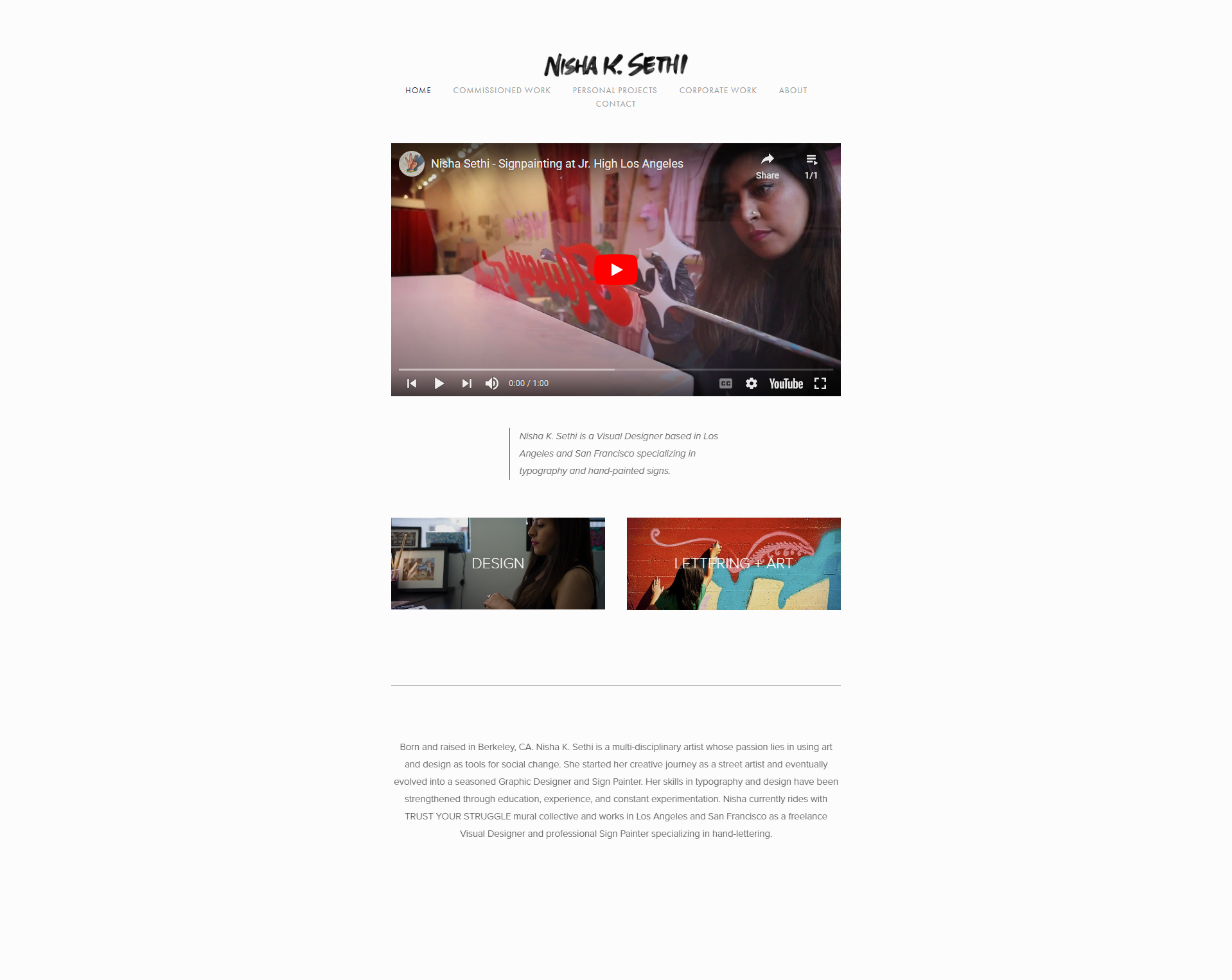
What we liked most about this site:
- The home page’s jazzy video introduces the artist’s hand-lettering skills.
- Simple, clean design puts the focus on past projects and multi-disciplinary art.
- Portfolio pages feature concise descriptions with photos of the artist at work.
Nisha K. Sethi is an artist and designer based in San Francisco and Los Angeles. The website effectively showcases Nisha’s typography and skills as a multi-disciplinary artist, starting at the top of the minimalistic home page. Visitors get an immediate taste of this designer’s hand-lettering skills through the auto-played video.
The site’s clean and uncluttered portfolio design shows off Nisha’s past work alongside a concise description of the project. Many portfolio pages feature photos of the artist herself at work, showing her versatility firsthand.
The straightforward About page lends a personal touch, conveying her journey of becoming an artist and her passion for artistry as a medium for social change.
5. David Milan
High-impact images, videos, and illustrations.

What we liked most about this site:
- The straightforward structure and gallery format make it easy for visitors to navigate and explore the works.
- Captivate potential clients with a dynamic display of animated art complemented by static designs and graphics.
- A grid-based layout fills the screen to full length with brightly colored images and video.
- Ultra-minimalistic single project pages feel cool and clean after the visual home page.
David Milan is a 3D artist and designer working across multiple disciplines, including typography and illustrations. Street art-inspired texture and typography dominate this easy-to-navigate example of graphic design websites.
With a straightforward, grid-based structure, this site stands out among graphic design website examples, drawing visitors to focus on his colorful designs through animated and static art. The gallery of works is displayed across the screen’s width and extends full-length down the page, providing a visually engaging experience. Each piece’s page is a simple pop-up modal featuring the artwork and title.

Build your website in 1 minute
Found inspiration? Your website is just a few clicks away. Start
with 10Web AI Website Builder to effortlessly bring your vision to life.
6. Roos Beeldt
Fun illustrations and artwork in a colorful package.
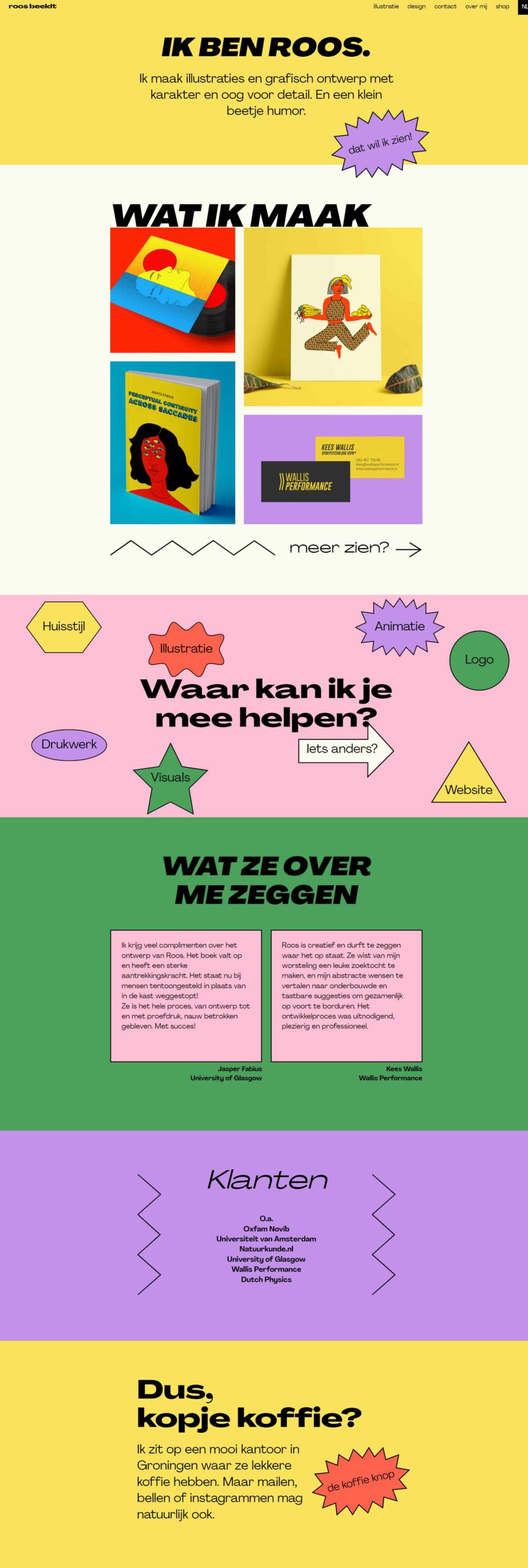
What we liked most about this site:
- Innovative use of colors, shapes, and quirky hover effects.
- Memorable graphic design website with casual, personable visuals.
- Unique illustrations are used to create a unique and distinctive brand identity.
Roos Beeldt is an illustrator and a graphic designer. Her portfolio is among great graphic design websites that reflect the artist’s creative approach with
memorable designs and illustrations.
The portfolio further highlights Roos’s ability to develop a consistent brand identity, as evidenced by attention to detail on web design visual cues, which is admirable and inspirational. Furthermore, the Shop section lets you buy her amazing artistic and illustrative work directly from the designer.
7. Sierra Plese
Showstopping project pages.
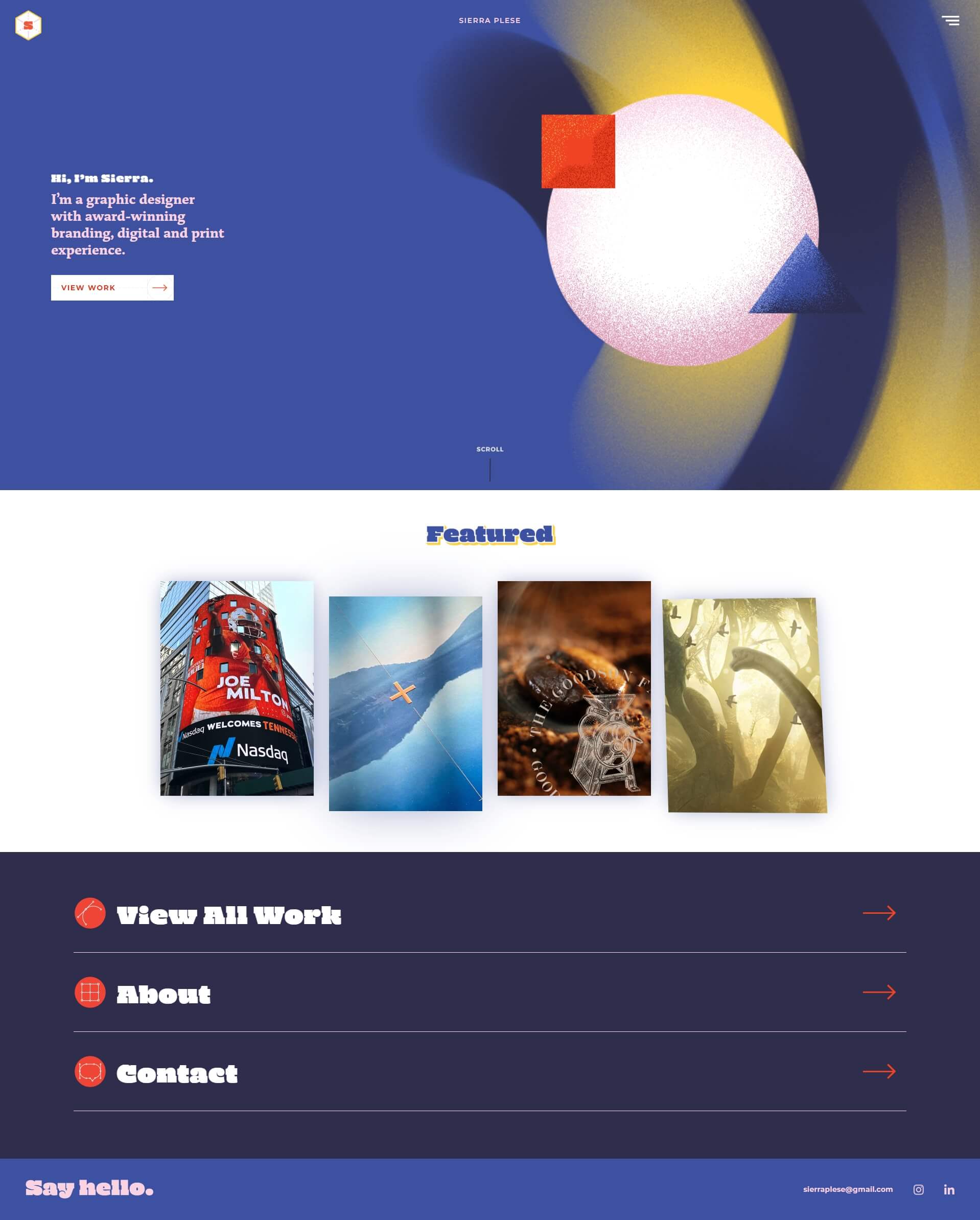
What we liked most about this site:
- The creative use of shapes, textures, and movement elevates the overall design.
- Modern and elegant design with dynamic hover effects.
- Images of digital and print design dominate project pages in a macro mosaic layout.
Sierra is an award-winning Graphic Designer with a BFA in Graphic Design and a BS in Communications, focusing on Digital Media. Her graphic design website example showcases her skills as a graphic designer, specifically in branding and digital and print designs.
Textured geometric shapes follow the cursor, adding a playful and dynamic element to her portfolio. Hover effects applied to various elements in her website enhance the user interface, making it engaging and intriguing.
Sierra’s masonry-like portfolio, with its transitions and overlays, gives way to project pages featuring plenty of images to get to know her style.
Layered images of print and digital design give the project pages a depth and weighty feel that is often missing from image galleries.
8. Craig Black
Minimalistic layout with subtle effects.

What we liked most about this site:
- Focus on artwork and illustrations with a minimalist design.
- Interactive features to enhance user engagement.
- Showreel video brings art installations and processes to life.
Craig Black is a Scottish Visual Artist best known for his “Acrylic Fusion” technique and specialization in bespoke artwork, installations, and live performance art. Like the best graphic design websites, Craigs puts the projects front and center with subtle design elements that don’t detract from the page content. The home page displays wall-to-wall colorful, crisp images of his hand-poured acrylic projects.
Each project page loads with smooth transitions and treats visitors to numerous images of the artwork and the artist himself at work. These photos let guests learn more about the artist’s poured paint techniques. A Showreel page offers similar information in a snappy video with plenty of artwork examples and further insight into the artist’s process, a plus for any great artist website.
9. Aries Moross
Typography meets live art design portfolio.

What we liked most about this site:
- It has an attractive, uncluttered, and easy-to-navigate layout.
- The minimalistic design approach emphasizes the artwork.
- Clear categorization of projects.
Aries Moross is a creative director, illustrator, and designer with a career beginning in 2007. Later, they expanded the practice, built a team, and laid the foundation of Studio Moross in 2012. The Aries Moross design portfolio is one of the best graphic design website examples demonstrating amazing design skills.
A typographical feast for the eyes awaits visitors to this graphic design website. Stacked project names slowly rotate across the page in big, bold letters. Clicking one of these takes you to the project’s page, where photos glide, slide, and fade in, forming a large gallery while scrolling down. Additional portfolio projects grace the end of each project’s page, keeping visitors engaged.
The focus of a minimalistic design is solely on the artwork. Each project is categorized by medium and project type, making it easier for potential clients to navigate and comprehend Aries Moross’ skills and experience. In addition, a link to Studio Moross is filled with case studies, deeper information on projects, and a link to the designer’s shop.
10. Lingk Graphic Design
Understated details for a graphic design showcase.
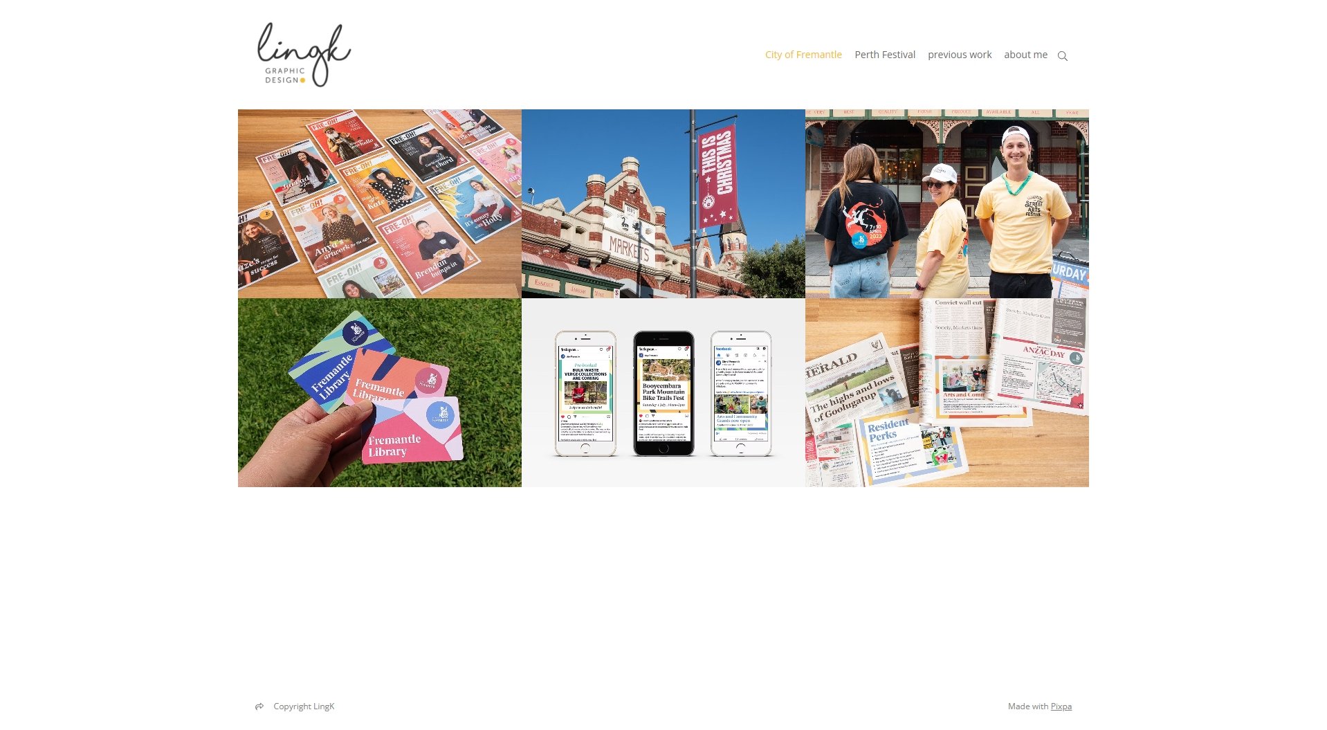
What we liked most about this site:
- Transparent depiction of projects for elaborate campaigns and events.
- Skillfully showcased portfolio exemplifying the designer’s unique expertise in each project.
- Unique logo design with a blend of simplicity and elegance.
Ling K’s portfolio website highlights the most recent projects while showcasing previous work with clear and concise descriptions of the services provided. The unassuming user interface of this graphic designer website template provides potential clients with an easy way to assess the designer’s work and get a feel for her style.
The home page’s clean design shows off a grid of images leading to different project categories. Project pages feature a variety of illustrations, mockups, and photographs of artwork appearing in the real world.
The versatility of graphic design websites like this one makes it ideal for demonstrating the integration of promotional materials for multifaceted events like festivals and conferences.
11. Tobias van Schneider
Sophisticated, portfolio-first graphic design website.

What we liked most about this site:
- Sophisticated, dark design feels like a meet and greet.
- Effective mixture of calls to action and portfolio projects.
- Portfolio-forward site prominently displaying detailed projects.
Tobias van Schneider is a designer, co-founder at Semplice™, speaker, mentor, and maker. Tobias’s portfolio website, known as HOVS (House of van Schneider), inspires entrepreneurial designers so much that millions of people use and love his creations.
The graphic designer’s website starts off with the real nitty gritty. The no-nonsense home page offers project images along with in-depth information on each. Information about HOVS is interspersed throughout, inviting visitors to reach out to the designer.
The primary navigation bar features various sections, including Blog, About, Instagram, Mixtapes, and Sign Up. In the blog, you can explore and learn about design-related topics, self-improvement, portfolio tips, freelance life, UX writing, and more. Like some of the best graphic designer websites, Tobias’s site also offers a DESK Reading Club for exclusive content and an Artistic “Mixtapes” section for designers and creative minds.
12. Steve Wolf
Minimal design with a focus on the portfolio.

What we liked most about this site:
- High-quality pictures enhance the overall presentation.
- Grid design enhances work visibility and maintains professional UI.
- The home page cuts to the chase with many vibrant illustrations and branding materials.
Steve Wolf Designs is a graphic design studio with Steve Wolf as its creative director, who uses his design experience to support brands. Steve Wolf’s graphic design website template stands out due to its incredibly sharp graphics and elegant grid style. The home page is unadorned except for multitudes of images, mockups, and photographs of branding materials doing their thing in various real-world places.
The whitespace-heavy theme continues on the project pages, with pertinent information at the page’s top and numerous illustrations and designs showcased in an orderly gallery below.
The About page provides information regarding partners, workshops, and interviews. Furthermore, visitors can check out the designer’s shop to purchase posters to brighten any environment, including your room and office.

Build your website in 1 minute
Found inspiration? Your website is just a few clicks away. Start
with 10Web AI Website Builder to effortlessly bring your vision to life.
13. Skyler Hefley
Straightforward and easy to navigate.
What we liked most about this site:
- Case studies and prototypes show off capabilities and skills.
- Visually appealing and informative design.
- Seamless scheduling with an informative ‘Book Now’ feature.
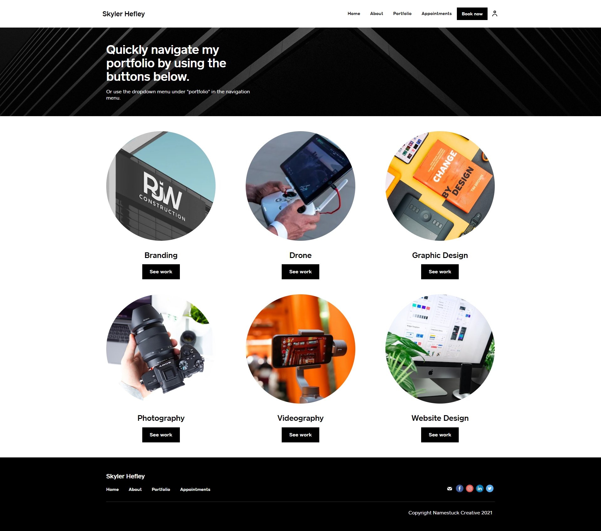
Skyler is a strategic brand builder, consultant, drone pilot, designer, photographer, and videographer. Skyler Hefley’s website is considered one of the best graphic design websites that takes a different approach to showcase branding, graphic designing, web designing, and much more by packing each with information in an individual package. The Hefley portfolio is an excellent example of showcasing their work and demonstrating their ability to potential clients by including case studies.
The home page is delightfully easy to navigate, with a friendly tip on finding what you’re looking for at the top. Projects are categorized into user-friendly groups of services and design mediums. Each category’s page showcases remarkable visuals, including photos, mockups, illustrations, and examples of the work displayed in the real world.
The “Book Now” feature offers a streamlined and effective platform for appointment scheduling, allowing clients to easily book their preferred time slots for professional services for creative solutions. Clicking the link provides some pricing information and sets expectations for future communications.
If you value responsive and friendly designs like these graphic design websites, choose 10Web AI Website Builder to start creating your graphic designer website templates with AI for a seamless user experience.
14. Ellen Skye Riley
Minimalist, functional, and visually appealing.
What we liked most about this site:
- User Interface with a subtle color and style.
- Visually appealing with a focus on typography.
- Simple and easy-to-read content conveying each project’s story.
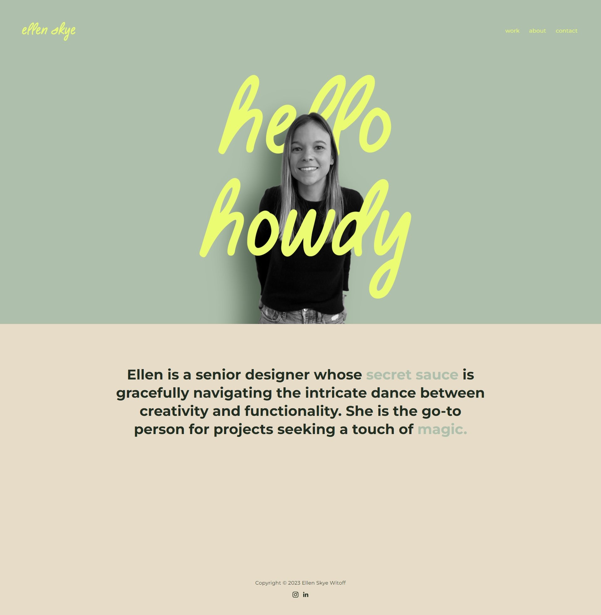
Ellen Skye is a high-caliber brand designer and visual storyteller at Salesforce. The design portfolio presented on Ellen Skye’s website serves as an outstanding demonstration of quality graphic designer website examples, effectively highlighting her skill as an illustrator and visual storyteller.
The low-key website is easy on the eyes, with dashes of color sprinkled throughout. The portfolio is easy to take in at a glance but is full of detail the more you look. Each project’s page is an art gallery-style walkthrough of the project’s materials, painting a picture of this designer’s style and flair.
Other pages include simple yet polished About and Contact pages that carry through with this subtly colorful and engaging example of graphic design websites.
15. MB Creative
Strategically creative with a sleek design.

What we liked most about this site:
- Unique animations and creative presentation of key portfolio projects
- Scrolling reveals a walkthrough of case studies, introducing the team’s work.
- A memorable design portfolio with cohesive branding, layout, and content.
MB Creative is a close-knit family of creative and curious facilitators and strategists based in beautiful Toronto, Canada. MBC is not only an expert in refreshing award-winning websites but also in search engine optimization (SEO) to help increase traffic to your website, and that’s why it stands out as one of the best graphic design websites. Their website showcases their beautiful websites created through strategy-driven design.
Visitors immediately get a feel for MB Creative’s work with an animated walkthrough of several key projects that demonstrate their versatility. Scrolling reveals details and links to case studies for various types of projects. Case study pages are highly visual and informative, offering behind-the-scenes information on the project’s process.
16. Alex Trochut
Artistically bold with unique typography.

What we liked most about this site:
- Symphony of colors, typography, and visuals from top to bottom.
- Graduated scrolling effects add interest to the portfolio images.
- Unique and dynamic layout.
When it comes to creating a visually engaging online portfolio, one can never go wrong by referring to some top-notch 3D graphic design websites. A good example is Alex Trochut’s portfolio. A digital craftsman from Barcelona, Spain, with proficiency in design, 3D illustration, and typography. Alex Trochut’s graphic design website template is an effective and efficient portfolio that showcases graphic design, product design, animations, music, and NFTs.
This graphic designer website employs a dynamic and interactive layout. As you scroll through the home page, the way project thumbnails move and appear on the screen is engaging and puts the focus on the artist’s portfolio.
The minimalist navigation allows the artwork to take center stage. It’s intuitive yet unobtrusive, ensuring that visitors can easily find their way around without being distracted from the artwork.
The About page shows off Alex Trochut’s signature style of bold and artistic typography, delving into engaging biography, prestigious awards, captivating online classes, and more.
17. Wendy Ju
Captivating & animated portfolio

What we liked most about this site:
- Exudes a warm and personable feel.
- An interactive and visually rich portfolio highlighting diverse projects.
- Minimalist design and user-friendly interface
Wendy is a product designer with a Bachelor’s degree in Communications Design and is pursuing a Master’s degree in Human-Computer Interaction. The interest lies in crafting valuable experiences that bridge humanized technology and social wellness. Wendy Ju’s graphic design portfolio website is captivating with its minimalistic appearance and delicate animations to highlight the capabilities of branding, web design, app design, and much more.
This graphic designer website template has earned recognitions, including D&AD New Blood Portfolio Winner, Wix Blog – 15 Outstanding Wix Website Examples, and Forbes – Best Designed Websites of 2023.
The homepage animation invites clients into her realm, providing a sense of curiosity. A playful cursor interaction adds engagement and a splash of color to the softly neutral palette. The combination of basic design and precise animations complements her artistic capabilities.
How to create the best graphic design websites
Ready to create your own graphic design website? The internet is filled with awesome examples of graphic design websites to explore. Find styles that resonate with you and get inspired. Yes, the point of building a remarkable portfolio is to showcase your work, but the content should be curated with a keen eye and presented in a way that’s uniquely yours.
With providers like 10Web, building a website has never been easier. With the right tools and a dash of creativity, you can craft a standout portfolio that highlights your skills and draws in potential clients. To help you get started, here are some essential tips for designing a website that leaves a lasting impression.
1. Showcase versatility
When selecting projects for your portfolio, prioritize quality over quantity. It’s better to have a handful of exceptional projects that truly showcase your skills and creativity than a multitude of mediocre ones. Each project you choose should highlight a different aspect of your abilities, whether it’s your knack for typography, your eye for color, your understanding of layout, or your ability to create compelling visual narratives. Make your highest-value projects the focal point of your portfolio website. These are the projects that best represent your skills and your unique design style.
2. Choose the right platform
Invest in a high-quality website with a personalized domain URL to display professionalism to potential clients. Choose a hosting service that effectively organizes your portfolio and contains areas like Projects, About Me, and Contact Me. Take into consideration the use of website builders that are developed expressly for portfolio websites.
If you want to exude professionalism and showcase your portfolio with a personalized domain URL, consider investing in 10Web AI Website Builder today. With 10Web, you can easily build, showcase, and personalize your portfolio and establish your unique presence with just a few clicks.

Build your website in 1 minute
Found inspiration? Your website is just a few clicks away. Start
with 10Web AI Website Builder to effortlessly bring your vision to life.
3. Embrace case studies and client recommendations
Create in-depth case studies to give your projects meaningful context. Describe the context, the issue, the procedure, and any deliverables associated with each project. Case studies allow prospective customers to comprehend your one-of-a-kind approach and problem-solving skills better. In addition, consider incorporating testimonials from previous customers to demonstrate both your professional approach and the value you deliver to your customers.
4. Make your website clean and easy to navigate
Your portfolio website should be a testament to your skills as a graphic designer, embodying a sleek, visually appealing, and user-friendly design. Avoid overwhelming visitors with excessive design elements; opt for a clean, minimalist design that highlights your projects. Your work should be the star, and the design of your portfolio should serve to enhance and highlight your projects, not overshadow them. Use descriptive headers and subheadings to guide visitors through your portfolio. Include key sections like ‘Home’, ‘About’, ‘Portfolio’, and ‘Contact’.
5. Prominently display contact information
Ensure your contact information is easily accessible on your portfolio website. Facilitate communication with potential clients by prominently featuring links to your email address and a contact form on your website. Consider adding a “Book an Appointment” button for a more direct approach to discussing project ideas or sharing product concepts. Regularly monitor your contact channels to respond promptly to all inquiries, demonstrating your professionalism and commitment to potential clients.
6. Showcase your unique personality
Your portfolio should reflect your unique personality and creative vision. It’s not just about showcasing your work; it’s also about presenting who you are as a designer. The design elements you choose, the color palettes you favor, and the typography you use, all contribute to this narrative. Incorporate elements that resonate with your style and make your portfolio distinct. This could be anything from a unique logo, a signature color scheme, or a typeface you love. Your portfolio should be an extension of yourself, giving potential clients a glimpse into your design style and what it might be like to work with you.
7. Show your creative process
Your portfolio should display the final product and narrate the creative journey you undertook to reach that endpoint. Consider including dedicated sections that detail your thought process and the steps you took to arrive at each design solution. Start with the initial brainstorming phase, discuss the challenges you faced, the ideas you explored, and how you refined your concepts through iterations. This transparency allows potential clients to gain insight into your problem-solving skills, approach to design challenges, and working methodology.
8. Present non-client work and personal projects
If you’re just starting out or wish to showcase a broader skill set, don’t hesitate to include non-client work or personal projects in your portfolio. These projects can exhibit your initiative, creativity, and ability to juggle multiple tasks. While maintaining a professional tone for client work, highlight the unique aspects of these personal projects. They can serve as a testament to your passion for design and your ability to innovate beyond client specifications.
9. Stay updated and improve continuously
A graphic design portfolio is a dynamic entity, never truly finished. It’s crucial to stay abreast of the latest design trends, technological advancements, and best practices in the marketplace. Regularly refine your portfolio by adding new projects, updating case studies, and enhancing your presentation. Solicit feedback from peers, mentors, or potential clients to ensure your portfolio remains relevant, engaging, and reflective of your evolving skills and style.
10. Develop a personal brand
Beyond assembling a collection of your work, invest time crafting a personal brand that encapsulates your aesthetic preferences and core values. Design a unique logo, create business cards, and establish a consistent visual identity across your website and social media platforms. A strong personal brand helps you differentiate yourself in a crowded market and leaves a lasting impression on potential clients, reinforcing your professional image and commitment to design excellence.
Common mistakes when building a graphic design portfolio website
Creating a standout graphic design portfolio is essential for showcasing your talents and attracting potential clients or employers. However, even the most talented designers can fall into common pitfalls that diminish the impact of their portfolios. By being aware of these mistakes, you can ensure your portfolio effectively represents your skills and professionalism.
Here are some mistakes to avoid and common solutions:
- Lack of focus: Including too much work can make your portfolio feel cluttered and unorganized. Focus on showcasing only the projects that align with your expertise and target audience.
- Poor presentation: Low-quality images or inconsistent formatting can get in the way of great work. Using high-resolution images with a clear layout to enhance readability makes your work more visible.
- Not updating regularly: An outdated portfolio may suggest that you’re no longer creating. Keep your portfolio current. Add new projects and remove outdated ones. You can even show your in progress projects.
- Lack of context or explanation: Presenting designs without context can confuse viewers. Talk to your audience. Briefly explain your process. Tell them the solutions you developed for each project, why you chose that solution, and how you did it.
- Bad user experience: A hard-to-navigate portfolio is annoying at best. Make sure that navigation is intuitive, your graphic design website fast loads fast, and is responsive.
- Not unique: A generic portfolio will be difficult to remember. Your portfolio has to be saturated with your personal style and branding.
- Contact information: If clients have to really search and not find your contact information, well, they’re not coming back. Make sure you have a dedicated contact page with clear and current links.
- Overcomplicating the design: Flashy effects can distract from your work. Keep the design clean and simple, ensuring your work is the focal point.
- Ignoring SEO best practices: Poor SEO can reduce your portfolio’s visibility. Optimize your site with relevant keywords, metadata, and alt tags to improve search engine rankings.
- Not proofreading content: Typos and errors, they happen to the best of us, but it gets in the way of your professionalism. Make sure to proofread all written content or have someone else look through it to catch mistakes.
Portfolio organization and format
An effectively organized and well-formatted portfolio is crucial for showcasing your graphic design skills professionally. Whether you opt for a website, PDF, or physical portfolio book, the format should align with your goals and cater to your target audience.
For a website portfolio, ensure it offers user-friendly navigation with a logical structure, making it easy for visitors to explore your work. The design should be responsive across all devices, and incorporating interactive elements like animations or videos can enhance engagement. Don’t forget to optimize your site with relevant keywords to improve search engine visibility.
In a PDF portfolio, keep the content concise by highlighting select pieces of your best work. Use a clean, professional layout with high-quality images and consistent typography. Ensure the PDF is compatible across various devices to prevent formatting issues.
A portfolio book provides a tangible experience that can be impactful during interviews or meetings. Invest in high-quality printing to produce crisp images and vibrant colors. Arrange your projects thoughtfully, perhaps starting and ending with your strongest pieces, and choose durable materials that reflect the professionalism of your work.
Across all formats, maintain consistent branding to strengthen your personal identity. Include a brief introduction or artist statement to provide context about your background and design philosophy. Make your contact information easily accessible to encourage potential clients or employers to reach out. Regularly update your portfolio by adding new projects and removing outdated ones to showcase your latest skills and styles.
By carefully considering how you organize and present your portfolio, you enhance the impact of your work and make a lasting impression on your audience.
Creating your own graphic design portfolio website
Creating an online presence for your graphic design business has never been easier, thanks to 10Web’s powerful suite of tools and features. With 10Web’s AI Website Builder, WooCommerce integration, and the 10Web Booster, you can create a visually stunning and highly functional website tailored to showcase your creativity. These tools are perfect for building a professional platform that highlights your portfolio, attracts clients, and manages your business operations seamlessly.
Follow these steps to launch your graphic design website:
- Sign up for free on 10Web
- Visit 10Web.io and create a free account.
- Select the option to start a new website using the AI Website Builder.
- Describe your business
- Provide details about your graphic design business.
- Include your desired site name, services (e.g., branding, digital art, or custom illustrations), and any other relevant details.
- Generate an AI-driven outline
- Let the AI generate a website outline for you.
- Review the proposed sections (such as a hero image, portfolio gallery, testimonials, and contact forms) and customize them as needed.
- Choose a visual style
- The AI will automatically suggest primary colors and fonts that match your branding.
- Adjust these or use the Ultimate UI Kit to further refine your website’s aesthetics.
- Add ecommerce features
- Enable WooCommerce integration to offer online purchasing of design services or digital products.
- Set up payment methods like PayPal, Stripe, and Google Pay.
- Define shipping zones if you sell physical items like prints.
- Customize with pre-designed sections
- Use 10Web’s pre-designed templates to add sections like About Me, Service Details, or a Portfolio Gallery.
- Add a blog to share design tips and case studies, or include a booking system for consultations.
- Optimize performance
- Use the 10Web Booster to ensure your site loads quickly and provides an excellent user experience.
- Integrate advanced caching, compression, and image optimization tools.
- Publish your site
- Secure your site with a free SSL certificate generated through the 10Web dashboard.
- Launch your graphic design website to attract clients and showcase your talents.
Build the best graphic design portfolio websites with 10Web
Creating an outstanding portfolio of graphic design work is about telling your story, engaging your audience, and leaving a lasting impression. Curate your strongest work, present it with clarity, and infuse your personal brand into every detail.
Ready to craft a portfolio that not only attracts clients but also establishes you as a creative force in a competitive industry? Now more than ever, tools like 10Web AI Website Builder give you access to creating a professional, visually stunning website, no matter your technical skills. Take the first step today—start building your graphic design portfolio!

Build your website in 1 minute
Found inspiration? Your website is just a few clicks away. Start
with 10Web AI Website Builder to effortlessly bring your vision to life.
Frequently Asked Questions
Which website is best for graphic design?
- Behance: A top choice for designers to display their portfolios and discover cutting-edge projects from around the world. It’s great for networking and visibility in the creative community.
- Dribbble: Focused on showcasing and discovering creative work, Dribbble is a community where graphic designers, web designers, illustrators, and other creatives share their projects and get feedback.
- Adobe Portfolio: Integrated with Adobe Creative Cloud, Adobe Portfolio allows designers to easily create professional portfolio websites to showcase their work.
- 10Web: A comprehensive platform that utilizes AI to help designers create a website in minutes. It’s particularly beneficial for those looking to automate the design process while ensuring their website is optimized and responsive.
What should a graphic designers website look like?
How do I create a graphic design website?
Does a graphic designer design a website?
Where to find graphic design inspiration?
What makes a good design portfolio?
How to showcase graphic design work online?
What are essential elements of a design website?
Which tools are best for graphic design?
How to present design projects effectively?
What types of projects should be included in a portfolio?
What are the latest trends in graphic design?

Build your website in 1 minute
Found inspiration? Your website is just a few clicks away. Start
with 10Web AI Website Builder to effortlessly bring your vision to life.


