Trying to build a good website for your nonprofit can feel like a huge task. There are so many elements to consider—from conveying your mission to encouraging donations and support. In this article, we’ve curated a list of 30 standout nonprofit websites to inspire you. By the end of this article, you’ll have all the tips you need, whether you’re redesigning your existing website or building one from scratch.

Build your website in 1 minute
Create your dream website with 10Web AI Website Builder
and take your business online!
FAQ
What is a nonprofit website?
Can a nonprofit get a free website?
Can a nonprofit have a .com website?
Why do nonprofit agencies often include blogs on their websites?
How to create a nonprofit website?
1. World Vision
Humanitarian aid and development provided.

What we like the most about this website:
- World Vision’s website showcases impactful imagery and statistics on global hunger.
- The website offers easy navigation to donation and child sponsorship options.
- It displays engaging stories and testimonials from affected communities and staff.
World Vision is a humanitarian organization focused on addressing poverty and injustice. The homepage highlights the global hunger crisis, showcasing the organization’s efforts in food assistance, health, and clean water access. Visitors are encouraged to donate, sponsor a child, or pray to support these initiatives. The layout is informative and calls to action are prominently featured to facilitate support and involvement.
2. The Greater Boston Food Bank
Food bank services offered regionally.

What we like the most about this website:
- The website showcases its impact with compelling imagery and real stories of those who were helped.
- It features clear CTAs, especially for donations and volunteer opportunities.
- The design is user-friendly, making information on food assistance and support easily accessible.
The Greater Boston Food Bank’s website focuses on combating hunger in Eastern Massachusetts. The website has various resources like food assistance programs, donation portals, and volunteer opportunities. It’s a hub for individuals seeking help and those wanting to contribute, with a layout that highlights their mission, achievements, and community involvement.
3. The Association of Theological Schools
Theological education and leadership training.
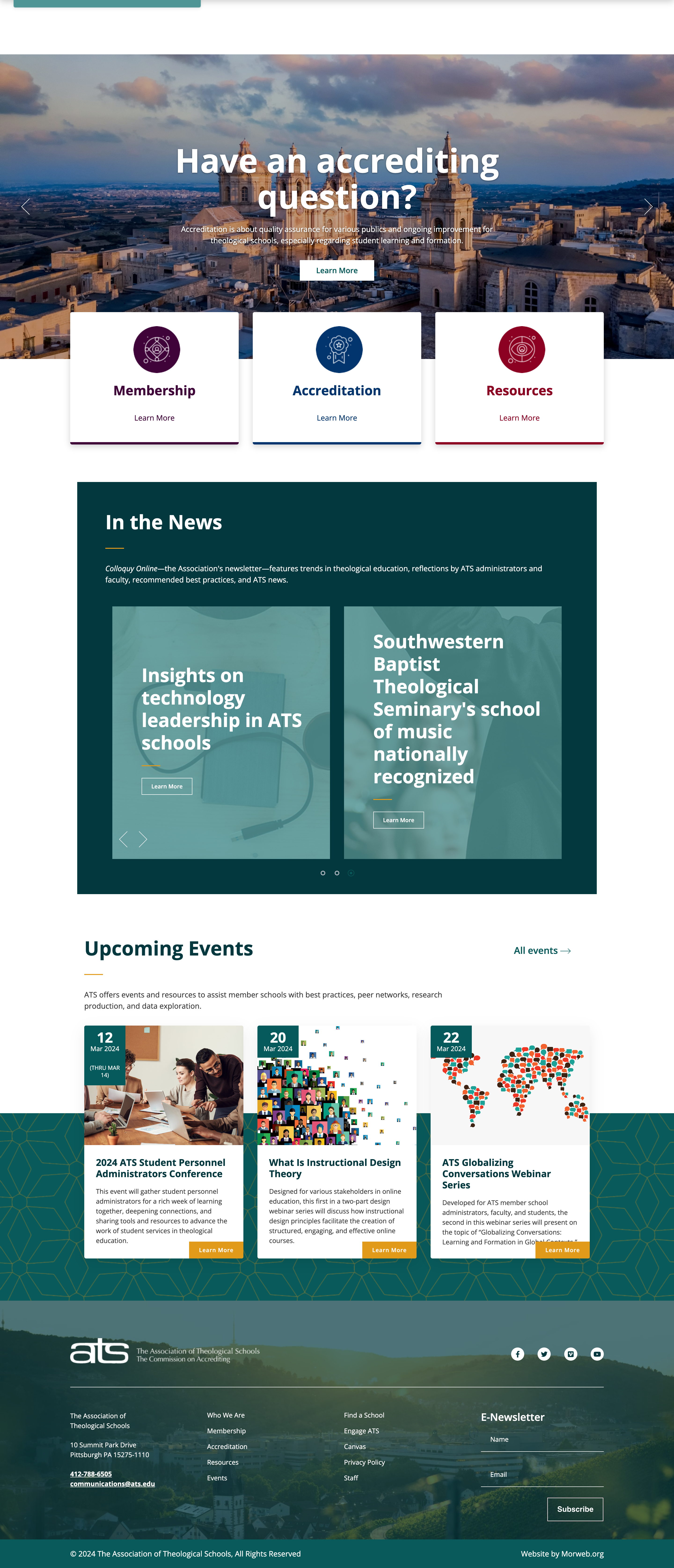
What we like the most about this website:
- The website has a professional and clean design, facilitating easy navigation.
- It prominently features its values, fostering a strong sense of purpose.
- The use of official imagery and detailed information about member schools is highly informative.
The Association of Theological Schools website serves over 270 graduate theology schools in North America, offering accreditation and support. The site is designed to be a resource for schools, students, and faculty, detailing membership benefits, accreditation processes, and educational events. The layout is designed to facilitate easy navigation to important information including various resources for administrators, faculty, and students.
4. Invisible Children
Advocacy and rehabilitation for children.

What we like the most about this website:
- The website uses imagery and videos that effectively communicate its mission.
- Its design is intuitive with clear CTAs encouraging visitors to donate or get involved.
- The color scheme and visual elements are chosen to evoke empathy without overwhelming the user.
Invisible Children partners with local peacebuilders in Central Africa to end violent conflict and build sustainable peace. The website showcases its work in conflict zones, emphasizing community and peacebuilding. It ranks among the best nonprofit websites for its innovative solutions like crisis mapping and community-based early warning systems. The layout is streamlined, making it easy for visitors to browse through the website.
5. Onward
Travel experiences with storytelling.

What we like the most about this website:
- The Onward website has an “Impact Stories” section, with real-world examples of their work.
- It utilizes clear imagery and narratives to illustrate its impact and partnerships.
- The engaging CTAs encourage users to engage and partner with the organization.
Onward is dedicated to empowering organizations to create more inclusive cultures. Through tailored change management plans, learning experiences, and coaching, they aim to address inequity in various sectors, including nonprofits, companies, and educational institutions. The layout is streamlined, making it easy to understand their offerings and the significant impact they strive to achieve toward building an equitable world.

Build your website in 1 minute
Found inspiration? Your website is just a few clicks away. Start
with 10Web AI Website Builder to effortlessly bring your vision to life.
6. Sarara
Safari experiences in Northern Kenya.

What we like the most about this website:
- The Sarara website integrates immersive full-screen wildlife and landscape photography.
- It includes video tours that highlight the unique beauty of Kenya’s wilderness.
- The website clearly outlines the initiatives, demonstrating a strong commitment.
Sarara is dedicated to promoting conservation and ecotourism in Northern Kenya. It offers visitors a chance to experience the region’s natural beauty while participating in conservation efforts. The site also details the Sarara Foundation’s work in supporting the local community and wildlife. Its layout represents the spirit of adventure and conservation ethos, making it a portal to one of Africa’s last true wilderness areas.
7. WWF Living Planet Technology Hub
Technology solutions for conservation accelerated.

What we like the most about this website:
- WWF website integrates striking visuals and interactive elements to engage users.
- The website displays an interactive map with global WWF technology projects.
- It highlights innovative challenges like the Nature X Carbon and Generation Water Tech Challenge.
The WWF Living Planet Technology Hub focuses on matching technology with nature conservation efforts. It’s an initiative to introduce and support technological solutions like environmental DNA, conservation drones, and machine learning to protect wildlife and nature. The site’s aim is to inspire innovative approaches to conservation. The layout is straightforward, making information on technology’s role accessible to all visitors.
8. HerStart
Entrepreneurial skills to empower women.

What we like the most about this website:
- The website provides access to a rich resource hub filled with tools and insights.
- It covers impactful testimonials and stories that highlight their success and influence.
- The use of compelling CTAs guides visitors to participate or contribute to the cause.
Next on our list of the best nonprofit websites is HerStart. It is an initiative by Youth Challenge International to advance women’s equality through entrepreneurship. The website offers innovative programs, fellowships, and investment opportunities focused on young women in Ghana, Tanzania, and Uganda. It provides them with the skills, confidence, and resources needed to launch or grow their businesses.
9. Just One International
Support for Honduran communities.

What we like the most about this website:
- The website uses imagery that highlights their projects and the communities they support.
- The website features a “Meet the Team” section, presenting a personal touch.
- The site’s design elements are used effectively to evoke a sense of hope and urgency.
Just One International empowers Honduran communities by providing scholarships, family support, and essential resources like food and water. The organization’s website effectively communicates its mission and offers multiple ways to get involved, from donations to learning more about their projects. Its layout and design are not only visually appealing but also guide users smoothly through the information and stories.
10. Tapestry Capital
Community investment opportunities.

What we like the most about this website:
- The website has an “Our Impact” section, highlighting the projects they’ve financed.
- It features impactful testimonials that show their success in community financing.
- The site utilizes compelling CTAs, guiding visitors to learn more and get involved.
Tapestry Capital helps charities, non-profits, and co-operatives across Canada raise capital from investors who believe in their mission. It’s Canada’s leading partner in community bond campaigns, with over $100 million raised and 59 projects financed. The layout is straightforward and user-friendly, designed to educate and encourage action from potential investors in their financing model.

Build your website in 1 minute
Found inspiration? Your website is just a few clicks away. Start
with 10Web AI Website Builder to effortlessly bring your vision to life.
11. Heifer International
Livestock and training for families.

What we like the most about this website:
- The website includes a detailed interactive map highlighting global projects.
- It has an “Animal Gift Catalog” that allows donors to contribute specific resources to families in need.
- The use of testimonials effectively demonstrates their success and mission.
Heifer International’s website is dedicated to ending hunger and poverty while caring for the Earth. It’s helping communities become self-sufficient and sustainable. The website’s layout is user-friendly, with clear calls to action encouraging donations and involvement. Their success is depicted through impactful stories, statistics of households helped, and a strong emphasis on women’s empowerment in agriculture.
12. Only One
Environmental and social campaigns.

What we like the most about this website:
- The website boasts engaging CTAs encouraging visitors to take immediate steps.
- It effectively showcases its global impact through statistics and success stories.
- It features an immersive video highlighting the ocean’s beauty and the urgency of conservation efforts.
Only One is a nonprofit organization focused on ocean conservation and climate action. By using expert insights and a community-driven approach, it empowers individuals to contribute to significant environmental changes. The website’s layout is user-friendly and educational. It provides easy access to information, from signing petitions to funding projects, ranking the website among the top nonprofit website examples.
13. Charity Water
Globally initiated clean water projects.

What we like the most about this website:
- Charity Water utilizes high-quality imagery and videos to showcase its impact.
- It has an innovative tracking tool, for donors to see where and how their contributions are used.
- The site integrates a virtual reality experience to immerse visitors in the communities they’re helping.
Charity Water is a nonprofit organization dedicated to providing clean and safe drinking water to people in developing countries. The website is well-designed, with a clean layout that makes it easy to navigate and engage with their mission, achievements, and ways to contribute. Their use of compelling imagery and clear information about their work makes it one of the top examples of nonprofit websites.
14. Starts With Us
Anti-racism resources and training.

What we like the most about this website:
- The website employs a unified color scheme that’s visually appealing.
- The website integrates pledges and challenges, inviting visitors to commit to positive actions.
- It highlights partnerships with various organizations, showcasing an inclusive approach to social change.
Starts With Us is a nonpartisan, nonprofit initiative aimed at overcoming extreme political and cultural divisions in the U.S. It seeks to empower Americans with skills for engaging across differences to advance the country. The site promotes a culture of open-mindedness, empathy, and bravery through its programs and partnerships. It focuses on enhancing a culture of constructive communication and critical thinking.
15. Doctors Without Borders
Medical aid in crisis zones.

What we like the most about this website:
- The website offers live updates and a “Stories” section, with real-time information.
- The design is clean, with a strong emphasis on their mission and values.
- The integration of an interactive map provides a unique way for visitors to explore their global impact.
Doctors Without Borders is an international humanitarian organization. It provides medical assistance to people affected by conflict, epidemics, disasters, or exclusion from healthcare in over 70 countries. The website is designed to encourage donations and volunteer efforts with easy navigation and clear CTAs. Their commitment to transparency is evident through detailed reports and financial statements.
If interested in exploring more examples read our article on the top 23 Healthcare Websites in 2024.

Build your website in 1 minute
Found inspiration? Your website is just a few clicks away. Start
with 10Web AI Website Builder to effortlessly bring your vision to life.
16. Power for Parkinson’s
Support for Parkinson’s community.

What we like the most about this website:
- The website utilizes vibrant colors and compelling imagery to highlight its mission and services, creating a welcoming atmosphere.
- The website features an “In Your Corner” community section that showcases personal stories, creating a deeper emotional connection.
- It includes a prominently displayed “Donate” button, encouraging community support.
Power for Parkinson’s focuses on providing free mind and body fitness classes for people with Parkinson’s disease, both online and in-person in Austin, TX. Committed to supporting the Parkinson’s community, the website emphasizes the power of exercise in managing Parkinson’s symptoms. It offers comprehensive resources, including live and pre-recorded classes, aimed at fostering a sense of community among participants.
17. Nyws
Anti-violence services for women.

What we like the most about this website:
- Nyws uses impactful imagery and stories, creating an emotional connection.
- The website incorporates an emergency exit button for user safety and privacy.
- It highlights a strong call to action with a “Donate” button, making it easy for visitors to contribute.
Nyws is an anti-violence center in Toronto dedicated to empowering women, non-binary, and trans folks to live free from violence. With over 38 years of service, Nyws has supported over 11,000 individuals and their children. The website’s layout is user-friendly, offering essential information about services, stories of impact, and ways to help, effectively communicating the center’s mission and needs.
18. Wycliffe Bible Translators
Bible translation and literacy programs.

What we like the most about this website:
- The website uses a “Give Now” button making it easy for users to donate.
- It uses bold and large typography to enhance its visual appeal and streamline browsing.
- It incorporates dark shades of green cyan to enhance the user experience.
Wycliffe is well-known for its focus on Bible translation projects around the world, aiming to make the Bible accessible in every language. Their website highlights their mission, showcases stories of impact, and uses engaging imagery and design to attract support. The site includes clear CTAs making it easy to donate, volunteer, and offer prayer support, sharing inspiring stories of their work around the world.
19. Second Harvest Foodbank
Food rescue and distribution network.

What we like the most about this website:
- The website includes an interactive map for finding food assistance locations.
- It displays real-life impact stories that highlight individual and community benefits.
- The site presents detailed statistics on their contributions and efforts in fighting hunger.
The Second Harvest Foodbank’s website is dedicated to their mission of ending hunger. They’ve been making a significant impact since 1986 by providing meals to communities in need. The layout is user-friendly, with sections on how to get involved, find food, or become a volunteer. The website effectively communicates the organization’s impact, vision, and ways the community can contribute to their cause.
If interested in food-related web designs, you can find more food website examples here.

Build your website in 1 minute
Found inspiration? Your website is just a few clicks away. Start
with 10Web AI Website Builder to effortlessly bring your vision to life.
20. Law in Action Within Schools
Legal education and reform initiatives.

What we like the most about this website:
- The website features a “Programs” section, with various initiatives and partnerships.
- It incorporates impactful testimonials with video stories to demonstrate its influence on students’ lives.
- The color scheme is professional, enhancing the site’s appeal and readability.
The Law in Action Within Schools website is a hub for Canada’s leading law school youth outreach program. It aims to provide innovative legal and justice education to high school students facing barriers. Its well-organized layout makes navigating through various programs and resources straightforward, ensuring visitors can easily find information on how to get involved or support the initiative.
21. KidSport Canada
Sports opportunities for underprivileged children.

What we like the most about this website:
- The KidSport website presents its mission with engaging visuals and clear messaging.
- It has a “Find Your Chapter” interactive map, for visitors to connect with local branches.
- The “Success Stories” section highlights the positive impact on children’s lives.
KidSport Canada is dedicated to helping children participate in sports by providing grants to cover the costs of registration fees and equipment. Their work ensures that all children, regardless of their financial situation, have the chance to play and benefit from organized sports. The site’s layout is clean, focusing on how to apply for grants, donate, and learn about their impact, making it easy for visitors to understand their mission.
22. Make-A-Wish America
Granting wishes for children with illnesses.

What we like the most about this website:
- The website uses imagery and stories of wish kids to emotionally connect with visitors.
- The color scheme is appealing, enhancing the overall experience.
- The site integrates the “Ways to Help” section, guiding users through various support options.
Make-A-Wish America’s website is dedicated to supporting the mission of granting life-changing wishes for children with critical illnesses. The site showcases the impact of wishes on children and their families. It offers visitors multiple ways to get involved, including donating, volunteering, and referring a child. The use of real stories from wish kids and statistics on the benefits of wishes adds a powerful touch to the website.
23. Concern Worldwide
Emergency relief and development programs.
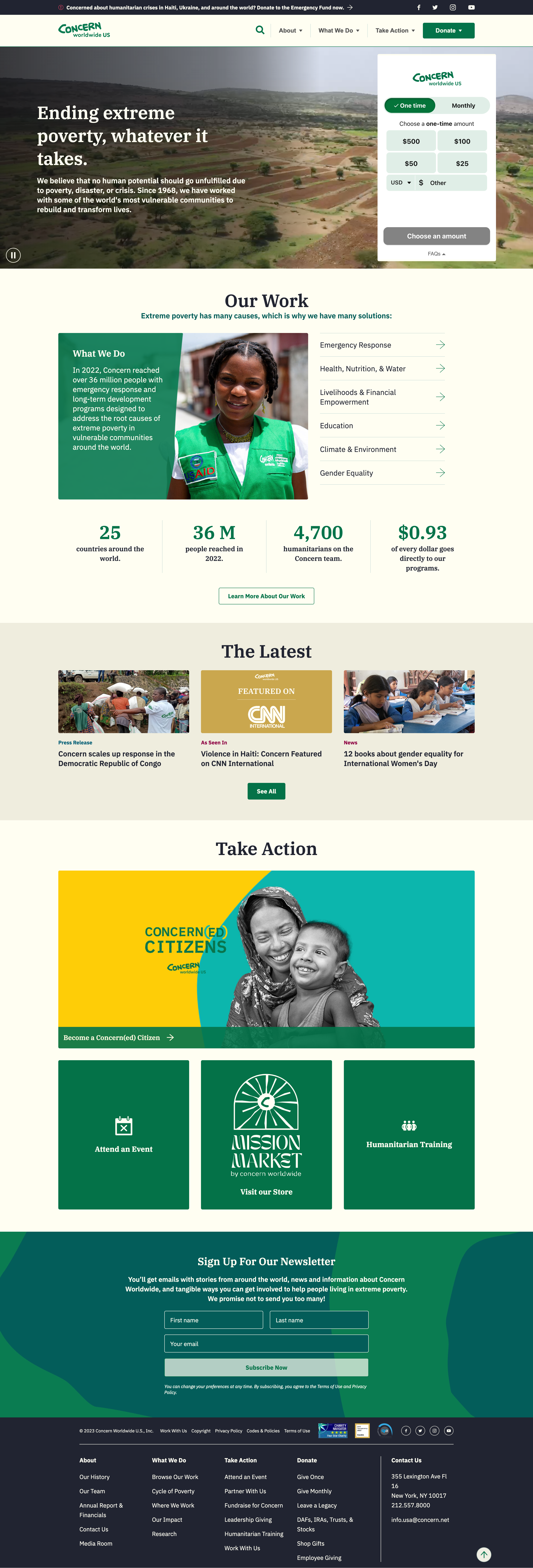
What we like the most about this website:
- The website features impactful imagery and stories that highlight their global humanitarian efforts.
- The website has a section dedicated to COVID-19, highlighting their immediate response to global crises.
- It efficiently uses color and design to evoke a sense of urgency and compassion.
Concern Worldwide is a humanitarian organization dedicated to ending extreme poverty. It works with the world’s most vulnerable communities to transform lives through emergency response and long-term development programs. In 2022, they reached over 36 million people across 25 countries. The organization is showcasing its impact with a high percentage of donations going directly to their programs.
24. YMCA
Community supporting services and programs.

What we like the most about this website:
- YMCA’s website features engaging imagery of participants from various programs.
- It integrates a location finder for local YMCA centers, enhancing user experience.
- The site offers a dynamic mix of content, enriching the visitor’s understanding of their impact.
The YMCA website’s mission is to strengthen communities through youth development, healthy living, and social responsibility. It details the wide range of programs designed to support individuals and communities in achieving their potential. The website ranks among the best nonprofit websites because of its user-friendly layout. It makes it simple for visitors to find information on how to get involved, donate, or benefit from the YMCA’s offerings.
25. Waves for Water
Globally implemented clean water solutions.

What we like the most about this website:
- Waves for Water stands out with its Courier Program, enabling travelers to carry water filters to communities in need.
- It features real-world impact statistics and goals, enhancing transparency.
- The website’s color scheme and layout are streamlined for easy navigation and information absorption.
Waves for Water is dedicated to solving the global water crisis by ensuring that everyone has access to clean water. It encourages involvement through various programs, including disaster response initiatives and the promotion of clean water projects worldwide. The organization’s success is evident in the millions of people impacted and the wide-ranging global outreach.

Build your website in 1 minute
Found inspiration? Your website is just a few clicks away. Start
with 10Web AI Website Builder to effortlessly bring your vision to life.
26. Oxfam Canada
Poverty alleviation and advocacy efforts.

What we like the most about this website:
- Oxfam Canada’s site prominently highlights their mission with a focus on women’s rights.
- It uses impactful imagery and stories to convey the urgency of their work and the difference they make.
- The site has a “Take Action” button that guides visitors to contribute to the cause.
Oxfam Canada is dedicated to fighting inequality and poverty with a strong focus on empowering women and girls worldwide. The organization uses research, advocacy, and direct actions to address the main causes of poverty and injustice. The website communicates this mission, offers educational resources, and shows the impact of their work efficiently, thus taking its place in our list of best nonprofit websites.
27. Warrior Rising
Entrepreneurial support and resources for veterans.

What we like the most about this website:
- Warrior Rising’s website employs compelling storytelling and strong visuals.
- It offers testimonials from veterans, providing real-life success stories building trust.
- The website has a “Start a Business” program tailored specifically for veterans.
Warrior Rising is a nonprofit organization focused on empowering U.S. military veterans and helping them create sustainable businesses. The site aims to aid veterans in the transition to civilian life through entrepreneurship. It includes education, business coaching, and funding. This website ranks among the greatest nonprofit website examples because of its layout, specifically designed to facilitate veterans’ access to resources.
28. Samaritan’s Purse
Humanitarian aid and disaster relief.
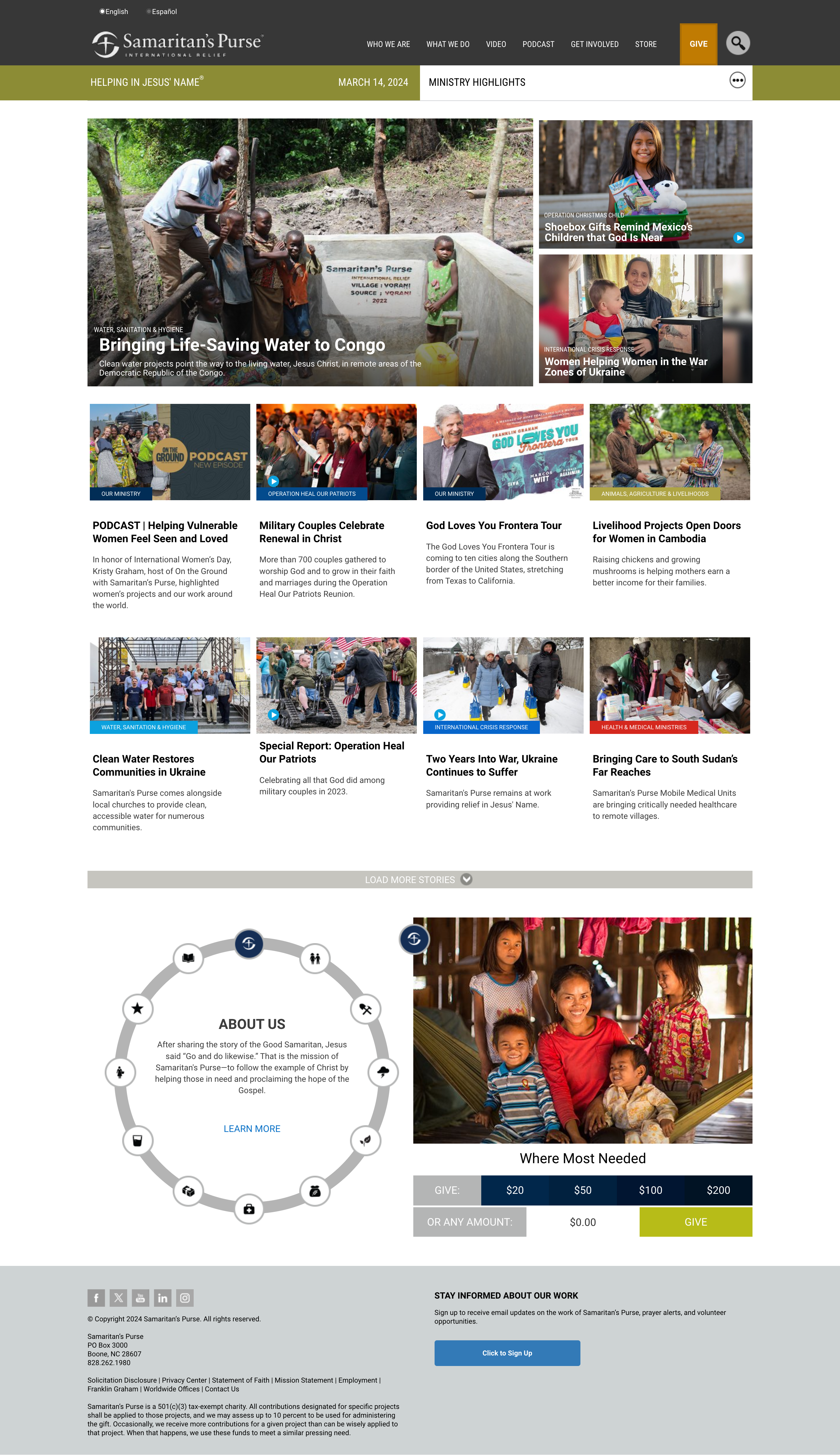
What we like the most about this website:
- Samaritan’s Purse website has a “Prayer Point” section for spiritual support.
- It uses compelling imagery and videos, effectively presenting their global humanitarian efforts.
- It has a real-time impact counter showing the global reach of their projects.
Samaritan’s Purse is a nonprofit focused on providing international disaster relief and humanitarian aid. This is one of the best nonprofit websites as it does an excellent job of outlining various initiatives, from disaster response to medical missions. It makes it easy for visitors to understand how they can get involved. The site’s layout is designed for accessibility, guiding users through a range of programs and ways to support the organization’s mission.
29. ASPCA
Animal protection and welfare services.
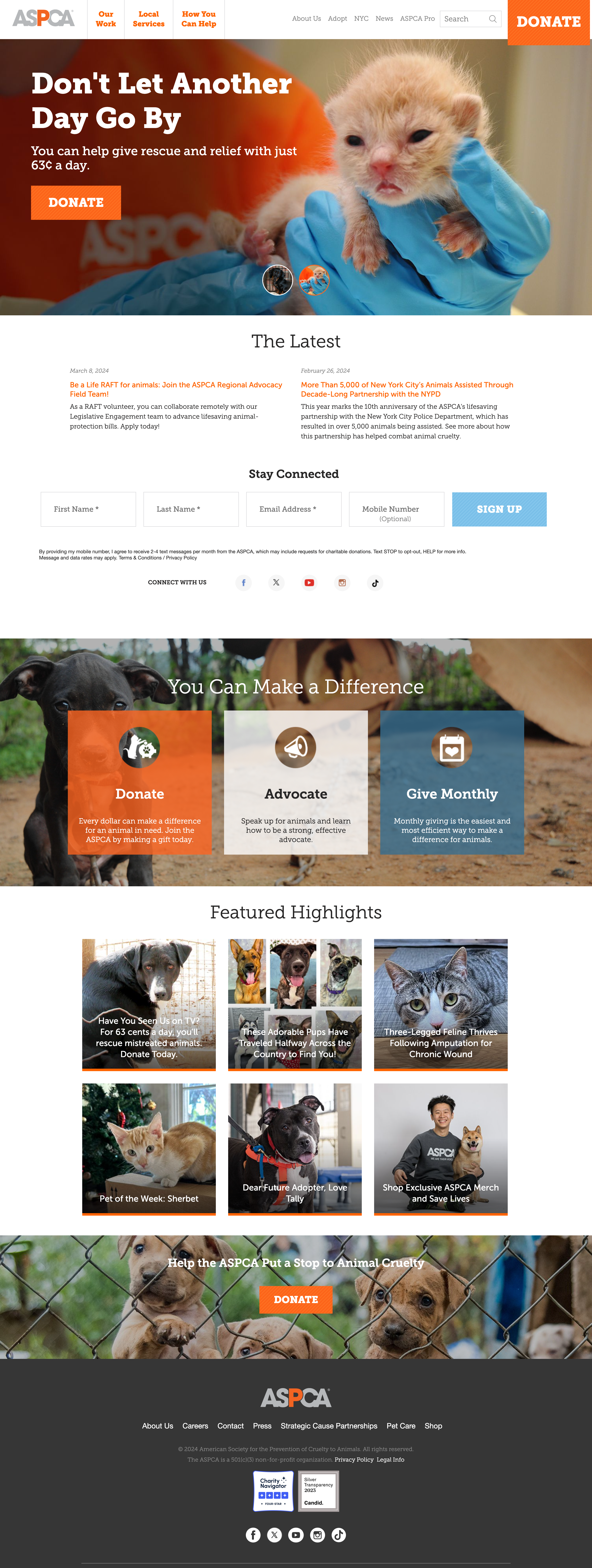
What we like the most about this website:
- The ASPCA website uses compelling imagery and stories to highlight the importance of animal welfare.
- It has a dedicated section for success stories and rescue operations, enhancing engagement.
- The website contains information on pet adoption and animal welfare services.
The ASPCA is dedicated to preventing cruelty to animals across the United States. Founded in 1866, it’s one of the oldest animal welfare organizations. The site offers a wealth of information on animal rescue, adoption, and advocacy, aiming to inspire visitors to take action. Through powerful storytelling and imagery, it showcases its efforts in rescuing animals and helping them find homes.

Build your website in 1 minute
Found inspiration? Your website is just a few clicks away. Start
with 10Web AI Website Builder to effortlessly bring your vision to life.
30. National Wildlife Federation
Wildlife conservation and education programs.

What we like the most about this website:
- The website has vibrant imagery and nature-focused design showing the beauty of wildlife.
- The site offers clear CTAs, like “Donate Today” and “Subscribe to Ranger Rick.”
- It integrates the “Wildlife Guide” offering detailed information about various species, enhancing educational value.
Last on our list of the top nonprofit websites is the National Wildlife Federation’s website. This website aims to inform people and get them involved in keeping America’s wildlife safe. The website does a great job by using stunning pictures and easy-to-understand information. It targets a wide audience including hunters, anglers, and nature enthusiasts.
How to create your own nonprofit website
Creating a website involves a series of strategic steps. This section will help you in turning your vision into reality and creating your ideal website.
1. Gather inspiration: Begin by exploring the various examples of the websites listed in this article that are handpicked by the 10Web Editorial team. Take notes of all the things that you like and that you’d like to see on your website as well.
2. Select the right platform: There are different website builders and platforms, each with its unique advantages and disadvantages. For example, WordPress stands out with its customization and wide range of themes and plugins, while Wix stands out with its easy-to-use editor.
3. Optimize website performance: Your website’s speed and responsiveness are crucial for engaging visitors and improving search engine rankings. Opt for reliable hosting that ensures your site is fast and accessible to all users.
4. Use AI to simplify website creation: AI can help with everything from design decisions to content creation, making the process more efficient. Use AI to automate and innovate, reducing the time you spend on website building and focusing more on growing your business.
All these and even more can be automated with 10Web AI Website Builder:
- Create a website with AI in less than a minute
- Super fast Google Cloud Partner hosting
- Website performance and speed optimization
- Managed security and backups
Conclusion
Wrapping things up, we’ve seen some amazing examples of nonprofit websites that stand out by being easy to use and telling great stories. Remember, the key is to keep your site clear, make your mission obvious, and always show how visitors can help. With these tips and inspirations in mind, you’re well on your way to creating a nonprofit website that can make a difference. With a bit of creativity, these tips, and the help of a user-friendly 10Web AI Website Builder, you can easily create a nonprofit website that will not only look great but also effectively attract and keep visitors interested. Let’s get started on making your nonprofit website today!


