You searched for personal website inspiration and landed in a sea of glossy templates, overused gradients, and carbon-copy designs that say nothing about you. That’s the problem: most personal website advice focuses on aesthetics instead of what actually gets you noticed.
Personal websites are one of the most flexible career tools. They offer a space to share our story, highlight our work, and attract the crowd we are searching for. Still, most creators make the same mistakes that quietly kill their results.
This guide does it differently. We’ll discuss 15 personal website examples that deliver all the right results, with real takeaways you can borrow.
Why do 90% of personal websites fail
The biggest problem with most personal websites is that they’re designed to feed your ego, not get you work. Pretty layouts, fluffy mission statements, and clever animations won’t land clients or job offers if nobody can figure out what you actually do. Here are the 3 mistakes that quietly destroy 90% of personal sites.
1. Focusing on design instead of value
You’re not building a mood board. You’re building a tool. Cool design means nothing if your visitor can’t immediately see what problem you solve and why you’re worth contacting. Nobody hires you solely because your gradients are smooth (but it still needs to be smooth to show professionalism).
What to do: Write down in one simple sentence who you are, who you help, and why it matters. The rest (fonts, colors, fancy visuals) should just back up that message.
2. Adding too many features
Every extra hover state, animation, or clever scroll effect increases one thing: the odds of your visitors leaving. Complexity looks cool for five seconds, then people get tired. If they have to think to navigate, you lose them.
What to do: Based on UX best practices, you should strip it down. One or two colors. One or two fonts. Simple, obvious navigation. If you’re adding something because it’s “cool,” delete it.
Real statistics: A well-designed UI can boost conversion by 200%, and strong UX strategy by up to 400%, according to Forrester research. That means clarity and usability aren’t just user-friendly, they sell.
3. Writing for yourself, not the reader
Most people treat personal sites like LinkedIn bios: long, vague, and full of buzzwords. People aren’t here to read your life story. They just want to know: Can you help them?
What to do: Share your passion, but frame it around how it helps others. Instead of saying what you love doing, show how that passion solves a real problem or makes life easier for your clients.
15 best personal website examples
We’ve gathered the best personal websites across four popular types: portfolios, resumes, blogs, and freelancer pages. Each category comes with quick takeaways to help you understand what works and why, so you can borrow smart ideas for your own site.
1. Sean Halpin: How do you show your work without saying a word?
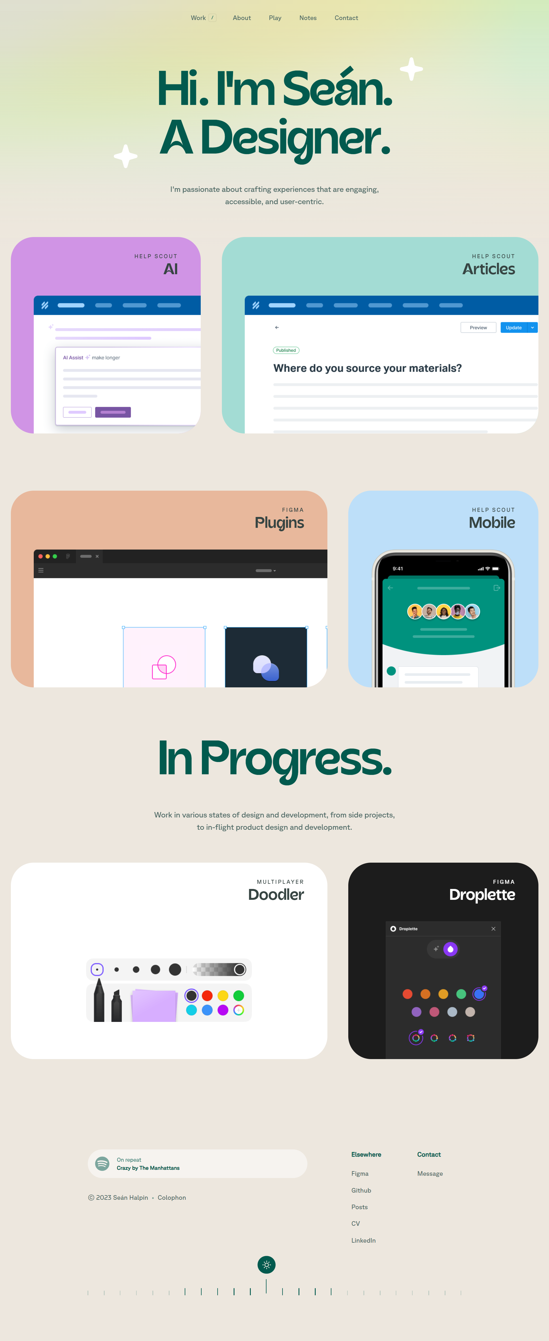
What we like about this personal website:
- Designer-first intro
- Work-first layout with visual hierarchy
- Shows personality without oversharing
This personal website is a great example of “show, don’t tell.” Seán skips the filler and puts the spotlight on his work. No long bios or mission statements, just a clear, focused layout that shows what he does and what he’s working on. The “In Progress” section stands out: it keeps the site feeling alive without looking unfinished. It’s a smart move if you want to show momentum without over-explaining.
What you can use:
- Prioritize showing, not telling
- Use a minimalist layout to keep attention on the work
- Display work-in-progress to show momentum and trust
2. I Am Tamara: How can you own a niche without sounding pushy?
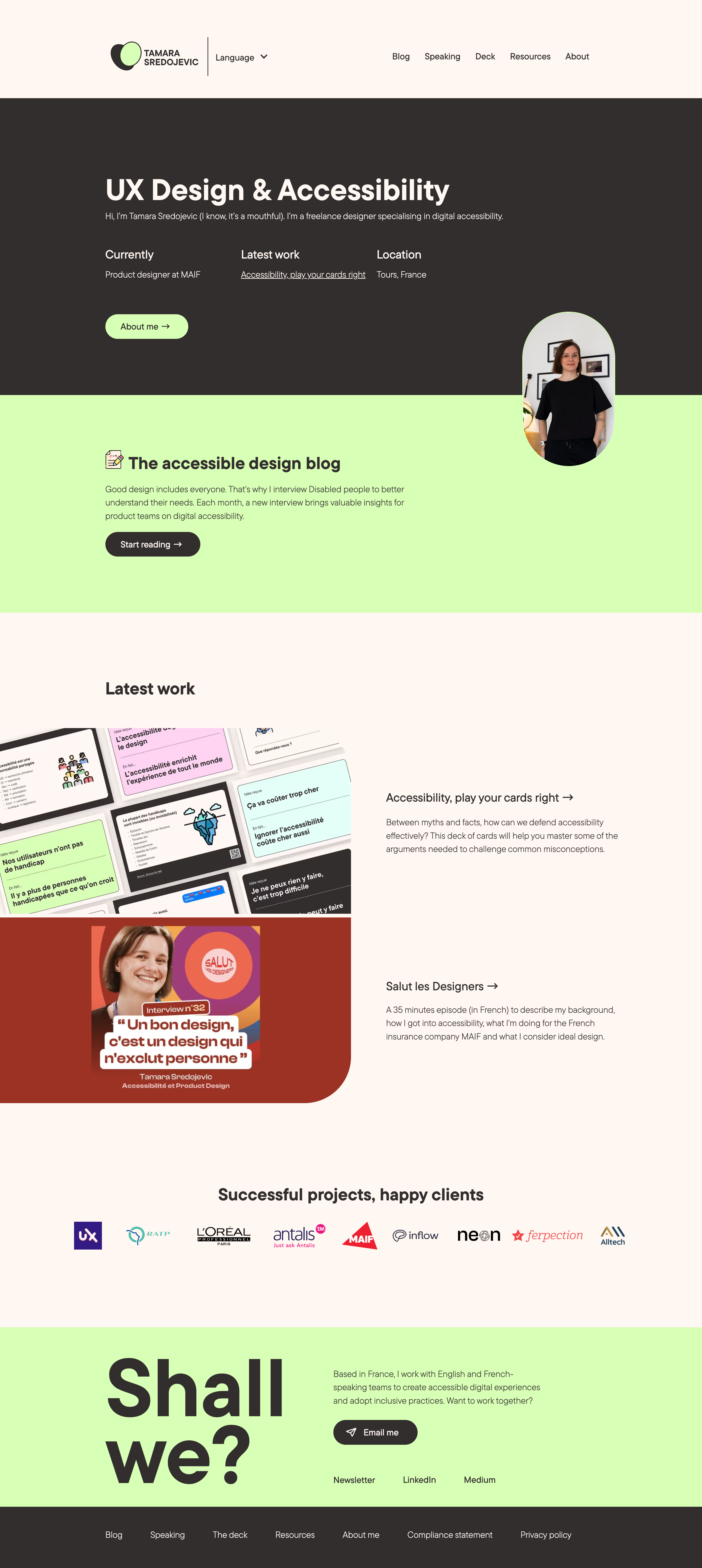
What we like about this personal website:
- Strong positioning
- Useful visual hierarchy
- Client trust built-in the structure
One lesson we should all learn from Tamara’s site is to clearly own our niche. Right at the top, she mentions her focus on accessibility in UX design. This is more of a marketing-related tip, but it’ll definitely help you position yourself better and attract the right people.
The layout doesn’t waste your time either: latest work, blog, speaking, contact. Everything’s there and easy to find. She also backs up her expertise with recognizable client logos and a blog that interviews real users, not just talks about them. These are the kinds of trust-builders the best personal websites tend to include.
What you can use:
- Own your niche early and visibly
- Use logos and blog content to build credibility
- Keep navigation frictionless and user-focused
3. Melanie Daveid: How do you make a site feel high-end?

What we like about this personal website:
- Striking visuals
- Clear narrative through projects
- Strong client-proof without overselling
There are websites that radiate confidence without trying too hard. Melanie’s site is one of those personal website examples. It leans into the artistic side of UX, clearly built to reflect her actual work. The black-and-white theme keeps the focus on the project cards, which use subtle color to naturally draw attention. Each project section feels like its own story, replacing the previous one in a dynamic flow.
What you can use:
- Let your work define the visual theme
- Use project sections to tell a narrative
- Keep the focus with contrast (like B&W with color pops)
4. Lisa Maltby: How can artists let their work do the talking?

What we like about this personal website:
- Artwork speaks first
- Warm tone without oversharing
- Strong proof of versatility
The right move for an illustrator or any visual artist is to minimize text and show the work. Lisa’s site does exactly that. You scroll straight into her colorful portfolio, packed with personality. The website feels playful but still professional. There’s variety in the formats (from food packaging to murals), but everything stays cohesive. If your personal website is about selling creative services, this is a great example of letting your work show range while keeping the vibe approachable.
What you can use:
- Lead with visuals, not descriptions
- Keep the tone warm but minimal
- Show versatility through different formats
If you love the aesthetics of this website, you’ll be amazed at how easy it is to replicate with 10Web AI Website Builder.
5. David Milan: Can bold design still be simple?

What we like about this personal website:
- Visual explosion that fits the work
- No distractions from the art
- Strong energy and confidence
David’s site wastes zero time explaining itself. You land on a full-screen collage of color, typography, and layered visuals that express his style. There’s no scrolling intro, no slow build. It jumps straight into the portfolio grid, which is the right move for someone whose work speaks this loudly.
We talked about simplicity earlier – David’s site is a great example of how boldness and vibrancy don’t have to lead to messiness. All the attention is on the visuals. If you want to read about him, great – just one click takes you to a short paragraph. But otherwise, the design does the talking.
What you can use:
- Let high-energy visuals speak for you
- Skip long intros and get straight to your work
- Use layout to highlight energy without clutter
Main takeaway: What makes a great portfolio website work?
These cool personal websites keep it clean and focused. Every design choice backs up a clear message about who the creator is and what they’re great at. No distractions, no trying to be everything at once.
How to use this yourself: Start by choosing one feeling or impression you want visitors to walk away with. Then build around it. Let that vibe guide your layout, colors, fonts, and copy. Show real work, and ditch anything extra.
Explore portfolio websites further
If you’re ready to go deeper, we’ve gathered even more portfolio websites, plus design tips for creatives like you. Read about them here.
6. Brandon Johnson: How do you build a resume site that feels human?

What we like about this personal website:
- Clear personal positioning
- Scientist-focused proof of work
- Playful interactive elements
Brandon’s site is what happens when you skip the boring resume format and go straight to what matters. He tells you who he is, what he cares about, and backs it up with publications. The whole thing feels more like a conversation than a credentials dump. And the little “always ON” toggle? A clever way to show personality without forcing it. If you’re making a resume-style site, take notes: be direct, be human, and don’t be afraid to add something unexpected.
What you can use:
- Use plain language to tell your story
- Add personal touches to build connection
- Lead with who you are, not just what you’ve done
7. Hugo Bazin: What’s the secret to confident personal branding?

What we like about this personal website:
- Clear personal branding
- Confident, structured storytelling
- Playful design details
Hugo’s site can be considered a masterclass in branding for personal websites. The intro gives you exactly what you need: who he is, what he does, and how to get in touch. Instead of listing roles, he leads with identity: teacher, creator, team lead. It reads more like a positioning statement than a CV. The visual style (color blocks, icons, and bold type) adds energy without distracting from the content.
What you can use:
- Use personal identity over job titles
- Add color and icons for a confident brand voice
- Guide the visitor clearly and visually
8. Nathaniel Koloc: Can a text-heavy site still feel light?

What we like about this personal website:
- Distraction-free layout
- Content-led storytelling
- Sticky menu for smooth UX
This site is a great reminder that simplicity, done well, can stand out. It’s a one-page layout with a white background and black text that just tells his career story. Instead of design tricks, he relies on sharp copy and bolded highlights to guide the reader. You get a full view of his path, but you’re not overloaded, which is rare for a text-heavy site. The sticky menu keeps navigation easy, and the content is actually full of useful advice, so you have a motive to read on.
What you can use:
- Use typography and layout to guide reading
- Tell a full story with minimal visual clutter
- Offer value through content, not design gimmicks
9. Orestis Georgiou: How do you make complex work easy to navigate?

What we like about this personal website:
- Clear expertise focus
- Well-structured longform content
- Smart use of bold type and spacing
Orestis packs a ton of content into his site. It has books, research, talks, consulting, but it’s all broken down clearly, with just enough context to invite a click. The bold headers and clean spacing help you scan quickly while still feeling guided. If your background is complex, you can use this approach of categorization to highlight all aspects.
What you can use:
- Use spacing and headings to improve scannability
- Break down complex work into digestible sections
- Categorize your experience to help users find what matters
10. Ilya Kulbachny: How can a website preview your personality?
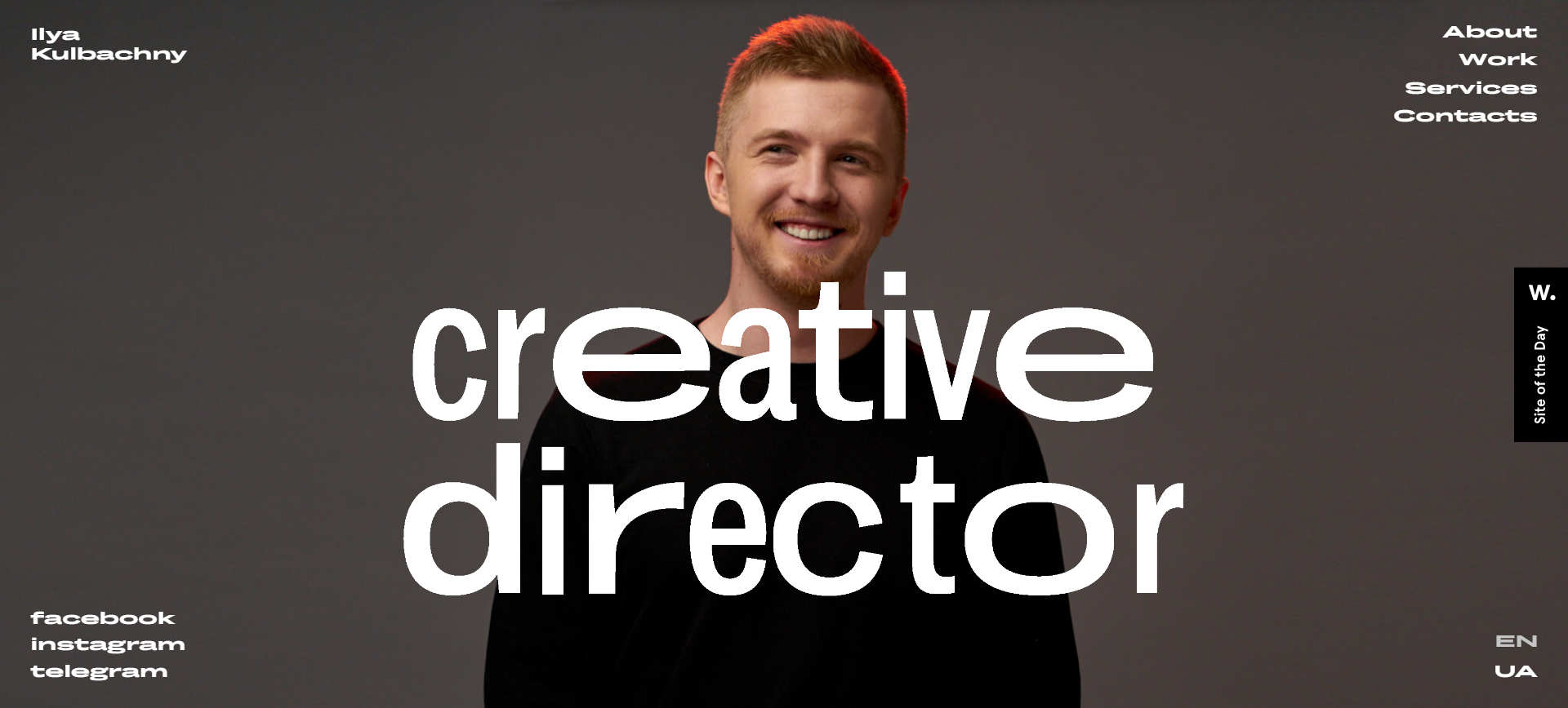
What we like about this personal website:
- Skills demonstration
- Smooth scrolling experience
- Simple colors
As soon as the site starts loading, you see playful progress bars showing statuses like “having breakfast” or “on my way.” You haven’t even seen Ilya yet, but you already get a feel for his personality and creativity. Since he positions himself as a creative director (clearly stated in the image at the top), this intro doubles as a preview of his style and vision. The same goes for the site’s structure and visuals. They reflect creativity at every step. He’s not just telling you he’s creative. He’s showing it.
What you can use:
- Use playful cues to show who you are
- Design your intro to reflect your creative identity
- Keep it simple, but never boring
Inspired by this website’s design? Customize and create your own personal website using AI with ease.
Main takeaway: What makes a great resume website work?
These personal websites build trust by being human, focused, and structured. Each one answers: “Who am I really, and why does that matter?”
How to use this yourself: Ditch the resume language. Write like you’d pitch yourself to someone smart and curious. Use identity-driven copy, sprinkle in proof, and let your layout carry the rest.
Explore resume website examples further
Looking for even more inspiration (plus actionable tips for structuring your own)? Review our guide on best resume website examples!
11. Minimalist Baker: How should a content site be structured?

What we like about this personal website:
- Super organized layout
- Smart filtering for dietary needs
- Recipe-first user experience
This site nails what so many personal websites get wrong: it’s designed around how visitors actually want to browse. It’s easy to find what you need: vegan, gluten-free, or just hungry. All the needs are covered and you can find the right sections due to easy navigation. The bold photos draw you in, but it’s the tagging system and clean structure that keep you clicking.
What you can use:
- Prioritize filtering and categories over pretty fluff
- Make your layout intuitive and goal-oriented
- Keep things clean but actionable
12. Salt in Our Hair: Can you make a blog feel personal and useful?

What we like about this personal website:
- Travel-first content structure
- Friendly and polished visuals
- Built-in trust with human touch
Salt in Our Hair is a personal blog by a couple shaving stories and tips for travelers. Each section is photo-rich, clean, and tailored for action. This site works because it has both warmth and value. It’s not just pretty photos: there’s real, well-organized info people can use, like a clear 10-day Portugal itinerary. If you’re sharing lifestyle content, study how this site earns trust: clean design, personal touches, and content that actually helps.
What you can use:
- Balance aesthetics with real, helpful content
- Use visual cues to support clarity
- Build trust with personal tone and actionable info
Main takeaway: What makes a great blog website work?
A great blog website respects the reader’s time. Everything is built around usefulness, clarity, and vibe. They feel personal, but never chaotic.
How to use this yourself: Map out how your ideal reader actually navigates (searching by topic? goal? vibe?). Then structure categories, tags, and content flow around that.
Explore this topic further
If you want more real-world examples and blog design tips that turn casual readers into loyal fans, take a look at our guide on best blog websites.
13. Jen Carrington: How can a calm site still convert?

What we like about this personal website:
- Warm, spacious layout
- Clear coaching value upfront
- Strong brand voice and visual identity
Jen’s site gets straight to the point, in the best way. You land on the page and instantly get who she’s here for (creative business owners), what she offers (coaching, podcast, blog), and the feel of it all (gentle, thoughtful, no hustle vibes). If your site feels vague or overloaded, this is a great reminder: clear and calm beats clever and crowded.
What you can use:
- Communicate your offering clearly and warmly
- Use gentle branding to create emotional safety
- Don’t overcomplicate, just guide
14. Ali Abdaal: How do you guide different audiences without confusion?

What we like about this personal website:
- Clear “How can I help?” framing
- Well-placed newsletter CTA
- Long-form layout that’s easy to scan
Ali’s site flows like a great sales pitch from a very prepared friend. It opens with a bold promise, walks you through who he helps and how, and wraps it all up with useful content and a call to action. The “How can I help you?” blocks are a smart way to guide different types of visitors without overwhelming them. Even though the blog supports his business, it doesn’t feel pushy. It’s helpful, skimmable, and full of value whether you buy something or not.
What you can use:
- Use self-segmenting navigation (“How can I help?”)
- Prioritize long-form that’s easy to skim
- Always include value-first CTAs
15. Mark Manson: What’s the key to standing out with just copy?
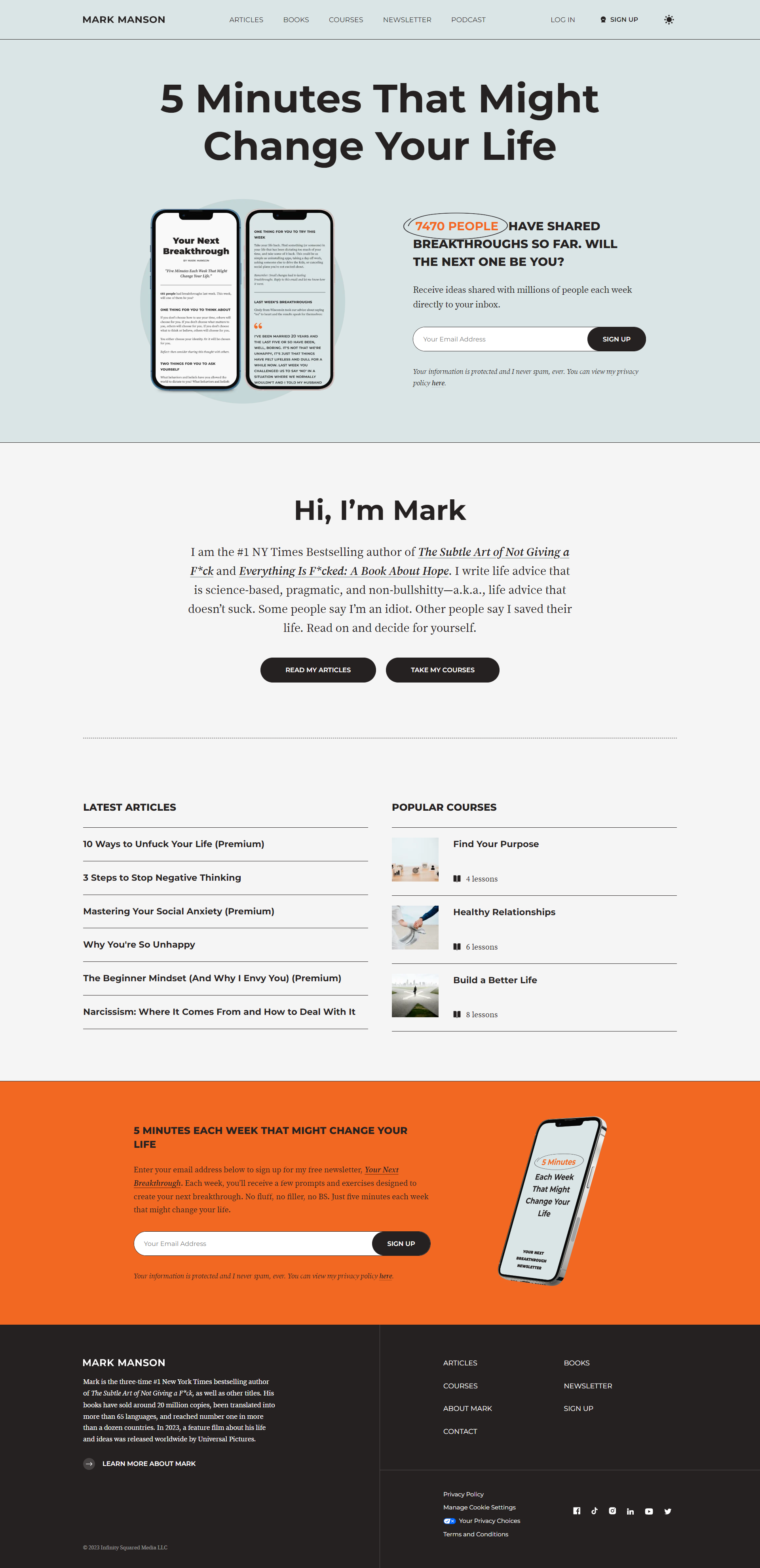
What we like about this personal website:
- Big promise up top
- Sharp copy and no-BS tone
- Multiple CTAs that feel natural
Mark’s site opens with a headline that punches through the noise: “5 minutes that might change your life.” It sets a direct and intriguing tone instantly. The layout supports it: a quick intro, then clear next steps (articles, podcast, newsletter). His personality comes through in the blunt but smart writing. This makes everything feel honest and purposeful.
What you can use:
- Use punchy, direct headlines
- Back everything up with helpful content
- Design for action, not just impression
Main takeaway: What makes client-oriented websites work?
The three personal website examples we reviewed feel like someone saying, “Here’s what I do, how I can help, and what to do next.” No flexing, just clarity and confidence.
How to use this yourself: Write like a real person. Instead of vague phrases, say who you help, what you offer, and how to get started. Then back it up with proof and one good CTA.
Explore freelancing further
Starting out on freelancing is not an easy road, so if you need guidance on your journey, explore our guide on how to start a freelance business.
How should you structure a personal website for maximum impact?
Skip the templates. Here’s the simple system that works for personal websites:
| Step | What to do | Why it matters |
| Positioning first | One sentence: who you are, who you help, why you matter. | Grabs attention instantly. If this isn’t clear, visitors bounce. |
| Work second | Show your best work (projects, outcomes, case studies). | Proof beats credentials. People want to see what you can actually deliver. |
| Trust signals | Add client logos, testimonials, stats, or press mentions. | Builds authority and lowers skepticism fast. |
| Simple navigation | Stick to 3–5 sections: About, Work, Services, Contact, Blog (optional). | Easy navigation = higher engagement. Don’t make people think. |
| Personality layer | Include a blog, side project, or personal touch. | Makes your site feel human and memorable. |
| One CTA | Clear action: Hire me, Book a Call, Work With Me. | Gives visitors a next step. No action = no conversion. |
How can AI help you build a personal website faster?
The hardest part of personal websites isn’t creativity, it’s friction. Blank pages. Endless design edits. Technical setups you don’t care about. That’s where AI earns its keep. There are smart builders like 10Web AI Website Builder that give you a shortcut to the tiring work.
- You just tell AI a few simple things: who you are, what you do, what pages you want, the general vibe you’re going for.
- Let the AI build your site for you: In seconds, you’ll get a complete website draft with a layout, content, pre-filled section, and complete design.
- Make it yours and publish: Now you can jump in and customize fonts, colors, sections, content, and more. You can edit them in a few clicks or tell AI what to change and it’ll do its part.
That’s it. You get a complete site draft (not a shell or just a layout) instantly. It’s like skipping the frustrating part and jumping straight into “now I can actually make this work.”
When you need to move a section, change the layout, or rewrite your “About” page after you publish, you get assistance here as well. You can do it manually with drag-and-drop, or just tell the AI Co-Pilot what you want changed in a simple chat. It handles the technical parts so you can stay in flow mode.
What should you focus on once your site’s built?
Once the base is ready, your focus shifts to the good stuff:
- Sharpening your intro headline
- Choosing the projects or proof points that matter
- Writing that one CTA that makes people click
- Sharing content that reflects you
The AI takes care of the scaffolding. You bring the substance.
Remember: People don’t hire you because your fonts are cool. They hire you because your message is clear. AI can’t figure out your “why,” but it can clear away the digital clutter so you can.
Studies back this idea. According to Nielsen Norman Group, the more mental effort people have to spend figuring out your website, the harder it becomes for them to find what they’re looking for and actually get things done.
Create your dream website with 10Web AI Website Builder 
Build your website in 1 minute
and take your business online!
Conclusion: What we learned from the best personal websites
If there’s one thing all the best personal websites have in common, it’s this: they make it easy to understand who you are and why you matter. They don’t rely on bold animations or buzzwords. They show clarity, focus, and just enough personality to make someone want to connect.
What you can learn from the best personal websites
- Prioritize clarity, confidence, and minimalism
- Let your work do the talking, supported by structure
- Build trust with authenticity, not over-explaining
- Use focused visuals, proof of work, and identity-first messaging
- Guide visitors based on their intent, not your resume
Your website is a conversation starter, a reputation builder, and often, your first impression. It can help you land a job, attract new clients, or simply create something you’re proud to share. And no, you don’t need to be a designer or coder to get it right. Tools like 10Web AI Website Builder make it easy to have your dream personal website in front of you in minutes.
So take a deep breath, start simple, and build something that sounds like you. The internet’s waiting.
Create your dream website with 10Web AI Website Builder 
Build your website in 1 minute
and take your business online!
FAQ
Where can I find personal website examples that are creative but super simple? How do I make a site that reflects my personality without knowing JavaScript? What should I include in a personal website if I’m just starting out? How do you balance clean design with personality? How important is mobile optimization for a personal site? Can my site be effective if it’s static HTML with no animations? Is it okay to skip SEO for the sake of minimalism? How much effort should go into performance (e.g., 2kb HTML bragging rights)? Is brutalist design still a thing or just a niche joke?


