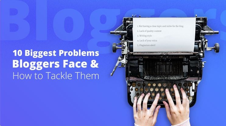
“Business Effectiveness” and “Business Efficiency” are two different concepts. While effectiveness is about doing the right thing, efficiency is about doing the thing right.
Yet, whichever one we take as measurement, in order for your business to succeed today, you need to have a successful business website.
So, what are the crucial 10 design requirements for an effective business website?
1. Mobile responsiveness
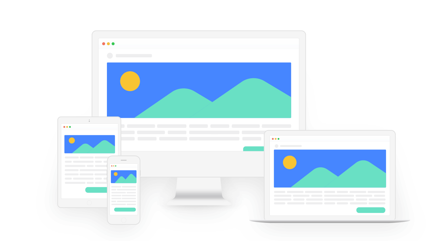 Mobile responsiveness is the first essential practice you have to follow today in order to have a successful website. That’s because mobile use has surpassed desktop use and now has a 63% share in overall web use.
This means that 63% of your website visitors are going to look at your brand through the prism of their smartphone screen.
That’s why you should make sure your website’s reflection on the mobile screen is appealing.
2. Speed it up
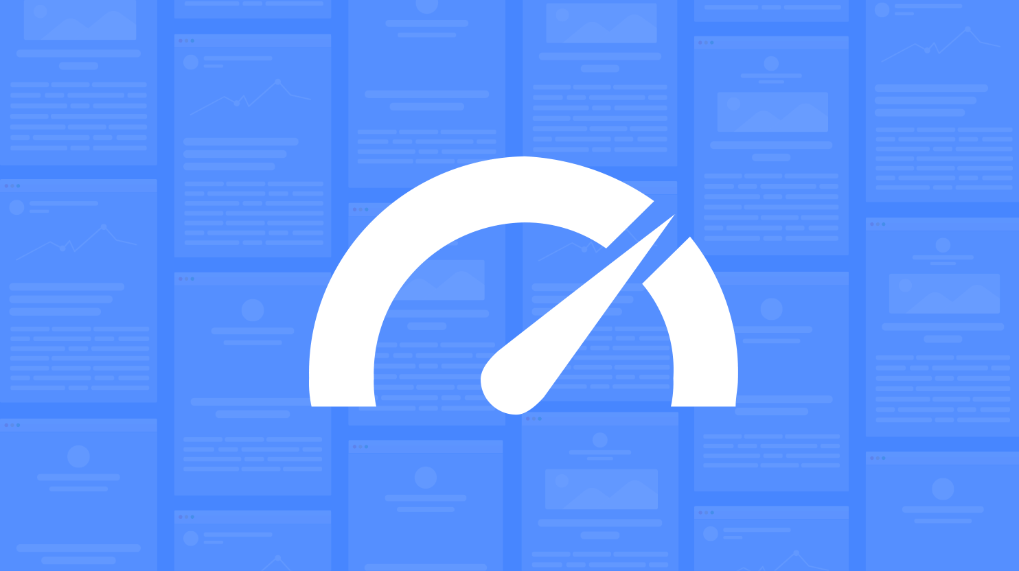
Speed might not be everything for your website, but lack of speed is totally going to leave you with nothing. You should keep in mind that the visitor is busy and prioritize optimizing your website to save their time.
Otherwise, they’ll drop your page even before getting to the content. Moreover, website speed directly affects your SEO as well, meaning a slow site is going to drag your ranking score down.
Here you’ll learn 10 tested and working ways of speeding up your site.
3. Show a face

People trust people. That’s a proven fact. It’s pretty natural too: It’s easier for the customer to believe you when they see the real person behind the brand.
So, give your business a face. Use faces on your landing pages and home page.
That’ll help build trust with your visitors easier, making you more relatable and “real” for them.
4. Add your address with a map and a response form
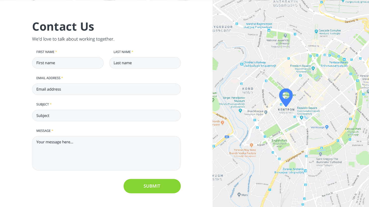
Communication is key in business development. People want to see that you’re accessible.
Adding your physical address with a map and showing them where you’re located is a great sign of accessibility that your audience will appreciate.
Adding a contact form for them to easily get in touch with you is even more important: It’s a way to show that you care about what they think and are there for them.
5. Easily navigable
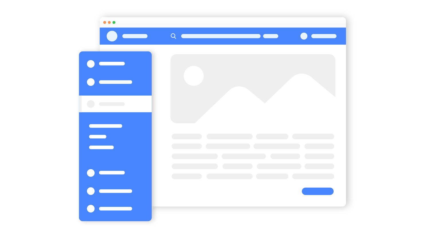 Sophisticated design might be cool and visually appealing, but make sure your imagination doesn’t ruin user experience because your users still need to be able to easily navigate your page.
Follow the “three click rule,”stating that your user should be able to reach anything they need with just three clicks. Otherwise, they are likely to get tired of wandering in your website which will result in the page being dropped.
6. Choose your fonts and colors
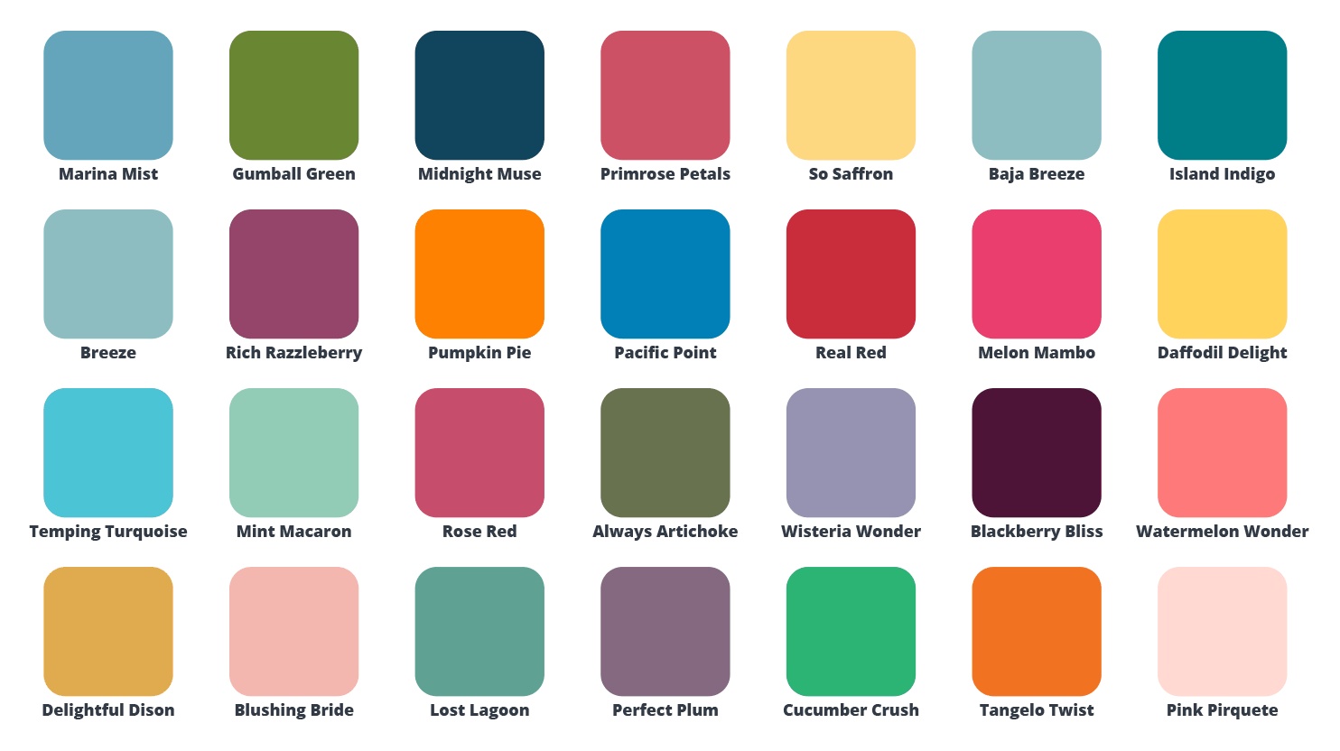
The colors and fonts you use on your website are a part of your unique “signature.” Make sure you know in detail about color psychology of logo design and brand identity. They make you recognizable among competitors, so you should choose those extra-carefully. Try to make it formal enough to express the business part of it, yet engaging enough to attract your visitors.
You also need to pick colors and fonts that are easily readable and pleasant for the eye. It’s advisable to use contrasting colors increasing the readability.
That indeed doesn’t mean that using bright purple on dark green is going to do you good – it’s a business website after all!
7. Don’t forget about fun

The “wow” effect works, so you need to try your best to impress the visitors.
A little bit of fun is going to capture their attention immediately and interest them enough to want to stay and browse your site some more.
As for the fun, you can add really cool engaging elements to the site, such as color play, design tricks, etc. Minimums is a great example of a fun and informative website if you’re looking for inspiration.
Nowadays, you can even experiment with creative designs, layouts, and illustrations without being a professional designer.
8. Design your text with the “F” design
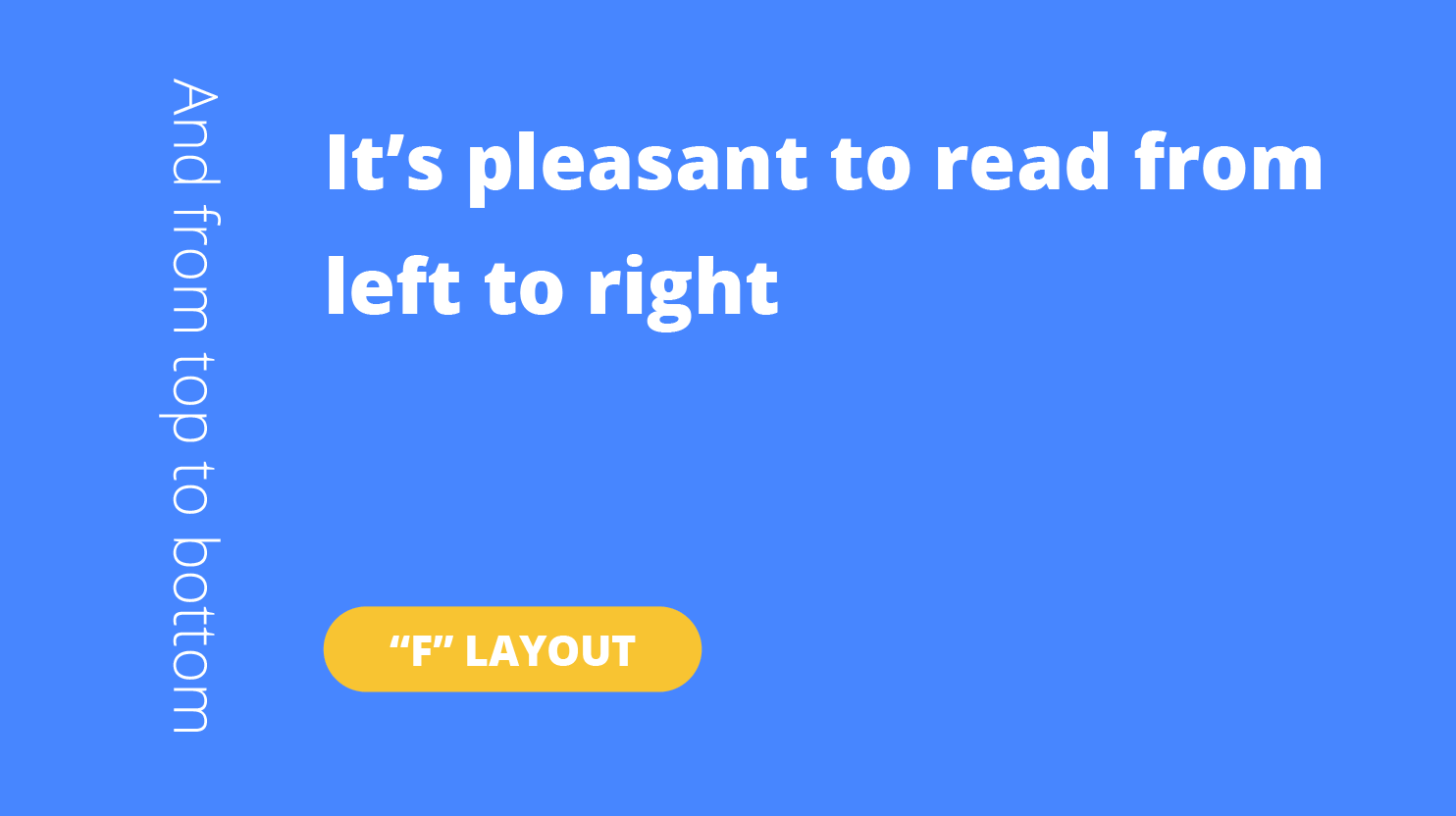
Studies have shown that naturally human eyes and brain scan the computer screen in an F pattern: left to right, getting shorter as the eyes go down. So, you should try to design a website that corresponds to that very pattern.
Generally, the closer you get to the natural flow of eye perception, the better your content will be perceived by users.
9. Control the space
Too much information is no information. If you fill in every ounce of free space on your screen, you’re more likely to scare the visitor away. Leaving some free space to suit the needs of the eye is crucial.
Yet, too much free space is not that great either.
Instead, find a healthy balance. Make smart use of the territory: customize your text, add CTA buttons and other interactive elements, so that it’s visually more appealing, easily readable and engaging for visitors.
10. Meaningful content
It’s pretty obvious that the main aim of your business is selling your product. However, that doesn’t mean that every single post on your website should be advertising. Less sales, more engagement is the perfect way for you.
Remember that your website visitors tend to care about a whole list of things related to your product. Thus, talking about those will capture their attention.
Create interesting and quality content to attract customers like a magnet. Choosing the right images to accompany your text is of no less importance.
Interested in learning more about making successful business websites? Here you may find the answer to your “Why use WordPress for your business website?” question.
See How 10Web Can Benefit You
Visit our homepage to learn more about the ultimate AI-powered website builder.
See How 10Web Can Benefit You
Visit our homepage to learn more about the ultimate AI-powered website builder.

Build a website with AI in one minute
Create your dream website with 10Web AI Builder and take your business online!