In the digital age, good web design is more important than ever. Understanding and incorporating the latest web design best practices will help you craft a design that effectively communicates your message, influences visitors, and reach your website goals. However, the landscape of web design is a dynamic and ever-evolving field. Trying to research all the latest trends can leave your head spinning and even more confused about where to start.
That’s why we’ve provided this comprehensive guide of website design best practices, with multiple checklists, to guide you. We’ve divided this guide into:
- User experience (UX),
- User interface (UI), and
- E-commerce design principles.
So, let’s explore the significance of these design practices and discover the latest trends that can elevate your online presence.
In This Article
The importance of good website design
Following good principles of website design is crucial for several reasons and cannot be overstated in this digital age. A well-designed website plays a crucial role in establishing a strong online presence, attracting and engaging visitors, and ultimately driving business success.
Here are a few key reasons why good website design is essential:
- First impressions matter, and your website is often the first point of contact for potential customers. A visually appealing and user-friendly design creates a positive initial impression, instilling trust and credibility in your brand.
- Navigation is another critical aspect of website design. A well-organized and intuitive navigation structure allows users to easily find the information they need, reducing frustration and enhancing user experience. Clear menus, logical page hierarchy, and prominent calls-to-action guide visitors through your website and encourage them to take desired actions.
- Responsive design is another vital component of good website design. With the increasing use of mobile devices, it is essential that your website adapts seamlessly to different screen sizes and resolutions. A mobile-friendly design ensures that users can access and navigate your site effectively on smartphones and tablets, enhancing their overall experience and improving your search engine rankings.
- Search engines prioritize websites that offer a positive user experience, including fast loading times, optimized images, and relevant content. By implementing SEO-friendly web design best practices, such as using descriptive page titles, header tags, and meta descriptions, you can improve your website’s visibility in search engine results.
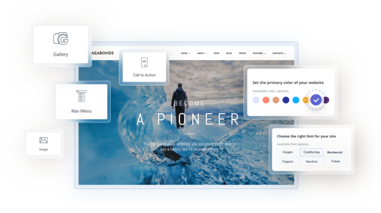
Get a head start on website creation with AI
Create a custom website tailored to your business needs 10X faster with 10Web AI Website Builder!
 No credit card required
Website user experience (UX) best practices and trends
UX design is the practice of creating intuitive and enjoyable interactions between users and digital products or services. It involves understanding user needs and optimizing the overall experience to enhance usability, satisfaction, and engagement.
You should formulate a strategy for your overall UX first before you start with UI design. So, we’ll first look at the UX web design best practices you should know about in 2023:
Mobile-first design
Most of the internet traffic across the world now happens on mobile devices, with a 58.33% share. The gap between mobile and desktop internet traffic is expected to continue growing. That means that the majority of your website’s visitors likely use mobile devices.
Traditionally, web design starts with creating a desktop site and then trying to develop a mobile site from that. However, this trend suggests that you should prioritize the design of your mobile site from the beginning. Everything, from your design to videos and images to page layouts, needs to follow responsive web design best practices.
All your pages need to be fully responsive and display correctly on screens of different sizes. You also need to get the same message across using less screen space.
Personalized user experiences
In an online world that threatens to overload users with information, consumers expect businesses to cater to their individual needs and preferences. 66% of consumers expect brands to understand their individual needs, making personalizations one of the key web design best practices.
So, it’s important that you gather user data, whether through analytics, forms, cookies, or user accounts so that you can analyze and understand your customer base. From there, you can segment users and deliver dynamic content that caters to each group’s interests or pain points.
Of course, to do this at scale, you’ll need the help of AI and machine learning tools, as it will be too resource-intensive to do manually.
Accessibility and inclusivity
Most people think accessibility only means catering to users with disabilities. However, it actually encompasses a variety of web design best practices that involve making your site easier and more comfortable to use for any visitor. This can also mean users in different locations, speaking different languages, or with different areas/levels of expertise.
Most people feel more confident interacting with a brand if they can read or interact in their preferred language. Localization also has a significant impact on digital advertising, SEO, and CTRs on Google SERPs.
Also, don’t forget that different audiences have different reading conventions. Most Western audiences are used to an F-shaped reading pattern, which means your eyes naturally move from left to right and top to bottom. However, many Middle-Eastern and Asian visitors are used to different patterns, like RTL. Following these conventions help users scan your page and to focus their attention on the most important information.
For assistive technologies, you can follow established frameworks, like the WCAG 2.1 web design guidelines. Some examples include using Voice user interfaces *(VUIs) that can be used by smart speakers and voice assistants.
Micro-interactions
Microinteractions improve UX by providing feedback, guiding users, and adding delight. As one of the web design best practices, it can be used to communicate system status, validate user actions, or encourage specific behaviors. Overall, they make interactions more intuitive, engaging, and enjoyable.
They should be used wherever they make sense to guide the user and validate their actions. Here are some typical examples of UX-related micro-interactions:
- Buttons that change color/shape on hover click, or actioned statuses.
- Real-time form validation that shows users that their input is correct.
- Progress indicators like progress bars, spinners, etc. that show action is underway, e.g., uploading or downloading a file.
- Notifications that are accompanied by a sound or animation to alert users.
Dark mode
The dark mode is gaining in popularity among internet users for a number of reasons. Firstly, it reduces eye strain and fatigue by minimizing the brightness and contrast of the screen, especially in low light.
For some, dark mode provides a visually pleasing and modern aesthetic, allowing content and key elements to stand out. It also offers accessibility benefits for users with visual impairments or sensitivity to bright light. Surprisingly, as many as 86% of people prefer using dark mode on their devices.
Minimalistic and clean design
Embrace simplicity by using clean layouts, ample white space, and concise content to provide a visually pleasing and focused experience. Many first-time web owners or newbie designers think that white space looks empty and unimaginative to users. However, it’s actually essential to give a design balance and space out content so that it doesn’t feel overwhelming.
The minimalist design also goes hand in hand with the KIS principle (keep it simple) and other web design best practices that should be kept in mind during new website planning or website redesign. Focusing on essential elements and decluttering the interface also helps focus visitors’ attention where you want it.
Fast loading speed
Optimizing web pages to load quickly and efficiently reduces bounce rates and improves the user experience. You probably know that internet users have short attention spans and even less patience. If your pages take a long to load, it will frustrate users and create a bad first impression, causing them to go elsewhere.
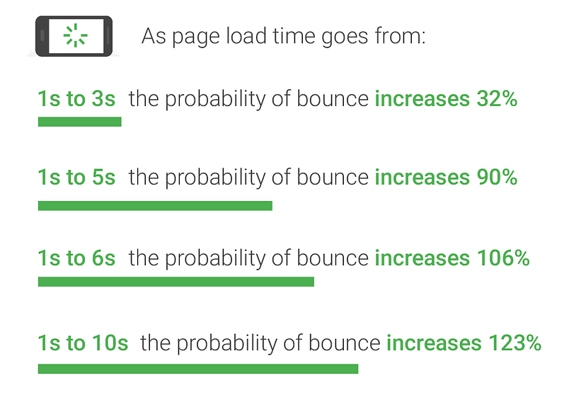
The above graphic by Google shows how strongly loading times correlate to bounce rates. Users won’t read your content, interact with your brand, or buy from you if they abandon your site. So, many of your web design best practices may be useless if you don’t fix your performance first.
That’s why Google now also uses performance as a factor in determining a website’s search engine ranking. It’s also why they keep pushing the implementation of user-centric performance metrics called core web vitals.
So it’s crucial to use a tool like 10Web PageSpeed Booster that can automatically detect and fix performance issues on your website. It can help you with various aspects of WordPress site performance, from HTML/JS/CSS minification to image optimization to caching and CDN delivery. By helping you achieve a PageSpeed score of 90+, it will help you outpace your competitors.
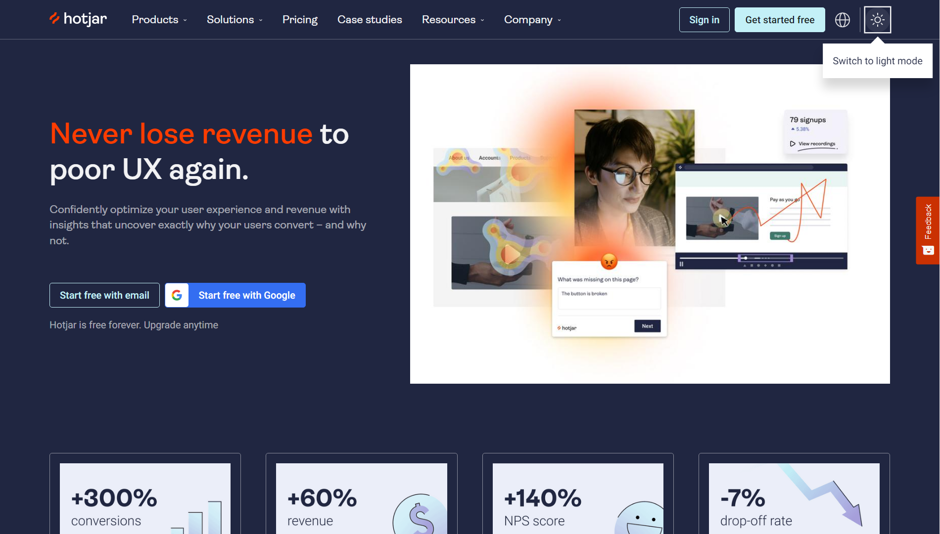
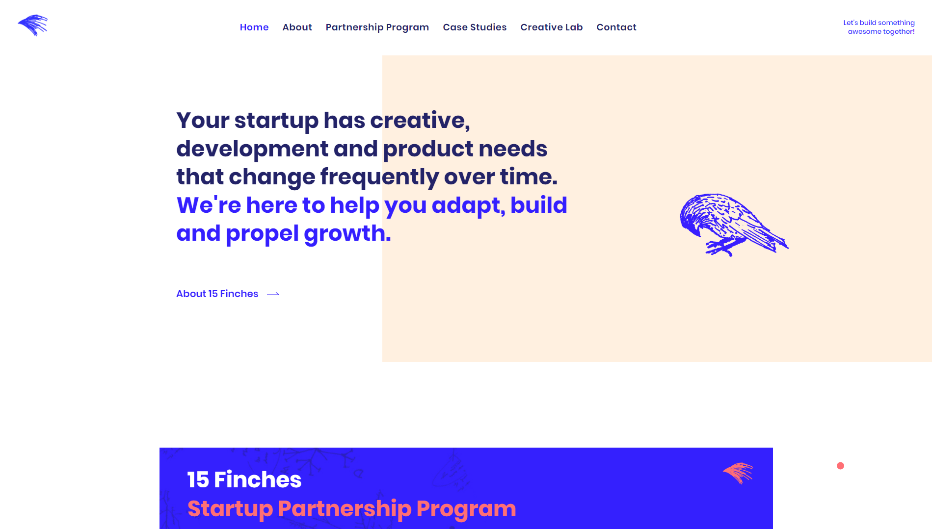
Seamless navigation
One of the most important website user experience best practices involves making it as easy as possible for your visitors to get around your website and find what they are looking for. This starts with creating a logical and intuitive hierarchy for your website’s business pages as well as blog categories and posts.
Here, is a perfect example of clear and straightforward navigation:
You can do this by creating a simple wireframe map of your site’s pages with the homepage at the top and every page you link to on the level below. It’s considered best practice to not have more than three levels of navigation.
To make navigation smoother, you should also use multiple ways to navigate your site:
- A primary navigation menu at the top of your page.
- A footer navigation menu at the bottom of your page.
- Clickable breadcrumbs for pages down the site hierarchy or blog categories/posts.
- Search functionality.
- Content-heavy sites can also use sidebar navigation. This is typically used for related and recommended articles or to find content by category/tags.
Related Article
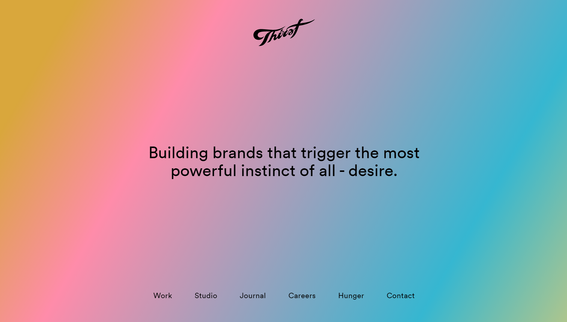
Emotion-driven design
Emotion-driven design is crucial in web design best practices as it focuses on creating experiences that resonate emotionally with users. In most cases, you’ll want to design interfaces that evoke positive emotions and create memorable experiences by using color psychology, thoughtful typography, and visual storytelling.
Image source
There are a few steps you can follow to create an effective emotion-driven design:
- Conduct user research to uncover the target audience’s emotions and motivations.
- Incorporate visual elements, color schemes, and typography that align with the desired emotional response.
- Craft compelling storytelling and use relevant imagery to evoke specific emotions.
- Ensure consistency across the user journey, reinforcing emotional connections.
- Regularly gather user feedback to refine and optimize emotional design elements for a truly impactful and resonant user experience.
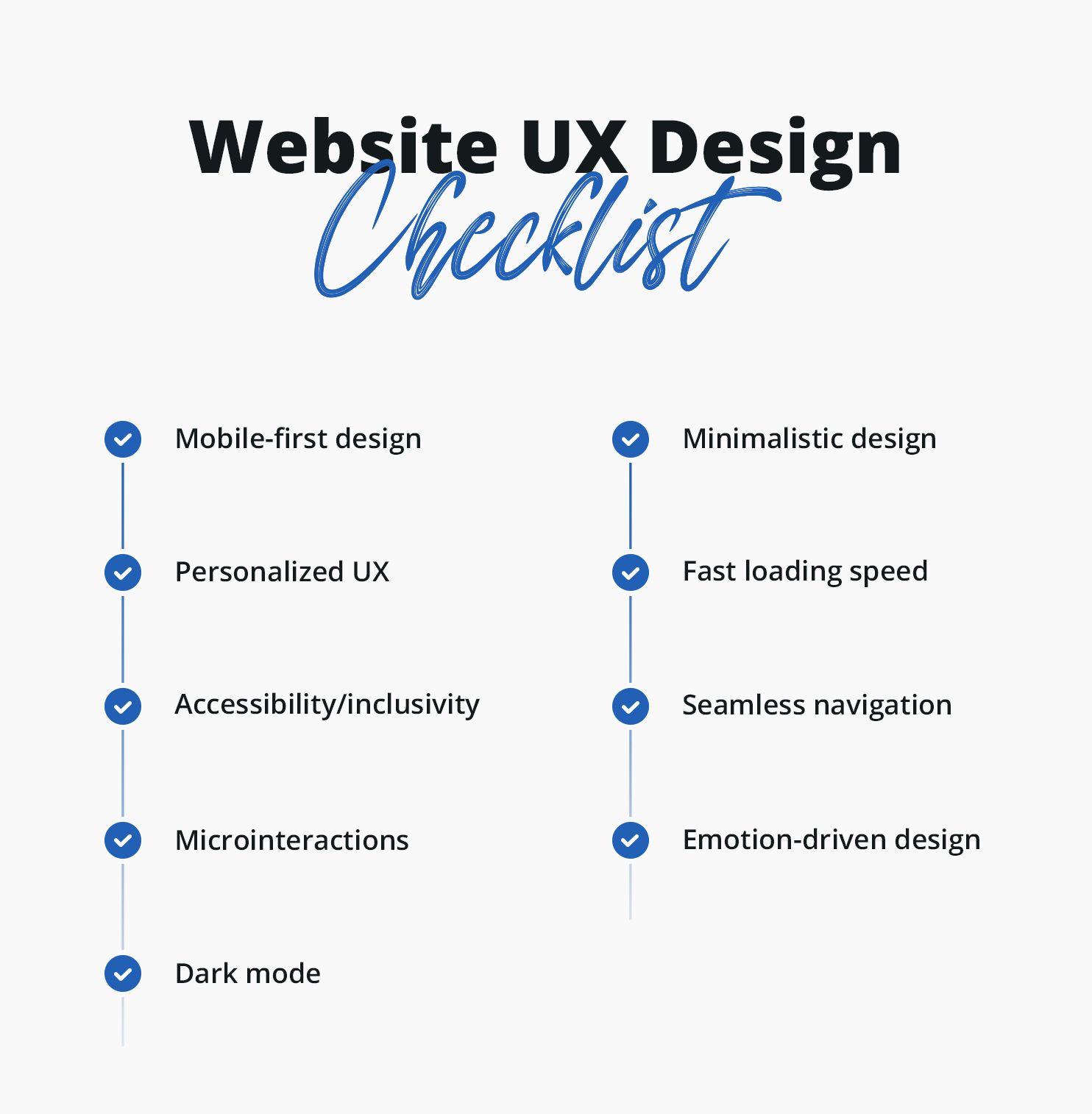
Website UX design checklist
For easy reference, here is a checklist for ensuring you implement all these user experience web design best practices:
- Mobile-first design:
- Ensure all pages are fully responsive and display correctly on screens of different sizes.
- Optimize design, videos, images, and page layouts for mobile users’ experience.
- Adapt interactive elements (menus, buttons) for touch-based interactions.
- Personalized user experiences:
- Collect user data through analytics, forms, cookies, or user accounts.
- Segment users based on interests or pain points.
- Deliver dynamic content and recommendations tailored to each user group.
- Utilize AI and machine learning tools for scalability.
- Accessibility and inclusivity:
- Consider users with disabilities and diverse needs.
- Implement localization for different languages and reading conventions.
- Follow WCAG 2.1 guidelines for assistive technologies.
- Microinteractions:
- Use micro-interactions to provide feedback, guide users, and add delight.
- Examples include animated buttons, real-time form validation, progress indicators, and notifications.
- Dark mode:
- Offer a dark mode option to reduce eye strain and provide a visually pleasing experience.
- Consider accessibility benefits for users with visual impairments.
- Implement a toggle switch for easy switching between dark and light modes.
- Minimalistic and clean design:
- Embrace simplicity with clean layouts, ample white space, and concise content.
- Focus on essential elements and declutter the interface.
- Ensure a consistent user experience across different devices.
- Fast loading speed:
- Optimize web pages for fast loading to improve user experience and reduce bounce rates.
- Use performance optimization tools to address issues like minification, image optimization, caching, and CDN delivery.
- Seamless navigation:
- Create a logical and intuitive hierarchy for website pages and blog categories.
- Utilize primary and footer navigation menus, clickable breadcrumbs, search functionality, and sidebar navigation for content-heavy sites.
- Emotion-driven design:
- Conduct user research to understand emotions and motivations.
- Incorporate visual elements, color schemes, and typography to evoke desired emotional responses.
- Craft compelling storytelling and use relevant imagery.
- Ensure consistency in emotional design elements throughout the user journey.
- Gather user feedback for continuous refinement and optimization.
Website user interface (UI) design best practices and trends
Web UI design best practices focus on the visual and interactive elements of a site, like buttons, icons, layouts, and other graphical components. It primarily deals with aesthetics and usability, while user experience (UX) design encompasses the broader aspects of the user journey. While they are separate ideas, it’s important that both work in harmony to create meaningful and seamless experiences.
With that in mind, here are some of the top UI web design best practices and trends for 2023:
Neumorphism
Neumorphism is a rising trend in UI design, which has become popular for its sleek and modern appearance. Inspired by skeuomorphism and flat design, Neumorphism combines the best of both worlds by creating realistic, tactile elements with subtle shadows and gradients.
This design approach aims to mimic the feel of physical objects on digital interfaces, enhancing the user experience with its visually pleasing aesthetics. With soft edges, light sources, and depth, Neumorphism adds a sense of depth and realism to UI elements.
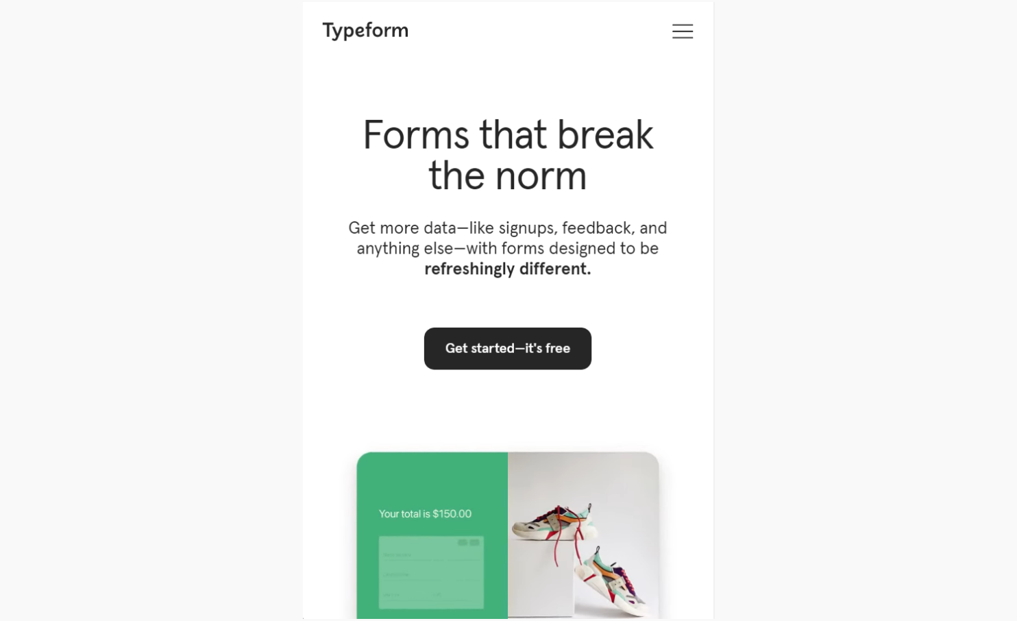
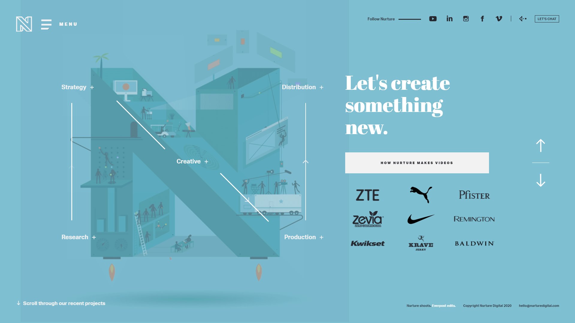
Gradients and vibrant colors
Use bold and vibrant color schemes, including gradient combinations, to create visually appealing interfaces that capture attention. Gradients offer a smooth transition between colors, creating depth and visual interest.
Just because you use multiple colors and gradients also doesn’t mean you have to abandon minimalist web design best practices. The above is an excellent example of how you can combine the two to create a memorable and enjoyable browsing experience.
Asymmetrical layouts
Asymmetrical web design is a relatively new trend that is moving away from conventional grid-based web design best practices. By intentionally breaking traditional web design layout guidelines, designers can create dynamic and exciting layouts that are still easy to follow.
Asymmetrical web design is not suitable for all types of websites. However, it’s useful in cases where you want to highlight visual elements, making it popular for photography sites, portfolios, galleries, resumes, and blogs.
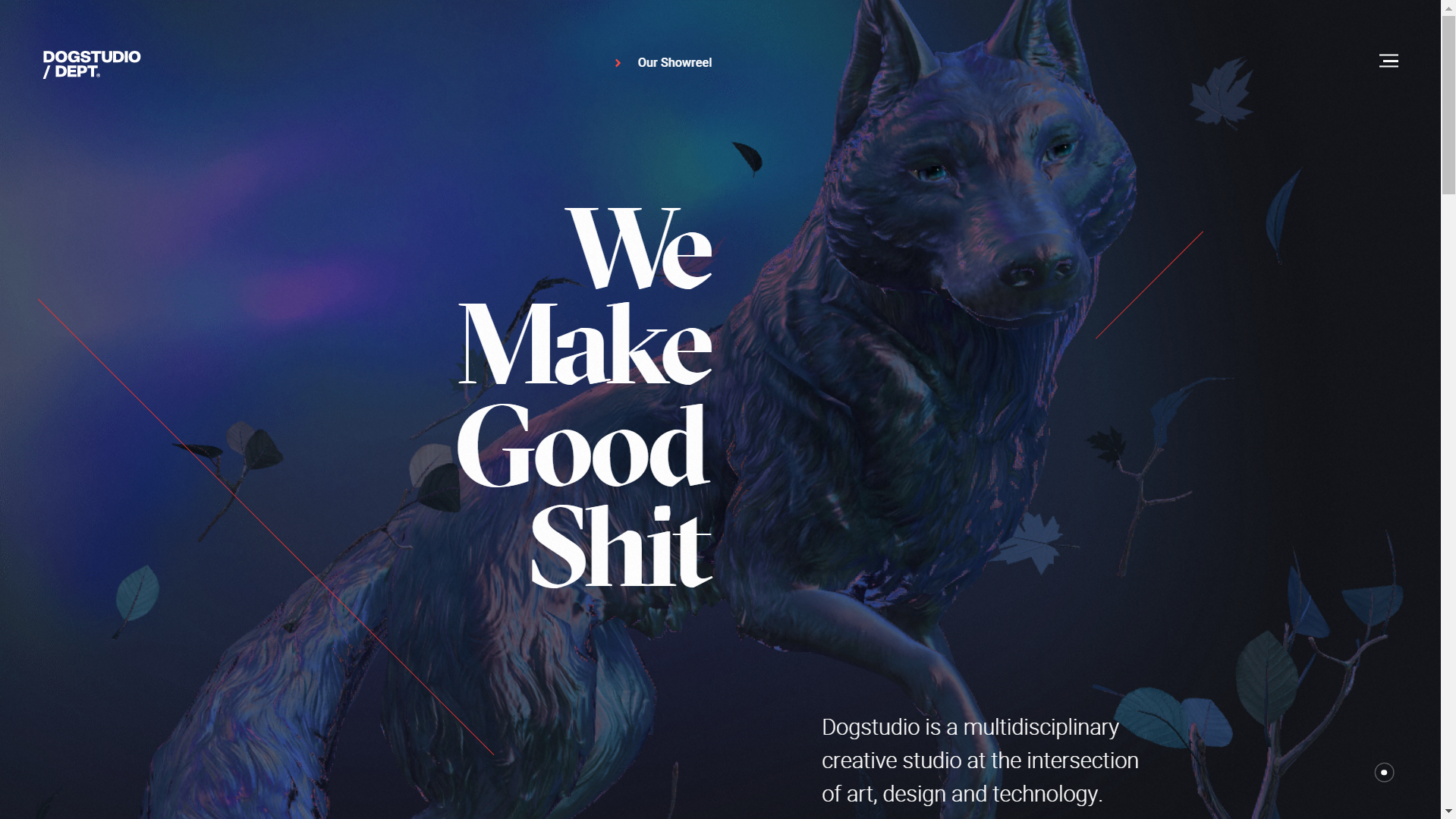
Custom illustrations and animations
Custom illustrations and animations are gaining popularity because they give websites a unique and personalized touch. By incorporating custom-made visuals, designers can effectively communicate brand identity, engage users, and create memorable experiences. It gives your pages a distinct visual style that aligns with the brand’s personality, conveying messages in a more playful and expressive way.
Additionally, custom animations add interactivity and dynamism to the user interface, enhancing engagement and guiding users’ attention.
Mixed typography
Mixed typography is another growing trend in UI design that combines various font styles and sizes to create a visual hierarchy and evoke specific emotions. By using different fonts, designers can emphasize key messages or content, guiding users’ attention and enhancing the overall user experience.
This technique allows for greater creativity and flexibility in conveying information, making the design more engaging and memorable. However, it’s important to maintain consistency and ensure readability by using complementary fonts and appropriate sizing to achieve a harmonious design and not break web design best practices.
Bold and oversized elements
Bold and oversized elements are another effective technique in UI design to create a visual hierarchy and draw attention to key content, such as headings, titles, or call-to-action buttons.
This approach not only captures users’ attention but also conveys a sense of importance and urgency.
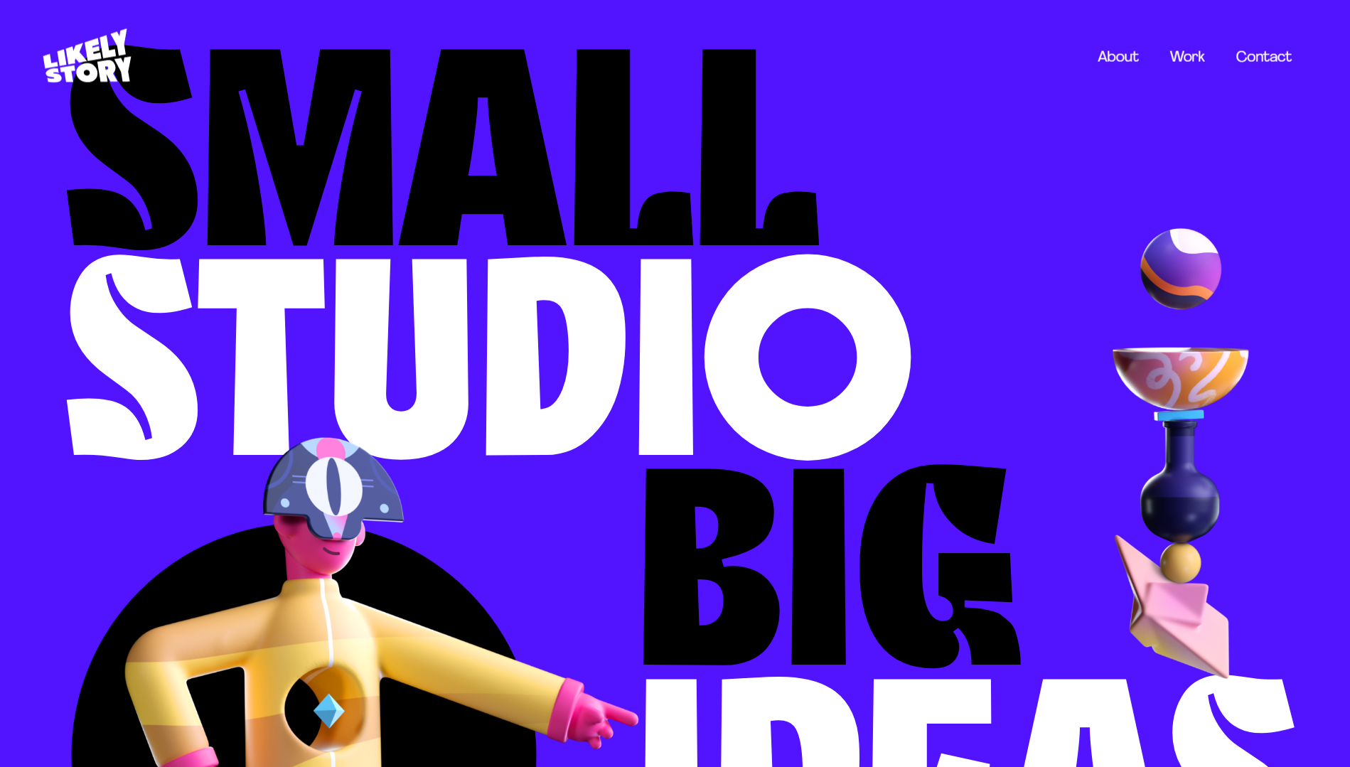
However, it’s crucial not to overuse bold and oversized elements. Striking a balance between readability and impact is essential, so users can easily digest the information.
Create depth
Combining depth and shadows with floating and overlapping elements has become a popular approach to creating engaging and immersive experiences. By incorporating subtle shadows and layering techniques, designers can add depth to elements, providing a more realistic and tangible feel to the design.
This technique enhances the overall user experience by giving a sense of hierarchy and organization. Floating and overlapping elements also contribute to the illusion of depth and interaction, making the design visually dynamic and engaging.
However, you should also be careful not to create a design that’s cluttered and overwhelming by overdoing it. One popular way to do this in a balanced way is to use parallax scrolling effects.
Microcopy and conversational UI
Microcopy refers to the small snippets of text placed throughout the interface to guide users, provide instructions, or offer helpful hints. By using concise and conversational language, designers can create a friendly and approachable tone, making the user feel supported and understood.
Conversational UI takes this a step further by incorporating natural language and interactive dialogue into the design. It mimics human conversation, enabling users to interact with the interface as if they’re having a conversation with a real person. You can think of it as an entire UI that operates like a chatbot.
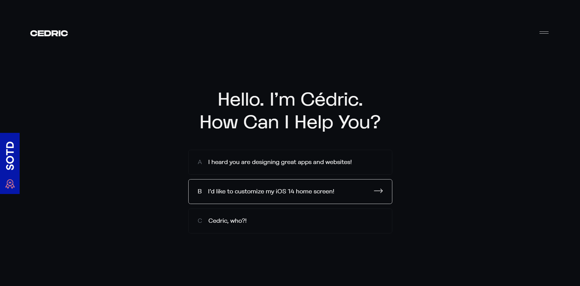
By integrating microscopy and conversational UI effectively, designers can create intuitive and engaging experiences that feel more human-centric and user-friendly.
Augmented reality (AR) and virtual reality (VR) integration
By incorporating AR and VR elements, designers can create immersive and interactive experiences for website visitors. AR can be used to overlay digital information onto the physical environment, providing contextual details and enhancing user understanding.
VR, on the other hand, transports users to virtual environments for engaging interactions. This offers a unique and memorable user experience.
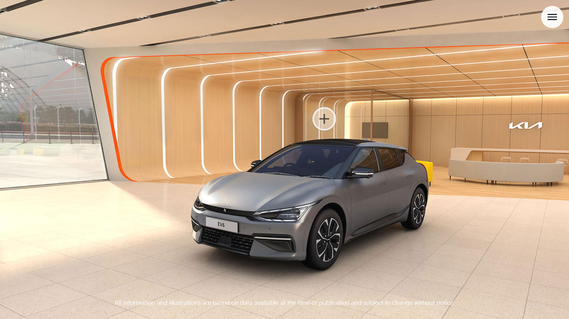
Between the two, AR is becoming more popular in mobile use cases because users can use them in their everyday lives. VR is gaining ground in the retail space, as it’s being used to create virtual showrooms for cars or furniture or shopping experiences for fashion and accessories.
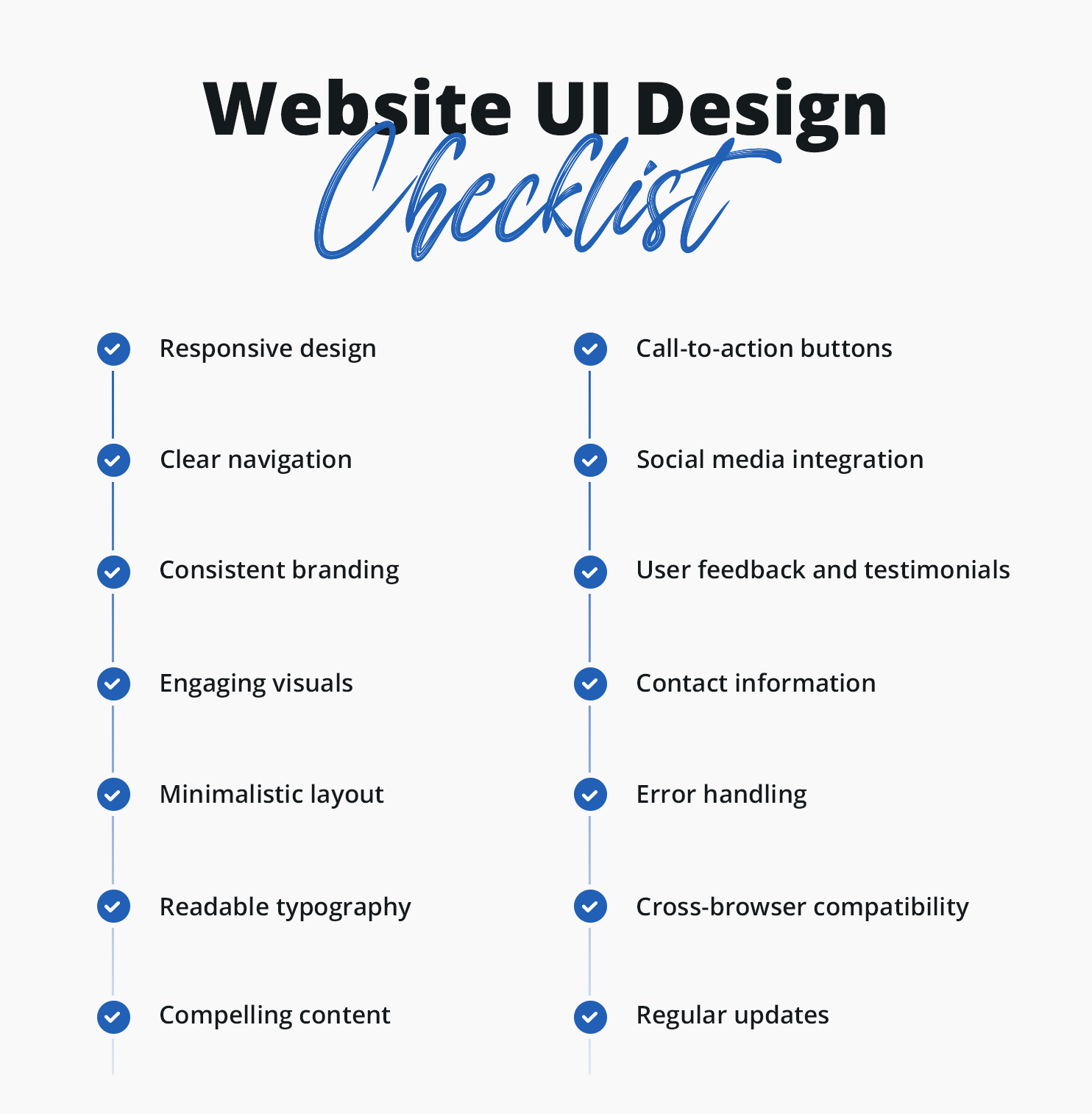
Website UI Design Checklist
Of course, it’s not possible to base your website’s design on all of these UI web design best practices and trends at the same time. However, you can take basic lessons and principles from a few at a time to craft a new and interesting online experience.
However, here is a sample website design requirements checklist to ensure you apply your UI design principles effectively:
- Responsive design: Ensure all website elements adapt seamlessly to different screen sizes and devices.
- Clear navigation: Highlight navigational elements and place them in expected locations.
- Consistent branding: Maintain consistent colors, typography, and visual elements throughout the website.
- Engaging visuals: Use high-quality images, videos, and graphics to capture attention.
- Minimalistic layout: Keep the design clean and clutter-free, focusing on essential elements.
- Readable typography: Choose legible fonts and font sizes for easy reading.
- Compelling content: Provide valuable and engaging content that aligns with the target audience, don’t forget personalized and microcontent.
- Call-to-action buttons: Use clear and persuasive CTAs to guide users toward desired actions.
- Social media integration: Incorporate social media buttons and sharing options for easy content sharing.
- User feedback and testimonials: Display user reviews and testimonials to build trust and credibility.
- Contact information: Make contact information easily accessible for users to reach out.
- Error handling: Design informative error messages and provide guidance for users.
- Cross-browser compatibility: Ensure interactive elements function properly across different browsers.
- Regular updates: Occasionally update and maintain the website to keep it in line with the latest UI design trends. But, carefully consider making drastic changes as it could damage your brand consistency.
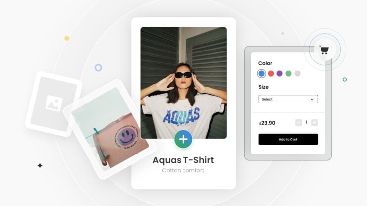
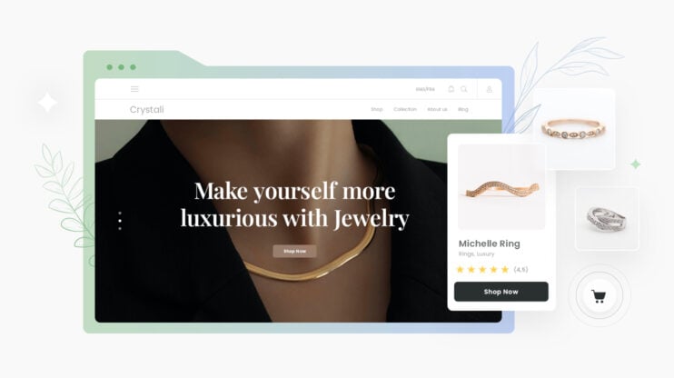
[Bonus] 10 crucial eCommerce website design specifications
Most of the same web design best practices and trends that apply to typical websites also apply to e-commerce. However, usability has an even greater impact because you’re working with people who want to make a purchase, so bad design can negatively impact your conversions. You can see them as e-commerce website design requirements that will directly impact your profits:
- Responsive design: M-commerce already accounts for 42.4% of all e-commerce sales. Having a responsive design that adapts seamlessly to various screen sizes and devices is vital to providing a consistent and enjoyable shopping experience across desktop, mobile, and tablet devices.
- Clear product presentation: Present products in a visually appealing and informative way. This not only means using high-quality product images with detailed descriptions but also using new technologies, like superzoom and 360-degree views, to entice customers.
- Intuitive navigation and search functionality: Make it as easy as possible for users to find the best product that fulfills their needs and wants. Combine personalized recommendations with advanced filters, sorting options, and auto-suggestions, or use virtual assistants to help and guide them.
- Streamlined checkout process: Optimizing the checkout process to minimize friction and maximize conversions. This includes having a guest checkout option, progress indicators, saved payment methods, minimal forms, and shipping address auto-fill to expedite the process.
- Seamless shopping cart experience: Create a hassle-free experience through persistent cart functionality, visible product summaries, and the ability to easily modify quantities or remove items.
- Trust signals and security: Establish trust with potential customers through signals such as secure payment gateways, SSL certificates, customer reviews, and trust badges.
- Clear and prominent calls to action (CTAs): Visually distinct CTAs will guide users through the buying process. Use action-oriented language, contrasting colors, and strategic placement of CTAs to encourage conversions.
- User reviews and social proof: 93% of customers read reviews before buying, and 58% are willing to pay more for a product with positive reviews. Including reviews, ratings, and testimonials builds trust and influences purchasing decisions.
- Optimized page loading speed: 22% of customers have abandoned cart just because it takes too long to load. Discuss techniques such as image optimization, caching, and minimizing HTTP requests to ensure fast-loading pages and reduce bounce rates. You should also use a host with a platform optimized for e-commerce hosting, like 10Web’s dedicated WooCommerce hosting.
- Localization: Localizing your e-commerce pages for different languages and currencies can lead to 22% or 40% higher conversions, respectively. This is because users feel more confident buying in their own language.
Conclusion
Researching web design best practices and staying up to date with design trends is a powerful way to enhance your creative work and captivate your audience. Remember, website design is a dynamic field that constantly evolves, so embracing new ideas and experimenting with fresh concepts can help you create impactful and visually appealing designs.
We can’t put it better than Steve Jobs, the co-founder of Apple Inc.:
“Design is not just what it looks like and feels like. Design is how it works.”
This may seem like a lot to take in, and you may feel lost if you’ve never designed a website before. However, this is where leveraging the power of artificial intelligence through a tool like 10Web AI Website Builder can come in handy.
10Web’s AI-powered tool uses the latest website design principles to create modern, attractive, and effective websites that are also tailored to your business needs. As a user, you have two options:
- You can either provide the link of the website you like and 10Web AI Website Builder will recreate its layout or
- Just let the 10Web AI Website Builder create a website leveraging the power of AI.
In both cases, it will generate a personalized website from scratch.
Get a head start on website creation with AI
Create a custom website tailored to your business needs 10X faster with 10Web AI Website Builder!
FAQ
How can I improve the loading speed of my website in 2023?
How can I ensure my website follows mobile web design best practices in 2023?
How important is website accessibility in 2023?
Build a website with AI in one minute
Generate your website now for Free
Create your dream website with 10Web AI Website Builder and take your business online!


Wait!
Your online store
is a click away
Your online store is a click away
-
 Create an ecommerce website in 1 minute with AI
 -
Set up and manage payments, products & more
-
Grow your business with all in one platform
 Create an ecommerce website in 1 minute with AI