If you’re thinking of launching a new brand or upgrading your online store, this guide features standout ecommerce websites across fashion, beauty, tech, and more. You’ll learn what makes these sites work, from product discovery to mobile design, and how you can use AI tools to create something just as polished. Scroll through these 31 ecommerce website examples for ideas, then bring your favorite features to life with ease with 10Web AI Website Builder.
Best fashion and apparel ecommerce websites
Discover ecommerce website examples from sporty clothing brands, luxury fashion labels, and more, all showcasing style and innovation in this ultra-competitive market.
Global giants like Nike, eco-friendly upstarts, and fashion ecommerce websites lead the way in design innovation, storytelling, and user experience. These examples highlight how product discovery, brand identity, and seamless checkout bring it together for everything from lifestyle brands to apparel.
What you’ll learn:
- How leading brands use lifestyle imagery to boost conversion
- How sizing tools and “fit finders” reduce friction and returns
- Where design minimalism meets bold branding
- Why intuitive filters and smart navigation matter for shoppers
1. Nike
Bold branding and intuitive navigation make Nike’s ecommerce website a standout for performance-driven online shopping.

What They Sell: A huge range of athletic gear. Think sneakers, sports apparel, equipment, and accessories for men, women, and kids.
Design Vibe: Sleek, modern, and sporty. It’s all about performance and style.
Navigation: Super user-friendly. Easy-to-find categories like Men, Women, Kids, and Sports, plus a search bar.
Layout: Clean and clear, with high-quality images and minimal text. Makes browsing and shopping a breeze.
Finding Stuff: You can search by category, collection, pierce, size or use the search bar.
Mobile-Friendly: Absolutely. The site is responsive and works well on mobile devices.
Privacy & Security: They’re on top of it. Nike takes data privacy seriously with clear policies and secure checkout.
Nike’s online store is a visual treat, blending dynamic imagery with a user-friendly layout. The site isn’t just about showcasing products; it’s a visual journey into the brand’s world of style and performance. Behind its stylish exterior, Nike’s website is a model of ecommerce effectiveness. It handles a wide range of products with ease, offering intuitive navigation and a hassle-free checkout process.
2. Zenni Optical
Zenni’s ecommerce site blends affordable eyewear with cutting-edge AR try-ons and visual search for a seamless shopping experience.

What They Sell: Zenni Optical offers a wide variety of eyewear, including prescription glasses, sunglasses, and protective eyewear.
Design Vibe: The site has a modern and accessible design, focusing on the variety and affordability of eyewear.
Navigation: It’s user-friendly with clear categories, making it easy to browse through different styles and types of eyewear.
Layout: The layout is straightforward and visually engaging, emphasizing the diversity of their eyewear collection.
Finding Stuff: Easy to navigate with detailed product filters and search options. Offer Visual Search functionality that allows users to upload an image to search for glasses.
Mobile-Friendly: Yes, the website is optimized for a smooth browsing experience on mobile devices.
Privacy & Security: They ensure a secure shopping experience and protect customer privacy.
The website stands out in the eyewear market with its cutting-edge AR try-on feature, offering a new level of convenience in online shopping. This, along with a well-organized display of products on the homepage and visual search functionality, ensures an informative and hassle-free shopping experience. Zenni’s category and filter system simplifies the shopping experience for hundreds of frames, letting users drill down by a slew of attributes. Shoppers can find the best shape, color, lens type, fit, or product type in seconds.
3. Tiffany & Co.
Tiffany’s online store pairs luxury branding with a minimalist layout that highlights elegance and ease of browsing.

What They Sell: Luxury jewelry, fine watches, and premium accessories. Think elegant necklaces, iconic engagement rings, and timeless pieces.
Design Vibe: Classic elegance meets modern luxury. It’s like stepping into a world of sophisticated glamour.
Navigation: Effortlessly simple. Clearly defined sections for jewelry, gifts, watches, and more.
Layout: Refined and visually stunning. The products take center stage against a minimalist backdrop.
Finding Stuff: Everything is laid out clearly, from product details to pricing.
Mobile-Friendly: Absolutely. The site adapts beautifully to mobile, ensuring a seamless experience.
Privacy & Security: Top priority. Your information is treated with the utmost confidentiality and security.
Tiffany & Co.’s website is a digital extension of its storied brand, offering an immersive and elegant online shopping experience. Each product page is thoughtfully crafted with detailed descriptions and high-quality images, allowing customers to appreciate the fine craftsmanship of Tiffany’s jewelry.
4. Omega Watches
Omega’s ecommerce site conveys craftsmanship and luxury through high-end visuals, clear filters, and interactive gift guides.

What They Sell: Luxury Swiss watches with a focus on craftsmanship and precision.
Design Vibe: Elegant and sophisticated, showcasing the watches as timeless pieces.
Navigation: Straightforward with clear categories like collections, men’s, and women’s watches.
Layout: Classy and sleek, emphasizing high-quality visuals of the watches.
Finding Stuff: Simple, with easy-to-use search and filter options. Has interactive gift finder functionality, allowing one to find the perfect gift based on their preferences.
Mobile-Friendly: Yes, adapts well for mobile devices.
Privacy & Security: Prioritizes customer data protection with clear privacy policies.
Omega’s online store is a digital extension of its legacy in watchmaking. The website’s sophisticated design and quality imagery echo the elegance and precision of Omega watches. Gift finder allows you to quickly browse through all their products, and filter based on your preferences.

Looking to sell online?
Create your custom online store in minutes with 10Web AI Ecommerce Website Builder and take your business online.
5. Allbirds
Allbirds combines sustainable values with clean UX, showcasing products through nature-inspired visuals and a shoe finder quiz.

What They Sell: Environmentally friendly shoes, focusing on comfort and eco-conscious materials. Their range includes sneakers, slip-ons, and apparel.
Design Vibe: Nature-inspired and uncluttered. The site reflects their commitment to sustainability through a clean and earthy aesthetic.
Navigation: User-friendly with easy-to-follow menus. It’s simple to switch between categories like shoes, apparel, and limited editions.
Layout: Spacious and inviting, with a focus on product images and sustainability stories.
Finding Stuff: Hassle-free with clear product categories and descriptions. Has interactive Shoe finder quiz to filter out the results that you look for.
Mobile-Friendly: Seamlessly adapts to mobile devices, offering a smooth shopping experience.
Privacy & Security: Takes customer privacy seriously, with transparent policies and secure online transactions.
Allbirds’ online store combines an eco-conscious ethos with a visually appealing design. The website shines in offering a user-friendly experience, with straightforward navigation and clear product descriptions. This approach makes selecting the ideal footwear easy and enjoyable, catering to environmentally conscious consumers.
6. UNTUCKit
UNTUCKit’s website uses interactive quizzes and product sliders to highlight its signature fit and guide shoppers effortlessly.
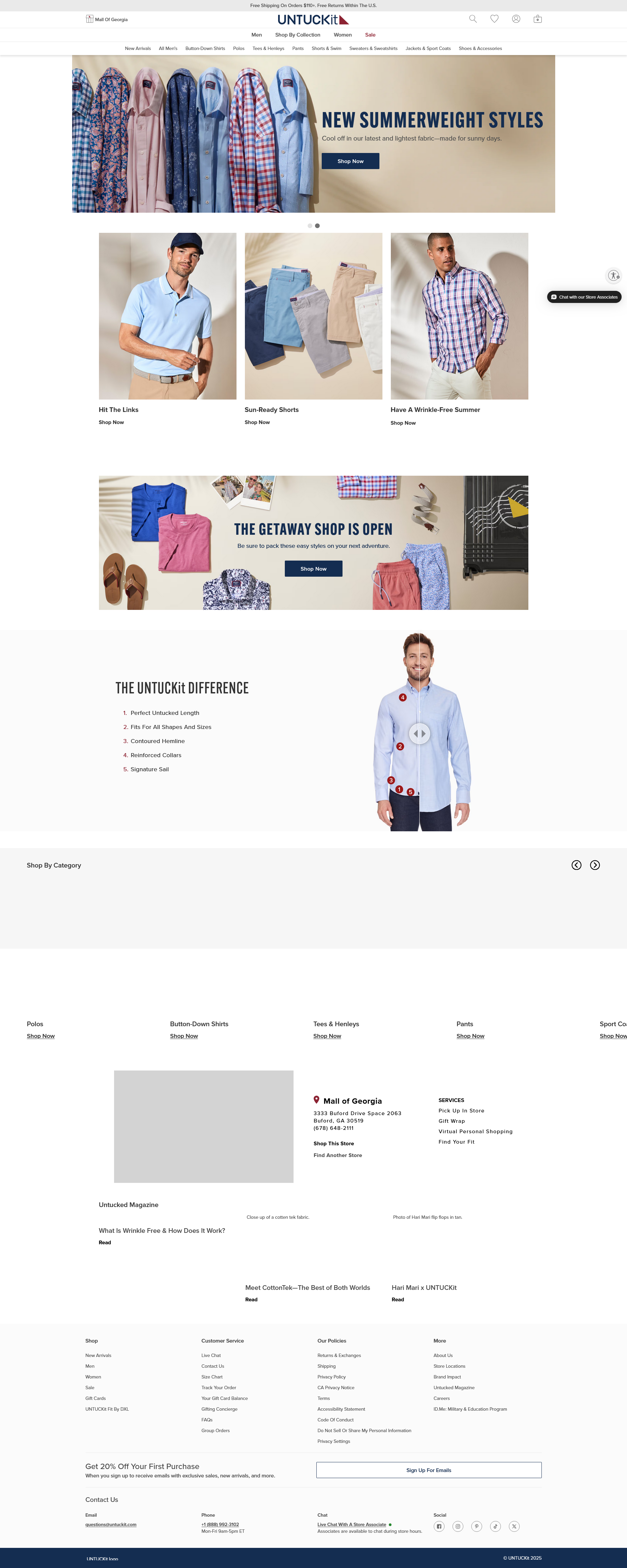
What They Sell: Offers a range of men’s and women’s casual wear, including their signature untucked shirts, along with polos, tees, and other apparel.
Design Vibe: Modern and straightforward, mirroring the brand’s approach to casual, effortless style.
Navigation: Well-organized, with distinct categories for easy browsing of their collections.
Layout: Clean and engaging, with a focus on the unique features of their clothing.
Finding Stuff: It’s easy to select items and access detailed product information. The site also features an interactive “find your fit” quiz, aiding in quick product discovery and offering a 360 view of the apparel.
Mobile-Friendly: Fully optimized for a smooth experience on mobile devices.
Privacy & Security: Emphasizes secure transactions and customer privacy.
The website employs a visual slider, allowing users to compare UNTUCKit shirts with regular ones, showcasing the unique fit and style of their garments. Links to Instagram and Facebook are prominently featured, encouraging visitors to engage with the brand across various channels.
7. Dick Moby
Dick Moby’s clean, modern ecommerce site champions sustainable eyewear with strong product visuals and eco-conscious storytelling.

What They Sell: Offers a range of stylish sunglasses and eyeglasses made from sustainable materials, focusing on eco-friendliness without compromising style.
Design Vibe: The site has a modern, clean look that highlights their commitment to environmental responsibility and fashion.
Navigation: User-friendly interface with clear categories, making it easy to find specific styles and learn about the materials.
Layout: Visually appealing and informative, emphasizing both the style and sustainability of the eyewear.
Finding Stuff: Products are well-presented with clear descriptions, making it easy to browse and choose.
Mobile-Friendly: Fully optimized for mobile browsing.
Privacy & Security: Prioritizes secure shopping and customer data protection.
Dick Moby’s online store opens up a world where elegance meets environmental consciousness. The site’s sophisticated yet simple design, complete with interactive elements, invites users to explore their collection of eco-friendly eyewear.
8. Jackie Smith
Jackie Smith’s ecommerce site brings playful fashion to life with vibrant design, crisp navigation, and standout visuals.

What They Sell: A trendy selection of handbags and accessories featuring unique designs and vibrant colors.
Design Vibe: Chic and playful, the site captures a fun, fashionable spirit with a focus on stylish imagery.
Navigation: Straightforward and intuitive, making it easy to explore different collections and product types.
Layout: The layout is visually engaging, combining clean lines with eye-catching graphics to showcase their products.
Finding Stuff: Simple to navigate with clear product categories and detailed information, including sizing and color options.
Mobile-Friendly: Yes, the site is optimized for mobile devices, ensuring a good browsing experience on various screens.
Privacy & Security: The site demonstrates a commitment to user privacy and secure online shopping.
Jackie Smith’s website stands out with its use of bright colors, reflecting the brand’s lively and youthful spirit. The approachable design invites customers to explore and engage with the products, turning shopping into a joyful journey of discovery.
9. Grainne Morton
Grainne Morton’s website captures handcrafted artistry through detailed product imagery and an elegant, gallery-style layout.

What They Sell: Unique handcrafted jewelry featuring eclectic designs that blend vintage and contemporary styles.
Design Vibe: The site exudes an artistic and bespoke charm, reflecting the individuality of the jewelry pieces.
Navigation: Well-organized, making it easy to explore earrings, necklaces, and other collections.
Layout: The layout is visually rich and elegant, emphasizing the beauty and detail of each piece.
Finding Stuff: Straightforward, with clear categories and product information.
Mobile-Friendly: The website is optimized for mobile users, ensuring a good browsing experience.
Privacy & Security: Demonstrates a commitment to protecting customer information.
Grainne Morton’s website stands out with its earth-toned palette and linework that frames the stunning product photography, reflecting the handcrafted nature of the jewelry. The site’s seamless integration of an Instagram feed invites users to interact with the brand on multiple platforms, enhancing the community feel.
Did any of these sites catch your eye? Start working on yours in minutes with the AI Website Builder.
Top ecommerce website examples for beauty and skincare brands
Treat yourself and take in these examples of ecommerce websites dedicated to beauty, wellness, and personal care, each offering unique products and experiences.
These ecommerce websites showcase how to build trust, communicate value, and make self-care feel personal through thoughtful design. You’ll see how brands like Sephora and Bite use visual design, interactivity, and clarity to create loyalty.
What you’ll learn:
- How product visuals and quizzes personalize the buyer journey
- How clear design and storytelling build brand trust
- Why wellness sites thrive on minimalist design and strong CTAs
- How some sites use bright, energetic visuals to reflect their product benefits
10. Sephora
Sephora’s ecommerce experience combines elegant design, powerful filters, and curated beauty content for seamless product discovery.
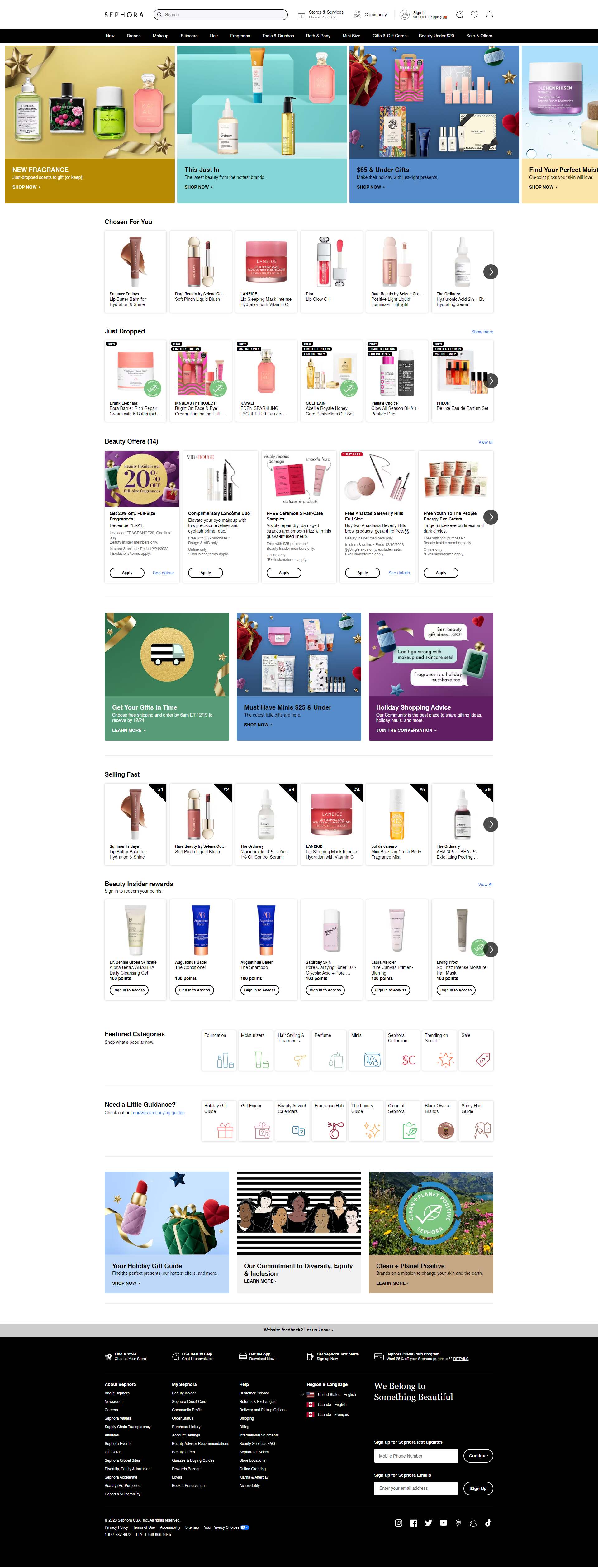
What They Sell: This ecommerce website sells extensive selection of beauty products, including makeup, skincare, haircare, and fragrances from various top brands.
Design Vibe: The website likely exudes a trendy and luxurious atmosphere, matching the sophistication of the beauty industry.
Navigation: Probably well-organized with distinct sections for different product types, new arrivals, and brand-specific pages.
Layout: Likely visually rich and engaging, showcasing products with clear, attractive images.
Finding Stuff: Easy with effective search tools and filters for brand, product type, and specific beauty needs.
Mobile-Friendly: Expected to be optimized for mobile users, providing a seamless shopping experience.
Privacy & Security: Presumably a high priority, with measures to ensure secure transactions and customer privacy.
Sephora’s website offers a curated selection of beauty products featuring an elegant and user-friendly interface. It’s designed for easy navigation and showcases a diverse range of makeup, skincare, and fragrances. Product pages include thousands of verified customer reviews, helping buyers compare items and make informed choices.
11. Lush
Lush’s vibrant ecommerce site highlights ethical values with bold visuals, natural storytelling, and a playful shopping flow.

What They Sell: Lush offers a variety of fresh, handmade cosmetics, including bath bombs, soaps, skincare, and hair care products, all with a focus on ethical sourcing and natural ingredients.
Design Vibe: The site is vibrant and earthy, emphasizing its commitment to natural and cruelty-free products.
Navigation: It’s user-friendly, with clear categories for different types of products, making it easy to navigate.
Layout: Visually rich and engaging, showcasing their colorful products with a focus on their natural ingredients and ethical practices.
Finding Stuff: Simple, with detailed product descriptions and sorting options. A user-friendly search tool.
Mobile-Friendly: Yes, the website provides a smooth experience on mobile devices.
Privacy & Security: Strong focus on customer privacy and secure online transactions.
Each product is showcased against a backdrop that exemplifies the item’s essence and Lush’s vibrant brand identity. This approach makes their offerings stand out and conveys the joyful experience of using Lush products.
12. LARQ
LARQ’s minimalist online store showcases its tech-forward hydration products through clean layouts and modern product storytelling.

What They Sell: Innovative self-cleaning water bottles and water purification systems.
Design Vibe: Clean, modern, and tech-focused, with a strong emphasis on product functionality.
Navigation: Intuitive and user-friendly, with clear sections for different products.
Layout: Sleek and straightforward, showcasing products effectively.
Finding Stuff: Easy to find specific items, with detailed product information readily available.
Mobile-Friendly: Yes, the site is well-optimized for mobile users.
Privacy & Security: They prioritize customer privacy and security, with clear policies in place.
LARQ’s website pairs a clean, modern look with user-friendly functionality. It’s more than a shopping site; it introduces innovative hydration products presented through a minimalistic yet engaging interface.
13. Bite Toothpaste Bits
Bite’s ecommerce site stands out with eco-conscious messaging, animated visuals, and a slider comparing their sustainable oral care.

What They Sell: Bite offers eco-friendly toothpaste tablets, aiming to reduce plastic waste with plastic-free, sustainable packaging.
Design Vibe: The site has a clean, modern look, highlighting their commitment to sustainability and natural ingredients.
Navigation: Easy to use, with well-defined categories for their oral care products.
Layout: Simple yet effective, focusing on product benefits and environmental impact.
Finding Stuff: Straightforward, with clear product descriptions and benefits.
Mobile-Friendly: Fully optimized for mobile browsing.
Privacy & Security: Strong focus on customer privacy and security.
The site skillfully blends interactive elements, such as the product comparison slider, with lively animations to engage visitors. These features not only illustrate the uniqueness of their chewable toothpaste bits but also keep the user experience dynamic and informative.
14.
Frank Body’s website blends playful branding and vibrant design with a skin quiz that guides personalized product selection.
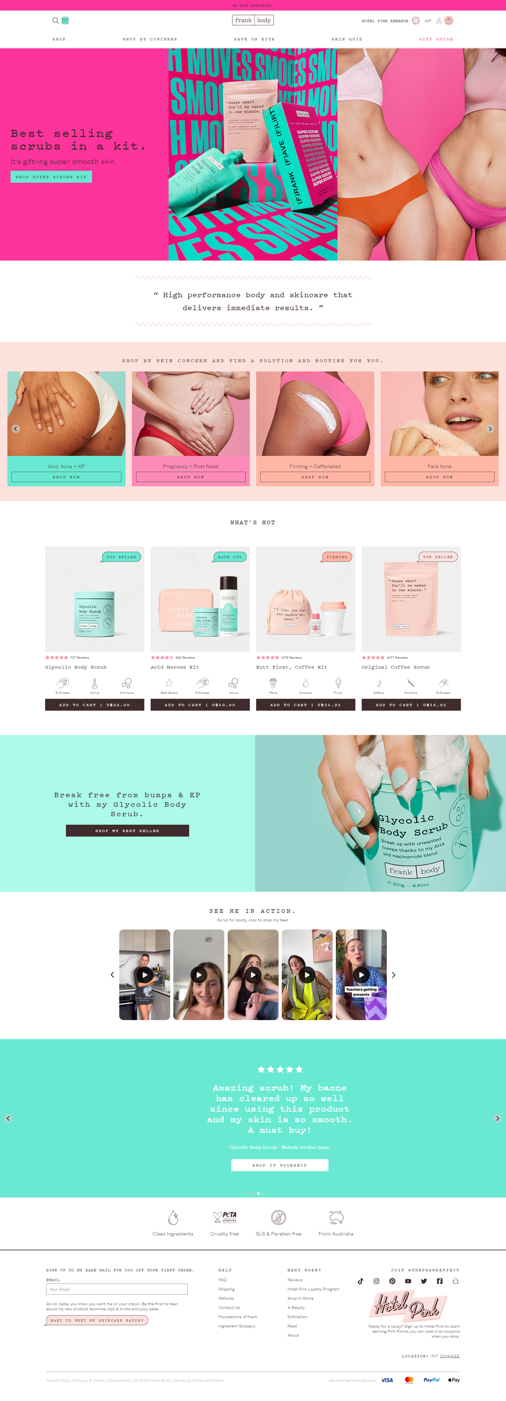
What They Sell: Skincare products with a focus on natural ingredients. Their range includes coffee scrubs, face masks, and body care items.
Design Vibe: Playful and vibrant, emphasizing the fun aspect of skincare.
Navigation: Easy and intuitive, with clear sections for different product categories.
Layout: Colorful and user-friendly, showcasing products attractively.
Finding Stuff: It’s straightforward to access detailed product information. The website features an interactive “skin quiz,” which assists users in finding the best products for their specific skin type and goals.
Mobile-Friendly: Well-optimized for mobile browsing.
Privacy & Security: Clear policies ensuring customer data protection.
The website effectively balances its vibrant design with efficient ecommerce functionality. It provides a smooth, user-friendly shopping experience, from exploring products to checking out, ensuring customer satisfaction at every step.

Looking to sell online?
Create your custom online store in minutes with 10Web AI Ecommerce Website Builder and take your business online.
15. Bliss World
Bliss World energizes skincare ecommerce with bold colors, simple navigation, and product highlights designed for fun self-care.
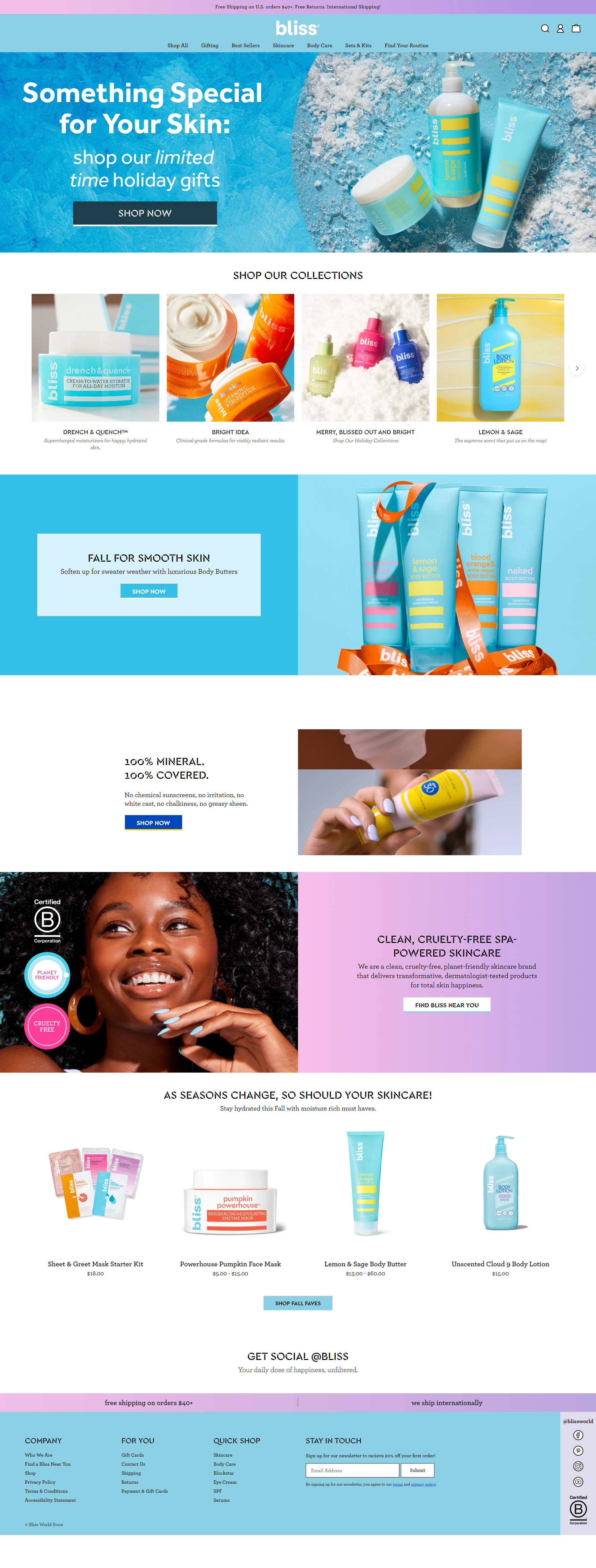
What They Sell: Bliss offers an extensive array of skin care products, from rejuvenating face masks to luxurious moisturizers, focusing on cruelty-free and clean ingredients.
Design Vibe: The website exudes a joyful and energetic atmosphere, aligning with the brand’s bright and positive image.
Navigation: It’s quite straightforward, with products categorized for easy access, helping users quickly find what they need.
Layout: Colorful and lively, the site’s design effectively showcases their products, appealing to a beauty-conscious audience.
Finding Stuff: The website makes it easy to locate products, with clear categorization and detailed descriptions, including usage and ingredient information.
Mobile-Friendly: Optimized for mobile users, it ensures a seamless shopping experience on various devices.
Privacy & Security: They emphasize secure shopping and protecting customer data.
Bliss World’s website is a vibrant haven for skincare enthusiasts. The bright colors and playful design make interacting with the site a cheerful experience, mirroring the energizing effect of their skincare products.
16. Zeuss
Zeuss offers a clean, inclusive wellness site with personalized product flows and modern UX for health-conscious shoppers.
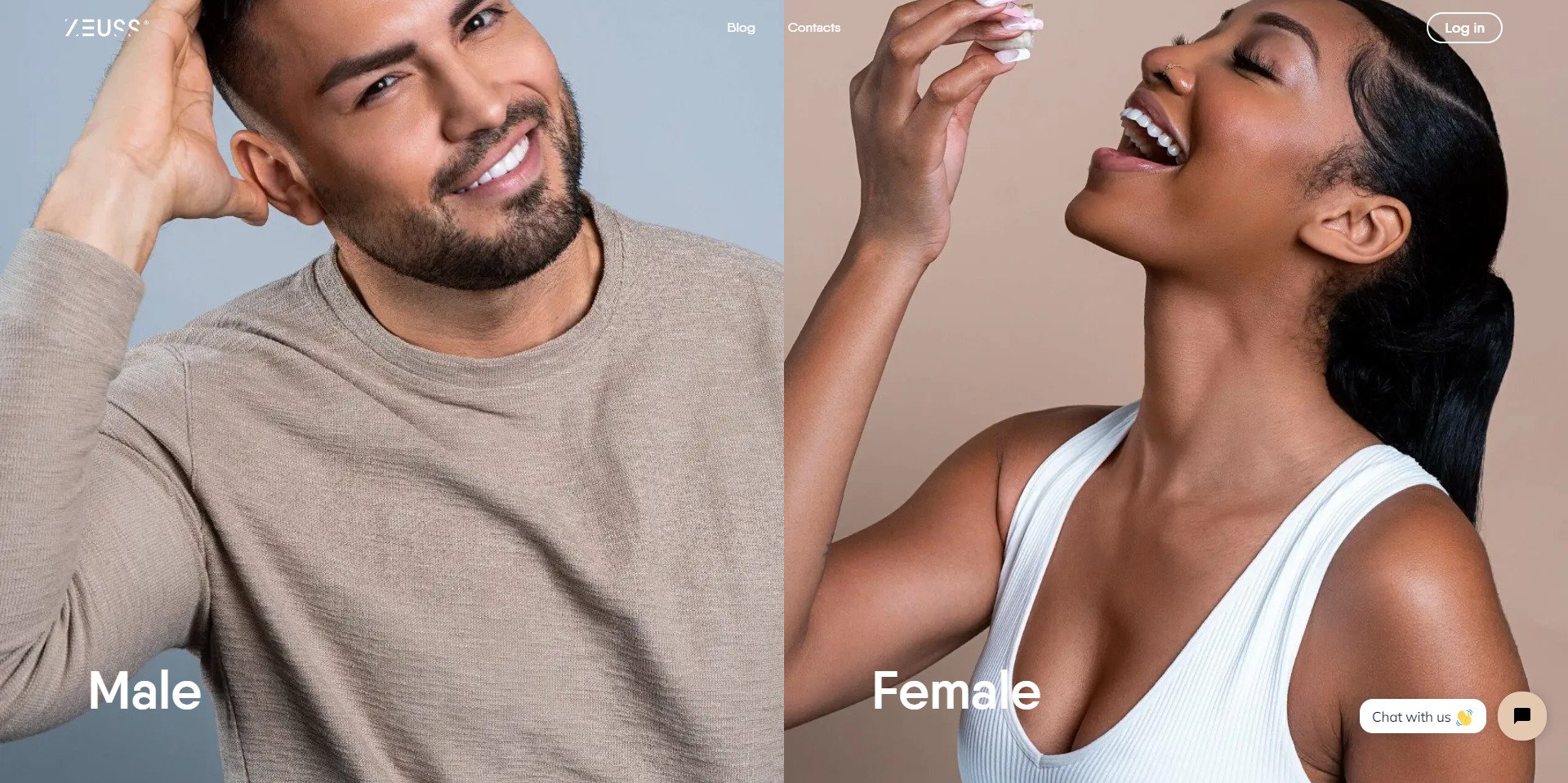
What They Sell: Offers personalized treatments for weight loss, hair, and skincare, catering to both male and female customers.
Design Vibe: Features a contemporary and clean look with high-quality images showcasing products for different genders.
Navigation: Simple and direct, with distinct sections for male and female product lines.
Layout: Unique blend of vertical and horizontal scrolling, providing an engaging user experience.
Finding Stuff: Easy to navigate, with well-organized content and toggle headings for more details.
Mobile-Friendly: Appears well-optimized for a seamless mobile experience.
Privacy & Security: Emphasizes secure transactions and user privacy.
Zeus’s online presence skillfully combines a modern aesthetic with its focus on personal wellness products. The website’s clean design and organized layout reflect the brand’s commitment to making wellness accessible and understandable.
If you found your favorite site in the ecommerce website examples, tell the AI Website Builder what you liked most, and get started with your new site in minutes.
Best home decor and furniture ecommerce websites
These ecommerce website examples are ready to delight window shoppers with cozy color palettes, inviting living spaces, and trendy designs.
Selling home goods online requires more than pretty pictures. The best home décor and lifestyle sites show it’s about evoking a sense of space and helping shoppers imagine a better version of their home. These examples of ecommerce websites show how to make it happen, with immersive design, editorial storytelling, and conversion-ready UX.
What you’ll learn:
- How mega menus and filters improve the shopping journey for large inventories
- Why lifestyle photography makes browsing more engaging
- How search and categorization support high-consideration purchases
- How ecommerce design can express brand voice and interior style
17. Crate & Barrel
Crate & Barrel’s ecommerce site uses mega menus, smart filters, and clean UX to streamline shopping for home essentials.

What They Sell: Sophisticated, modern homeware, including furniture, kitchen appliances, decor, and lighting.
Design Vibe: Light and clean interface, reflecting high-quality and modern branding.
Navigation: Mega menu with category displays and featured product images on the homepage for easy navigation.
Layout: User-friendly, with breadcrumbs to track navigation within the website.
Finding Stuff: Detailed filtering and sorting options based on features, prices, and materials.
Mobile-Friendly: Likely optimized for a smooth mobile experience.
Privacy & Security: Expected to prioritize secure online transactions and customer privacy.
Crate & Barrel’s website is a testament to user-friendly design, with self-explanatory menu items that simplify the search for home and lifestyle products. The mega menu’s clear structure and comprehensive filters facilitate an effortless discovery process, while the search bar’s autocomplete function serves up suggestions to speed up shopping. Explore elegant and practical ecommerce websites for home decor where design meets functionality.
18. Vitra
Vitra’s site merges modern furniture with editorial-style visuals and a product quiz for a curated interior design experience.
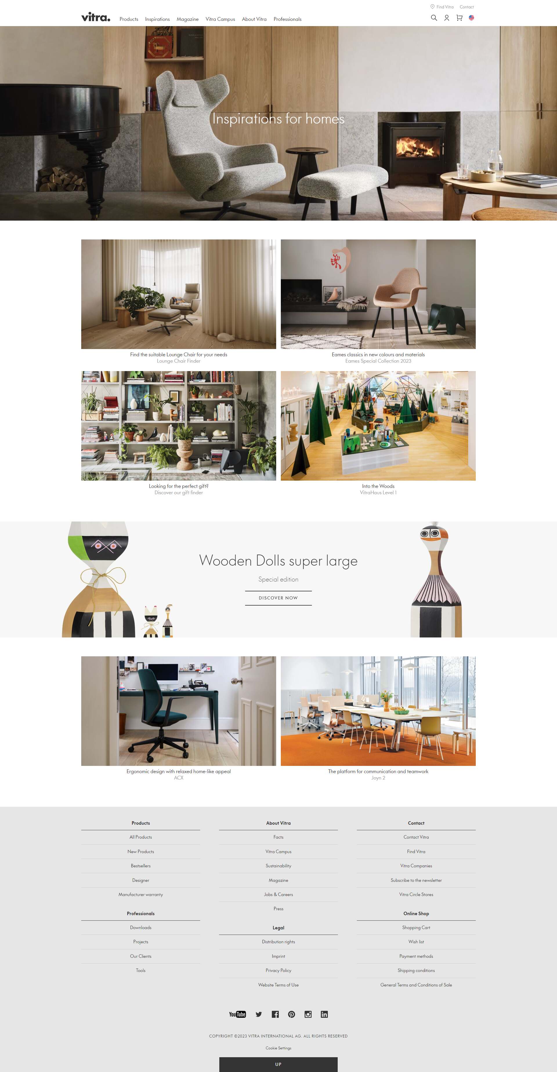
What They Sell: High-end, designer furniture and home accessories. From iconic chairs to sleek office setups, they’ve got a range of modern and classic designs.
Design Vibe: Elegant and artistic. The site feels like a blend between a sophisticated design studio and a contemporary art museum.
Navigation: Streamlined and intuitive. Categories are well-organized, making it easy to browse through various furniture collections and design pieces.
Layout: It’s visually stunning, with a focus on large, captivating images that highlight the design details of each piece.
Finding Stuff: Fairly straightforward. The site’s layout and organization make it easy to explore products, learn about designers, and view product specifications.
Mobile-Friendly: Absolutely. The site is responsive and adapts well to different screen sizes, offering a seamless experience on mobile devices.
Privacy & Security: Their commitment to privacy is evident, with clear policies and secure handling of customer data.
Vitra’s website is a testament to the Swiss company’s commitment to both style and functionality. Catering to both businesses and individuals, the site makes navigating through its diverse range of furniture effortless.
The inclusion of the Find My Vitra quiz adds a personalized touch, guiding users to products that meet their specific needs. The shoppable editorial photos showcase the furniture in a lifestyle setting and make the shopping process intuitive and enjoyable.
19. Grovemade
Grovemade’s minimalist store reflects its handcrafted desk accessories with warm visuals and a focused browsing flow.

What They Sell: Elegant office accessories, including desk organizers, monitor stands, and unique workspace items made from natural materials.
Design Vibe: The website exudes a contemporary and artisanal aura, with a focus on the beauty of craftsmanship and natural wood.
Navigation: Navigating is a cinch, with clear and concise categories for various product types.
Layout: The layout is minimalistic yet warm, effectively showcasing their products with high-quality images.
Finding Stuff: Locating specific items is straightforward, with well-organized product listings and detailed information.
Mobile-Friendly: Fully optimized for mobile, ensuring a smooth user experience on any device.
Privacy & Security: They emphasize secure shopping and the protection of customer data.
Grovemade’s online presence is a seamless extension of its design philosophy. The website’s clean and contemporary look is a nod to their focus on crafting quality desk organization and office accessories. It’s more than just a store; it’s a showcase of thoughtfully designed products that enhance workspaces.

Looking to sell online?
Create your custom online store in minutes with 10Web AI Ecommerce Website Builder and take your business online.
20. Rebecca Atwood
Rebecca Atwood’s ecommerce site elevates textile design with artful photography, soft palettes, and interactive overlays.

What They Sell: Offers a range of artistic home textiles, including wallpapers, fabrics, and pillows, characterized by unique prints and a hand-painted feel.
Design Vibe: Reflects sophisticated artistry with a serene and soft color palette, emphasizing the beauty of handcrafted designs.
Navigation: Well-organized and intuitive, allowing easy access to various collections and design stories.
Layout: The site is aesthetically pleasing, showcasing products with detailed images and inspiring settings.
Finding Stuff: Straightforward, with each product accompanied by comprehensive descriptions and styling tips.
Mobile-Friendly: Fully optimized for mobile devices, ensuring a seamless browsing experience.
Privacy & Security: Prioritizes customer data protection with a secure shopping environment.
The site’s layout, with its earth-toned linework and well-placed product highlights, guides visitors through a refined selection of home goods with ease.
The website goes beyond static displays by incorporating numbers overlaying the product images that, when interacted with, reveal pop-up boxes.
Take note when you find ecommerce websites that you like, then describe the best parts to the AI Website Builder so you can start working on your new site today.
Top tech and electronics ecommerce website examples
These electronics ecommerce website examples combine futuristic design with user-focused features to showcase innovation and functionality.
Electronics and our favorite gadgets boast a huge market share of online sales. These popular products are often attention-grabbing, cutting-edge products that appeal to our senses. From VR to audiophiles, these ecommerce websites showcase products with attractive web design and peak ecommerce features
What you’ll learn:
- How ecommerce sites highlight tech features without overwhelming users
- How interactivity and visual design guide tech product discovery
- How brands create unified ecosystems across product lines and categories
- Where clear UI meets immersive storytelling in the tech space
21. Meta Quest
Meta Quest’s site immerses shoppers in VR with sleek visuals, product-focused storytelling, and intuitive navigation.

What They Sell: Meta Quest specializes in virtual reality (VR) headsets and accessories, offering immersive VR experiences.
Design Vibe: The website likely reflects a futuristic and high-tech aesthetic, showcasing their VR technology.
Navigation: The site probably has clear navigation for different VR products and accessories.
Layout: Expect a modern, interactive layout focusing on product features and virtual reality experiences.
Finding Stuff: The site simplifies exploring different VR headsets and accessories. A prominent search feature on the right side enhances the ease of searching and filtering for users.
Mobile-Friendly: The website is probably optimized for a smooth mobile experience.
Privacy & Security: Meta generally emphasizes user privacy and data security, especially given the nature of VR technology.
Meta Quest’s website is a prime example of how to effectively present cutting-edge technology. Its sleek design and graphics instantly draw visitors into the world of virtual reality, while the user-friendly navigation ensures they can easily explore the full range of VR products and resources.
22. DJI
DJI’s ecommerce experience highlights aerial innovation through rich visuals, streamlined product paths, and organized tech categories.
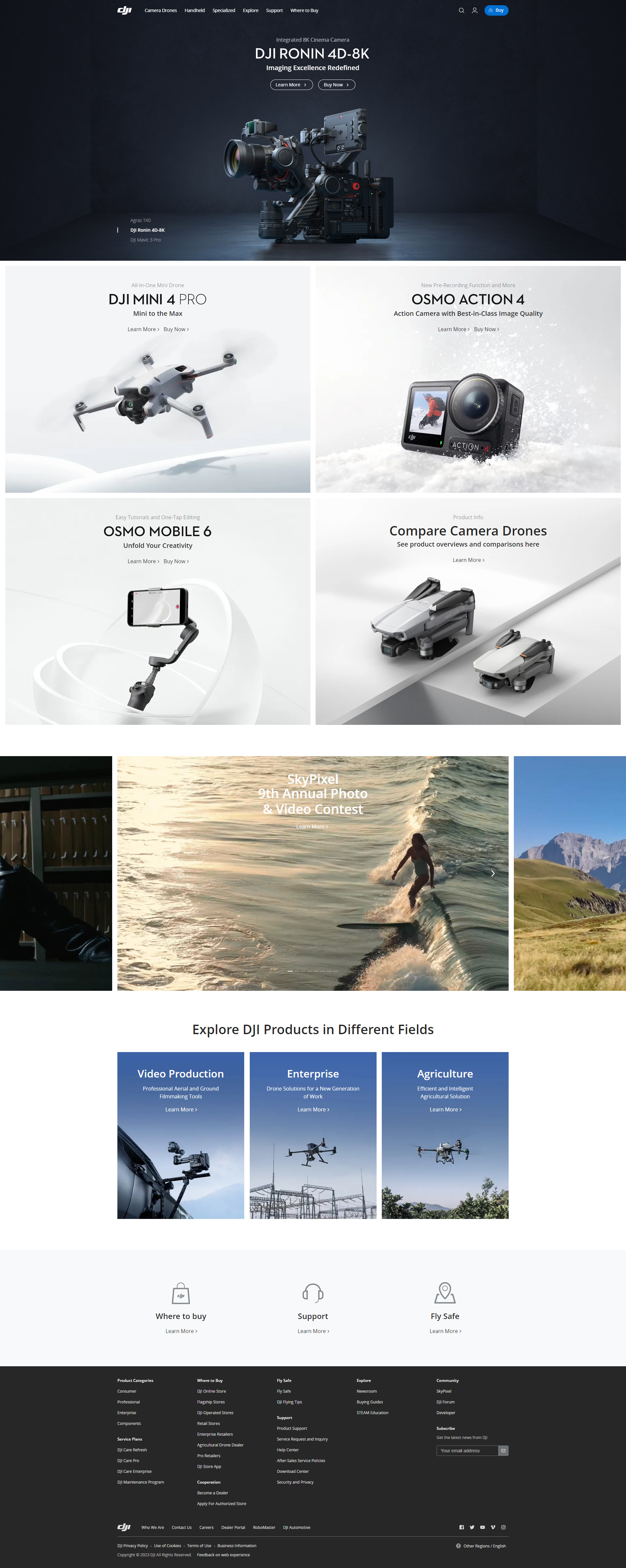
What They Sell: Advanced drones and camera technology for aerial photography, videography, and content creation.
Design Vibe: Futuristic and high-tech, showcasing cutting-edge products with a focus on innovation.
Navigation: User-friendly, with categories for consumer and professional drones, handheld gimbals, and accessories.
Layout: Visually engaging, highlighting products with dynamic images and interactive elements.
Finding Stuff: It is easy to find specific products with organized categories and detailed information.
Mobile-Friendly: Yes, the site adapts well to mobile devices.
Privacy & Security: Emphasizes customer privacy and secure shopping experience.
DJI’s website showcases its range of advanced drones and camera technology, emphasizing innovation in aerial photography and videography. It features a high-tech, interactive design with clear navigation and product categorization, ensuring an engaging and informative user experience.
23. Razer
Razer’s bold, gamer-centric site features high-contrast visuals, fast navigation, and detailed specs for gear-hungry shoppers.
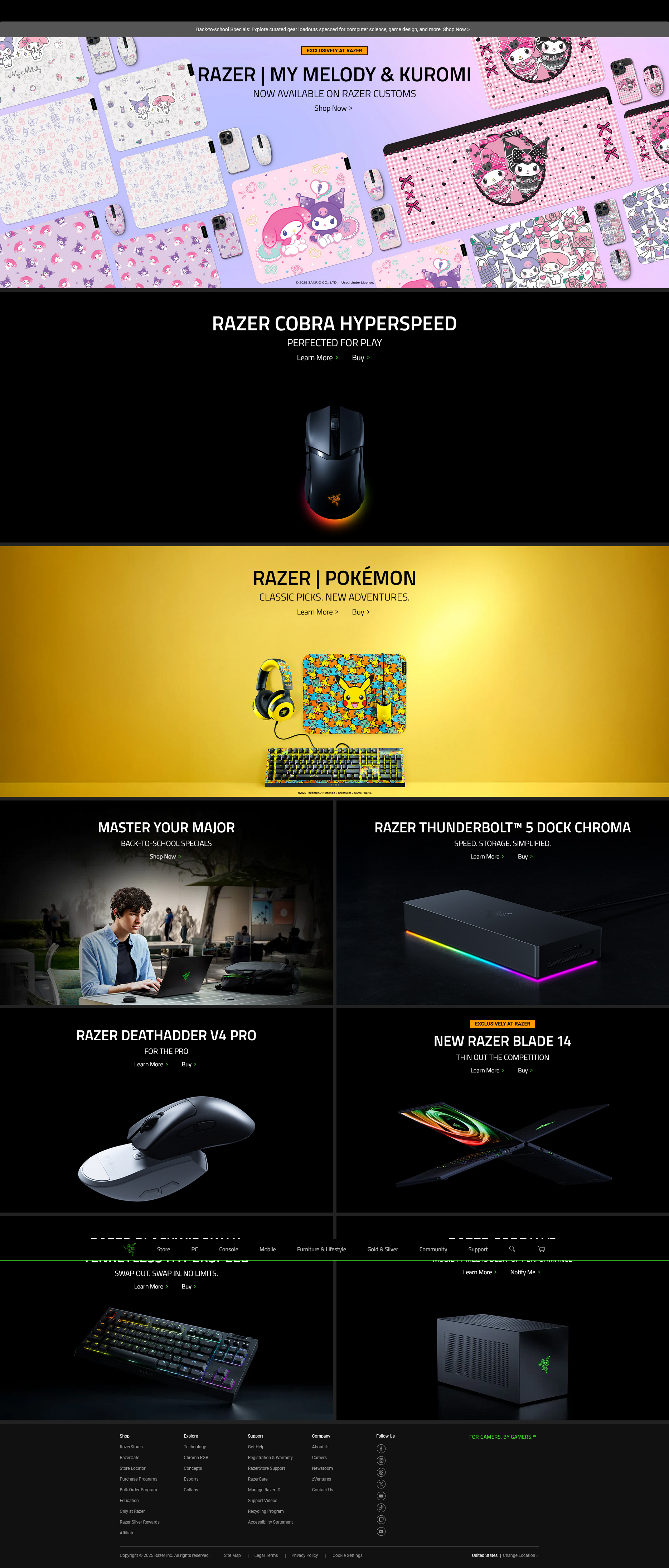
What They Sell: They specialize in cutting-edge gaming laptops, peripherals like mice and keyboards, and accessories designed for gamers.
Design Vibe: The site has a dynamic, futuristic aesthetic that is appealing to the gaming community with its high-energy visuals.
Navigation: Well-structured and intuitive, making it easy to explore various gaming products and accessories.
Layout: Engaging and interactive, with bold graphics and animations showcasing their products.
Finding Stuff: Product information is detailed and accessible, making it easy to find specifications and options.
Mobile-Friendly: Fully optimized for mobile users, ensuring a seamless browsing experience.
Privacy & Security: Emphasizes secure shopping and customer data protection.
Razer’s website is a sleek, high-tech space for gaming gear, featuring their performance-focused laptops, peripherals, and accessories. The design is dynamic and gamer-centric, with easy navigation and an engaging layout. Optimized for mobile, it ensures a secure user experience.
Encounter the latest tech ecommerce websites, from gadgets to advanced electronics, through these innovative platforms.

Looking to sell online?
Create your custom online store in minutes with 10Web AI Ecommerce Website Builder and take your business online.
24. Bose
Bose’s site delivers sleek design and audio-centric shopping with standout visuals, filters, and secure purchasing.

What They Sell: Premium audio products, like noise-canceling headphones, wireless earbuds, and high-fidelity speakers.
Design Vibe: The site boasts a sleek, modern look, emphasizing the sophisticated technology and premium quality of its audio products.
Navigation: Easy to navigate, with well-defined categories for different product types, making it easy to explore their extensive range.
Layout: The layout is polished and user-centric, highlighting products with clear, high-resolution images and detailed descriptions.
Finding Stuff: Searching for products is straightforward, aided by a helpful search bar and well-organized product categories.
Mobile-Friendly: The website is fully optimized for mobile devices, providing a smooth and accessible browsing experience.
Privacy & Security: They place a high priority on customer privacy and secure online shopping, ensuring a safe experience.
Bose’s website is a celebration of sound, offering a range of headphones, earbuds, speakers, and more. The site is designed to capture the essence of Bose’s audio excellence, with special emphasis on seasonal deals and new product launches. It’s not just an online
store; it’s a destination for audio enthusiasts.
25. Logitech
Logitech’s ecommerce platform organizes a wide product lineup through smart navigation, clear CTAs, and strong product imagery.
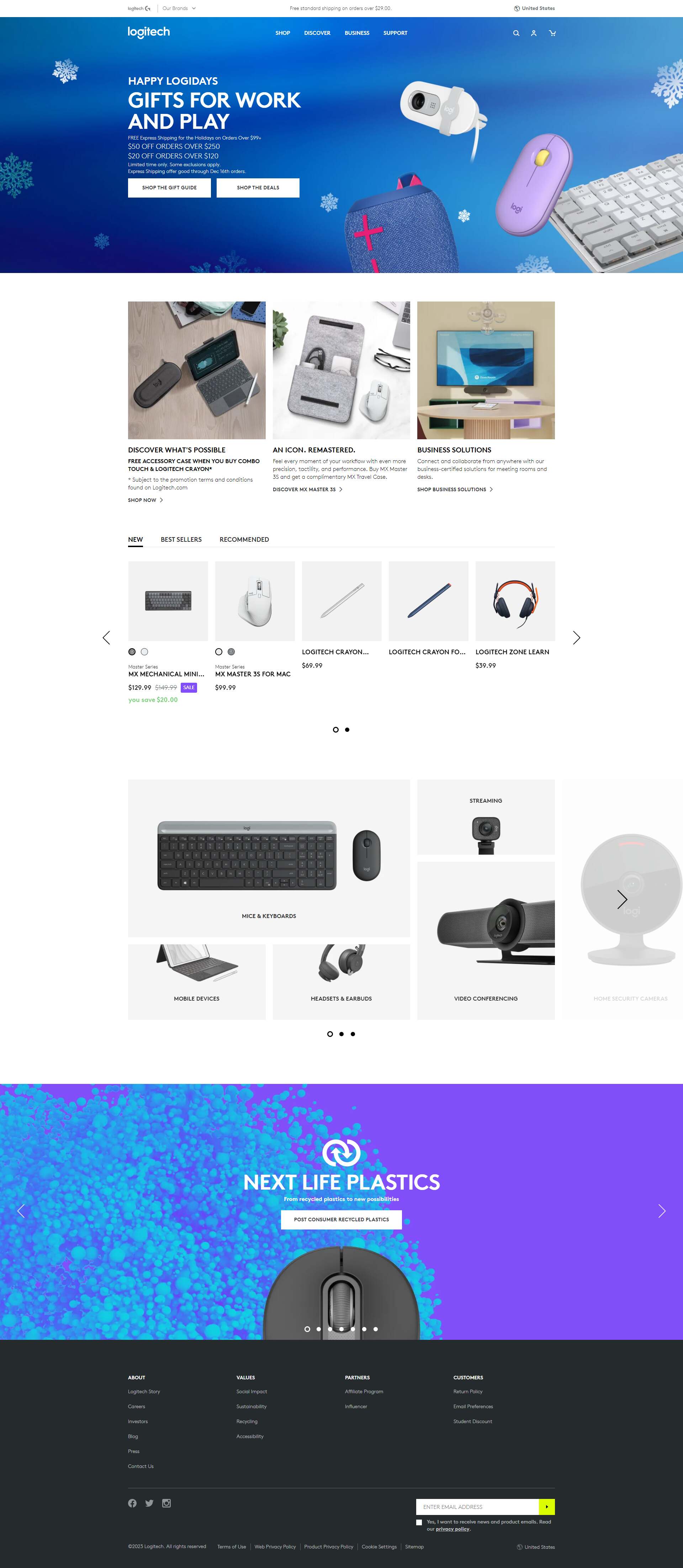
Design Vibe: The site has a tech-forward and innovative feel, showcasing its products with a focus on functionality and design.
Navigation: Clearly categorized, allowing easy access to different product types and specific needs.
Layout: Visually engaging with a focus on high-quality product images and interactive elements.
Finding Stuff: Products are easily discoverable with detailed descriptions, reviews, and specs.
Mobile-Friendly: The website is well-optimized for mobile devices, ensuring a good browsing experience.
Privacy & Security: Emphasizes secure transactions and user privacy.
Logitech excels in tech accessories, offering a range of ergonomic and high-performance gadgets. Their site blends sleek design and user-friendly navigation, showcasing their products’ quality and innovation. It’s optimized for mobile use and emphasizes secure shopping, making it an ideal stop for tech-savvy consumers.
26. Sonos
Sonos combines premium sound with elegant UX, guiding users through products with intuitive flows and clean design.

Design Vibe: The site has a stylish and contemporary feel, focusing on the sleek design of its products.
Navigation: Navigation is user-friendly, with distinct sections for different product types and user support.
Layout: Clean and engaging, showcasing their audio products with high-quality images.
Finding Stuff: Simple to browse, with clear product descriptions and specifications.
Mobile-Friendly: The website is well-optimized for a seamless mobile experience.
Privacy & Security: Emphasizes secure shopping and protecting user data.
Sonos’ website offers a sleek showcase of its wireless audio systems, with a focus on high-quality sound and stylish design. The site’s user-friendly layout and clear navigation make exploring their products effortless. Optimized for mobile, it ensures a secure shopping experience.
27. Anker
Anker’s site presents tech essentials with fast-loading pages, crisp layout, and easy browsing for everyday devices.

Design Vibe: The site presents a contemporary, tech-savvy look, focusing on the innovative aspects of its products.
Navigation: User-friendly, with well-organized categories for easy browsing of their extensive product range.
Layout: Clean and informative, showcasing their products with an emphasis on technical details and usability.
Finding Stuff: Easy to navigate, with clear descriptions and specifications for each product.
Mobile-Friendly: Optimized for mobile devices, providing a seamless shopping experience.
Privacy & Security: Prioritizes protecting customer information and ensuring secure transactions.
The site is designed with a focus on its products, using high-quality visuals and engaging content to showcase its features.
It takes time to develop a great ecommerce website. Tools like the AI Website Builder give you a head start on a new website like the examples above. Find out how the process works, then give it a try with a site like one of the features examples.
Creative niche ecommerce website examples to explore
Experience a diverse range of specialized and niche market ecommerce websites with off-the-beaten-path products and services.
These unique ecommerce websites prove that you don’t need millions of visitors to create a memorable ecommerce experience. By leaning into distinct visuals, strong storytelling, and creative layouts, these niche websites stand out and convert.
What you’ll learn:
- How small brands stand out through distinct design and brand voice
- How interactive or immersive features create a high-touch feel
- How curated experiences drive discovery and repeat visits
- Why focused product offerings lead to easier navigation
28. Birchbox
Birchbox’s personalized ecommerce flow blends curated beauty boxes with interactive design and an elegant user experience.
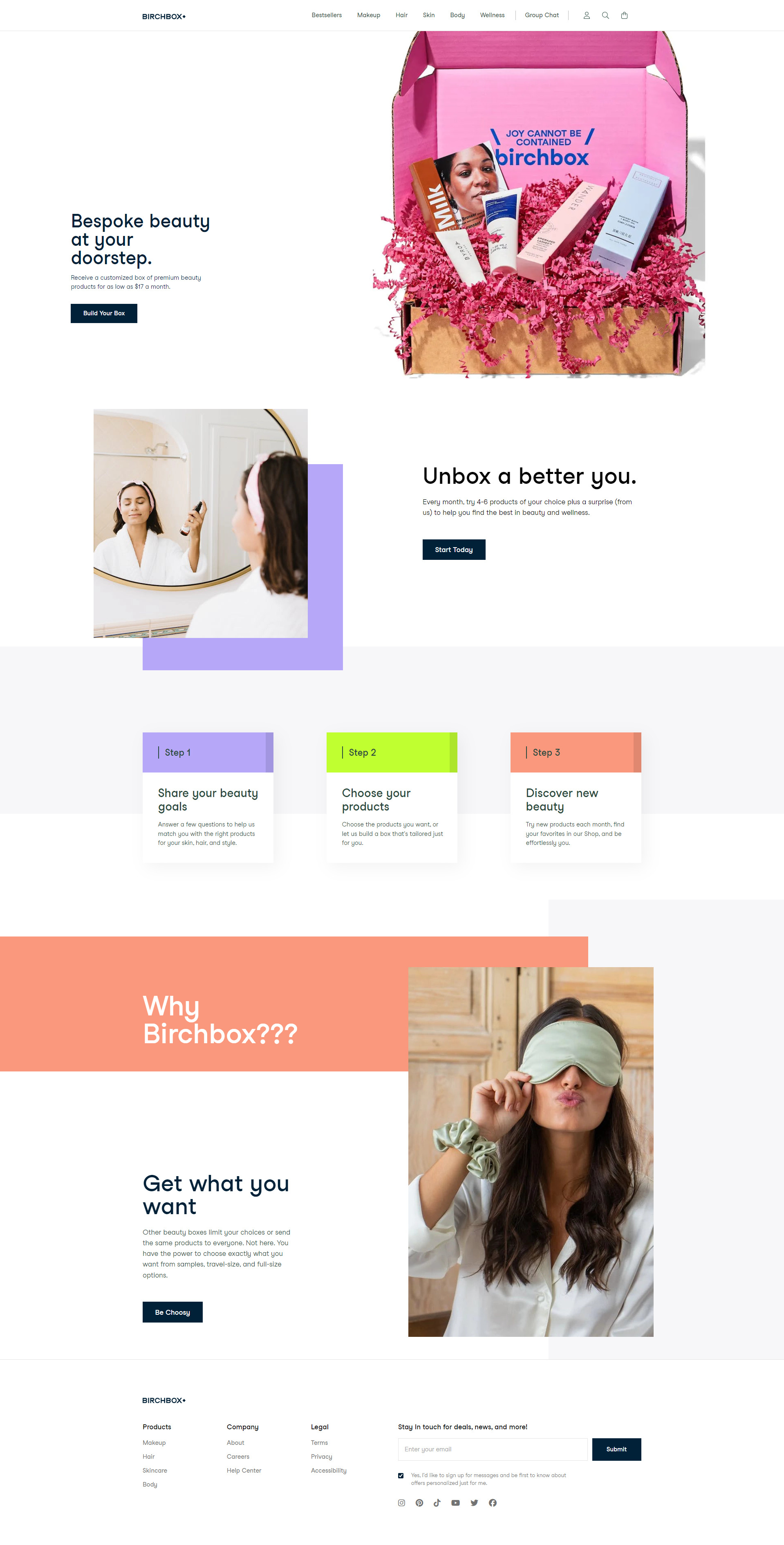
What They Sell: Customizable beauty subscription boxes offering a mix of samples and full-size products in makeup, haircare, skincare, and wellness.
Design Vibe: Chic and user-friendly, emphasizing personalized beauty experiences.
Navigation: Straightforward, with options to build your box or explore individual products.
Layout: Modern and clean, showcasing products and subscription details effectively.
Finding Stuff: Easy to navigate with options to personalize or explore products.
Mobile-Friendly: Yes, optimized for convenient mobile browsing.
Privacy & Security: Committed to customer data protection.
Birchbox’s website stands out with its elegant design and customer-centric approach. The site effectively communicates the value of its products through a visual and interactive journey, making selecting a beauty box fun and personalized.
Related articles
29. Sierra Designs
Sierra Designs’ website fuels outdoor adventure with rugged imagery, easy gear navigation, and a focus on sustainability.

What They Sell: They specialize in high-quality outdoor equipment and apparel, offering tents, sleeping bags, backpacks, and clothing for camping and hiking enthusiasts.
Design Vibe: The site has an adventurous and natural feel, reflecting the outdoor lifestyle with vibrant images of nature and outdoor activities.
Navigation: User-friendly, with distinct categories for each type of gear and apparel, making it easy to find what you’re looking for.
Layout: The layout is clean and engaging, emphasizing the functionality and quality of their products.
Finding Stuff: Products are well-organized with detailed descriptions, user reviews, and specifications.
Mobile-Friendly: The site is optimized for mobile users, ensuring a good experience across devices.
Privacy & Security: Demonstrates a commitment to customer privacy and online security.
Sierra Designs’ website is a showcase of their dedication to outdoor exploration. It’s a one-stop shop for high-quality, reliable gear designed to meet the needs of outdoor enthusiasts. The site’s layout and imagery are crafted to inspire adventure, emphasizing the brand’s commitment to both functionality and sustainability.
30. Heveya
Heveya’s site invites users into a serene ecommerce space with virtual showrooms, video tours, and luxury bedding details.

What They Sell: They specialize in organic latex mattresses, natural bedding accessories, and sustainable bed frames.
Design Vibe: The website has a serene and natural aesthetic, emphasizing eco-friendliness and comfort.
Navigation: Clear and straightforward, with distinct sections for mattresses, bedding, and accessories.
Layout: Clean and inviting, showcasing products with an emphasis on sustainability.
Finding Stuff: Easy to locate products, with detailed descriptions and informative guides.
Mobile-Friendly: Yes, the site is optimized for mobile users.
Privacy & Security: Committed to customer privacy and secure online transactions.
Heveya’s online presence is a masterclass in digital elegance, merging the tactile pleasure of offline browsing with the convenience of online shopping. From detailed tour videos to an engaging virtual showroom, the site invites visitors to immerse themselves in a world of organic luxury bedding.
31. Bon Bon Bon
Bon Bon Bon’s playful ecommerce design matches its artistic chocolates, using bold visuals and vibrant, brand-forward layout.

What They Sell: Bon Bon Bon offers an array of gourmet chocolates, known for their inventive flavors and artistic presentations, perfect for gifts or indulgence.
Design Vibe: The site is lively and whimsical, mirroring the creativity and playfulness of their chocolate bonbons.
Navigation: It’s straightforward, with categories making it easy to explore their chocolate collections and gift options.
Layout: Engaging and colorful, the layout showcases the chocolates attractively, enticing visitors to explore more.
Finding Stuff: Products are well-categorized, and each bonbon has a descriptive page, enhancing the shopping experience.
Mobile-Friendly: The website works well on mobile devices, facilitating easy browsing and purchasing.
Privacy & Security: They ensure a secure shopping environment, protecting customer data.
Bon Bon Bon’s website is a visual feast, mirroring the artistry of their chocolates. The bold colors and engaging design make browsing through their selection a delightful and inspiring experience. It’s a digital representation of the brand’s creative essence, inviting visitors to explore and indulge in their unique chocolate creations.

Looking to sell online?
Create your custom online store in minutes with 10Web AI Ecommerce Website Builder and take your business online.
What makes a great ecommerce website?
Ecommerce websites need great design to succeed. Good design helps customers find products easily and buy them quickly. It also makes the site look trustworthy and professional.
The best ecommerce website examples focus on designs using white space, clear product photography, and simple navigation. These elements make the site easy to use on both computers and phones. They also help draw attention to important things like sales or new items.
Simplicity and user experience
A clean, simple design is key for a positive user experience on ecommerce sites. Too many options can confuse shoppers. Use clear menus and categories to help people find what they want. Put important things like the shopping cart and search bar where they’re easy to see.
Good product pages are vital. Show big, high-quality photos of items. Write clear product details and prices. Make the “Add to Cart” button stand out.
The checkout process should be smooth. Ask only for needed info. Offer guest checkout for faster buying. Show progress bars so people know where they are in the process.
Mobile responsiveness and cross-platform compatibility
More people shop on phones now. In fact, mobile ecommerce sales are on track to surpass $2 trillion in 2024. Because over 50% of ecommerce sales come from mobile, your site must work well on all devices.
One essential way to help accomplish this is by using a responsive design that fits different screen sizes.
Make buttons and links big enough to tap on small screens. Use a single-column layout for mobile. Put the most important info at the top.
Test your site on many devices and browsers. Make sure it looks good and works right on all of them. This helps you reach more customers.
Quick loading times and technical performance
Slow sites lose sales. Aim for pages that load in 2-3 seconds or less, even on mobile. Use small image files to speed things up. Remove unused code and plugins.
Put your site on a fast web host. Use content delivery networks to serve files from servers close to users. This cuts load times, encouraging visitors to stick around.
Keep testing your site’s speed. Use tools like Google PageSpeed Insights to find ways to make it faster. Quick loading keeps shoppers happy and boosts sales.
Leveraging customer reviews and testimonials
Customer reviews represent a key trust signal that helps shoppers make decisions. Display star ratings and review counts near product images. Show a mix of positive and negative reviews for authenticity.
Add a search function to help users find specific feedback. Allow customers to filter reviews by rating, date, or relevance.
Include photos or videos from real users to showcase products in action. Feature short testimonials from happy customers on product pages.
Ask buyers to leave reviews after their purchase through follow-up emails. Respond to both positive and negative reviews to show you value customer feedback.
Consider adding a Q&A section where shoppers can ask questions about products. This can address common concerns and boost confidence in buying decisions.
Analytics and continuous improvement
Tracking data and making updates are key to success. Smart ecommerce sites use tools to understand customers and improve their stores over time.
Web analytics tools show you how people use your site. They track things like:
- Number of visitors
- Pages viewed
- Time spent on site
- Where visitors come from
- Products viewed and purchased
Google Analytics is a popular free tool. It gives you lots of data about your visitors and sales.
Look at your analytics often. Pay attention to:
- Top landing pages
- Exit pages (where people leave)
- Best-selling products
- Cart abandonment rate
Use these insights to fix problems and make your site better. For example, if people leave on the checkout page, you might need to make it simpler.
What ecommerce platforms are best for beginners?
10Web provides a straightforward solution for building high-performance ecommerce websites through its AI-powered Website Builder and WooCommerce integration. This platform enables anyone to create professional online stores quickly. Beginners or those who want to hit the ground running will appreciate how the platform streamlines the process with:
- AI Ecommerce Website Builder
- WooCommerce integration
- Extensive style customization
- Advanced analytics and marketing tools
- Payment and shipping flexibility
- 10Web Booster for performance optimization
With the AI Website Builder, automatically fast hosting, and an easy-to-use dashboard to manage it all, 10Web takes care of the technical details while you focus on your store.
How to build an ecommerce website like these examples
You can generate a professional ecommerce website with 10Web’s AI Website Builder and get started setting up shop in minutes. Once the site is up and running, you’ve got all the tools you need to easily manage and update your storefront and products.
Here’s how it works:
- Describe your business
Start by answering a few questions about your store (what you sell, who it’s for). The AI will generate a tailored WooCommerce site structure and initial content based on your input. Be as descriptive as you want for this part. Now is a great time to tell the AI Website Builder exactly what you have in mind. - Choose your layout and visual style
Select a layout style that fits your brand. You can customize fonts, colors, and imagery to match your aesthetic. Nothing is set in stone. You can always change things later. - Generate your ecommerce website
In just a minute or two, the builder creates your homepage, a few product pages, and any other pages or elements chosen during the initial layout editing. - Customize your content and product pages
Upload your actual product photos, write detailed descriptions, set pricing, manage categories, and configure variations like sizes or colors. This step takes the most time, but it’s where your store truly comes to life. - Set up payments, shipping, and policies
10Web makes it easy to choose payment gateways (Stripe, PayPal, etc.), define shipping methods, and add return and privacy policies. - Optimize and launch
Add your domain, install analytics, optimize performance with 10Web Booster, and preview your site on desktop and mobile. Once everything looks good, it’s time for your grand opening.
Take inspiration from the best ecommerce website examples
From sleek layouts to seamless user experiences, the best ecommerce websites demonstrate how effective design can elevate a brand and drive conversions. By studying these top ecommerce website examples, you’ve seen how thoughtful design elements like mobile responsiveness, fast loading times, and intuitive navigation, are crucial to engaging customers and boosting sales.
Now that you’re brimming with great ideas, check out how the right hosting and website builder can help you set up your new ecommerce store and prime your online retail business for success.

Looking to sell online?
Create your custom online store in minutes with 10Web AI Ecommerce Website Builder and take your business online.
FAQ
What makes a good ecommerce website in 2025?
A good ecommerce website in 2025 combines fast loading speeds, mobile-first design, intuitive navigation, high-quality visuals, and clear calls to action. The best ones also personalize product discovery and simplify checkout.
How can I build an ecommerce website like these examples?
You can build a similar website using AI website builders like 10Web, which generate a full store from a short business description. Then you can customize the layout, style, and content to match your favorite design features.
Which ecommerce platform is best for beginners?
For beginners, platforms like Shopify and Wix are easy to start with, while WooCommerce offers more control for WordPress users. Tools like 10Web combine AI and WooCommerce to simplify setup without sacrificing flexibility.
Do I need a developer to create a website like this?
Not anymore. AI builders can now generate beautiful ecommerce websites with smart layouts, optimized speed, and integrated features with no coding needed. You can then tweak it yourself or get help if needed.
What types of ecommerce websites are trending right now?
Fashion, skincare, wellness, sustainable goods, and niche lifestyle brands are growing fast. Trending ecommerce sites often focus on storytelling, video content, mobile UX, and bold brand design.
How can I get inspired before launching my online store?
Review real examples across categories like fashion, wellness, tech, and more. Pay attention to layout, product filtering, visuals, and what makes the experience feel smooth. Then use an AI builder to quickly prototype your version.


