If your site is off target and generic, it’s most likely your prompt, not the tool.
Every AI website builder reads your input and generates a site based on what you described. If the description is thin, the output defaults to the statistical average for your industry. You get a layout that works for everyone and stands out for no one. The fix is writing a website prompt that gives the AI a real brief to work from.
What is a website prompt?
A website prompt is the text instruction you give an AI website builder to describe the site you want it to create. It is the AI’s only source of context. Unlike a human designer, the AI has no knowledge of your brand, your audience, or your visual preferences unless you include that information in the prompt itself.
Why most website prompts fail
Most prompts fail because:
- They describe the output, not the goal. “Make it modern and clean” tells the AI nothing actionable. Modern to an orthodontist’s office looks completely different from modern to a streetwear label.
- They skip the audience. Without knowing who the site is for, the AI can’t calibrate tone, information hierarchy, or which sections to surface first.
- They have no visual direction. Aesthetic terms like “professional” collapse into the most statistically common design for your industry category.
- They assume one prompt is enough. The first generation is a foundation. Refinement happens through targeted follow-up prompts.
- They leave out the primary goal. A site built to capture inquiry leads has a different structure from one built to sell a product. Without this, the AI guesses. It usually guesses wrong.
The five elements of a strong website prompt
A reliable website prompt includes five pieces of information. These give the AI enough context to make intentional design and copy decisions instead of statistical ones.
Business type and purpose
State what the business does and what the website is supposed to accomplish. Be specific about the offer, not just the category.
“Photography studio” and “a film photography studio that books 6-months-in-advance weddings for couples with a budget over $8,000” are not the same input. The second one changes the tone, the visual weight, the pricing presentation, and what the CTA copy should say. One sentence of specificity produces a measurably different output.
Target audience
Describe who the site is built for, not just demographically but behaviorally. What does this visitor already know? What are they trying to decide?
A site for corporate procurement managers needs dense, precise copy with clear spec tables. A site for couples booking a once-in-a-lifetime event needs warmth and visible trust signals at every scroll depth. Include the audience’s awareness level, what they’re comparing you against, and what would make them take action.
Prompt example:
“The audience is engaged couples aged 28–40 planning a wedding with a budget over $8,000. They are comparing two or three photographers and need to see style consistency and past client evidence before submitting an inquiry form.”
Visual style and tone
Tell the AI how the site should look and sound. Ground aesthetic direction in concrete references rather than abstract adjectives.
“Elegant” means nothing on its own. “Thin serif fonts, cream and dusty rose palette, editorial photo layout with generous whitespace” is actionable. If you have existing brand colors or fonts, include them. State the tone of voice explicitly: warm and personal, authoritative and sparse, playful and conversational.
Prompt example:
“Visual style: editorial and romantic. Cream background, dusty rose accents, thin serif headline font, generous whitespace. Tone: warm and personal, written as if from someone who has done this hundreds of times and genuinely cares about the outcome.”
Pages and structure
List every page the site needs and what each one is supposed to accomplish. One sentence per page is enough. The AI uses this to build navigation, set information hierarchy, and decide which content blocks belong where.
Prompt example:
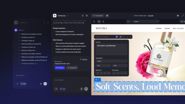
“Five pages: Home (hero with inquiry CTA, portfolio preview, short studio bio), Portfolio (full gallery organized by venue type), Services (three packages with pricing), About (photographer story and working style), Contact (short inquiry form with date and budget fields).”
Skipping this step produces a site with the default page structure for your industry. That structure may have nothing to do with how your business actually operates.
The primary call to action
Every page should lead somewhere specific. Tell the AI what that action is and where it goes. The CTA determines button copy, visual emphasis, and placement across the entire layout. Be explicit per page if the actions differ.
Prompt example:
“Primary CTA across all pages: ‘Book your date’ linking to the contact inquiry form. Secondary CTA on the Portfolio page: ‘See the full gallery’ linking to the portfolio page.”
How to put a full prompt together
Combine all five elements into one structured block. Put business type and purpose first. The AI weighs earlier context more heavily than details buried at the end.
Complete example:
“Create a website for a boutique wedding photography studio specializing in candid, film-style photography. The primary goal is to get engaged couples to submit a booking inquiry.
Audience: couples aged 28–40 planning a wedding over $8,000. They are comparing photographers and need to see style consistency and social proof before making contact.
Visual style: editorial and romantic. Cream background, dusty rose accents, thin serif fonts, generous whitespace. No stock photography. Placeholder image blocks only. Tone: warm and personal, written by someone who genuinely cares about the outcome of the wedding day.
Pages: Home (hero with inquiry CTA, portfolio preview, short studio bio), Portfolio (full gallery), Services (three packages with pricing), About (photographer story), Contact (inquiry form with date and budget fields).
Primary CTA on all pages: ‘Book your date’ linking to the contact form.”
This is 155 words. That is the right length for an initial website prompt: specific enough to make intentional decisions, focused enough to stay coherent.
How to refine with follow-up prompts
The first output is a foundation, not a finished site. Targeted follow-up prompts are how you close the gap.
Effective follow-up prompts are section-specific, not global. “Make it better” produces inconsistent changes across the layout. These work:
- To adjust copy: “Rewrite the homepage hero headline. The current version leads with the service. It should lead with the emotional outcome: what the couple will have ten years from now.”
- To change layout: “Move the testimonials block above the pricing section on the Services page. Add a subheadline before the testimonials that reads: ‘From couples who booked with us.'”
- To add a missing element: “Add a FAQ section to the bottom of the Services page. Cover: how far in advance to book, whether a second shooter is included, and what happens if a date needs to change.”
One instruction per follow-up. That specificity makes changes predictable and prevents unintended layout shifts.
Frequently asked questions
How long should a website prompt be?
100–200 words for the initial prompt. Long enough to cover all five elements, short enough to stay focused. Follow-up prompts should be one to three sentences each.
Do I need a separate prompt for each page?
No. The initial prompt should describe the full site. Once the structure is generated, use follow-up prompts to refine individual pages.
What if the AI ignores part of my prompt?
Pull out the ignored instruction and send it again as a standalone follow-up. Instructions buried inside a dense paragraph are regularly deprioritized. Short, isolated instructions get more reliable results.
Does the order of information in a prompt matter?
Yes. Business type and primary goal should always come first. Details mentioned at the end of a long prompt carry less weight in the output.