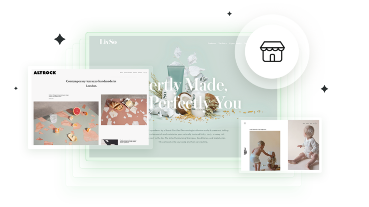
If you’re looking for inspiration for your next website, you’re in the right place. We’ve gathered 28 best Elementor websites that showcase the full potential of this powerful page builder. The list is pretty diverse, from ecommerce stores and online portfolios to business sites. You will definitely find smart design choices here, to later adapt for your own projects.
Elementor is a favorite among WordPress website creators for good reason. It offers great flexibility, allowing you to design custom layouts without touching a single line of code. Your site automatically adjusts for mobile, plus you have a visual editor with real-time feedback. All those make your design process smoother and more intuitive.
Create your dream website with 10Web AI Website Builder 
Build your website in 1 minute
and take your business online!
How we choose the best Elementor websites
We chose these Elementor websites for their design brilliance. Each one of those Elementor website examples shows off smart design choices that make their niche content shine. We mainly paid attention to:
- Clever layouts: How pages use grids and spacing to naturally guide your eyes and make information easy to digest.
- Color magic: The way colors set the mood, highlight what matters, and reflect each site’s unique personality.
- Smooth navigation: Menu systems that feel natural while cleverly organizing content in ways that make sense.
- Tailored design touches: Design elements crafted specifically for the content type rather than following cookie-cutter trends.
Each site offers practical inspiration you can apply to your own projects. You’ll spot clever ways to balance looks and function that work regardless of audience size.
28 best Elementor websites
In this collection, you’ll find a mix of the best Elementor websites from different industries, showing how Elementor works for both simple and complex designs. For each example, we’ll break down what makes it effective so you can apply similar strategies to your own site. Let’s start.
1. Rockscape
Company: A landscape design firm specializing in waterfront properties, creating natural outdoor spaces with local materials.

What we like about this website:
- Project showcase highlighting completed works.
- Service details outlining construction, maintenance, and seasonal enhancements.
- Responsive design for smooth viewing on all devices.
On the Rockspace’s website you are greeted with visually appealing animations and reactions that make navigation feel interactive and engaging. But the highlight is the strategic approach to calls-to-action. From the moment the page loads (with a branded loading screen rather than a blank page), you encounter multiple conversion opportunities naturally integrated into the design. Even their main slogan “Reveal the possibilities” functions as an invitation to engage. This creates a frictionless path from visitors to supporters while maintaining an easy-on-the-eyes aesthetic.
2. Brandon Li
Company: A nomadic filmmaker sharing travel experiences through compelling visuals.
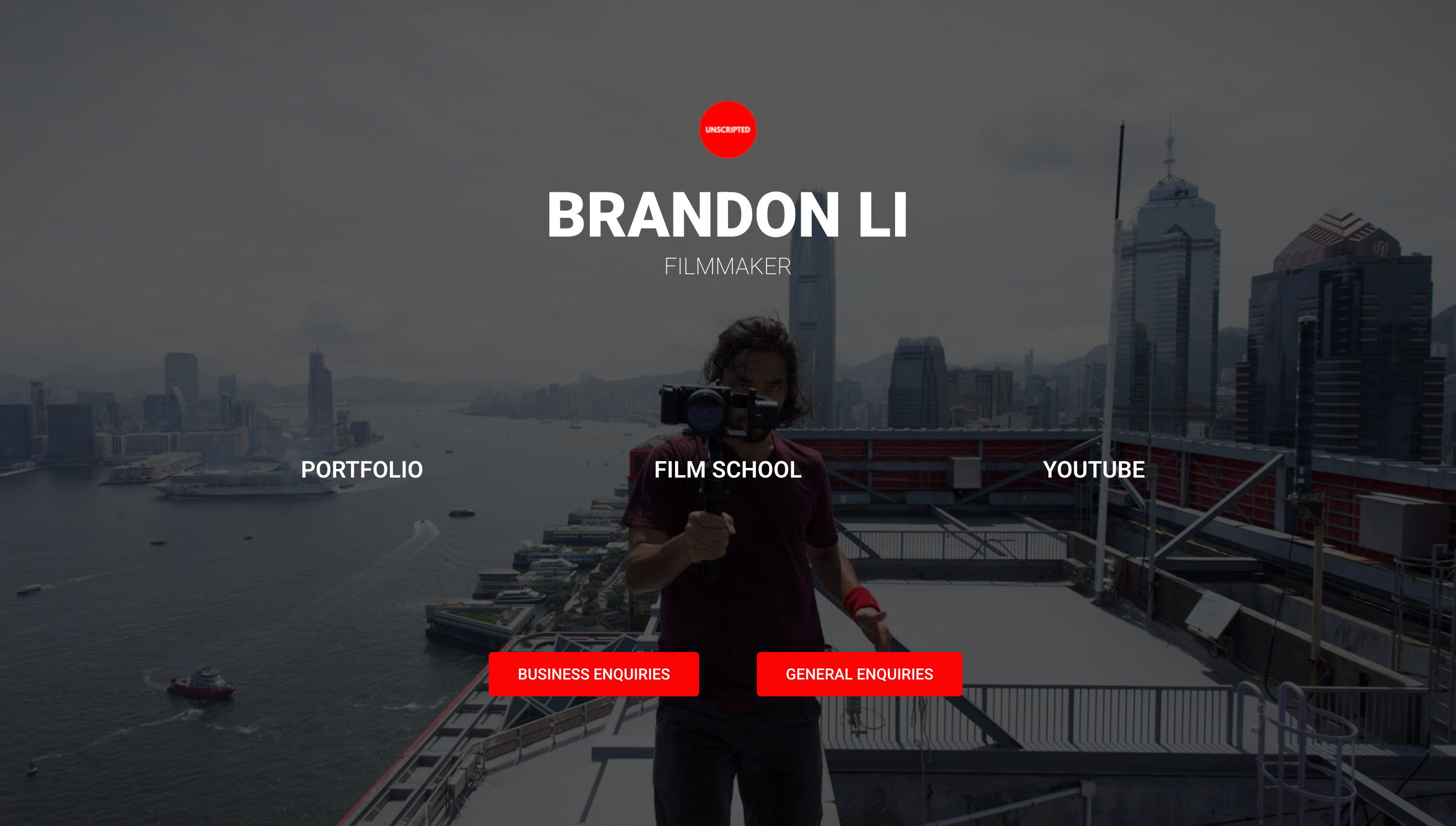
What we like about this website:
- Minimalist one-page design focused on essential content.
- Full-screen background image creating an immersive feel.
- No header or footer for a clean, distraction-free experience.
Brandon L is one of our favorite Elementor websites. It brilliantly demonstrates the “three-click philosophy“ of elite web design. The genius lies in what’s missing: no overwhelming galleries, no endless scrolling, no visual clutter. Visitors immediately see three strategic pathways (Film School, YouTube, and Business Inquiries) without needing to scroll or hunt for information. This zero-distraction approach delivers great benefits for both parties: visitors gain instant clarity to make decisions in seconds, while Brandon enjoys higher conversion rates to his platforms.
3. Relearn Digital
Company: An educational platform offering digital marketing courses with a focus on accessibility.
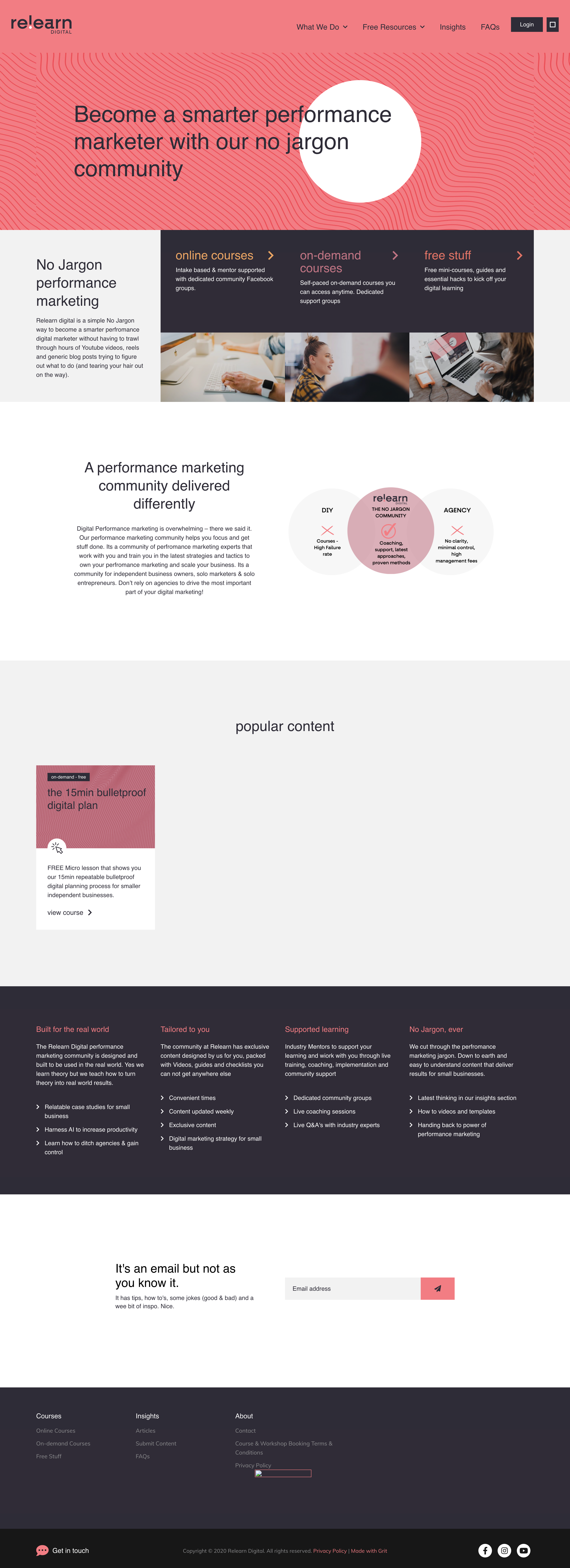
What we like about this website:
- Clean, minimalist layout keeping attention on course content.
- Responsive design for smooth user experience on any device.
- Intuitive navigation and content easy accessibility.
This is one of the Elementor website examples that show how less can be more in web design. Their minimalist approach creates clear visual priorities, drawing eyes naturally to key details. Colors serve as helpful section markers and make scrolling intuitive. The result is a clean, focused design where content breathes and visitors can easily find what they need. For brands wanting clarity without sacrificing style, this can be a good reference to keep in mind.
Create your dream website with 10Web AI Website Builder 
Build your website in 1 minute
and take your business online!
4. Mitchell Adam
Company: A boutique consultancy firm delivering bespoke services with a refined digital presence.

What we like about this website:
- Professional, polished design reflecting expertise.
- Interactive scrolling affects visitor engagement.
- Client testimonials displayed prominently for credibility.
Mitchell Adam’s website took the classic business landing page approach that prioritizes function. You are immediately presented with a clear binary choice – “hire” or “apply” – a simple decision-making process right from the start. They also use shapes and colors to create a visual hierarchy, which helps with the visitor’s natural flow through the content.
5. itho | Design
Company: A creative agency offering digital marketing and design solutions.

What we like about this website:
- Modern, sleek aesthetics emphasizing visual appeal.
- High-quality imagery showcasing past projects effectively.
- User-friendly interface with easy navigation.
itho is one of the leaders in Elementor website examples for being aesthetic and professional at the same time. It used purple shades to create a visually pleasing experience while guiding visitors through a complete decision path. Their single-page layout smartly arranges content – intro, services, video, pricing (because at this point you are interested in how much it all costs), and contact – creating a smooth journey that helps visitors move naturally from first look to taking action.
6. Aurec Capital
Company: An investment firm providing asset management, private equity, and capital solutions.
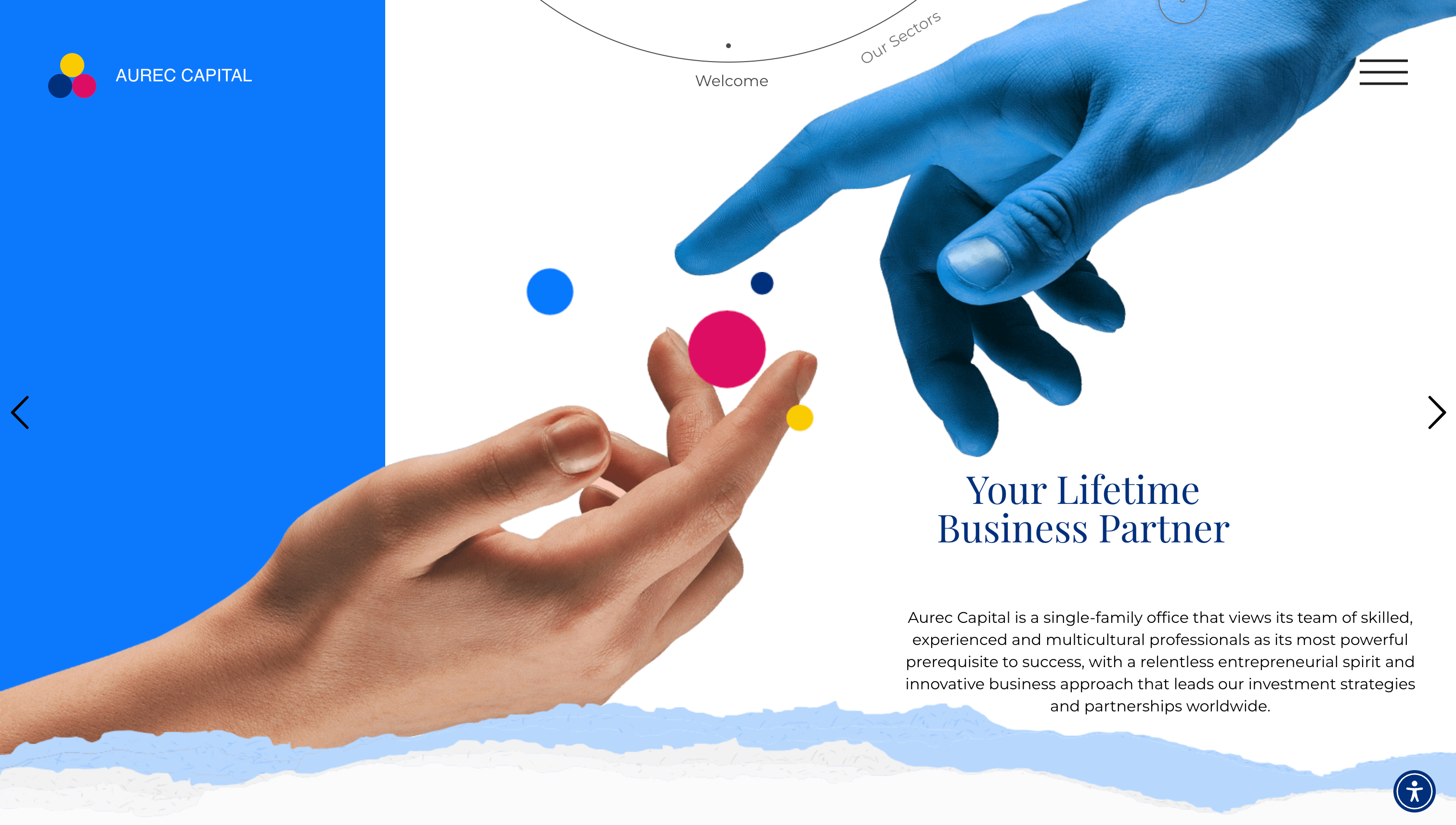
What we like about this website:
- Fully responsive design for accessibility on all devices.
- Elegant, yet engaging layout.
- Clear service presentation detailing investment opportunities.
Aurec Capital turns website browsing into an art show. Their design cleverly uses the famous “Creation of Adam” painting to represent their client connections, while adding modern touches like colors that follow your mouse movements. The slideshow format lets you control the pace, creating a theater-like experience where you’re both audience and director. By having interactive elements, Tech Capital creates a website that feels like a guided tour rather than a corporate page. This is a great way to engage your visitors.
Create your dream website with 10Web AI Website Builder 
Build your website in 1 minute
and take your business online!
7. Scope Copenhagen
Company: A design and construction studio turning client ideas into reality.

What we like about this website:
- Minimalist Danish design with large typography and ample white space.
- High-quality project visuals adding credibility.
- Consistent color scheme creating a cohesive experience.
Their website uses a subtle grayish-white background that helps their work samples stand out. By keeping the backdrop neutral and creating a gallery-like setting where visitors naturally focus on the portfolio pieces scattered throughout the page. Simple font choices provide just enough information without stealing attention from the visuals. This approach solves the main challenge for portfolio sites – keeping eyes on the work while still guiding visitors toward important actions.
8. Lost Tribe Travel
Company: A travel company offering unique adventure experiences.

What we like about this website:
- Vibrant photography capturing the essence of exploration.
- Engaging layout encouraging discovery.
- Easy navigation for smooth browsing.
This specific Elementor website brings something new to the table: strategic use of photos. It skips the typical large slider in favor of a changing photo gallery that instantly transports visitors into the travel environment. This smart approach creates an emotional connection from the first moment. Key metrics displayed below the gallery (countries visited, tours offered, cultural experiences) build immediate trust through concrete numbers.
As visitors scroll, experiences are neatly categorized (city adventures, natural wonders, cultural trips, and more) with stunning destination photography as the main visual element. Their use of high-quality images helps visitors mentally place themselves in each location, turning simple browsing into a virtual exploration that inspires actual travel planning.
9. General Condition Studio
Company: An award-winning design studio blending branding and digital experiences.

What we like about this website:
- Creative design elements showcasing artistic expertise.
- Interactive portfolio displaying a range of projects.
- Responsive design for seamless accessibility.
General Condition Studio opens with a captivating video showcasing their diverse work – photography, graphic design, and video elements all blended together. This visual introduction creates an immediate “stop and watch” moment where visitors become genuinely engaged with the content.
As you scroll down, you discover the website itself uses the same creative approach shown in their portfolio work. All this together creates a natural connection between their projects and their digital presence. By turning their website into both a portfolio container and a portfolio piece itself, they demonstrate their creative abilities before you even begin examining individual projects.
10. Notarity
Company: A digital platform for online notary appointments.

What we like about this website:
- Clean, professional design instilling trust.
- Clear call-to-action buttons streamlining bookings.
- Concise service descriptions for clarity.
This Elementor website example shows how to refresh the standard business landing page format. They follow the proven layout – hero image on the right, call-to-action on the left – but add interest through thoughtful shading choices that separate content sections and CTAs. The site is more graphic than the other business websites in the list. This helps to visualize concepts, making information easier to digest. They also have smart placement of CTAs after each major content block, which creates a natural “learn-then-act” rhythm throughout the page.
Create your dream website with 10Web AI Website Builder 
Build your website in 1 minute
and take your business online!
11. Croing
Company: A digital agency specializing in branding, web development, and marketing.

What we like about this website:
- Modern, dynamic design featuring engaging animations.
- Showcase of services and case studies demonstrating expertise.
- Responsive layout for smooth browsing across devices.
Here I’d like to highlight the immediate display of high-profile clients builds instant credibility and the floating meeting button that stays handy without getting in the way. trust. Every part of the page shows off their creative skills while gently pointing visitors toward making contact.
12. Balzac
Company: A marketing firm specializing in luxury beverage industries, tailoring strategies to elevate premium brands through storytelling, influencer collaborations, and high-end event marketing.

What we like about this website:
- Elegant, high-end design reflecting a premium brand image.
- Comprehensive service breakdown covering various market segments.
- Engaging blog section sharing industry insights.
This website makes an immediate connection through striking imagery of the famous writer, creating an instant brand association. The site uses soft pastel colors, but the design is especially clever for its conversation-like structure – it’s built as a simple FAQ format that anticipates visitor questions and provides just enough information to spark interest. By answering basic questions like experience level and location, then linking to deeper content, the design pulls visitors naturally through their story.
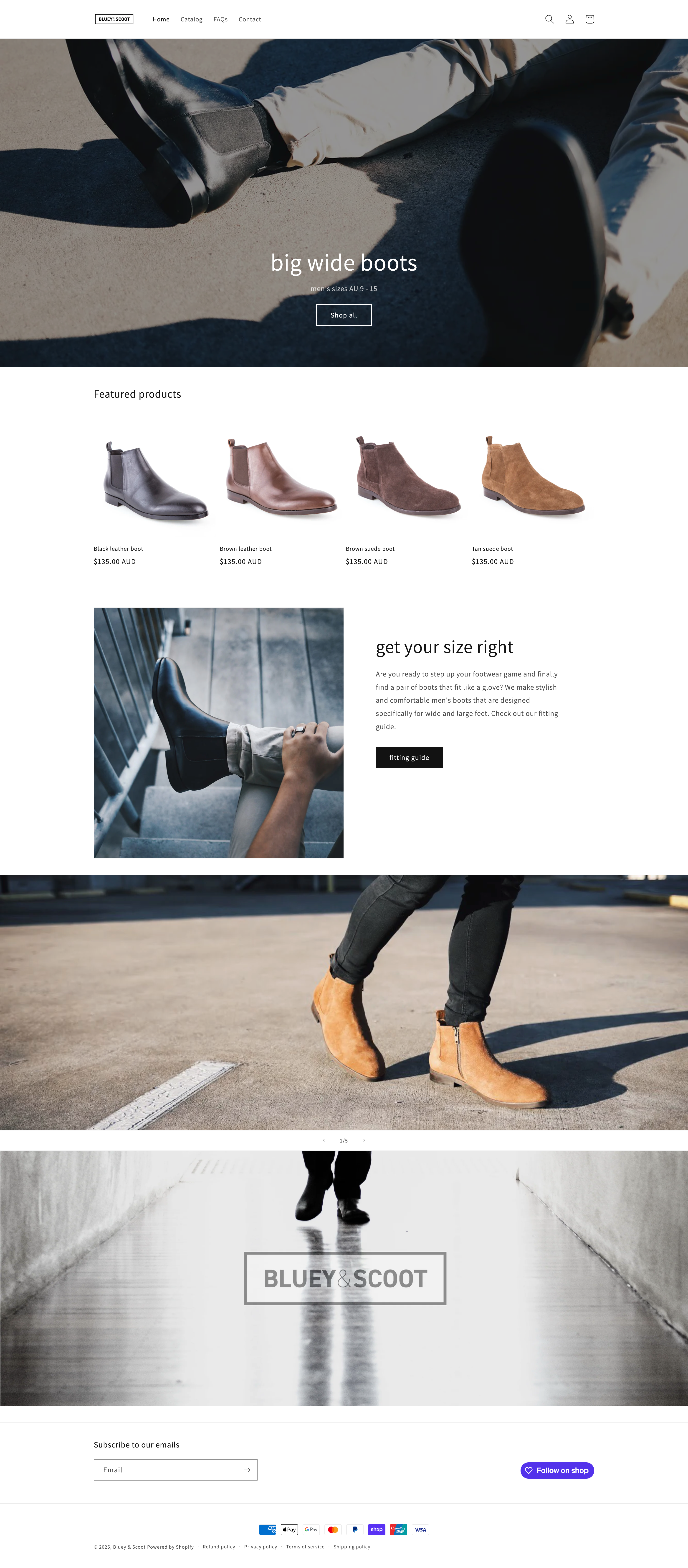
13. Bluey & Scott
Company: A business consulting firm providing clear, practical solutions.
What we like about this website:
- Professional, clean design focused on clarity.
- User-friendly navigation enhancing accessibility.
- High-quality visuals supporting the brand’s message.
Finally, we have an ecommerce shop on our list. This Elementor website example nails the key that drives online sales – a clean design that makes finding products effortless. The prominent “Shop All” button immediately guides visitors to merchandise. Every product page delivers just the right amount of information, presented clearly to help shoppers make confident buying decisions.
Unlike portfolio sites that need to showcase creativity, this store understands that ecommerce success comes from simplicity – creating a shopping experience that feels natural, simple, and trustworthy from homepage to checkout.
14. Halley Stevensons
Company: A manufacturer of waxed cotton fabrics with a strong heritage.

What we like about this website:
- Full-screen imagery emphasizing craftsmanship and history.
- Transparent header that solidifies on scroll.
- Cohesive color scheme maintaining brand consistency.
Halley Sevenson showcases their company history and modern design on the same homepage. The goal for this is to build trust and show prominence using design and content at the same time. You immediately see their founding year (1864), but then as you scroll they create an educational journey – materials, techniques, origin story, and more – making you feel connected to their tradition and expertise as a visitor. Every element works together to present Halley Sevenson as both historically significant and creatively relevant today.
15. Jason Blackeye
Company: A web designer and content creator showcasing his work online.

What we like about this website:
- Modern, visually appealing design highlighting creativity.
- Interactive elements enhancing engagement.
- Fully responsive layout for a seamless experience.
Jason’s Elementor website example brilliantly combines a CV and portfolio with its relaxing design. The creative blocks show his professional skills and experience without overwhelming visitors with too much information and the simple pastel color scheme maintains focus on his work. His intentional positioning comes through immediately in clearly defined boxes, which makes it easy for potential clients to understand exactly what he offers.
Create your dream website with 10Web AI Website Builder 
Build your website in 1 minute
and take your business online!
16. Bygeorge Legal
Company: A law firm providing intellectual property-focused services for individuals and businesses.

What we like about this website:
- Professional, approachable design building trust.
- Clear service breakdown making legal help accessible.
- Responsive structure ensuring usability across devices.
Bygeorge Legal’s website immediately tries to build trust by showing their intellectual property specialists smiling and laughing on the homepage. This might seem odd for a law firm, but this smart choice addresses the most important element in legal services – building client confidence in the people who will represent them.
The navigation prioritizes “Our People” as the header item, emphasizing the human expertise behind their services before detailing specific IP offerings. By putting faces to their firm name, this Elementor website example helps potential clients feel comfortable with their team before they even read about their legal capabilities.
17. Artacademybrand
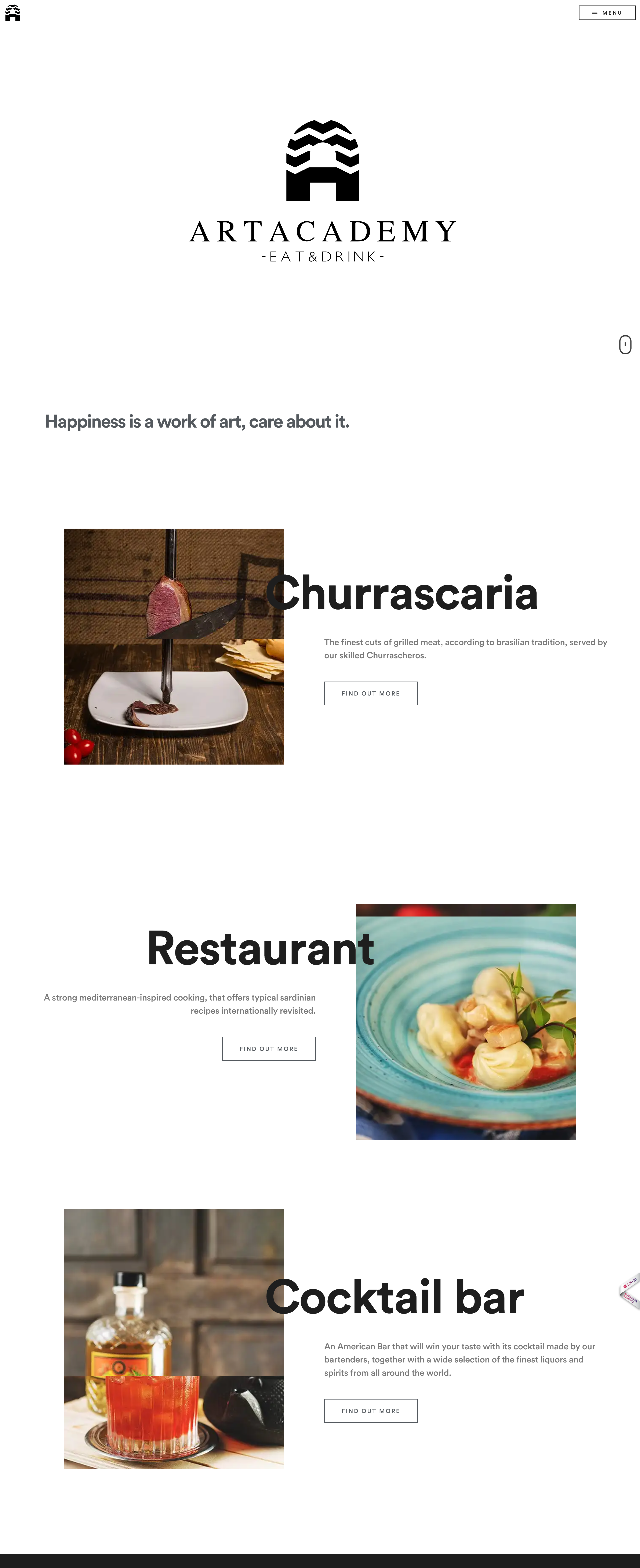
Company: A dining and cocktail destination blending Brazilian and Mediterranean cuisine in a post-industrial setting, offering gourmet dishes, Churrasco specialties, and expert cocktails.
What we like about this website:
- Elegant visual design reflecting the restaurant’s refined post-industrial ambiance.
- Menu display for visitors to explore dishes and beverages easily.
- User-friendly navigation for fast access to essential information.
Artacademybrand’s website cleverly resolves potential name confusion with an immediate tagline that explains their unique concept – “happiness as a work of art.” The homepage quickly clarifies their three-part experience: traditional Brazilian Churrascaria, a Mediterranean-inspired restaurant and a wake-up American cocktail bar. This short presentation transforms what could be a confusing concept into an inviting experience. The visitors can immediately understand the creative dining adventure.
18. AK Hoodies
Company: A brand offering stylish, high-quality graduation sweaters.

What we like about this website:
- Vibrant, youthful aesthetics appealing to students.
- Social media integration boosting engagement.
- User-friendly interface simplifying shopping.
AK Hoodies is again one of the ecommerce Elementor websites. Although they have a two-color design scheme, the website is still vibrant. This is important since the business itself is youth-centered. The homepage immediately presents clearly labeled categories – new arrivals, bestsellers, styles, and more. This organization shows an understanding of how different customers shop, whether they’re trend-focused, interested in popular items, or search by specific aesthetic preferences.
19. Mikanovo
Company: A technology and design solutions provider with a minimalist approach.

What we like about this website:
- Clean, content-focused design without distractions.
- Responsive layout for easy access.
- Simple navigation keeping usability in mind.
Mikanovo’s website immediately communicates their value proposition, showing visitors exactly how they help with branding and other services before revealing anything else. Their portfolio section brilliantly organizes work by industry – SAS, technology, biotech. This makes it easy for potential clients to find relevant examples without scrolling through unrelated content.
The simple visual presentation of their diverse portfolio maintains a cohesive look that doesn’t overwhelm or distract visitors. This lets you keep the focus on their capabilities across different sectors as a visitor.
20. R11 Solutions
Company: An IT firm delivering digital solutions for businesses

What we like about this website:
- Modern, service-focused layout reinforcing expertise.
- Clear call-to-action buttons guiding user interaction.
- Fully responsive design for seamless navigation.
R11 Solutions feels familiar and fresh at the same time. Their hero section takes the standard web layout and adds just enough creative flair to make it stand out. Visitors immediately get that this is a team that balances structure with imagination – exactly what you want in a creative partner. But my favorite part is their right-side header “Let’s Talk” button gives visitors instant direction. The button is also cleverly located in all the sections, which increases the chance of it being clicked.
Create your dream website with 10Web AI Website Builder 
Build your website in 1 minute
and take your business online!
21. Fourpillars Studio
Company: A creative agency specializing in branding and design for startups, lifestyle brands, and cultural institutions.
What we like about this website:
- Dynamic single-page layout with smooth game-like scrolling.
- Bold contrasts and typography for a strong impression.
- Interactive elements enhancing engagement.
This is one of those Elementor websites that feel like gaming nostalgia. The page starts as four mysterious black pillars (as the company’s name) on a white background, but scrolling suddenly becomes an interactive playground. Pillars and dots are moving and once you tap anywhere, you’re transported to an old-school arcade game. This clever misdirect makes exploration fun while subtly demonstrating their creative thinking.
As you journey through this playful experience, you discover a button leader to their portfolio (with perfect timing). It’s brilliantly simple: they don’t just tell you they value excellence, edge, integrity and simplicity – they let you experience it through design that makes you feel like a kid again.
22. Canvas Pontiac
Company: An initiative promoting local artists and artwork.

What we like about this website:
- Artistic, visually engaging layout showcasing talent.
- Easy navigation for seamless browsing.
- Responsive design for accessibility.
Similar to the other Elementor websites that focus on showcasing their work, Canvas Pontiac’s website transforms your screen into an art gallery, but in a more colorful and vibrant manner. By showing diverse artworks against a clean backdrop, they create an experience that feels like walking through an exhibition.
23. Highopes
Company: A branding agency focused on the cannabis business.

What we like about this website:
- Modern, clean layout keeping content in focus.
- User-friendly interface streamlining interactions.
- Responsive design for smooth browsing.
If you are focusing on a niche in a large industry, you’d want to consider Highopes’s website. They instantly communicate their cannabis branding expertise through visual storytelling that hits all the right notes. Against a sleek black backdrop, their high-quality photography showcases their portfolio in a continuous, dynamic stream.
The design doesn’t just tell you they’re industry specialists; it shows you through every carefully curated visual element. Their presentation strike is professional enough for corporate clients yet creative enough for cannabis brands. One glance and you immediately understand both what they do and the caliber of work they deliver – no explanation needed.
24. Delv
Company: A crypto mining infrastructure provider.

What we like about this website:
- Engaging design blending digital and physical branding.
- Clear service breakdown covering key offerings.
- Dynamic visuals enhancing storytelling.
Although Delv maintains the familiar hero layout – text left, image right, call-to-action button, it’s still one of the best Elementor websites. They transform this standard approach by making their imagery work harder. Instead of a generic stock photo, they have a stretch-like drawing of a thick door – a symbol of safety, security and quality they want to provide. This subtle twist positions them separately from stock-photo-using competitors, at least visually. Simple structure, powerful psychology.
25. McGarr Massage Therapy
Company: A therapeutic practice offering in-home and clinical treatments.

What we like about this website:
- Clean, calming design reflecting wellness focus.
- Detailed service descriptions helping clients choose.
- Simple online booking for added convenience.
This site brilliantly uses visual restraint to create an emotional connection. The black-and-white photography creates an immediate sense of intimacy that perfectly aligns with her healing work. Rather than just promoting services, the imagery and thoughtful design reveal the person behind the practice – making visitors feel they’re choosing a relationship, not just booking a massage. The soft pastel color accents provide just enough warmth against the monochrome base, creating a visual experience that feels as calming as the therapy itself. It’s a masterclass in using design to evoke the exact feeling clients will experience when they visit her Montreal practice.
26. Studio NelNel
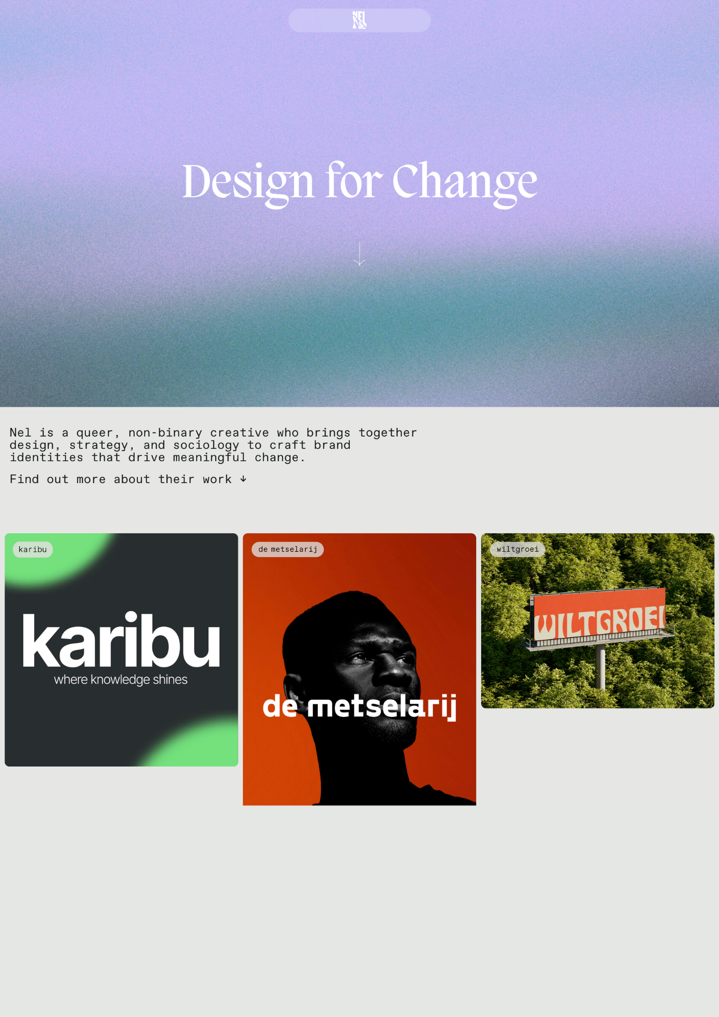
Company: An artist using their skills for social impact.
What we like about this website:
- Bold, vibrant aesthetics.
- Human-centered design focusing on accessibility.
- Simple yet diverse portfolio showing visual identities.
Similar to Brandon L’s website, Studio NelNel masters the art of decision simplicity. The moment you arrive, you’re greeted by a striking color backdrop and a simple slogan. With the next and final scroll, you see all the essentials – who the artist is and a direct link to their work. No maze of options, no information overload, just the perfect amount of context to guide your next click. It’s a refreshingly decisive design that respects visitor time and attention. By eliminating choice paralysis, the site actually increases engagement.
Create your dream website with 10Web AI Website Builder 
Build your website in 1 minute
and take your business online!
27. Angélique Damour
Company: A Paris-based design studio.
What we like about this website:
- Elegant, minimalist design highlighting creative work.
- Responsive layout for accessibility.
- Intuitive navigation for user experience.
Angélique Damour’s website is a masterclass in visual harmony. Every element – from the typography to the color palette and photography – flows together to create an unmistakable Parisian-like elegance. There’s something almost intangible about how they’ve crafted their digital presence; it feels less like browsing a website and more like stepping into a thoughtfully designed space. These balanced visuals can communicate a brand’s personality more powerfully than words ever could.
28. Ideabile
Company: A personal platform for a digital expert specializing in scalable solutions.

What we like about this website:
- Clean, professional layout emphasizing projects and expertise.
- Showcases work and insights through articles and case studies.
- Responsive design for smooth viewing across devices.
Finally, Ideabile is one of the simplest Elementor websites. It uses paste colors, blocks, simple organization, and makes sure no crucial information gets lost. By avoiding the common trap of overdesign, they’ve created an experience that informs without overwhelming – giving visitors exactly what they need without the unnecessary visual noise that exists on so many modern sites.
Build Elementor website with AI
You’ve seen what’s possible with Elementor, and now it’s time to build your own website. But turning an idea into a fully functional site isn’t always smooth. As we discussed, choosing the right layout, colors, and fonts is important. But it can feel challenging, especially if you don’t have advanced skills or are just starting out.
In the background, you need to take care of performance concerns like speed, security, and SEO optimization. This adds another layer of complexity. And dealing with hosting, backups, and maintenance? That’s not exactly the fun part. Some platforms like 10Web have all of this housed into one platform. You can build your website using the 10Web AI Website Builder with a few pieces of information about your business. Then, once your website is created using the AI, you can edit it with the 10Web drag-and-drop editor based on Elementor.
Here’s how 10Web simplifies the development of Elementor websites:
- Enter your website name: Fill in your website’s name.
- Add a brief description: Describe your website in a few words and click Generate Your Website.
- Review details: Confirm the website name and description are accurate, and adjust if needed.
- Review AI-generated structure: Click Next to check the AI-generated website layout.
- Customize design: Click Next to choose colors, fonts, and styles that fit your brand.
- Generate your website: Click Generate to apply your customizations and finalize your site.
As a result you get a ready-made Elementor website that you can edit with 10web’s drag-and-drop editor using AI. This makes your job easier if you don’t know how to use Elementor. To edit the section you want, you just click on it, type your request in the AI Co-Pilot chat, and it will instantly apply the changes. The Co-Pilot simplifies the process from updating text and adjusting design elements to replacing images.
Your end site will already be fast, SEO-friendly, and secure, with Google Cloud hosting built-in. Automatic backups, updates, and security will also mean you never have to worry about the technical side.
Create your dream website with 10Web AI Website Builder 
Build your website in 1 minute
and take your business online!
Why 10Web for Elementor?
Instead of spending days setting up WordPress, finding the right hosting, wandering around Elementor settings, and installing plugins, 10Web does it all for you in minutes.
- Instantly-generated Elementor website: No blank pages, no setup hassle.
- Fully hosted & secured: Google Cloud hosting with built-in speed optimization & backups.
- WooCommerce-ready: If you’re building an online store, all ecommerce features are included.
- AI-powered automation: Skip the manual work and jump straight into editing.
Build your Elementor website today
Exploring the best Elementor websites of 2025 reveals just how much is possible in web design. But bringing your own vision to life can be challenging – unless you have the right tools. With 10Web AI Website Builder, you get the creative freedom of Elementor. AI handles the technical details, from design to performance optimization, so you can focus on making your site uniquely yours. No weeks of trial and error – just a fully optimized website, ready for your personal touch. Start building today and launch your Elementor site with confidence.
Create your dream website with 10Web AI Website Builder 
Build your website in 1 minute
and take your business online!
FAQ
What are some examples of websites using Elementor? How to design a website with Elementor? What are the best templates for Elementor? Is Elementor Pro worth it? Can I use Elementor for free? How does Elementor compare to Wix? What features does Elementor offer? How many sites use Elementor? Is Elementor user-friendly? What is the purpose of Elementor in web design?
Create your dream website with 10Web AI Website Builder 
Build your website in 1 minute
and take your business online!


