An event website is where people take action. You can use it to attract attendees, convey essential details, and leave a lasting impression. A functional and appealing website can serve for corporate gatherings, festivals, webinars, workshops, and much more.
Below are the most inspiring and successful event website examples to help you plan and design your own. We’ve got practical tips on layout, navigation, user experience, and essential features for you. Let’s start exploring the best event website examples on the internet!
23 event website examples that work
The best event websites mix creativity with functionality. They’ve got all the essentials—like schedules, speaker bios, ticket info, and venue details—right where users need them. Plus, they keep things fun with interactive stuff like countdown timers, RSVP forms, and social media feeds. Here are our top choices.
1. Humane Journeys
Ethical animal-focused travel experiences. 
Humane Journeys, by The Humane Society of the United States, offers unique travel opportunities to engage with animal welfare and conservation efforts globally. The program stands out for its commitment to ethical travel and education on creating a more humane world for animals. This website example combines immersive storytelling with a clear call to action, using stunning visuals and donation options to engage both travelers and supporters.
Takeaway: Use immersive visuals and highlight mission-driven experiences to engage visitors while providing easy ways to support your cause, even if they can’t attend.
2. Coachella
Iconic music and arts festival. 
The Coachella, as an event website example, presents information on the Coachella Valley Music and Arts Festival, a highly anticipated annual event featuring artist lineups, ticket sales, and event details. It’s a go-to resource for attendees. It captures the festival’s vibrant atmosphere through its artistic backgrounds and bright colors, while offering user-friendly navigation with clear sections and interactive multimedia elements.
Takeaway: Use interactive elements and a themed design for an engaging experience that mirrors the event’s vibe.
3. Sneaker Con
Premier event for sneaker enthusiasts.
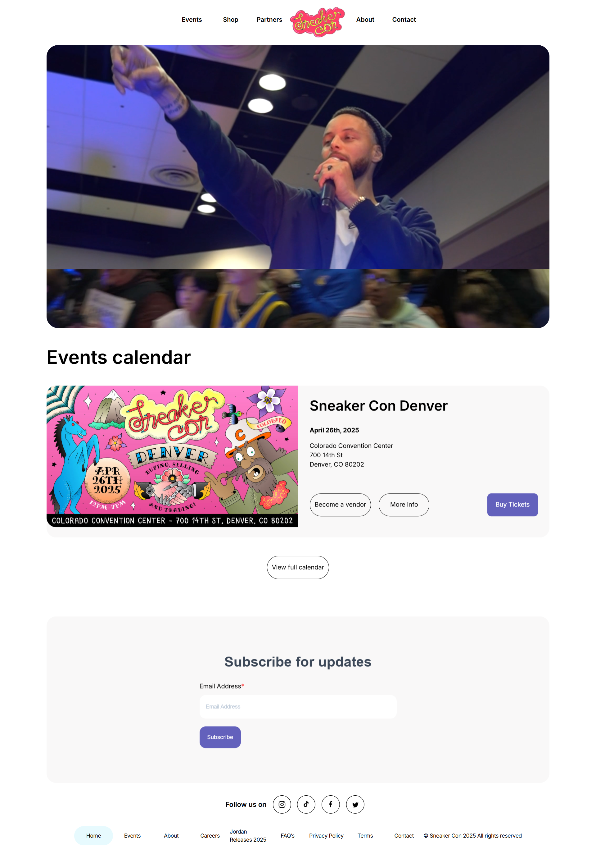
Sneaker Con is a global event for sneaker enthusiasts to buy, sell, and trade some of the most sought-after footwear on the market. The website offers information on event dates, locations, and ticket purchasing, catering to the community of sneaker fans worldwide. The website captivates visitors with an auto-play video, making them feel like a part of the event.
Takeaway: Include dynamic visuals in your website, like auto-play videos, from past events, to immediately capture visitor interest.
4. DCYF
Child, youth, and family support services. 
The DCYF focuses on supporting children, youth, and families in San Francisco through funding and strategic initiatives. The website provides information on grants, programs, and resources to improve community well-being and opportunities for young people. They present community-driven events and resources in a clear, organized way, using easy-to-read fonts and uplifting visuals to make information accessible.
Takeaway: Well-organized layout with bold, readable fonts and mission-driven visuals can clearly convey your event’s purpose and keep visitors interested.
5. Unleash
Sales and marketing event platform. 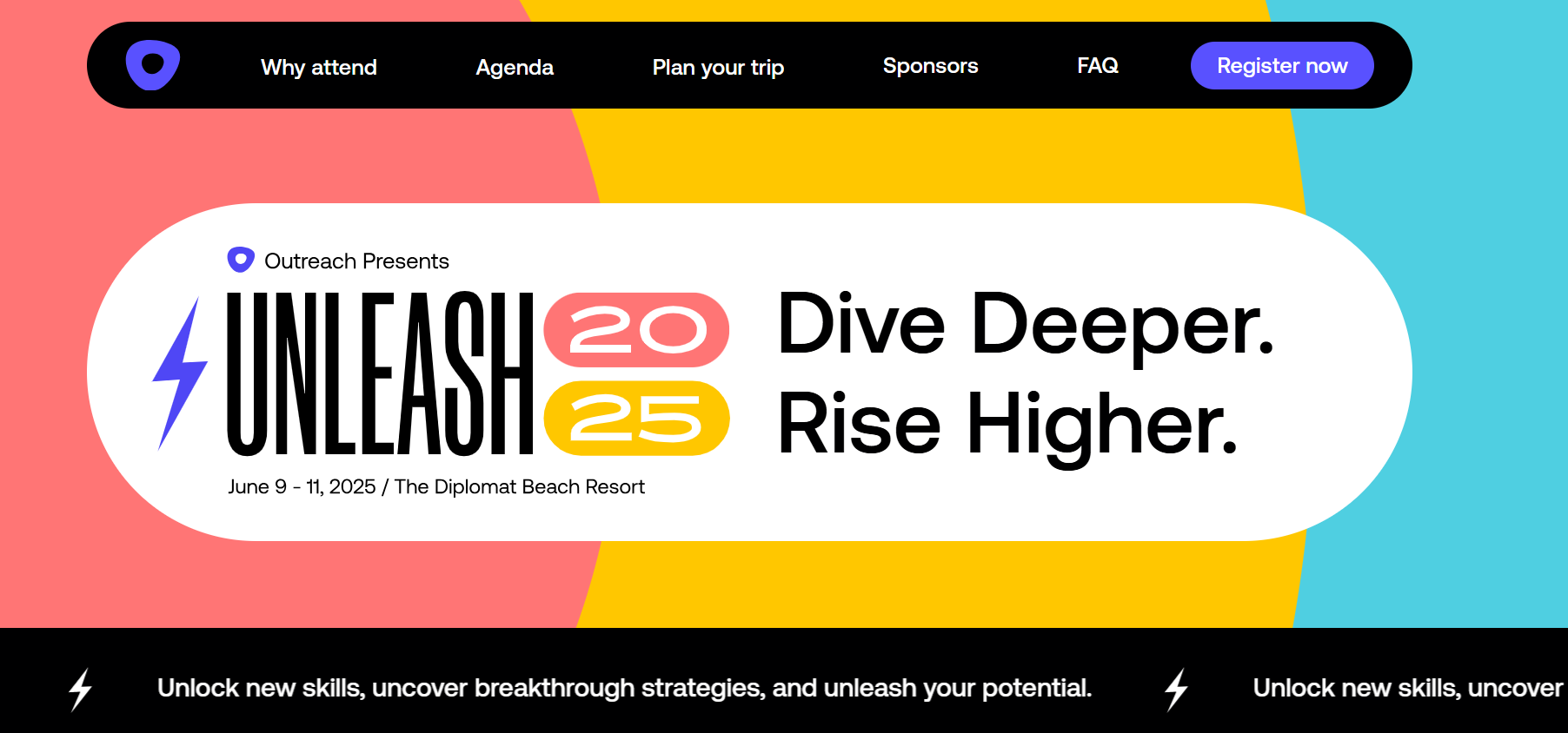
The Unleash 2025 event website uses vibrant colors, intuitive icons, and prominent event-related statistics to engage visitors. It highlights key speakers and topics, offering clear headlines and calls-to-action that enhance user engagement. The site also provides detailed information tailored to various attendee roles, such as sellers, sales leaders, RevOps professionals, and admins, ensuring relevant content for each group.
Takeaway: Designing an event website with an appealing layout, clear navigation, and role-specific content can significantly enhance user engagement, providing a personalized experience for diverse attendees.
Create your dream website with 10Web AI Website Builder 
Build your website in 1 minute
and take your business online!
6. KIKK Festival 2017
Creativity and digital technology festival. 
As a festival about design for designers, by designers, KIKK has created some amazing event websites over the years. However, the 2017 edition stands out in our minds for its amazing concept that has been stunningly executed. Visitors are taken on a visual journey from the surface to the ocean depths as they scroll, with all the small and beautiful details reflecting the festival’s creative and exploratory spirit.
Takeaway: Create an engaging storytelling experience through interactive scrolling and thematic visuals that reflect the essence of your event, keeping visitors intrigued and engaged.
7. Circles Conference
Creative professionals networking event. 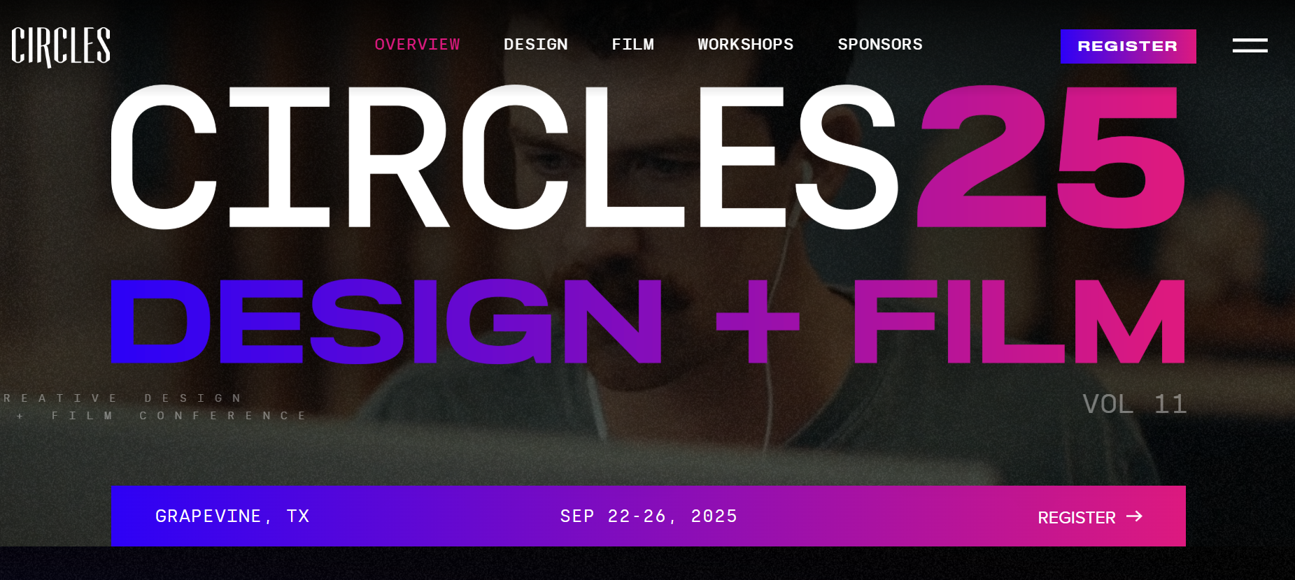
Circles Conference is a three-day event focused on creative design, held in Grapevine, TX. It brings together designers, makers, and innovative thinkers to explore creative design and the role of AI in enhancing creativity. The site is one of the most committed event websites, providing visitors with actionable knowledge by integrating vibrant branding elements, such as engaging graphics and a cohesive red color scheme. The website is artistic and strongly communicates the event’s creative nature.
Takeaway: Consistent and bold branding, through distinctive colors and thematic graphics, can enhance an event website’s appeal and reinforce its core message.
8. Snowflake Summit 2022
Cloud data platform conference. 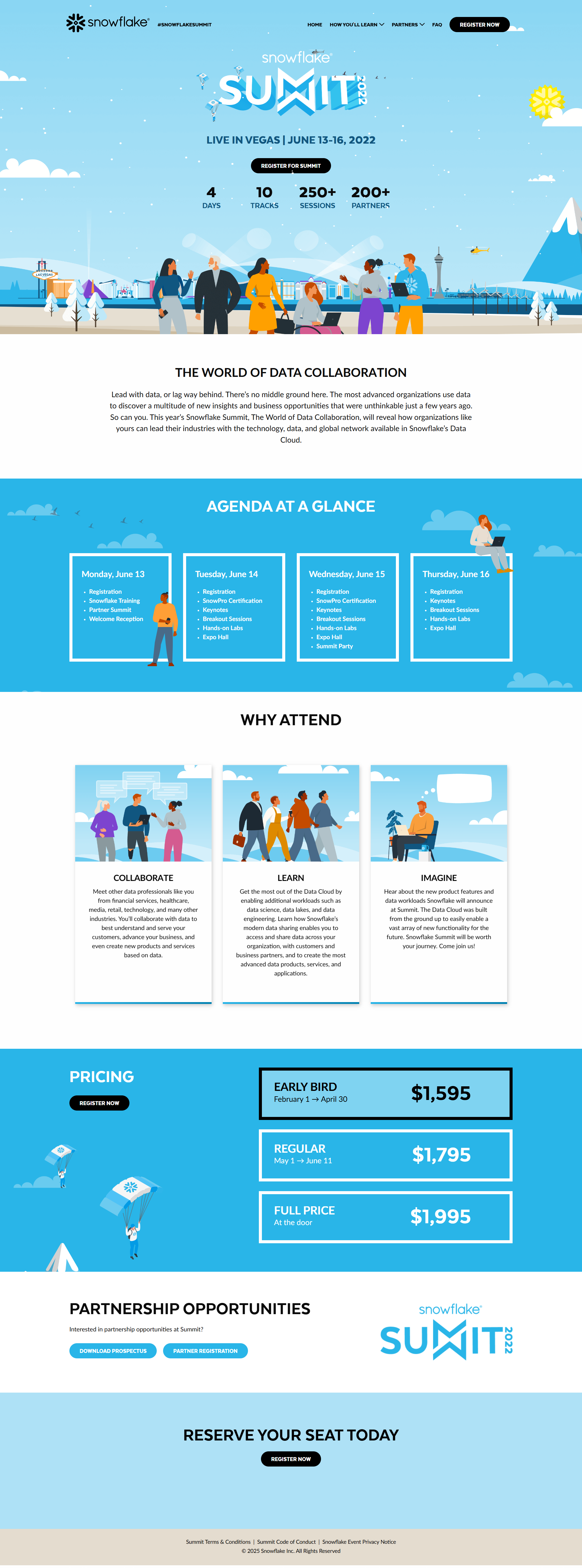
The Snowflake Summit 2022 was a 4-day event in Las Vegas aimed at data professionals. The site combines elegance with meaningful discussions. The website makes it easy for visitors to find what they need with lots of white space and simple, clear content. The agenda is well-organized, covering keynotes, breakout sessions, and hands-on labs. The use of inclusive graphics highlights the event’s commitment to diversity.
Takeaway: Keep your event website easy to navigate, with a well-structured agenda and visuals that reflect your event’s values, so attendees feel welcome and informed.
9. Vorstadt Sounds
Swiss music festival hosting diverse genres. 
The Vorstadt (Suburban) Sounds Festival is an intimate music festival located on the outskirts of Zurich. It is organized by a non-profit association composed of young musicians and culturally committed individuals. The site is one of the most minimalistic event website examples. The website clearly states the event’s dates, location, and the variety of musical acts.
Takeaway: An event website should authentically reflect the spirit and values of the event, offering clear details and fostering community engagement.
10. The Caverns
Unique underground music and event venue.

The Caverns, located in Grundy County, Tennessee, offers a unique concert experience within a natural underground amphitheater. The website displays its unique underground music venue, giving visitors a glimpse into live performances held within a natural cave environment. The cinematic, documentary-style footage of past events transfers the atmosphere of concerts held in this subterranean setting.
Takeaway: Captivate potential attendees by highlighting the venue’s unique characteristics and offering engaging multimedia content. Immerse visitors in the event experience.
11. Bloomberg Technology Summit 2021
Tech industry challenges and opportunities summit. 
The 2021 Bloomberg Technology Summit explored how the pandemic changed technology and business, revealing new opportunities in hidden challenges. Using a combination of custom graphics and informative segments, the site is one of the most creative event websites. It has detailed subpages with information on the event’s agenda, benefits of attending, and the speakers.
Takeaway: Combine clean design elements with dynamic visuals to engage visitors, offer detailed yet accessible information about the event, and highlight the expertise of speakers.
12. Reactor School
Startup school and pre-accelerator for youth. 
Reactor School is a startup school and pre-accelerator for individuals under 30, focused on making the next generation of entrepreneurs. It provides a comprehensive ecosystem for young founders, including education, mentorship, and access to venture capital, making it a standout platform for entrepreneurial development.
Takeaway: Use clear, purpose-driven content and highlight your community’s impact to resonate with your target audience and build credibility.
13. Inman Connect New York
Real estate industry networking event. 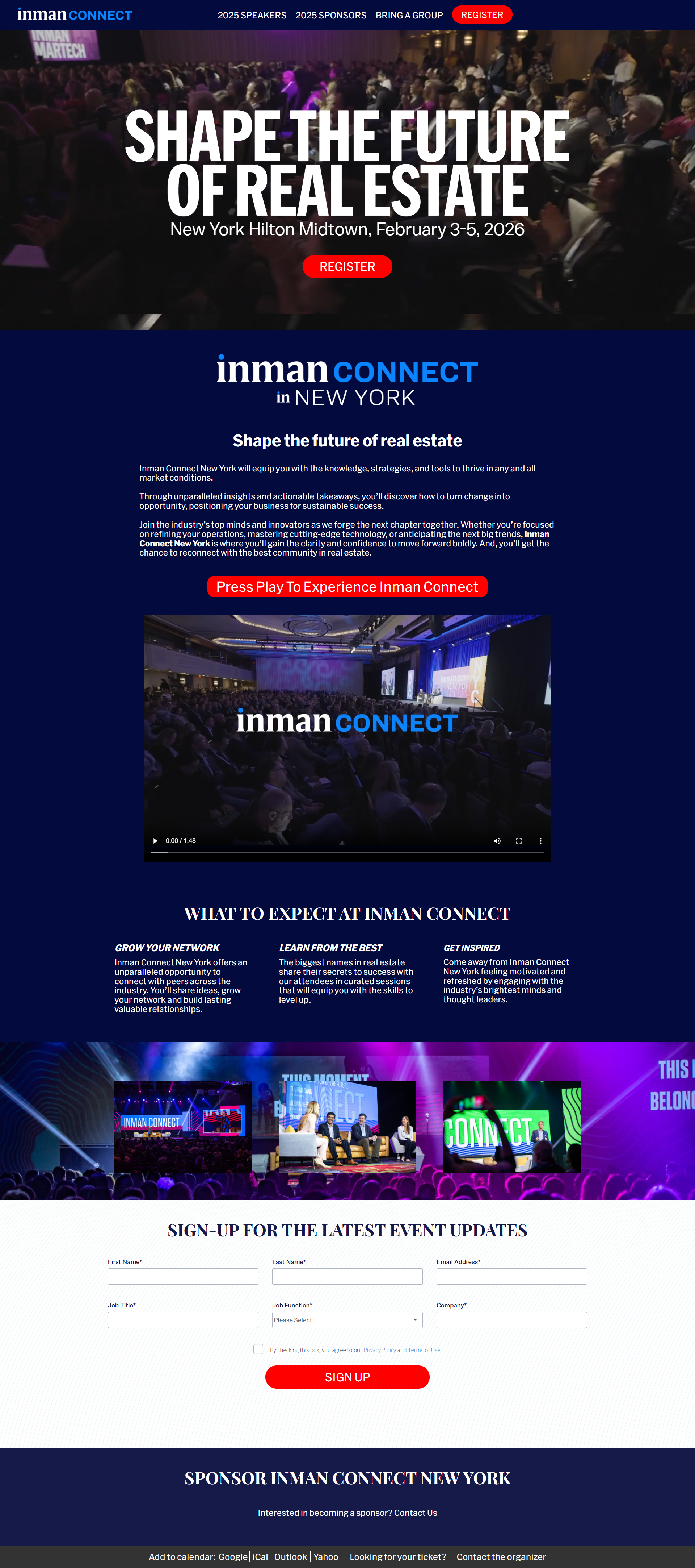
Inman Connect New York is a premier real estate conference offering insights into market trends, technology, and strategies for industry professionals. With a lineup of different speakers and sessions, it’s designed to inspire and educate attendees. The website is about professional design and content.
Takeaway: Use testimonials and CTAs to build excitement and encourage registration while maintaining a professional and informative layout.
14. Mountains On Stage
Mountain film festival.
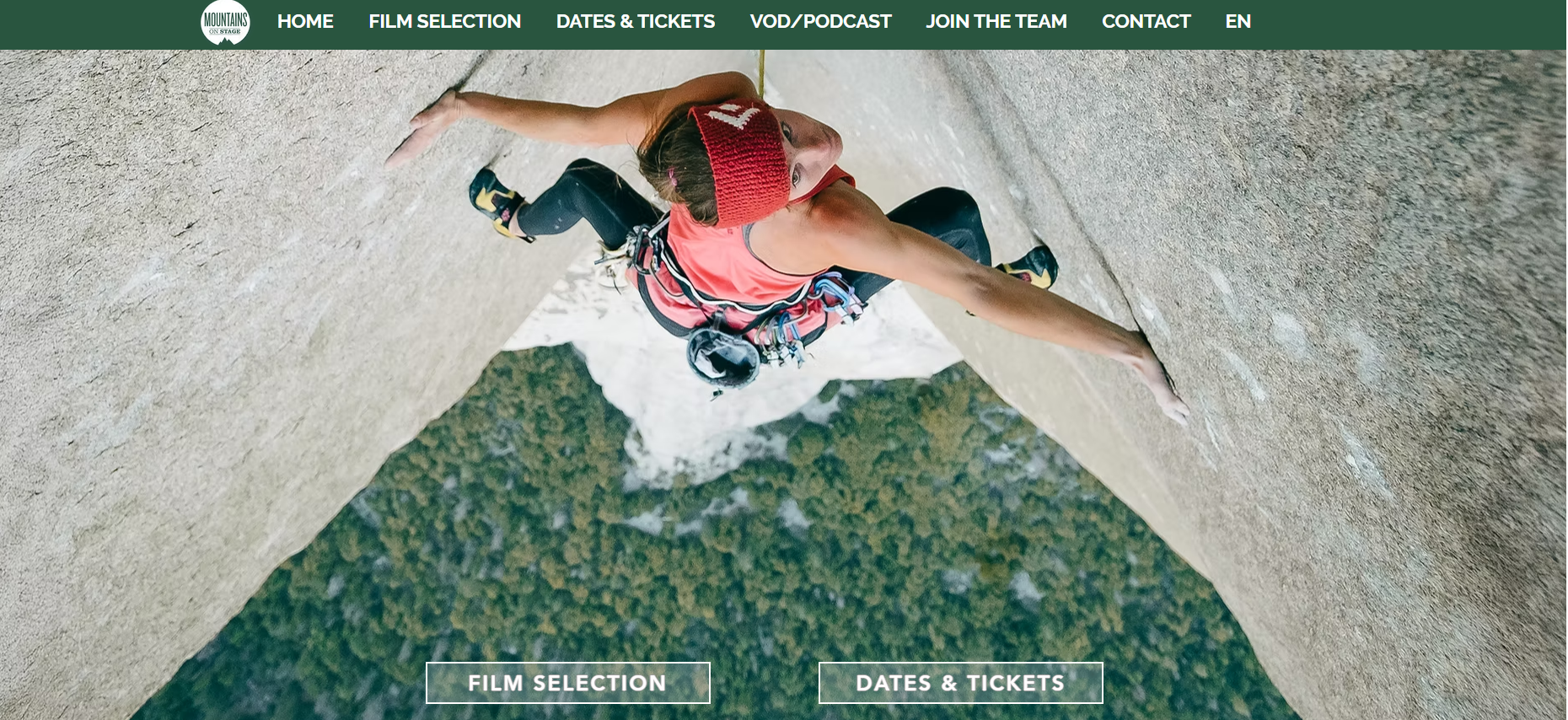
Mountains on Stage is a mountain film festival that brings the spirit of the mountains to urban audiences through a selection of films related to mountain sports. The festival aims to inspire adventure and exploration through captivating storytelling and breathtaking visuals. The website captivates visitors with full-screen, cinematic imagery showing mountain landscapes in all their glory.
Takeaway: Use visuals that reflect the event’s essence, simplify the ticket purchasing process, and offer detailed insights into the event’s mission and offerings.
15. The Big Grill
Barbecue and food festival. 
The Big Grill Festival, Europe’s biggest BBQ & Food Festival. Few event websites can compete in terms of sheer enjoyment, making it one of the most fun examples. The visitors surely feel they are a part of the festival. Providing information on things like festival dates, location, and ticket options is an essential and effective step. The website effectively highlights unique features such as the ‘Rancho Relaxo’ area and ‘Little Grillers’ kids’ zone, emphasizing the festival’s inclusivity and family-friendly environment.
Takeaway: Multimedia elements can effectively convey the event’s atmosphere, present essential information clearly, and highlight unique features that set the event apart.
16. All Together Now
Music and arts festival. 
All Together Now, set at Curraghmore Estate, Co Waterford, offers a diverse music and arts festival experience. It’s distinguished by its inclusive approach, blending music, art, and wellness activities, making it a unique gathering for festival-goers of all ages. The detailed information about the festival’s lineup, accommodation options, and various experiences is an attendee-centric approach, helping them plan their visit effectively.
Takeaway: Provide essential information about the event and encapsulate the spirit and atmosphere through design and content.
Ready for a website like this? The 10Web Event Website Builder can help transform your vision into a full-featured events website.
Create your dream website with 10Web AI Website Builder 
Build your website in 1 minute
and take your business online!
17. Splore
Music and community festival in New Zealand. 
Splore Festival, set in the scenic Tāpapakanga Regional Park, is more than just an event; it celebrates creativity, community, and environmental causes. The website focuses on community and participation, inviting attendees to participate in various artistic and wellness activities. The Splore Festival website captivates visitors with its vibrant visuals and dynamic design. It emphasizes the event’s commitment to sustainability and community, providing detailed information on eco-friendly initiatives and cultural respect.
Takeaway: Mirror the spirit and values of the festival with engaging visuals and informative content. Highlighting sustainability efforts and community engagement to inform and resonate with potential attendees.
18. Live Worx
Digital transformation and industrial innovation event. 
LiveWorx is a premier digital transformation event focusing on cutting-edge technologies and innovative strategies. Aimed at a corporate audience, the site is highly effective at conveying its prestige and value. The LiveWorx website effectively utilizes a dark color scheme to reflect its high-tech focus, providing a sleek and modern aesthetic. The site is designed for easy navigation, allowing users to explore event schedules, speaker information, and session details.
Takeaway: Use a color scheme that matches the event’s theme to create a cohesive visual identity.
19. Fathom
Special event cinema distributor. 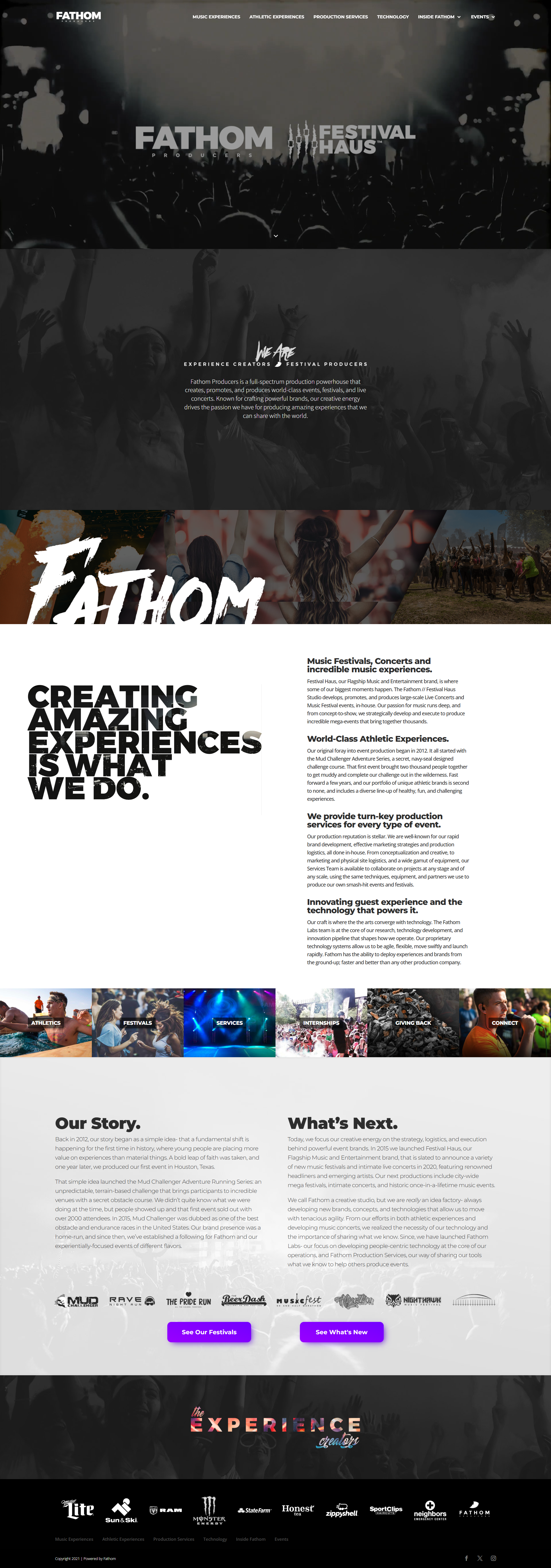
Fathom Events’ website has a user-friendly interface that immerses visitors in a cinematic experience. The homepage features black-and-white videos that capture the energy of large concerts, with flashes of color adding vibrancy. The “Athletic Experiences” page contrasts this with sleek, full-color images and dynamic video clips, showcasing the diversity of events offered. The site provides behind-the-scenes insights into the technology used in their event productions, enhancing transparency and engagement.
Takeaway: An event website can greatly benefit from integrating high-quality multimedia content that reflects the essence of the events.
20. The Scotch
Golf tournament and fundraiser event. 
The Scotch is an annual golf fundraiser and dinner aiming to assist first responders and veterans battling post-traumatic stress disorder. The site is one of the event page examples that crafts a great user journey that supports its cause. The inclusion of personal stories and statistics about veteran suicides humanizes the cause and underscores the event’s impact. Details about the event’s schedule, purpose, and beneficiaries let visitors understand the significance of their participation.
Takeaway: Incorporate a unique and consistent theme that resonates with your audience, clearly communicate the event’s purpose and impact,
21. III Point
Music, art, and technology festival. 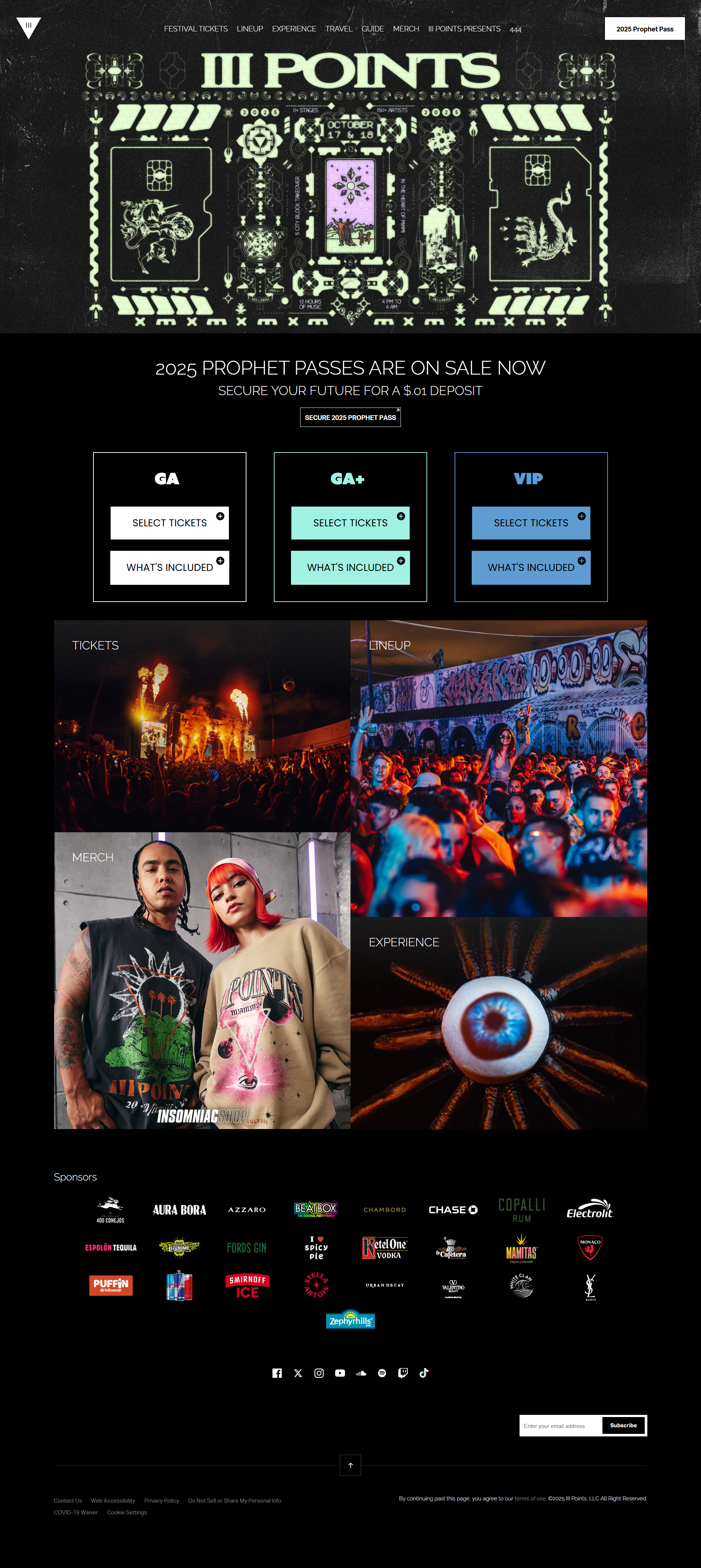
III Points is a music, art, and technology festival in Miami. The site promotes the event with detailed information on performances, tickets, and the festival atmosphere, aiming to create a unique cultural gathering. The III Points Festival website captivates visitors with its vibrant and dynamic design, reflecting the festival’s eclectic and innovative spirit.
Takeaway: Let the event website embody the essence of the event itself, using design elements and content that resonate with the target audience.
22. World Usability Day
Events promoting usability and design. 
World Usability Day is dedicated to making life easy through better design. It promotes usable products and services, contributing to a more accessible and environmentally conscious world. The website prominently features current themes and upcoming events, making it easy for visitors to stay informed and engaged. The resources, such as reports and design challenges, encourage community involvement and continuous learning.
Takeaway: An event website can convey its purpose and provide easy access to relevant information, such as themes, events, and resources, to inform its audience.
23. Design in Motion Festival
Digital design and motion graphics festival. 
The DEMO, or Design in Motion Festival, is the world’s largest motion design event. The website focuses on exhibiting the finest motion designs from around the globe in public spaces. The site’s interactive graphics capture attention and spark curiosity, reflecting the festival theme. It’s like a digital extension of the event, embodying its essence through dynamic, interactive typography and vibrant neon-colored backgrounds.
Takeaway: An event website can mirror the event’s core themes and energy with interactive and dynamic design elements that engage visitors.
Create your own event website with 10Web
Gathered the information you needed for a great event website? Ready to build your own? With 10Web’s AI Website Builder, you can go from idea to live site in just a few clicks. For a festival, webinar, workshop, or corporate gathering, 10Web makes it easy to create a professional, high-performing event website that draws people in and keeps them engaged. Here’s why 10Web is your go-to solution:
- AI-driven website creation: All it takes is a quick description of your event, and AI does the rest. It builds a complete website with everything you need: schedules, ticketing, registration forms, and more.
- Customization: AI Co-Pilot will help you adjust layouts, add high-quality visuals, and fine-tune content to fit your event’s vibe. All it takes is a chat command.
- Mobile optimization and performance: Your event website will look great and load fast on any device. Plus, 10Web guarantees automated 90+ page speed scores, so your visitors don’t lose interest waiting for pages to load.
- Secure hosting: Enjoy reliable, secure hosting powered by Google Cloud. Your site comes with a free custom domain, SSL certificate, and instant publishing – no waiting around!
- Integrated AI features: Generate eye-catching content, optimize text for SEO, and add visually appealing sections – all with a few clicks. Staying on brand and looking sharp has never been easier.
Let’s create an event website for you:
- Go to 10Web.io > describe your event > click Generate Your Website.
- Review and edit (if needed) the website name, description, and structure.
- Click Next > choose the website colors, fonts, and styles.
- Click Generate to apply.
With 10Web, building an event website is quick, easy, and most importantly, it works. Focus on planning your event while your website attracts attendees.
Get started with your event website
The best event website examples all share a few key things: they’re purposeful, they tell a story, and they convert. It’s done through visuals (especially from past events), interactive elements, or a clear, compelling message. These websites know how to captivate visitors and guide them toward taking action. Successful event websites also make it easy for people to find what they need: schedules, ticket information, and event highlights. Everything is presented in a way that feels intuitive.
If you’re aiming to create a website that not only looks impressive but also drives attendance and engagement, 10Web is here to help. With 10Web’s AI Website Builder, you can effortlessly build a website that tells your event’s story, showcases the best moments, and keeps visitors hooked. You just provide the basics, and AI takes care of the rest. Start today and see how easy it is to create a stunning, functional site that gets results.
FAQ
What is an event website?
What are the best event websites?
What makes a good event page?
How to create an event website?
Create your dream website with 10Web AI Website Builder 
Build your website in 1 minute
and take your business online!


