With online shopping embedded in our daily routines, a striking ecommerce website can make or break a brand’s success. As competition grows fierce, a modern, user-focused design is not just a nice addition but an essential feature that attracts, engages, and converts visitors.
This article highlights the cornerstone elements of modern ecommerce website design for 2024, offering inspiration and practical ideas to elevate your store’s design. From minimalistic layouts to interactive features, discover how these standout sites capture attention and drive conversions in today’s crowded online market.
FAQ
What design elements enhance online shopping?
Key design elements include high-quality images, clear typography, intuitive navigation, and prominent calls-to-action (CTAs). Incorporating elements like customer reviews, trust badges, and easy-to-find contact information can also enhance the shopping experience.
How to create a user-friendly online store?
Focus on a clean layout, simple navigation, and a streamlined checkout process. Ensure that product categories are clearly labeled, and utilize filters and search functionality to help users find products quickly. Mobile responsiveness is also crucial for user-friendliness.
What layout works best for product pages?
A grid layout is often effective for product pages, allowing users to view multiple items at once. Each product should have a clear image, a brief description, pricing information, and an easy-to-find “Add to Cart” button. Consider including related products to encourage additional purchases.
Which colors boost ecommerce conversions?
Colors can influence purchasing decisions. Generally, blue is associated with trust, green with health, and red with urgency. It’s essential to consider your brand identity and target audience when choosing colors, ensuring they evoke the desired emotions.
How important is mobile optimization?
Mobile optimization is critical, as a significant portion of online shopping occurs on mobile devices. A responsive design that adjusts to various screen sizes, fast loading times, and easy navigation are essential for providing a good mobile shopping experience.
What features are essential for online stores?
Essential features include a secure payment gateway, user-friendly navigation, search functionality, product reviews, wish lists, and a clear return policy. Additionally, incorporating live chat support can enhance customer service.
How to improve site navigation?
Use a clear and logical hierarchy for categories and subcategories. Implement a search bar, breadcrumbs for easy backtracking, and filters for product attributes. Ensure that the menu is easily accessible from every page.
What role does branding play in ecommerce design?
Branding establishes trust and recognition. Consistent use of logos, colors, and typography across the site helps create a cohesive identity. Strong branding can differentiate your store from competitors and foster customer loyalty.
How to integrate payment options effectively?
Offer multiple payment options, including credit/debit cards, digital wallets, and alternative payment methods. Ensure that the checkout process is simple and secure, providing clear information about payment security to reassure customers.
What are the best practices for product images?
Use high-resolution images that allow for zooming in. Include multiple angles and lifestyle images to showcase products in use. Providing images that depict scale and context can help customers make informed purchasing decisions.

Create your online store in minutes!
Looking to sell online? Develop and launch your store with 10Web AI Ecommerce Website Builder.
Modern ecommerce website design examples
Online shopping has become a big part of our lives. Many people now buy things from websites instead of going to stores. Good website design is essential for online shops to do well.
A well-designed online store can help a business sell more products. When a website looks nice and works well, shoppers are more likely to buy things. This article will show you some great examples of online store designs. You’ll see what makes these sites work so well for selling products on the internet.
Clothing and accessories
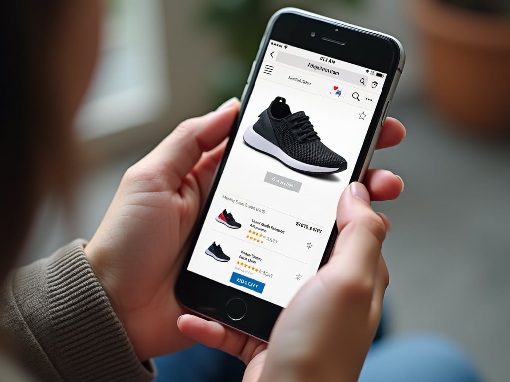
Clothing and accessories represent a huge share of the ecommerce market. Excellent branding and presence are essential to stand out in a crowded and competitive niche, and these examples of modern ecommerce website design stand head and shoulders above the crowd.
Warby Parker
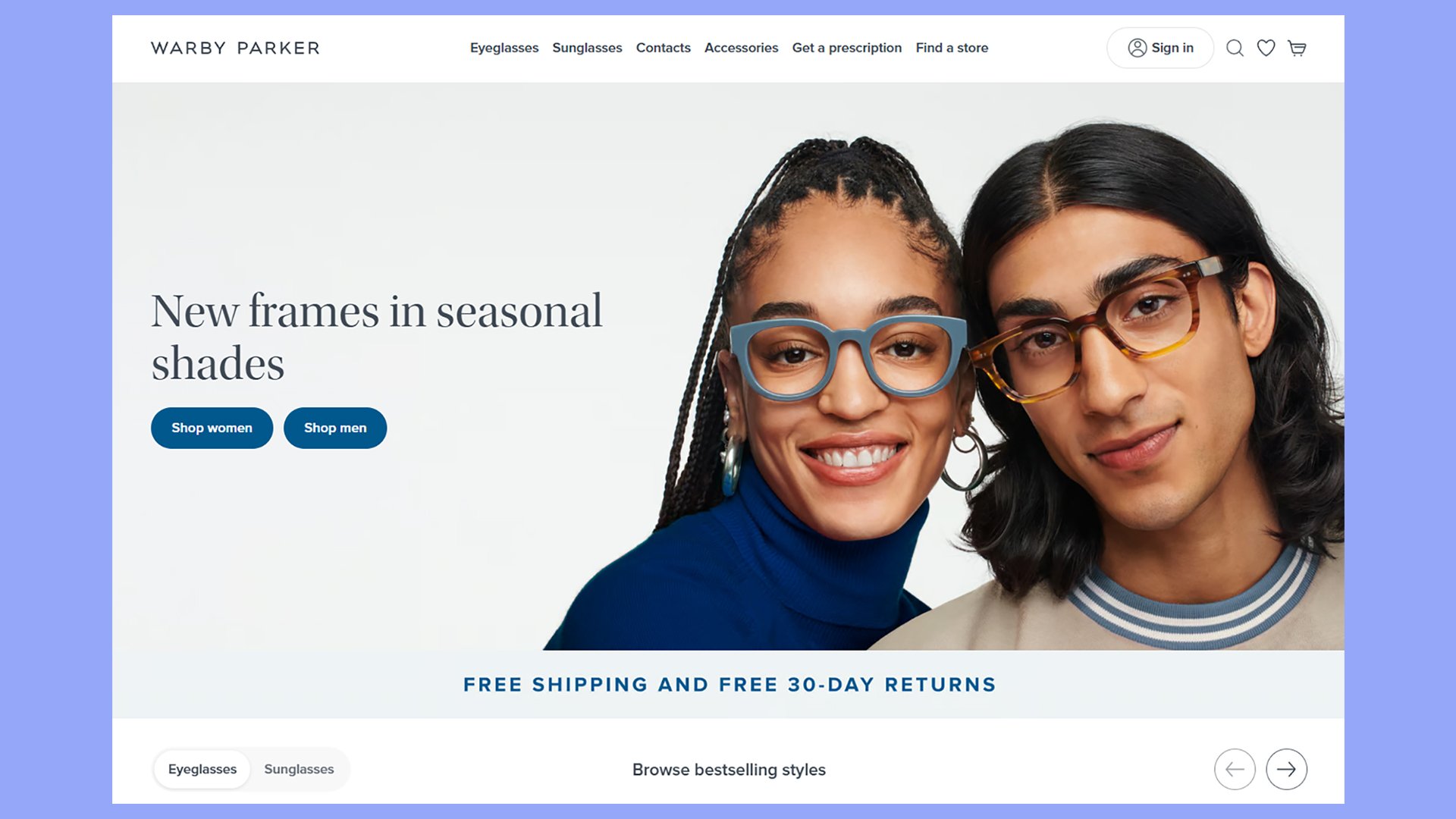
Warby Parker’s website is a top example of modern ecommerce design. The clean, simple layout puts their eyewear front and center. White space helps you focus on the products without distractions.
The site makes it easy to find what you need. You can quickly browse eyeglasses, sunglasses, and other products. Warby Parker uses high-quality product photos to show off their glasses from different angles.
A standout feature is their virtual try-on tool. It uses augmented reality to let you see how frames look on your face before buying. This clever tech helps reduce returns and boosts your confidence in your purchase.
Product pages include clear descriptions, sizing info, and frame measurements. Customer reviews add social proof to help with your decision. The site also offers a home try-on program where you can test 5 frames for free.
Other key design elements:
- Simple navigation menu
- Lifestyle photos showing glasses in use
- Bold call-to-action buttons
- Quiz to help find your perfect frames
- Easy-to-find prescription input
Allbirds
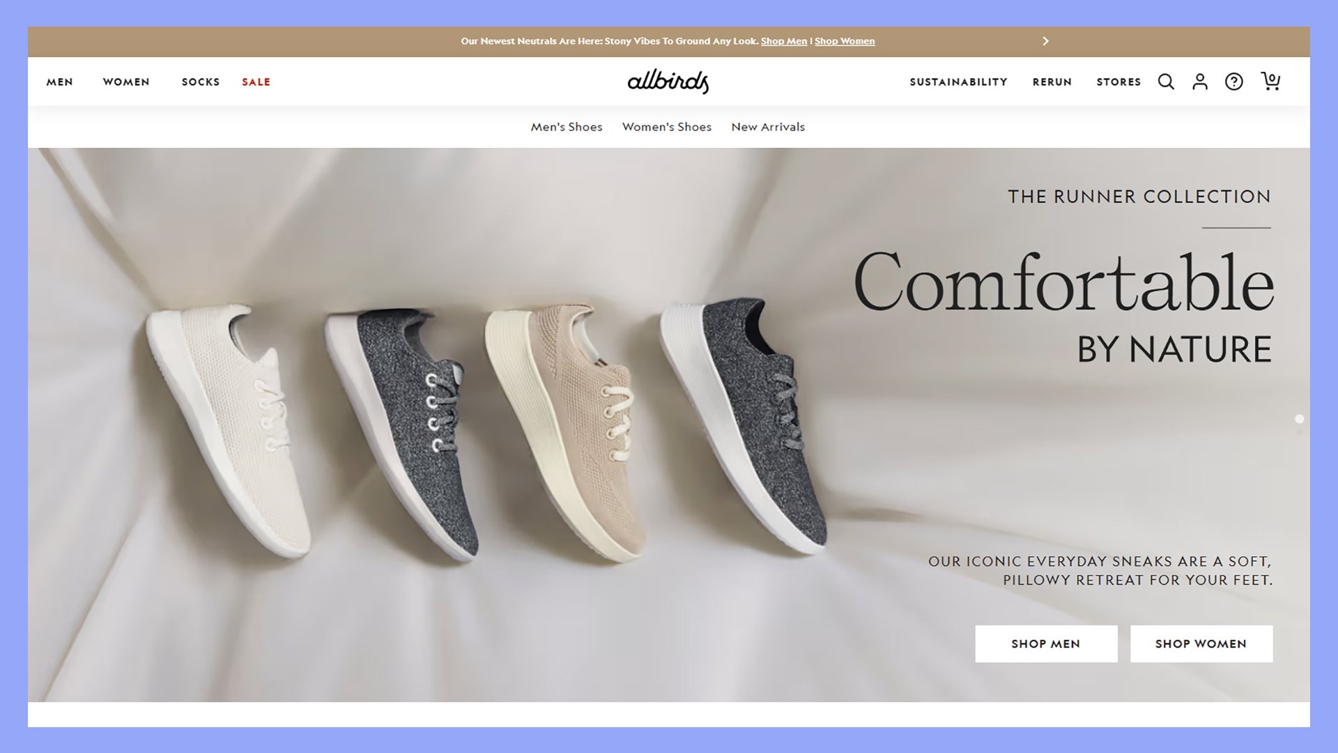
Allbirds creates comfy casual shoes using natural materials like wool. Their website shows off their products with great photos and clear descriptions. You’ll find it easy to browse different styles for men, women, and kids.
The site uses simple, clean design that matches the brand’s focus on natural materials. Product pages give you all the info you need to make a choice. You’ll see photos of shoes from different angles and on people’s feet.
Allbirds makes buying simple with clear size guides and easy-to-use buttons. They also show you reviews from other customers to help you decide. The site works well on phones too, so you can shop anywhere.
Some cool features of the Allbirds site:
- Zoom-in photos to see shoe details
- Color options are shown clearly
- Free shipping and returns are highlighted
- Info on eco-friendly materials used
- Quiz to help find your perfect shoe
Everlane
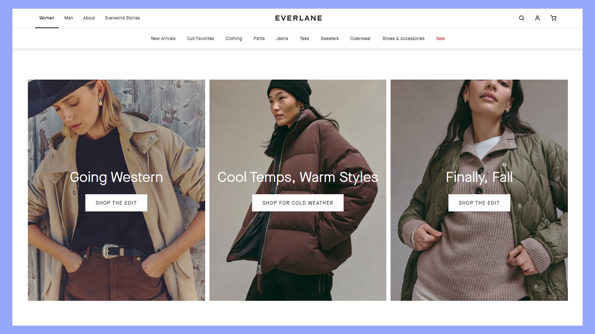
Everlane’s website shows off modern ecommerce design at its best. You’ll notice the clean, minimalist look right away. The site uses lots of white space and a simple color scheme. This makes it easy for you to focus on the products.
The homepage greets you with big, high-quality images of their clothes. You can quickly see what’s new and popular. As you scroll, you’ll find clear sections for different product types.
Product pages on Everlane are well-organized. You get clear photos from different angles. The site tells you about the materials and where the item was made. This helps you make informed choices.
Everlane makes shopping easy. You can filter products by size, color, and style. The site remembers your preferences for next time. Checkout is smooth and straightforward.
Other features of Everlane’s design:
- Customer reviews on product pages
- “Choose What You Pay” sales section
- Detailed size guides
- Information about their ethical practices
- Easy-to-use mobile version
Away
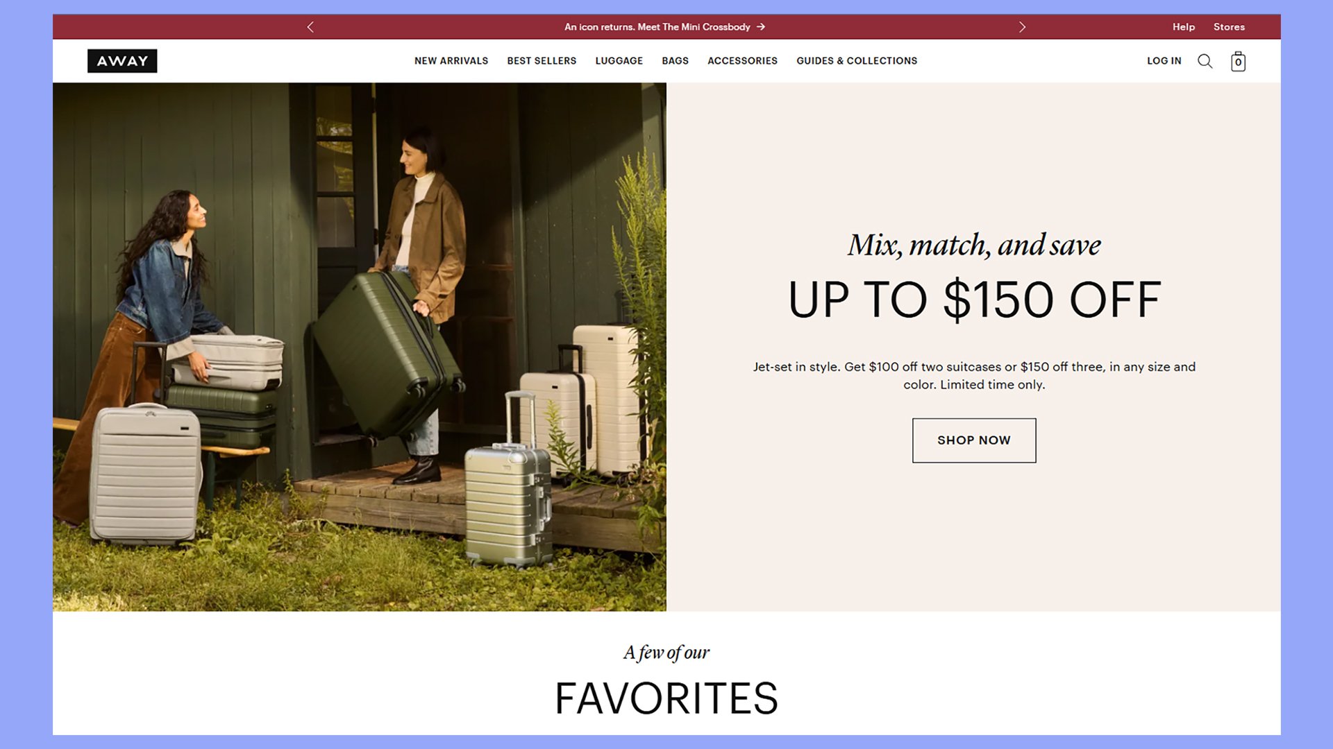
Away’s website showcases a clean, modern design that puts their luggage front and center. The homepage greets you with large, high-quality images of their suitcases in various colors and sizes. This visual approach helps you quickly grasp the brand’s style and product range.
As you scroll, you’ll find clear product categories and easy-to-use filters. This makes it simple to find exactly what you’re looking for. Away uses lifestyle photos to show their luggage in action, helping you picture how it might fit into your own travels.
The product pages are well-organized and informative. You’ll see multiple images from different angles, along with key features highlighted in an easy-to-scan format. Away includes customer reviews right on the product page, building trust and helping you make informed decisions.
Notable features in Away’s design:
- Clean, minimalist color scheme
- Clear calls-to-action
- Mobile-friendly layout
- Size comparison tool
- Free shipping and returns policy prominently displayed
Zara
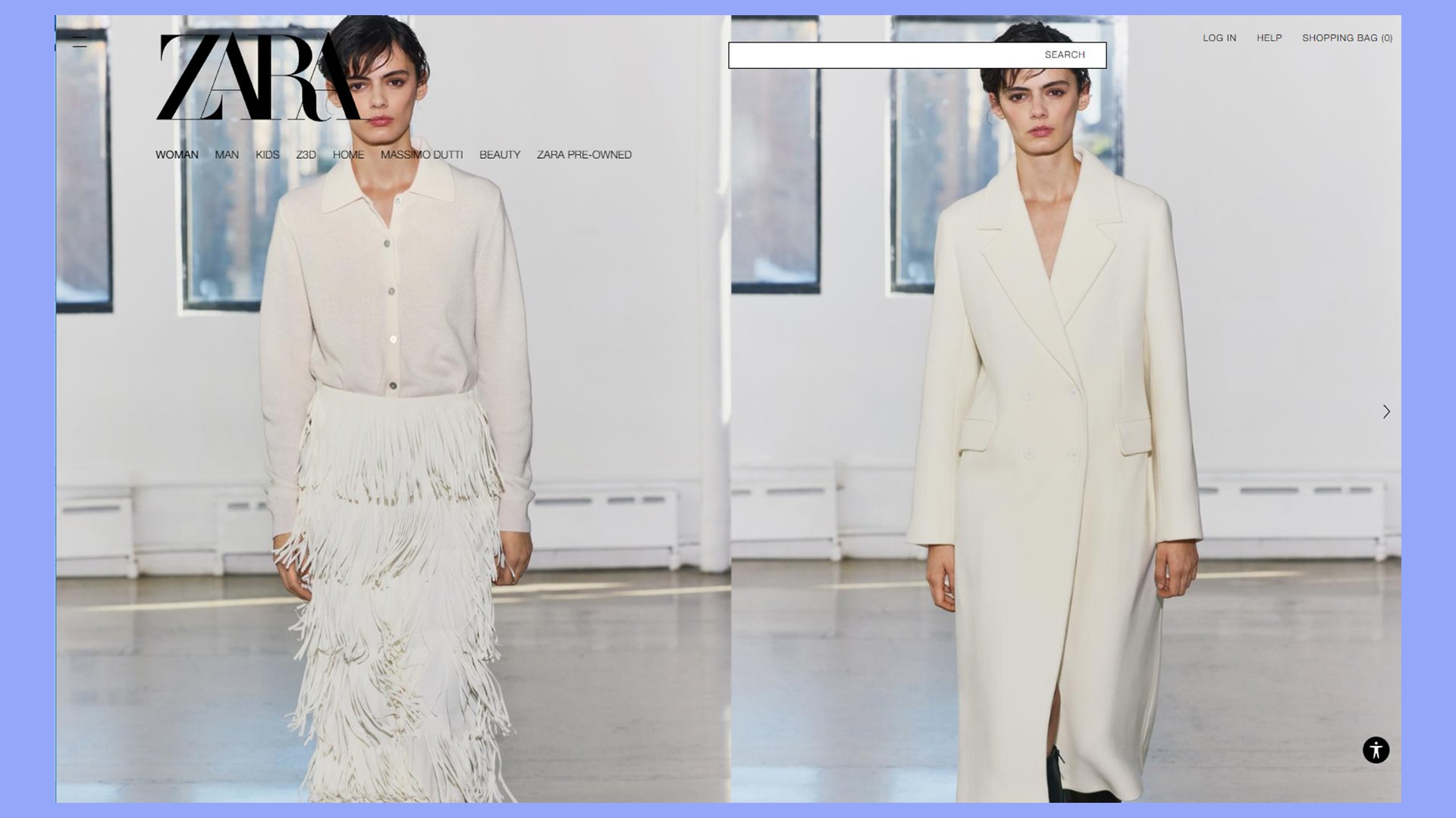
Zara’s website shows how a fashion brand can create a smooth online shopping experience. The homepage has big, high-quality photos that change often. This keeps things fresh and exciting for shoppers.
When you click on a product, you’ll see clear images from different angles. You can zoom in to see details up close. The product descriptions are short but give you the key info you need.
Zara uses a clean, simple design that puts the focus on the clothes. The white background makes the product photos stand out. You’ll find it easy to browse through different styles and colors.
The site works well on phones and computers. This means you can shop from anywhere, anytime.
Zara also offers features like:
- Quick view options for products
- Size guides to help you choose the right fit
- “New in” sections to showcase the latest items
- Wishlist feature to save items for later
- Easy returns process
Chubbies Shorts
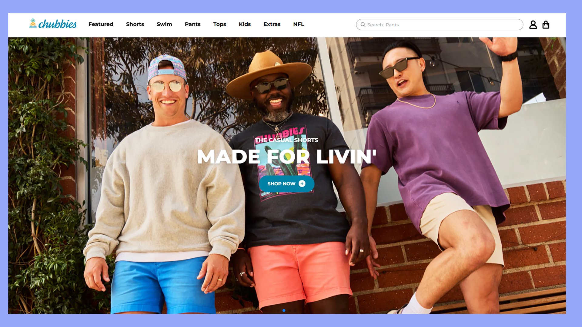
Chubbies Shorts brings fun and style to their ecommerce site. You’ll notice bright colors and playful designs that match their product line. The homepage greets you with eye-catching images of people wearing their shorts in various settings.
Product pages are clean and easy to navigate. You can quickly see different colors and styles. The site uses high-quality photos that show off the shorts from multiple angles. This helps you get a good look at what you’re buying.
Chubbies adds personality to their product descriptions. They use humor and casual language that fits their brand. You’ll find precise details about sizing, materials, and care instructions, too.
The site makes it simple to shop. You can filter by type of shorts, length, and other features. This saves you time when looking for specific styles.
This modern ecommerce website design example incorporates the following:
- Mobile-friendly design
- Customer reviews on product pages
- Size guide with measurements
- Free shipping and return policy clearly stated
- Social media links to see products in action
Bombas
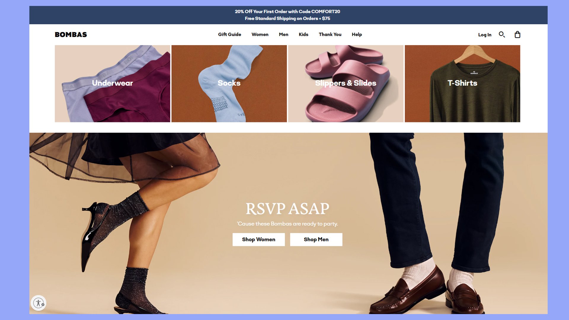
Bombas is a sock and apparel company with a bright, fun website design. You’ll find cheerful colors and playful graphics that match their brand personality. The site puts products front and center with big, clear images.
The homepage greets you with a bold headline and eye-catching product photos. As you scroll, you’ll see different sock collections displayed in colorful grids. Each product has a simple description and price, making it easy to shop.
Bombas uses lifestyle images to show their socks in action. This helps you picture how the products might fit into your life. The site also highlights its giving program, where the company donates a pair of socks for each pair sold.
Navigation is simple, with clear category labels at the top of the page. You can quickly find what you’re looking for, whether it’s men’s, women’s, or kids’ items.
Other features of Bombas’ design:
- Clean, minimalist product pages
- Easy-to-use size guide
- Customer reviews are prominently displayed
- Free shipping offer clearly shown
- Loyalty program promoted throughout the site
Rothy’s
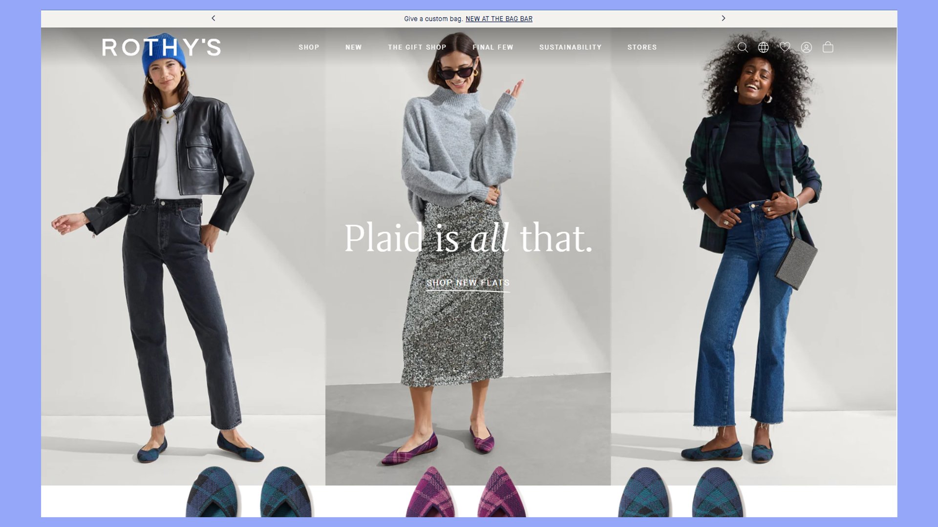
Rothy’s stands out as a top ecommerce site for sustainable footwear. You’ll find their homepage clean and inviting, with big product images that grab your attention. The site uses soft colors that match its eco-friendly brand.
As you browse, you’ll see clear product descriptions that focus on comfort and sustainability. Each shoe page shows different angles and close-ups. This helps you see the details before you buy.
Rothy’s makes shopping easy with a simple menu at the top. You can quickly find what you’re looking for. The site also has a size guide to help you pick the right fit.
Customer reviews are easy to find on each product page. This helps you feel more sure about your purchase. Rothy’s also offers free shipping and returns, which is great for online shoppers.
This modern ecommerce website design example stands out with features like:
- Clear navigation menu
- High-quality product images
- Sustainability information
- Easy-to-read size guide
- Customer reviews on product pages
Services
These software-as-a-service (SaaS) platforms showcase their products and services through modern ecommerce website designs.
Shopify

Shopify is a top choice for many businesses that are creating online stores. It offers easy-to-use tools and great-looking designs. You’ll find many inspiring examples of Shopify sites that blend style and function.
This website shows how simple design can be effective. It uses lots of white space and clear text. This makes it easy for you to find what you need. The site’s clean look matches its product – simple meal replacements.
Shopify’s landing pages are set up to sell. You’ll find:
- High-quality product showcases
- Sleek typography
- Clear feature descriptions and messaging
- Customer testimonials
These elements work together to give you all the info you need to make a decision. The modern design is clean and focused, keeping your attention on the products.
Squarespace
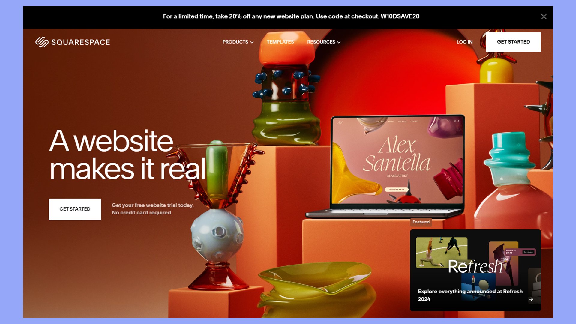
Squarespace is a top choice for modern ecommerce websites. It offers sleek templates that showcase products beautifully. You’ll find many great examples of Squarespace stores online.
Squarespace leverages a simple yet eye-catching site. Modern typography and eye-catching colorful visuals combine, offering a feast for the eyes.
Some key features of Squarespace’s site include:
- Clear messaging
- Clear calls-to-action among textures and colors
- High-impact visuals that pop
- Addresses pain-points
Wix
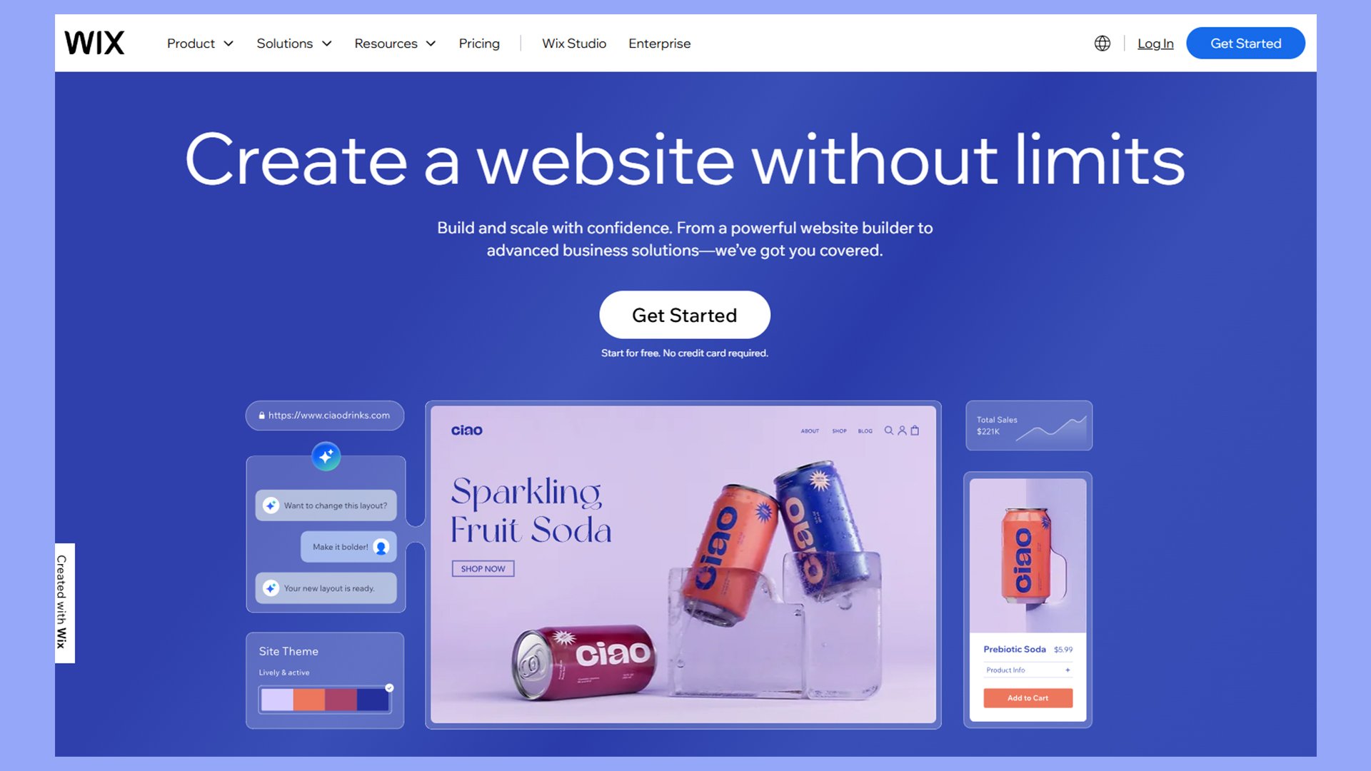
Wix offers many tools for creating modern ecommerce websites. Their platform lets you build online stores with eye-catching designs and user-friendly features. You can choose from various templates or start from scratch to make your site unique.
Wix’s site is a great example of modern ecommerce design. Modern elements like color blocking and patterns stand out. Colorful visuals grab the attention at strategic points without overwhelm. Clean layouts and easy navigation help would-be site owners find what they need quickly.
Other common features of Wix ecommerce designs include:
- The spacious feel is easy on the eyes
- Colorful visuals punctuate the neutral palette
- Puts the product and services front and center
Food and drink
These modern ecommerce website design examples bring a contemporary feel to your table.
Blue Apron
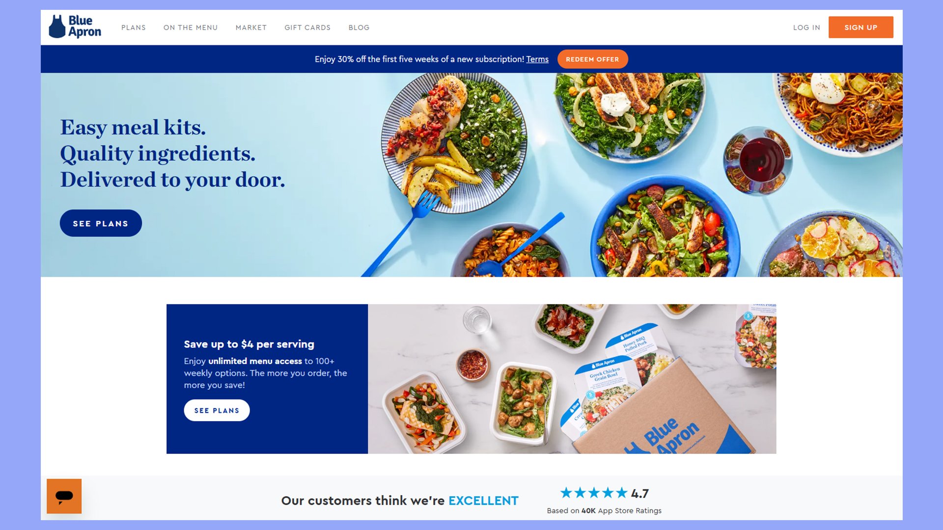
Blue Apron’s website shows off meal kit delivery in a tasty way. The site uses bright photos of finished meals to make your mouth water. You can easily see what’s on the menu each week.
The site makes picking meals simple. You can filter by diet type, like vegetarian or low-carb. Each recipe has clear info on cooking time and skill level. This helps you choose meals that fit your needs.
Blue Apron uses videos to show how to cook the meals. This gives you a sneak peek at what you’ll be making. The site also has customer reviews for each recipe. This lets you see what other people think before you order.
The site offers deals for new customers right on the homepage. You can see how much you’ll save by signing up. There’s also a FAQ section to answer common questions.
- Clear pricing info
- Sleek recipe cards with step-by-step photos
- Gift card options
- Flexible plans that you can change weekly
Thrive Market
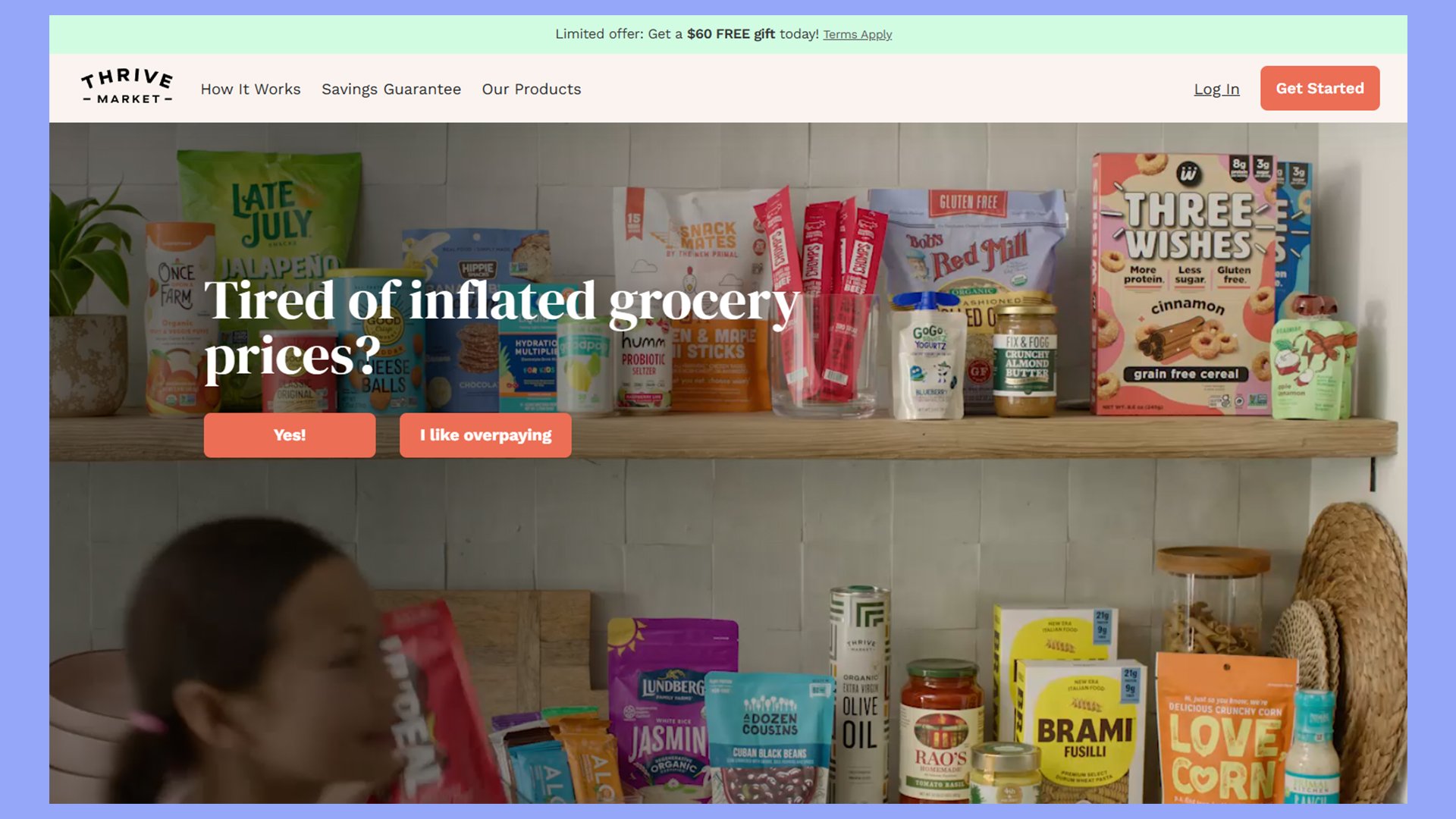
Thrive Market’s website shows off a clean design and easy navigation. You’ll see a simple layout with lots of white space. This makes it easy to find what you need.
The homepage has big, clear images of healthy foods. You’ll spot a search bar at the top to help you find products fast. A menu can also group items by diet type, like keto or vegan.
Product pages have clear photos and details about each item. You’ll find nutritional info and ingredient lists right there. Customer reviews help you decide what to buy.
Thrive Market uses green and white colors to match its healthy image. The site works well on phones, too, so you can shop on the go.
- The fresh color palette is on-brand
- Approachable, well-presented information
- Customer testimonials build trust
- Understated layout conveys value

Create your online store in minutes!
Looking to sell online? Develop and launch your store with 10Web AI Ecommerce Website Builder.
Home and outdoors
These examples of modern ecommerce design showcase their home and outdoor products with a modern vibe.
Rifle Paper Co.
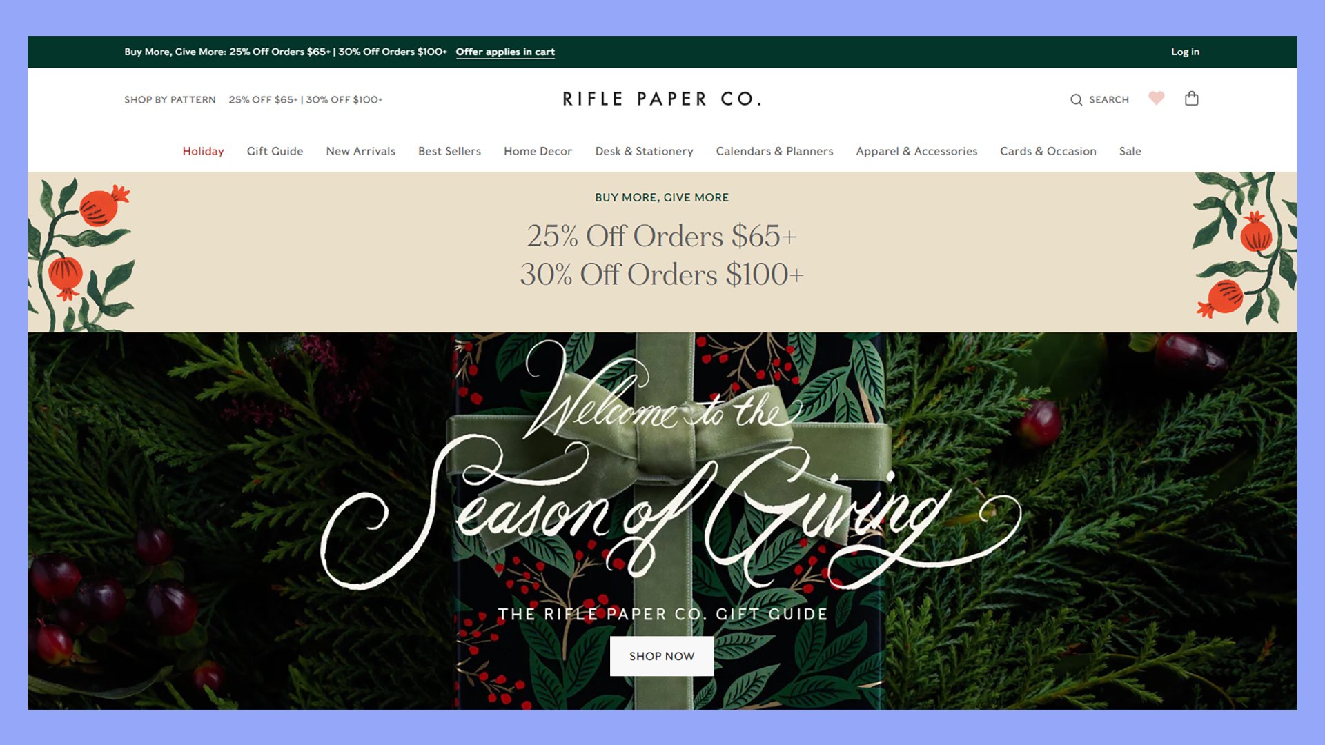
Rifle Paper Co. offers a great example of modern ecommerce design. Their website showcases their stationery and lifestyle products with beautiful imagery and clean layouts. You’ll find it easy to browse their collections and find what you need.
The product pages use large, high-quality photos to highlight the details of each item. You can see close-ups of patterns and textures. Short descriptions focus on key features and benefits rather than technical specs.
Rifle Paper Co. includes:
- High-quality images and illustrations
- Minimalistic layout and design
- Sleek, prominent search bar
- Mobile-friendly design
The design reflects the brand’s artistic style with floral motifs and a soft color palette. This creates a cohesive look across the site that matches their products.
Outdoor Voices
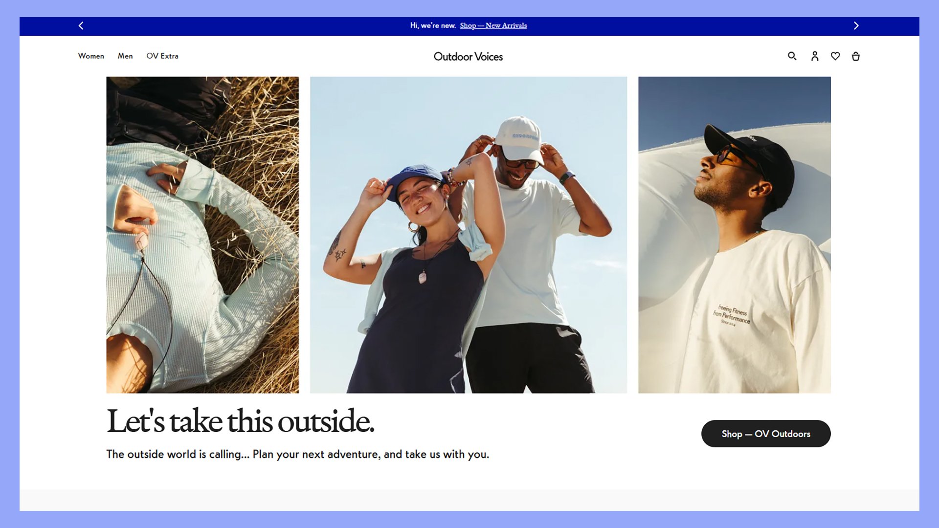
Outdoor Voices has a clean, modern ecommerce design. The homepage uses lifestyle images to show off the brand’s aesthetic. You’ll see a simple font choice that creates a neat look. The layout has a clear visual hierarchy to guide your eye.
The product pages are easy to browse. You can quickly find sizes and colors. There are clear product descriptions that highlight key features. Customer reviews add social proof to help you decide.
The site has a smooth checkout process. You can easily add items to your cart and complete your purchase. The design is mobile-friendly, so you can shop on any device.
Other modern features of this website include:
- Large, high-quality lifestyle images
- Minimalist color scheme and layout
- Interactive shopping features
Casper
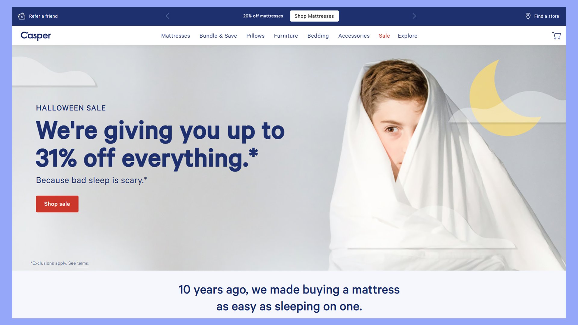
Casper’s website shows how to make buying mattresses online easy. The design is clean and simple. You’ll see big, clear photos of their products. They use white space well to avoid clutter.
The site highlights key mattress features with icons. This helps you quickly see what’s special about each one. Short, punchy descriptions tell you the benefits without getting too technical.
Casper uses customer reviews to build trust. You can see ratings and comments right on the product pages. They also offer a 100-night trial, which is front and center on the site.
The checkout process is smooth. You can easily add items to your cart and see shipping options. Casper offers free delivery and returns to make buying feel risk-free.
Modern ecommerce website design features:
- Interactive product recommendations
- Clear value propositions
- Clean, hi-res photos highlight product quality
Burrow
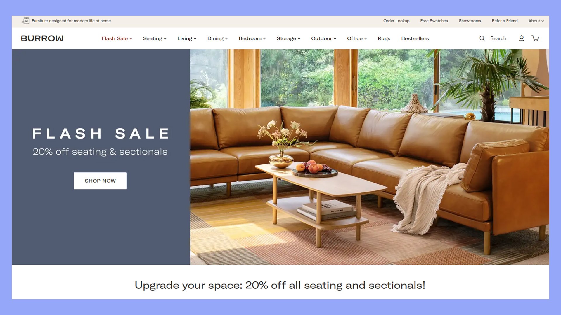
Burrow makes furniture shopping easy and fun. Their website has a light, cheerful feel that puts you at ease. You’ll find clear product photos and simple descriptions that tell you what you need to know. The site uses white space well, giving each piece room to shine.
When you look at a couch or chair, you see it from different angles. This helps you picture it in your home. Burrow shows how pieces fit together, which is great for their modular furniture. They use icons to highlight key features like stain-resistant fabric.
You can customize your furniture right on the product page. Pick your fabric, leg color, and arm style with a few clicks. As you make choices, the image updates to show your design. This makes shopping interactive and personal.
This site also features:
- Interactive images and demos
- Inviting photos of living spaces feels relatable
- Understated colors and minimal text offer a clean look
Wellness and fitness
These wellness and fitness sites stand out with modern design elements and principles.
Peloton
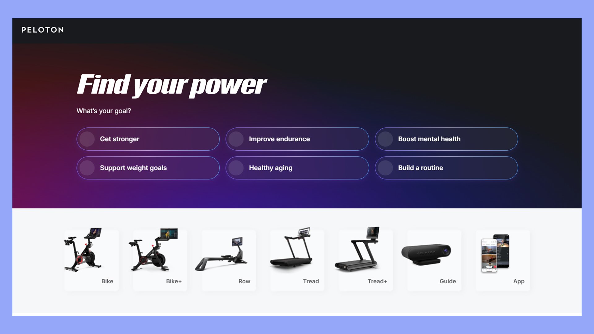
Peloton’s website shows off a modern ecommerce design. You’ll notice a clean layout with lots of white space. The site uses big, high-quality photos of their bikes and treadmills in action. This helps you picture yourself using the products.
The homepage greets you with a bold headline and a clear call-to-action button. As you scroll, you’ll see different product categories neatly organized. Each section has its own “Shop Now” button, making it easy to find what you want.
Peloton uses video content to showcase its classes and instructors. This gives you a taste of the Peloton experience before buying. The site also displays customer reviews, building trust with potential buyers.
The product pages are packed with useful info. You’ll find detailed specs, comparison charts, and FAQs. These help you make an informed decision. Peloton offers financing options right on the product page, making the purchase feel more doable.
Modern website design features:
- Detailed product photos
- Interactive product features
- Bold, energetic design
Dollar Shave Club
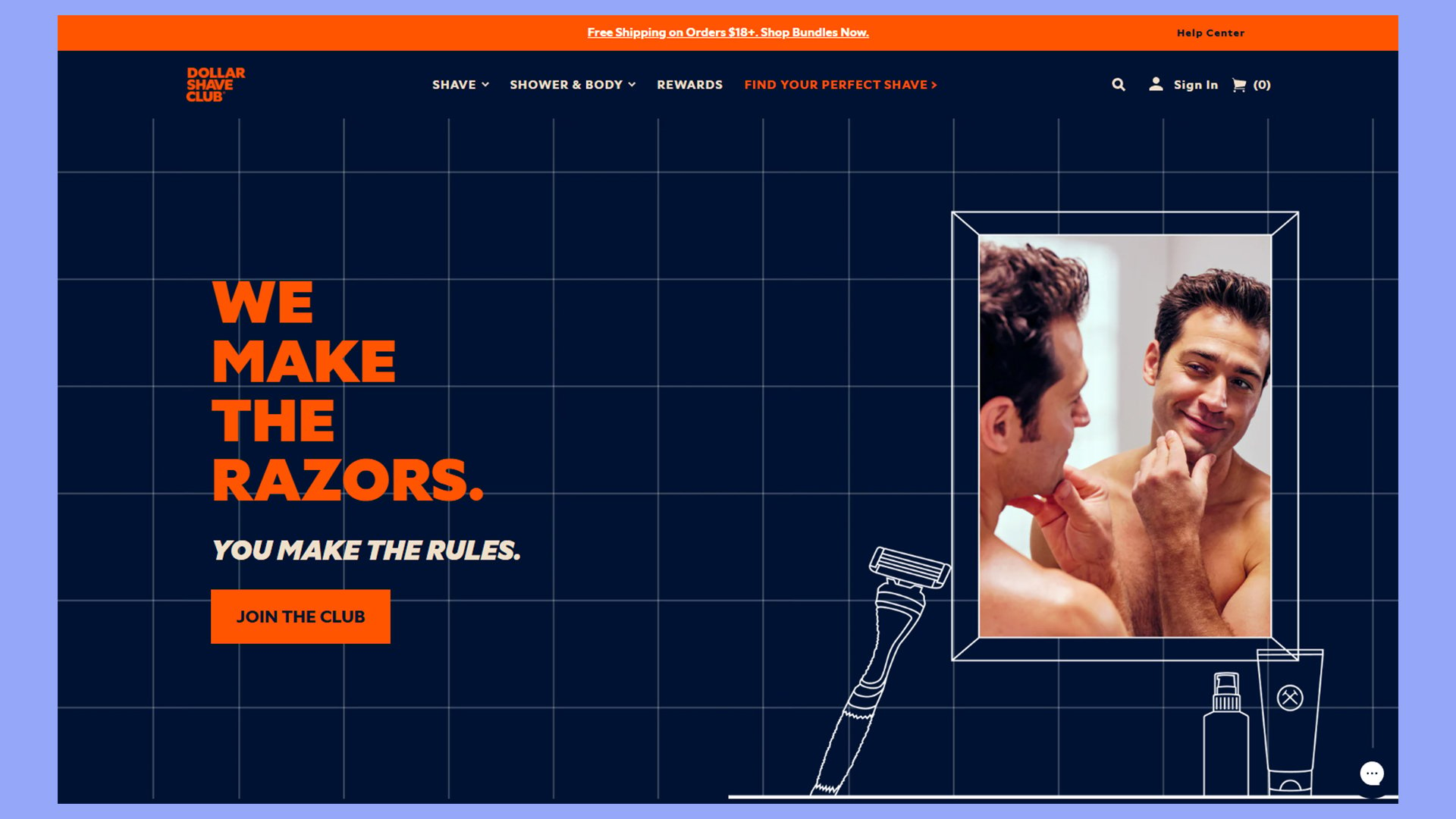
Dollar Shave Club’s website is a great example of modern ecommerce design. The site uses a clean, simple layout that makes finding what you need easy. Their homepage features a bold headline and a clear call-to-action button that stands out.
The product pages are well-organized. You’ll see high-quality images of their razors and other grooming products. Each item has a clear description and price. The site also uses customer reviews to build trust.
Dollar Shave Club’s website is designed to be fun and engaging. They use humor in their copy to make shopping more enjoyable. The site is also mobile-friendly, so you can browse and buy on your phone.
Some other features of Dollar Shave Club’s website design include:
- Fun, conversational language is perfect for the target audience
- Clear and easy to navigate
- Interactive product elements
- Product quizzes to guide users
Drunk Elephant
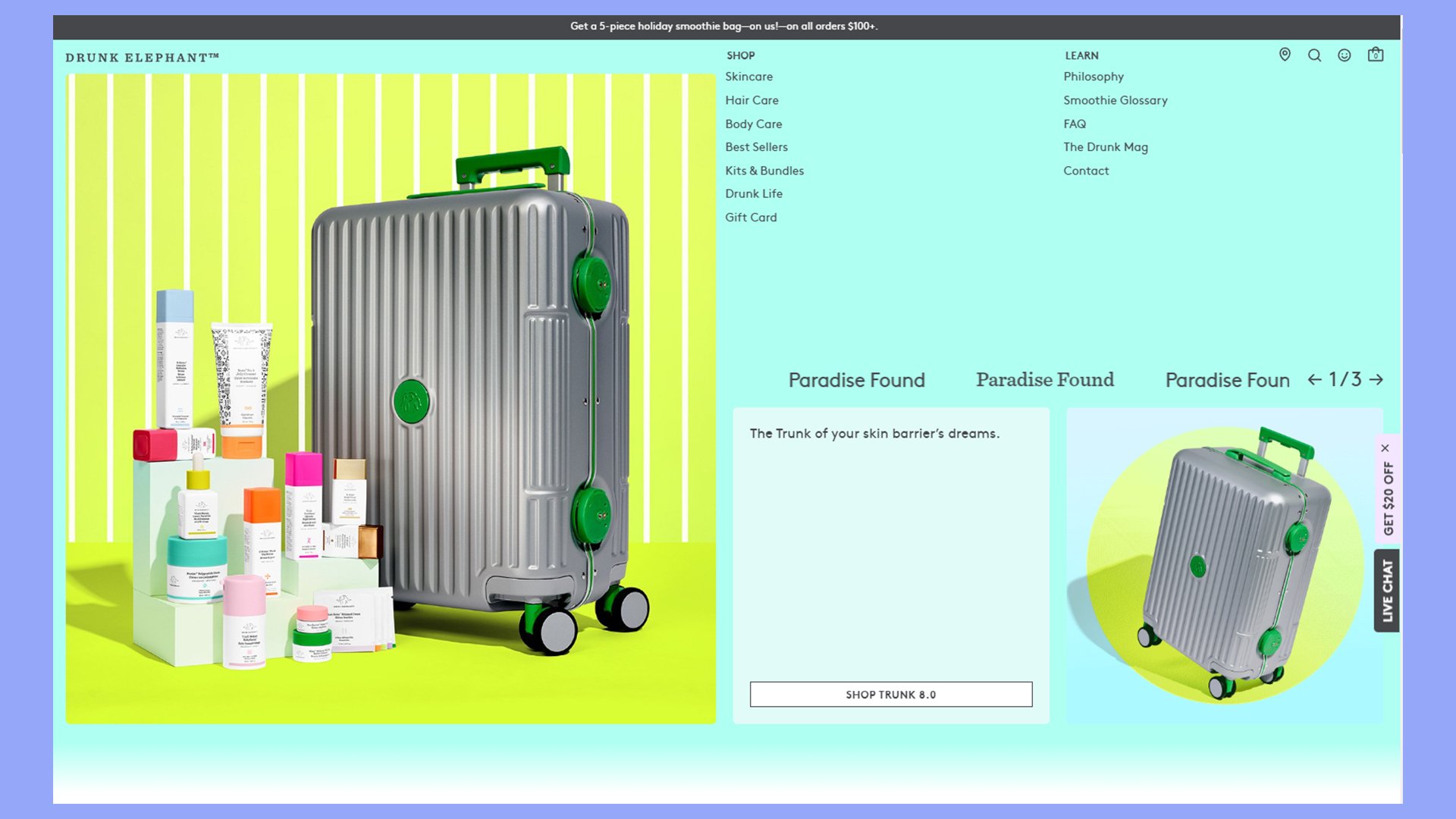
Drunk Elephant’s website stands out with its clean, modern design. The brand uses a simple color scheme that matches its product packaging. You’ll find a user-friendly layout that makes shopping easy.
The site showcases products with big, clear images. Each item has a detailed description that tells you what it does and how to use it. You can see customer reviews right on the product pages, which helps you make choices.
Drunk Elephant uses fun graphics and icons to explain complex skincare ideas. This makes learning about their products more enjoyable. The site also has a quiz to help you find the right products for your skin.
You can easily browse different categories like face, body, and hair care. The checkout process is smooth and quick. Drunk Elephant often offers free samples with orders, which is a nice touch.
On this website, you’ll find:
- Colorful, on-brand design
- Interactive educational content
- Uncluttered product pages
Glossier
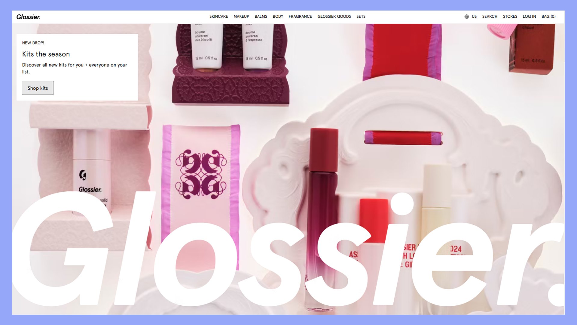
Glossier’s website stands out with its clean, minimalist design. You’ll find a user-friendly layout that puts the focus on their skincare and makeup products. The site uses lots of white space and soft pastel colors to create a fresh, modern look.
Product pages on Glossier are simple yet effective. You’ll see big, high-quality images that show off each item. The site includes clear product descriptions that highlight key benefits. Customer reviews are easy to find, helping you make informed choices.
Glossier uses a smart mix of product and lifestyle photos. This helps you picture how the makeup might look in real life. The site also has helpful features like shade finders for foundation and concealer.
Glossier stands out for its modern ecommerce website design:
- Minimalistic, on-brand aesthetics
- Simple product pages highlight the products, not the website
- Tools to match shades and products
- Prominently displayed reviews add social proof
Choosing the right ecommerce platform for modern design
Picking a platform for your online store is the key to creating a modern, eye-catching design. Some top options include Shopify, Wix, BigCommerce, and WooCommerce.
Shopify offers sleek templates and easy customization. You can quickly set up a professional-looking store with minimal tech know-how. It’s great for beginners but may limit advanced users.
Wix provides drag-and-drop editing for total creative control. You can build a unique site that matches your brand perfectly. The tradeoff is a steeper learning curve.
BigCommerce balances power and ease of use. You get robust features without needing coding skills. It works well for growing businesses that need scalability.
WooCommerce stands out as the top choice for modern ecommerce design. As a WordPress plugin, it gives you complete flexibility. You can create any look you want and add custom features as needed.
With WooCommerce, you’ll enjoy:
- Full control over your site’s code and design
- Thousands of themes and plugins
- Built-in blogging for content marketing
- Easy integration with other WordPress tools
The platform you pick shapes your site’s look and feel. Think about your design goals and tech skills when deciding. For most stores, WooCommerce offers the best mix of power and customization.

Create your online store in minutes!
Looking to sell online? Develop and launch your store with 10Web AI Ecommerce Website Builder.
Establishing your online presence with 10Web
For businesses looking to establish a strong online presence with modern ecommerce website design, 10Web offers a comprehensive platform powered by its advanced AI Ecommerce Website Builder .
This tool enables entrepreneurs and businesses to quickly build visually appealing, efficient, and fully customized online stores. With no need to start from scratch or rely solely on pre-designed templates, the AI builder generates section-based pages based on the specifics of the business.
This process includes structured outlines, ready-to-edit ecommerce sections, and automatic styling, all aiming to deliver a fresh, modern look.
Key Features for modern ecommerce design:
- AI-generated page structure: The builder creates page structures, suggesting optimized sections like product listings, hero banners, customer testimonials, and more. Users can rearrange, edit, or add sections to meet brand and design preferences.
- Customization with style controls: Automatic color, font, and style suggestions are based on your brand, with options to adjust these using the Ultimate UI Kit to create a cohesive and contemporary look.
- WooCommerce integration: The robust backend supports complex inventory, customer, and order management for advanced ecommerce needs.
- Pre-designed and free-form sections: Over 60 customizable templates across 14 section types make it easy to design without compromising uniqueness.
How to get started:
- Sign up on 10Web: Start by creating a free account on 10Web.
- Describe your business: Provide a brief description of your business, and the AI will generate a relevant outline.
- Customize layout and content: Use the interactive editor to modify sections, upload images, and add product descriptions.
- Style and finalize: Adjust colors, fonts, and layouts, then preview your ecommerce store in real-time.
- Launch your store: Once everything is ready, publish your website and manage it through 10Web’s dashboard.
Advanced performance optimization
10Web’s PageSpeed Booster automatically enhances website performance, ensuring fast loading times for better user experience and conversion rates.
Key elements of modern ecommerce website design
Modern ecommerce design focuses on creating a smooth and enjoyable shopping experience. It combines visual appeal with practical features to help customers find and buy products easily.
Responsive layout
A responsive layout adjusts to fit different screen sizes. This means your online store looks good on phones, tablets, and computers. Some key points of responsive design are:
- Flexible grids that resize content
- Images that scale to fit the screen
- Text that’s easy to read on small devices
- Menus that collapse into a hamburger icon on mobile
Responsive design helps more people shop on your site. It also boosts your search engine rankings since Google favors mobile-friendly sites.
Designing for users
User-centered design puts shoppers first. It aims to make buying simple and fun. Some ways to design for users include:
- Clear product photos and descriptions
- Easy-to-use search and filter options
- Quick view options for product details
- Wish lists to save items for later
- Guest checkout for faster purchases
Think about how customers will use your site. Make common tasks quick and easy. Remove any roadblocks that might stop someone from buying.
User-centered navigation
Good navigation helps shoppers find what they want fast. Here are some tips for user-friendly navigation:
- Use clear category names
- Add a search bar that’s easy to spot
- Include breadcrumbs to show where users are
- Create dropdown menus for subcategories
- Add a sticky header with key links
Well-planned navigation can boost sales. It helps customers explore your products and find new items they might like.
Trust and assurance
Building trust is key for online stores. Shoppers need to feel safe sharing their info and buying from you. Ways to build trust include:
- Showing secure payment icons
- Adding customer reviews and ratings
- Displaying contact info clearly
- Having a clear return policy
- Using SSL certificates for security
When customers trust your site, they’re more likely to buy. They’ll also come back for future purchases.
Leveraging calls to action
Calls to action (CTAs) guide users in taking the next step. They can boost sales when used well. Tips for effective CTAs:
- Use action words like “Buy Now” or “Add to Cart”
- Make buttons stand out with contrasting colors
- Place CTAs where they’re easy to see and click
- Use different CTAs for different stages of buying
- Test different words and designs to see what works best
Good CTAs can turn browsers into buyers. They help move customers through your site to complete their purchase.
Innovative features enhancing user experience
Modern ecommerce websites use clever design elements to make shopping easier and more fun. These features help customers find what they want and buy it quickly.
Interactive product displays
Many top ecommerce sites now use 360-degree product views and zooming tools. These let you see items from all angles and check small details. Some even have augmented reality (AR) features. With AR, you can see how furniture might look in your home before buying.
Amazon uses hover-to-zoom on product images. This lets you see close-ups without clicking. Warby Parker lets you try on glasses virtually using your device’s camera. This makes online shopping feel more like being in a store.
Ideas to improve the online shopping experience:
- Video demos of products in use
- Color and style swatches you can click
- Size guides with measurements
- Customer photos showing the product
Seamless checkout process
The best ecommerce sites make buying quick and easy. They cut out extra steps and offer helpful options. Many now have one-click ordering for repeat customers. This saves time and reduces cart abandonment.
Apple’s website has a clean, simple checkout. It shows you exactly where you are in the process. Shopify stores often use a single-page checkout. This puts all the steps on one screen, making it faster to complete your order.
Some sites remember your details for next time. Others let you check out as a guest. Both options make buying smoother.
- Autofill for shipping and payment info
- Multiple payment methods like PayPal and Apple Pay
- Order tracking right from the confirmation page
- Clear return policies are easily visible during checkout
Conclusion
In today’s digital-first world, having a modern ecommerce website design is essential for standing out in a competitive marketplace.
By studying these ten standout online stores of 2024, you’ve seen how thoughtful design choices—from clean layouts and interactive features to seamless navigation—can enhance user experience and drive sales. Applying these design principles to your own store can create a more engaging, trustworthy, and enjoyable shopping experience for your visitors.
Ultimately, a strong design doesn’t just make a good impression—it can be the key to building customer loyalty and achieving long-term success in ecommerce.

Create your online store in minutes!
Looking to sell online? Develop and launch your store with 10Web AI Ecommerce Website Builder.


