
Are you serious about growing your podcast? Think beyond the audio. Your online presence and podcast website design are as important as the content. A website gives your show a professional advantage, helps new listeners find you, and makes sharing show notes easier.
Podcasting isn’t slowing down. According to Grand View Research, the podcasting market will hit $47.83 billion in 2025. So, it’s worth learning what’s working online and what’s not.
Below, you’ll find 21 podcast websites that have great design, UX, and conversion. Each one comes with a quick summary and bullet-point takeaways you can steal.
What makes a great podcast website?
When choosing these examples, first, I filtered the sites that move a visitor from “what’s this show?” to “hit subscribe” in possibly fewer clicks. Some important features make a podcast website great.
Here is my selection checklist for the best podcast websites.
- Instant “Play” button – make the latest episode one click away, the moment I visit the website.
- Skimmable show notes – quick summary, time-stamps, and guest links.
- Brand-tight visuals – cover art, color palette, and typography that match the podcast vibe and social thumbnails. Visuals communicate faster than words.
- Embedded player – no mystery 404s, no sending me off-site unless I choose Apple or Spotify myself.
- Fast loading – Nobody waits for audio. If loading takes long, I quit.
- Mobile-first layout – easy controls, readable fonts, and zero horizontal scroll on a phone.
- Social proof & community – ratings, testimonials, or a Discord/Slack link that says “Join the conversation.”
- Clear CTAs – subscribe, share, or support on Patreon, each with its own spotlight, never fighting for attention.
Tick every box above and you’ll have a podcast website that converts casual browsers into fans.
21 top podcast website examples
Let’s look at 21 of the best podcast website examples, chosen with real podcaster pain points in mind. Each example highlights the smart features on the website. You can borrow them to boost engagement and grow your audience.
1. The Diaries of a CEO
What makes this podcast website great:
- Strong visual identity in the hero section showing “unfiltered journeys”
- Clear copy that defines the value proposition
- One-tap subscriptions & live updates
A personal favorite for me, The Diary of a CEO combines influential interviews with a website that checks every mark I’ve set. A powerful hero and a clear tagline present the podcast’s promise. The “Most Popular Episodes” section is easy to browse. Preview images, strong titles, and clear “Watch Episode” buttons drive traffic to the episode pages. The rolling news feed at the bottom adds fresh social proof and keeps the experience alive.
2. Stuff You Should Know
What makes this podcast website great:
- Instant listen & subscribe from every episode card
- Bold, minimalist branding
- Strong visual identity
Stuff You Should Know makes a strong first impression with its red background and black text, perfectly matching the podcast’s iconic look. The homepage keeps it simple – only the podcast name in center stage with just three clear buttons – About Us, Episodes, and On Tour – it’s easy for visitors to find what they need right away. Vintage nods mix with modern touches. Even with 1,500+ episodes, everything feels effortless to find, turning casual visitors into fans.
3. Rotten Mango
What makes this podcast website great:
- Personality-packed hero that pulls you into the podcast’s story
- Visual cues and a featured card for the latest episode
- A fan-thank-you section spotlighting supported charities
Rotten Mango successfully presents the true-crime vibe with a design that feels mysterious and inviting. This tagline, “with her mysterious partner in crime,” adds extra mystery to the website. From the first glance of that playful hero to the path into new episodes, everything guides you straight to listening. Wrapping up with a shout-out to fan-driven charitable causes turns casual clicks into genuine community connections. Savvy branding and thoughtful UX can make a podcast website unforgettable.
4. Huberman Lab
What makes this podcast website great:
- Lead-generating hero – a zero-cost “Daily Blueprint” email
- Science-forward positioning
- Smart content organization
- Easy access to episodes and protocols
The Huberman Lab podcast website is a clean, science-backed hub that reflects the podcast’s mission: practical neuroscience to improve everyday life. The homepage spotlights key episodes. Bold titles like “Improve Your Metabolism” and “Achieve Inner Peace & Healing” make the value clear. Dr. Huberman’s expertise is highlighted through his bio and book. This is one of the best podcast website examples, presenting complex information in clear language.
5. The Joe Rogan Experience
What makes this podcast website great:
- One-click “Watch now” button takes you straight to the latest episode on Spotify
- Instant credibility that it “consistently ranked one of the most popular podcasts”
- Clear sectioning between podcast, comedy, and biography
The Joe Rogan Experience’s website uses strong, personality-focused branding, starting with a picture of Rogan. The website is organized to highlight his various career paths, with easy-to-find sections for his podcast, biography, and merchandise. The podcast section briefly explains what the show is about and why people might enjoy it. The design is direct, just like Rogan’s communication style, without unnecessary extras.
6. Twenty Thousand Hertz
What makes this podcast website great:
- Vibrant visual storytelling and a full-bleed hero image
- Educational yet playful tone of positioning
- Thoughtful episode highlights
The Twenty Thousand Hertz website catches the eye with a colorful, cartoon-like main image that creates a fun mood. The website is neat, showing popular episodes and “classics” that help both new visitors and regular listeners find interesting content. It combines educational information with familiar pop culture references, covering everything from Netflix’s “Tudum” sound to the McDonald’s jingle.
7. Ctrl Shift
What makes this podcast website great:
- High-energy branding with great typography
- Clear value proposition
- Engaging, playful episode visuals
CTRL SHIFT! is a dynamic podcast website. The bright orange color scheme and large, hand-drawn text contain lots of character. The main section quickly establishes the podcast’s importance by mentioning it is a Top Business Podcast on Apple Podcasts. With the “Scroll to Discover” feature, all episodes only open when you scroll. Also, each episode page is featured uniquely.
8. Finding Founders
What makes this podcast website great:
- Emotion-driven tagline with thematic focus – “A podcast about vulnerability and entrepreneurship”
- A “What Guests Are Saying” section showing social proof and testimonials
- Curated episode previews with bold titles
Founding Founders blends real, human stories with entrepreneurship in a warm and relatable way. The hero image and tagline set the tone. Bold episode titles and visuals make it easy to dive in. Testimonials from well-known voices boost trust and credibility, encouraging new listeners to stick around. The “About” section highlights the podcast’s storytelling depth and its UCLA partnership, adding authority.
9. Jocko Podcast
What makes this podcast website great:
- Visual identity with the show’s tone
- High-impact, cinematic episode previews
- Clear access to gear and premium content
The Jocko Podcast’s website makes an impact with gritty black-and-white visuals, strong contrast, and a straight-to-the-point layout that reflects its focus on discipline and leadership. It’s bold and unforgettable. Recent episodes take center stage in a cinematic design. Extras like the merch store, book features, and Jocko Underground are also built in smoothly, making it easy for fans to dive deeper. As the Jocko style – focused and practical, it’s among the top podcast website examples.
10. How Did This Get Made?
What makes this podcast website great:
- The visual hook with the hosts communicates the comedic style of the podcast
- Access to episode listening and live tour details
- Playful branding indicating podcast’s irreverent energy
The How Did This Get Made? podcast website brings the fun with a hero image of the hosts, which communicates itself, showing off the show’s humor and personality. The built-in audio player makes jumping into episodes easy, while the lively tour section highlights live events in a fun, simple way. Bright colors and typography perfectly match the podcast’s chaotic energy. Quick links to merch, email sign-ups, and Paul Scheer’s book help turn visitors into loyal fans through a mix of comedy, ease, and community.
11. Floodlines
What makes this podcast website great:
- Custom illustrations setting a poetic tone before you even hit “Play”
- Immersive layout with one-click play buttons, and “Read the Transcript” links doubling as SEO boosters
- Elegant, editorial experience that makes it feel like a mini-documentary
The Floodlines website creates an emotional, artful experience. Hand-drawn illustrations and a muted color palette set a poetic, haunting tone that fits the weight of its subject: Hurricane Katrina and its aftermath. Each episode feels like a chapter in a visual storybook, blending emotion with strong journalism. The scroll-based layout and smooth transitions give it the feel of a digital documentary rather than a standard podcast page. It’s one of the best podcast website examples of storytelling through thoughtful design.
12. Afrobility
What makes this podcast website great:
- Dual-subscription CTAs, leading to either “Subscribe to Podcast” or join the newsletter
- Structured titles and descriptions with hosts names telling you who you’ll be listening to and what to expect
- Integrated player and sharing tools
The Afrobility website is focused on featuring the released podcasts. It uses a simple black-and-white layout with a touch of purple. Episodes are listed with sharp headlines and clear summaries to browse and jump into what matters most. The consistent format boosts readability, especially for listeners interested in African tech and business. The site’s clarity matches the podcast’s no-hype, thoughtful take on big, impactful topics.
13. This American Life
What makes this podcast website great:
- Gives the print magazine vibes with unique typography
- Helpful guidance for episodes and smart descriptions for a sneak peek
- Strong member appeal through callouts, showing the podcast is free
I love how the This American Life podcast website feels like a friend passing you the best episodes. It honors the show’s storytelling legacy with an elegant, text-focused design that feels like a beautifully created publication. The homepage highlights the latest episode with a striking visual and summary, while “Recently Aired” and “Recommended” sections offer a warm path through the archive. A charming “Life Partner” callout invites listeners to support the show with ad-free access and bonus content.
14. Office Ladies
What makes this podcast website great:
- Jenna and Angela (the hosts) greet you with a warm and cozy image
- Fan engagement features and CTAs
- News, awards, and behind-the-scenes content
The Office Ladies podcast website excellently shows its cozy, nostalgic vibe: it feels like catching up with two best friends from The Office, then jumping straight into the newest episode with one tap. The episode section is easy to browse, with direct links to listen and explore past content. A merch store and fan submission form keep it interactive, while award highlights and animated promos add extra charm.
15. Congratulations with Chris D’Elia
What makes this podcast website great:
- A full-width shot of Chris in mid-laugh against a bold backdrop immediately sets an energetic vibe
- Strong Patreon callout and one-tap subscription on different platforms
- Simplified layout focused on subscription
The Congratulations with Chris D’Elia website brings a fun, high-energy feel that matches the podcast’s quirky tone. The latest episode is in front of you to dive into right away. A bold image of Chris and the punchy blue-yellow color scheme highlight his comedic style and keep things visually lively. The Patreon section lays out perks like ad-free episodes, bonus content, and exclusive merch, turning visitors into loyal fans. It’s a sharp, no-fuss site built to connect with its audience.
16. Bad Therapist
What makes this podcast website great:
- Coach-driven visual identity created through personal branding
- Clear navigation and CTAs, like the “Book a Call” and “Try the Fee Calculator” buttons
- A wall of authentic testimonials that reinforce the podcast’s effectiveness
The Bad Therapist podcast website blends strong personal branding with a clear mission. It aims to help therapists grow beyond the therapy room. The design feels approachable and confident, with vibrant CTAs guiding visitors to book calls easily. Testimonials are proof of impact, reinforcing the podcast’s value for clinicians. The embedded episode playlist keeps listening smooth, while the conversational tone mirrors the host’s relatable, empowering voice.
17. Crime Junkie Podcast
What makes this podcast website great:
- Goes beyond podcasting with the fan club & live events
- Organized layout of episodes
- Integration of community support
The Crime Junkie Podcast website makes an impact with high-contrast podcast website design that spotlights its live tour, boosting fan engagement beyond the show. The homepage balances entertainment and advocacy, featuring supported organizations that deepen emotional connection. Episodes are laid out with gripping visuals and summaries, making it easy to binge or revisit favorites. The “Audiochuck” branding adds a clean, professional touch. It’s a fan-first site that brings together storytelling, merch, and mission in one space.
18. Jordan B Peterson Podcast
What makes this podcast website great:
- Academic minimalist design with strong typography, generous white space, and a focused layout
- A prominent “Featured Episode” section with full summary and context hooks
- One-click platform & newsletter access
Jordan B Peterson is phenomenal, as is his podcast website. Jordan B Peterson Podcast website matches Dr. Peterson’s structured, academic style with a focused layout. The homepage highlights the featured episode through a bold video embed and detailed show notes for context and depth. The design stays minimal, with all attention on the content. It’s a top podcast website example for clarity and purpose-driven presentation.
19. Lemonade Stand
What makes this podcast website great:
- A magazine-style episode archive with a clean, scrollable list of guest features
- Each entry kicks off with a “Who Is…” intro that reads like the opening of a story
- Story-style episode summaries
The Lemonade Stand podcast page gives off a warm, friendly vibe that fits its uplifting take on entrepreneurship. Each episode feels like a blog feature, with thoughtful intros that pull you into the guest’s story before you decide to play it. The mix of business leaders, creators, and innovators keeps things fresh, while the simple layout makes it easy to explore. It’s a feel-good space that turns business talk into genuine, human storytelling.
20. Terrible, Thanks for Asking
What makes this podcast website great:
- Emotional and heartfelt branding
- Intuitive episode browsing helps website visitors get into the story really fast
- Balance between visuals and storytelling done through generous white space and minimal menus
The Terrible, Thanks for Asking podcast website leaves a lasting impression, much like the stories it shares. The bold yellow palette and tear-drop logo set the tone for honesty and vulnerability. She shows who she is through honest storytelling. A clean episode layout makes it easy to explore the archive and keep listening. Among the best podcast website examples, this one is good for how its strong visual identity deepens the emotional connection, creating a space that feels safe, real, and human.
21. DOPA
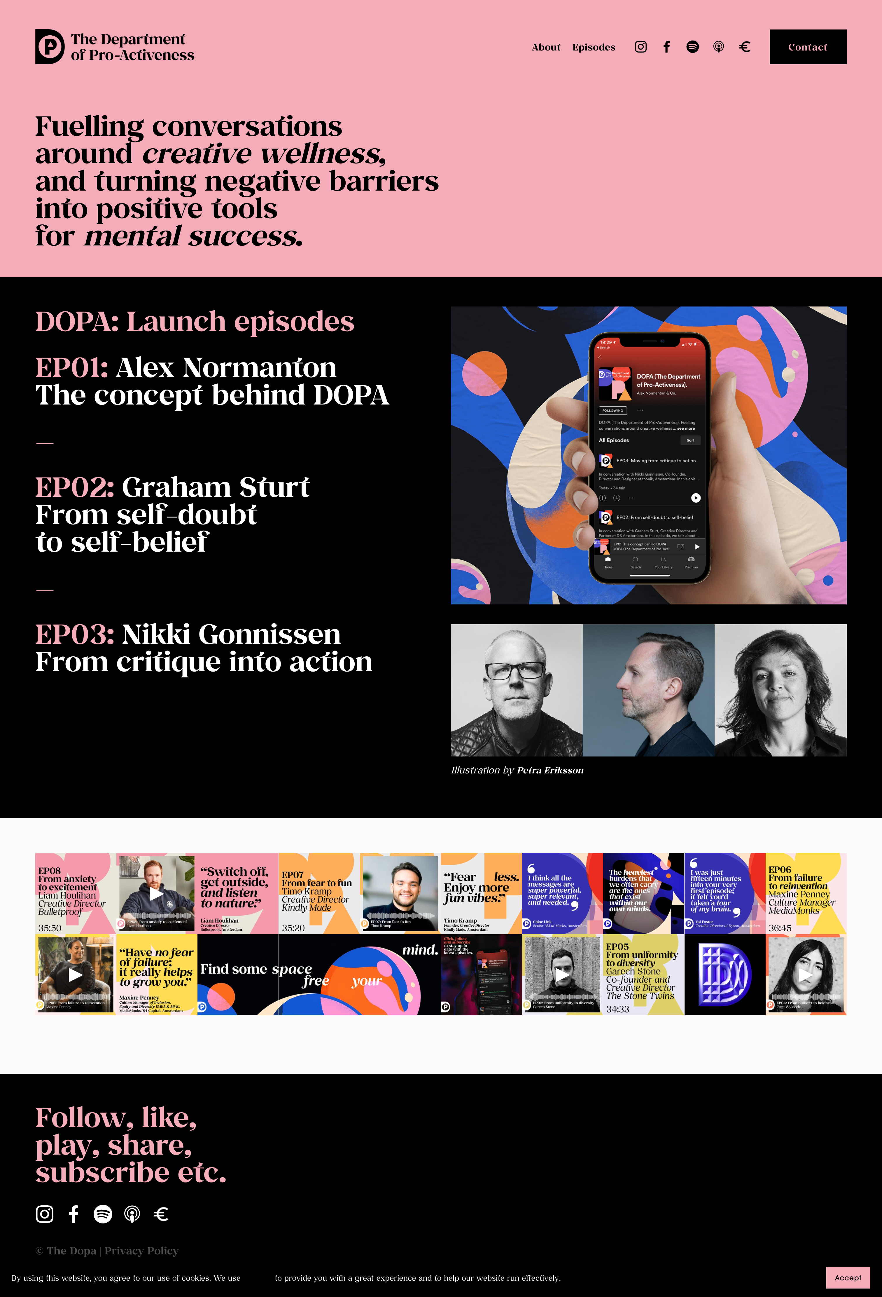
What makes this podcast website great:
- Oversized hashtags and deliberate line breaks turn the hero into a rallying cry for creative wellness
- Visually engaging episode tiles acting like a bold chapter heading, linking directly to host profiles and the audio
- Emotionally resonant copy
The DOPA podcast website makes its purpose clear at first glance – it’s more than a show, it’s a manifesto. Bold visuals and expressive typography reflect the focus on creativity and mental wellbeing, turning each scroll into a quiet moment of reflection. Episode titles feel like mini artworks, drawing you in, while the copy speaks directly to personal challenges. The site stays with you, not just through its design, but through the way it makes you feel.
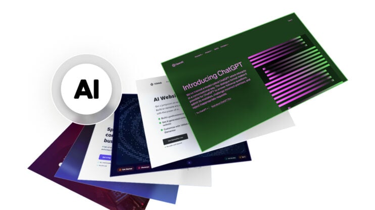
Create your dream website with 10Web AI Website Builder 
Build your website in 1 minute
and take your business online!
How to create a podcast website?
If you want to launch your own podcast website fast and cheap, and keep everything originally branded, then 10Web’s AI Website Builder is your go-to tool. You don’t need to hire a developer or struggle with complex design tools. It’s a fast and simple way to create a podcast website that promotes your episodes, shows your brand, and builds trust with your audience.
You tell the AI about your podcast, who it’s for, and what makes it unique – it’ll generate a custom website tailored to your show, with everything automated for you. The layout is designed to highlight your episodes, encourage subscriptions, and guide visitors to take action, like joining your mailing list or supporting you.
Let’s create your podcast website:
- Go to 10Web.io > describe your podcast > click Generate Your Website.
- Review and edit (if needed) the website name, description, and structure.
- Click Next > choose the website colors, fonts, and styles.
- Click Generate to apply.
Once you’re live, keep using AI Co-Pilot to add new episode announcements or blog posts. With design, content, and hosting all handled in under five minutes, you can focus on what matters most: making great audio and video and growing your audience.
Turn visitors into subscribers
Your podcast website should capture the core of your show – its voice, personality, and purpose – while making it effortless for visitors to listen, subscribe, and connect with your content. Looking at these top podcast website examples, it’s clear that success comes from a mix of bold branding, smooth navigation, and smart features that keep listeners engaged.
Turn visitors into loyal subscribers with a stunning, AI-powered podcast website – build yours with 10Web today in just a few clicks!
FAQ
What is the best podcast website?
What should a good podcast website include?
What’s the best way to display episodes on a website?
Do I need a blog or just episode pages?
How do I build a great-looking site?
How can I get more listeners from my website?
Can I monetize my podcast website?
What’s the easiest platform for building a podcast website?
Create your dream website with 10Web AI Website Builder
Build your website in 1 minute
and take your business online!
Love the designs? Make them yours in a few clicks with 10Web AI Website Builder.Build your website in 1 minute
Create your website now for Free


![]()