
Blogs are where people go to share what they know, obsess over what they love, and build a little corner of the internet that actually feels personal. The tricky part is wading through an overwhelming number of examples to figure out what a great blog should look like in 2026.
This guide does the opposite. You’ll get 18 blog website examples selected for one reason. Each one has a structure, layout, or content pattern that makes it an archetypal blog template for its topic. Some are built around guides, others around storytelling, visuals, or a clean writing-first format, but each is exemplary of the best parts from their respective niches. Plus, you’ll find some sample AI prompts to build a site like each category, so you can get your blog rolling with 10Web.
Check out these blog website examples for the best ideas to borrow, and get started building a magnetic blog that draws readers back time and time again.
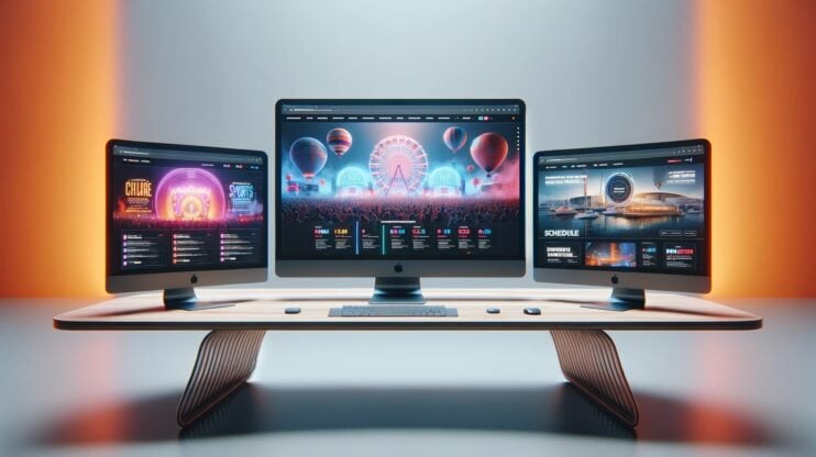
Create your dream website with 10Web AI Website Builder 
Build your website in 1 minute
and take your business online!
How to create your own blog website with 10Web
Establishing a blog is a powerful way to share your ideas, expertise, or creative content with a global audience, and 10Web’s blog website generator makes this process simple and efficient. With AI-powered tools, you can quickly set up a personalized blog that reflects your style and message, with no coding skills required:
- AI-powered website creation: Easily generate a customized blog by providing a few details about your theme or focus area. The AI builder takes care of design and layout, crafting a site tailored to your unique voice.
- SEO and performance optimization: Ensure your blog is fast-loading and optimized for search engines to increase visibility, attract readers, and support your content growth goals.
- Secure and scalable hosting: Benefit from Google Cloud hosting, which ensures your blog can handle traffic spikes securely and provides reliable data protection.
- Content management and customization: Use the drag-and-drop editor to add new posts, update content, and adjust design elements effortlessly, giving you full creative control over your blog.
Follow these steps to build your blog in minutes!
- Visit 10Web.io, click on Generate with AI (if needed), and enter a brief description of your blog or content to help the AI create relevant content and design elements.
- Review the suggested pages and sections, adding or removing as needed.
- Select a color scheme and typography that aligns with your brand and click Generate.
- Now it’s time to customize your AI-generated site. The AI Website Builder produces a complete WordPress site according to your description, then the drag-and-drop editor and AI co-pilot make it easy to fine-tune the design, update content, and make additional adjustments to match your branding and style.
With these steps, 10Web’s AI Website Builder allows you to launch and manage a blog website quickly and with minimal effort.
Generate your website with AI
Archetypal blog website examples
These blog website examples are grouped by niche, so you can quickly find the foundational elements that make a great blog. Each category highlights two archetypal sites that exhibit the niche’s key layout and content patterns that make that type of blog work, whether you’re building a community-driven lifestyle blog, a guide-heavy travel site, or a writing-first personal blog. Use shortcuts below and head straight to the format closest to your goal, then use the AI prompt to borrow the structure and design that fits.
- Lifestyle
- Travel
- Food
- Fashion and beauty
- Tech
- Photography
- Art and design
- Health and fitness
- Classic blogs
Lifestyle blog website examples
Lifestyle blogs work best when browsing feels effortless, because readers come in with different moods and interests. These examples show how to organize broad topics without turning the homepage into a cluttered feed.
1. A Cup of Jo
Diversity of women’s lifestyles.
Content structure highlights:
Content is organized into clear lifestyle categories, with a steady publishing rhythm that supports repeat visits. The site functions like a daily editorial hub rather than a one-topic blog.
What we like most about this website:
- Cup of Jo covers topics such as style, food, travel, relationships, and parenting.
- The website is user-friendly, with an inviting design and organized categories.
- It features engaging, well-written content with a personal touch.
Cup of Jo is a daily lifestyle site for women, founded by Joanna Goddard. It covers an array of subjects from fashion to parenthood, standing out with its authentic voice and relatable content. The blog generates revenue mostly through sponsored posts, indicating a successful business model. The mix of diverse topics, a personal approach, and strong community engagement make Cup of Jo a popular lifestyle blog.
Why it works:
Cup of Jo feels like a community as much as a blog, which is why readers stick around and come back often. The structure makes browsing effortless, and the voice makes the content feel trustworthy and relatable. It’s a strong blueprint if you want to publish frequently without your blog turning into a chaotic feed.
What to borrow:
- A category-led navigation that lets readers jump straight into topics like style, relationships, or motherhood.
- A magazine-style homepage that balances fresh posts with strong entry points for new visitors.
- A warm, personal writing tone with clean typography that keeps longer lifestyle posts easy to read.
2. A Beautiful Mess
Lifestyle, creativity, and DIY inspiration.
Content structure worth noting:
Content is built around idea categories (DIY, home, food/recipes, style), so readers browse by interest rather than chronology. It also functions like a library—easy to explore, easy to revisit.
What we like most about this website:
- Covers DIY, recipes, home décor, and everyday lifestyle ideas in one creative hub.
- Uses bright, cohesive visuals that make every post feel inviting and easy to browse.
- Extends the blog experience with a podcast for deeper lifestyle and design insights.
A Beautiful Mess, founded by sisters Elsie and Emma, is a lifestyle blog full of creative inspiration. With thousands of posts on topics like DIY crafts, recipes, and home décor, it offers something for every interest level, from beginners to advanced crafters and homemakers. The blog’s unique combination of colorful aesthetics and practical content appeals to readers looking to enhance their homes, try new recipes, or learn a new craft. Each post radiates a warm, personal touch, making it a welcoming space for creativity and self-expression.
Why it works:
A Beautiful Mess succeeds because it treats lifestyle content like practical inspiration, not just personal updates. The structure makes it simple to discover evergreen posts, while the visual system keeps everything feeling cohesive. If your lifestyle blog relies on repeatable formats and visual ideas, this is a strong model to borrow from.
What to borrow:
- A project-led homepage that helps readers jump straight into DIYs, recipes, and décor ideas.
- Bright, consistent visuals and repeatable layouts that keep the site feeling organized.
- Scannable, step-based post formatting that makes lifestyle tutorials easy to follow.
Sample AI prompt to generate a lifestyle blog
Paste in the prompt, and create a lifestyle blog like the examples above:
Create a warm, magazine-style lifestyle blog that covers relationships, parenthood, home, style, and wellness. Use a clean, airy design and build a homepage with: (1) featured story, (2) newest posts, (3) topic blocks for 6 categories, (4) ‘most popular this week,’ and (5) a subtle newsletter signup. Add a Start Here page, an About page, and category pages with clear post cards and easy-to-read typography for long blogs.
Use it like the examples:
- Ask the AI to create 6 top-level categories and keep them consistent in the navigation.
- Add a Most Popular section to mimic the “daily editorial hub” feel.
Travel blog website examples
Travel blogs usually win on structure, not just photos—readers want destinations, planning help, and trusted recommendations fast. These travel blog examples show how to build a site that feels like a resource hub, not a diary.
3. Nomadic Matt
Budget-friendly travel tips.
Content structure worth noting:
The site is organized like a travel resource hub with destination pages and evergreen planning guides. Older posts stay discoverable through structured navigation and guide clusters.
What we like most about this website:
- Offers budget-friendly travel guides that make planning affordable trips feel simple.
- Uses clear navigation and layouts that help readers find destinations fast.
- Includes destination guides, travel tips, and personal stories in one organized hub.
Nomadic Matt’s blog is a treasure trove of information for travelers, especially those looking to explore the world on a budget. Matt, the author, is a travel expert who has been journeying since 2008. His site stands out for its practical advice, budget travel tips, and destination guides. The website is not just about travel stories; it’s a great guide to traveling more while spending less, reflected in its motto “Travel Better, Cheaper, Longer.”
Why it works:
Nomadic Matt feels less like a personal diary and more like a travel handbook you can rely on. The structure helps first-time visitors find answers fast, then naturally leads them into deeper reading. If your goal is search traffic and long-term evergreen value, this is one of the strongest blog models to follow.
What to borrow:
- Destination-based navigation that lets readers jump straight into the trip they’re planning.
- Guide-first formatting with clear subheads, scannable sections, and practical next steps.
- Strong internal linking that connects city guides, country hubs, and planning basics.
4. The Blonde Abroad
Solo female travel tips.
Content structure worth noting:
Content is grouped into clear travel intents like destinations, travel tips, and packing resources, so readers can plan a trip without digging through endless archives.
What we like most about this website:
- Covers destination guides, packing tips, and travel photography advice in one place.
- Uses a visually polished design with clear, easy-to-browse travel categories.
- Focuses on solo female travel, offering practical guidance for women exploring the world.
The Blonde Abroad is a comprehensive travel blog aimed at solo female travelers, founded by Kiersten. It offers detailed guides, travel tips, and resources for a range of destinations worldwide, emphasizing safety and empowerment for female travelers. The blog’s success is evident in its large readership and extensive content coverage, making it a great resource for women seeking travel inspiration and advice. The site includes diverse travel categories like adventure, budget, luxury, and couples’ travel.
Why it works:
The Blonde Abroad balances inspiration and usefulness, which is exactly what most travel blog readers want. It feels personal and curated, but still structured enough to function as a planning resource. If you want a travel blog that builds a recognizable personal brand while still scaling with evergreen guides, this is a great reference point.
What to borrow:
- A clear solo female travel niche that makes the blog’s angle instantly recognizable.
- Strong visual storytelling with clean layouts and aspirational but readable design.
- Trip-focused organization through guides, packing resources, and destination browsing.
Sample AI prompt to generate a travel blog
Build a travel blog that feels like a planning resource hub, focused on [budget travel / solo female travel]. Create navigation for ‘Destinations,’ ‘Travel Tips,’ ‘Packing,’ and ‘Start Here.’ For the homepage, include: destination tiles, a ‘Plan Your Trip’ section, newest guides, and a ‘popular itineraries’ block. Create destination landing page templates with sections for: best time to visit, budget, sample itinerary, where to stay, and related guides.
Use it like the examples:
- Tell the AI to generate destination hub pages (country/city) so old posts don’t disappear into archives.
- Add internal links on templates: Next read: planning basics to destination guides.
Food blog website examples
Food blogs need to help people make decisions quickly, especially on mobile. These food website examples highlight recipe-friendly layouts, smart filtering, and formatting that makes cooking steps easy to follow.
5. Minimalist Baker
Simple, quick, vegan recipes.
Content structure worth noting:
Recipes are organized with tags and filters that function like a lightweight database, while evergreen recipe collections keep older posts discoverable beyond the archive.
What we like most about this website:
- Shares simple recipes designed around 10 ingredients, one bowl, or 30 minutes.
- Uses clean design and high-quality food photography that’s easy to browse.
- Includes dietary icons and tags (GF, vegan, dairy-free) for quick filtering.
The Minimalist Baker is a food blog that focuses on simplicity and health in cooking. It’s known for its approachable recipes that are perfect for busy lifestyles or those new to cooking. The site’s clean design and high-quality photography make it visually appealing and user-friendly. Minimalist Baker stands out as an inspiring resource for anyone looking to create delicious, fast-cooking meals, proving that cooking can be enjoyable and healthy.
Why it works:
Minimalist Baker turns a food blog into a decision-making tool, which is exactly what most recipe seekers want. The structure reduces friction. Find a recipe, confirm it matches your diet, start cooking. If you’re building a food blog, this is a great model for balancing inspiration with utility.
What to borrow:
- A clear recipe promise (10 ingredients, 1 bowl, 30 minutes) that guides the whole blog experience.
- Dietary icons and tags that help readers find gluten-free, vegan, or dairy-free recipes fast.
- A recipe index-style layout built for quick browsing, not endless scrolling.
Found inspiration? Your website is just a few clicks away. Start
Build your website in 1 minute
with 10Web AI Website Builder to effortlessly bring your vision to life.
6. Pinch of Yum
Food blog offering simple, flavorful recipes for everyday life 
Content structure worth noting:
Recipes are grouped into approachable categories and collections, with evergreen indexing that encourages browsing by craving or occasion rather than by publish date.
What we like most about this website:
- A diverse collection of approachable recipes suitable for various skill levels.
- High-quality photography that showcases each dish beautifully.
- Engaging storytelling that adds a personal touch to the culinary experience.
Founded by Lindsay Ostrom, Pinch of Yum began as a casual hobby in 2010 and has since evolved into a full-fledged business reaching millions of readers. The blog features a lot of recipes, from quick and easy meals to indulgent desserts, all presented with clear instructions and stunning visuals. Lindsay’s background as a former 4th-grade teacher brings a relatable and educational approach to her content, making cooking accessible and enjoyable for all. Beyond recipes, Pinch of Yum offers insights into Lindsay’s personal life, including travel experiences and reflections on motherhood, creating a warm and inviting community for food enthusiasts.
Why it works:
Pinch of Yum succeeds because it’s warm and personal, but still structured like a reliable cooking resource. Readers can come for the storytelling and stay for the repeatable, easy-to-follow recipe experience. It’s a strong reference if you want a food blog that feels like a brand, not just a recipe dump.
What to borrow:
- A consistent recipe-plus-story format that adds personality without hiding the instructions.
- Clear recipe page structure with scannable steps, strong visuals, and easy flow.
- Organized variety across quick meals, comfort food, and desserts without feeling scattered.
Sample AI prompt to generate a food blog
Create a recipe-focused food blog with a bright, clean design and strong food photography. Make the blog easy to use on mobile. Build a homepage with: recipe categories, ‘quick dinners,’ ‘most cooked,’ and ‘new recipes.’ Add a recipe index page with filters for dietary needs (gluten-free, vegan, dairy-free) and time-to-cook (15/30/60). Use a recipe post template with scannable sections: jump-to-recipe button, ingredients, steps, tips, and related recipes.
Use it like the examples:
- Ask the AI to implement icons/tags for dietary needs and show them on recipe cards.
- Keep a recipe index as a main nav item.
Fashion and beauty blog website examples
Fashion and beauty sites rely on visual consistency and a clear point of view, but they also need structure to keep evergreen style content discoverable. These fashion blog examples show how to balance editorial polish with practical browsing.
7. He Spoke Style
Men’s detailed style guides.
Content structure worth noting:
Content leans into evergreen style guides and lifestyle-adjacent topics, which helps the blog build depth over time. It’s structured to reward browsing and repeat visits, not just one-off reads.
What we like most about this website:
- Offers detailed men’s style guidance that blends classic and modern fashion.
- Expands into lifestyle topics like liquor and cigars alongside menswear.
- Uses strong hero imagery to spotlight key collaborations and featured articles.
He Spoke Style is a premier online destination for premium men’s style content. It stands out with its blend of informative articles and visually appealing fashion showcases. The blog is not just about clothing; it’s about the lifestyle and culture surrounding men’s fashion, making it a go-to resource for those seeking to elevate their style. The website features an elegant design and high-quality images, making it an ideal example for those interested in elegant blog website examples.
Why it works:
He Spoke Style feels authoritative because it focuses on timeless guidance, not fleeting trends. The structure makes it easy to discover high-value content, and the design reinforces the premium niche. If you want a fashion blog that builds trust and long-term search value, this is a strong blueprint.
What to borrow:
- Guide-driven style content that feels like an evergreen reference library, not a simple post feed.
- Large hero features that spotlight cornerstone posts, collaborations, or key guides.
- Clean, premium visuals with editorial photography and minimal clutter for a high-end feel.
7. The Blonde Salad
Content structure worth noting:
Posts are organized like an editorial hub across multiple lifestyle categories, which supports broad browsing while keeping fashion at the center.
What we like most about this website:
- Shares curated fashion, beauty, and lifestyle content with a trend-forward editorial feel.
- Built around Chiara Ferragni’s global personal brand and style influence.
- Uses high-quality visuals and polished layouts for a magazine-like experience.
Founded by Chiara Ferragni, The Blonde Salad has become an iconic name in the fashion blogging world, blending high-fashion aesthetics with everyday style inspiration. Known for its chic, editorial feel, the blog covers fashion, beauty, travel, and lifestyle topics, appealing to a global audience looking for the latest in style. Chiara’s influence as a fashion entrepreneur and her trendsetting approach make The Blonde Salad a go-to destination for readers seeking inspiration in both their wardrobes and lifestyle choices.
Why it works:
The Blonde Salad succeeds because it combines fashion inspiration with a polished, publication-like experience while still feeling creator-led. It’s a strong example of how a personal brand can scale into a broader style platform. If your goal is to build a fashion blog that feels premium and cohesive, this is a useful model to borrow from.
What to borrow:
- Editorial, magazine-style visuals that make the blog feel like a fashion brand from the first glance.
- A flexible content mix that expands into beauty, travel, and lifestyle without losing focus.
- Strong creator-led identity that keeps the aesthetic consistent across every topic.
Sample AI prompt to generate a fashion or beauty blog
Generate a premium fashion blog with an editorial look and a clear point of view: [men’s style guides / fashion + beauty lifestyle]. Use a minimal layout with large visuals, clean typography, and a featured ‘guide’ area. Create categories for ‘Style Guides,’ ‘Outfits,’ ‘Grooming/Beauty,’ and ‘Lifestyle.’ Build a homepage with: featured guide, newest posts, and a ‘best evergreen articles’ section. Add a ‘Lookbook’ or ‘Shop’ page and a post template that supports high-quality images without clutter.
Use it like the examples:
- Tell the AI to prioritize evergreen guides (“best of” / “start here”) so content stays discoverable.
- Use one hero feature section to spotlight cornerstone posts or collaborations.
Tech blog website examples
Tech blogs tend to succeed when they have a strong angle and writing that rewards attention. These examples show how to publish with authority, keep the reading experience clean, and build loyal return readers.
9. Stratechery
Strategic tech analysis and insights.
Content structure worth noting:
Content is organized around recurring analysis themes and archives, with the newsletter acting as the main distribution channel. It’s built for depth and continuity rather than endless category browsing.
What we like most about this website:
- Delivers deep weekly tech analysis through a newsletter-style publishing model.
- Uses a subscriber-based approach that keeps the reading experience focused and ad-free.
- Covers major tech companies and trends through a business-and-strategy lens.
Stratechery, created by Ben Thompson, is renowned for its analytical approach to technology and business strategy. The blog’s content is carefully researched and presented. It offers readers a blend of industry analysis, economic theory, and business strategy. Its unique subscription model makes it a valuable resource for tech professionals and enthusiasts. Stratechery’s focus on the intersection of technology, business, and strategy offers a unique perspective in the tech industry.
Why it works:
Stratechery feels valuable because it’s opinionated, research-driven, and consistently positioned around one core promise: strategic analysis of tech. The structure supports habit reading and makes subscription feel like a natural next step. If you want a tech blog that grows through authority (not volume), this is a strong model.
What to borrow:
- A newsletter-driven cadence that makes each new post feel intentional and worth returning for.
- A subscription-first model with minimal distractions and a premium reading experience.
- A clear tech-and-business strategy angle that attracts a focused, high-intent audience.
10. 9to5Mac
Broad Apple news updates.

Content structure worth noting:
Posts are published in a news-style stream, supported by topic organization and evergreen guide/review content that can rank long after publication.
What we like most about this website:
- Focuses entirely on Apple news, products, and ecosystem updates for a dedicated audience.
- Covers multiple formats, from breaking news to reviews and how-to guides.
- Encourages community engagement through comments and social sharing features.
9to5Mac stands out as a premier destination for Apple news and information. It provides a blend of breaking news, detailed product reviews, and user guides. Its wide coverage and interactive features create a vibrant community for Apple fans. Whether you’re looking for the latest iPhone releases, MacOS updates, or Apple Watch features, 9to5Mac offers up-to-date, reliable information and expert insights, for both casual users and tech professionals.
Why it works:
9to5Mac works because it’s predictable in the best way: readers know exactly what they’ll get, and they can visit daily without friction. It combines fast updates with evergreen utility, which helps it stay relevant across both news spikes and long-tail search. If you’re building a niche tech blog, this is a solid blueprint for scale.
What to borrow:
- A tight Apple-only niche that keeps the blog instantly relevant and highly repeatable for readers.
- A content mix of news, reviews, and how-to guides that matches different search and browsing intents.
- Active community signals through comments and sharing that encourage return visits beyond SEO.
Sample AI prompt to generate a tech blog
Create a tech analysis blog focused on the intersection of technology and business strategy. Use a distraction-free reading experience and a premium feel. Build a homepage with: latest essays, ‘most-read analysis,’ and topic hubs for 4–6 themes (AI, Big Tech, startups, platforms, regulation). Add a newsletter signup that appears at the end of posts and on the homepage. Create an essay template with clear headings, pull quotes, and a ‘related analysis’ block for internal linking.
Use it like the examples:
- Ask the AI to create topic hubs (not just categories) so readers can binge one theme.
- Keep CTAs minimal: newsletter at end-of-post + a light homepage signup.
Photography blog website examples
Photography websites often serve two purposes: showcasing work and teaching craft. These photography blog examples show how to combine inspiration, education, and credibility without burying the blog inside a portfolio. With an AI website builder, you could use any of these examples as photography website templates.
11. David duChemin
Art and craft of photography.
Content structure worth noting:
The blog sits inside a larger knowledge-and-products ecosystem (articles + books/courses), which turns content into a pathway: read > learn > buy. It’s built more like an education hub than a casual photo journal.
What we like most about this website:
- Offers educational photography content through blogs, tutorials, and published books.
- Combines practical teaching with personal, creative reflections in the writing.
- Integrates an online store where readers can explore courses and resources directly.
David duChemin’s website is an immersive platform centered around his work and teachings in photography. He is a renowned photographer, author, and adventurer, sharing his extensive knowledge and experiences through various mediums like books, blogs, and tutorials. This blog example stands out for its combination of perfect visual content and deep articles that inspire readers about the art and craft of photography.
Why it works:
David duChemin’s site feels authoritative because the blog is part of a complete teaching platform, not an isolated stream of posts. Readers get depth, a clear point of view, and obvious next steps if they want to go further. If you’re building a photography blog that supports courses, services, or products, this structure is a strong model.
What to borrow:
- A teach-and-inspire content style that blends personal insight with practical photography learning.
- Books, courses, and resources are integrated naturally without interrupting the blog experience.
- A clean creator-focused layout that connects the photography work with the writing.
Found inspiration? Your website is just a few clicks away. Start
Build your website in 1 minute
with 10Web AI Website Builder to effortlessly bring your vision to life.
12. Behind the Shutter
Educational resources and tips for aspiring photographers.
Content structure worth noting:
The site functions like a training library, with tutorials and resources organized around skill-building and career-building. Video content acts as a second entry point alongside written posts.
What we like most about this website:
- Provides beginner-friendly tutorials and tips that make photography skills feel approachable.
- Covers everything from technical shooting skills to business advice for photographers.
- Combines articles with high-quality video lessons for hands-on learning.
Founded by Sal Cincotta, Behind the Shutter is a comprehensive photography blog dedicated to helping photographers improve their skills and grow their careers. With a strong focus on education, the site offers tutorials, articles, and videos covering technical photography skills, creative techniques, and insights into running a photography business. Known for its beginner-friendly approach, Behind the Shutter equips photographers with the knowledge and tools they need to succeed, making it a valuable resource for those looking to turn their passion into a profession.
Why it works:
Behind the Shutter succeeds because it treats the blog like an educational product, not just marketing content. The structure helps readers progress, which builds trust and repeat visits. If you want your blog to double as a learning hub in a niche, this is a great blueprint.
What to borrow:
- A beginner-friendly mix of articles and video tutorials that keeps learning engaging and accessible.
- Broad but focused coverage of skills, creativity, and photography business growth.
- A curriculum-like structure where posts feel like guided lessons, not scattered tips.
Sample AI prompt to generate a photography blog
Build a photography blog that combines education and inspiration. Create sections for ‘Learn,’ ‘Blog,’ ‘Work,’ and ‘Shop/Resources.’ On the homepage, include: featured tutorial, latest articles, and a ‘recommended for beginners’ section. Make a post template for tutorials with: summary, gear/settings (optional), step-by-step sections, example images, and related lessons. Add a resources page for books/courses/presets and integrate a store without interrupting reading.
Use it like the examples:
- Tell the AI to design the site as a learning hub. For example, content > resource > next step.
- Include a recommended for beginners block to guide first-time visitors.
Art and design blog website examples
Art and design blogs are built for discovery, so visuals and browsing patterns matter as much as the writing. These examples show how to make a high-volume creative feed feel curated and easy to explore.
13. Colossal
Art, design, and visual culture blog.
Content structure worth noting:
Content spans multiple creative categories (fine art, illustration, design, photography, craft, etc.), but discovery is driven by trending/popular modules and visual browsing rather than deep taxonomy.
What we like most about this site:
- Features a “Trending” grid that surfaces popular posts through visuals instead of text-heavy links.
- Uses large, high-definition imagery that makes each article feel gallery-like and immersive.
- Covers diverse creative fields, from fine art and design to photography, craft, and animation.
Colossal, created by Christopher Jobson, is an art, design, and visual culture blog celebrated for its international platform that elevates artists and makes art accessible. Its diversity in covering various creative fields, such as street art, photography, and modern craft, distinguishes it. The blog’s unique design and innovative content significantly improve the user experience, making it a standout source for blog website examples.
Why it works:
Colossal succeeds because it removes friction between curiosity and content—one strong image can pull you into a story instantly. The structure also helps older posts keep circulating through trending-style surfacing. If your blog depends on visuals, this is a great model for turning browsing into binge reading.
What to borrow:
- An image-first layout that lets readers browse visually before diving into a post.
- A clean Trending-style section that resurfaces popular evergreen content without clutter.
- Full-width, high-resolution visuals that make each article feel like a curated gallery.
14. Booooooom
Contemporary art and culture.
Content structure worth noting:
The blog blends editorial features with community submissions, creating a steady pipeline of new work across art, culture, and design. It’s structured like a curated feed with participation baked in.
What we like most about this site:
- Invites artists to submit work, creating a community-driven discovery platform.
- Blends interviews, project features, and user-generated content across creative mediums.
- Uses regular calls for submissions to spotlight emerging talent and keep the blog fresh.
Booooooom stands out as a hub for creative minds, offering a blend of professional and emerging art across various mediums like film, music, and design. It’s not just a showcase; it actively invites participation, hosting calls for submissions and community projects. This approach promotes a sense of belonging among artists and art enthusiasts. The website’s community-centric model and diverse content make it a well-known site in the art world.
Why it works:
Booooooom feels alive because it’s built around discovery and contribution, not just publishing. That community loop keeps readers returning and gives emerging artists a reason to share the site. If you want an art/design blog that can grow through both curation and audience involvement, this is a strong blueprint.
What to borrow:
- A submission-driven model that turns readers and artists into active contributors, not just viewers.
- Repeatable feature formats like spotlights and interviews that scale without losing cohesion.
- Clear engagement prompts that encourage participation and build loyalty beyond search traffic.
Sample AI prompt to generate an art and design blog
Create an art and design discovery blog built for visual browsing. Use a clean grid layout where images lead discovery. Build the homepage with: a trending grid, newest features, and categories for art, illustration, design, photography, and craft. Add a submission page for artists and a simple submission form. Create post templates that prioritize large images and include: artist credits, short intro, gallery-style image sections, and related posts.
Use it like the examples:
- Add a Trending grid section to resurface evergreen posts through visual browsing.
- If you want community growth, add a Submit Work CTA and a submission workflow.
Health and fitness blog website examples
Health and fitness readers arrive with goals, not curiosity, so content needs clear entry points and trustworthy structure. These examples show how to organize workouts, nutrition, and motivation so readers can find what they need and return consistently.
15. MyFitnessPal Blog
Nutritional and workout tips, recipes, and motivational stories.
Content structure worth noting:
Content is organized like a wellness resource center with recurring themes (nutrition, training, recipes, motivation). It functions more like a library of guidance than a chronological journal.
What we like most about this site:
- Offers nutrition and fitness guidance tailored to different goals and lifestyles.
- Integrates community motivation through real user success stories and progress journeys.
- Stays current with fresh health content grounded in trends and evolving wellness research.
The MyFitnessPal blog stands out as an inclusive and well-rounded health and fitness resource. It seamlessly blends nutritional advice, workout tips, and healthy recipes with motivational success stories from its community. This approach not only educates but also inspires and supports readers in their wellness journeys. This blog example is an ideal source for trustworthy and useful information because of its focus on staying up to date with the latest trends in health and fitness.
Why it works:
MyFitnessPal’s blog feels trustworthy because it balances actionable tips with real-life stories that make the advice feel achievable. The structure supports both quick answers and deeper exploration, which is ideal for health topics where readers return with new goals over time. If you want a health blog that scales with structured guidance, this is a strong model.\
What to borrow:
- Goal-based content paths that help readers browse by nutrition, workouts, habits, or results.
- A blend of practical guidance and success stories that adds motivation and credibility.
- Trend-aware wellness updates that keep the blog fresh and worth revisiting regularly.
16. The Fitnessista
Personal fitness and health blog.
Content structure worth noting:
Posts are organized into training categories and wellness topics, giving readers clear entry points beyond the latest post. It’s a personal blog that still behaves like a searchable fitness library.
What we like most about this site:
- Organizes workouts into clear training categories like Total Body, Abs, and Lower Body.
- Uses a warm, approachable design that makes wellness content feel inviting.
- Keeps readers engaged with fresh fitness trends and healthy recipe updates.
The Fitnessista, created by Gina Harney, is a popular health and fitness blog. It blends workout tips, nutritious recipes, and personal anecdotes about motherhood and wellness. The blog’s personal touch to providing practical, real-world health advice make it a go-to resource for those looking to improve their fitness and overall well-being.
Why it works:
The Fitnessista succeeds because it makes fitness feel doable and human while still giving readers concrete plans and ideas. The structure helps readers self-select content based on their goals, which encourages repeat visits. If you want a health and fitness blog that blends personality with practical organization, this is a great reference.
What to borrow:
- Workout categories by body focus that help readers find a usable routine immediately.
- A warm, personal tone that keeps fitness advice approachable and practical.
- A balanced mix of routines and healthy recipes that supports everyday wellness goals.
Sample AI prompt to generate a health and fitness blog
Create a health and fitness blog organized around goals. Use clear navigation for Workouts, Nutrition, Recipes, and Habits. Build a homepage with: goal tiles (fat loss, strength, mobility), newest articles, and success stories highlights. Create category pages that feel like mini libraries, and use a post template that includes: quick summary, step-by-step plan, safety notes, and related articles. Keep the tone supportive and evidence-aware.
Use it like the examples:
- Ask the AI to group content by goal-based paths.
- Add a success story section to boost trust and motivation.
Classic blogs: long-form, short-form
Some blogs are simply built around writing. The format matches the author’s cadence, with either frequent short posts or fewer deep essays. These examples show both ends of the spectrum and how the traditional blog design supports each style.
17. Seth’s Blog (short-form)
A daily, writing-first blog.

Content structure worth noting:
Posts are organized like a continuous stream, with archives and search doing most of the navigation work. It’s built for consistency and return visits, not category-hopping.
What we like most about this website:
- A distraction-free homepage that lets readers jump straight into the latest ideas.
- Short, frequent posts that support consistent publishing and habit reading.
- Archive-style browsing with search and past entries that keeps older writing easy to discover.
Seth’s Blog is built around consistency and clarity rather than flashy design. It’s essentially a stream of thoughtful entries, presented in a way that keeps attention on the writing. If you want a blog that’s easy to maintain, fast to publish on, and designed to build habit readers over time, this is one of the cleanest models to borrow from.
Why it works:
This is a pure “writing-first” blog where the design stays out of the way and the voice does the heavy lifting. It’s a strong example of how simple structure can still feel premium when the reading experience is frictionless. If your goal is to publish often and build a loyal audience over time, this format is hard to beat.
What to borrow:
- A recent-post-first homepage that makes it easy to start reading immediately.
- Short, well-spaced posts that encourage frequent publishing and “one more” reading.
- Archive and search-driven navigation that keeps past ideas discoverable without endless scrolling.
18. Wait But Why (long-form)
A long-form blog with binge-worthy storytelling.
Content structure worth noting:
The blog leans heavily on evergreen flagship posts and a “best of / popular” style entry point. It’s less about frequent posting and more about building a durable library of high-impact pieces.
What we like most about this website:
- Long-form posts with strong headings, visuals, and pacing that keep deep reads approachable.
- Popular and evergreen entry points that help new readers find the best essays fast.
- Internal linking that naturally pulls readers into related posts and series-style rabbit holes.
Wait But Why is the opposite of high-frequency blogging, and that’s the point. The site focuses on a smaller library of standout essays that people revisit and share for years. If your goal is to publish fewer posts but make each one feel like a destination—and keep readers on your site for a long time—this blog is an excellent example to learn from.
Why it works:
Wait But Why proves you do not need a high posting cadence to build a massive audience if your content is memorable and easy to navigate. The site is designed to turn first-time visitors into binge readers, which is exactly what long-form blogs need. If you want your blog to feel like a destination, this is the blueprint.
What to borrow:
- Long-form posts with strong structure and visuals that make deep topics easy to read.
- A “start with the classics” approach through popular and evergreen entry points for new readers.
- Internal links and series-style flow that naturally lead readers into deeper exploration.
Sample AI prompt to generate a blog
Create a writing-first blog with two content modes: (1) short daily posts and (2) occasional long-form essays. Use a minimal design with excellent typography. Build a homepage that prioritizes recent posts, plus a ‘Start Here’ page with the best essays. Add strong search and archives. Create two post templates: a short-form template with generous spacing and a long-form essay template with a table of contents, clear headings, and a ‘next read’ section for internal linking.
Use it like the examples:
- For short-form, keep navigation simple and make recent posts the main path.
- For long-form, add a start with the classics page, and next read links to encourage binge reading.
Blogging websites in 2026
In 2026, blogging is still thriving, with these 18 top blog examples showing how anyone can create content that connects and inspires. Each blog highlights the power of sharing real stories, practical tips, or personal passions, proving that success is all about being authentic and engaging your readers. Whether you’re new to blogging or looking to improve, these examples can give you plenty of ideas to get started or grow.
If you’re ready to start blogging, tools like 10Web’s AI Website Builder make it easy to create a blog that reflects your style and interests. Just pick a topic you care about, draw inspiration from these examples, and start building something unique. Remember, the best blogs evolve and keep learning from their audience – so jump in and make your mark!
FAQ
What makes a blog website a good example?
What does a blog look like in 2026?
How do I create a blog website with 10Web’s AI Website Builder?
What pages should every blog include?
How do I choose blog categories, and how many should I start with?