
Ecommerce landing page designs are key to turning visitors into customers. These pages are like digital storefronts that show off products and persuade people to buy. A good landing page can boost sales and help a business grow.
Making a great ecommerce landing page takes skill and planning. It needs to look nice, be easy to use, and give shoppers the info they need. Let’s look at some top examples of ecommerce landing pages and what makes them work so well.
In this article, you’ll learn essential strategies for designing high-converting ecommerce landing pages, with insights into layouts, visuals, CTAs, and mobile optimization that drive sales. You’ll also explore 20 real-world examples of effective landing pages from top brands to see these principles in action.
FAQ
How to design an ecommerce landing page?
What is the landing page structure of ecommerce?
What is a landing page for dropshipping?
How do I create a landing page to sell my product?

Create your online store in minutes!
Looking to sell online? Develop and launch your store with 10Web AI Ecommerce Website Builder.
Design principles for effective ecommerce landing pages
Good ecommerce landing pages use smart design to turn visitors into buyers. They focus on what shoppers need and make it easy to buy.
User-centric design
Put your customers first when making your ecommerce landing page design. Think about what they want to see and do. Use clear headings and short chunks of text. This helps people find info fast. Add big, clear photos of your products. Let shoppers zoom in to see details.
Make your page work well on phones and computers. Use buttons that are easy to tap on small screens. Put the most important stuff at the top so people don’t have to scroll far.
Visual hierarchy and accessibility
Guide shoppers’ eyes to what matters most. Use size, color, and space to show what’s important. Put your main product photo and “Buy Now” button where they stand out.
Make sure everyone can use your page. Pick colors that are easy to see. Use text that’s big enough to read. Add alt text to images for people who use screen readers.
Trust and credibility elements
Show shoppers they can trust you. Add customer reviews near your products. Display trust badges for secure payments. Include your return policy and contact info.
Use real photos of people using your products. This helps shoppers picture themselves with your items. Add a FAQ section to answer common questions.
Best practices for enhancing user experience
Good ecommerce landing page design focuses on making things easy for shoppers. It helps them find what they want and buy it without hassle. Let’s look at two key areas that make online shopping better.
Simplified navigation
A clear menu helps shoppers find products fast. Use easy-to-read labels for your categories. Put a search bar at the top of the page where people can see it. This lets customers type what they want if they don’t want to browse.
Group similar items together. This makes sense to shoppers and helps them find related products. Use dropdown menus for subcategories to keep the main page clean.
Add filters to help narrow down choices. Let people sort by things like price, color, or size. This saves time and makes shopping more fun.
Responsive and mobile optimization
More people shop on phones now. Your ecommerce landing page design must work well on all devices. Make sure text is big enough to read on small screens. Buttons should be easy to tap with a finger.
Use a responsive layout that changes to fit different screen sizes. This means your site looks good on phones, tablets, and computers. Test your site on various devices to catch any issues.
Speed matters for mobile users. Optimize images and remove unnecessary elements to make pages load faster. Quick-loading pages keep shoppers happy and boost sales.
Create your online store in minutes!
Looking to sell online? Develop and launch your store with 10Web AI Ecommerce Website Builder.
20 ecommerce landing page design examples
Let’s look at 20 successful landing page examples from top brands to demonstrate how these principles are applied in real-world scenarios.
Amazon’s ecommerce landing page
Amazon‘s landing pages are designed to grab your attention and make buying easy. They use large, clear product images and detailed descriptions to show you exactly what you’re getting. The pages highlight key features and benefits in easy-to-read bullet points.
Customer reviews and ratings are front and center, helping you make informed choices. Amazon often includes comparison charts so you can see how products stack up against each other. Videos and 360-degree views give you a closer look at items.
The Buy Now and Add to Cart buttons stand out, making it simple to purchase. Amazon suggests related items you might like, boosting sales. They also show how many items are left in stock to create urgency.
Other features of Amazon’s ecommerce landing page design:
- Quick delivery estimates
- Wishlist option
- Question and answer sections
- Size charts for clothing
- Personalized recommendations
Nike’s interactive design
Nike‘s ecommerce landing page design showcases a mix of style and function. You’ll notice the sleek layout with high-quality product images front and center. The page uses a simple color scheme that lets the products stand out.
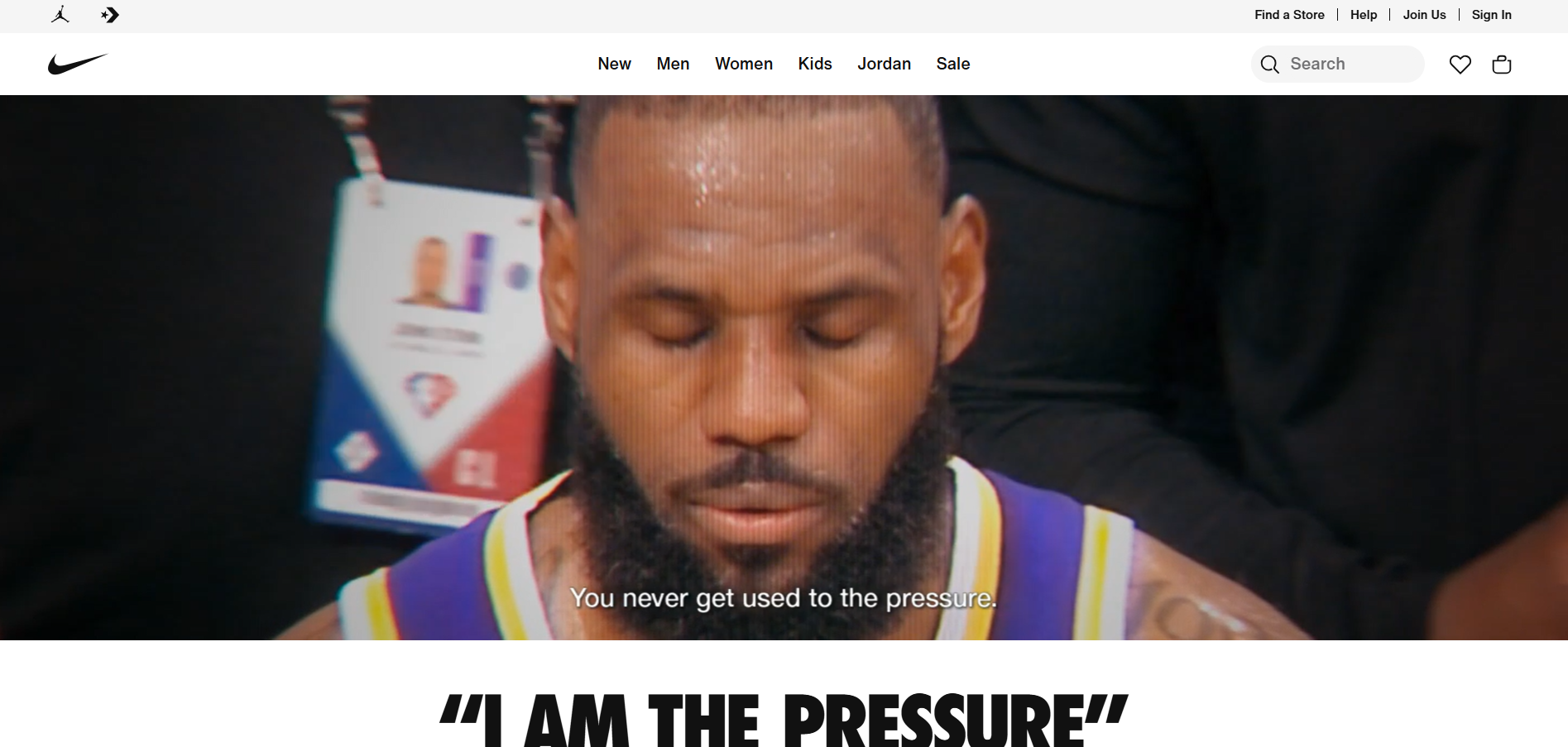
Nike’s design puts user experience first. You can easily browse different shoe categories and collections. The page has clear call-to-action buttons that guide you through the shopping process.
Product descriptions on Nike’s page focus on benefits rather than just technical details. This helps you understand how the shoes will improve your performance or style.
Nike includes interactive elements to keep you engaged. You might see 360-degree product views or videos showing the shoes in action. These features give you a better idea of how the products look and feel.
- Dynamic product filtering
- Customer reviews and ratings
- Size guide tool
- Wishlist feature
- Personalization options
Warby Parker’s seamless UX
Warby Parker‘s landing page shows off great design and easy use. The page looks clean and modern. It has big, clear photos of glasses from different angles. This helps you see what the glasses look like up close.
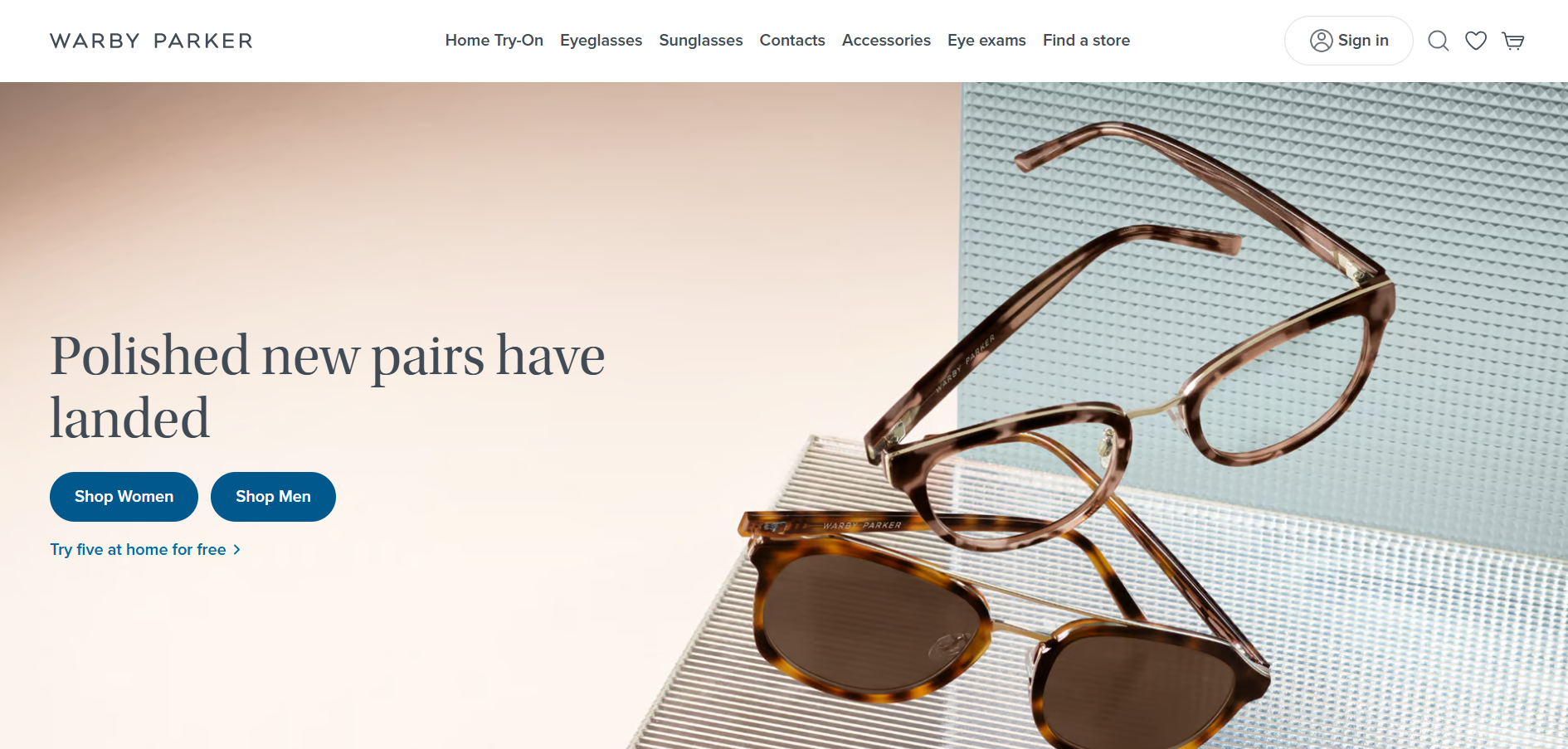
The page is simple to use. You can find what you need quickly. There’s a quiz to help you pick frames that fit your style. This makes shopping for glasses online feel more personal.
Warby Parker includes helpful info about each pair of glasses. You can see details like size, color, and materials. There are also customer reviews to help you decide.
The page has some cool features that make shopping easier:
- Virtual try-on tool
- Home try-on program info
- Easy prescription upload
- Free shipping and returns mentioned
- Clear pricing details
Casper’s unique storytelling approach
Casper uses a clever storytelling approach on their ecommerce landing page design. They grab your attention with a bold headline that makes you curious. The page tells a story about getting better sleep with their products.
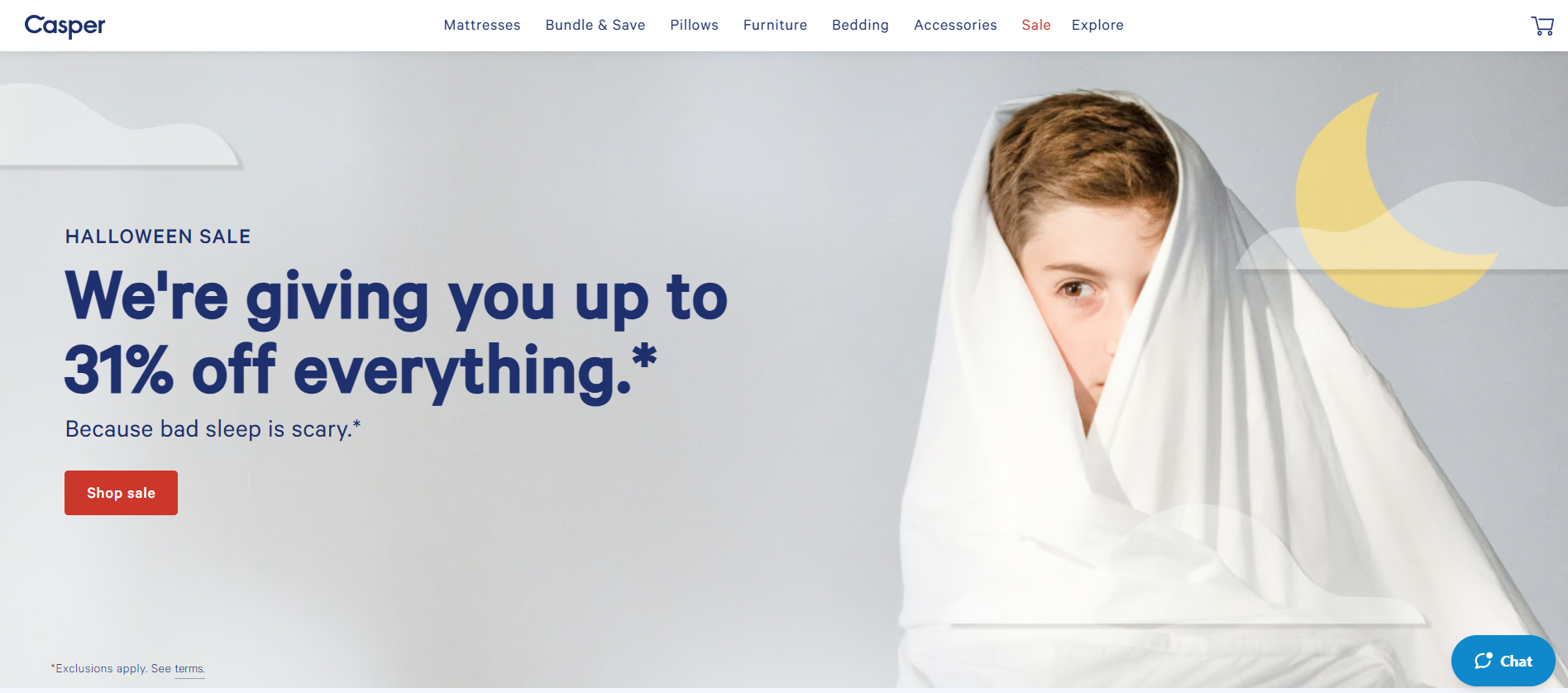
Casper uses simple language to explain complex sleep science. They show how their mattresses solve common sleep problems. This makes it easy for you to see the benefits.
The page uses a mix of product images and lifestyle photos. This helps you picture yourself using the mattress in your own home. Casper also adds customer reviews to build trust.
They break up the page with fun illustrations and icons. This keeps you interested as you scroll. The design is clean and focused on the main message.
Other features of Casper’s landing page:
- Sleep quiz to find the right mattress
- Free shipping and returns highlighted
- 100-night trial period prominently displayed
- Clear pricing information
- Easy-to-use size selector
Zara’s easy-to-navigate interface
Zara‘s ecommerce landing page design showcases a clean and minimalist approach. The site uses a grid layout with large, high-quality images that catch your eye. You’ll find the main navigation menu at the top, making it easy to browse different categories.
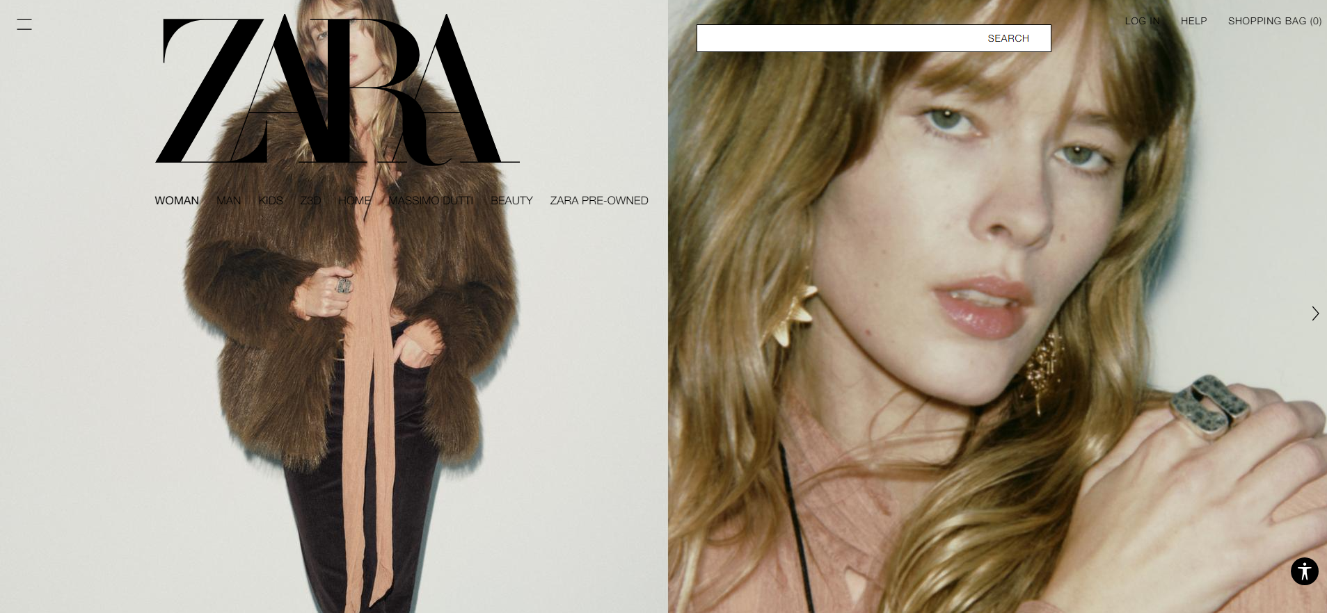
The search bar is prominent, allowing you to quickly find specific items. Zara’s homepage features a rotating banner with new arrivals and seasonal collections. This keeps the content fresh and exciting for returning visitors.
Product pages are simple yet effective. You’ll see multiple product images, size options, and an Add to bag button. Zara also includes a Share feature, encouraging social media engagement.
The mobile version of Zara’s site is equally user-friendly. It adapts well to smaller screens, maintaining the same sleek design and easy navigation.
Some other features of Zara’s ecommerce landing page design include:
- Wishlist functionality
- Quick view option for products
- Size guide
- Product recommendations
- Newsletter signup
Etsy’s personalized recommendations
Etsy uses smart product suggestions to make your shopping easier. When you browse items, Etsy shows you related products you might like. This helps you find more things that match your style.
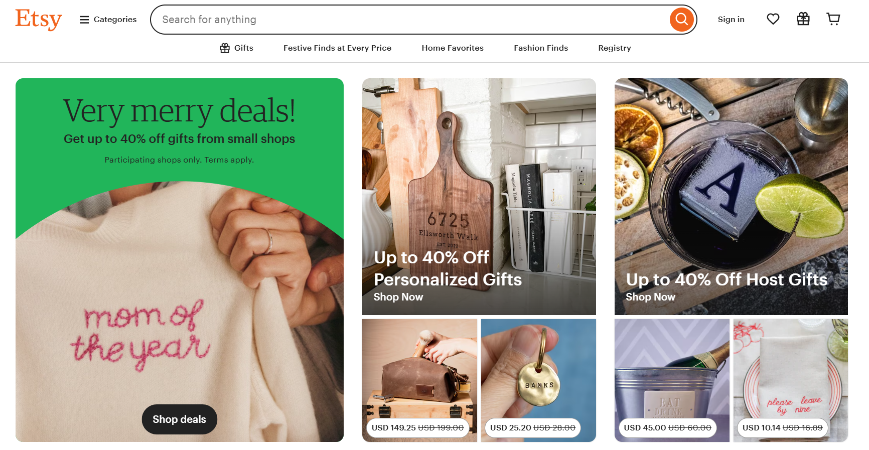
The site looks at what you’ve viewed and bought before. It then picks items that fit those interests. You’ll see these recommendations as you scroll through listings. They often appear in a row labeled You may also like or Similar items you may enjoy.
Etsy also sends emails with personalized picks. These emails show new items based on your past searches and purchases. This keeps you connected to the site and helps you discover new sellers.
- Custom product carousels
- Tailored email suggestions
- Recently viewed section
- Curated collections based on your tastes
- Gift guides matched to your interests
Apple’s clean and modern aesthetic
Apple‘s website shows off their sleek product designs. The pages use lots of white space and minimal text. This makes the products stand out.
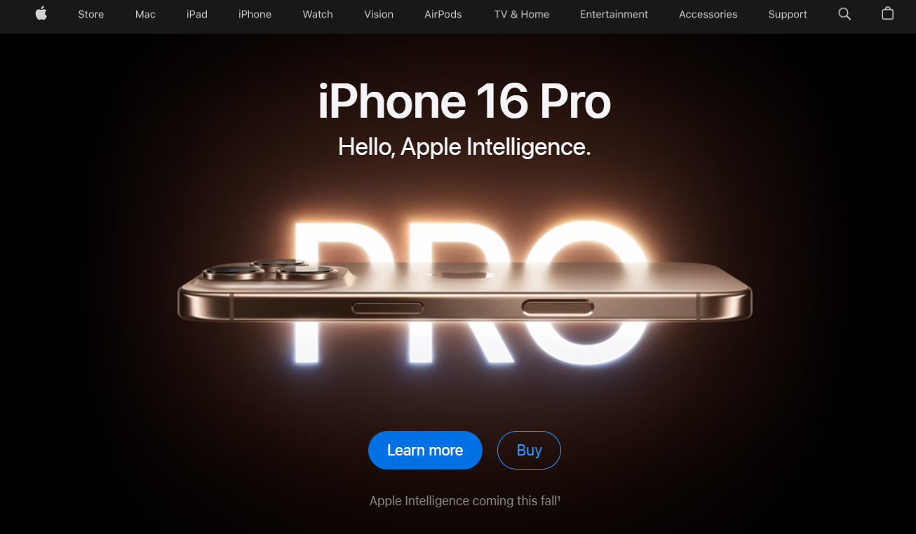
You’ll see big, high-quality photos of iPhones, MacBooks, and other devices. The images take up most of the screen. Product names and short descriptions appear in simple fonts.
Apple uses a black and light gray color scheme. This gives the site a classic look. The design stays consistent across all pages.
Key features of Apple’s landing pages:
- Large product images
- Minimal text
- Black and gray color scheme
- Simple navigation
- Clear call-to-action buttons
- Product comparison tools
- Customer reviews
- 360-degree product views
H&M’s fast-loading pages
H&M‘s ecommerce landing page design focuses on speed and simplicity. The pages load quickly, even on slower internet connections. This helps keep shoppers engaged and reduces bounce rates.
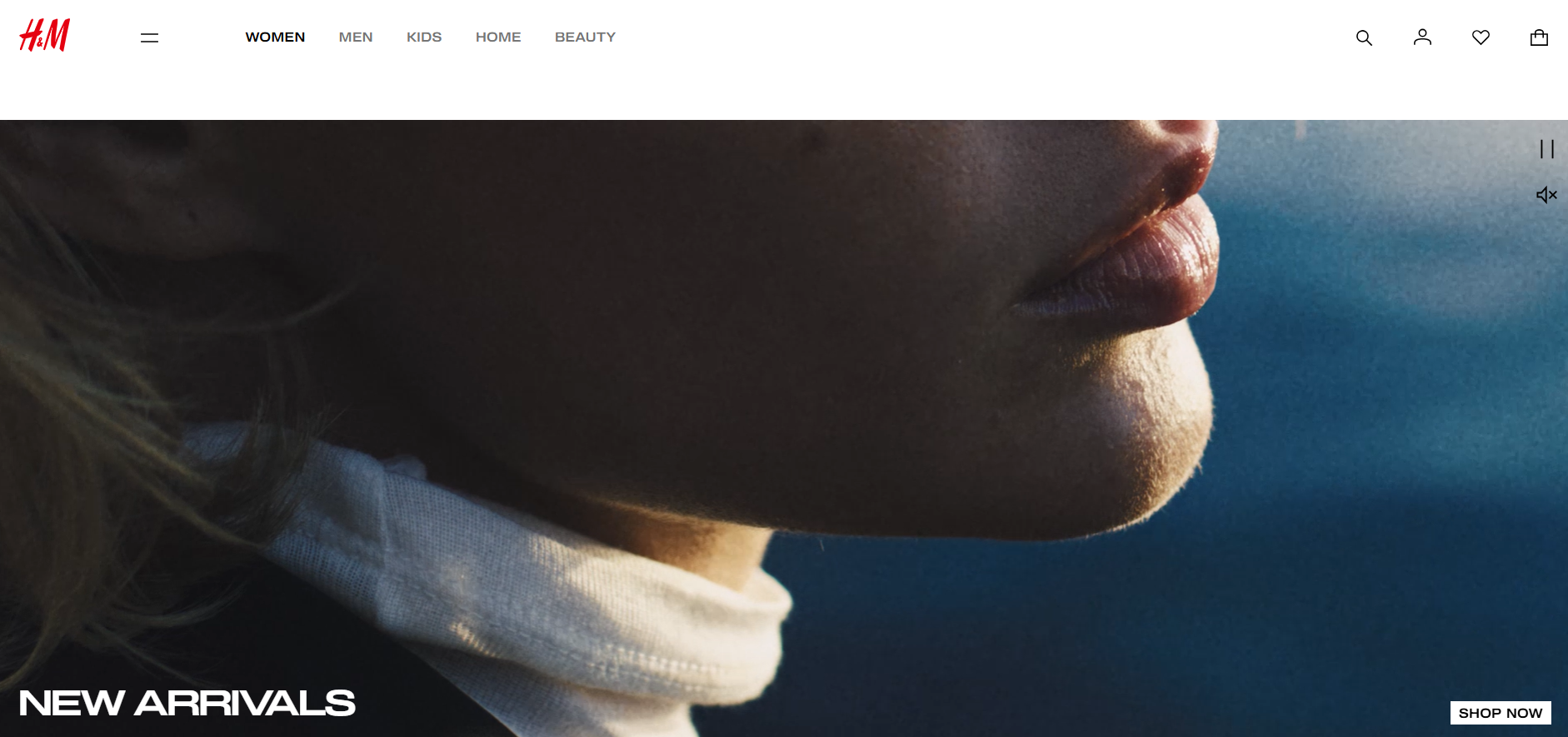
The layout is clean and uncluttered. You’ll find large, high-quality product images that load progressively. This means you can see the basic image outline right away, with details filling in as you scroll.
Product descriptions are short and to the point. They highlight key features without overwhelming you with text. Prices are clearly displayed, making it easy to compare items at a glance.
H&M uses a sticky header with a search bar and cart icon. This lets you quickly find what you’re looking for or check out at any time. The menu is simple and easy to navigate.
Other features of H&M’s fast-loading pages include:
- Minimal animations
- Optimized images
- Streamlined checkout process
- Mobile-friendly design
- Quick view options for products
Blu Dot’s minimalist design
Blu Dot‘s ecommerce landing page shows how simple design can be powerful. The page uses lots of white space to make products stand out. You’ll see big, clear photos of furniture against plain backgrounds.
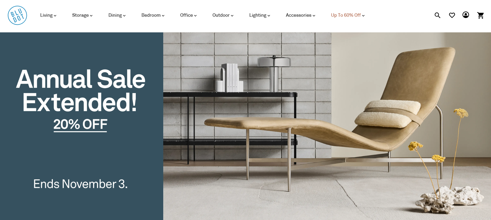
Product names and prices are easy to read. Short descriptions tell you what’s special about each item. The menu at the top is simple, helping you find what you want fast.
Blu Dot uses a clean layout that puts the focus on their modern furniture. Colors are mostly neutral, matching their style. The Add to Cart button is bright and easy to spot.
You can quickly switch between product views to see different angles. Customer reviews are right there to help you decide. The page loads fast, making shopping smooth on any device.
- Grid layout for easy browsing
- High-quality product images
- Minimal text for quick scanning
- Consistent brand colors
- Mobile-friendly design
Bonobos’ effective call-to-action
Bonobos uses smart design on their product pages to boost sales. They show clear photos of clothes from different angles. This helps you see how items look.
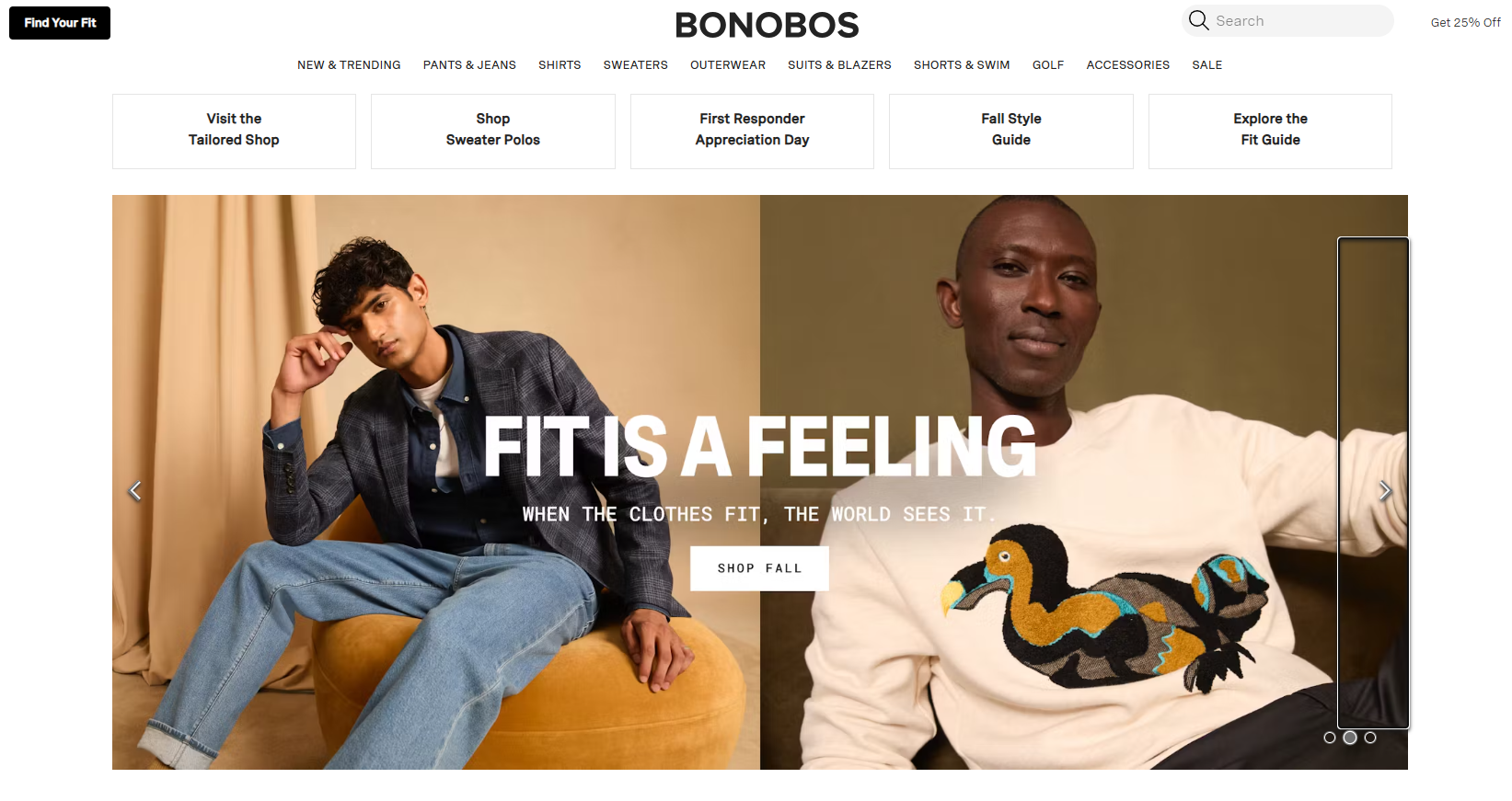
The pages have simple layouts. You can easily find sizes and colors. Bonobos adds helpful details about fit and fabric. This gives you confidence in what you’re buying.
Their call-to-action buttons stand out. The Add to Cart button is big and blue. It’s easy to spot and click.
Bonobos includes customer reviews. These show real opinions from other shoppers. This can help you decide if an item is right for you.
The site offers free shipping and returns. This takes away worry about trying new clothes. You’ll see this info near the buy button.
Other features on Bonobos product pages:
- Zoom-in photos
- Size guide
- Fit details
- Care instructions
- Complete the look suggestions
Slack’s engaging visuals
Slack‘s ecommerce landing page design uses eye-catching images to show off its product features. You’ll see detailed screenshots of the Slack interface in action. These visuals help you quickly grasp how the app works and what it can do for your team.
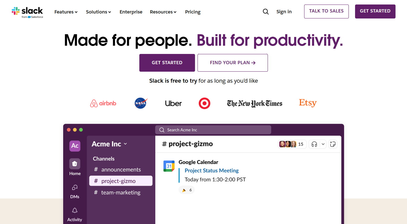
The page uses a mix of product shots and lifestyle images. You’ll spot photos of people using Slack in office settings. This helps you picture how the tool fits into real work situations. The visuals are clean and modern, matching Slack’s brand style.
Slack adds icons next to key features. These simple graphics make it easy to scan the page and find important info. You’ll also see short video clips that show Slack in use. These help bring the product to life without slowing down the page.
- Clear call-to-action buttons
- Testimonials from happy customers
- Simple pricing table
- FAQ section for quick answers
- Mobile-friendly design
Target’s mobile optimization
Target‘s mobile site puts shoppers first. The homepage shows big, clear product images you can easily tap. As you scroll, you’ll see deals and popular items grouped by category. This makes finding what you want simple.
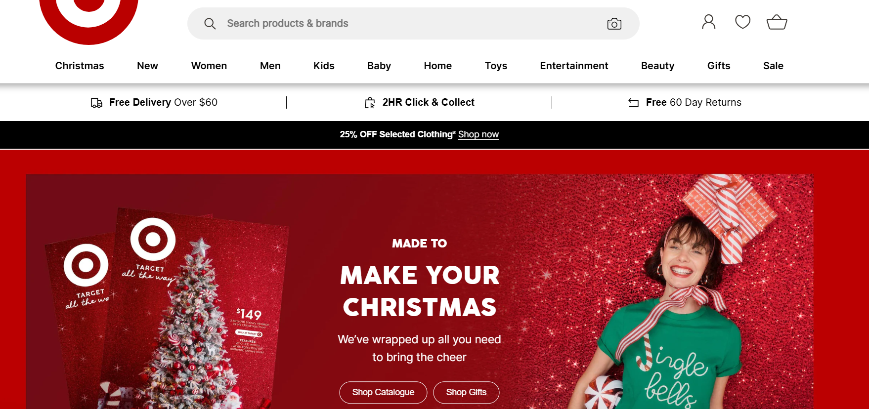
The search bar stays at the top as you browse. You can quickly look up specific products without going back to the homepage. Product pages have large photos and clear pricing. You’ll also see customer reviews to help you decide.
Target makes checkout easy on mobile. You can save your payment info for faster buying next time. The site remembers your past orders too. This lets you quickly reorder things you buy often.
- Clean, uncluttered design
- Fast-loading pages
- Easy navigation between sections
- Mobile-friendly product filters
- One-tap add to cart buttons
Sephora’s product showcase
Sephora‘s ecommerce landing page design shines in its product showcase. You’ll find clear, high-quality images that show off each item from multiple angles. The layout is clean and easy to navigate.
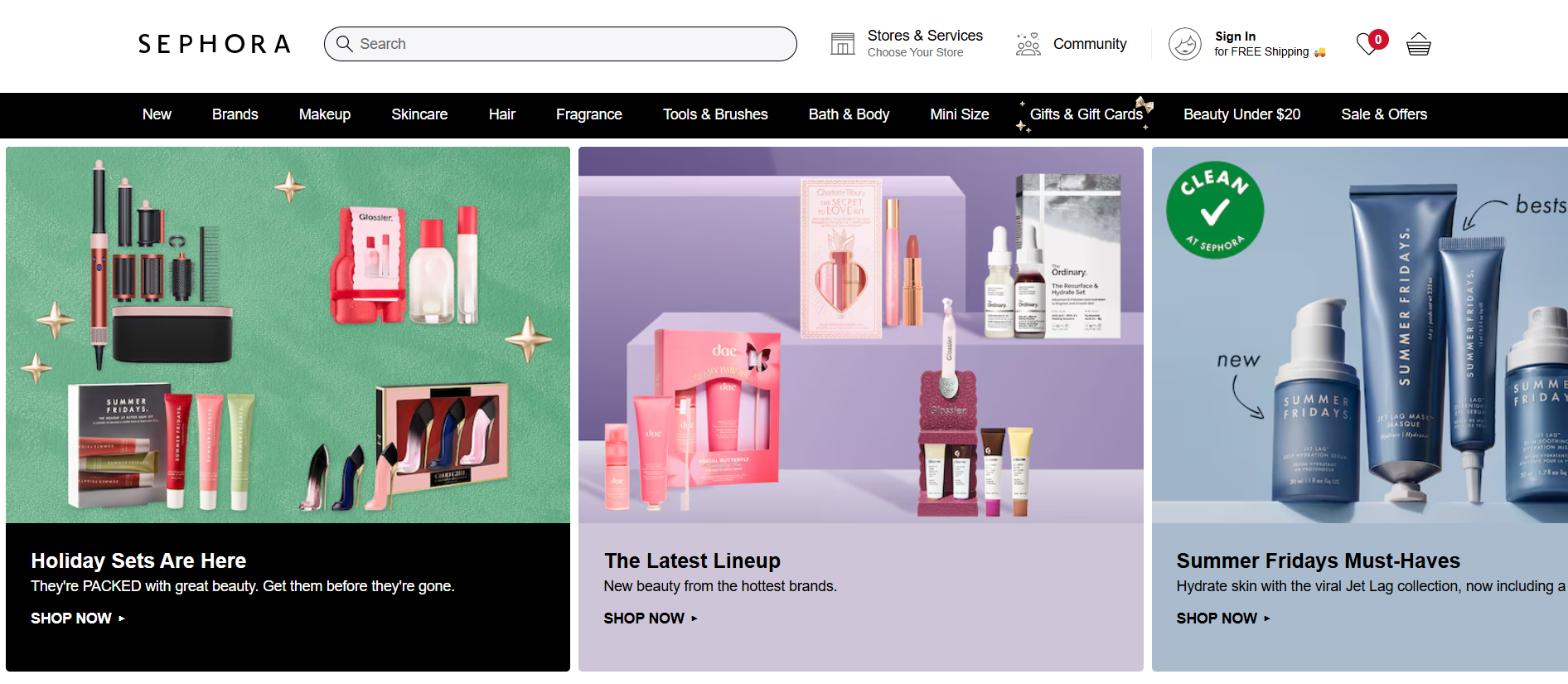
Product descriptions are short and to the point. They focus on what the product does for you, not just its features. You can quickly see key details like color options and size.
Customer reviews are front and center. You can read what others think before you buy. This helps you feel more sure about your choice.
The page has a smart layout with tabs. You can jump to sections like “How to Use” or “Ingredients” without scrolling. This makes finding info fast and simple.
Sephora uses video content well. Short clips show how to apply makeup or use skincare items. This gives you a better idea of what to expect.
Other features on Sephora’s product pages include:
- Color swatches for makeup
- Quick Look pop-ups
- Add to Basket button always visible
- Related product suggestions
- Free sample offers with purchase
Figma’s user-friendly experience
Figma makes creating ecommerce landing pages simple. You can design pages quickly with its easy-to-use tools. The platform lets you work together with others in real-time, which speeds up the process.
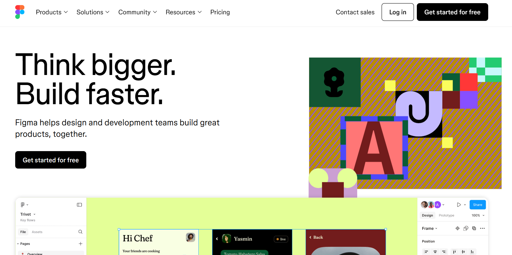
Figma offers many ready-made components for ecommerce sites. You can find things like product cards, shopping carts, and checkout forms. These save you time and help keep your design consistent.
The software also makes it easy to create responsive layouts. This means your landing pages will look good on all devices. You can test how they’ll appear on phones, tablets, and computers right in Figma.
With Figma, you can easily update your designs. If you change one element, it updates everywhere. This keeps your landing pages looking neat and professional.
Other helpful features in Figma include:
- Design libraries
- Prototyping tools
- Version history
- Comment and feedback options
- Easy file sharing
Wayfair’s extensive use of filters
Wayfair helps you find what you need with its many filter options. You can narrow down products by price, color, size, and more. This makes shopping easier when you browse their large catalog.
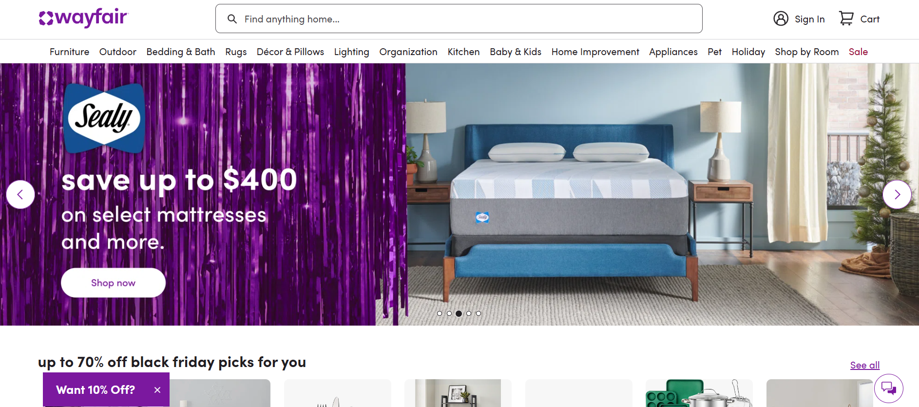
The filters are easy to use. You can quickly check boxes or use sliders to set your preferences. This saves you time as you search for the perfect item.
Wayfair’s filters are smart. They change based on the product category you’re looking at. For example, when shopping for furniture, you’ll see options for material and style.
You can also use multiple filters at once. This lets you find exactly what you want without scrolling through pages of products.
- Clear filter labels
- Mobile-friendly design
- Price range sliders
- Color swatches
- Customer rating filters
Square’s subtle animation effects
Square‘s landing page uses gentle animations to make browsing smoother. When you scroll, elements fade in softly. Buttons light up as you move your mouse over them. These small touches make the page feel alive without being distracting.
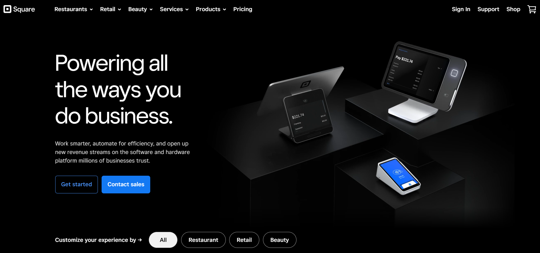
The main hero image slides in from the side when the page loads. This draws your eye to the key message right away. As you scroll down, product images appear with a slight bounce. This adds a playful feel to the page.
Square’s animations are quick and smooth. They don’t slow down the page or get in the way. Instead, they guide you through the content naturally. This helps you focus on the important parts of the page.
- Smooth scroll animations
- Fade-in effects for text and images
- Subtle hover animations on buttons
- Sliding transitions between sections
- Micro-interactions on form fields
Everlane’s transparency in design
Everlane takes a unique approach to ecommerce landing page design. They show you exactly how much it costs to make each product. You’ll see a breakdown of materials, labor, transportation, and markup right on the page.
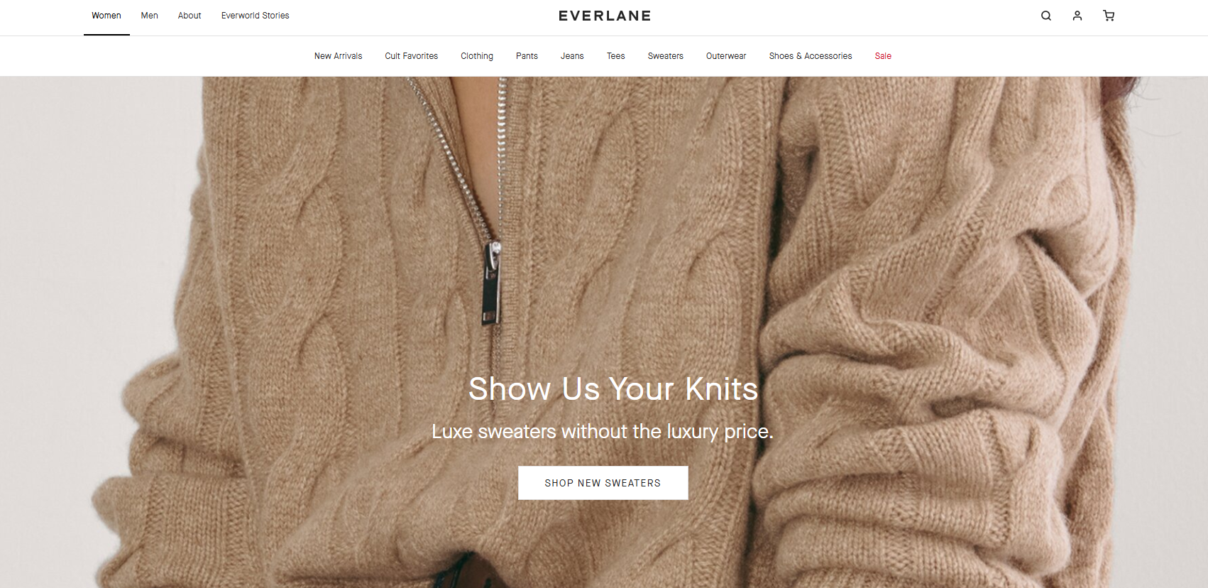
This transparency extends to their factory partners too. Everlane shares details about where items are made. You can learn about working conditions and ethical practices.
The design is clean and simple. Product photos are high-quality but not overly styled. Descriptions focus on materials and construction. This fits with Everlane’s radical transparency brand image.
Pricing info is front and center. You see the true cost alongside Everlane’s price. This builds trust and shows value.
Other key features of Everlane’s design:
- Minimalist layout
- Easy size guides
- Customer reviews
- Choose What You Pay sales model
- Sustainability info for materials
IKEA’s innovative furniture explorer
IKEA‘s furniture explorer offers a fresh take on online shopping. You can browse products in a virtual home setting, making it easier to picture items in your own space. The explorer uses 3D models and lets you move around rooms to view furniture from different angles.
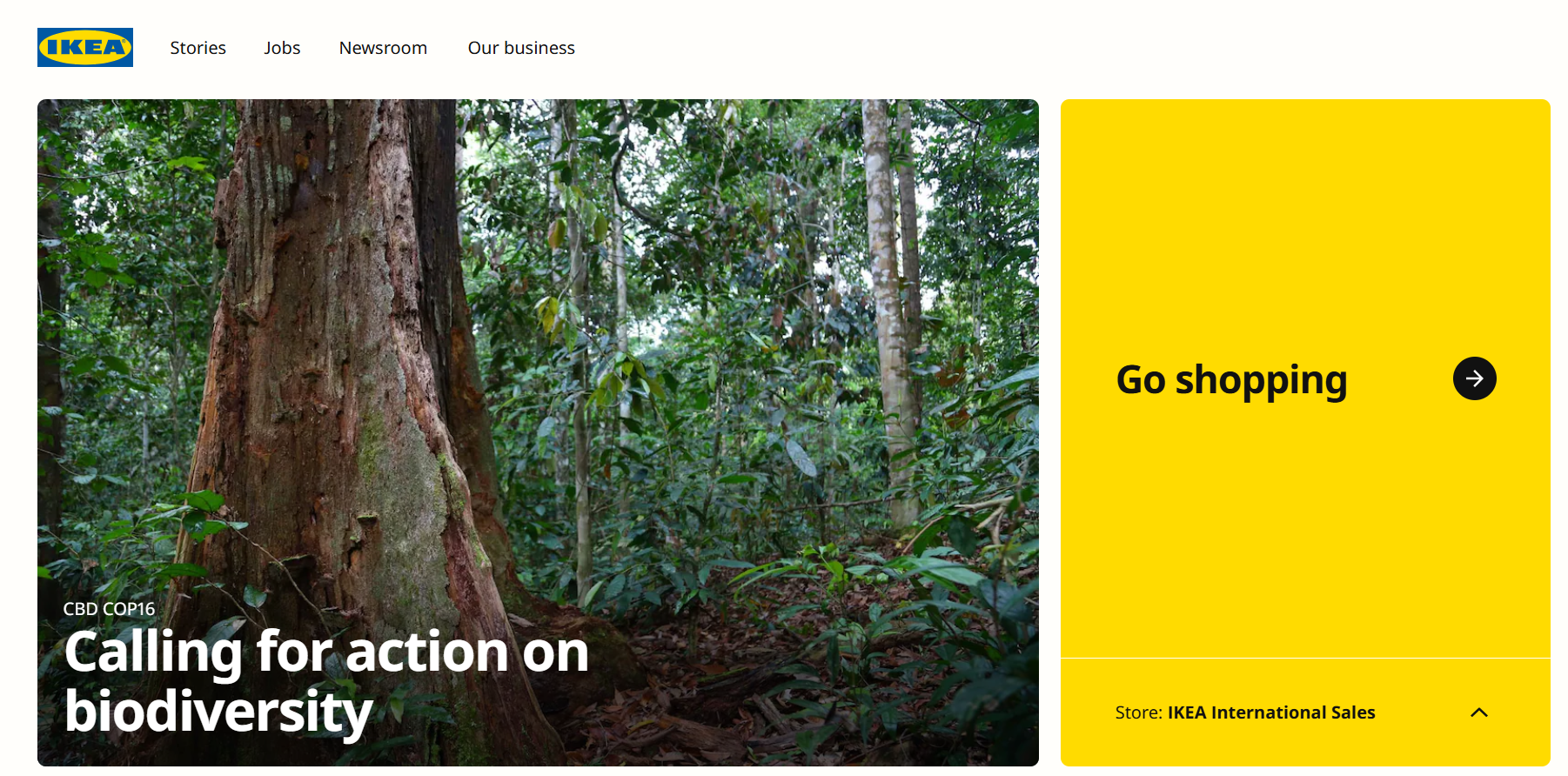
The interface is simple to use. You click and drag to move through rooms, and tap on items to see details. Product info pops up with clear descriptions, prices, and Add to cart buttons. This setup helps you make quick decisions as you explore.
Ikea includes helpful features in the explorer:
- Room style filters
- Measurements tool
- Color customization
- Augmented reality previews
- Suggested pairings
- Customer reviews
These tools make the shopping experience fun and practical. You can mix and match items to create your ideal room setup before buying.
ASOS’s customer-first approach
ASOS puts you at the center of its ecommerce landing page design. The site makes it easy to find what you’re looking for with a clean layout and smart search features.
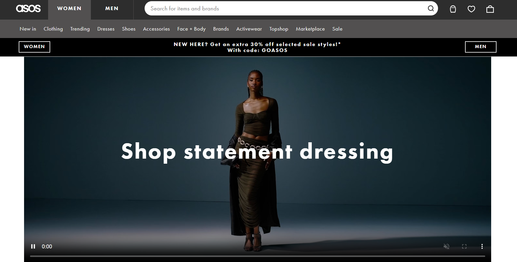
You can browse through over 850 brands quickly. ASOS shows you clear product images and details to help you decide. The site uses lifestyle photos to give you a better idea of how items look.
ASOS makes shopping fun with style tips and outfit ideas. You can see customer reviews to help you choose. The site also suggests items that go well together.
When you’re ready to buy, ASOS offers many payment options. You can easily track your order and return items if needed. The site works well on phones, too, so you can shop anywhere.
- Clear product categories
- Zoom feature for close-up views
- Size guides and fit information
- Wishlist function
- Free delivery and return options
Create your online store in minutes!
Looking to sell online? Develop and launch your store with 10Web AI Ecommerce Website Builder.
Building your ecommerce landing page design with 10Web
10Web offers an ideal solution for crafting a powerful ecommerce landing page, combining the capabilities of its AI Website Builder 2.0 with advanced ecommerce tools. With 10Web’s AI-driven technology, you can create a high-conversion landing page tailored specifically to your online store’s needs in just minutes. Here’s how 10Web can support your ecommerce landing page design and functionality:
- AI Ecommerce Website Builder: 10Web’s AI Website Builder enables rapid and fully customizable page creation. Start with a quick onboarding where AI gathers information about your business, helping generate a structured outline and optimal sections like product highlights, customer testimonials, and promotions.
- WooCommerce integration: Seamlessly integrate with WooCommerce to access powerful selling features, such as personalized product pages, flexible payment options, and automated tax and shipping settings. This makes it easy to manage your store from the same platform, saving time and enhancing functionality.
- Pre-designed section templates: Choose from over 60 pre-designed templates specifically designed for ecommerce landing pages. These templates are tailored for key landing page elements such as headers, hero sections, product showcases, and call-to-action areas.
- Ultimate UI kit for styling: Customize colors, fonts, and layouts to align with your brand, using 10Web’s Ultimate UI Kit for seamless visual cohesion.
- 10Web Booster for speed optimization: Boost your site’s load time automatically to increase conversions and SEO rankings, essential for ecommerce success.
- Real-time analytics and customer insights: Track product performance, view customer behavior, and analyze sales directly on your dashboard.
Step-by-step guide to creating your ecommerce landing page on 10Web
- Sign up for free on 10Web: Start by signing up on 10Web’s platform to get access to its AI Website Builder and ecommerce tools.
- Provide business information: During onboarding, enter details about your brand and store goals. The AI will then generate a draft outline for your landing page.
- Outline review and customization: Review and refine the AI-generated layout, adding or removing sections as needed to fit your landing page goals.
- Customize styles and layouts: Use the Ultimate UI Kit to adjust visual elements like color schemes and fonts.
- Set up WooCommerce: Integrate WooCommerce for store management, adding products and configuring payment and shipping options.
- Optimize with 10Web Booster: Automatically enhance loading speeds and performance to ensure a smooth customer experience.
- Publish and analyze: Launch your landing page, and track analytics to understand visitor engagement, product interest, and customer insights.
With 10Web, you can create a professional, high-performance ecommerce landing page that supports conversions and offers customers an enjoyable shopping experience.
Conclusion
Creating an effective ecommerce landing page is important for turning visitors into buyers. By focusing on key elements—like compelling headlines, high-quality visuals, clear calls-to-action, and trust-building features such as customer reviews—you can build a page that not only looks appealing but also drives conversions. Minimalist layouts and mobile-friendly design further enhance usability, catering to the growing number of mobile shoppers.
Whether you’re launching a new product or enhancing existing pages, a well-designed landing page can set your store apart, attract more customers, and increase sales. By following these principles and drawing inspiration from the real-world examples discussed, you can create landing pages that make a lasting impact and support your ecommerce success.
Create your online store in minutes!
Create your online store in minutes!
Develop and launch your store with 10Web AI Ecommerce Website Builder.