
In a highly competitive space, a user-centric ecommerce UX design can set your store apart and drive more conversions.
This article guides you through essential ecommerce UX design principles, showing you how to build an online experience that not only attracts customers but also keeps them engaged and satisfied.
With practical insights on intuitive navigation, mobile optimization, and checkout streamlining, you’ll discover easy steps to enhance your store’s usability, increase customer loyalty, and optimize for conversions.
FAQ
What are some examples of effective ecommerce design?
Effective ecommerce design includes intuitive navigation, clear product categorization, high-quality images, streamlined checkout processes, and responsive design for mobile devices. Examples include sites like Amazon, Shopify, and Zappos, which prioritize ecommerce user experience through easy access to products and a seamless shopping journey.
What are the best practices for ecommerce design?
Best practices for ecommerce design include:
- Simplifying navigation and search functionality.
- Ensuring fast load times.
- Providing detailed product descriptions and reviews.
- Implementing a secure and straightforward checkout process.
- Using clear calls to action (CTAs) and maintaining a consistent visual hierarchy.
What is a well-known case study on ecommerce design?
One well-known case study is the redesign of the Etsy website. The company focused on improving user experience by enhancing search functionality, simplifying the checkout process, and making product pages more visually appealing. This led to increased user engagement and higher conversion rates.
What defines the best ecommerce design?
The best ecommerce design is defined by its ability to create a seamless, enjoyable shopping experience that meets user needs. It should be visually appealing, easy to navigate, and optimized for conversions while providing essential information clearly and effectively.
What are common design patterns in ecommerce?
Common design patterns in ecommerce include:
- Grid layouts for product listings.
- Sticky navigation bars for easy access.
- Modal windows for quick views of products.
- Infinite scrolling or pagination for browsing products.
- Breadcrumbs to enhance navigation.
How does UX design apply to online shopping?
UX design applies to online shopping by ensuring that the entire user journey—from product discovery to checkout—is intuitive and satisfying. It involves understanding user behavior, addressing pain points, and creating interfaces that facilitate easy navigation and decision-making.
Why is user interface important for online stores?
The user interface (UI) is crucial for online stores because it directly affects how users interact with the website. A well-designed UI enhances usability, encourages exploration, and ultimately drives conversions. A positive UI experience can build customer trust and loyalty, leading to repeat business.

Create your online store in minutes!
Looking to sell online? Develop and launch your store with 10Web AI Ecommerce Website Builder.
Ecommerce UX design principles and tips
Good ecommerce UX helps customers shop easily and builds trust in your brand. It focuses on making sites simple to use and meeting shoppers’ needs.
User-centric design principles
Put your customers first when designing your online store. Make it easy for them to find products, learn about them, and complete purchases.
Use clear menus and search tools. Show big, high-quality photos of your items. Write product details that answer common questions. Add customer reviews to help shoppers decide.
Make your checkout process quick and simple. Only ask for needed info. Give shoppers a guest checkout option. Show order totals and shipping costs upfront. Offer several payment choices.
Test your site with real users to find and fix problems. Watch how they shop and listen to their feedback. Keep improving based on what you learn.
Understanding the ecommerce journey
Know the steps shoppers take on your site. They might start by browsing, comparing items, adding products to the cart, and checking out. Or they may search for a specific product and buy it right away.
Map out these paths to make each step smooth. Help ease users onto other potential paths. For example, add a “Related items” section on product pages. Put a clear “Add to cart” button near product info. Show a progress bar during checkout.
Think about what shoppers need at each point. New visitors may want to learn about your brand. Returning customers might look for deals or quick reorders.
Choice overload
Don’t overwhelm shoppers with too many choices or info. This can make deciding hard. Instead, help them focus on what matters most.
Group similar products together. Use filters to narrow options. Show key details first, like price and ratings. Hide less important info behind “See more” links.
Guide shoppers with smart defaults and suggestions. Pre-select common options. You can try recommending products based on their browsing, but always let users change these picks easily.
Use visual cues to highlight important stuff. Make sale prices stand out. Show low stock warnings. Use progress bars in forms.
Optimized performance for a solid UX foundation
A fast, smooth site is key for good UX. Slow loading frustrates shoppers and may drive them away. Aim for pages that load in 2-3 seconds or less. The right hosting platform can easily put this goal within reach for even the least technically inclined ecommerce owners.
Use small image files that still look good. Enable browser caching so repeat visitors load pages faster. Put your content on a CDN to speed up loading worldwide.
Make sure your site works well on all devices. Use responsive design so it looks good on phones, tablets, and computers. Test on different screen sizes and browsers.
Homepage and site navigation
A well-designed homepage and smart navigation are key to a good online shopping experience. They help customers find what they want and make buying easy.
Layout and information hierarchy
Your homepage should show off your best products right away. Put top sellers, deals, and new items front and center. Use big, clear pictures and short, catchy text to grab attention.
Break up the page into sections. Group similar things together. For example, put all women’s clothes in one area and men’s in another. This makes it simple for shoppers to scan and find what they need.
Use white space to avoid a cluttered look. Leave room between sections so each part stands out. Make important buttons like Add to Cart or Shop Now big and easy to spot.
Menu design and search functionality
Your menu is like a map of your store. Keep it simple and clear. Use words shoppers know, not fancy terms. Put your main product types at the top level. Then, break those down into more specific groups.
Add a faceted search function that’s easy to see and use. Put it near the top of every page. Make sure it can handle misspellings and suggest popular searches as people type.
For big stores, add filters to help narrow down choices. Let shoppers pick things like size, color, or price range. This helps them find exactly what they want faster.
Ensuring intuitive user flow
Think about how people shop and make your site match. Put things where folks expect to find them. Keep the same layout on all pages so shoppers don’t get lost.
Make it clear what to do next. Use arrows or buttons to guide people through your site. Show them related items and upsells they might like based on what they’re looking at.
Test your site with real shoppers. Watch how they use it and fix any spots where they get stuck. Keep tweaking until it feels natural and easy to use.
Product discovery and browsing
Good product discovery and clear browsing choices help shoppers quickly find what they want. This leads to more sales and happy customers. Let’s look at some key parts of this process.
Category page optimization
A well-organized category page makes shopping easier. Group similar items together. Use clear labels for each group. Put popular items near the top.
Show how many products are in each category. This helps shoppers know what to expect. Use images to make categories more appealing.
Add a short description for each category. This gives shoppers a quick overview. It can also help with search engine rankings.
Make sure the page loads fast. Slow pages frustrate shoppers and hurt sales. Test your category pages on different devices.
Filter and sort mechanisms
Filters and sorting tools help shoppers narrow down choices. Common filters include price, color, size, and brand. Make these easy to find and use.
Let shoppers pick more than one filter at a time. Show how many products match each filter. This saves time and reduces frustration.
Offer different ways to sort products. Options like price, newest, and best-selling are helpful. Make the current sort order clear to avoid confusion.
Remember to keep mobile users in mind. Filters should work well on small screens, too. Consider using a slide-out menu for filters on mobile.
Product thumbnails and quick views
Good product thumbnails grab attention and give key info. Use optimized, high-quality images that show the product clearly without slowing down page load speeds. Add hover effects to show extra details.
Include important info like price and ratings on the thumbnail. This helps shoppers compare items quickly. Use consistent layouts for all thumbnails.
Quick view features let shoppers see more without leaving the page. Include larger images, key features, and an Add to Cart button. Make sure quick views work well on mobile, too.
Consider adding a Compare feature for similar products. This can help shoppers make decisions faster. Just don’t overwhelm them with too much info at once.
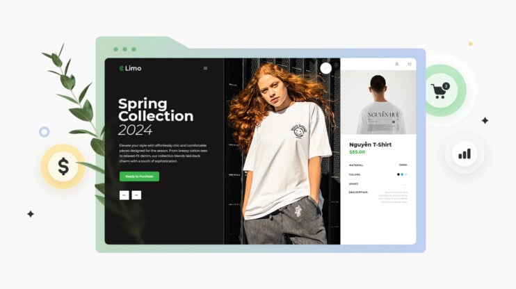
Product pages that convert
Good product pages help customers make buying choices. They show items clearly and give useful details. Here’s how to make product pages that turn visitors into buyers.
High-quality product images
Product photos are key. Use big, sharp pictures that show the item from many angles. Let shoppers zoom in to see small details. Include photos of the product being used. This helps buyers picture themselves with it.
Add videos to show the product in action. Short clips can explain features better than words alone. For clothes or accessories, include shots of models wearing them. This gives a sense of size and fit.
Use white backgrounds to keep focus on the product. Make sure colors look true to life so customers know what to expect. Poor photos can make even great products seem cheap or fake.
Detail-rich product descriptions for users and search engines
Write clear, full product descriptions. List key features and specs. Explain how the product solves problems or makes life better. Use bullet points for easy scanning.
Include all important details like size, weight, color options, and materials. Mention any special care instructions. Be honest about any drawbacks.
Use words shoppers might search for. This helps your page show up in search results. But keep the text natural, not stuffed with keywords.
Answer common questions in the description. This can cut down on customer service calls. It also helps buyers feel more sure about their choice.
Great product descriptions naturally include terms that searchers use to find sought-after items. This is an excellent way to encourage visibility in search engine results.
Social proof and reviews
Show what other buyers think. Leverage user-generated content and let customers leave star ratings and written reviews and testimonials. Display the average rating near the top of the page.
Include photos or videos from real customers using the product. This builds trust and gives a real-world view of the item.
Highlight top reviews that speak to key product benefits. But don’t hide negative feedback. Honest reviews, good and bad, help buyers make informed choices.
Add trust symbols like security badges or awards. These show that your site is safe and that your products are of good quality. You can also display how many items you’ve sold to show popularity.
Streamlined shopping cart experience
A well-designed shopping cart can boost sales and keep customers happy. Smart features and smooth processes help shoppers feel confident and finish their purchases.
Cart design and functionality
The shopping cart should be easy to find and use. Put a cart icon in the top right corner of every page. Show the number of items in the cart next to the icon. Let shoppers add items without leaving the product page.
Make it simple to edit cart contents. Include clear Add, Remove, and Update buttons. Show product images, names, prices, and quantities. Add a Continue Shopping button to let users keep browsing.
Use a progress bar to show where shoppers are in the checkout process. This helps them know what to expect next. Keep the layout clean and uncluttered to avoid overwhelming users.
Promotions and upselling opportunities
The cart page is a great place to boost sales. Show related products or popular add-ons. Use phrases like “Customers also bought” to suggest items.
Offer free shipping for orders over a certain amount. Tell shoppers how much more they need to spend to get free shipping. This can encourage larger purchases.
Add a coupon code field to the cart page. Make it easy for shoppers to apply discounts. Show the savings clearly to make customers feel good about their purchase.
Minimizing cart abandonment
Cart abandonment happens when shoppers add items but don’t buy. Cart abandonment rates are sky-high, with roughly 70% of all ecommerce visitors eventually leaving before purchasing. To prevent this, be upfront about costs. Show shipping fees and taxes early in the process.
Allow guest checkout. Some people don’t want to create an account. Give customers the option to buy without signing up.
Use clear error messages. If there’s a problem with payment or shipping info, explain it simply. Make it easy for shoppers to fix mistakes.
Add a Save for Later feature. This lets indecisive shoppers come back to finish their purchase. Send reminder emails about saved items to bring customers back.
Checkout optimization strategies
A smooth checkout process can boost sales and customer satisfaction. Key areas to focus on include simplifying steps, offering payment options, giving choices for account creation, and building trust.
Simplifying the checkout process
Break the checkout into clear steps. You want customers to feel assured that they are making a purchase that meets expectations from an ecommerce store that provides transparency during a secure checkout process.
- Use progress bars to show how far along customers are.
- Remove extra fields and only ask for needed info. Auto-fill forms when possible to save time.
- Group related fields together. For example, put all shipping info in one section.
- Use descriptive labels and helpful hints for each field.
- Offer a “same as billing” option for shipping to cut down on data entry.
- Let shoppers review and edit their orders before paying.
Make it easy to go back and change items or details. Give users a clear path out of the shopping cart to easily navigate the checkout process and ensure their orders are placed correctly.
Payment methods and security
Give shoppers many ways to pay. Accept credit cards, PayPal, Apple Pay, and other popular options.
Show all payment choices clearly with logos or icons.
Use strong encryption and security badges to protect data. Display trust symbols like Norton or McAfee seals.
Ensure the ecommerce store is protected by SSL. This adds a lock icon in the browser bar to show the site is secure.
Be clear about fees and taxes. Break down all costs before asking for payment info. Avoid surprise charges at the end that might make people think twice about making the purchase.
Guest checkout vs. member checkout
Let people check out as guests without making an account. This speeds things up for new or one-time buyers.
Place the guest option first or make it stand out.
For members, make login easy and fast. Add social login options like “Sign in with Google.”
Give perks for creating an account, like faster checkout next time or order tracking.
If someone starts as a guest, let them create an account at the end. This way, they don’t lose their info if they change their mind.
Create your online store in minutes!
Looking to sell online? Develop and launch your store with 10Web AI Ecommerce Website Builder.
Mobile ecommerce considerations

Mobile ecommerce has unique challenges and opportunities, but mobile users represent a huge market. Businesses must adapt their websites and apps for smaller screens, touch controls, and mobile payment methods.
Responsive design adaptations
Mobile sites must work well on different screen sizes. Use a fluid layout that adjusts to fit any device.
Make sure the text is big enough to read without zooming. You can make text more readable by breaking up long product descriptions into short chunks.
Simplify menus and navigation for easy tapping. Put the most important info at the top of the page. Make buttons and links big enough to tap easily.
Use large, clear product images that load quickly. Make sure product pages allow users to zoom in on photos.
Test your site on many devices to check how it looks and works. Make it a priority to correct any issues with text that is too small or overlapping images or buttons.
Touch interactions and gestures
Design for fingers, not mouse pointers. Make tap targets at least 44 x 44 pixels.
Space out links and buttons to avoid accidental taps. Use swipe gestures for image galleries and menus.
Add a search bar that’s easy to find and use on smaller screens.
Let shoppers filter and sort products with simple taps.
Make forms short and easy to fill out on a phone or touchscreen device. Use dropdowns, toggles, and other touch-friendly inputs.
Allow pinch-to-zoom on product photos. Use pull-to-refresh for updating content.
Consider adding haptic feedback for taps and swipes to improve the mobile-friendly ecommerce user experience.
Mobile payment systems
Offer popular mobile payment options like Apple Pay, Google Pay, and PayPal. These let users pay quickly without typing card info.
Make sure your checkout process works smoothly on phones.
Use the right mobile keyboard for each field, like number pads for phone numbers. The last thing you need is a potential customer who’s frustrated by entering a credit card number to make a purchase.
Show order totals and shipping costs clearly before payment.
Give shoppers a way to save their info for faster checkout next time. Avoiding the need to enter details can be a good incentive for customers to create an account.
Accessibility in ecommerce
Making online stores easy for everyone to use is essential. This includes people with disabilities or those who need extra help when shopping online. That’s why it’s vital to meet accessibility standards. Let’s look at some ways to do this.
Color contrast and readability
Good color choices help people see your site clearly. Use dark text on light backgrounds or light text on dark backgrounds.
Avoid low contrast like light gray on white. Make sure text is big enough to read easily. Pick simple fonts without fancy decorations.
Use headings to organize content. Break up long text into short paragraphs. This helps people scan the page quickly.
Add alt text to images so screen readers can describe them. Captions for videos help hard-of-hearing users follow along.
Keyboard navigation and screen readers
Some people can’t use a mouse. Make sure they can move through your site with just a keyboard.
All buttons, menus, and forms should work with keyboard controls. Add a “skip to main content” link at the top of each page.
Screen readers turn text into speech for blind users. To make sure they work appropriately, label all form fields clearly. Use proper HTML tags for structure. Describe images in the alt text.
Finally, make sure pop-ups and error messages can be read aloud, too.
Accessible product selection and purchasing
Good accessibility is automatically fostered by good product pages. Product details, like sizes, colors, materials, and features, should always be clear and easy to understand.
Show multiple photos from different angles. Offer zoom features to see details up close.
Make the checkout process simple. Highlight required fields and display clear error messages so users know what to do.
Allow guest checkout to make the checkout process quicker and easier. Offer multiple payment options so potential customers can use the method they’re most comfortable with.
Make sure order summaries are easy to review. Let users save items for later or add to wishlists easily.
Account management and dashboard design
A well-designed account area helps users manage their info and orders easily. It also builds trust and keeps customers coming back.
User profile best practices
Make it simple for users to update their details. Put key info like name, email, and shipping address front and center.
Use clear labels and placeholders in form fields. Add a profile photo option to personalize the experience.
Let users link social accounts for faster logins. Give them control over email preferences and notifications. Include a “Save changes” button that’s easy to find.
Show a progress bar to encourage users to complete their profiles. Highlight any missing required fields.
Offer tips on creating a strong password.
Order tracking and history
Give users a quick view of recent orders on the main account page. Include order number, date, status, and total. Add a “Track order” button next to each one.
Create a full order history page with search and filter options.
Let users sort by date, status, or price. Show order details like items, shipping info, and payment method.
Add a reorder button for past purchases. Include product images to jog users’ memory.
Offer the option to leave reviews for items bought. This can help build trust and provide window shoppers with insights that help them make decisions.
Security and privacy settings
Put security options in a clear spot on the account page. Make it easy for users to change passwords, set up two-factor auth, and view login history. Consider adding a “Logout of all devices” option for extra safety.
Give users control over their data. Let them choose what info to share and how it’s used. Include a way to download or delete account data. Add checkboxes for marketing emails and personalized ads.
Explain how long you keep info and why. Use plain language to describe your privacy policy.
User feedback and support systems
Getting help and giving input are key parts of online shopping. Let’s look at some ways stores make this easy for shoppers.
Live chat and AI bots
Many online stores now use live chat to help customers. You can click a button to talk to a real person right away. This is great for quick questions about products or orders.
Some stores also use AI chatbots. These can answer simple questions any time of day. Bots can help you find items, track orders, or get basic info. If the bot can’t help, it can connect you to a human agent.
Help centers and FAQs
Most online stores have a help center or FAQ page. This is where you can find answers to common questions.
Topics often include:
- How to order
- Shipping info
- Returns and exchanges
- Payment options
- Account help
These pages are set up to be easy to use. You can often search for topics or browse by category.
Good FAQ pages save you time and solve problems quickly. They also cut down on the need to contact customer service for basic issues.
Feedback collection mechanisms
Online stores want to know what you think. Good stores take feedback seriously and use it to get better.
They use different ways to get your feedback:
- Star ratings for products
- Comment sections
- Surveys after purchases
- Email follow-ups
Some sites have a Feedback button on every page. This lets you report issues or suggest ideas anytime.
Your input helps stores improve their websites and products. It also shows them what customers like and don’t like.
Building a user-centric ecommerce site with 10Web
If you’re building an ecommerce site with 10Web, you’ll find a powerful set of tools and integrations to make the process smooth and efficient. 10Web’s platform, particularly through its AI Ecommerce Website Builder, brings intuitive, visually appealing, and conversion-focused UX design to life without requiring a technical background. Here’s a look at how 10Web’s features can enhance your ecommerce site’s user experience:
- AI-powered website generation: 10Web’s AI Website Builder guides you in creating custom site sections, including essential ecommerce layouts like product galleries, checkout pages, and dynamic headers. With AI-generated section outlines and pre-designed templates, you can tailor each page for ease of navigation and a visually compelling experience.
- WooCommerce integration: Fully integrated with WooCommerce, 10Web allows you to set up product pages, a shopping cart, and payment options with minimal hassle, ensuring a seamless, secure checkout experience for users. WooCommerce widgets within 10Web’s editor make it easy to add interactive, user-friendly elements to any ecommerce site.
- Performance optimization with the 10Web Booster: Optimized load times through the 10Web PageSpeed Booster mean faster page loads, improving user experience and conversion rates. Speedy performance is critical for retaining customers who expect a quick, smooth online shopping experience.
- Comprehensive store management: Manage your ecommerce operations from one dashboard, including product, order, and customer management, along with analytics and marketing tools to track sales and site performance. The dashboard’s intuitive UX ensures you spend less time managing back-end tasks and more time enhancing customer-facing features.
To get started with your ecommerce site on 10Web:
- Sign Up on 10Web: Create a free account on 10Web and select “Create Website” to get started with AI website generation.
- Enter business information: Provide details about your ecommerce business, such as product types, target audience, and branding style.
- Generate an AI outline: The AI will generate an outline for your website, including main sections like Home, Product Categories, and Contact pages. Adjust, add, or remove sections based on your design needs.
- Customize the design: Use the drag-and-drop editor to personalize each page’s style, including color, typography, and image selections.
- Configure WooCommerce settings: Activate WooCommerce for ecommerce functionality, add products, set up payment methods, and arrange shipping options.
- Optimize for speed and UX: Enable the 10Web Booster for faster loading times, ensuring your site runs efficiently and enhances user satisfaction.
10Web’s ecommerce UX design tools, from its intuitive AI Website Builder to WooCommerce integration and performance optimization, offer everything needed to build a compelling online store that keeps users engaged and converts sales effectively.
Create your online store in minutes!
Looking to sell online? Develop and launch your store with 10Web AI Ecommerce Website Builder.
How to find and fix UX issues
Finding and fixing UX issues helps improve your online store. There are several ways to spot problems and make your site better for customers.
Analytics
Look at your website data to find UX problems. Use tools like Google Analytics to see how people use your site.
Check which pages have high bounce rates. This means visitors leave quickly. Find pages where users spend little time. These could have usability issues.
Look for drop-offs in your checkout process. Many people leaving during checkout can point to UX problems.
Check which devices people use. If mobile users leave more often, your site may not work well on phones.
Use heatmaps to see where visitors click most. This shows what catches their eye. It also reveals if important buttons are hard to find.
Testing tools
Use software to check your site’s UX. These tools scan for common problems. They look at things like page speed, broken links, and mobile-friendliness. They also suggest ways to improve.
Try tools like Lighthouse or PageSpeed Insights. They give scores for different aspects of your site.
Accessibility checkers find issues for users with disabilities. They look for things like missing alt text on images. They also check color contrast and keyboard navigation.
Cross-browser testing tools help ensure your site works on different browsers. This catches display issues you might miss.
User testing
Watch real people use your site. This gives direct feedback on UX issues. You can do this in person or through online services.
Ask testers to complete tasks on your site. Watch where they get stuck or confused. Listen to their thoughts as they navigate.
Try methods like card sorting to improve your site structure. This helps organize your products in a way that makes sense to users.
Use surveys to get feedback from many customers. Ask about specific parts of your site. Find out what they like and what frustrates them.
A/B testing lets you try different designs. Show two versions to different users. See which one performs better. This helps make data-driven UX decisions.
Conversion rate optimization (CRO)
CRO helps boost sales by making websites more user-friendly. It uses data and testing to improve how visitors interact with your site. This leads to more people buying your products or signing up for your services.
The importance of sales funnels
Sales funnels guide users from the first visit to the final purchase. A good funnel makes the buying process smooth and easy.
Start by grabbing attention with a catchy headline. Then, show how your product solves a problem. Next, offer proof like customer reviews. Finally, make it simple to buy with a clear call-to-action.
Use these steps in your funnel:
- Awareness: Get people to notice your product
- Interest: Show why it’s useful
- Decision: Help them choose
- Action: Make buying easy
Short, clear copy works best. Add images or videos to explain complex ideas. Remember, each step should lead naturally to the next.
A/B testing and analytics
A/B testing compares two web page versions to see which one works better. It’s a key part of CRO.
You change one thing at a time, like a button color or headline. Then, you measure which version gets more sales or sign-ups.
Tools like Google Analytics help track how people use your site. Look at:
- Time spent on page
- Bounce rate
- Click-through rate
- Conversion rate
Use this data to find weak spots in your design. Maybe people leave at the checkout page. Or they don’t click an important link. Once you know the problem, you can test fixes.
Keep testing and improving. Small changes can lead to big gains over time.
Landing page optimization
A landing page is where users “land” after clicking an ad or link. It’s often the first thing they see, so it needs to be good. A great landing page can turn visitors into customers.
Tips for better landing pages:
- Clear, bold headlines
- Short, punchy text
- Eye-catching images
- Strong call-to-action buttons
- Trust signals like reviews or logos
Make sure your page loads fast. Users leave slow sites. Also, design for mobile. More and more people shop on phones and tablets.
Test different layouts and content. What works for one product might not work for another. Always aim to match your page to what your users want and need.
Personalization techniques
Personalization makes each user’s experience unique. It uses data about their behavior to show content they’re likely to like. This can boost sales and make users feel valued.
Ways to personalize:
- Show products based on past views
- Greet users by name
- Offer location-based deals
- Send emails about items left in the cart
Start simple. Use browser cookies to remember preferences. As you gather more data, you can do more complex personalization.
Always respect privacy. Let users choose what data they share.
Test your personalization efforts. Sometimes, users prefer a standard experience. Find the right balance for your audience.
Post-purchase experience and retention
A good post-purchase experience can turn first-time buyers into loyal customers. It builds trust and keeps shoppers coming back. Let’s look at some key parts of the post-purchase journey.
Order confirmation and fulfillment
After a purchase, send a clear order confirmation email right away. Include:
- Order number
- Items bought
- Total cost
- Estimated delivery date
Give buyers a way to track their package. A page on your site with real-time shipping updates works well. Send text or email alerts when the order ships and arrives.
Make returns easy. Provide a simple form and clear instructions. Include a prepaid return label if possible. Quick refunds make customers happy.
Loyalty programs and repeat purchases
Loyalty programs reward repeat buyers. Here are some ideas:
- Points for purchases
- Exclusive discounts
- Early access to sales
- Free shipping
Keep the program simple. Let users see their points and rewards easily. Send reminders about available perks.
Personalize offers based on past purchases. If someone often buys shoes, send them shoe deals. Use their birthday or sign-up date for special rewards.
Email campaigns and re-engagement
Stay in touch after the sale. Send useful emails like:
- Product care tips
- Suggested items that go with their purchase
- Reorder reminders for consumable products
Ask for reviews a week or two after delivery. Make it easy with a link to a short form. Share good reviews on your site.
For inactive customers, try a “We miss you” email. Include a special offer to bring them back. Keep the tone friendly and personal.
Test different email types and times to see what works best. Use clear subject lines and keep messages short.
Conclusion
In today’s ecommerce landscape, an effective UX design isn’t just beneficial—it’s essential.
By focusing on core principles like intuitive navigation, mobile-friendly layouts, and a streamlined checkout, you create a shopping experience that meets customer expectations and maximizes conversions.
This article has provided practical insights into optimizing each stage of the buyer’s journey, helping you turn more visitors into loyal customers. Embrace these ecommerce UX design strategies to set your store up for sustained growth and customer satisfaction.
Create your online store in minutes!
Looking to sell online? Develop and launch your store with 10Web AI Ecommerce Website Builder.
Create your online store in minutes!
Create your online store in minutes!
Develop and launch your store with 10Web AI Ecommerce Website Builder.