
Editing the mobile version of your WordPress site ensures that it is visually appealing and functional across all screen sizes. This article delves into the essential tools and strategies for optimizing mobile responsiveness, from selecting the right themes and using the WordPress Theme Customizer to tweaking content layout and employing page builders like Elementor and WPBakery. It covers practical tips for enhancing mobile usability, such as adjusting menu dynamics, improving readability, and optimizing page load times, all aimed at creating a superior mobile user experience.
FAQ
How do I edit my WordPress site for mobile only?
To edit your WordPress site for mobile only, you can use plugins like WP Touch or use a page builder that has mobile-specific settings such as Elementor or WPBakery. These tools allow you to make changes that apply only to mobile views without affecting the desktop version.
How do I edit a mobile view of my WordPress website in Elementor without affecting its desktop view?
In Elementor, you can edit the mobile view by selecting the responsive mode while editing. Navigate to the bottom panel in Elementor, click on the Responsive Mode icon, and choose Mobile. Any changes you make here will only affect the mobile view of your site.
Does WordPress have a mobile editor?
WordPress itself does not have a dedicated mobile editor. However, the WordPress Theme Customizer allows for some responsive editing, and using third-party page builders like Elementor or WPBakery can provide more extensive mobile-specific editing tools.
Where do I edit the mobile menu in WordPress?
To edit the mobile menu in WordPress, go to the Appearance > Menus section in your WordPress dashboard. Here, you can manage what appears in your mobile menu, assuming your theme is responsive or has specific mobile menu settings. Additionally, using plugins like Responsive Menu can give you more control over the mobile menu’s design and functionality.
Getting started with mobile editing
Editing the mobile version of your WordPress site ensures that your content is accessible and aesthetically pleasing across all devices. A responsive theme and the WordPress Theme Customizer are essential tools for this process.
Understanding responsiveness
Responsive design is your ally when it comes to creating a mobile-friendly WordPress site. It ensures that your site’s content displays attractively across a variety of screen sizes. When you select a responsive WordPress theme, you’re choosing a design that automatically adjusts the layout based on the device it’s being viewed on. This means your site will look great whether it’s accessed from a desktop computer, a tablet, or a smartphone.
Simplify WordPress with 10Web
Automate manual work with 10Web Managed WordPress Hosting and 10Web AI Website Builder. Optimize your WordPress website effortlessly.
Using the WordPress customizer
One of the most powerful tools for personalizing your WordPress site is the WordPress Customizer. This built-in feature provides a live preview of your changes, letting you adjust settings and see the results in real time. Here’s how you can edit the mobile version of your WordPress site using the theme customizer.
First things first, you need to know where to find the Customizer. To access it:
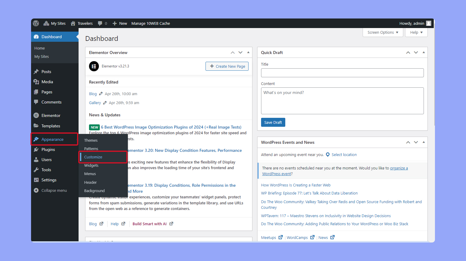
- Log in to your WordPress dashboard.
- On the left sidebar of the dashboard, click on Appearance > Customize.
Customizing site identity
One of the first things you might want to change is the site identity, which includes the site title, tagline, and site icon (favicon). Here’s how you do it:
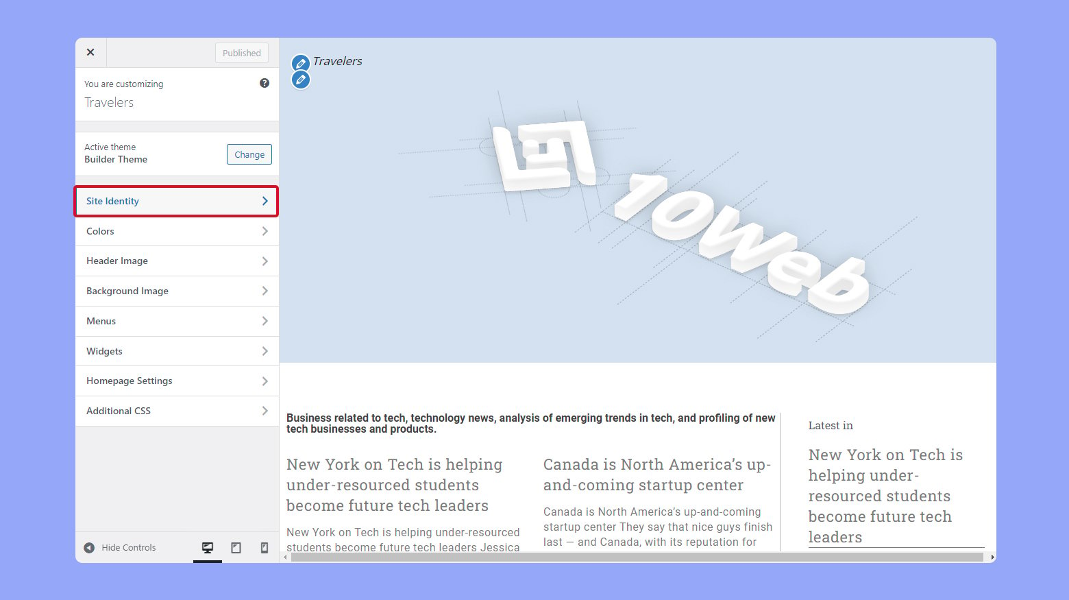
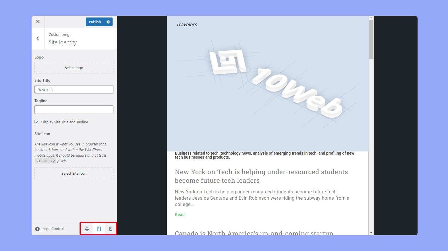
- Click on Site Identity. This is typically at the top of the Customizer menu.
- Edit the Site Title and Tagline. You can change these fields to reflect your website’s brand or purpose. The changes appear in the live preview.
- Add or change the site icon by uploading a new site icon. This icon will appear in the browser tab and other places where your website is referenced.
Changing colors and fonts
To personalize the visual style of your site, you can adjust colors and fonts. This step allows you to match your branding or create a unique look.
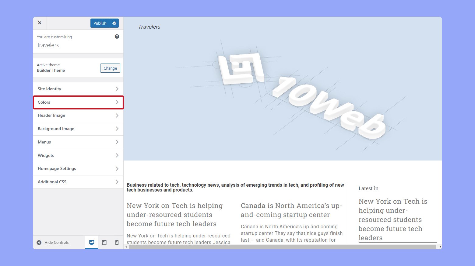
- Go to Colors or Typography. The specific section names depend on your theme, but you should find options for changing colors and fonts.
- Choose new colors for different elements like the header, background, and links.
- Some themes allow you to change font families and styles for headings and body text.
Customizing layout and navigation
Your website’s layout and navigation can greatly affect user experience. You can tweak these settings in the Customizer to improve usability.
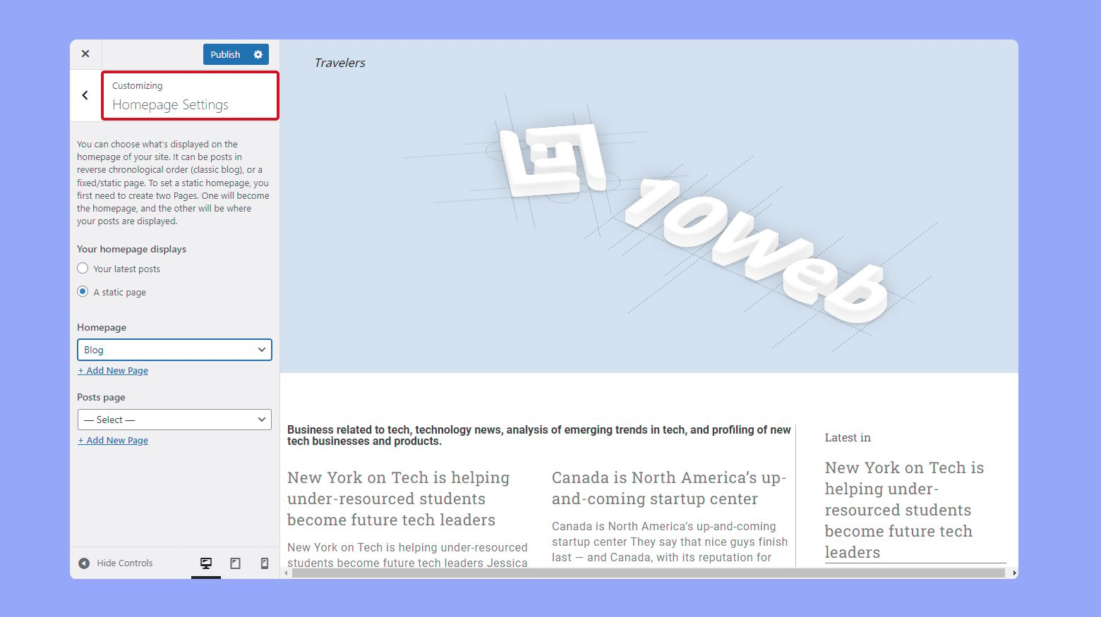
- Go to Layout or Homepage Settings. These sections let you define how your site’s content is structured.
- You can choose between a static front page or a blog roll, depending on your site’s focus.
- In the Menus section, you can add, remove, or rearrange menu items. You can also assign menus to different locations, like the header or footer.
Adding widgets
Widgets are small blocks of content that you can add to various parts of your site, such as sidebars or footers. They enhance functionality and user interaction.
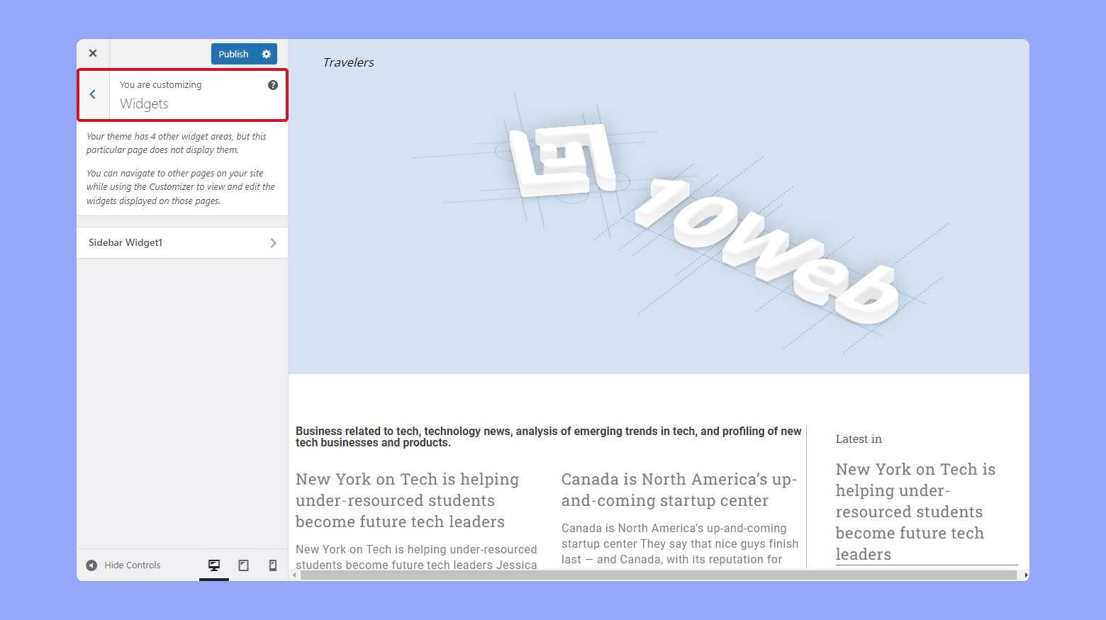
- Go to Widgets. This section lets you add or remove widgets from specific areas.
- Click Add a Widget and choose from the list of available widgets, like a calendar, recent posts, or a search bar.
- You can drag and drop widgets to rearrange them within their designated areas.
Keep in mind that any changes you make here will affect how your site looks on all devices, so use this feature conscientiously to maintain a cohesive experience for your visitors.
Choosing the right theme
When you’re setting up your website with WordPress, selecting a mobile-responsive theme is crucial as it ensures that your site will look good and function well on all devices.
Mobile-friendly themes
For a mobile-friendly website, you should focus on themes that are explicitly designed to be responsive. A responsive theme automatically adjusts its layout to fit the screen size of the device being used to view it. You can find various free WordPress themes that are mobile-friendly by browsing the WordPress theme repository. When choosing a theme, look for tags such as ‘responsive’ or ‘mobile-friendly’ in the theme descriptions.
Testing a theme’s mobile responsiveness
Once you’ve narrowed down your choices, it’s vital to test how these themes perform on mobile devices. One reliable method is to use Google’s Mobile-Friendly Test. Simply enter the theme’s demo URL and the tool will analyze it, providing you with feedback on its mobile performance. Additionally, you can preview the mobile responsiveness within WordPress by using the Theme Customizer; switch to the mobile device preview to see how your site will appear on smartphones and tablets.
Content layout and navigation
When editing your WordPress site, optimizing content layout and navigation specifically for mobile devices is crucial. This enhances the user experience significantly, as they interact with your site on smaller screens.
Optimizing menus
A responsive menu ensures that your site visitors can easily navigate your content on any device. Consider using a responsive menu plugin to streamline this process. These plugins allow you to:
- Create a mobile-specific menu with touch-friendly dropdowns.
- Rearrange menu items to highlight the most important pages for mobile users.
Adjusting font sizes and colors
The legibility of your text on mobile devices relies heavily on appropriate fonts sizes and colors. To make adjustments:
- Increase font size for better readability on small screens without causing the text to overflow the screen width.
- Choose colors with sufficient contrast to maintain readability in various lighting conditions.
Enhancing readability for smaller screens
The design elements of your WordPress site should adapt to different screen sizes without losing functionality. Here’s how you can enhance readability:
- Implement a fluid layout that adjusts the element sizes according to the screen width.
- Test different design elements for legibility and ease of access, ensuring a seamless mobile experience.
Using plugins and page builders
Plugins and page builders are essential tools that allow you to customize the mobile version of your WordPress site with ease. They offer a user-friendly interface and drag-and-drop functionality, which can be extremely helpful in crafting a responsive design without the need for extensive coding knowledge.
Using Elementor
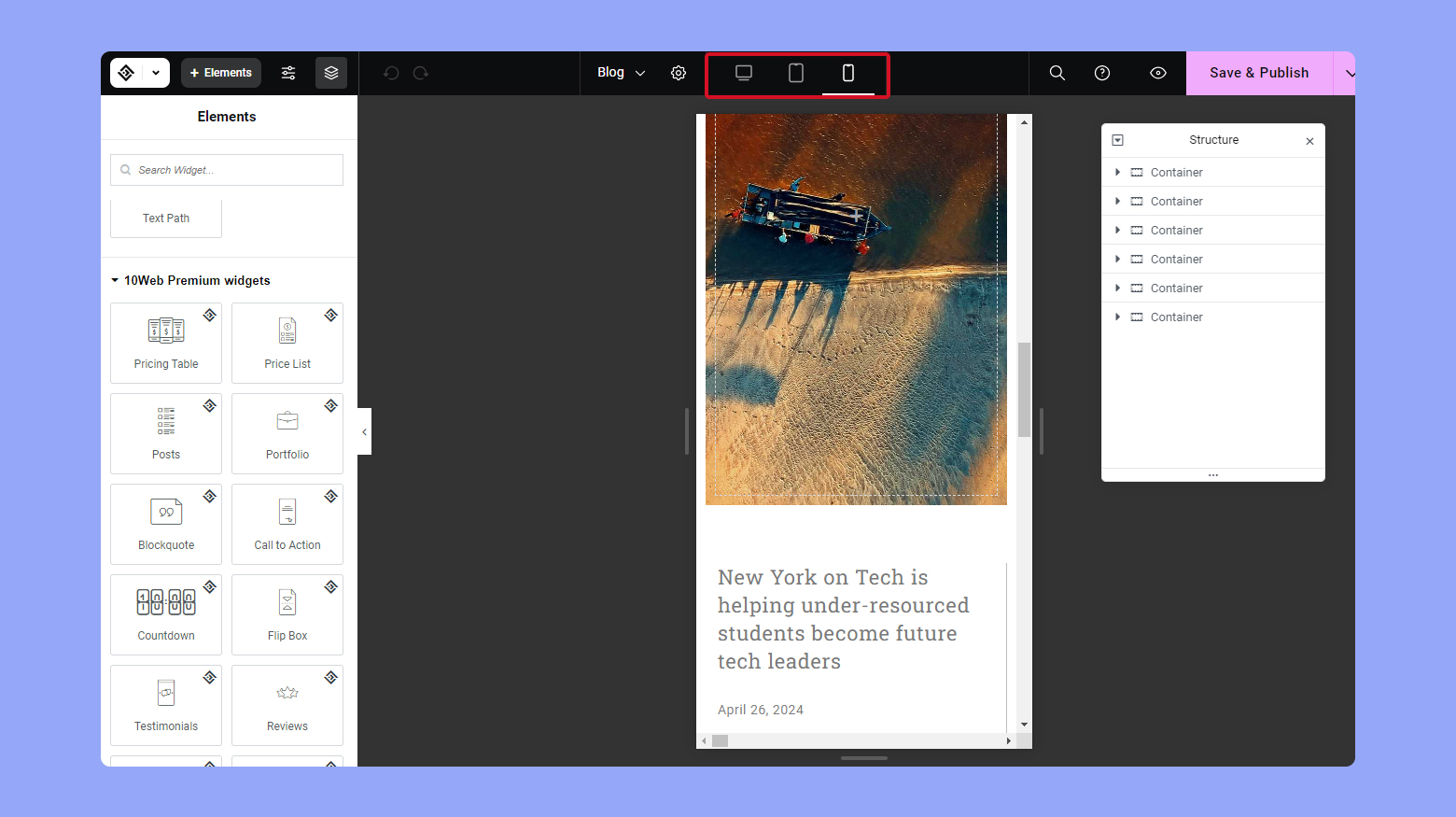
Elementor is a versatile page builder plugin that enables you to visually design your site. After installing and activating Elementor:
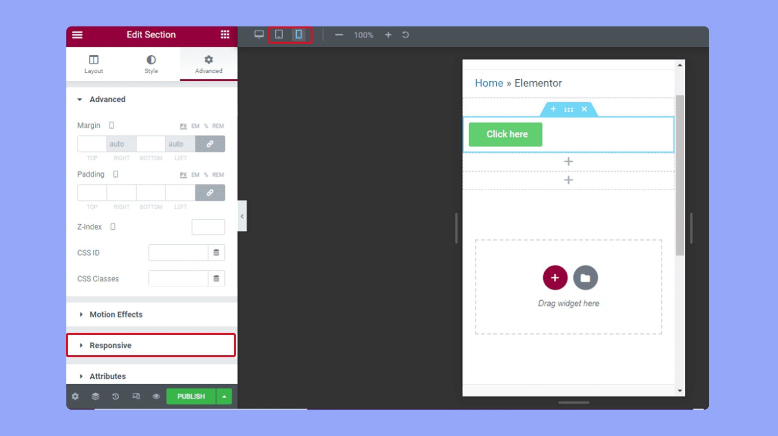
- Navigate to Elementor > Mobile > Edit from your WordPress dashboard.
- Here, you have full control over your site’s mobile layout, allowing you to adjust elements like text size, column order, and visibility of widgets specifically for mobile users.
Using the 10Web Builder
For websites hosted on 10Web, the 10Web Builder is based on Elementor free with an extra package of premium widgets specifically designed for complete website creation and editing. To edit your WordPress website’s mobile version using the 10Web Builder:
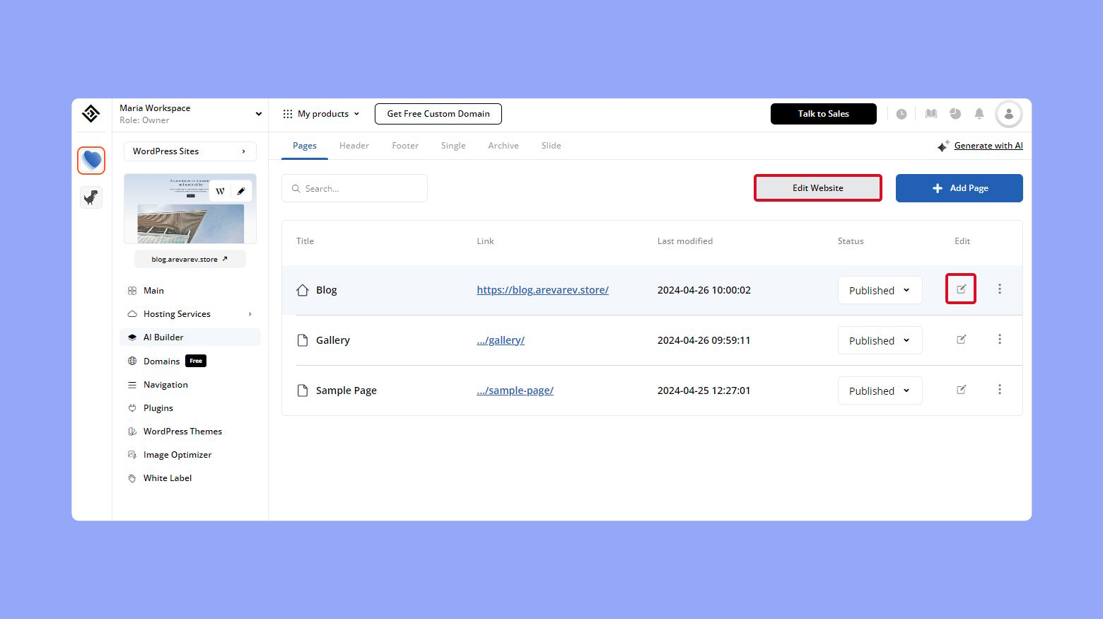
- Log into your 10Web dashboard.
- Click on the website you want to edit.
- Click on AI Builder > Edit Website.
- If you want to edit a specific page, click on the edit icon on that specific page.
- On the top bar of the 10Web Builder, click on the mobile icon you want to edit for.
Simplify WordPress with 10Web
Automate manual work with 10Web Managed WordPress Hosting and 10Web AI Website Builder. Optimize your WordPress website effortlessly.
Exploring WPBakery features
WPBakery Page Builder is another plugin that makes it easy to modify mobile views with dedicated settings:
- Utilize the Responsive Options to tweak how your elements display on different devices.
- Use the Design Options to apply custom CSS that only affects the mobile version of your site.
Remember, with WPBakery, you have the option to hide certain elements on mobile devices to maintain a clean and uncluttered mobile experience.
Discovering other WordPress page builders
Numerous other page builders can enhance your mobile site editing:
- Beaver Builder: Offers a live, front-end editing experience with mobile preview options.
- Thrive Architect: Focuses on conversion-focused building and also provides responsive design controls.
- Divi Builder: Comes with a diverse set of modules that can be customized for responsive design right out of the box.
By exploring these plugins, you’ll find one that resonates with your design preferences and functional needs.
Optimizing mobile experience
Ensuring your WordPress site is optimized for mobile devices is crucial, as it impacts how visitors interact with your content on smartphones and tablets. A positive mobile experience hinges on quick load times and navigating the site without interruptions.
Accelerating mobile page load times
Load times are a defining factor for mobile experience. Here are ways to accelerate them:
- Choose a Reputable Web Host: This can vastly improve your site’s performance, as a responsive host reduces the risk of downtime.
- Optimize Images: Use tools to compress images without losing quality, helping your pages to load faster.
- Minimize HTTP Requests: Reduce the number of elements loaded on each page.
- Use Caching: Implement caching plugins to save dynamically generated pages, decreasing the load on the server.
Additionally, regularly monitor your site’s performance using mobile speed testing tools to ensure your load times remain optimized.
Addressing pop-ups and mobile usability
Pop-ups can be intrusive, particularly on mobile devices. To tackle this:
- Ensure Pop-Ups are mobile-friendly: If you use pop-ups for sign-ups or promotions, make sure they’re easy to dismiss and don’t take up the entire screen on mobile.
- Adapt Pop-Up timing and size: Display pop-ups after a user has been on your site for a sensible duration, and confirm that they scale correctly on both smartphones and tablets.
Remember, websites that are considerate of mobile browser usability by handling pop-ups judiciously enhance the user’s overall experience.
Conclusion
This article provides a comprehensive guide on how to edit the mobile version of your WordPress site, ensuring it looks appealing and functions well across all screen sizes. It covers essential tools and strategies, from selecting mobile-responsive themes and using the WordPress Theme Customizer to employing plugins and page builders like Elementor, 10Web Builder, and WPBakery. The article emphasizes the importance of customizing layout, navigation, and content to improve mobile usability, focusing on legibility, menu dynamics, and page load speeds. It also suggests testing mobile responsiveness and optimizing images and pop-ups to enhance the user experience. Overall, the article serves as a valuable resource for anyone looking to refine their WordPress site for mobile users, aiming to create a seamless and engaging mobile experience.
Simplify WordPress with 10Web
Simplify WordPress with 10Web
Skip and automate manual work with 10Web Managed WordPress Hosting and the 10Web AI Website Builder.
