Your logo is usually the first thing people see when they discover your brand – it’s your main visual identifier. Just like you make quick judgments when you meet someone new, your logo gives people their first impression of your brand. It’s what catches attention, sticks in memory, and becomes recognizable over time.
When I was choosing a profession, graphic design was high on my list. One exercise I loved doing while building my portfolio was picking a random local shop in my neighborhood and designing a logo for it – something that felt like that place, with the right colors, style, personality, and message. It was fascinating how a simple design could instantly capture the vibe of a small bakery, a cozy bookstore, or a trendy café.
When you’re figuring out how to come up with a logo for your own business, you don’t need to start from scratch. Today, we’re going to do something similar – but for your own brand. We’ll choose the right style, colors, fonts, and logo type to create a design that grabs attention, reflects your identity, and sticks with your audience. Let’s get started.
Disclaimer: The logos, slogans, and brand names used in this blog are the intellectual property of their respective owners. They are used here solely for illustrative purposes to demonstrate the importance of impactful branding. These examples are not generated by our tool, and their inclusion does not imply any affiliation, endorsement, or sponsorship by the respective companies.
What makes a great logo? (and how to come up with a logo that works)
Think of the logos you recognize instantly – Nike, Apple, McDonald’s. What do they have in common? They are minimal and familiar, yet they are unique enough to make an impression and carry the messaging to the degree where it’s literally branded into your mind. Be honest, when you read Nike, didn’t you say their slogan in your mind? If you didn’t then, I’m sure you did now. This is the power of a great logo.
So, to figure out what your logo should look and feel like, let’s go over key success characteristics:
- Memorable: A great logo is easy to recognize and recall. You don’t need a complex design – just a distinct, well-thought-out mark. The simpler it is, the more it sticks.
- Simple: Overly intricate logos might look cool, but they don’t translate well across different platforms. A clean, simple design ensures your logo remains effective on everything from a business card to a billboard.
- Timeless: Avoid chasing trends that will make your logo feel outdated in a few years. The best logos stand the test of time. The Coca-Cola script, for example, has barely changed in over a century.
- Versatile: Your logo should look great everywhere – whether it’s on top of a store, a website, an Instagram profile, a T-shirt, or a product package. A strong logo works in color, black and white, and at any size.
- Relevant: Your logo should match your brand’s personality and audience. A playful children’s brand won’t have the same logo style as a luxury fashion label. The key is aligning your design with your brand identity.
Let’s look at a clear example. Nike’s swoosh is one of the most iconic logos in the world. Why? Because it’s simple, versatile, and packed with meaning. It represents movement and speed, aligning perfectly with Nike’s brand identity. It works on shoes, ads, and even as a standalone icon without any text.

A great logo creates instant recognition and leaves a lasting impression. If you’re wondering how to come up with a logo that captures your brand’s personality, start by understanding these key characteristics that make logos successful.
Start with your brand identity (not the design)
You might be tempted to jump right into sketching logos or browsing design tools – but hold on. Learning how to come up with a logo starts with knowing who you are as a business. Your logo needs to communicate who you are, what you stand for, and how you want people to feel when they encounter your brand. If you skip this step, you risk creating a nice-looking logo that doesn’t resonate with anyone, including you. So, before you think about colors or fonts, ask yourself these core questions:
- What values do you want to communicate? Think about the principles and beliefs behind your brand. Are you innovative and cutting-edge? Warm and community-focused? Luxurious and exclusive?
- How do you want customers to feel when they see your logo? Logos evoke emotions. Do you want people to feel energized, comforted, or curious?
- What makes your brand different? Identify your unique edge. What sets you apart from competitors? Your logo should hint at that difference.
To do this in practice, you can go the classic rout of paper and pen, or use tools like WordClouds.com or Canva. A word cloud can show you the main ideas that make your brand special by making the most-used words bigger and easier to spot. List adjectives that describe your business – words like modern, fun, trustworthy, elegant, or bold. For example, a yoga studio might have words like calm, grounded, natural, and peaceful, while a gaming startup might lean toward bold, energetic, and innovative.
This is your main takeaway: Logos that resonate with audiences aren’t designed in isolation – they’re rooted in a brand’s core identity. Once you’ve defined who you are, the visual elements will come together more naturally.
How to come up with a logo idea: Find your inspiration
Knowing your brand is a great start, but it’s often not enough. We all need a little inspiration sometimes. You’ve probably seen logos you admire and thought, I’d love something like that. That’s a good thing. And when you’re brainstorming how to come up with a logo, inspiration often comes from unexpected places. The best logos aren’t forced – they’re born from exploring different ideas, perspectives, and creative sparks.
Look at competitors (then do it your way)
Your competitors have already tested the waters – take advantage of that. Study their logos to see what works and what doesn’t:
- What visual elements are common in your industry?
- What colors, shapes, or fonts dominate the space?
- How can you break the pattern and stand out?
For example, in the coffee industry, many logos use earthy tones, steam icons, and serif fonts to convey warmth and tradition. But Blue Bottle Coffee went with a simple, bright blue bottle icon. It’s minimalist, fresh, and completely distinct in the sea of brown coffee logos. And it’s more than that. When you see that blue bottle as the logo, you might be instantly surprised – thrown off – since it’s not what you’d imagine for a coffee brand. I was intrigued when I first saw it, which made me Google them, read about them, and learn a little more. That single logo instantly positioned them in my mind as a cool brand, even before I tried their coffee.
But keep in mind that you shouldn’t copy. You should try to differentiate. If everyone uses circular logos, explore rectangles. If muted tones are everywhere, try bold, vibrant colors.
Another way to stand out is by looking beyond your industry for inspiration. Some of the best ideas come from completely unrelated fields. If you only study competitors, your logo might blend in rather than stand out. Instead, try looking at different industries—if you’re designing a tech logo, explore fashion brands. If you’re in hospitality, check out food packaging. Cross-industry inspiration helps break away from clichés and brings fresh perspectives.
This approach isn’t limited to logos. One of the most famous examples is Issey Miyake, the fashion designer. Originally trained as an architect, he applies architectural principles and techniques to fashion design, creating structured, innovative garments. In the logo world, Chanel follows a similar path. Its iconic interlocking “CC” logo is inspired by architectural symmetry and geometric balance, giving it a timeless, elegant look. These examples show how stepping outside your field can lead to truly distinctive branding.
Create a mood board (your visual playground)
Now, you might have some idea on what you want and don’t want. When you have collected inspirational images, fonts, colors, and logos that feel like your brand, you can use a simple mood board to turn your abstract ideas into visual direction. Pinterest or Canva are a good place to get started. Enter one of them and start clipping designs from magazines, packaging, and websites. Don’t limit yourself to logos – include anything that creates your desired brand vibe.
The emotion that your finished mood board (collection of all your visual elements) evokes is what you should try to communicate with your logo. For example, Airbnb’s logo is a masterclass in simplicity and storytelling. Their icon combines a heart (love), a location pin (travel), the letter A (Airbnb), and a sense of togetherness (belonging). This is what its mood board would also feel like and it came from their core mission: to make people feel at home anywhere in the world.
So, your next step would be to start a mood board and gather at least 10 visual pieces that match your brand’s aesthetics. You might be surprised where your best idea comes from.
Choose your logotype
Not all logos are created equally – and that’s a good thing. There are different types of logos to fit different kinds of brands, industries, and personalities. Some logos use text to make a statement. Others lean on symbols, while some combine the two. The key is choosing the right type of logo that reflects your brand and resonates with your audience.
When you have your inspirations in place, it’s time to practically work on your logo idea, and knowing what type fits you best is your first step. Let’s break each of the seven main logo types down, with examples of each.
1. Lettermark (monogram) logos
Lettermark logos are initial-based designs that use a company’s initials instead of its full name. If you’re figuring out how to come up with a logo for a long or complex name, this can simplify things. IBM, HBO, and CNN all use lettermarks to stay memorable. These logos simplify long names into short, recognizable marks.
When to use:
- If your company name is long and hard to fit on marketing materials.
- If you want a sleek, minimalist look.
But make sure the font matches your brand personality. A modern tech firm might use bold sans-serif letters, while a luxury brand might opt for elegant serifs.
2. Wordmark (logotype) logos
Wordmark logos use just the company’s name in a distinctive typeface. When you’ve got a short, catchy name, this type of logo can be incredibly effective. Google, Coca-Cola, and Disney are good examples of logotypes. But you can still be creative with it. If we take FedEx, for example, their wordmark logo is simple, but the hidden arrow between the E and X subtly communicates speed and precision.
When to use:
- If your brand has a unique or memorable name.
- If you want name recognition above all else.
3. Pictorial mark (logo symbol)
This logo type uses a single image or icon to represent the brand. Over time, the image becomes so closely tied to the company that words become unnecessary. For example, we all identify Apple products by just the symbol. The same can be said about Target, Twitter (X), and many others. In all of those cases, it works because it’s simple, recognizable, and directly connected to the company’s name.
When to use:
- If you want an iconic, instantly recognizable logo.
- If your brand name lends itself to a visual representation.
4. Abstract mark logos
Abstract logos use unique, geometric shapes rather than recognizable images. These shapes convey feelings and ideas instead of direct associations. For instance, Pepsi’s red, white, and blue swirl – it’s not clearly imaged. But they pass specific emotions through symbols and associations. For example, the Adidas three-stripe logo represents a mountain – symbolizing challenges and achievement.

When to use:
- If you want something modern and distinctive.
- If you’re planning to expand internationally (abstract shapes often transcend language barriers).
5. Mascot logos
Mascot logos feature a character or figure that personifies your brand. They often appeal to family-friendly businesses or casual brands like KFC (Colonel Sanders), Michelin (the Michelin Man), and Planters (Mr. Peanut). This is a simple tecnique that makes the brand appear more approachable. This is also used by other industries. For example, Mailchimp’s Freddie the Chimp adds personality to an otherwise functional service like email marketing. The character makes the brand fun and approachable.
When to use:
- If you want to create a playful, relatable brand identity.
- If your audience includes families or children.
6. Combination mark logos
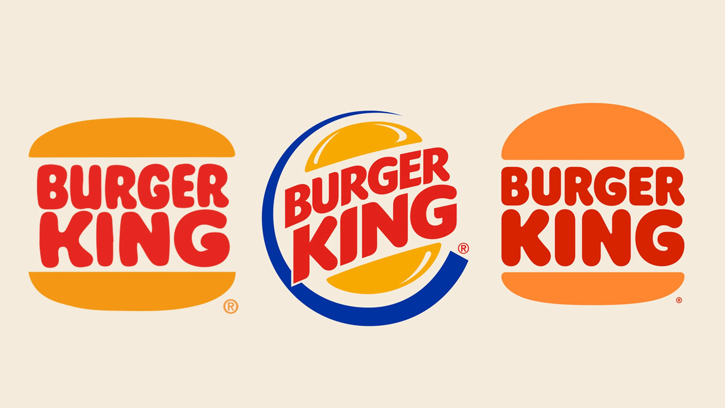
Combination marks blend text and an icon. These logos are more flexible in use – you can use the elements together or separately. Known names in this category are Burger King (name inside the burger icon), Lacoste (crocodile with brand name), and even the same Adidas logo. It was initially an abstract mark, but at some point, the company started using the wordmark as well. Even with the combination, the entire logo, mark and visual element are kept simple and clear. For example, Burger King redesigned its logo in 2021, going for a simplified combination mark that feels modern yet nostalgic.
When to use:
- If you want the best of both worlds (text and imagery).
- If your logo needs to work in varied contexts.
7. Emblem logos
Emblem logos place text inside a shape – like a badge, seal, or crest. They tend to look traditional, official, and trustworthy. I am sure you have seen examples of this, a lot. Like every morning, when you get a Starbucks, you are holding one of those logos, the siren icon in a circular badge. Another memorable one is Harley-Davidson’s shield logo, which feels rugged and strong – just like the bikes they build.
When to use:
- If you want to convey a sense of heritage or prestige.
- If your brand has a long-standing, trusted reputation.
How to choose the right logo type
Let’s circle back to your brand’s basic framework. Examine three key aspects: your brand’s unique character, your industry context, and your target audience:
- Is my name long or complex? → Try a lettermark.
- Do I want to build visual recognition? → A pictorial mark could work.
- Is my audience playful and casual? → A mascot might fit best.
If you’re unsure, go for a combination mark, it’s versatile, adaptable, and lets you introduce your brand name while building icon recognition. This is what McDonald’s did. It started with a combination mark (the name with golden arches). Over time, the arches alone became recognizable worldwide.
Choose the right style and colors
Your mood board and logo ideas might look good, but they should also feel right. When figuring out how to come up with a logo, your logo’s style and colors should work together to tell your story without words. The right choices will capture attention, raise the right emotions, and make an impression. The wrong ones? They’ll make your logo blend into the background or, worse, confuse your audience.
Here’s how to choose the perfect style and colors for your brand logo.
Start with your style
Think about how you want your logo to feel. Is your brand modern and bold? Playful and quirky? Classic and sophisticated? Logos generally fall into a few popular style categories:
| Logo style | Description | When to choose this style |
| Minimalist & modern | Clean lines, simple shapes, and white space for a sleek, timeless look. Ideal for tech, luxury, and professional brands. | When professionalism, clarity, and innovation are key and if your brand values simplicity and efficiency. |
| Vintage & retro | Hand-drawn elements, muted tones, and distressed textures to evoke nostalgia, tradition, and authenticity. Great for artisanal brands. | If your brand emphasizes tradition and craftsmanship and when you want to convey authenticity and heritage. |
| Playful & quirky | Bright colors, fun fonts, and unconventional shapes that create a casual, approachable vibe. Perfect for youth-oriented brands. | If fun, creativity, and friendliness define your brand and when targeting kids, families, or creative professionals. |
| Elegant & sophisticated | Minimal designs with fine lines, monochrome palettes, and timeless typography. Perfect for luxury and high-end brands. | If your brand focuses on high-end or artisanal products and when you want to convey timeless elegance, quality, and trust. |
Understand color psychology
Once you have your style, let’s look for your colors. Colors aren’t random. Each color awakens a specific feeling – excitement, trust, calmness, or whatever you want your audience to feel. Colors also have a cultural significance. For example, in the western world, the color for mourning is black, while in India it’s white. Keep this in mind when choosing your colors.
For example, red is associated with boldness, passion, and energy. It grabs attention and creates strong emotions like excitement, urgency, and love. This makes it great for brands that want to appear dynamic, energetic, or youthful.
Examples:
- Coca-Cola – The vibrant red conveys happiness and excitement.
- YouTube – Red signals action and engagement—press play and enjoy.
- Target – The red bullseye stands out and feels bold and confident.
On the other hand, blue is for brands who want to appear more trustworthy, professional, calm, stable and competent. That’s why if you try to remember blue logos mainly corporate and tech brands come to mind.
Examples:
- Facebook – Blue conveys trust and familiarity.
- LinkedIn – The blue logo reflects professionalism.
- Samsung – Tech brands often use blue to communicate reliability.
Yellow is another common color for logos, and it’s mainly used to make the audience feel warm, positive, cheerful, optimistic and approachable. It’s great for brands that look to be associated with happiness and friendliness.
Examples:
- McDonald’s – The golden arches represent joy and energy.
- Snapchat – The bright yellow ghost screams fun and spontaneity.
- IKEA – The yellow logo communicates approachability and affordability.
However, if you are looking for elegance, want to seem classic and timeless, like many luxury and minimalist brands, simple black and white is what you can go for.
Examples:
- Chanel – Black and white simplicity equals pure sophistication.
- Nike – The swoosh works in any color, but black adds boldness.
- The New York Times – Black lettering reflects the brand’s tradition and authority.
What about multiple colors?
Sometimes, using more than one color adds depth and vibrancy to your logo. But it needs to be intentional and no more than 1-3 colors for clarity and simplicity. Too many hues can make your logo look amateurish. Good examples of multicolor brands are eBay and Google, where the colors have a meaning of variety, inclusivity and innovation.
How to choose the right colors
When Spotify was rebranding, they tested their green color in different contexts. They wanted a hue that felt fresh yet timeless. As a result they ended up with the now-iconic neon green that pops across digital platforms. What they did is:
- Went back to your brand identity – What emotions do you want to evoke?
- Looked at competitors – Which colors dominate your industry? Can you break the pattern?
- Tested with real people – Show your options to potential customers and gather feedback.
Follow this simple process. Pick 2-3 logo styles that fit your brand personality. Then, experiment with color combinations and get feedback from your target audience. There’s no right answer – just something that would fit your brand and that your audience loves.
Typography: Choose the right font
Fonts are like accents – they influence how people perceive your brand. HBO, Netflix, Harley Davidson – you can recognize those fonts anywhere, and they are very bold. A blocky typeface feels completely different from an elegant script or a clean, modern sans-serif. You might make a beginner mistake and pick a cool font that you like, which, however, might not match your brand, or even be liked by the customers. You might even want to hire a font designer specifically for your brand – that’s how important it is.
Although there are millions of fonts, logos usually use one of these four font types:
| Font Type | Description | Examples |
| Serif Fonts | Fonts with small “feet” or strokes at letter ends, conveying stability, tradition, and authority. | Time Magazine (journalistic authority), Dior, Vogue (luxury and sophistication) |
| Sans-Serif Fonts | Clean, modern fonts without decorative strokes, giving a sleek, approachable feel. | Google (modern and friendly after 2015 rebrand) |
| Script Fonts | Fonts that mimic handwriting, from elegant calligraphy to casual, playful styles. | Coca-Cola (classic script reflecting tradition and familiarity) |
| Display Fonts | Decorative, custom fonts designed to stand out with unique shapes and proportions. | Disney (whimsical and creative) |
When choosing a font, match it to your brand’s vibe – sans-serif for a modern tech startup or serif for high-end retail. Prioritize readability; a playful script might look fun but won’t work if it’s hard to read. Test your logo on different screens and sizes to ensure clarity. Keep it simple with a maximum of two complementary fonts, like Slack’s bold sans-serif paired with colorful shapes. Finally, experiment with different weights, spacings, and styles to find the best fit across various platforms.
Sketch, test, and refine
You’ve got your brand identity, logo type, style, and colors figured out – it’s time to bring those ideas to life. Approach this like a brainstorming session and don’t be too hard on yourself. This is a creative process and the goal here isn’t to create a masterpiece from the get go – it’s to explore possibilities, test ideas, and refine until you land on a logo that works.
Start with rough sketches (imperfect is perfect)
Grab a pen and paper (or a tablet) and start sketching. Forget about neatness or symmetry right now. This phase is about getting ideas out of your head and onto the page.
Try these simple techniques:
- Word-to-image exercise: Turn words from your brand identity into visuals. If your brand values energy, how can you represent that? A lightning bolt? A swoosh?
- Shape exploration: Draw basic shapes – circles, triangles, squares – and experiment with how they might reflect your brand.
- Font experiments: Test different lettering styles for your business name.
Use logo design tools (bring your sketches to life)
Once you’ve explored enough on paper, it’s time to translate your sketches into digital form. Even if you’re not a designer, modern tools make it easy. Canva is especially great for beginners with simple templates. There are a lot of AI-powered logo generators that can help you simplify the process even further. And if you want more customization and editing freedom, you can use Adobe Illustrator.
You don’t need to be tech-savvy. The founders of Glossier used Canva to prototype their initial logo ideas. They then worked with a designer to polish the final version, but most of the work was still done using basic tools.
Pro tip: Save your logo in different formats (JPEG, PNG, SVG). An SVG file scales perfectly without losing clarity – crucial for large prints and tiny social media icons.
Test for versatility (because your logo won’t live in one place)
A great logo looks amazing anywhere – on a website, product packaging, the side of a truck and anywhere else. That’s why testing is a must. Here’s a simple checklist to evaluate versatility:
- Black & white test: Remove the color. Does your logo still look strong without it?
- Size scaling: Shrink your logo to favicon size. Can you still read the text or recognize the symbol?
- Background variations: Place your logo on different backgrounds – dark, light, and colorful.
Get feedback (but choose your testers wisely)
Your logo might look great to you, but how does it resonate with others? Gather feedback from potential customers, not just friends or family. People close to you might hesitate to give honest opinions – or give feedback based on personal taste rather than brand relevance. There a couple of methods to get valuable feedback:
- A/B test different versions in surveys.
- Post mockups on social media and check engagement levels.
- Ask specific questions, like:
- “What words come to mind when you see this logo?”
- “Does this logo give you a sense of what our brand is about?”
- “Would you trust this brand based on the logo?”
When Slack introduced its new logo in 2019, they tested multiple versions with different internal and external groups. They tested with a lot of methods, and the final design, with cleaner lines and fewer colors, now looks sharper across apps, presentations, and print materials.
Common logo mistakes to avoid
While experimenting is part of the process, some mistakes are surprisingly common – and can seriously undermine your brand’s impact. Here are four key pitfalls to watch out for when creating your logo.
Overcomplicating the design
When Instagram rebranded in 2016, they replaced their detailed camera icon with a simple, gradient outline. The new logo, though controversial at first, became more recognizable and versatile. It’s tempting to cram too much into a logo – fancy gradients, intricate details, or multiple fonts. But the best logos are simple and clear. Complexity makes logos harder to recognize, remember, and scale across different formats.
Tip: Ask yourself: “Could a child draw this from memory?” If not, simplify further.
Chasing trends
Remember when skeuomorphic design (realistic textures and 3D effects) was all the rage? Brands like Apple and Microsoft were using it but ditched those shiny icons for flat, minimalistic logos that still look modern today. You don’t want your brand to exist for a couple of years, right? You are looking for something timeless that remains relevant for years, saving you the headache of constant rebranding.
Tip: Stick to core design principles – like simplicity, clarity, and relevance – and avoid following trends just for the sake of it.
Using the wrong font
Fonts carry meaning. Choose the wrong one, and your logo might send mixed signals. For example, hard-to-read scripts, generic typefaces, or fonts overused in memes (like Comic Sans) can make your brand look unprofessional. Moreover, people get used to specific fonts, and it’s always better to listen to them before making a decision. One massive failure that comes to mind regarding wrong fonts is the GAP’s case from 2010. Their logo redesign replaced their classic serif logo with a generic sans-serif font. The backlash was so intense that they reverted to the original within a week.
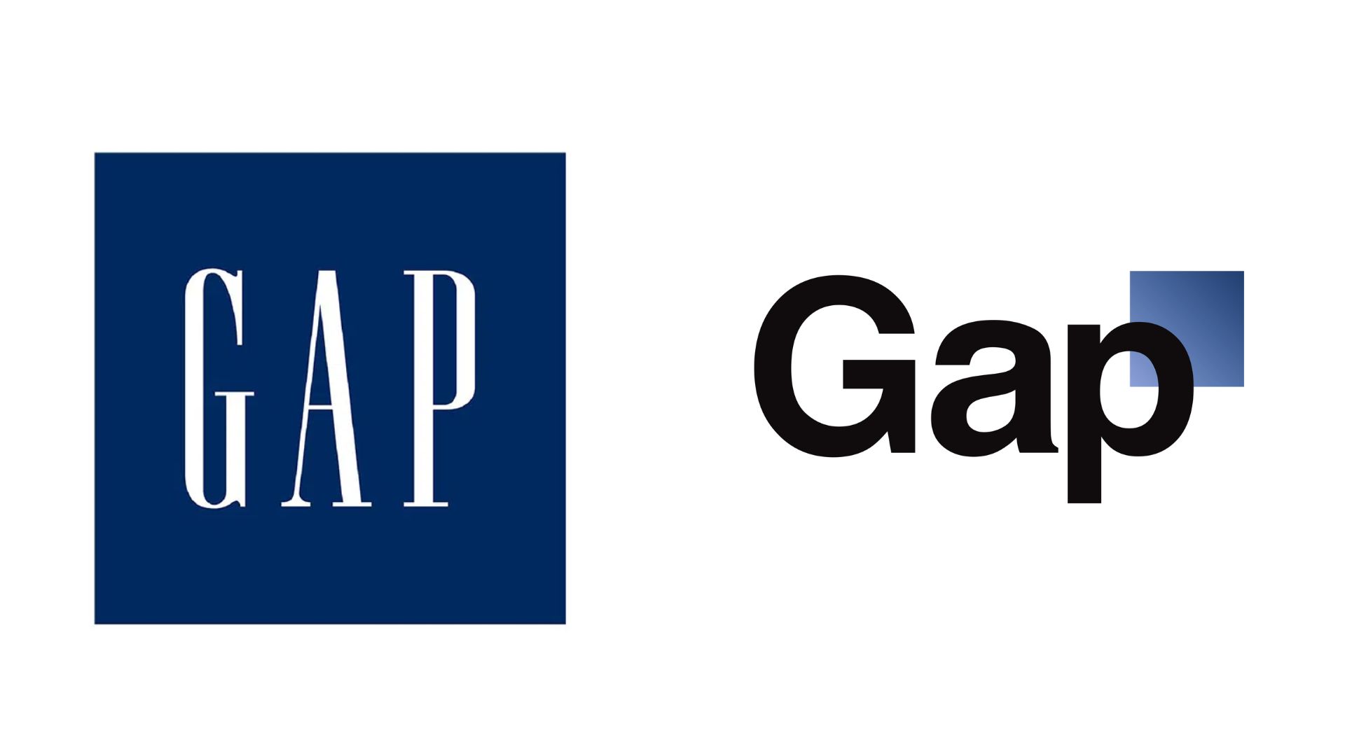
Forgetting your audience
Your logo is for your customers. If your design choices reflect your personal preferences but don’t resonate with your target audience, it won’t be effective. Many brands, like GAP, learned this the hard way. Others, like Tropicana, lost sales because of not being recognized on the shelves anymore. In any case, it’s important to involve your audience during the design process. Run polls, test variations, and gather feedback to ensure your logo speaks to the right people.
Conclusion
A logo is your brand’s signature in the world. It’s what people remember, recognize, and associate with your business. If you’re learning how to come up with a logo, focus on clarity, simplicity, and a strong connection to your brand’s identity.
So, grab a pen and start sketching ideas, or explore tools like Canva and AI logo makers. Don’t aim for perfection on day one – just start. The best logos evolve from simple ideas. And when you’re done, step back and test. Does it feel right? Does it communicate your brand’s story in one glance? If yes, you’re on the right path. Now go make a logo that sticks.
FAQ
What’s the first step when figuring out how to come up with a logo? How do I come up with a logo idea if I’m not a designer? What tools can help when learning how to come up with a logo? How do I choose the right colors for my logo? What font should I use in my logo? Should I include symbols or just use text in my logo? How can I make sure my logo is unique? What makes a logo memorable? What file formats should I have for my logo? How do I test if my logo works well? Can I change my logo later?


