Calling all creative spirits! Have you ever wondered how other artists create their snazzy websites? Many are so impressive the idea of making your own artist website might be intimidating, but don’t paint yourself into a corner.
First, check out these inspiring artist website examples, then find out how to create a captivating portfolio, website, or online store connecting your art with your audience.
Why every artist needs a website
If you’re an artist trying to grow your audience, sell artwork, or share your creative vision with the world, having your own website isn’t just nice to have. A website is a palette of marketing tools.
It’s your digital exhibit. It’s where your art takes center stage, free from algorithms, distractions, or awkward cropping. You get complete control over how your work is presented, how people experience it, and how they connect with you.
Plus, a website builds trust. It makes you look professional, serious, and established, whether applying for exhibitions, pitching to galleries, or just trying to grow your following. It’s the modern business card for creatives.
How to create an impressive artist website without web development skills
You don’t need to be tech-savvy or a designer to make a great website. Artists who naturally bring their ideas to life will enjoy the free-form creative control from AI-assisted website builders. These tools make the whole process fast and beginner-friendly, even if you want a more unique artist website design.
Key features of the best artist websites
Some creative website layouts grab your attention at first glance, while others feel like a maze or miss the mark completely. So, what sets the best artist websites apart?
The most effective artist websites are equal parts beauty and brains. They showcase your work in a way in an intentional, easy-to-explore way, staying true to your creative voice.
- Clean, visual-first layouts – Your art should speak for itself. Great websites give your work room to breathe with white space, strong images, and simple layouts.
- Easy navigation – Visitors shouldn’t have to play hide-and-seek to find your portfolio, bio, or shop. Clear menus go a long way.
- High-quality images – Blurry or pixelated images do your art and visitors a great disservice. Your site should feature crisp visuals to do justice to your work.
- A personal touch – Whether it’s a handwritten logo, a warm bio photo, or a behind-the-scenes blog, the best sites let people connect with you as a person, not just your art.
- Mobile-friendly design – Many visitors are browsing on their phones. Your site needs to look just as polished on a small screen as it does on a laptop.
- Contact and shop options – Whether someone wants to buy a piece or reach out for a commission, there should be an easy way to contact you.
The goal is to make it easy for people to fall in love with your work. Artists tend to think outside the box for their website design, hoping visitors will take the next step, whether that’s following, buying, or remembering your name.
44 of the best artist website examples
These artist website examples stand out from the crowd because they feature remarkable web design and user experience.
- Minimalistic
- Bold & experimental
- Artist websites with an online shop
- Storytelling & brand-focused
- Photography
- Whimsical & comic-inspired
- Motion & interactive
The thought process behind featured artist websites
We took the scenic route through tons of artist sites that masterfully balance aesthetics, functionality, and storytelling. It was tough narrowing it down to just one list. Ultimately, we chose these can’t-miss examples of artist websites based on creative presentation, design, navigation ease, and effectiveness in engaging visitors.
Minimalist artist websites
If you’re drawn to simplicity and letting your work breathe, these sites are an exercise in clarity. Think of uncluttered white space, thoughtful layouts, and just enough polish to make your art shine.
1. Mathias Ball
Putting the artist’s work front and center.
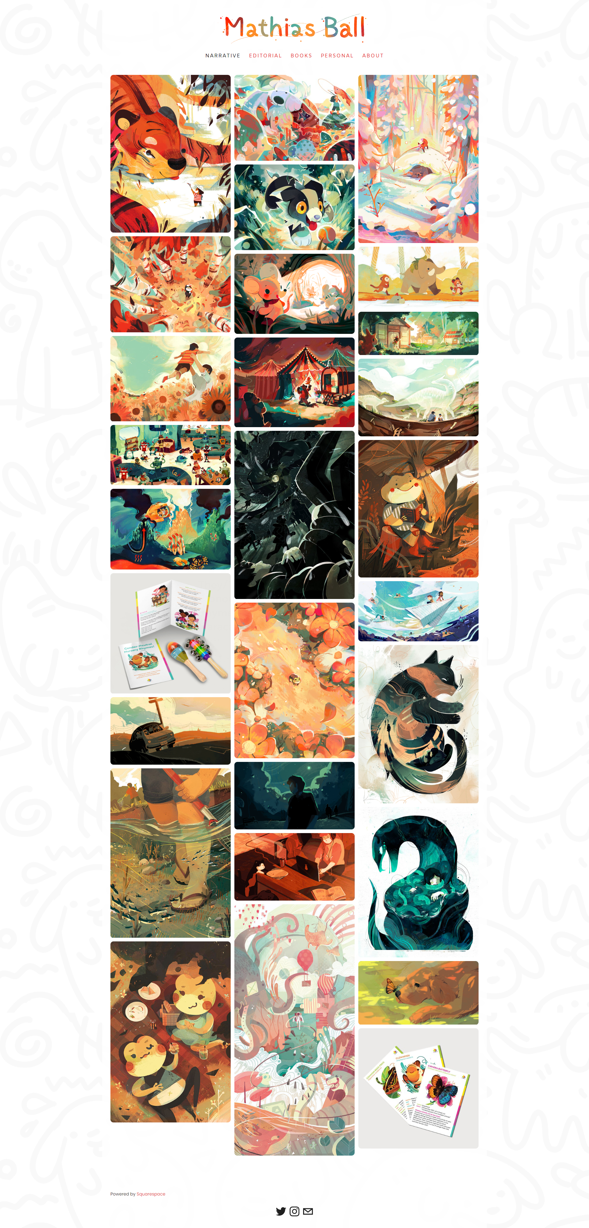
A clean, grid-based layout and white space make this a great simple artist website example. Mathias’ hand-drawn logo and warm color palette give it personality. At the same time, footer icons offer quick access to contact details and social media.
2. Benjamin Hardman
Ethereal Arctic photography.
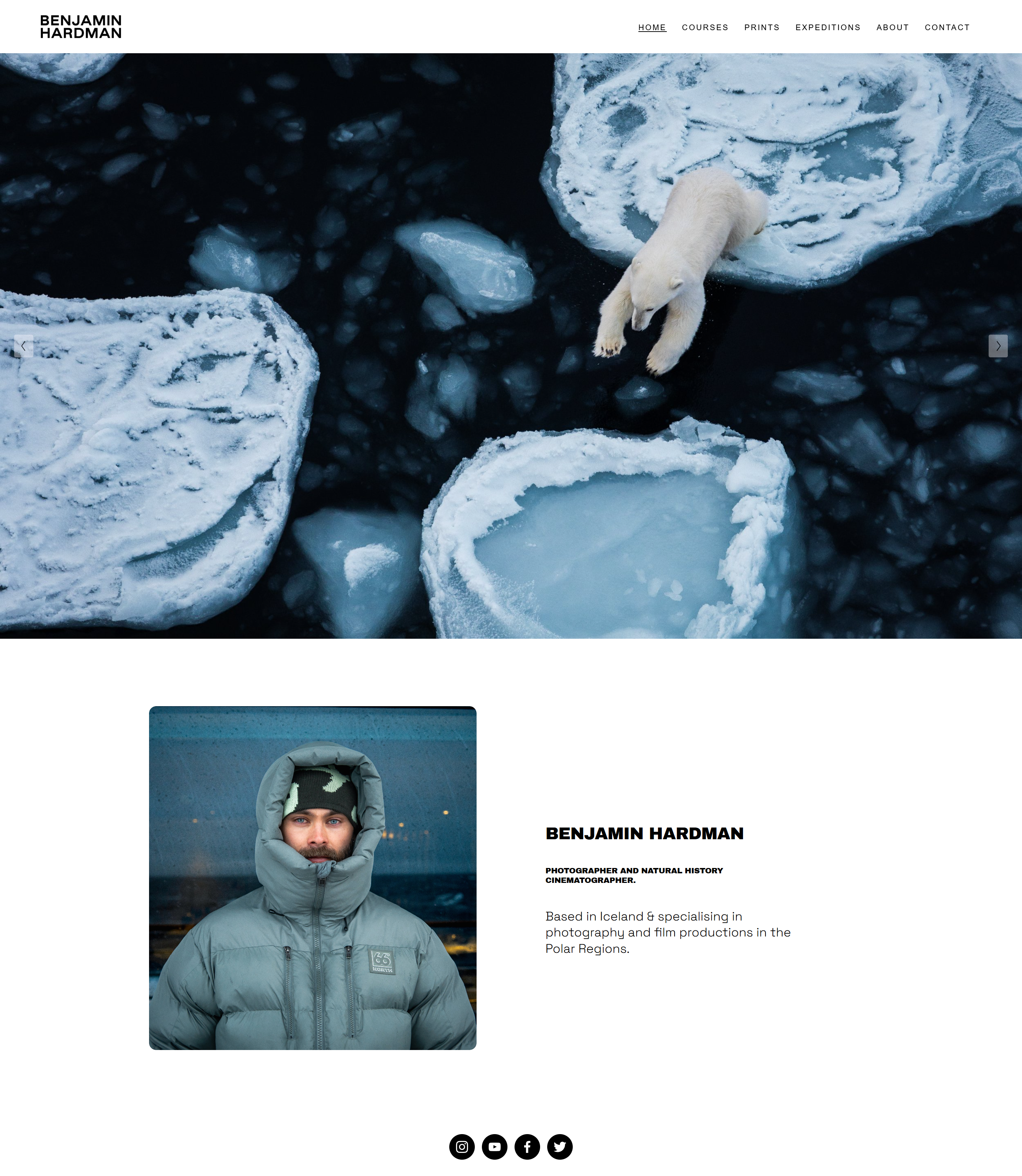
This artist website example beautifully showcases Arctic and Icelandic photography with large-format imagery and smooth navigation. The integrated print store and masterclass section make it a practical art website idea for photographers who want to sell and teach from the same platform.
3. Wenting Li
Simple navigation for browsing big, showy portfolios.

A great example of a simple artist website, Wenting Li’s layout uses whitespace, clean typography, and categorized galleries for illustration, murals, and comics. The vibrant colors and minimal navigation make this a go-to template for artists who value clarity and expression.
4. Mariella Paints
Simple navigation guides visitors through the artist’s work.

A soft, inviting artist website example blending gentle pastels with a calming, airy layout. Mariella’s homepage highlights dreamy watercolor art with straightforward navigation and a warm bio section. A site like this is a compelling option for artists who want a serene, story-driven portfolio.

Build your website in 1 minute
Found inspiration? Your website is just a few clicks away. Start
with 10Web AI Website Builder to effortlessly bring your vision to life.
5. Maegan Guerette
Gentle colors and subtle details fill this unbusy website layout.
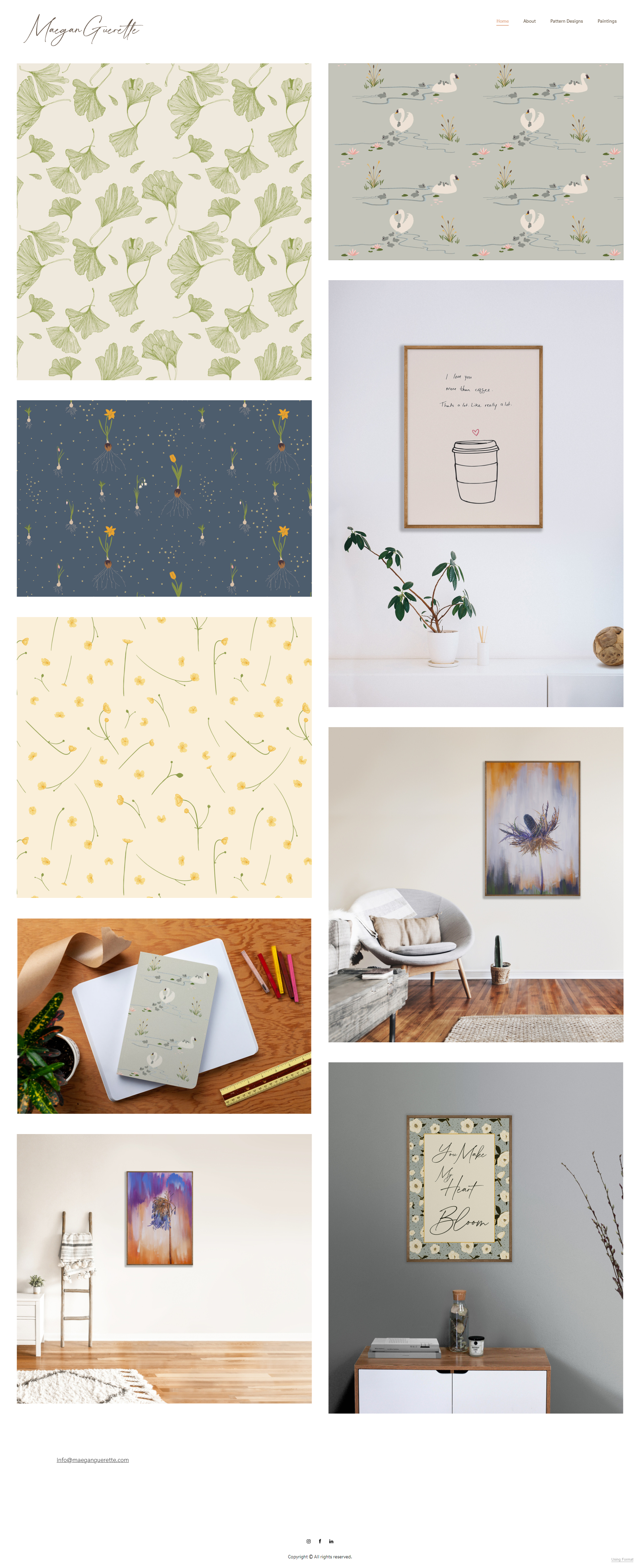
A horizontally scrolling gallery, soft colors, and gentle visual flow make this one of the most peaceful artist website examples. With intuitive navigation and a light layout, it’s a simple artist website idea that beautifully highlights photography and fine art.
6. Alison Lyons
A clean, straightforward design encourages art-gazing visitors to explore.
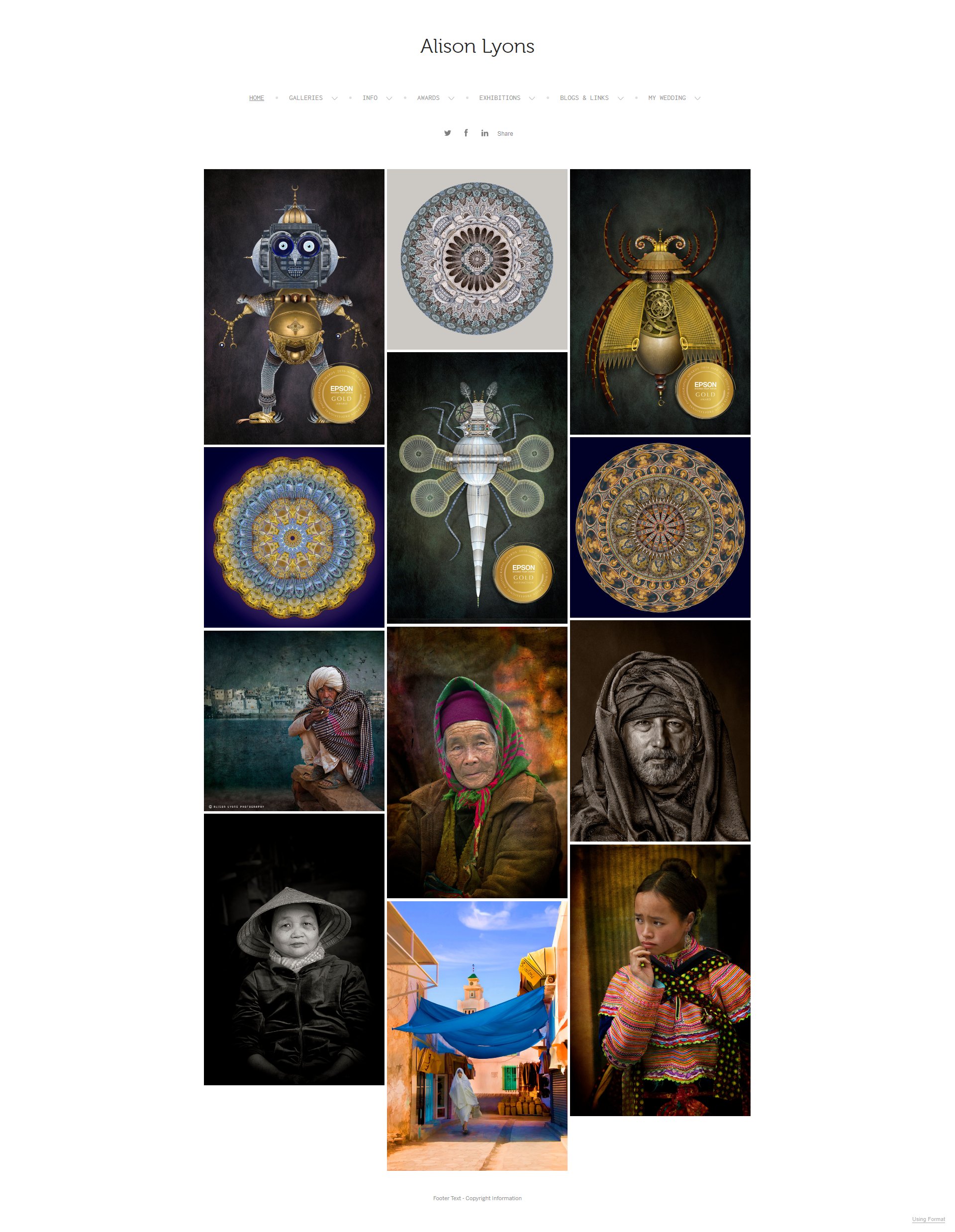
A clean, minimal artist website example designed to highlight photography through visual storytelling. With easy navigation, curated galleries, and subtle branding, it’s a great art website idea for photographers seeking a simple, elegant online presence that puts the work first.
Key takeaways
Let your art breathe. A clean, simple layout with smart spacing and strong visuals can feel as compelling as any flashy design. If you’re not sure where to start, 10Web’s AI Website Builder can help you generate a layout to keep things crisp and distraction-free.
Bold, experimental layouts
Ready to break the mold? These artist websites feel like works of art themselves, with playful scrolling, wild color palettes, and uncommon layouts. Perfect if you want your site to stand out and surprise.
7. Ketakuma
A vigorously animated and interactive artist portfolio website.

One of the most playful artist website examples, Ketakuma features animated comics, an interactive mascot, and a vibrant color palette. With dynamic scroll effects and a built-in merchandise shop, it’s a fun art website idea that keeps visitors engaged.
8. Alex Fisher
A vibrant artist portfolio website example.
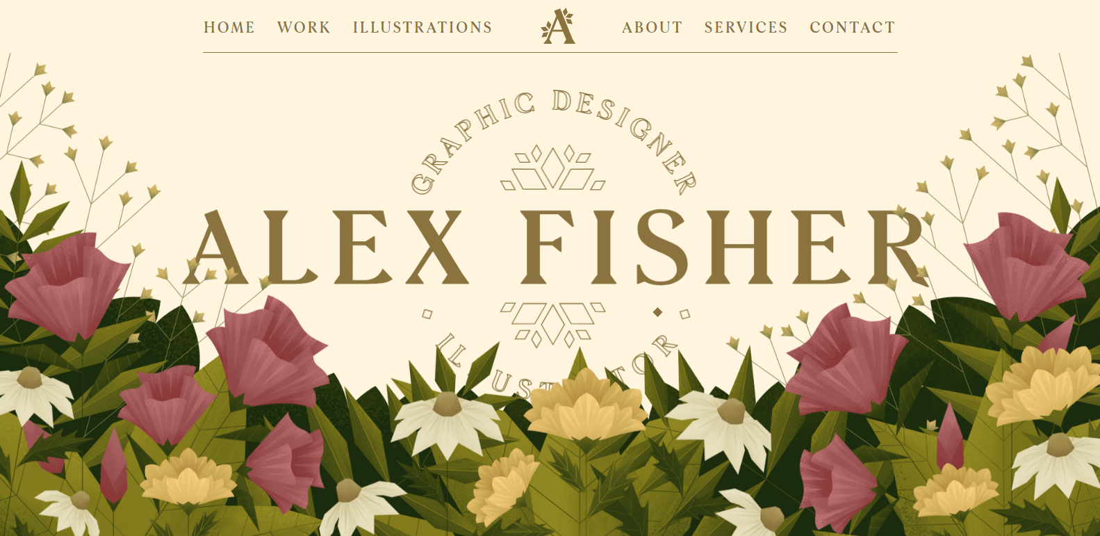
This vibrant artist website example uses layered scrolling, a rotating slider, and a bold color scheme to reflect the artist’s identity. A diamond-shaped cursor adds a fun twist. This site inspires artists looking to create a standout digital portfolio.
9. James White
A bold, retro, visually captivating portfolio.
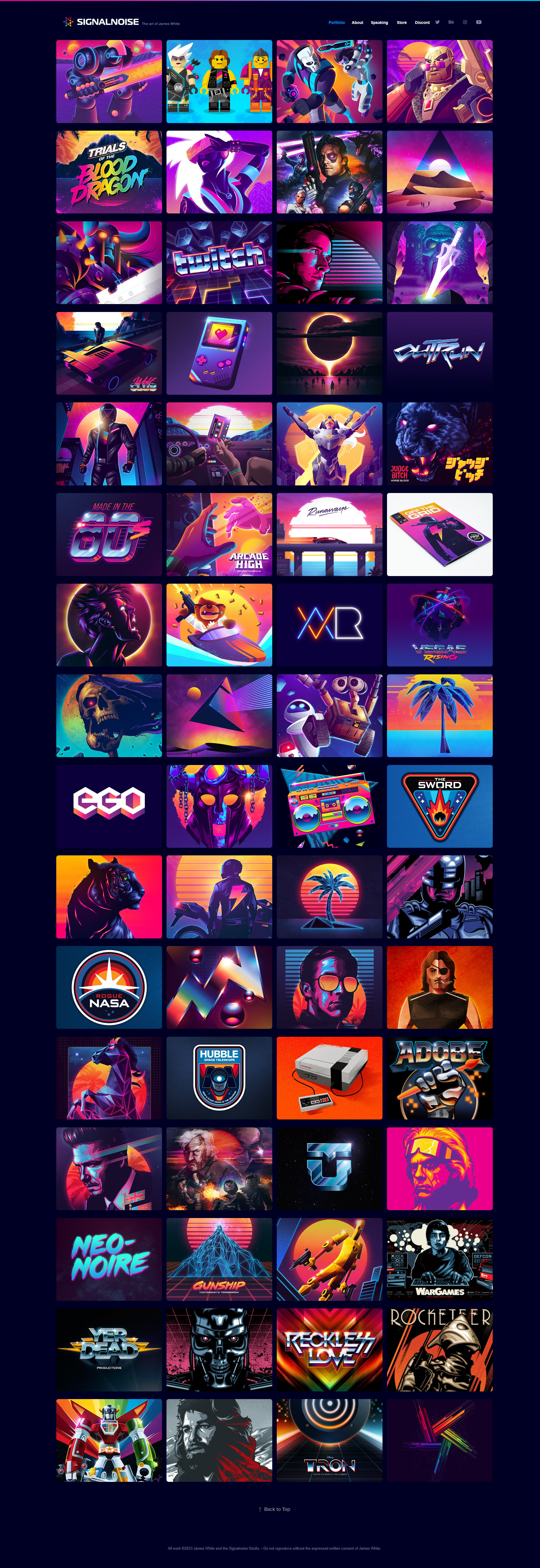
This is one of the most visually bold artist websites with retro-inspired artwork on a dark backdrop. The grid layout and neon aesthetic showcase his versatile work, offering creative art website ideas for designers exploring vibrant color palettes.
10. Phillip Pop Off
Minimal navigation overlays an animated background.
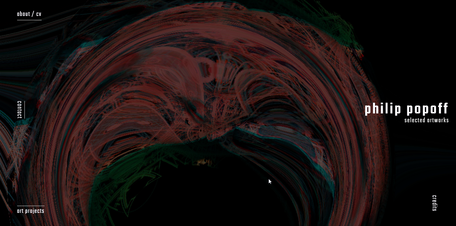
A unique artist website example for animators, this portfolio uses GSAP animations, sleek transitions, and minimalist overlays to highlight digital art. The detailed CV and interactive visuals make it ideal for artists with motion design or experimental visuals.
11. Jon Burgerman
A dynamic, playful, character-driven portfolio site.
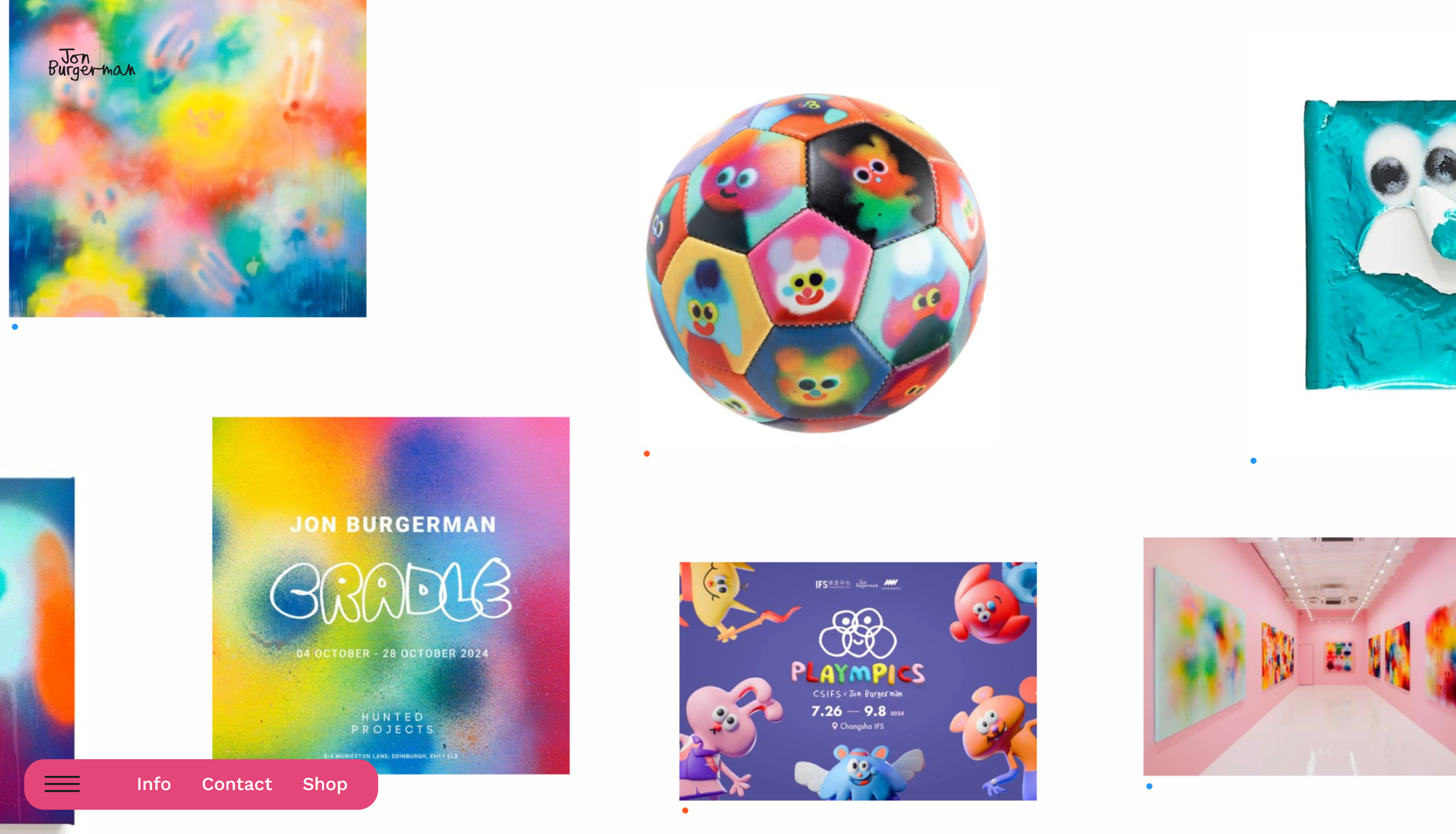
This is one of the most dynamic artist website examples. It’s bursting with character illustrations, parallax scroll, and animated interactions. The full-screen carousel and playful layout make it an ideal art website idea for bold, quirky portfolios that entertain as much as they inform.

Build your website in 1 minute
Found inspiration? Your website is just a few clicks away. Start
with 10Web AI Website Builder to effortlessly bring your vision to life.
12. Mike Perry Studio
An eclectic artistic showcase.

A vibrant artist website example with horizontal scrolling, animated menus, and bold visuals reflecting Mike Perry’s eclectic style. This site is a picture-perfect inspiration for artists seeking energetic art website ideas showcasing diverse media with playful navigation and a strong personality.
If you’re captivated by vibrant, animated navigation layouts, you can design a similar-style website using 10Web AI Website Builder. This tool allows you to craft a website that resonates with your aesthetic preferences and offers an engaging, dynamic user experience.
13. Brad Albright
A textured, gritty artist website design for nostalgic art.
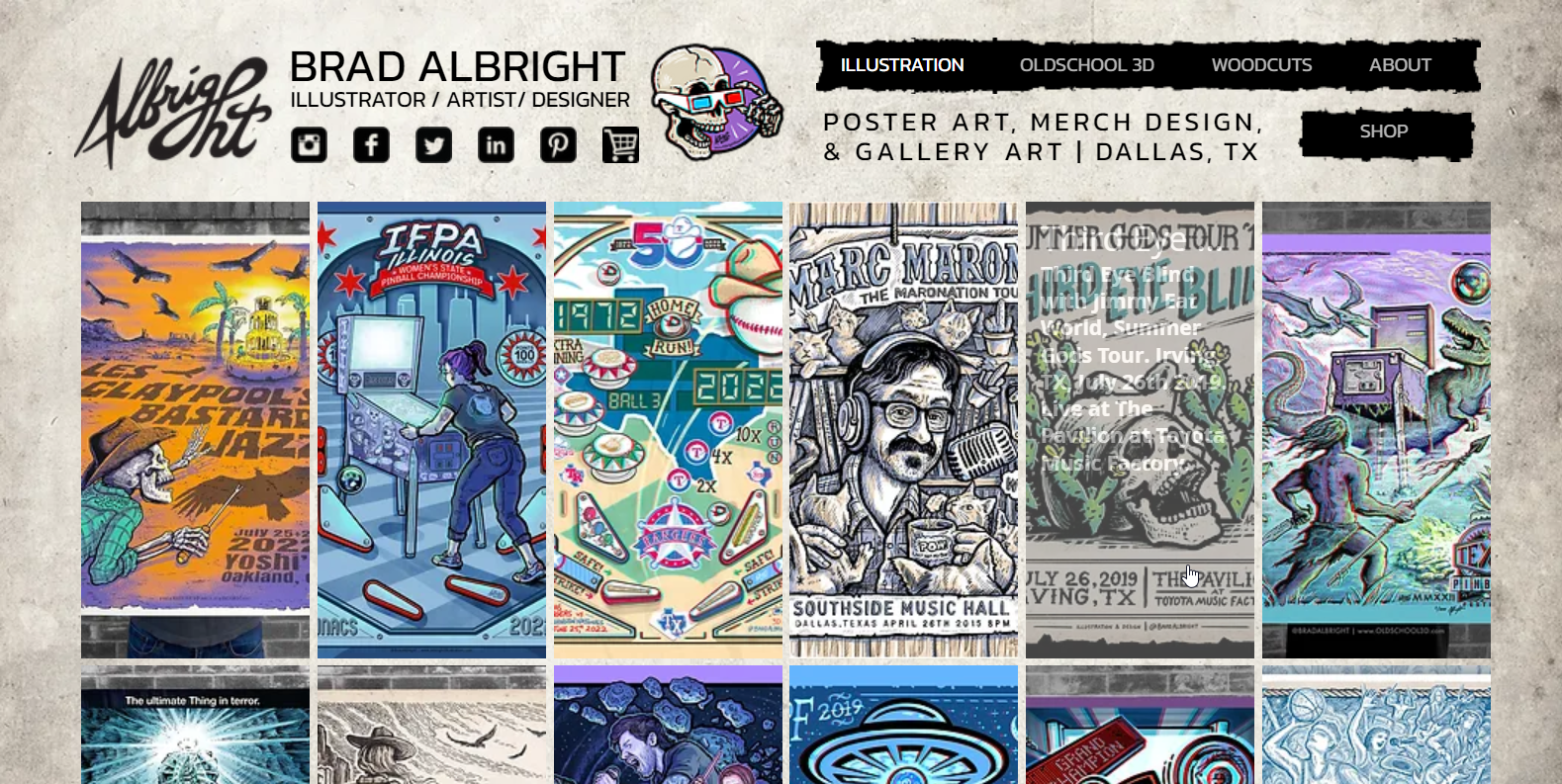
This retro-inspired artist website example features comic-style illustrations, textured backgrounds, and 3D anaglyph posters. The gritty, nostalgic design makes it a standout among art website ideas, ideal for artists blending pop culture with a bold visual aesthetic.
Related Articles
14. Woohyon
Unconventional layout for eclectic storytelling.

This unconventional artist website example tells a story across the entire site, combining video elements and a warm, biography-led design. With a dark background and editorial layout, it’s a memorable art website idea for mixed media or conceptual artists.
Key takeaways
These websites show structure isn’t a rule; it’s a playground. Bold colors, interactive scroll effects, and unconventional layouts are perfect if you want your website to feel like an extension of your creative energy.
Artist portfolios with an online store
Why choose between showcasing and selling when you can do both? These websites combine galleries with integrated shops, making it easy for fans to admire your art and take it home.
15. Nicole Lapin
Unexpected scrolling animations liven up a full-length home page.
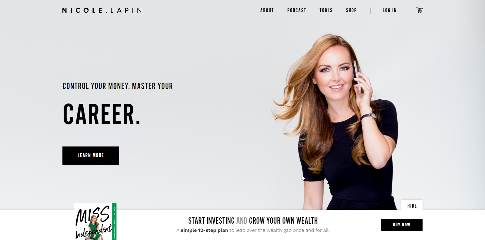
A professional, scroll-driven layout with strong visuals and ecommerce integration, this simple artist website example showcases Nicole Lapin’s brand and offerings clearly. With high-quality imagery and animated sections, it’s a polished art website idea for authors or media personalities.
16. Brooke Cormier
Casual theme with a personal touch.

A great example of a simple artist website, Brooke Cormier’s clean layout and warm imagery highlight her naturalistic paintings. With intuitive categories and an integrated shop, it’s one of the most accessible artist website examples for selling art online.
17. Alice X Zhang
Scroll through a gallery-like masonry design of portfolio pieces.
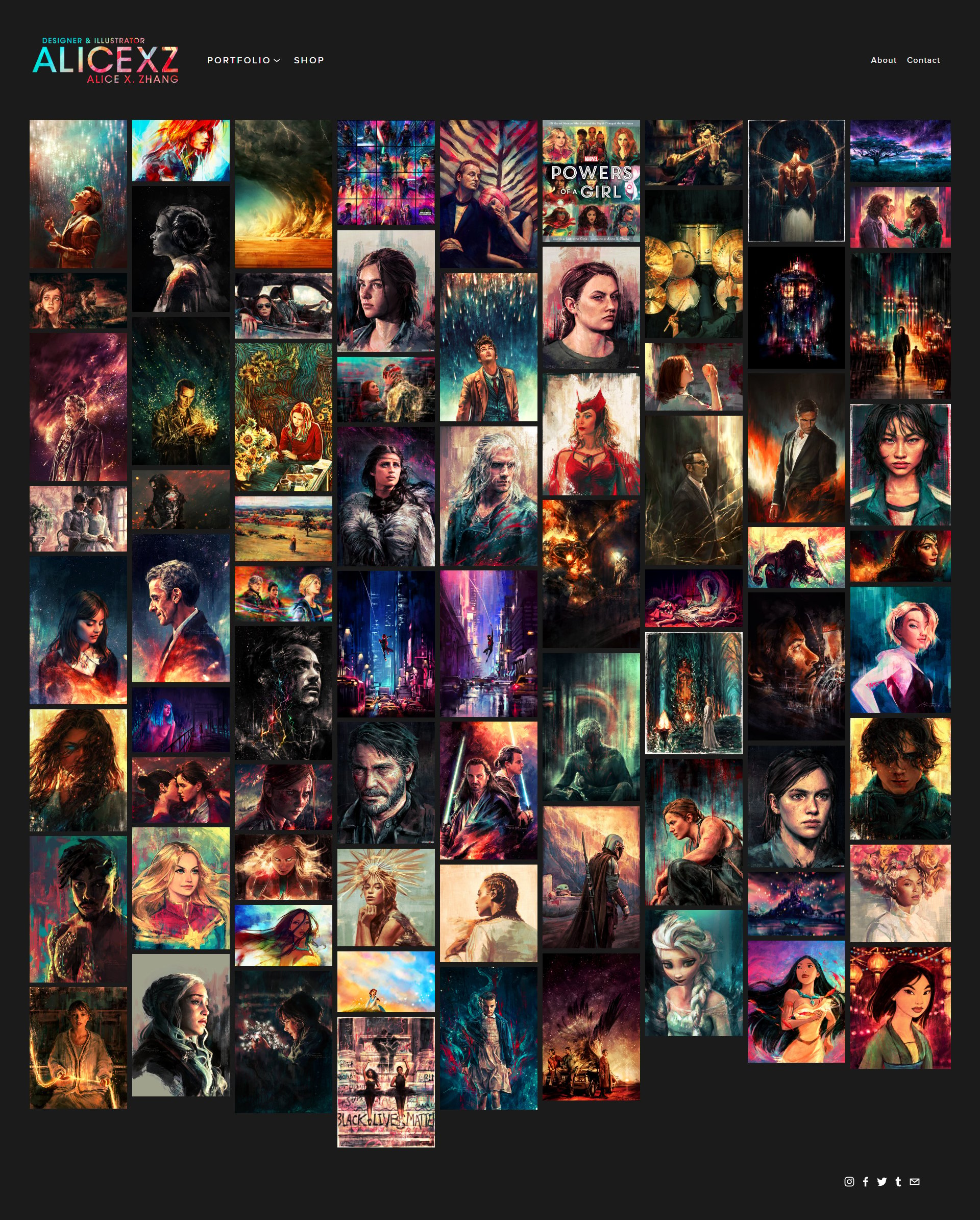
Dark backgrounds and vibrant artwork make this artist website example feel like a curated gallery. The masonry layout showcases emotionally charged portraits, while the integrated store supports sales. This strikes a good balance for artists with visual storytelling and ecommerce functionality.

Build your website in 1 minute
Found inspiration? Your website is just a few clicks away. Start
with 10Web AI Website Builder to effortlessly bring your vision to life.
18. Emily Mercedes
An ecommerce-focused art gallery.
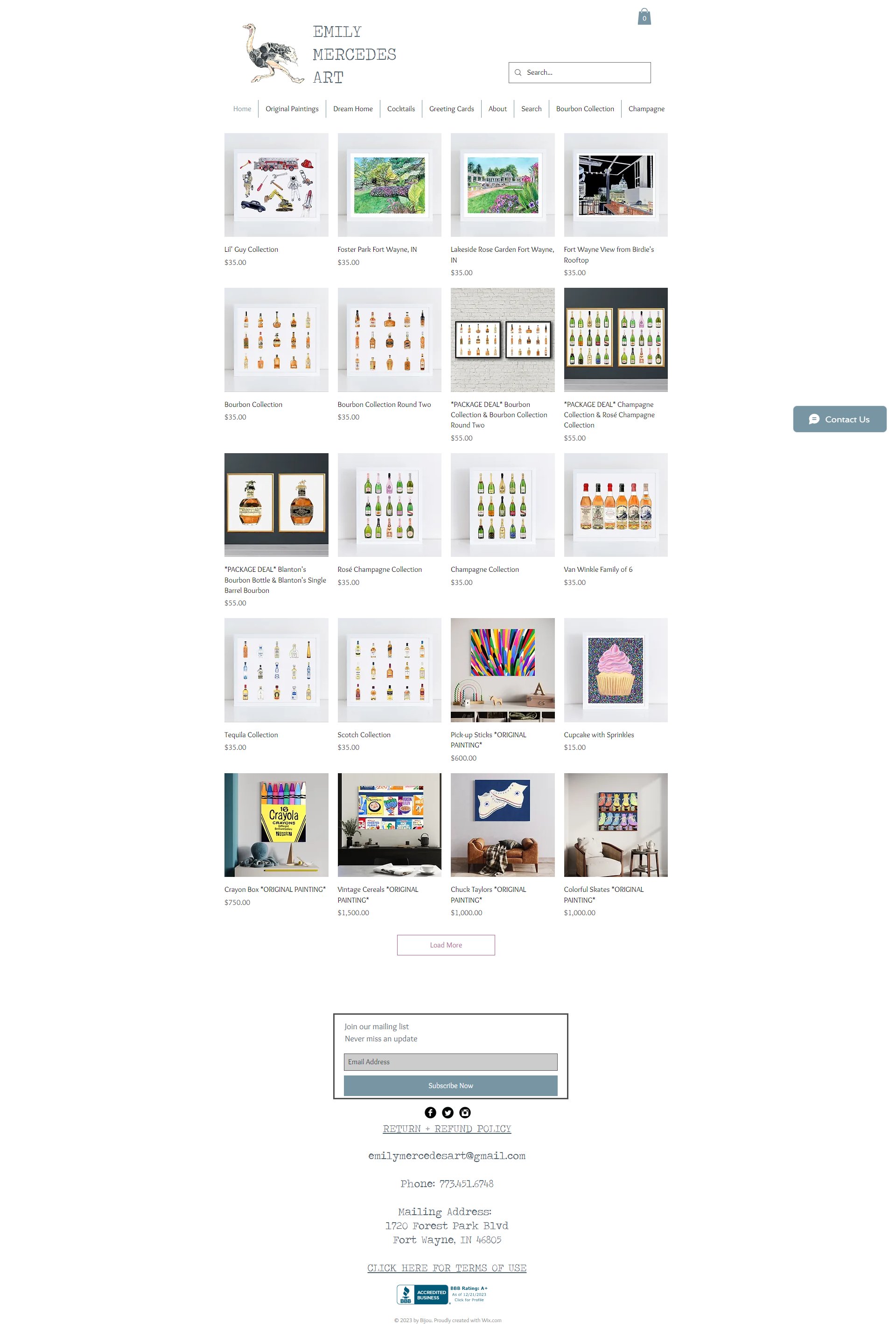
This ecommerce-focused artist website example blends bold artwork with an intuitive shopping experience. Clear categories, quick view options, and a memorable logo (an ostrich in this case) make it a standout art website idea for artists selling original work online in a vibrant, polished format.
19. The Art of Irina
A mixture of art and call-to-action sections.
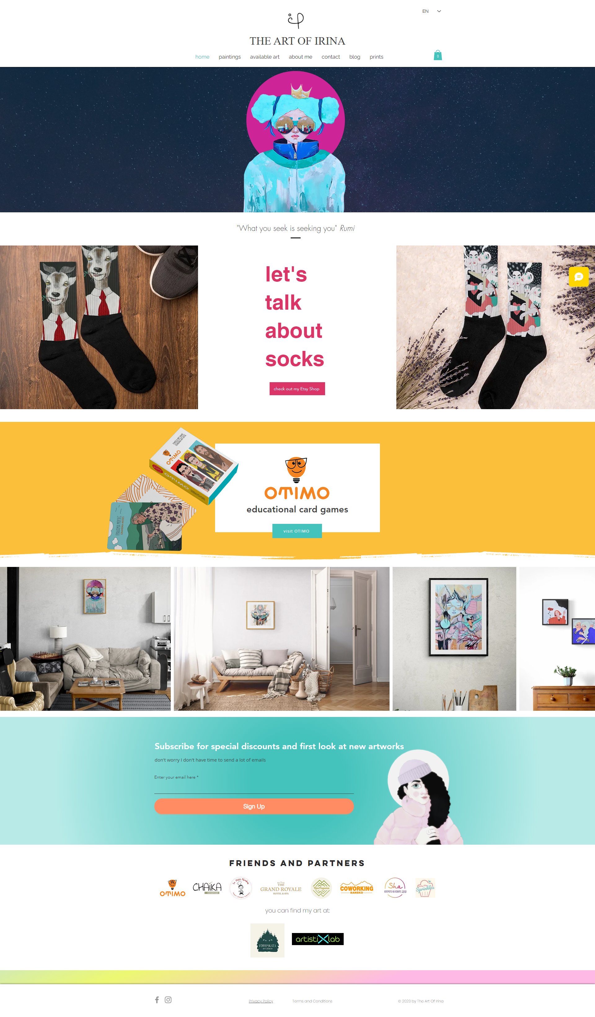
This artist website example features large paintings, categorized portfolios, and a live chat for direct artist interaction, blending visual art with personal storytelling. A fabulous art website idea for painters who want a warm, engaging space to connect with collectors.
20. Magnolia Visual Arts
A perfect film-reel theme for photographers.
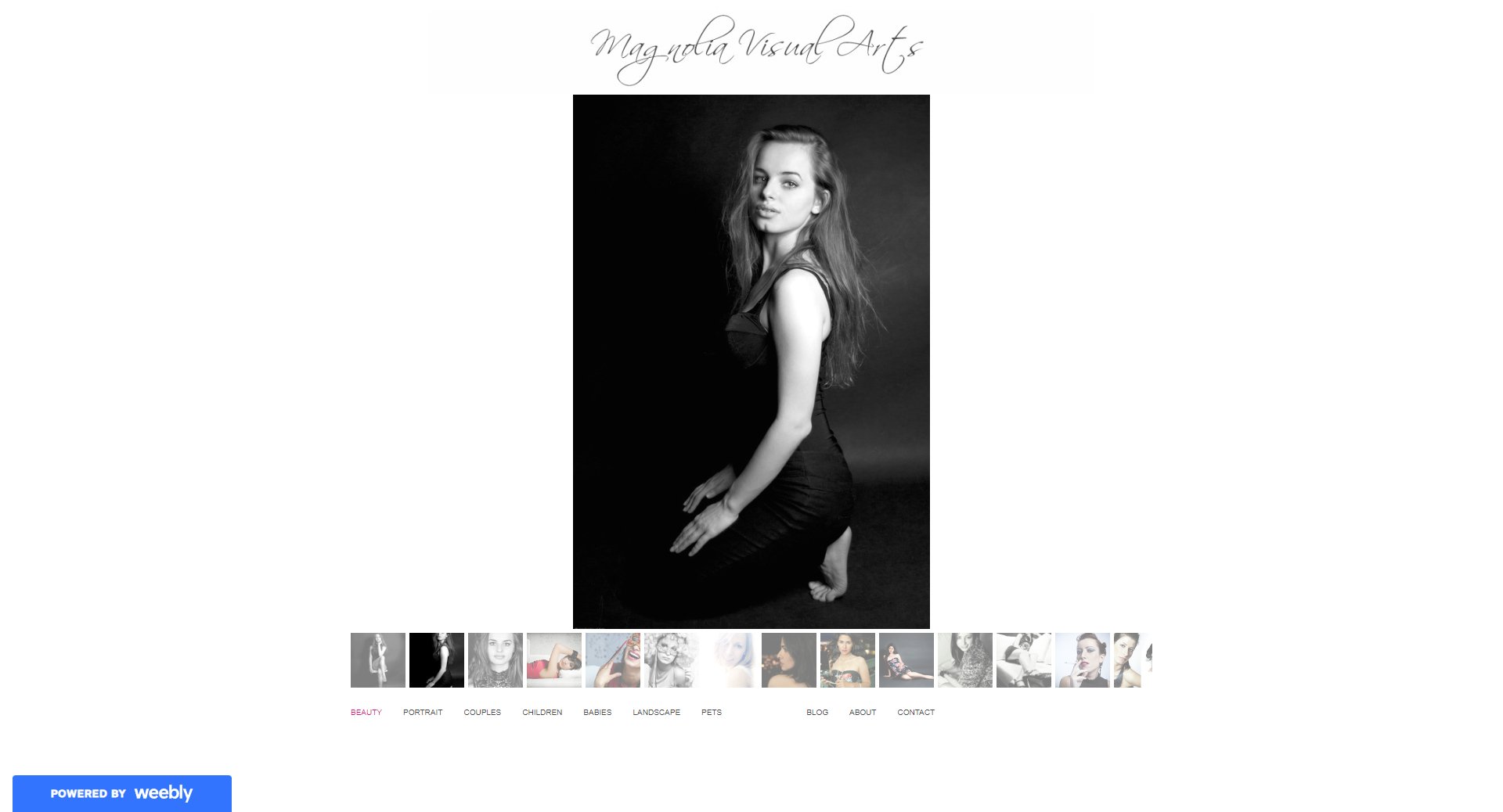
This photography-focused site uses a slideshow homepage and film-reel styling for project galleries. A strong artist website example for photographers, its creative layout and bottom navigation bar offer unique art website ideas that feel both editorial and personal.
21. Edzera Gallery
A welcoming showcase and personal introduction.

This artist website example blends ecommerce and cultural storytelling, featuring Indigenous artwork across categories like sculpture, canvas, and glass. With a helpful FAQ and live chat, it’s an inspiring art website idea for galleries promoting diverse collections online.
22. Jessie Maxwell Bearden
Sleek, uncluttered artist’s showcase.

This site features a sleek portfolio design with a colorful background, clear menus, and a standout client showcase page. This is one of the best artist websites for commercial artists or creative directors aiming to present work and credibility in a clean, vibrant layout.
Key takeaways
Show and sell! A good artist website can blend portfolio and shop without feeling cluttered. 10Web AI Website Builder makes it easy to add galleries and a store right from the start, so your art can start working for you.
Storytelling and brand-focused artist websites
These sites go beyond just showing work. They introduce you to the artist behind it. If your story, process, or personality is central to your creative identity, these examples will spark ideas for building deeper connections with your audience.
23. Shantell Martin
Artistic, interactive, minimalistic web design.
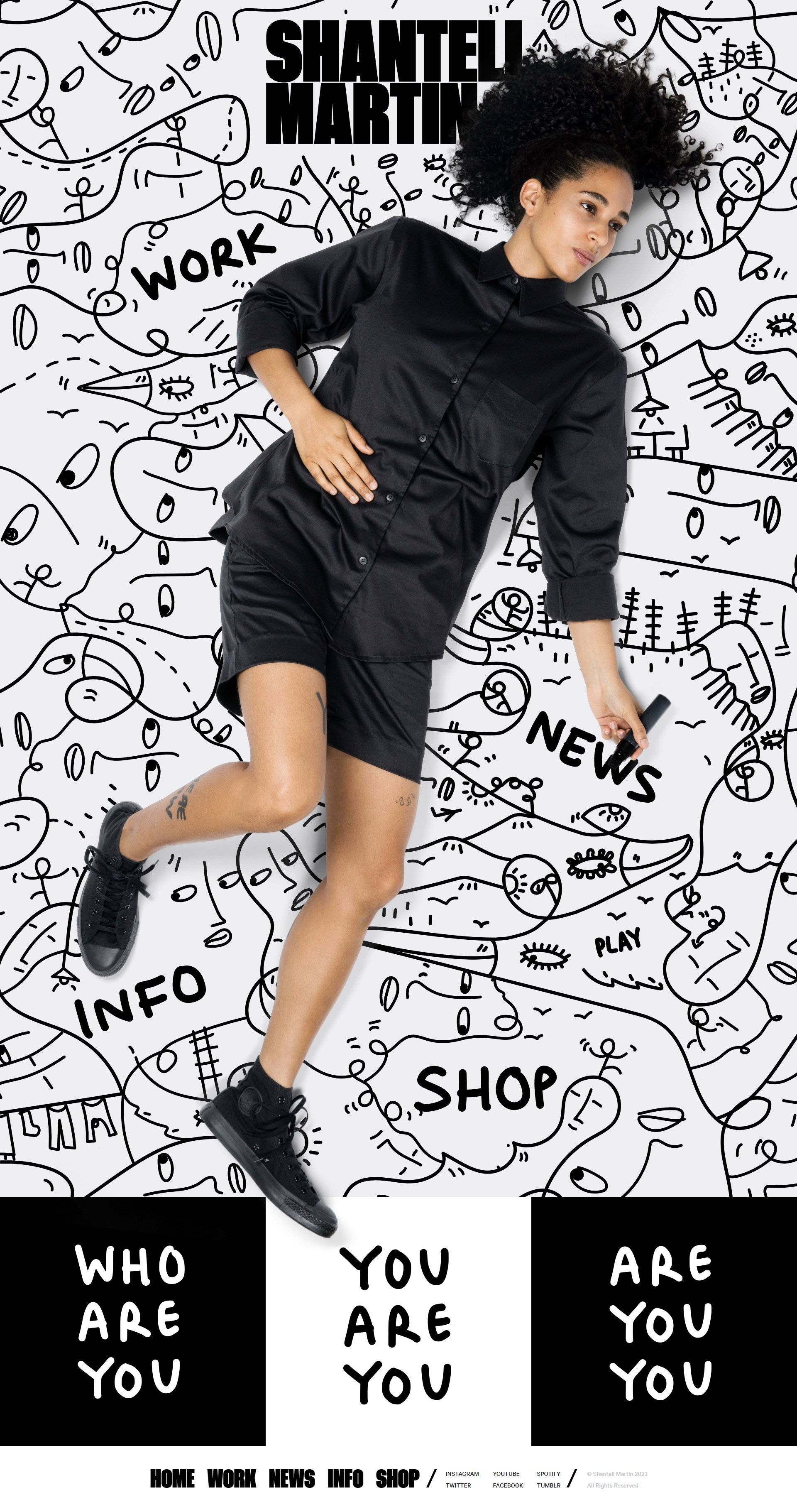
This artist website example blends minimalism with movement. Abstract lines follow your cursor, creating an interactive experience. Her monochrome doodles, floating text, and hover-based navigation make it stand out in modern art website ideas.
24. Alicia Haberman
Immersive and visually unique.
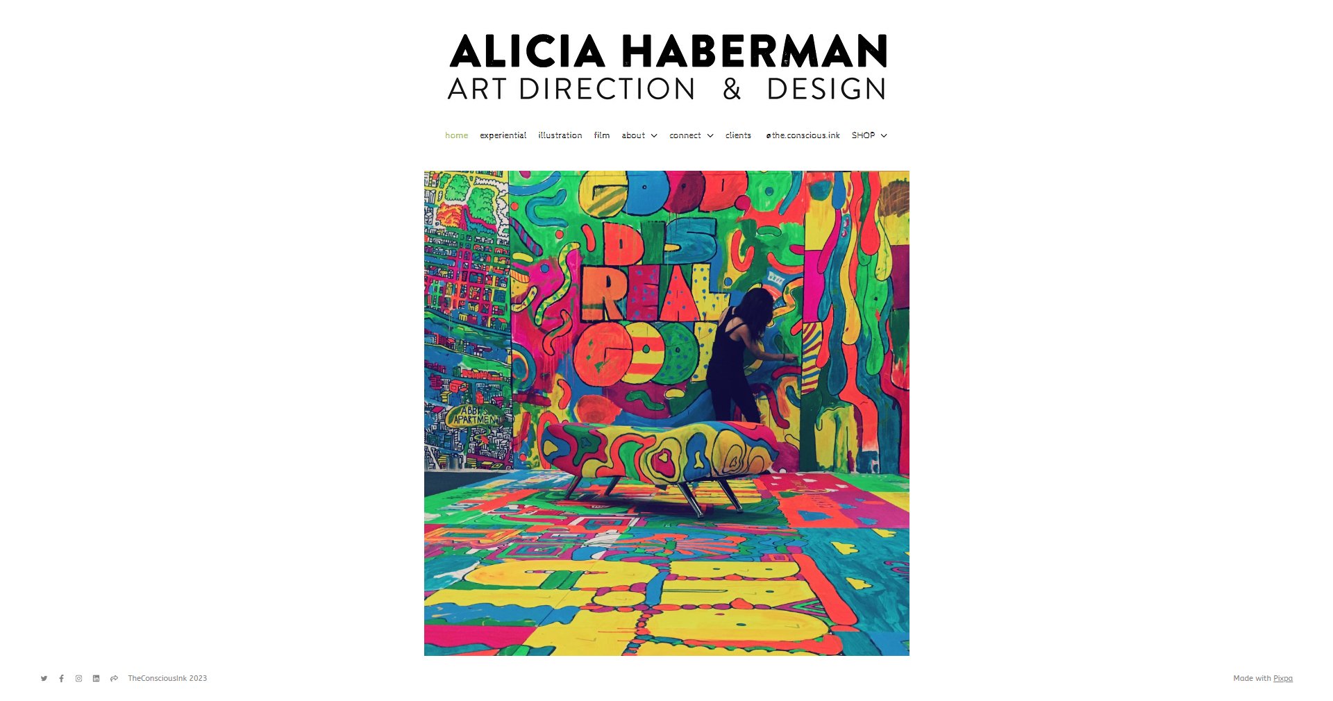
Alicia’s artist website stands out for its multidisciplinary layout, combining film, experiential design, and illustration. With rich visuals and bold sectioning, it’s one of the best artist websites for showcasing collaborative or cross-media creative work.
25. Michelle Carlos
A detailed, imaginative art display.

Michelle’s portfolio pairs hand-drawn elements with travel-inspired illustrations and a blog sharing her creative process. A great artist website example for storytellers, it combines intuitive navigation with an imaginative, personal design to bring her work to life.
26. Zaria Forman
Briskly modern color and detail.
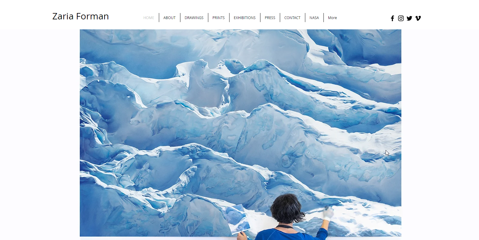
A briskly modern artist website example, Zaria Forman’s site combines pastel-powered visuals with press coverage and exhibit details. It’s a powerful art website idea for climate-conscious artists who want to showcase work alongside meaningful storytelling and global recognition.

Build your website in 1 minute
Found inspiration? Your website is just a few clicks away. Start
with 10Web AI Website Builder to effortlessly bring your vision to life.
27. J.K. Rowling
A creative 2-for-1 artist website designed for different audiences.
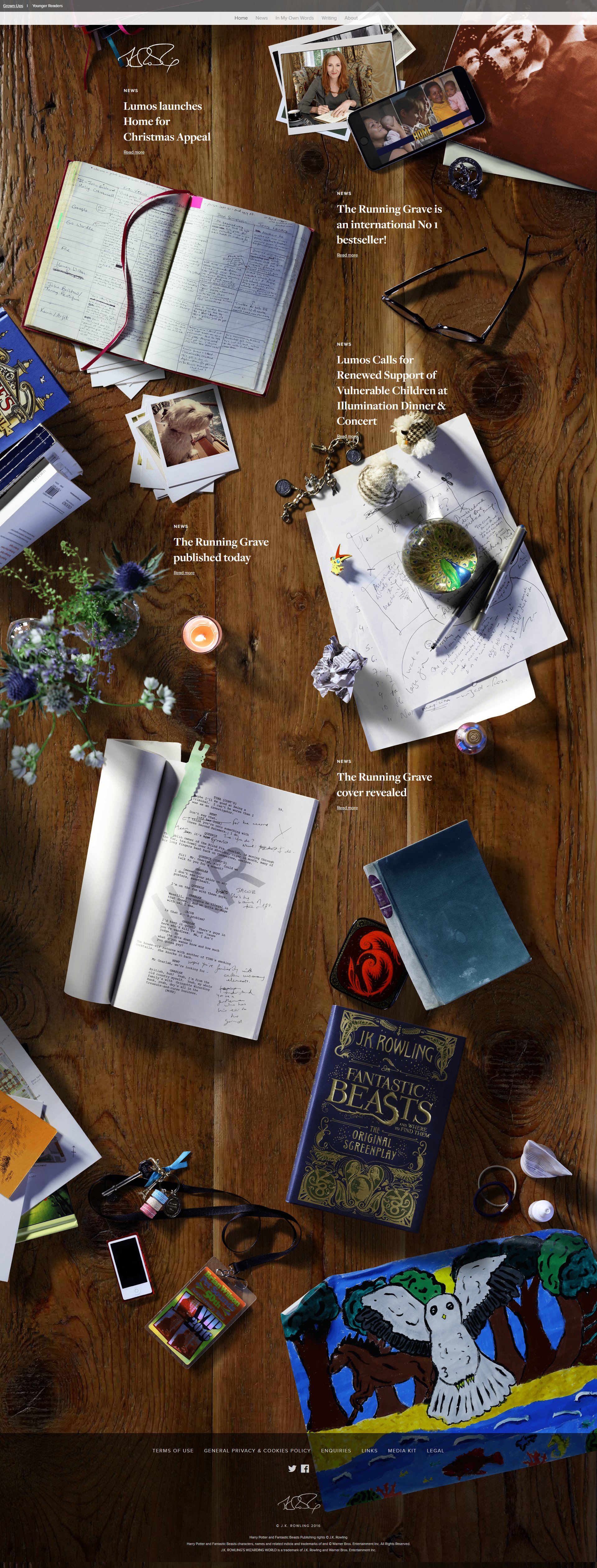
This creative artist website example uses age-based content paths and playful visual illusions to engage different audiences. With an imaginative layout and whimsical design, it’s a unique art website idea for storytellers or authors seeking a dynamic digital experience.
28. Amy Krouse Rosenthal
Bringing the artist’s style to life in a digital presence.
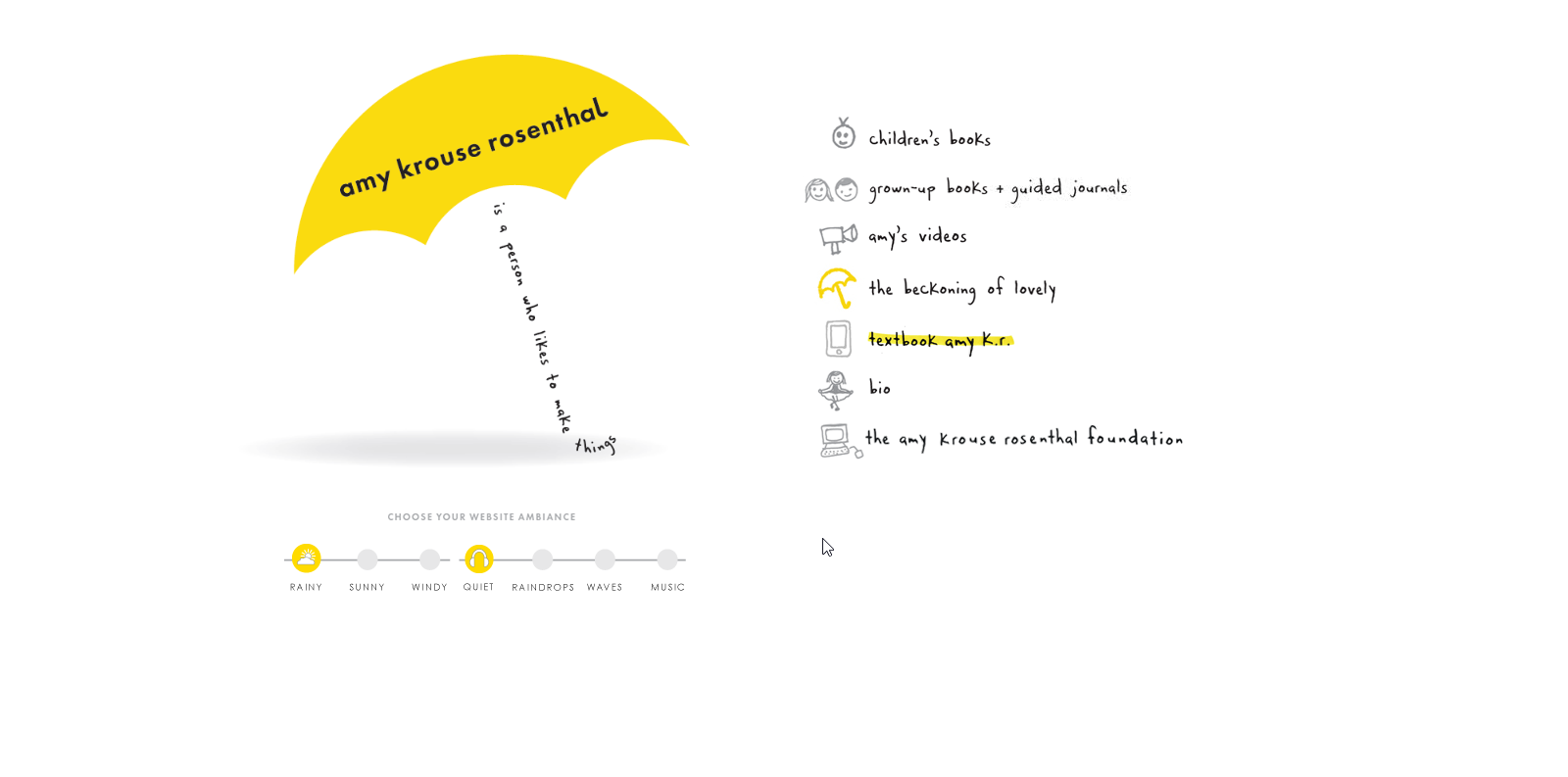
A charming artist website example that brings the artist’s voice to life through playful typography, ambient soundscapes, and customizable viewing experiences. It’s a standout art website idea for authors or creatives who want to craft a multisensory online presence.
29. Jason Arkles
A full-screen feast for the eyes.
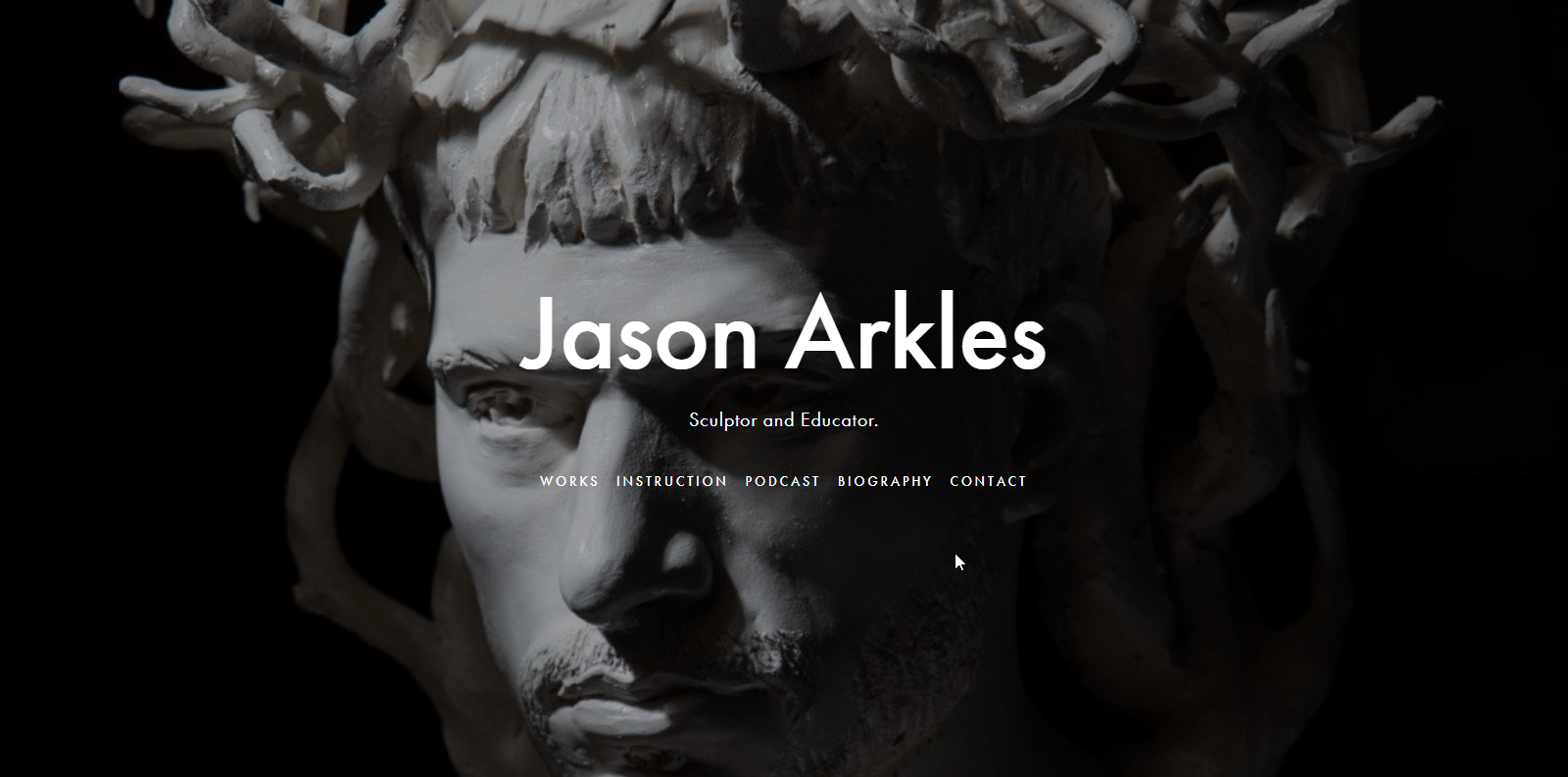
This full-screen portfolio highlights traditional art with a contemporary edge. Jason’s artist website example uses clean navigation and high-quality imagery, making it a simple artist website idea for sculptors or fine artists focused on timeless, gallery-style presentations.
30. Julio Salgado
Colorful artwork takes center stage in an unbusy page design.
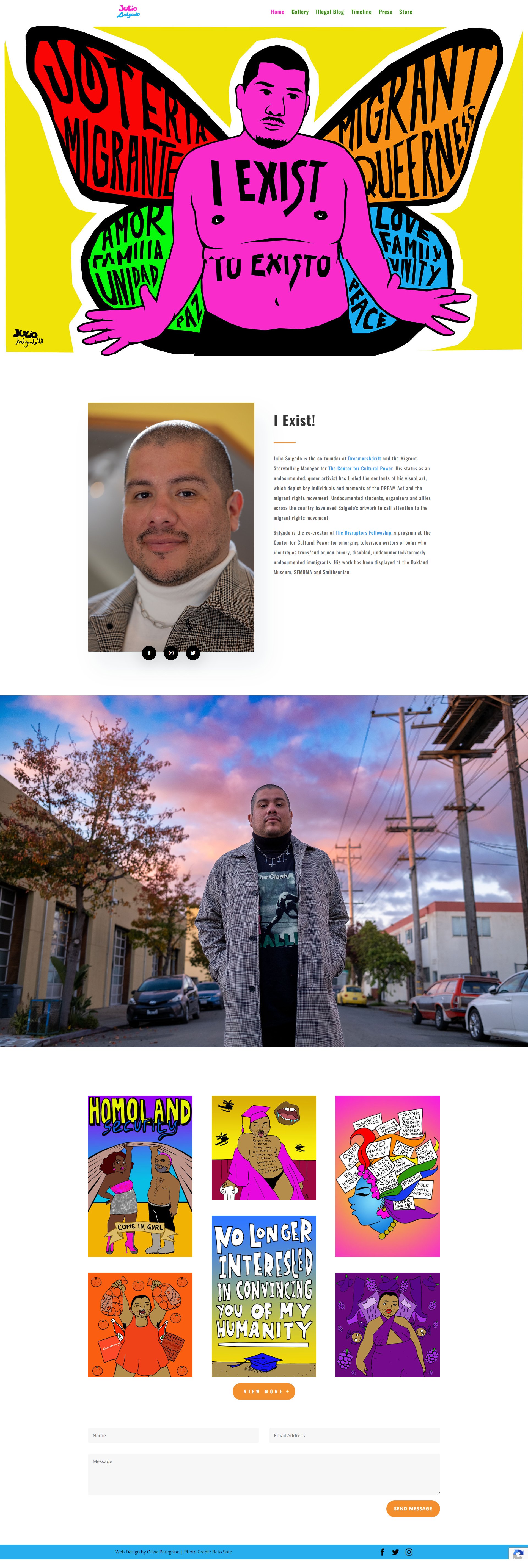
Bold color palettes and powerful visuals define this expressive artist website example. With a clean structure and activist-driven artwork, it’s an art website idea for creators who want their digital space to double as a visual platform for storytelling and impact.
Key takeaways
If your work is personal, your website should be too. These sites combine expressive design with storytelling, building trust and connection. A site that feels like “you” is often more memorable than one that’s just pretty.
Photography portfolio websites
As an art, photography deserves a category of its own. These examples highlight how a great layout, gallery structure, and image quality can elevate your work, from sweeping landscapes to intimate close-ups.
31. Mathieu Levesque
A dynamic, visually rich photography portfolio.
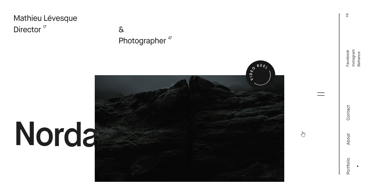
This sleek artist website example blends smooth scroll, modern typography, and a cinematic video reel. With off-canvas menus and detailed art sections, it’s a great example of an art website idea tailored for photographers or visual storytellers.
32. Levon Biss
Modern details enhance this photography portfolio.

A full-screen gallery and minimalist structure make this one of the best artist websites for photography. Levon Biss uses collapsible navigation and elegant layout choices to keep attention on his intricate macro photography. This is an ideal inspiration for artists looking for high-impact portfolio websites.

Build your website in 1 minute
Found inspiration? Your website is just a few clicks away. Start
with 10Web AI Website Builder to effortlessly bring your vision to life.
33. Elena Iv Skaya
A sophisticated photography showcase.
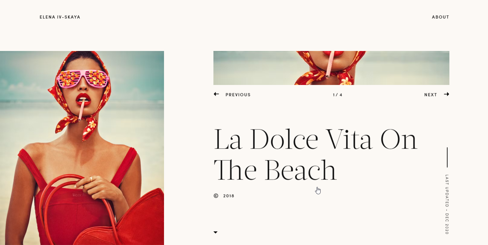
Elena’s minimalist website puts photography at center stage, with full-screen galleries and clean typography. One of the most elegant artist website examples, it’s a great fit for photographers who want to showcase high-contrast, painterly visuals in a sleek digital format.
34. Peter McKinnon Photography
Parallax scrolling photography masterpiece.
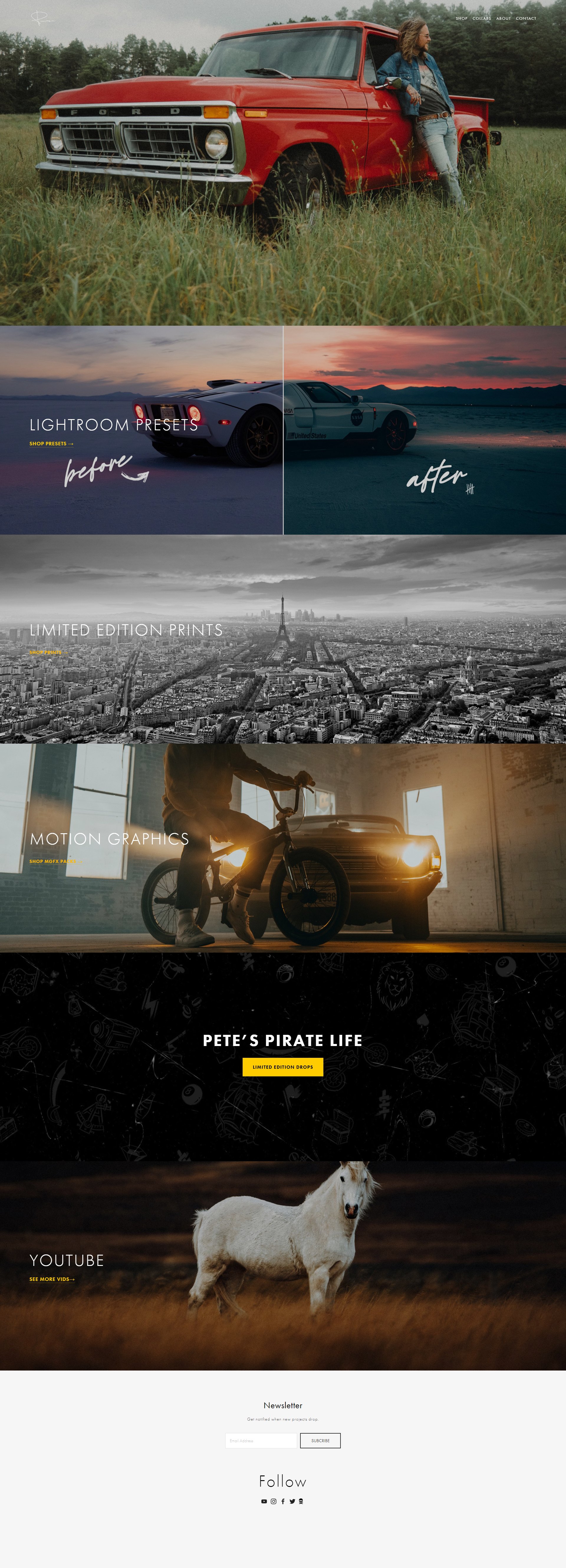
With parallax scrolling and immersive full-screen visuals, this is one of the best artist websites for photographers. Peter McKinnon’s sleek design highlights his cinematic style, making it a strong art website idea for visual artists focused on storytelling through photography.
Key takeaways
A strong photo portfolio site puts image quality first and makes navigation effortless. Whether showcasing client work or selling prints, a scroll-friendly layout is essential. Tools like 10Web AI Website Builder can help you create a polished, gallery-style experience in minutes.
Whimsical and comic-inspired portfolios
Full of charm, color, and character, these artist websites don’t take themselves too seriously. If your work is playful, narrative, or illustration-driven, these memorable artist websites are packed with inspiration.
35. Philippa Rice
A charming and colorful artist portfolio.

A playful, comic-style portfolio, Philippa Rice’s site features asymmetric layouts and colorful illustrations. It’s one of the most charming artist website examples for creators working in children’s books or whimsical design, offering fun, approachable navigation and visual storytelling.
36. Nathalie Lete
A whimsical, vibrant, visually immersive gallery.
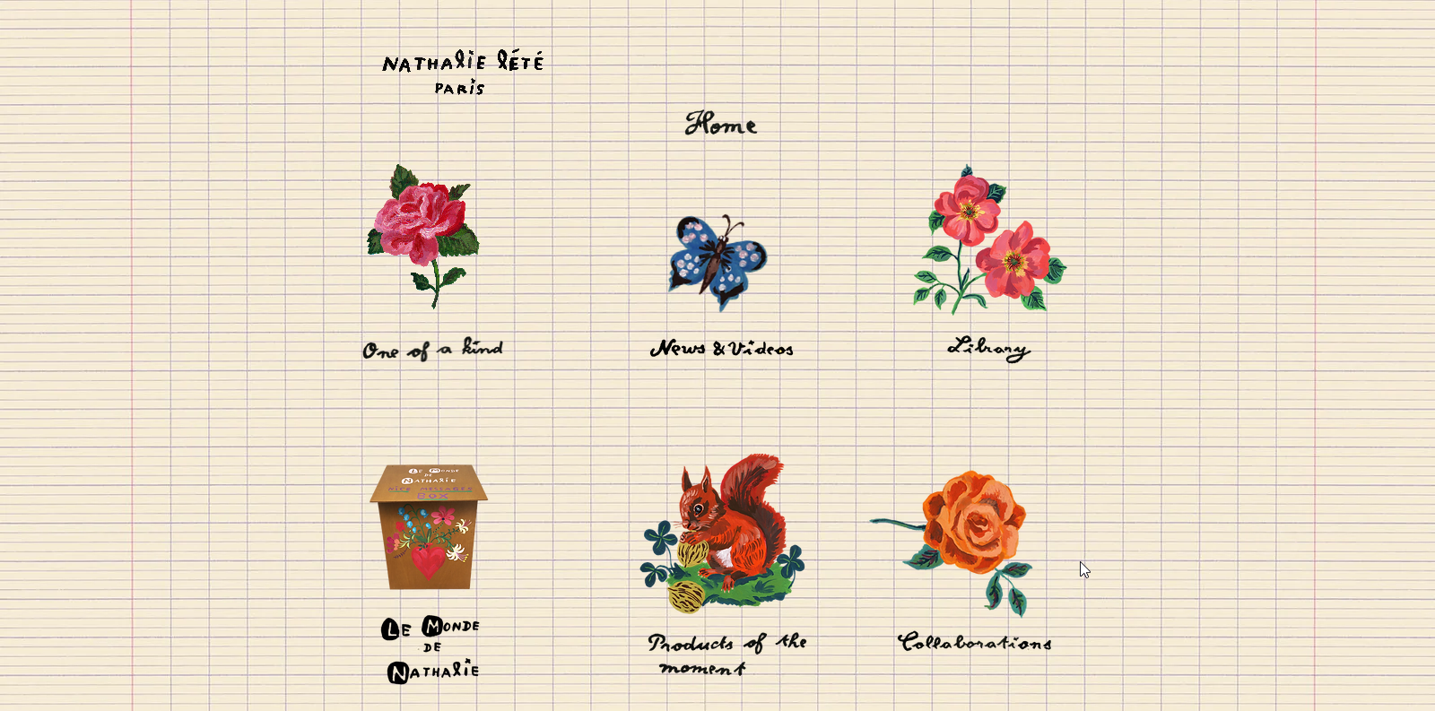
Whimsical and vibrant, this artist website example feels like a digital gallery. Hand-drawn fonts, rich textures, and journal-style grids give it a magical feel. This website presents a unique opportunity for inspiration for artists seeking unconventional art website ideas full of personality and color.
37. Gusté Design
An artist website with a colorful, clean, user-friendly design.
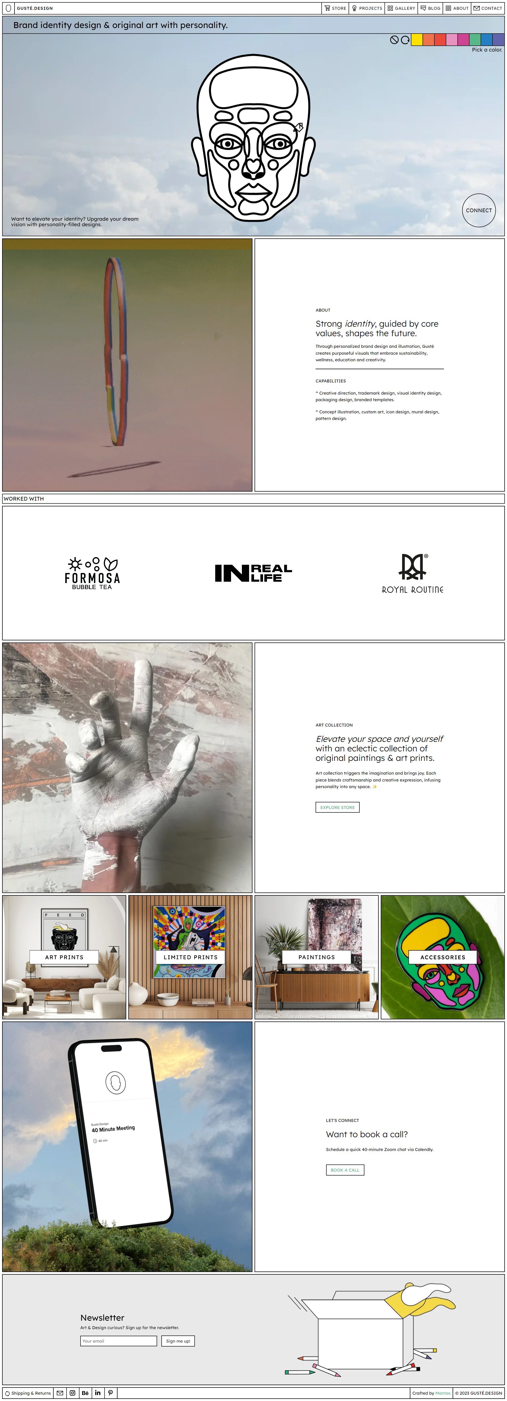
A simple artist website with interactive design touches, Gusté Design uses a soft cyan background to spotlight each artwork. The site includes a shop and call-to-action sections, offering practical art website ideas for creators focused on client work and engagement.

Build your website in 1 minute
Found inspiration? Your website is just a few clicks away. Start
with 10Web AI Website Builder to effortlessly bring your vision to life.
38. Michael Burk Studio
A delightful collage of candy-colored art and photography.
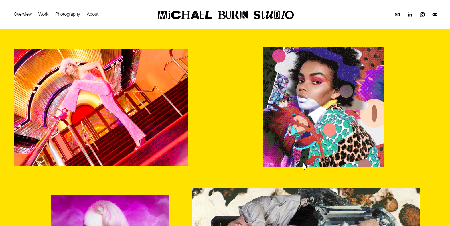
This candy-colored collage-style site uses a bold yellow backdrop and modern visuals to showcase multidisciplinary work. It’s a creative artist website example for combining photography, design, and branding in a playful but professional way.
39. Grand Deluxe
A showy grid layout for an artist’s portfolio.

This artist website example uses a colorful grid layout and minimal navigation to spotlight bold illustrations. Each artwork links to a deeper description, making it an excellent template for artists seeking structured, content-rich portfolios that still feel vibrant.
Key takeaways
Don’t be afraid to lean into fun. Playful visuals, offbeat navigation, and bold color choices can help your site feel more like an experience than a static page. It’s a great reminder your site should match your personality, not just your medium.
Interactive and motion-driven sites
These websites literally bring your art to life. Scrolling animations, hover effects, and immersive storytelling are ideal for artists who want to create an engaging experience beyond static pages.
40. Anton and Irene
Innovative and interactive vertical design.
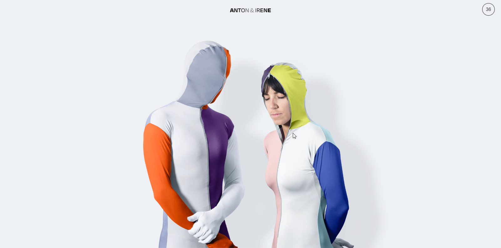
An interactive scroll-based journey, this artist website example features parallax motion, bold visuals, and snowy effects. It’s one of the most immersive art website ideas. It’s ideal for design studios or artists wanting a vertical storytelling experience packed with personality.

Build your website in 1 minute
Found inspiration? Your website is just a few clicks away. Start
with 10Web AI Website Builder to effortlessly bring your vision to life.
41. Pierrick Calvez
This understated layout shines the spotlight on the artist’s works.
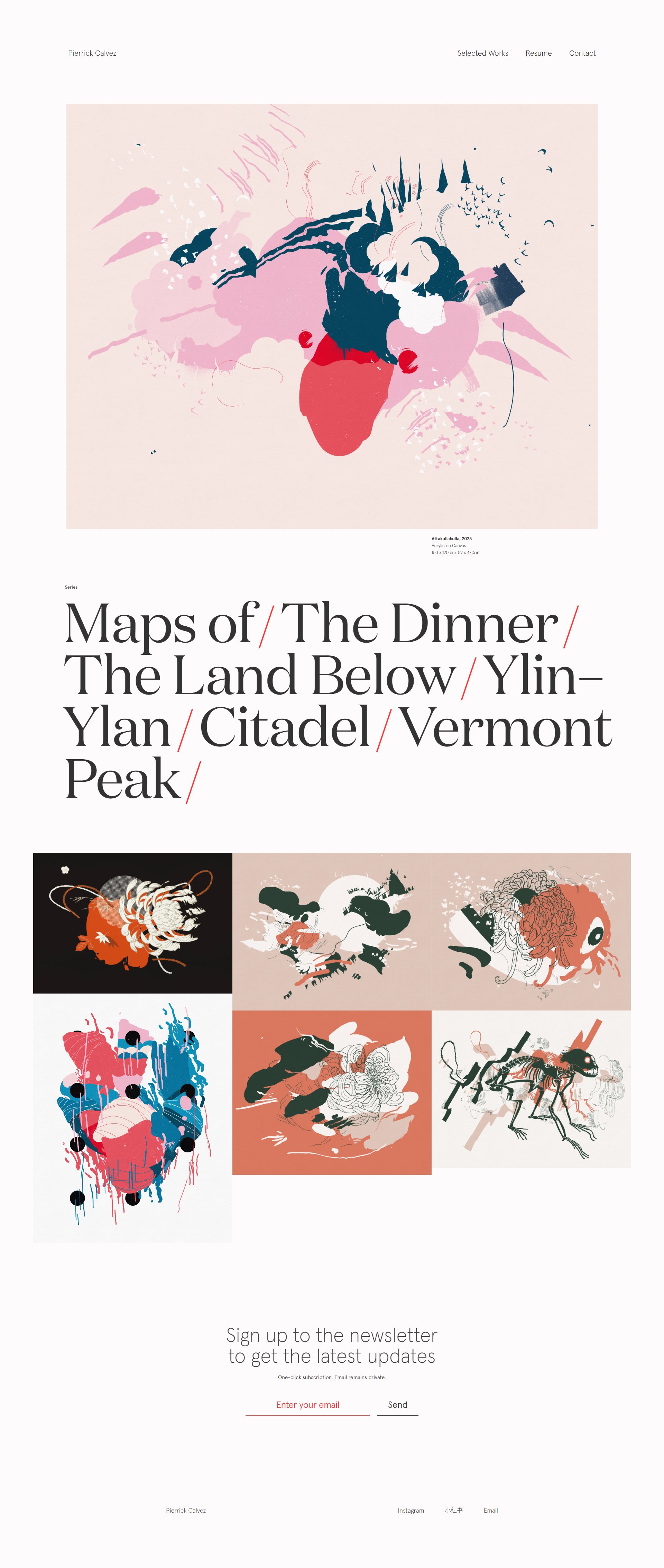
With a clean, modern layout with bold typography and colorful artwork, this artist website example emphasizes storytelling through minimalism. Studio insights, publications, and client lists add depth. This is a good example for artists looking for professional yet approachable website ideas.
42. Robert Wilson
Take a seat and enjoy this theater-like experience.
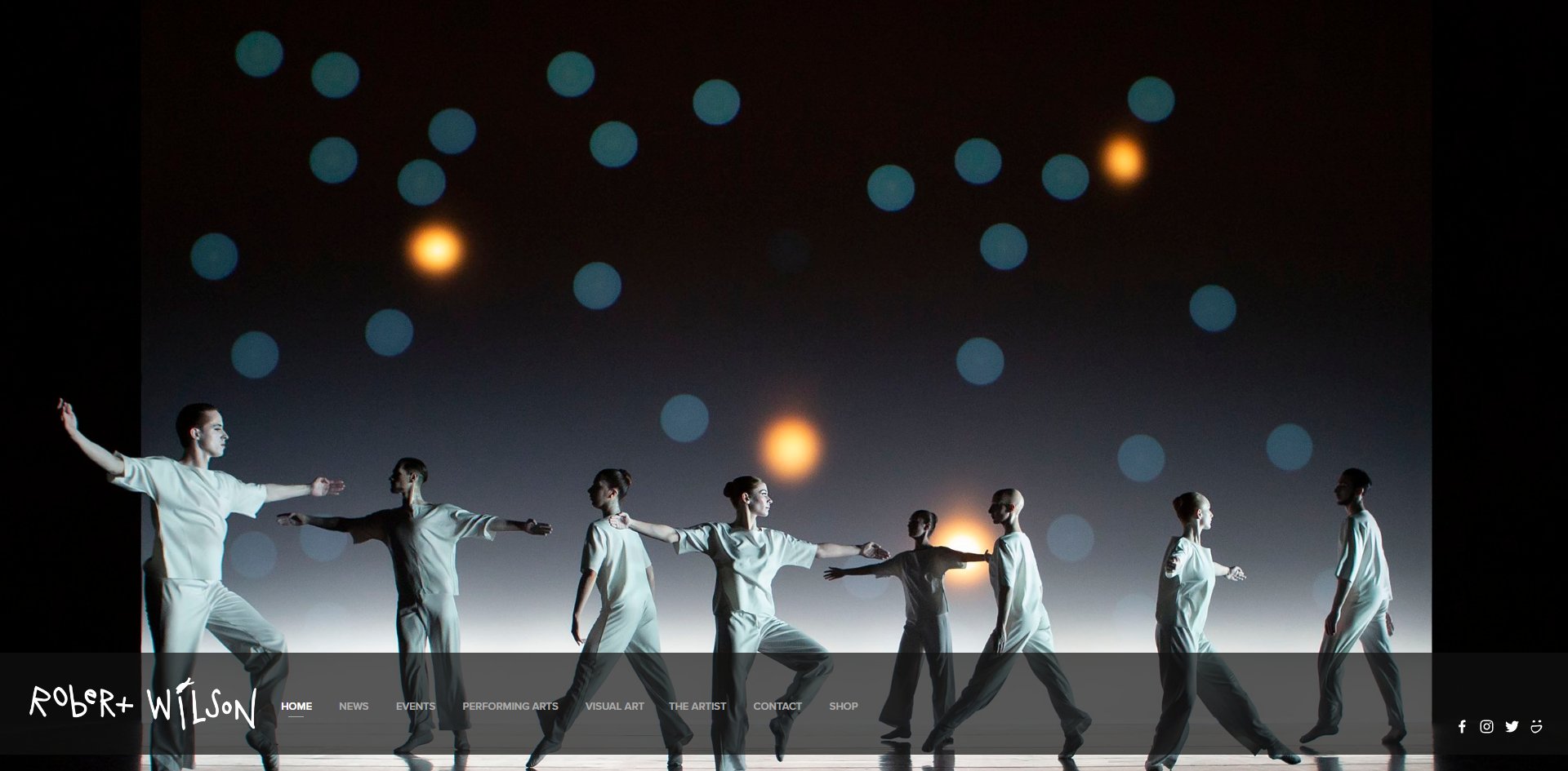
A genuinely theatrical artist website example, this site mimics the feel of a darkened stage. Full-screen imagery, minimal text, and simple navigation offer a compelling art website idea for performance artists and visual creators who want an immersive, cinematic experience.
43. Guilbo
Dark ambiance with an art noir feel.

With a dark, moody aesthetic, this artist website example feels like art noir. Full-screen galleries and elegant presentations make it a strong art website idea for painters seeking a dramatic, high-contrast digital showcase spotlighting their creative work.
44. Pedro Campos
Exhibiting detailed artwork that dominates the experience.
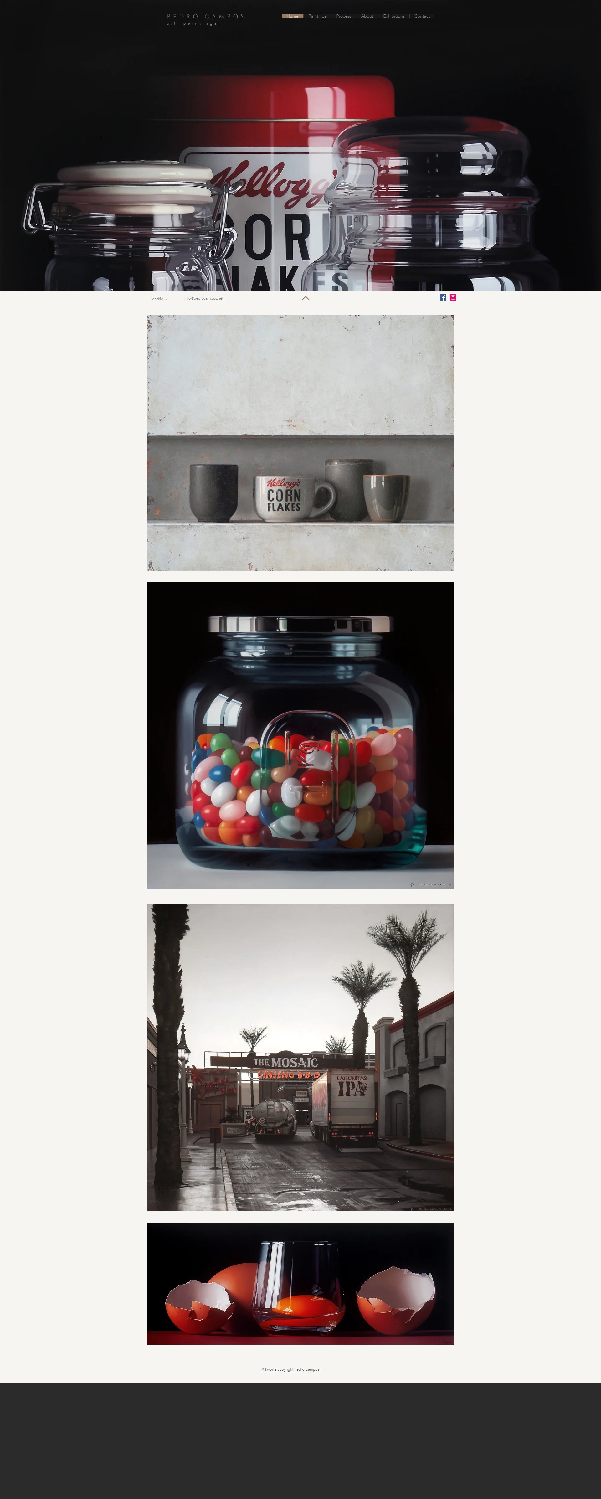
Pedro Campos’ site exemplifies simplicity, using a single-page layout to spotlight his hyperrealist paintings. Smooth transitions and crisp image presentation make this a clean and elegant artist website example for showcasing fine art in detail.
Key takeaways
Interactive design is the way to go if you want to create a digital space that surprises visitors. These sites use motion, scroll animations, and immersive layouts to turn portfolios into mini-exhibits. Even if you start with a simple structure, tools like 10Web’s AI Builder can give you a flexible foundation to experiment as you go.
Best website builders for artists in 2025
An artist website should be as unique as each individual style, but building a website sounds intimidating if you’re not tech-savvy or a programmer. The good news is you don’t need to be either. Website builders can help non-coders create the website of their dreams.
If you want a website like some of the examples above, here are some of the best options to consider:
| Website Builder | Best For | Tech Skill Needed | Cost | Customization Level | Ecommerce Ready | Quick Notes |
| 10Web AI Builder | Fast setup, no-code portfolio or shop | Beginner | $ | Medium–High (WordPress flexibility) | ✅ Yes | Describe your art style, AI builds your site — fast, visual, and easy to tweak. |
| Squarespace | Stylish, polished portfolio + shop | Beginner | $$ | Medium | ✅ Yes | Sleek templates, good balance of form and function. |
| Wix | Flexible DIY portfolios & small shops | Beginner–Intermediate | $$ | High | ✅ Yes | Tons of freedom, but can feel cluttered if over-customized. |
| WordPress + Elementor | Full control & scalability | Intermediate+ | $–$$ | Very High | ✅ Yes | Ideal for long-term growth — more learning curve upfront. |
| Big Cartel | Artist-first small shops | Beginner | $–$$ | Medium | ✅ Yes | Simple ecommerce without the bulk of Shopify. Made for creatives. |
| Shopify | Serious ecommerce | Beginner–Intermediate | $$$ | Medium–High | ✅ Yes | Great if your main goal is selling art, less ideal for storytelling/portfolio. |
Except for WordPress + Elementor, these website builders all include web hosting for the sites you create. For example, sites you build with 10Web AI Website Builder benefit from automatically optimized hosting for the best website performance and user experience.
Popular alternatives to website builders for artists
If you’re not ready to go with a full website builder, you’re not alone. Some artists start by showcasing their work on platforms that aren’t quite full websites. Still, these sites offer a way to get discovered or share a simple portfolio.
| Platform | Best For | Customization | Can You Sell Art? | Notes |
| Adobe Portfolio | Clean, simple portfolios for Creative Cloud users | Low–Medium | ❌ (No native shop) | Free with Adobe subscription, good for basic galleries |
| Behance | Discovery & community exposure | Very Low | ❌ (No shop) | More like a social network for artists — use it to drive traffic to your real site |
| Art sharing & discovery | None (platform-driven) | ❌ (Shop via link-in-bio or redirect) | Still one of the top ways artists get seen — just not a substitute for a real site | |
| Carrd | Simple one-pagers or link hubs | Low | ❌ (No built-in shop) | Great for early-stage portfolios, not meant for growing businesses |
Many artists start on platforms like Adobe Portfolio or Behance, then level up to a complete website on a platform like 10Web for more creative control, better branding, and ecommerce features.
Selling your art online: a quick guide for first-time sellers
Turning your website into a place where people can buy your work changes everything for artists. Luckily, selling art online doesn’t have to be complicated, and you don’t need a huge store or an expensive setup to get started.
- Start small.
You don’t need a massive ecommerce empire from day one. Selling a few originals or offering your best pieces is more than enough to begin. - Choose a platform designed to make selling easy.
Squarespace, Wix, and Shopify all have solid built-in store features. But if you want a quick, low-effort way to set everything up, 10Web’s AI Website Builder uses WooCommerce to give you an automatically generated online shop. No tech know-how is needed. - Add simple payment options.
Most buyers are used to payment gateway providers like Stripe, Square, and PayPal. All are easy to set up and supported by major platforms, although availability does vary by region. Make it easy when someone’s ready to buy, whether in person or online. - Think about your pricing.
It’s okay to experiment. You might start with lower-priced items and work your way up to originals or commissions. Include shipping costs (if needed) and keep things clear for buyers. - Make it feel like part of your art.
Your shop shouldn’t feel like a tacked-on sales page. Keep it beautifully designed and consistent with the rest of your site so the experience feels seamless and intentional.
Even if you’re not ready to sell yet, it’s best to select a website builder to grow with you. Platforms like 10Web and WordPress make it easy to add shop features when you’re ready.
Choosing a website builder for the most creative artist website layouts
If you’re just getting started and want a beautiful site without the technical headache, 10Web’s AI Website Builder gives you a ready-to-go layout that still feels personal. But if you’re more hands-on, tools like WordPress with Elementor or Wix give you more room to play with design elements.
Before you start: a few friendly tips to make everything easier
Before you design your artist website (or let an AI builder take care of the technical part), a little prep can go a long way. These small steps help you feel more confident and steer you away from common pitfalls that trip artists up.
- Start with a clear goal.
Do you want to sell your work, book commissions, or just share your portfolio? Your homepage should highlight that goal. - Pick your best work — not all your work.
You don’t need to upload everything you’ve ever made. Think of your site as a curated exhibit. Choose the pieces you’d be proud to show in a gallery. - Write a bio from the heart.
Do you want to sell your work, book commissions, or just share your portfolio? Your homepage should highlight that goal. - Think like a first-time visitor.
When someone lands on your homepage, can they instantly tell who you are, what you make, and where to go next?
Bonus tip: If all of this feels like a lot, you’re not alone. That’s why tools like 10Web’s AI Website Builder exist. You describe your art style, and it builds a ready-made website already structured for you. You can always tweak things later.
Mistakes to avoid when building an artist website
Even though website builders make the technical side of things easy, there are still some common mistakes to avoid.
- Overloading your homepage.
Keep it simple. Let your best work shine without crowding the screen. - Ignoring mobile layout.
Most people visit on their phones first. Make sure your design works beautifully on small screens. - Uploading massive images.
Good-looking images are essential, but compress your files so your site loads quickly (your visitors will thank you). - Confusing navigation.
Stick to simple, clear menus. Don’t make people hunt for your portfolio or contact page. - A stiff, overly formal bio.
Speak like a human. Tell your story the way you’d share it in conversation. - Don’t bore your visitors.
Show visitors what to do. Always include a call to action: view your shop, follow your Instagram, or get in touch.
Remember, your website doesn’t have to be perfect. Keep it honest, intentional, and uniquely yours. You can always grow and refine it over time.
Getting the word out: marketing your website
Depending on your goals, promoting your website is a long-term project. It’s best to keep updating and treating your website as a living portfolio. When starting out, focus on the basics to lay a solid foundation.
- Tell everyone you know. Add your website’s URL and a QR code to your business card.
- Use keyword-rich text to communicate what each page is about to visitors and search engines.
- Leverage email marketing to connect with buyers.
- Get involved and create collaboration opportunities with other artists.
- Drive traffic to your website through portfolio sites like Behance and social media.
Make your website and social media work better together
Already sharing your art on Instagram or other social media? Perfect. Your website should build on your presence.
Here’s how to make the two work hand-in-hand:
- Embed your feed on your homepage.
Most builders let you do this in a few clicks, and it keeps your site feeling fresh with new content without extra effort. - Link back to your site from your bio.
Make sure your website URL is easy to remember and easy to tap. (Bonus points if you link to a landing page with your best work or shop.) - Think of your website as your permanent home base.
Social platforms come and go. Your website is a place you fully control, with space for your full story, higher-res galleries, and a shopping experience that goes beyond what Instagram can offer. - Reuse content smartly.
Turn your process videos, reels, or behind-the-scenes posts into blog content or “about the art” sections on your site. You’ve already done the work. Doesn’t it deserve a lasting home?
The goal isn’t to replace social media. It’s to give your art a more professional, organized space, helping people go deeper.
Let’s build it: a beginner-friendly step-by-step guide
So, how do you actually go from “I need a website” to “My art is live online”?
You don’t need to know code, wrestle with hosting, or spend hours comparing templates. Tools like 10Web’s AI Website Builder make it easy. You just describe what you want, and it does the hard work.
- Tell the AI about your vision.
Describe your art style, the vibe you want your site to have, and your goals (like selling prints or showcasing your portfolio). The AI builds a custom layout based on your vision. - Tweak the structure with a few clicks.
Want to rename a page or move a section around? Easy. You can drag and drop pages, swap images, and rearrange things however you like. - Make it feel more “you.”
Customize colors, fonts, layouts, whatever reflects your creative identity. You’re not stuck with cookie-cutter templates and don’t need any tech skills to make them feel unique. - Upload your artwork.
Add high-quality images of your best pieces and organize them into portfolios or categories. You can even include captions, pricing, or process notes. - Connect your domain name.
Make it official by using your own domain. Choose something like YourNameArt.com or whatever fits your brand. Consider a regional extension like .co.uk or .ca. You’ll instantly look more professional, and it’s easier for people to find and remember you.
That’s it! Now you’re online!
Your site is fully customizable and easily updated whenever your work or style evolves. With a fully functional website up and running, you’re ready to get back to being an artist instead of a web developer.
Ready to build your own artist website?
Want to see how easy it is? Take any of these artist website examples (or a combination), and use them as inspiration to create a site that’s as creative and unique as your work. Whether you’re feeling inspired, motivated, or just a little curious, now’s a great time to start putting your ideas into motion. Even a simple site can make a big difference in how people discover and connect with your work.
You can try it free for a week, play around, and see how it works. There’s no pressure and no commitment. Just a simple, creative way to turn your inspiration into something real.
Start building your artist website here and see how easy it can be.

Build your website in 1 minute
Found inspiration? Your website is just a few clicks away. Start
with 10Web AI Website Builder to effortlessly bring your vision to life.
FAQ
What website is best for artists?
- 10Web: A comprehensive solution combining powerful AI-driven website building with automatically fast web hosting, making it quick and efficient for artists to create visually stunning and functional websites.
- Squarespace: Offers designer-quality templates ideal for visually impactful portfolios and direct art sales.
- Wix: Features a user-friendly drag-and-drop interface and a wide range of customizable templates.
What does an artist website look like?
Does an artist really need a website?
What should I name my artist website?
- Your name: The most straightforward approach is to use your full name or artist name (e.g., [YourNameArt.com]). If .com isn’t available, region-specific extensions like .co.uk, .in, or .art are also great choices.
- Art medium and name: Combine your name or nickname with your primary medium or style (e.g., [NameWatercolors.com], [NameSculptures.com]). This gives visitors an immediate idea of what to expect.
- Creative and memorable name: A unique, catchy name reflecting your artistic style or philosophy can stand out (e.g., [EternalCanvas.com], [VividBrushstrokes.com]). Ensure it’s easy to spell and remember.
- Geographical reference: If your work is strongly tied to a location, including a geographical reference can add a personal touch (e.g., [CityscapeArtistJohn.com], [DesertHuesByJane.com]).
- Conceptual name: Names evoking a concept or emotion related to your art can be intriguing (e.g., [EchoesOfColor.com], [ShadowsAndLightArt.com]).
Before deciding, check the availability of the domain name and consider how it aligns with your brand and long-term goals. Your website name should resonate with your artistic identity and be flexible enough to grow with your career.
How can I create an artist website?
How to make money online as an artist?


